Wednesday, June 28th, 2017
Two Panathenaic Peploi: A Robe and a Tapestry
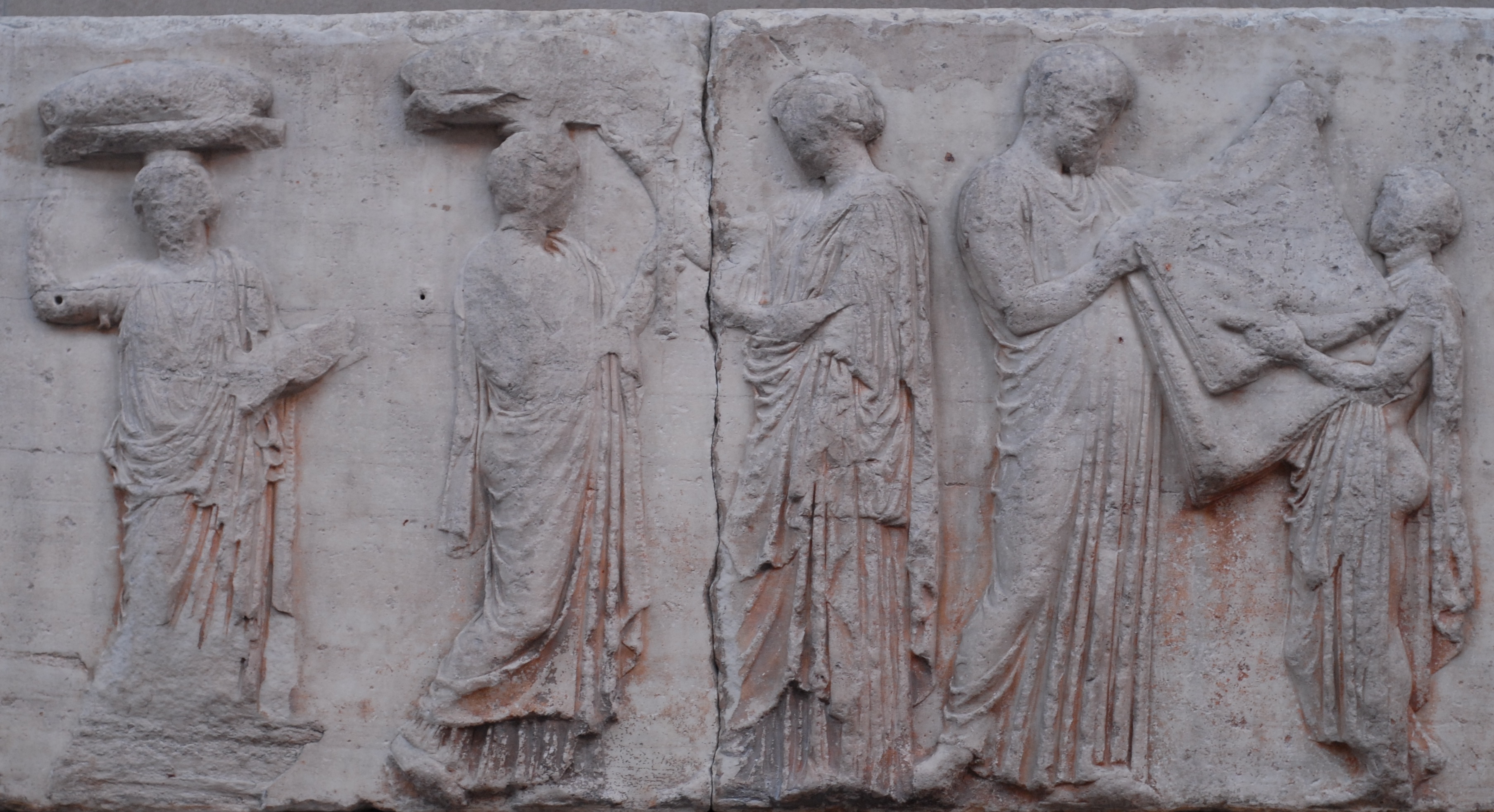
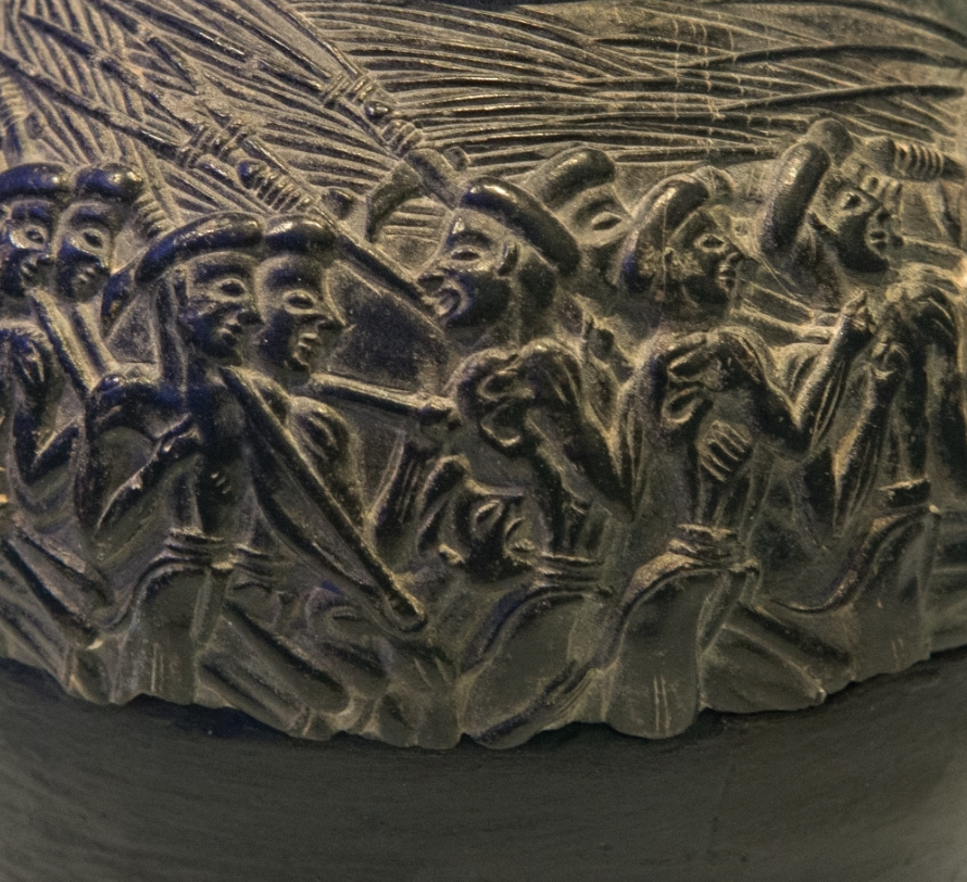
So-called “Peplos Scene” from the east Parthenon frieze (panels E31-35). The scene may depict the peplos garment being folded by a child (perhaps a weaver) and a chief priest. Mansfield believes that this image depicts the smaller peplos/robe of the annual Lesser Panathenaia.
A few weeks ago, I was doing some research on the traditional Greek garment, the peplos. Each year a special peplos was woven to decorate a statue of Athena on the acropolis of Athens. This garment was woven in celebration of the Panathenaic festival that took place every year in honor of Athena’s birthday. The typical annual celebration is called the Lesser Panathenaia, and every four years a spectacular celebration, the Greater Panathenaia would take place.
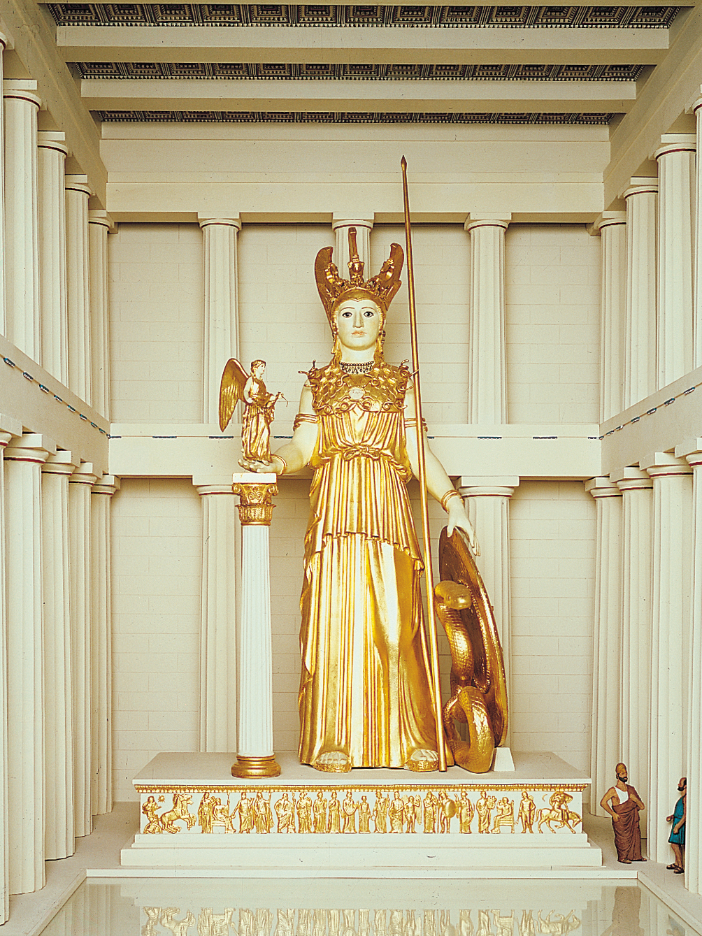
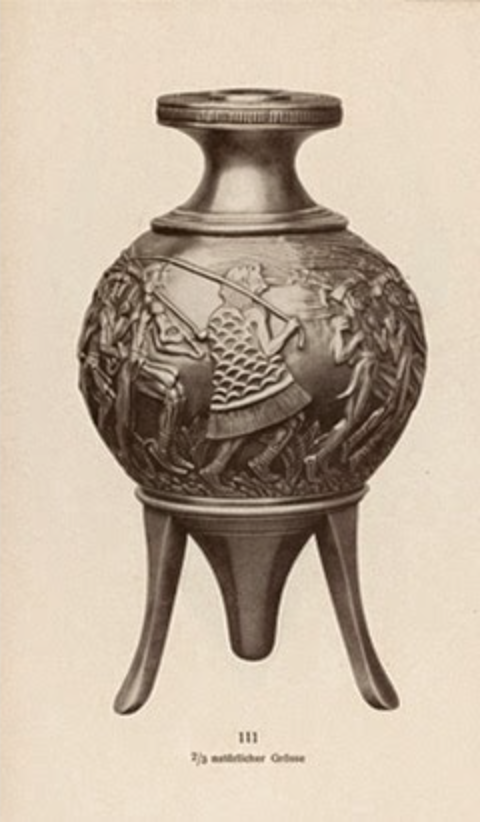
Phidias, model of Athena Parthenos (now lost) within the Parthenon, ca. 438 BC. Statue was approximately 11-12 meters (about 40 feet tall) and made of gold and ivory.
Up until a few weeks ago, I didn’t realize that this special Panathenaic peplos was a topic of deliberation among scholars. I thought that only an ancient wooden statue of Athena, called Athena Polias, was the only statue of Athena that was decorated for these celebrations.1 However, I came across a website which explained that an additional peplos was made every four years for the Greater Panathenaia celebration, and this different peplos was created for the monumental, chryselephantine (gold-and-ivory) statue of Athena Parthenos that Phidias created for the cella of the Parthenon. Incredulous, I wrote the owner of the website to ask for more information. He directed me a dissertation from 1985 by John Magruder Mansfield. I also found a 1992 exhibition catalog called Goddess and Polis: The Panathenaic Festival in Ancient Athens.
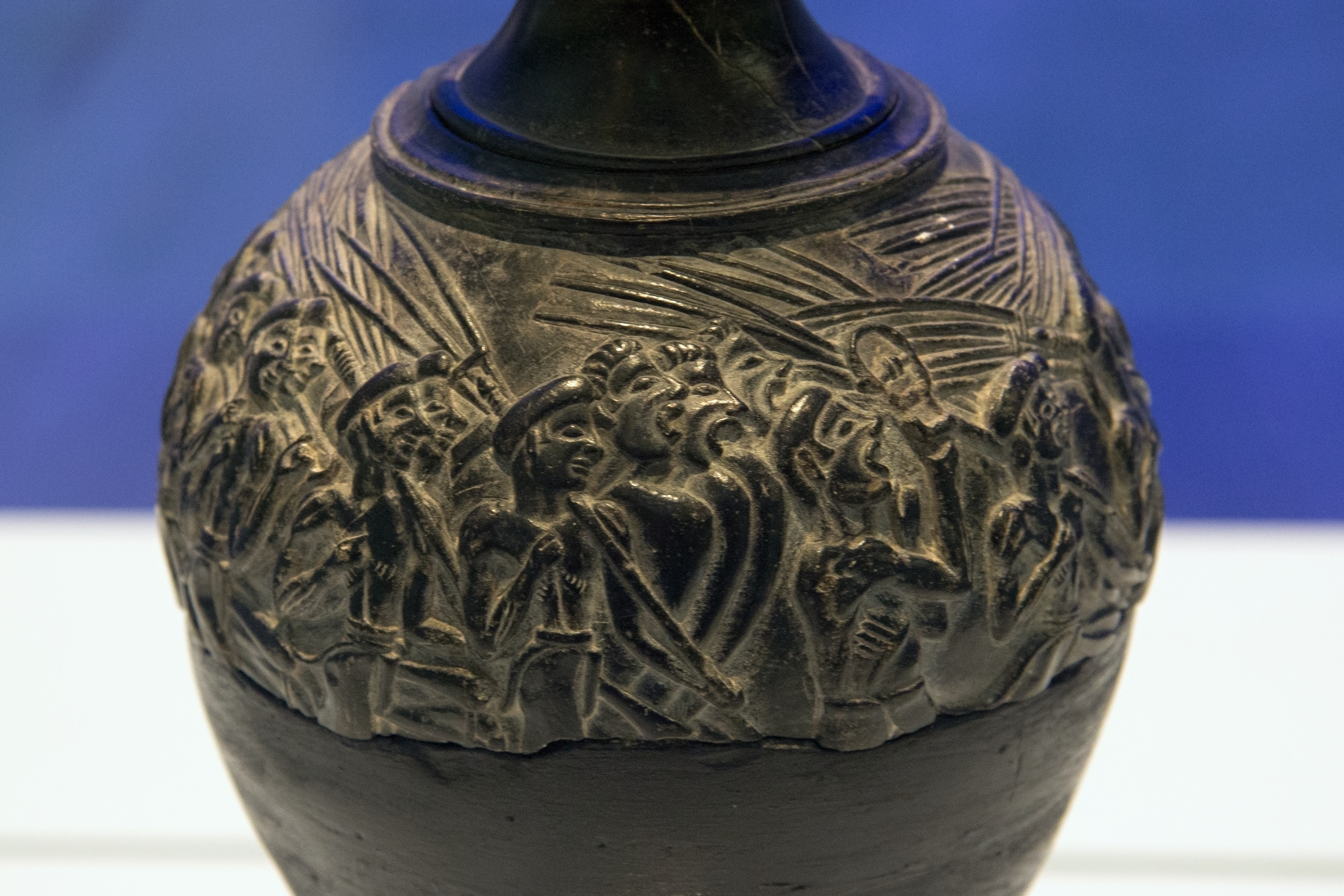
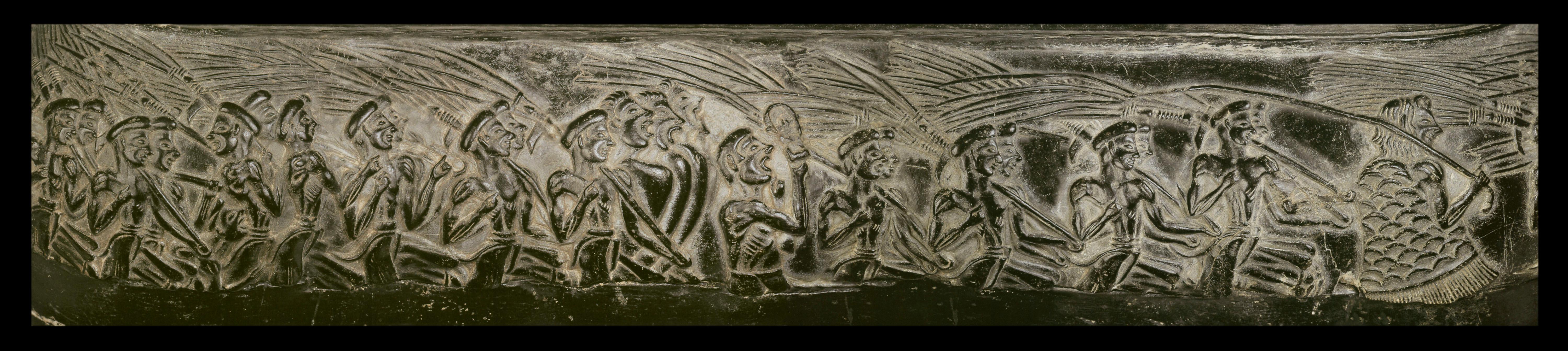
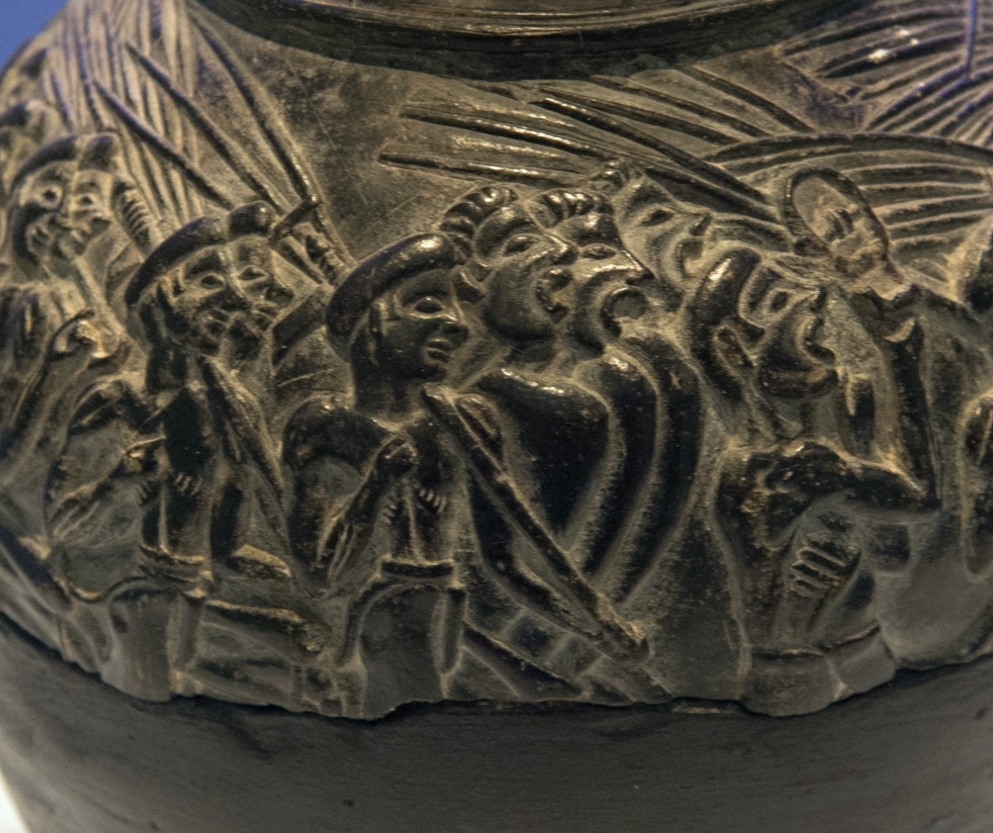
Manfield argues that there should be a distinction between the type of peploi that were created; this distinction can helps to clarify the semantic confusion caused by the Greeks using the word “peplos” in different contexts.2 A smaller peplos/robe was created by privileged women and given to Athena Polias at the Lesser Panathenaia. In contrast, a large peplos/tapestry was made by professional male weavers, who were selected by competition, and this large peplos/tapestry (between 16-64 square meters in area) was carried in procession as the sail of the Panathenaic Ship at the Greater Panathenaia celebration.3 This argument regarding a monumental-sized tapestry helps to resolve the historical descriptions of the Greater Panathenaia event, since the Panathenaic Ship is thought by many to be an actual maritime ship, perhaps captured from an enemy, and pulled on wheels.4 “In his comedy The Macedonians, written in c. 400, the poet Strattis refers to ‘countless men’ hauling on ropes to raise the peplos to the top of the mast, and others refer to the considerable expense of the ropes and tackle needed to do the job.”5
Therefore, it appears that two peploi were woven for the Greater Panathenaia celebrations, both a peplos/tapestry for the ship and a peplos/robe for the wooden cult statue of Athena Polias. Mansfield argues that the great peplos/tapestry of the Greater Panathenaia was decorated with the gigantomachy (the battle between the Olympian gods and the Titan giants), whereas the smaller peplos/robe was plain.6
Some scholars posit or imply that the peplos/tapestry could have been offered to, and not draped on Athena Parthenos, the gold-and-ivory cult statue in the Parthenon.7 This makes sense to me, and would help to reconcile the probability that the ancient Greeks did not feel compelled to embellished Athena Parthenos with a cloth, since the sculpture was already ornately decorated in ivory and gold. And we know that the tradition of creating the monumental peplos/tapestry was in practice before Lachares stripped the cult statue of its gold in order to pay troops in 296 BCE, so the creation of the peplos/tapestry tradition wasn’t out of an initial motivation to cover the despoiled statue. Instead, classicist Lewis suggests that the ancient peplos rite was transferred to the Athena Parthenos statue was soon as it was finished.8 The large peplos/tapestry would have been costly to create, so it is likely that it was hung in the Parthenon or the Temple of Athena Polias on the acropolis for the next four years, perhaps as a backdrop to one of the statues.9
It is difficult to know the specifics of how these peploi appeared and how they were used, beyond textual documents. For one thing, the woven cloth no longer exists. Additionally, the statues of Athena Polias or Athena Parthenos do not exist today either. But the process of weaving these tapestries and using them in conjunction with sculpture is still important to art historians, so we can learn how art was produced and how it functioned in ancient Athens.
1 It is likely that the Athena Polias was located in a temple (which dates around 525 BCE) that was next to the Erectheion; later, later the wooden statue was moved to the Erechtheion. For more history regarding the placement of this wooden statue, see See also Brunilde Sismondo Ridgway, “Images of Athena on the Akropolis,” in Goddess and Polis: The Panathenaic Festival in Ancient Athens by Jenifer Neils, ed. (Princeton, New Jersey: Princeton University Press, 1992), 125-127
2 John Magruder Mansfield, The Robe of Athena and the Panathenaic “Peplos,” PhD dissertation (University of California, Berkley, 1985), 16-17. See also E. J W. Barber, “The Peplos of Athena,” in Goddess and Polis: The Panathenaic Festival in Ancient Athens by Jenifer Neils, ed. (Princeton, New Jersey: Princeton University Press, 1992), 114.
3 Mansfield, 5-8. See Ridgway, 123.
4 Ridgway, 123.
5 Barber, 114. See also Mansfield, 47, 71-74.
6 Ridgway, 123
7 Ridgway, footnote on 210.
8 D. Lewis, “Athena’s Robe,” Scripta Classica Israelica 5 (1979-1980): 28-29.
9 Mansfield, 55.
