Category

Byzantine

Nicholas Galanin: Layers and Splits

Nicolas Galanin, "Ism #1," 2013. 19" x 32", digital photographic print. Image courtesy of the artist

Nicholas Galanin, “Ism #1,” 2013. 19″ x 32″, digital photographic print. Image courtesy of the artist

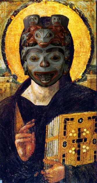
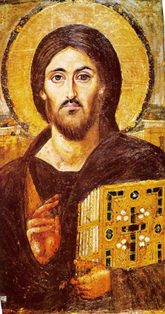
At the end of last month, I heard Dr. Christopher Green give a presentation that included some works of art by Nicholas Galanin, who is a Tlingtit-Unanagax contemporary artist. I was particularly struck by the digital photographic print Ism #1, which features the famous icon of Christ from the Monastery of Saint Catherine at Mount Sinai. However, in Galanin’s image, the face of Jesus has been covered with a Tlingit shaman’s mask (and not an actual shaman’s mask, which the Tlingit consider personal and not for public display, but a replica of a shaman’s mask).1 By creating a digital compilation of an original Byzantine painting with a photograph of a replica of a Tlingit mask (a replica made by Don Lelooska Smith of Cherokee heritage), Galanin’s work of art is full of layers that raise attention to authenticity, originality, appropriation and even theft.2 Galanin explained Ism #1 further in a quote on the Eazel website:

“The shaman’s mask over the crucified Christ can be read as theft of Indigenous culture and experience by a non-Indigenous community. This is also a strategy to use iconography understandable to a Eurocentric culture to make clear the level of suffering endured by carriers of Indigenous culture, and to elevate the importance and significance of the shaman’s mask to this audience.”

The two represented objects refer to complicated histories of destruction and disturbance. The Mount Sinai icon is a rare example of Byzantine art from the 6th century, because it pre-dates the period of iconoclasm (icon destruction) that took place in the 8th and 9th centuries. Because this icon was located at a remote location on a peninsula near the Red Sea, it escaped iconoclastic destruction. And yet, the original Tlingit shaman’s mask, which Galanin references through a secular copy, was also in a forested location with restricted access. It was located at a Tlingit shaman’s grave (at the area called Point Lena, Alaska), but it did not escape disturbance: it was “collected” (i.e. stolen) by George Emmons in 1919. The mask was located in the National Museum of the American Indian in the last half of the 20th century, only to be repatriated in 2003.1
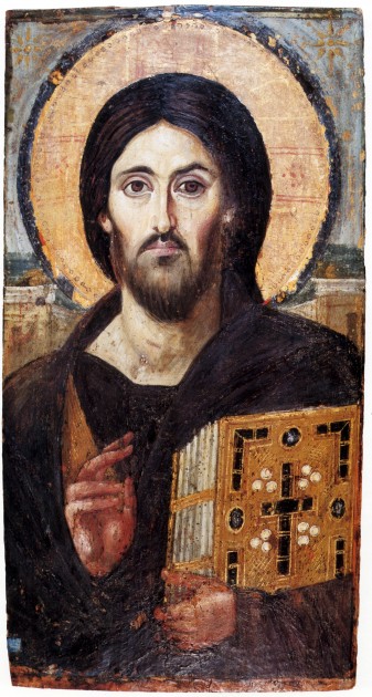
Christ, Monastery of Saint Catherine at Mount Sinai, 6th century. 33.1 x 19.4 in (84 x 45.5 cm, encaustic painting (pigments and wax). Image courtesy Wikipedia

Christ, Monastery of Saint Catherine at Mount Sinai, 6th century. 33.1 x 19.4 in (84 x 45.5 cm, encaustic painting (pigments and wax). Image courtesy Wikipedia

The meaning of the icon clearly has been altered by the addition of the Tlingit mask. In the original icon, Jesus’s face is asymmetrical: his right side (viewer’s left) is welcoming and calm, whereas his left side (viewer’s right) has harsher shadows and is pulled into a sneer. (If you want to see how differently the sides appear, check out these digital mockups of how the full faces would appear if the sides were symmetrical.) Through this split composition, the icon expresses the dual nature of Jesus Christ’s roles, as both a loving Savior for the righteous and a harsh Judge for the wicked.

I think that the composition of Christ’s face is also applicable to the context of the Christian missionaries interacting with Indigenous people during the period of Western expansion. Galanin explains, “During colonization and settlement, Christian missionaries functioned as a wedge used to split apart Indigenous communities.” As such, for those viewers who are familiar with this (hidden) split face, it can can serve as a reminder of Christianity’s divisive role in history. The visual layering even recalls this sense of the past, with the split face serving as the “older” first layer. I think that a hope of rectification and restitution is suggested by superimposing a symmetrical, visually-balanced mask on top of this asymmetrical face, especially with the knowledge that the original mask was repatriated to the Tlingit in 2003. And yet, by having these two cultures bound together within Galanin’s digital photomontage, the layered pull between the past and present conveys that an imbalance still exists today.
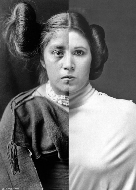
Nicolas Galanin, Things Are Looking Native, Native's Looking Whiter, 2012. Giclée print, 15.5" x 20.25"

Nicholas Galanin, “Things Are Looking Native, Native’s Looking Whiter,” 2012. Giclée print, 15.5″ x 20.25″. Image courtesy of the artist

This pull between past, present, and future is also seen in Galanin’s photographic image Things Are Looking Native, Native’s Looking Whiter (shown above). The past is suggested with the photograph on the left, which comes from a photograph of a Hopi-Tewa woman that was taken in the early 20th century by Edward Curtis. The butterfly whorl hairstyle (sometimes described as “squash blossom”) was worn by unmarried Hopi women. The older photograph is juxtaposed with a promotional photograph on the right of actor Carrie Fisher as the character Princess Leia from “Star Wars.” This juxtaposition references contemporary pop culture but also hints at the past and future too, with reference to a futuristic society that lived “a long time ago, in a galaxy far, far away.”

Just with the photograph of Ism #1, references to destruction and disturbance are compounded in this photographic print. In the early 20th century, when the controversial artist Edward Curtis was taking his photographs, the US government was involved efforts to “westernize” Indigenous communities and establish legislation and reservation policies that would restrict Indigenous rights. These actions included setting up boarding schools that worked to eradicate traditional Indigenous cultures and languages. Edward Curtis’s work, through the sense of false authenticity conveyed through the photographic medium, supported what Galanin calls “the national fantasy that Indigenous people and ways of life were disappearing. The imagery created was often staged with props Curtis carried with him, to construct photos that would eventually be used as a standard for disappearing tradition and authenticity.” With this context of destruction and cultural disturbance in mind, a Star Wars fan can’t help but think of the destruction of Princess Leia’s home planet, Alderaan, in “Episode IV: A New Hope” due to the machinations of the Galactic Empire.

Juxtaposing these images draws attention to issues of cultural appropriation and inaccurate constructs. Galanin explains on his Flickr portfolio, “In borrowing from Indigenous aesthetics, the image projects settler claims to Indigenous culture into the future. The title speaks to consumer culture’s desire to claim ‘Native inspired’ looks, while simultaneously refusing Indigenous people the agency to define Indigenous culture in an increasingly hybrid world. I point out that while non-Native ‘things’ look Native to the non-Natives who produce them, Natives continue to be held to historical constructs of Native-ness devised by non-Natives.” The horizontal split between the images creates visual competition, which emphasizes that these historical constructs for Natives still exist today. I appreciate that the faces of the figures are aligned as closely as possible, however, since that suggests to me that Native and non-Native cultures have the potential to come together in a balanced and respectful way.

(And on a side note, First Nation K’ómox artist Andy Everson includes references to Star Wars in his work as a way to reference dichotomies in life and reflect on cultural heritage. Andy was photographed in an Imperial Stormtrooper costume, covered with formline designs, by Navajo artist Will Wilson for his ongoing photographic project Critical Indigenous Photographic Exchange (CIPX). You can learn more about the work of these two artists here.)

I look forward to following Nicholas Galanin’s work! His “Never Forget” installation from 2021 also caught my attention, as it raises related questions about past, present, commodification and commercialism (even a different type of reference to Hollywood!), but directly and forthrightly addresses settler land occupation.

1 Christopher Green presentation at Central Washington University, April 30, 2021.

2 Ibid. I appreciate that Christopher Green drew attention to these layers specifically in his presentation.
Comments Off on Nicholas Galanin: Layers and Splits

Rublev’s “Holy Trinity”

Some of my friends from high school have chosen very interesting professions and fields of study. A few of these friends studied in divinity school, which can make for interesting conversations via social media. Whenever I have something meaningful to contribute in relation to art, I like to join in the conversation. I thought I’d share some of my thoughts that I contributed to a thread about the Trinity this evening. One of my friends, who is an Orthodox Greek, mentioned that the Hospitality of Abraham is one of the feast days in which the theology of the Trinity is celebrated. He mentioned how the Hospitality of Abraham is popular in icons, and I then popped in with some additional thoughts, which I’ve slightly modified below:

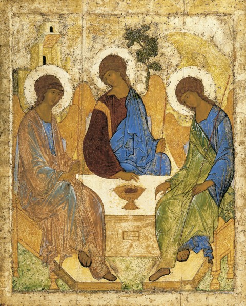
Andrei Rublev, Angels and Mamre (also called "Holy Trinity" or "Three Angels Visiting Abraham"), c. 1410-25. Tempera on wood, 142 cm × 114 cm (56 in × 45 in)

“I think that one of the most famous scenes showing the Hospitality of Abraham/Holy Trinity is the one by Andrei Rublev.

The mountain behind the figure on the right is a symbol for the Holy Spirit (since, for example, mountains are holy locations at which the Spirit can be manifest). The tree (next to the central figure) is a symbol for Christ and the cross. This figure also points to an object that resembles a cup filled with wine. I have read different interpretations regarding the architecture in the background on the right. On one hand, it can serve as a symbol for the house of God, or it can reference the Father as a Creator. Also, obviously, this structure can represent the tent in which Sarah “laughed within herself” upon hearing the prophesy that she would bear a child in old age (Genesis 18:12).

On a side note, I think that the practically identical faces of the angels help to emphasize the unity of the Trinity.”

There are a couple of other symbols and thoughts that I could have added to this comment, but I didn’t want to hijack the thread. I’ll include them here:

  • Circular composition of the angels seated at the table emphasizes the eternal and unified nature of the Trinity.
  • Each figure wears a blue garment, perhaps symbolizing the heavens.
  • I’ve read a couple of interpretations that the seemingly translucent nature of the Father’s garment (the figure on the far left) can emphasize the immaterial nature of God (i.e. the idea of God as Spirit). Although it appears that the quality of the paint may be deteriorating in this example above (which could prompt such a reaction about translucency), we can see that other Orthodox artists who copied Rublev (see an example HERE) also suggest this same idea of a translucent garment.
  • The two fingers for the central figure can represent how Christ is both earthly and divine.
  • Each figure holds a staff. I think that these staffs serve as symbols of authority and power. Another blogger thinks that the staffs suggest that God walks with men throughout their earthly pilgrimages.
  • On a different note, the scale of this piece is larger than you might suppose! It is 142 cm tall (over four and a half feet!).

Does anyone have other thoughts on the symbolism for this icon? On a side note, I think that the sweeping curves and sweet faces of these figures are very appealing. I really like Rublev’s style.

— 1 Comment

Christian and Islamic Art: Flesh vs. Word

Christ, Monastery of Saint Catherine at Mount Sinai, 6th century

I just finished a very busy, busy quarter. One of the classroom discussions that I will remember most involved a comparison between Islamic imagery and Christian imagery. Before discussing Islamic imagery, I introduced my students to Byzantine icons. We discussed how the frontal orientation of figures and direct eye contact were essential in the icon tradition, since such compositional devices encourage interaction with the viewer.1 In the case of the icon of Christ from the Monastery of Saint Catherine (one of the few icons which escaped destruction during the period of iconoclasm in the 8th and 9th centuries), we also discussed how the composition of Christ’s face was significant: “The right side of Christ’s face (our left) is open, receptive and welcoming, whereas his left side – Byzantium’s tradition side of judgment and condemnation – is harsh and threatening, the eyebrow arched, the cheekbone accentuated by shadow, and the mouth drawn down as if in a sneer.”2

To continue this discussion, I emphasized to my students that in many ways figural imagery lends itself to Christianity: Christ assumed a human body (“the Word became flesh”) and Christians are supposed to emulate the actions of Christ. Christians are also encouraged to emulate the lives of virtuous individuals, such as saints and martyrs. Such emulation and mimicry is encouraged when there is figural imagery, perhaps especially when such imagery exists in a narrative scene.

To emphasize this point about mimetic behavior, I had my students read a short article by Gary Vikan on Byzantine icons: “Sacred Image, Sacred Power.” I really like Vikan’s discussion of images and imitative behavior, which he supports with a 4th century quote from St. Basil. Basil explains how there is a parallel between the workshop practice of artists and the appropriate behavior of Christians:

“…just as painters in working from models constantly gaze at their exemplar and thus strive to transfer the expression of the original to their artistry, so too he who is anxious to make himself perfect in all the kinds of virtue must gaze upon the lives of saints as upon statues, so to speak, that move and act, and must make their excellence his own by imitation.”3

Jan Steen, "The Dissolute Household," ca. 1663-64

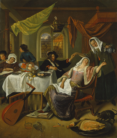
Although there were periods of iconoclasm in Christian history, I believe that the mimetic behavior of Christians is one of the reasons that figural imagery generally has prevailed in Christian art. And even during some of the comparatively later periods of iconoclasm, such as that experienced by Protestants, the secular imagery at the time was still based on mimetic behavior – particularly the moralizing themes found in Northern Renaissance and Northern Baroque art. Even when Christians weren’t looking toward strictly religious subject matter, they still looked toward paintings to help enforce what behavior they should mimic or avoid. Such moralizing paintings were created by Jan Steen, including The Dissolute Household (ca. 1663-64, see above).

Dome of the Rock, 687-91 CE, Jerusalem. Image courtesy Wikipedia

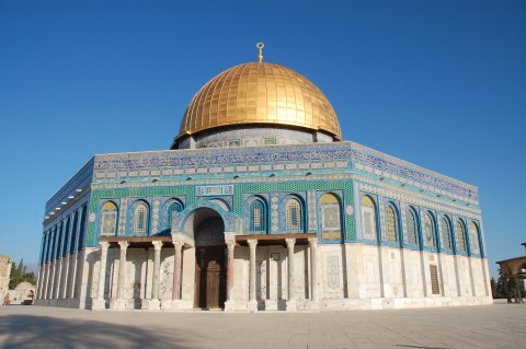
In contrast with Christianity, Islam doesn’t have exactly the same type of foundation in mimetic behavior: God revealed himself to Mohammad through his word, and therefore the words of the Qu’ran take precedence in religious imagery.4 For Islam, words are the embodiment of God. This point was emphasized in an article that I shared with my students, “The Image of the Word” by Erica Cruikshank Dodd. She explains, “The written or the recited Koran is thus identical in being and in reality with the uncreated and eternal word of God. . . If God did not reveal Himself or His Image to the Prophet, he nevertheless revealed a faithful ‘picture’ of his word.”5 God sent down his image in the form of a book. In turn, Muslims decorate the interior and/or exterior of their religious spaces with phrases from the Qu’ran, as can be seen on the exterior of the Dome of the Rock (a structure that Oleg Grabar describes as a “very talkative building”).

Floriated kufic script at the Sultan Hassan Mosque-Madrassa in Cairo, after 1356 CE

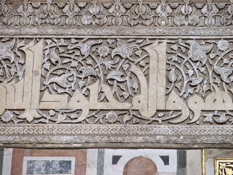
Despite the fundamental differences in Islamic art and Christian art, it is fun to notice some visual similarities. I like to consider how the words of the Qu’ran, as depicted in flat, two-dimensional text, have parallels with the flat stylizations found in many Byzantine icons. In some cases, as seen in the kufic script above, the elongation of the script has an interesting parallel with the elongation of human figures in Byzantine art. Furthermore, both text and image limit the distance between the viewer and representation by rejecting three-dimensional illusionism. As a result, the devout viewer is able to get as close to the embodiment of God as possible, whether that be an image or text.

1 Other visual devices in icons which encourage interaction with the viewer include the gold background (which removes the distraction of earthly or “real” time), half-length figures (to push the figure closer to the viewer), and overly-large eyes.

2 Gary Vikan, “Sacred Image, Sacred Power,” in Late Antique and Medieval Art of the Mediterranean World by Eva R. Hoffman, ed. (Malden, MA: Blackwell Publishing, 2007), 137.

3 Ibid., 140.

4 Although Muslims strive to maintain lifestyle outlined and practiced by the Prophet Muhammad, as explained in the Sunnah, the writings of the Qu’ran are the primary source for the Islamic faith and its religious art.

5 Erica Cruikshank Dodd, “The Image of the Word,” in Late Antique and Medieval Art of the Mediterranean World by Eva R. Hoffman, ed. (Malden, MA: Blackwell Publishing, 2007), 193.

— 16 Comments

Mosaic Restorations at Hagia Sophia

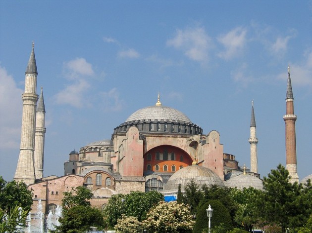
Hagia Sophia, Istanbul, Turkey, 532-537. Image courtesy Wikipedia

This summer I am going to Istanbul (and other parts of Turkey) with some old roommates from college. One of the things that I am most excited to see is Hagia Sophia. This church-mosque-museum has such a rich, nuanced, and even rough history.

Lately I’ve been thinking about the mosaics located inside Hagia Sophia. These mosaics, which were created over several centuries, have had a hard time due to earthquakes and other forms of damage. The early mosaics were removed during the latter part of the 720s as a result of iconoclasm, only to be returned under the rule of Empress Irene (752-803). Later, with the sack of Hagia Sophia under the Fourth Crusade of 1204, some mosaics were removed and sent to Venice. Other relics from Hagia Sophia also ended up in Europe during this same time.

After the fall of the Byzantine Empire in 1453, Hagia Sophia was converted into a mosque. Subsequently, perhaps over time, the mosaics were covered up with plaster and painted decorations.1 To finalize the process, the mosaics were uniformly covered with plaster sometime between 1847-1849, at the request of Ottoman ruler H. M. Sultan Abdul Medjid.2 The widespread covering of mosaics was part of a project to help give more strength, uniformity, and consistency to the structure, which had weakened and been subject to many modifications over the past several centuries. Old plaster had also fallen off some of the mosaics, and Medjid wanted the mosaics to be restored (i.e. removing the remaining old plaster) and then covered with new plaster.

This 19th century project on Hagia Sophia was overseen by Gaspare and Giuseppe Fossati, two Italian brothers. These men oversaw a crew of more than eight hundred people. During this process, the Fossati brothers “recorded the location and description of many of the mosaics before replastering over them.”3

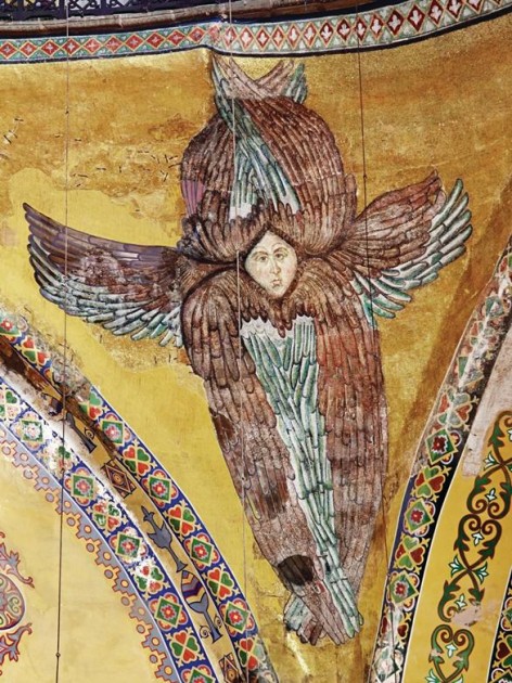
Seraphim in dome pendentive of Hagia Sophia, probably from the mid-14th century (post-dating an earthquake of 1344). The face of this seraphim was covered by the Fossati brothers in the 19th century. About one hundred and sixty years later, the face was uncovered and restored in 2009.*

In class yesterday, some of my students speculated that the covering of mosaics could have been done as an act of retaliation or anger against the Christians (perhaps as a result of the Crusades). From what I can tell, though, it doesn’t seem like the mosaics were covered to signify vengeance or even political domination. Instead, Muslims seemed to respect the original structure and its decoration.4 After all, the mosaics were covered with plaster instead of destroyed.

I have even read some discussion of how Muslims began to incorporate Hagia Sophia into their own cultural history, in order to justify the conversion of this structure into a mosque. These stories from Ottoman historical texts indicate to me that cultural appropriation of Hagia Sophia by Muslims was seen from more practical and religious viewpoints, instead of one that was riddled with spite. One version of this story relates that when the half-dome of the apse collapsed on the night of the Prophet Mohammad’s birth, it could only be repaired with a mortar composed of sand from Mecca, water from the well of Zemzem, and the Prophet’s saliva.5

The fate of the plastered mosaics would change again, after the establishment of the Republic of Turkey in the 20th century. The mosaics began to be uncovered in 1931, and work continued until 1938. During this same time period, Hagia Sophia was turned into a museum by Kemal Atatürk. The space officially opened as a museum in 1935.

Hagia Sophia, interior of dome during restoration in 2007. Image courtesy of Wikipedia

Restorations of the mosaics continued in the 20th century, and a major restoration took place between 1993 and 2010. This most recent restoration was fraught with its own difficulties, partially due to lack of consistent funding. And even though the Ministry of Culture and Tourism declared that the project was complete in 2010, there is still much more restoration work that needs to be done. In 2011, it was reported that many walls and passageways in Hagia Sophia were still covered with plaster. In the 19th century the Fossati brothers also recorded that a great Christ Pantocrator mosaic was located in the dome (among a number of other mosaics that are not visible today). I wonder if these mosaics still exist. Many are hopeful, including myself, that more mosaics are waiting to be uncovered.

*More information and pictures regarding the seraphim restoration can be found HERE.

1 We know that different individuals in the 17th and 18th centuries made some drawings of mosaics that they saw in Hagia Sophia. Evilya Effendi made some drawings of mosaics in the 17th century and Swedish traveler Cornelius Loos did some drawings in 1710. See Dr. Helen C. Evans, “Byzantium Restored: The Mosaics of Hagia Sophia in the 20th Century,” 4th Annual Pallas Lecture, University of Michigan, p. 2. Online copy of lecture available at: http://www.lsa.umich.edu/UofM/Content/modgreek/document/Evans_PallasLecture.pdf (accessed 24 May 2012).

2 Ibid.

3 Ibid.

4 It has been noted, though, that there was some internal resistance from the conversion of a Christian structure into a mosque. Robert Ousterhout writes, “Yet tension remained, and the Christian memory was never entirely erased. A firman of 1573 indicates that there was still some opposition to the preservation of a building built by non-Muslims.” See Robert Ousterhout, “Ethnic Identity and Cultural Appropriation in Early Ottoman Architecture,” in Muqarnas 12 (1995): 49. Online copy of article available at: http://archnet.org/library/documents/one-document.jsp?document_id=8983 (accessed 24 May 2012).

5 Ibid., 49.

— 5 Comments

Justinian Mosaic Altered Not Once, but Twice!


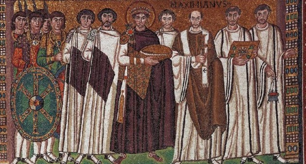
Detail of Justinian and His Attendants, wall of the apse of the San Vitale Church (Ravenna), c. 545-546. Church consecrated 547. Some alterations date c. 1100.

The mosaic “Justinian and His Attendants” at San Vitale (c. 544-545 CE) is one of the most famous works of art from the Byzantine period. It also happens to be one of my favorite piece from this era. It is commonly known that there were some alterations made to this mosaic just a few years after it was created, probably between 546 and 548. We know that the head of the archbishop (who is standing to the left of Justinian or the right side from the viewer’s perspective) was altered and the inscription Maximianus was included at this time. This change probably is because Bishop Victor was originally depicted in the mosaic. After Victor died in 545, Maximian came into power and wanted to have himself depicted instead. It is thought that Maximian needed to include his portrait as an assertion of power, since his authority was insecure at the time. In fact, around the time of this alteration the archbishop had recently been banned from entering the city of Ravenna, due to a dispute with its citizens.1

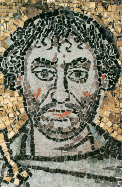
Detail of Justinian mosaic, probably depicting John the Nephew of Vitalian

Another one of the early modifications was the inclusion of a courtier who stands in between Justinian and the bishop (see above). If you look closely at the overall composition, you’ll see that this individual does not have any feet (which can be explained with the understanding that this figure is a late addition). It is thought that this figure represents John the Nephew of Vitalian, who was second in command to the commander-in-chief of Italy (the latter is thought to be depicted on the right side of Justinian, wearing a beard). Maximian may have seen potential in John the Nephew’s power, and therefore decided to include him in the composition.2 Although it does seem like it would be humiliating to be included in the background of the composition, John the Nephew did get a prime location between the emperor and archbishop.

However, in addition to these early alterations there are some other alterations to this mosaic which seem to have taken place several hundred years later, probably around 1100 CE. Isn’t that interesting? In the 1990s, scholars Irina Andreescu-Treadgold and Warren Treadgold published results on some technical analyses of the Justinian mosaic. The publications revealed changes in the scale and materials of the tesserae that were used.3 Based on these studies, I wanted to present some of the medieval restorations that took place.

Detail of deacon with tonsure, Justinian mosaic

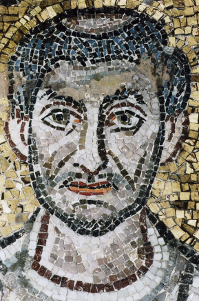
One of the interesting additions in the c. 1100 restoration is the tonsure (shaved top of scalp) which was added to one of the deacons on the right side of the mosaic. Although the origins of the tonsure are unclear, I am not familiar with any examples of the tonsure that exist before the 7th and 8th centuries. (If anyone does know of examples, I’d be interested to learn about them!) It’s important to realize that the tonsure might not have existed in the sixth century, when this mosaic was originally made!

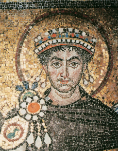
Detail of Justinian's crown and fibula (brooch)

Other medieval alterations include the emperor’s crown, which apparently was simplified and diminished in scale (although it is interesting to note that Empress Theodora’s crown, depicted in another mosaic in the San Vitale apse, is an original). A fibula (or brooch) was also added to Justinian’s attire in this later alteration (see above). I think that this inclusion of the fibula is rather interesting – perhaps the mosaicists wanted to visually compensate for the fact that they gave Justinian a smaller crown? Finally, the smaller pieces of tesserae at the beginning and end of the Maximianus inscription indicates that there was an alteration in this place, too.

Isn’t it interesting that we can deduce through formal and technical analysis that this mosaic was altered several hundred years after its creation? The nuanced history of this mosaic makes me love it all the more. What do you like best about this work of art?

1 Irina Andreescu-Treadgold and Warren Treadgold, “Procopius and the Imperial Panels of S. Vitale,” The Art Bulletin 79, no. 4 (1997): 721. Maximian had been barred from Ravenna because he had supported Justininan’s Edict of the Three Chapters. The inclusion of himself with the emperor in this mosaic serves to visually reinforce Maximian’s support of the emperor.

2 Ibid.

3 Ibid. See also Treadgold, “The mosaic workshop at San Vitale” in A. M. Ianucci ed., Mosaici a San Vitale e altri restaur. Il restauro in situ di mosaici parietali, Ravenna, 1992, pp. 31-41. The restoration is also briefly discussed in Sarah E. Bassett, “Style and Meaning in the Imperial Panels at San Vitale,” Arbitus et Historiae 29, no. 57 (2008): 56.

— 8 Comments

Email Subscription


Archives

About

This blog focuses on making Western art history accessible and interesting to all types of audiences: art historians, students, and anyone else who is curious about art. Alberti’s Window is maintained by Monica Bowen, an art historian and professor.