Saturday, April 20th, 2024
Dorothy Napangardi: Floor and Family
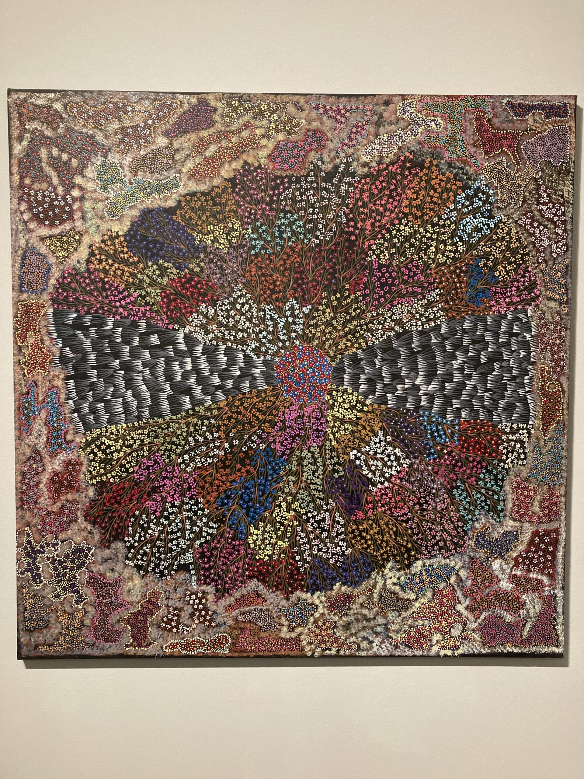
Dorothy Napangardi, “Yuparli (Bush Banana),” 1993. Synthetic polymer paint on canvas (Australian, Warlpiri people, Western Desert, Northern Territory). Private collection
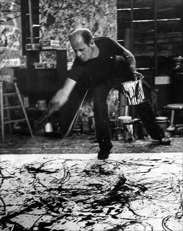
I recently found a video of the Australian Aboriginal artist Dorothy Napangardi at work: she is seated on the ground, sitting on top of the canvas, and carefully painting each line and dot. This process of working on a canvas has only existed for roughly about half of a century; before this point, Aboriginal artists would depict the ancient stories and symbols from the primordial Dreaming period on rock cave walls or in the dirt or sand. I’m reminded of how Navajo sandpaintings are somewhat similar in that regard, since they also are made on the floor. In fact, Jackson Pollock put his canvases on the floor because he was inspired by Navajo sandpaintings and their creation process. But despite the similarity that both artists paint on a canvas, Dorothy Napangardi is a reversal of Jackson Pollock: she is seated, collected and calm as she systematically works on creating lines and dots. This calm, reflective process also reflects Napangardi’s internal process. She said in 2002, “I really like painting. I really love doing dot paintings. While I’m doing my paintings, I always have my family in my mind, I have my country in my mind.”1
I love having this visual of Napangardi working from above the canvas, too, because it helps me to think about the aerial perspective that is taken by the Dreaming paintings of Aboriginal artists. These paintings are kind of like maps, in that they can reference the landscape, the experiences of primordial ancestors across the landscape, and primary plants and sources of food that thrive within the land. The painting “Yuparli (Bush Banana)” is a subject that Dorothy Napangardi depicted more than once (one such example is shown and above and another example). Christine Nichols explained in 2002:
It was in Alice Springs in 1987 that Napangardi began painting… She began to paint the bush banana, a symbiotic plant, winding vine-like around shrubs or small trees. Yuparli leaves are large and rather long. The first flower of the bush banana vine is known as Big Sister, while the second flower is Little Sister or the follower. Sometimes older bush bananas are cooked in the hot ashes to soften them up, otherwise they can be a bit crunchy. Young yuparli are tender and sweet and are prized bush ticker.”2
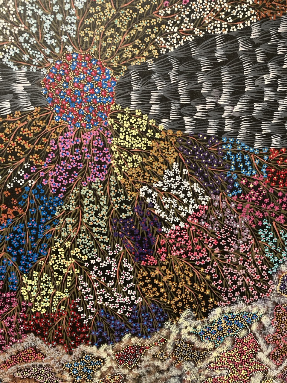
Dorothy Napangardi, detail of “Yuparli (Bush Banana),” 1993. Synthetic polymer paint on canvas (Australian, Warlpiri people, Western Desert, Northern Territory). Private collection
I wonder if the Big Sister and Little Sister names might have had special meaning for Dorothy Napangardi, since her half-sister Eunice was also a painter who depicted the Yuparli banana plant. Dorothy began painting in 1987, after Eunice had already begun to paint and earn an income through her art.3 Both of the women lived in Alice Springs and the subject of the banana plant is part of an imagery and story that has been handed down in their family. Eunice also painted the bush banana plant (see one example below) and sometimes these women painted banana plants in same year (both examples in this post are from 1993). I wonder how often the women thought of each other, perhaps thinking of their relationship as sisters, when they painted the banana plant and its flowers.
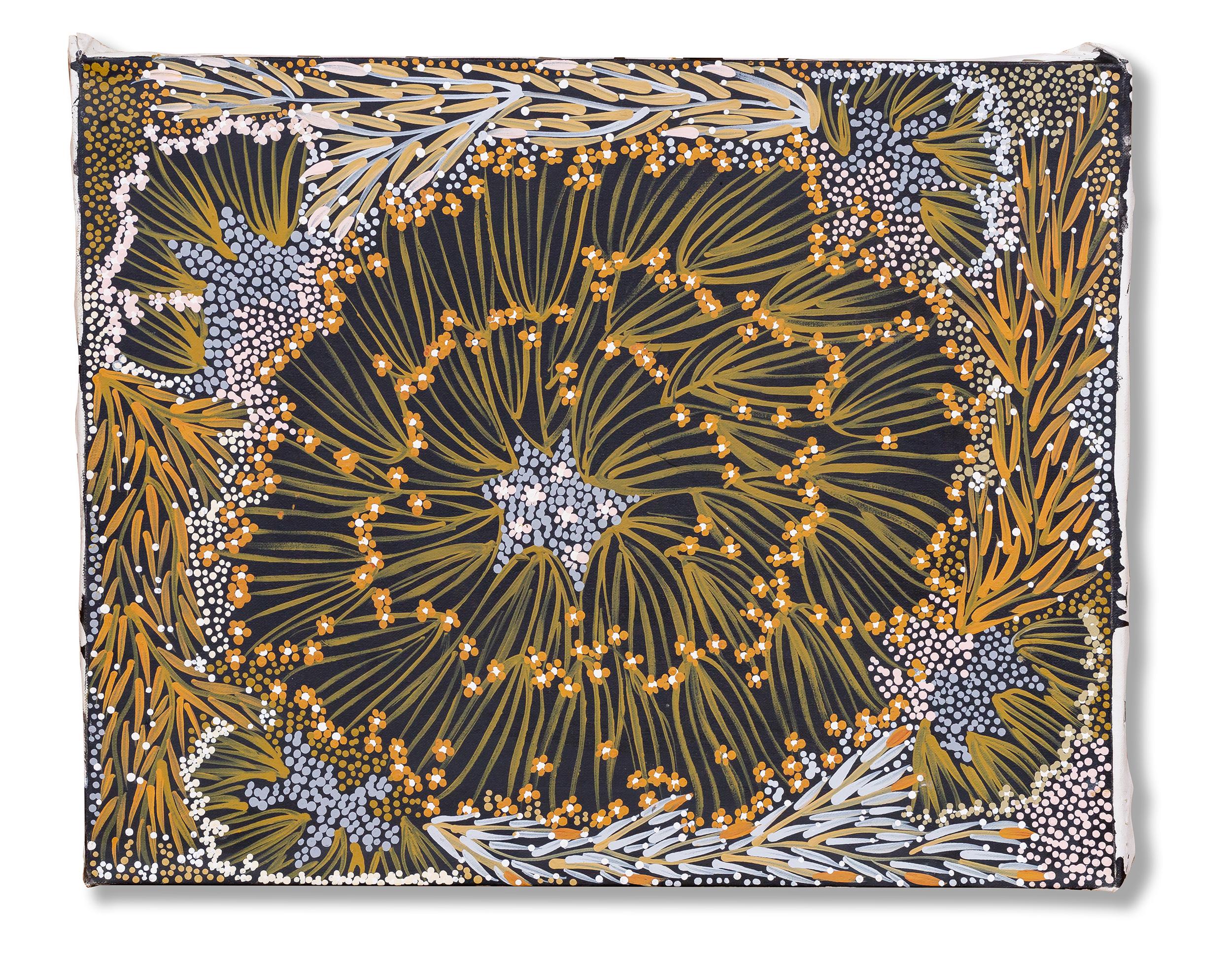
Eunice Napangardi, “Bush Banana Dreaming (Ipalu)” 1993. Acrylic on canvas, 15 3/4 x 20 in. (40 x 50.8 cm.)
1 Kathan Brown, “Dorothy Napangardi and Contemporary Australian Aboriginal Art,” (San Francisco: Crown Point Newsletter, November 2004). Article available here: https://crownpoint.com/app/uploads/Napangardi-Overview099.pdf
2 “Yuparli (Bush Banana), 1993” (Seattle, Washington: Seattle Art Museum, October 3, 2020). Museum label.
3 Kathan Brown.
