Artists and Candle Hats

This school year I’ve been volunteering at my child’s elementary school, making videos for the Meet the Masters curriculum and helping out with art projects in a few classrooms. So far we have done the Van Gogh unit as a school, and I’ve also created some videos for the Hokusai project coming up in January. It’s been fun to do, although I have been finding some errors and misleading information in both the Van Gogh and Hokusai units. Someone needs to hire an art historian to fact-check the Meet the Masters curriculum!

The Van Gogh unit inaccurately states that Van Gogh wore a hat with candles, in order to paint at night. This is a myth that dates back to 1922, when it first appeared in by a book by the art critic Gustave Coquiot. In fact, Van Gogh actually explained in one letter that he completed a painting at night by using a gas lamp.

However, I know of one 19th-century artist who did paint at night with candles in a hat: Francisco Goya. The candle holders in the hat can even be seen in this image (and perhaps even better in this cleaned detail image of the painting):

Francisco Goya, "Self-Portrait in the Workshop," 1790-95. Oil on canvas, 42 x 28 cm. Museo de la Real Academia de San Fernando, Madrid. Image via Web Gallery of Art

Francisco Goya, “Self-Portrait in the Workshop,” 1790-95. Oil on canvas, 42 x 28 cm. Museo de la Real Academia de San Fernando, Madrid. Image via Web Gallery of Art

Goya’s son, as well as his biographer Laurent Matheron both explain that Goya would use this hat. Goya’s son Javier wrote, “He painted only in one session, sometimes of ten hours, but never in the late afternoon. The last touches for the better effect of a picture he gave at night, by artificial light.”Matheron also commented on this practice in 1858: ‘He was so jealous of the effect that – like our Girodet who painted at night, his head crowned with candles – he gave the last touches to his canvases by candlelight.”2

Goya’s candle hat has inspired contemporary artist Von Sumner, as well as this poem “Candle Hat” by Billy Collins, which is inspired by the self-portrait by Goya shown above:

In most self-portraits it is the face that dominates:
Cezanne is a pair of eyes swimming in brushstrokes,
Van Gogh stares out of a halo of swirling darkness,
Rembrant looks relieved as if he were taking a breather
from painting The Blinding of Sampson.

But in this one Goya stands well back from the mirror
and is seen posed in the clutter of his studio
addressing a canvas tilted back on a tall easel.

He appears to be smiling out at us as if he knew
we would be amused by the extraordinary hat on his head
which is fitted around the brim with candle holders,
a device that allowed him to work into the night.

You can only wonder what it would be like
to be wearing such a chandelier on your head
as if you were a walking dining room or concert hall.

But once you see this hat there is no need to read
any biography of Goya or to memorize his dates.

To understand Goya you only have to imagine him
lighting the candles one by one, then placing
the hat on his head, ready for a night of work.

Imagine him surprising his wife with his new invention,
the laughing like a birthday cake when she saw the glow.

Imagine him flickering through the rooms of his house
with all the shadows flying across the walls.

Imagine a lost traveler knocking on his door
one dark night in the hill country of Spain.
“Come in, ” he would say, “I was just painting myself,”
as he stood in the doorway holding up the wand of a brush,
illuminated in the blaze of his famous candle hat.

I keep thinking of this glowing hat at this time of year, due to Santa Lucia traditions that lead up to Christmastime and the long nights that we are experiencing. We all need more light right now! Do you know of any other artists who painted with anything like a candle hat?

1 Javier Goya wrote, “Los últimos toques para el mejor efecto de un cuadro los daba de noche, con luz artificial,” (see Pedro Beroqui, “Una biografia de Goya escrita por su hijo,” Achivo Español de Arte III (1927), p. 100).

2 Laurent Matheron wrote, ‘”tait tellement jaloux de l’effet, que, – semblable a’ notre Girodet, qui, la nuit, peignait la tête couronnée de chandelles, – il donnait au flambeau les dernières touches à ses toil.” Quoted by Enriqueta Harris, “Goya in Madrid” in The Burlington Magazine 125, no. 965 (August 1983): 512.

Comments Off on Artists and Candle Hats

The 1928 Flood in the Tate

Paul Delaroche, "The Execution of Lady Jane Grey," 1834. Oil on canvas, 246 cm × 297 cm (97 in × 117 in). National Gallery, London. Image courtesy Wikipedia

Paul Delaroche, “The Execution of Lady Jane Grey,” 1834. Oil on canvas, 246 cm × 297 cm (97 in × 117 in). National Gallery, London. Image courtesy Wikipedia

Yesterday I was watching an episode of “Fake or Fortune” that discusses a flood of the Thames River in January of 1928 (see 31:05 in the video episode linked above). The flood filled the lower galleries of the Tate up to eight feet of water and many paintings were damaged. One of these paintings was The Execution of Lady Jane Grey (shown above) which did sustain some damage and tears, but clearly was not destroyed. Instead, the painting rolled up and was forgotten until 1973, when a researcher at the Tate discovered it was rolled up in another painting that was presumed lost in the aftermath of the flood: John Martin’s The Destruction of Pompeii and HerculaneumI think there is an element of irony that a painting about the eruption of Pompeii was nearly destroyed in another force of nature, albeit rising water instead of falling volcanic ash.

Although eighteen paintings were listed as damaged beyond repair, these two paintings by Delaroche and Martin turned up decades later. The “Fake or Fortune” episode considers the possibility of finding another one that may have been lost in the aftermath of the flood (a painting by Edward Landseer), although I won’t divulge a spoiler here! Luckily, many other works of art escaped damage or experienced minimal damage, including the new murals by Rex Whistler which had been completed for the Tate restaurant only the year before in 1927.

The Tate has a list of the paintings partially damaged and damaged in the flood (as well as some photographs of the event), It looks like at least one painting, Frederick Lord Leighton’s Helios and Rhodes  (see below) has been kept in the collection but is unable to be restored.

Lord Frederic Leighton, "Helios and Rhodes," 1830-1896. Oil on canvas, support 165.8 × 109.9 cm. Tate. Creative Commons License

Lord Frederic Leighton, “Helios and Rhodes,” 1830-1896. Oil on canvas, support 165.8 × 109.9 cm. Tate. Creative Commons License

This flood has had an impact on contemporary art, too. Artist Julia Fullerton-Batten used photography and digital tools to create a scene of workers carrying a painting out of a flooded gallery within the Tate. More information about this image and the step-by-step process used by Recom Farmhouse to help Fullerton-Batten create the scene, “Tate Britain Flood,” is found here.

This flood of the Thames in 1928 reminds me of the flood of Florence in 1966, which also created considerable damage to art. Do you know of other works of art that have been damaged or destroyed due to floods?

Comments Off on The 1928 Flood in the Tate

William Morris and Children’s Classics

Yesterday I finished listening to an audiobook of The  Secret Garden by Frances Hodgson Burnett. I have loved that story since I was a girl and it was fun for me to revisit the book. While I was looking up some favorite quotes from the text, I came across a Puffin classic collector’s series which incorporates William Morris designs into the covers of the books. All of the covers are designed by Liz Catchpole, who collaborated with the V&A Museum in order to choose Morris designs from the museum’s collection. This is the cover for  The Secret Garden in the series:

Cover of "The Secret Garden," by Frances Hodges Burnett, illustrated by Liz Catchpole

Cover of “The Secret Garden,” by Frances Hodgson Burnett, illustrated by Liz Catchpole

The William Morris design chosen for this cover is “Flower Garden” from 1879, which is a very appropriate title for a book about a garden! However, it should be noted the flowers in the Morris design differ from the ones mentioned in the book. The Secret Garden book mentions lots of flowers, including snowdrops, roses, daffydowndillys (daffodills), crocuses, irises, delphiniums, primroses, poppies, and cherry blossoms. By contrast, the “Flower Garden” design includes stylized flowers that look like snakeshead (fritillary) and borage. There doesn’t appear to be any ivy, so the quote on the back of the book cover about the “swinging curtain of ivy” is less relevant to the Morrisian design.

William Morris, "Flower Garden," 1879. Furnishing fabric of Jacquard-woven silk and wool, made at Queen Square Workshop and at Merton Abbey Workshop, England. © Victoria and Albert Museum, London. Used with permission.

William Morris, “Flower Garden,” 1879. Furnishing fabric of Jacquard-woven silk and wool, made at Queen Square Workshop and at Merton Abbey Workshop, England. © Victoria and Albert Museum, London. Used with permission.

All this being said, though, I still love the use of the Morris design for this book cover. I think that having the “Flower Garden” pattern used as part of Mary’s dress is clever in two ways: 1) it complements how this design by Morris was used to make 19th-century textiles at Merton Abbey and 2) the thriving foliage foreshadows the positive growth and internal change that Mary Lennox experiences as she lives as Misselthwaite and cares for the Secret Garden.

The V&A Store explains on their website how each of the books in the collector series are held within the National Library. These are the other books in the series, along with the Morris designs chosen:

  • The Wind in the Willows  cover is Morris’s “Willow Bough” design (1887). I think this choice is so appropriate, especially because the leaves overlap and curl as if they are being moved by the wind.
  • The Anne of Green Gables cover is Morris’s “Bird” design (1878). This design reminds me a little of a quote that Anne says while she travels with Matthew to Green Gables from the train station: “If you were out in a great big woods with other trees all around you and little mosses and June bells growing over your roots and a brook not far away and birds singing in you branches, you could grow, couldn’t you?”1
  • The Alice’s Adventures in Wonderland  cover is appropriately decorated with Morris’s “Brother Rabbit” design (1880-1881) to reference the White Rabbit.
  • The Little Women cover is Morris’s “Larkspur” design (1875). I don’t see a clear connection between the design and Jo on the cover. But larkspur is mentioned in the book at the beginning of Chapter 10, in a description of the different flowers that the four sisters grow in their respective quarters of the garden plot.
  • The Peter Pan cover is Morris’s “Marigold” design (1875). I don’t see a direct connection to the book, although the dense foliage could perhaps evoke the forest of Neverland.
  • The Jungle Book cover is the “Indian” design (produced 1868-70) used by Morris & Co. The V&A website explains that this design was not made by Morris, but was copied from an 18th-century wallpaper or may have been designed by architect George Gilbert Scott, whose company Watts & Co. produced some wallpapers. I can see why this cover was chosen, as the dense and spiky plants evoke a sense of a warm climate and jungle.
  • The Treasure Island cover design is “Strawberry Thief” (1883). While the birds in the design only loosely relate to the parrot on Long John’s Silver’s shoulder, I think that the theme of thievery can serve as a loosely appropriate parallel between the design and the pirate rogues in the book.

And in case you are curious, the William Morris designs are only on the covers of the books, and not part of any illustration within the texts themselves. (One reviewer has wondered if it would be possible for Liz Catchpole could illustrate the pictures within the text too.) I know Liz Catchpole has done a few other designs for books that include William Morris patterns, including The Twelve Days of Christmas, William Morris ABC and William Morris 123. If you know of other children’s books which incorporate William Morris designs, please share!

1 L. M. Montgomery, Anne  of Green Gables, first published 1908. Quote is from Chapter 2 and found online here.

— 4 Comments

Nicholas Galanin: Layers and Splits

Nicolas Galanin, "Ism #1," 2013. 19" x 32", digital photographic print. Image courtesy of the artist

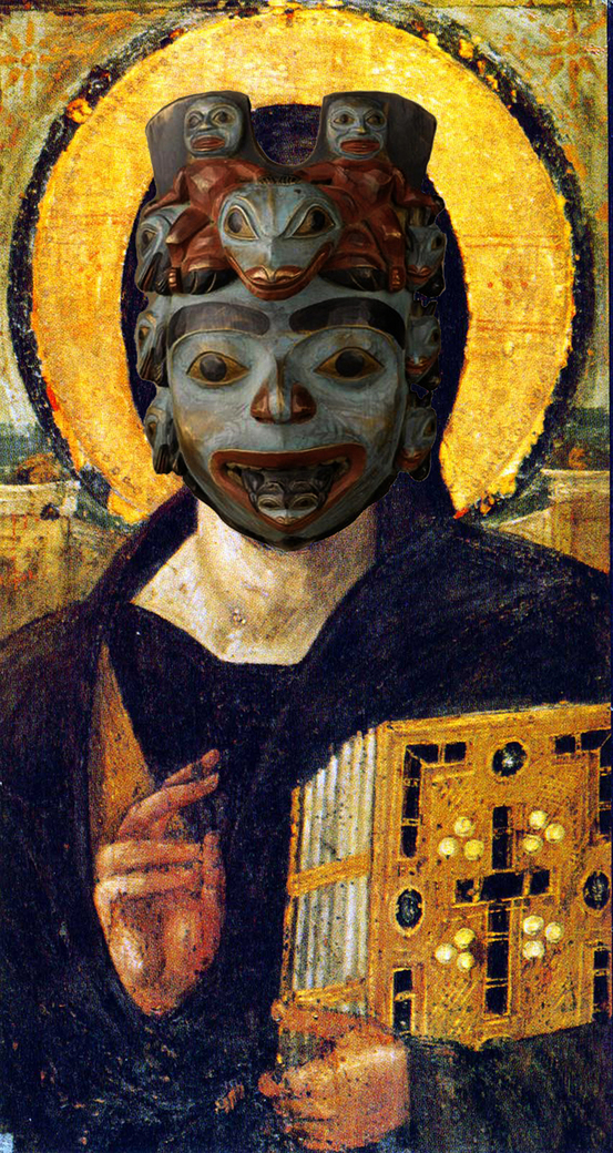
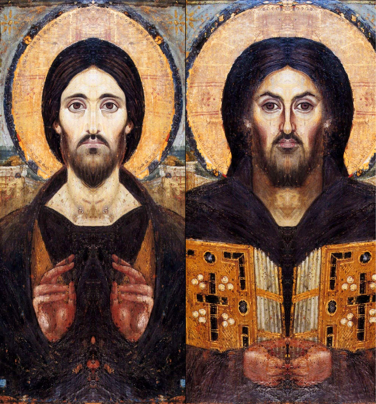
Nicholas Galanin, “Ism #1,” 2013. 19″ x 32″, digital photographic print. Image courtesy of the artist

At the end of last month, I heard Dr. Christopher Green give a presentation that included some works of art by Nicholas Galanin, who is a Tlingtit-Unanagax contemporary artist. I was particularly struck by the digital photographic print Ism #1, which features the famous icon of Christ from the Monastery of Saint Catherine at Mount Sinai. However, in Galanin’s image, the face of Jesus has been covered with a Tlingit shaman’s mask (and not an actual shaman’s mask, which the Tlingit consider personal and not for public display, but a replica of a shaman’s mask).1 By creating a digital compilation of an original Byzantine painting with a photograph of a replica of a Tlingit mask (a replica made by Don Lelooska Smith of Cherokee heritage), Galanin’s work of art is full of layers that raise attention to authenticity, originality, appropriation and even theft.2 Galanin explained Ism #1 further in a quote on the Eazel website:

“The shaman’s mask over the crucified Christ can be read as theft of Indigenous culture and experience by a non-Indigenous community. This is also a strategy to use iconography understandable to a Eurocentric culture to make clear the level of suffering endured by carriers of Indigenous culture, and to elevate the importance and significance of the shaman’s mask to this audience.”

The two represented objects refer to complicated histories of destruction and disturbance. The Mount Sinai icon is a rare example of Byzantine art from the 6th century, because it pre-dates the period of iconoclasm (icon destruction) that took place in the 8th and 9th centuries. Because this icon was located at a remote location on a peninsula near the Red Sea, it escaped iconoclastic destruction. And yet, the original Tlingit shaman’s mask, which Galanin references through a secular copy, was also in a forested location with restricted access. It was located at a Tlingit shaman’s grave (at the area called Point Lena, Alaska), but it did not escape disturbance: it was “collected” (i.e. stolen) by George Emmons in 1919. The mask was located in the National Museum of the American Indian in the last half of the 20th century, only to be repatriated in 2003.1

Christ, Monastery of Saint Catherine at Mount Sinai, 6th century. 33.1 x 19.4 in (84 x 45.5 cm, encaustic painting (pigments and wax). Image courtesy Wikipedia

Christ, Monastery of Saint Catherine at Mount Sinai, 6th century. 33.1 x 19.4 in (84 x 45.5 cm, encaustic painting (pigments and wax). Image courtesy Wikipedia

The meaning of the icon clearly has been altered by the addition of the Tlingit mask. In the original icon, Jesus’s face is asymmetrical: his right side (viewer’s left) is welcoming and calm, whereas his left side (viewer’s right) has harsher shadows and is pulled into a sneer. (If you want to see how differently the sides appear, check out these digital mockups of how the full faces would appear if the sides were symmetrical.) Through this split composition, the icon expresses the dual nature of Jesus Christ’s roles, as both a loving Savior for the righteous and a harsh Judge for the wicked.

I think that the composition of Christ’s face is also applicable to the context of the Christian missionaries interacting with Indigenous people during the period of Western expansion. Galanin explains, “During colonization and settlement, Christian missionaries functioned as a wedge used to split apart Indigenous communities.” As such, for those viewers who are familiar with this (hidden) split face, it can can serve as a reminder of Christianity’s divisive role in history. The visual layering even recalls this sense of the past, with the split face serving as the “older” first layer. I think that a hope of rectification and restitution is suggested by superimposing a symmetrical, visually-balanced mask on top of this asymmetrical face, especially with the knowledge that the original mask was repatriated to the Tlingit in 2003. And yet, by having these two cultures bound together within Galanin’s digital photomontage, the layered pull between the past and present conveys that an imbalance still exists today.

Nicolas Galanin, Things Are Looking Native, Native's Looking Whiter, 2012. Giclée print, 15.5" x 20.25"

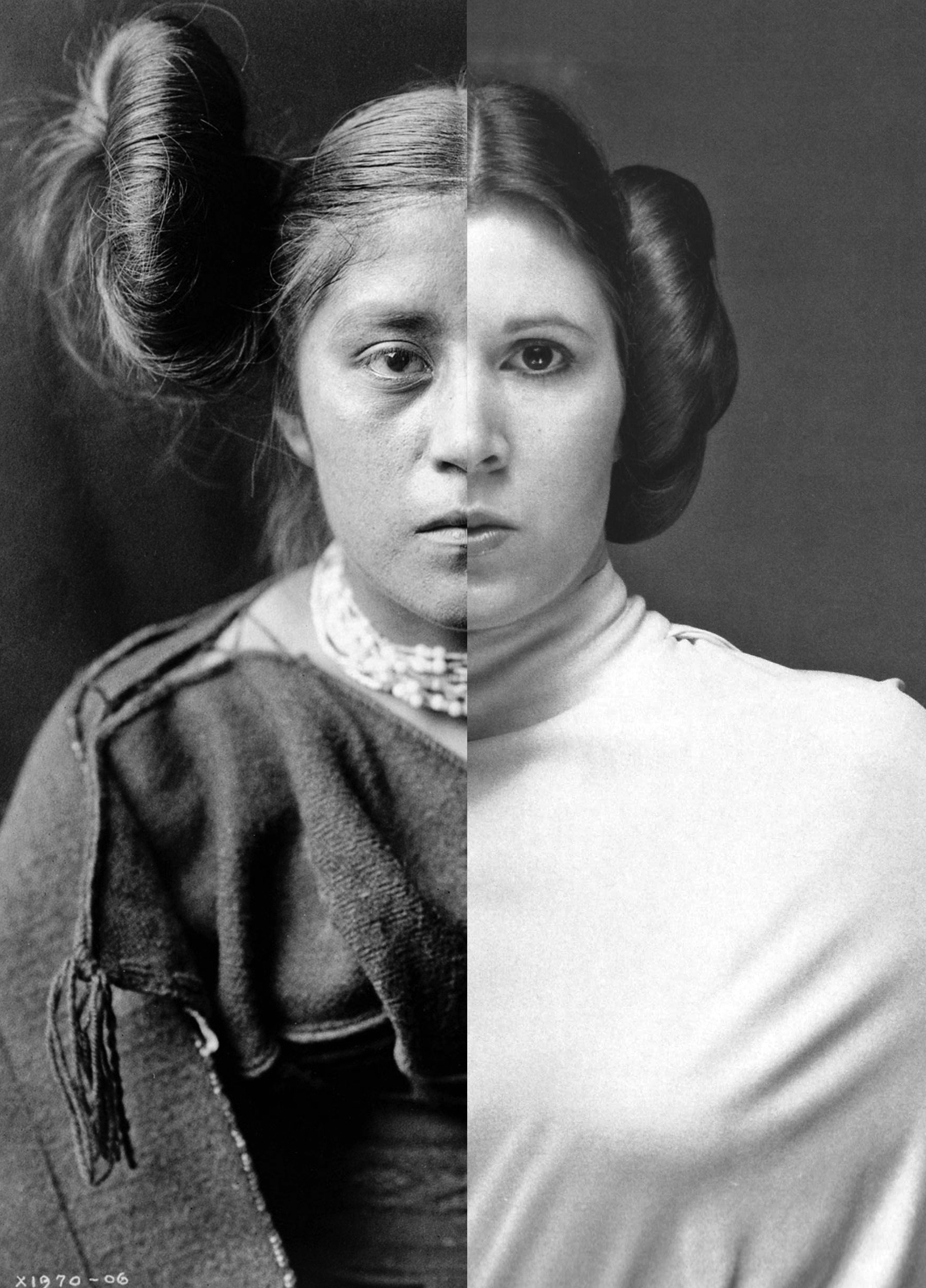
Nicholas Galanin, “Things Are Looking Native, Native’s Looking Whiter,” 2012. Giclée print, 15.5″ x 20.25″. Image courtesy of the artist

This pull between past, present, and future is also seen in Galanin’s photographic image Things Are Looking Native, Native’s Looking Whiter (shown above). The past is suggested with the photograph on the left, which comes from a photograph of a Hopi-Tewa woman that was taken in the early 20th century by Edward Curtis. The butterfly whorl hairstyle (sometimes described as “squash blossom”) was worn by unmarried Hopi women. The older photograph is juxtaposed with a promotional photograph on the right of actor Carrie Fisher as the character Princess Leia from “Star Wars.” This juxtaposition references contemporary pop culture but also hints at the past and future too, with reference to a futuristic society that lived “a long time ago, in a galaxy far, far away.”

Just with the photograph of Ism #1, references to destruction and disturbance are compounded in this photographic print. In the early 20th century, when the controversial artist Edward Curtis was taking his photographs, the US government was involved efforts to “westernize” Indigenous communities and establish legislation and reservation policies that would restrict Indigenous rights. These actions included setting up boarding schools that worked to eradicate traditional Indigenous cultures and languages. Edward Curtis’s work, through the sense of false authenticity conveyed through the photographic medium, supported what Galanin calls “the national fantasy that Indigenous people and ways of life were disappearing. The imagery created was often staged with props Curtis carried with him, to construct photos that would eventually be used as a standard for disappearing tradition and authenticity.” With this context of destruction and cultural disturbance in mind, a Star Wars fan can’t help but think of the destruction of Princess Leia’s home planet, Alderaan, in “Episode IV: A New Hope” due to the machinations of the Galactic Empire.

Juxtaposing these images draws attention to issues of cultural appropriation and inaccurate constructs. Galanin explains on his Flickr portfolio, “In borrowing from Indigenous aesthetics, the image projects settler claims to Indigenous culture into the future. The title speaks to consumer culture’s desire to claim ‘Native inspired’ looks, while simultaneously refusing Indigenous people the agency to define Indigenous culture in an increasingly hybrid world. I point out that while non-Native ‘things’ look Native to the non-Natives who produce them, Natives continue to be held to historical constructs of Native-ness devised by non-Natives.” The horizontal split between the images creates visual competition, which emphasizes that these historical constructs for Natives still exist today. I appreciate that the faces of the figures are aligned as closely as possible, however, since that suggests to me that Native and non-Native cultures have the potential to come together in a balanced and respectful way.

(And on a side note, First Nation K’ómox artist Andy Everson includes references to Star Wars in his work as a way to reference dichotomies in life and reflect on cultural heritage. Andy was photographed in an Imperial Stormtrooper costume, covered with formline designs, by Navajo artist Will Wilson for his ongoing photographic project Critical Indigenous Photographic Exchange (CIPX). You can learn more about the work of these two artists here.)

I look forward to following Nicholas Galanin’s work! His “Never Forget” installation from 2021 also caught my attention, as it raises related questions about past, present, commodification and commercialism (even a different type of reference to Hollywood!), but directly and forthrightly addresses settler land occupation.

1 Christopher Green presentation at Central Washington University, April 30, 2021.

2 Ibid. I appreciate that Christopher Green drew attention to these layers specifically in his presentation.

Comments Off on Nicholas Galanin: Layers and Splits

Braque’s “Homage to J. S. Bach”

Braque, "Homage to J S Bach," winter 1911-12. Oil on canvas, 21 1/4 x 28 3/4" (54 x 73 cm). Accessed 26 February 2021 at https://www.moma.org/collection/works/116275

Braque, “Homage to J S Bach,” winter 1911-12. Oil on canvas, 21 1/4 x 28 3/4″ (54 x 73 cm). Link to MoMa image


Last week one of my students selected to write about Georges Braque’s “Homage to J. S. Bach” for their weekly assignment. I think that this painting is clever in several different ways, including how the signature of Braque seems to also be a witty reference to the similarity between the artist’s last name and the last name of the famous Baroque composer.

Braque includes musical instrument or references to music ins several of his paintings, and he himself was a gifted musician who played the violin, flute and accordion. So it is unsurprising that he would create an homage to one of the greatest Western composers, who happened to be a personal favorite of Braque. And I think that Bach’s polyphonic musical compositions, which present dominant musical motifs at through different layers of instruments and voices, parallels that way that Cubist paintings present the same objects through a variety of fragmented perspectives. The various inventions of Bach also parallel how Braque sought to create variations of similar subjects throughout his career. The Philips Collection blog has a post, “From Bach to Braque,” which takes the analysis even further by pointing out that weaving together of voices in a Bach fugue gives a sense of structure, line, and architecture in Braque’s painting.

According to the MoMA website, Braque “thought musical instruments added a tactile dimension to the visual image: ‘The distinctive feature of the musical instrument as an object, he said, ‘is that it comes alive to the touch.'” Perhaps, as a painter, he felt a disconnect with his paintings because he didn’t physically touch them in the creation process, since he used a paint brush. In that way, music could bridge the gap of physicality. And I think that the musical subject matter adds an extra layer of experience that goes beyond the spatial explorations of Cubism, by adding visualization of the aural experience of listening to music.

Comments Off on Braque’s “Homage to J. S. Bach”

Email Subscription


Archives

About

This blog focuses on making Western art history accessible and interesting to all types of audiences: art historians, students, and anyone else who is curious about art. Alberti’s Window is maintained by Monica Bowen, an art historian and professor.