Guest Post: “Some Notes on Parrot Symbolism in Poetry and Religious Art”

Editor’s Note: Nicholas Bielby contacted me after coming across  my post “Parrots in Art.” Below is his essay on parrots in poetry and religious art, which adds new ideas to consider in tandem with  the things that I have written previously. Enjoy! -M

“Some Notes on Parrot Symbolism in Poetry and Religious Art”

Nicholas Bielby

Detail of some of the parrots at in the chancel at the Studley Royal chapel of St. Mary, 1871-78. Image is a detail of a Creative Commons Image via Wikipedia

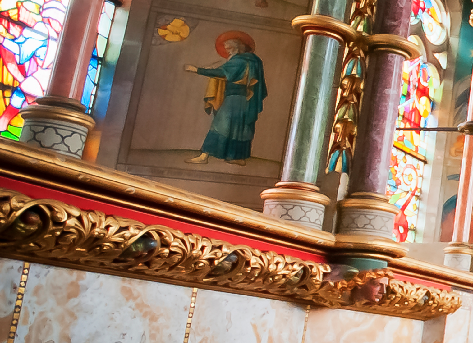
Detail of some of the carved parrots, nestled in the gold foliage, from the chancel at the Studley Royal chapel of St. Mary, 1871-78. Image is a detail of a Creative Commons Image via Wikipedia

When I took a guided tour of William Burges’s gothic revival church in the grounds of Studley Royal, I was struck by the way the chancel was decorated with highly coloured relief carvings of parrots. I asked the guide, David Thornton, about their significance and he did not know. But we decided to explore the matter further and keep in touch. What follows is the result of our joint explorations.

Macrobius records that, after the battle of Actium, where Octavian defeated Mark Antony and Cleopatra, a parrot greeted the victor, “Ave Caesar” – “Hail, Caesar!” Ever since the first parrot was brought back from India by Alexander the Great, parrots were thought to be miraculous because they spoke with a human voice. And what they generally said was “Ave”, the Latin greeting. Because of their miraculous ability to talk, gorgeous plumage and rarity, parrots were highly valued and used as gifts between kings and emperors. The parrot’s greeting to Octavian, later Augustus Caesar, was subsequently, in the Christian era, taken to be a pre-figuring of the angelic greeting, “Ave Maria.” The parrot was thus associated with the Virgin Mary.

It is not clear whether this association is the only route by which the parrot came to symbolise the Virgin Mary. But Boehrer, in his book “Parrot Culture,” (2004), cites a Middle English Dictionary as defining “papejai” as (i) a parrot and (ii) a lady, the Virgin Mary. He suggests that the rarity, value and decorative qualities of the parrot help make it represent ladies generally: “and the Virgin, most precious and delicate lady of all, stands in for all the others.”

Perhaps the most explicit evidence comes from the poet John Lydgate (C15th) in his Balade in Commendation of Our Lady, where he hails the Virgin Mary as a “popynjay plumed in clennesse.” The term “popynjay” (popinjay) comes from the Old French “papingay” meaning parrot, which itself derives from Arabic. Of course, in English from Shakespeare’s time at least the term “popinjay” is used to describe someone foppishly over-dressed and vain. But clearly, for Lydgate, the connotations of rarity and high value are what he has in mind. The term “clennesse” refers to moral and sexual purity. And the term ‘popinjay’ is the term for parrots in traditional heraldry. They would not be used on coats of arms to denote foppish vanity! They had, partly from the Middle East, connotations of wisdom and courage, and possibly more religious connotations.

Around 1400, the term “papiayes” is used in Sir Gawain and the Grene Knight in the heraldic description of the cloak that the ladies of the court embroider for Gawain when setting out on his quest. It is significant that Gawain should be afforded the protection of the Virgin Mary, as symbolised by the parrots, since one of the major challenges for Gawain on his quest is to retain his sexual purity while still maintaining his reputation for courtesy.

It is worth noting that Boeher mentions two medieval church vestments embroidered with popinjays – we may presume with religious, Marian significance. After all, since the medieval mind found symbols and correspondences in everything, the use of parrots was certainly not merely for decorative effect but for spiritual meaning!

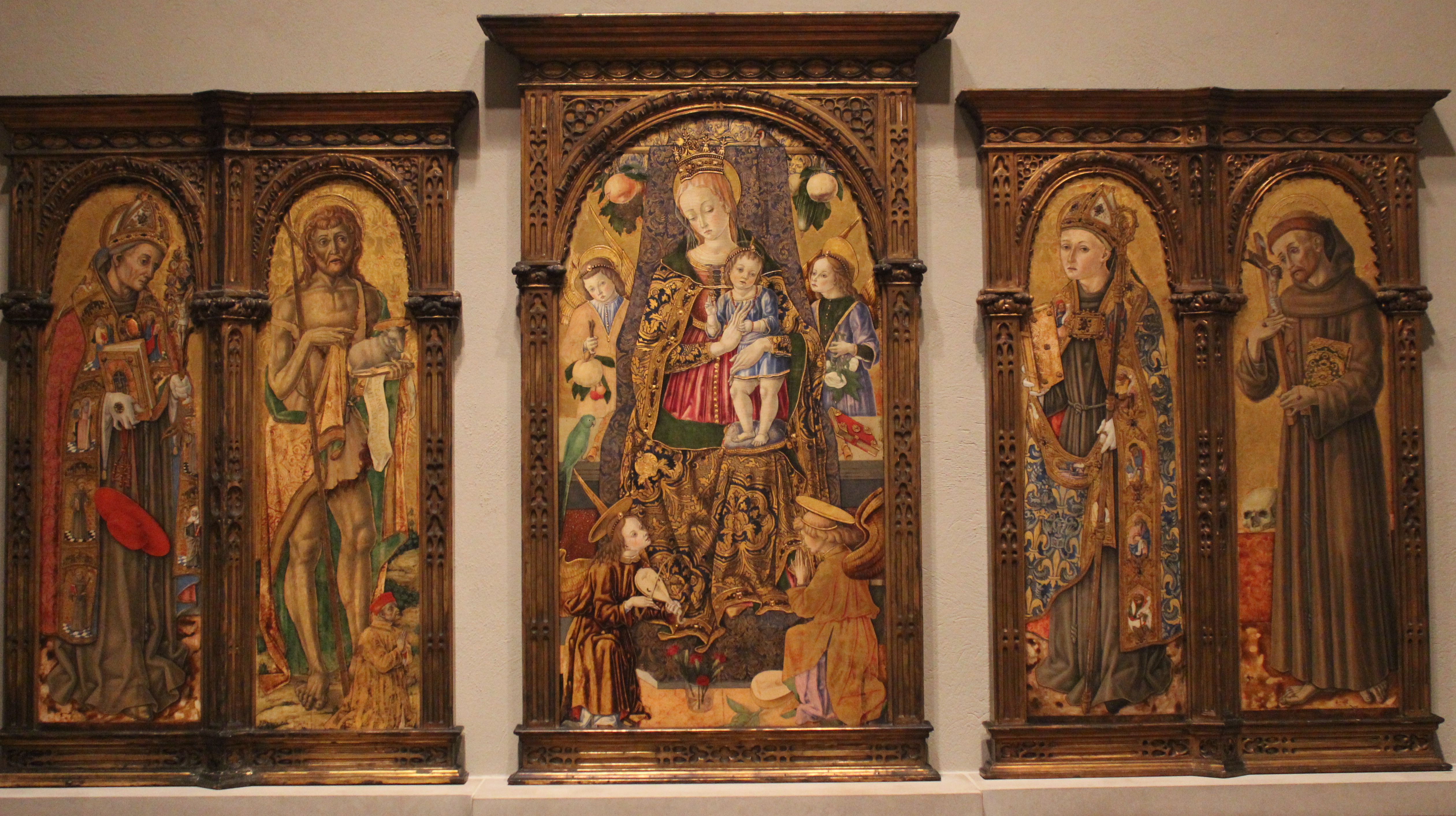
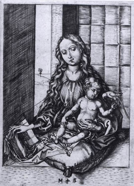
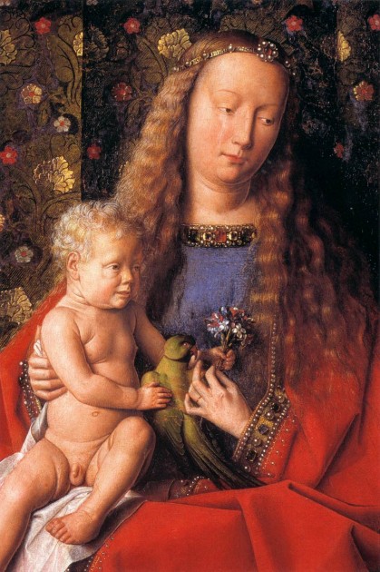
The parrot often appears alongside the Virgin Mary in art. Richard Verdi’s “The Parrot in Art” traces the parrot from Dürer to the modern day, but there are even earlier instances. Clearly, not all these parrots symbolise the Virgin, but Crivelli (c1481), Dürer, Baldung, Mantegna, Schongauer, Van Eyck and the Ms painting by the Egerton Master all feature a parrot with the Virgin.

Parrot from Zaragoza version of the “Defensorium” by Fransiscus de Retz

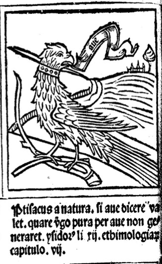
Parrot from Zaragoza version of the “Defensorium inviolatae virginatatis beatae mariae” by Franciscus de Retz (1343-1427)

In an image from the Zaragoza version of the “Defensorium” by Franciscus de Retz (1343-1427), a ferocious-looking parrot has a scroll issuing from its beak saying, “Ave.” It immediately follows an image of the Annunciation. The text beneath the parrot illustration seems to refer to a medieval folk-belief mentioned in the “Continuum Encyclopedia of Animal Symbolism in Art,” (2004), that conception takes place through the ear. And here it would seem to link with the parrot’s miraculous ability to speak. I have tried to transliterate the text correctly but the use of medieval Spanish diacritical marks and abbreviations have made this difficult. For example, I think it reasonable to expand ‘vgo pura’ to ‘virgo pura.’ I feel fairly confident about transcribing this much of the text:

“Ptisacus [presumably ‘psitacus’] a natura. si ave dicere valet. quare virgo pura. per ave non generaret…”

The apparent full stops would appear to indicate line divisions into something like goliardic rhymed verse, thus,

Psitacus a natura
Si Ave dicere valet
Quare virgo pura
Per ave generaret

This can be understood in the light of the folk-belief mentioned above that impregnation can take place through the ear – and consequently as a result of being greeted. It may mean something like, “If a parrot, by nature, has the power to speak a greeting, why should not, through a greeting, a pure virgin become pregnant?” What this demonstrates is not so much that the parrot symbolises the Virgin Mary but it does show her close association with the parrot in the medieval mind.

Later on, parrots feature in religious paintings, even if not immediately associated with the Virgin. Rubens includes a parrot in a painting of the Holy Family. Both Dürer and Rubens include a parrot in pictures of Adam and Eve at the Fall, when eating the apple. Here, I think, the symbolism is different. Skelton (early C16th) refers to the parrot, in Speke, Parrot, as “a byrde of Paradyse”. Maybe Dürer’s parrot, totally unaware of what is going on, simply signifies paradise, unaware of the danger it is in. In Rubens’ picture, the parrot is looking anxiously towards the serpent, aware of the danger. It would be far-fetched to see these parrots as long-term symbols of hope, the promise of the New Adam coming through Mary.

In general, by the time we get to the C16th and C17th, “popinjay” has come only to have its current derogatory meaning. It religious connotations seem to have been lost. For Dutch artists, parrots simply represent affluence, conspicuous consumption and trade connections with exotic places; and as time goes on, sometimes as symbols of vanity. Perhaps the Reformation, prevalent in the Low Countries, caused the Marian symbolism to be lost.

In the C19th, William Burges, follower of Pugin, was a great medievalist and collector of Dürer. Significantly, his church at Studley Royal, decorated in the chancel with a frieze of brightly coloured parrots, is dedicated to the Virgin. It is a fair guess that he had rediscovered the medieval Marian symbolism of the parrot. The same symbolic use of parrots can be found elsewhere in his work, for example in the chapel at Mount Stuart on Bute and in Cardiff Castle.

Nicholas Bielby is a retired faculty member of the School of Education at Leeds University. He is a poet and editor of  www.graftpoetry.co.uk

Comments Off on Guest Post: “Some Notes on Parrot Symbolism in Poetry and Religious Art”

Dutch Dollhouses and Miniatures

Jacob Ortman, "Doll's House of Petronella Oortman," c. 1710. Oil on parchment on canvas. 87cm × 69cm. Rijksmuseum

Jacob Appel, “Doll’s House of Petronella Oortman,” c. 1710. Oil on parchment on canvas. 87 cm × 69 cm. Rijksmuseum

When I watched The Minaturist TV series a few years ago, it didn’t even occur to me to wonder whether the 17th-century doll house was grounded in historical fact. I think that the darker aesthetic and bizarre aspects of the show made me think less about any historical foundation. However, I learned this evening that it there was a small group of adult Dutch women in the 17th and 18th centuries which have miniature houses – these dollhouses and miniatures were usually given in connection with weddings. They weren’t meant to be for children to play with, but were meant for adult collectors to enjoy. You can see some details of one such house that was on display at the MFA in this video.

Curatorial research fellow Courtney Harris explained in another MFA video, “The Dutch Golden Age in Miniature” how these miniature environments were ways for women to enact control over an environment on a small scale. Women were also able to interact with craftsmen to purchase miniature objects and held autonomy over what was placed on display. Women could also control the viewing of the miniature houses by keeping them covered with curtains until an appropriate time to reveal the miniature spaces to guests. One dollhouse, owned by Petronella de la Court, was an exact replica of her own house!

Doll's house owned by Petronella de la Court, c. 1670-1690. Centraal Museum, Utrecht. Image courtesy Wikipedia

Doll’s house owned by Petronella de la Court, c. 1670-1690. Centraal Museum, Utrecht. Image courtesy Wikipedia

The Rijksmuseum has an interesting painting in their collection which depicts the dollhouse owned by another collector, Petronella Oortman, a woman who “spent vast sums of money on creating and decorating her house” (see image at top of post). The museum also has the actual dollhouse in its collection as well. I am drawn to this painting, though, because it is a miniaturization of the miniature house. The actual house is 255 cm high and 190 cm wide (approx. 8.3′ x 6.2′), whereas the painting is 87 cm and 69 cm wide (approx. 2.9′ x 2.25′). I wonder why this miniature house caught the attention of a male painter, unless this painting was a commission? By painting the miniature objects on an even smaller scale than the actual house, is Jacob Appel attempting to outdo the technical achievements of the craftsmen who made the small objects for the house? Or is Appel’s creation of this painted house intended to rival the Petronella Oortman’s miniature creation?

— 1 Comment

John Currin’s “Thanksgiving” and Stretched Figures

Forget Norman Rockwell’s “Thanksgiving” as the iconic image for your 2020 holiday season. This uniquely terrible year needs a different painting and aesthetic, and I think John Currin’s “Thanksgiving” (2003) better fits the bill.

John Currin, "Thanksgiving," 2013. Oil on canvas, approx. 68" x 53". Tate

John Currin, “Thanksgiving,” 2013. Oil on canvas, approx. 68″ x 53″. Tate

As is typical in Currin’s art, this painting is a composite of several earlier artistic forms. For example, the elongated and intertwined figures recall Mannerist paintings, while the still life in the foreground suggests the vanitas images of the Dutch Baroque. And in a year in which so much has been upended and confusing, this bizarre pastiche of styles seems appropriate. Even the contradiction of a feast that is being undertaken by emaciated figures seems unsurprising this year. Robert Rosenblum noted that Currin’s art looks “both commonplace and fantastic” which reminds me of how this year has been terribly commonplace (for the millions of people who have stayed at home) and also fantastic in how its dystopian impact on the world seems to come from the realm of science fiction.

I’ve also thought about how this painting can serve as a reminder of those who have lost loved ones due to the virus, with the figures dressed in somber clothing, the limited color palette, and the wilted leaves in the vase. Even the pallid color of the uncooked turkey suggests death.

In the Mannerist period, the elongated and distorted figures were “mannered” in a way that suggested elegance and beauty. I’ve been thinking about how these “stretched” figures can be taken beyond the realm of aesthetics, and can be seen as metaphors for how so many people have been financially and emotionally stretched this year. And in the context of Thanksgiving, I’ve also been thinking about how many people are stretched between gratitude and grief this year. I’m reminded of a quote that Francis Weller said in an interview:

“The work of the mature person is to carry grief in one hand and gratitude in the other and to be stretched large by them. How much sorrow can I hold? That’s how much gratitude I can give. If I carry only grief, I’ll bend toward cynicism and despair. If I have only gratitude, I’ll become saccharine and won’t develop much compassion for other people’s suffering. Grief keeps the heart fluid and soft, which helps make compassion possible.”

So as I look at Currin’s painting, I see a mixture of a lot of things. I think about how I myself can be stretched, but this can lead me to having more compassion and growth. And I hope that one of the lasting effects of 2020 will be a greater rise in compassion and empathy.

When I learned that Currin was inspired to finish “Thanksgiving’ after his wife became pregnant, I thought of it in an entirely new way. His wife Rachel served as the model and John Currin views this painting as an allegory of her pregnancy, since it took nine months to finish. So while this image may seem bizarre, it can also suggest hopeful anticipation for the future, and I hope that positive expression can carry us forward to better times.

— 1 Comment

Josiah McElheny’s “From an Historical Anecdote About Fashion”

I haven’t been blogging on here this summer, but that is not to say that I haven’t been busy or thinking about art. The pandemic has forced me to spend the summer prepping online material for the three classes that I will be teaching this Fall quarter. I’ve been thinking about art every day, as I record lecture videos while seated at my desk. I’ve often chuckled at my bizarre sense of fashion during this videos, which is a professional look from the waist up, but a casual look from the waist down with flip flops or exercise pants hidden from the camera’s view.

Josiah McElheny, “From An Historical Anecdote About Fashion,” 2000. Blown glass objects and display case, overall: 67 7/8 × 120 × 27 5/16in. (172.4 × 304.8 × 69.4 cm). Whitney Museum of Art

Perhaps in some ways that’s why I have been drawn to Josiah McElheny’s “From an Historical Anecdote About Fashion” during this pandemic. I miss having a reason to get dressed up in fancy clothes, and I miss having the free time to watch films from the Golden Age of Hollywood. McElheny explains in an ART:21 documentary (at 40:38 in this video) that he was looking to draw parallels with “the connection between a glass factory and the designs of Christian Dior.”

The “historical anecdote” that served as inspiration for McElheny was regarding the 1952 Venice Biennale. That year, the glass design company owned by Paolo Venini entered a display of vases that were based off of the haute couture fashions which Ginette Gagnous Venini, the owner’s wife, wore when she visited the factory.2 Ginette was very involved in the business and was said to have been seen by those in the furnace room whenever she ascended or descended the stairs to and from the office.

Josiah McElheny, detail from “From An Historical Anecdote About Fashion,” 2000. Blown glass objects and display case, overall: 67 7/8 × 120 × 27 5/16in. (172.4 × 304.8 × 69.4 cm). Whitney Museum of Art

Josiah McElheny, detail from “From An Historical Anecdote About Fashion,” 2000. Blown glass objects and display case, overall: 67 7/8 × 120 × 27 5/16in. (172.4 × 304.8 × 69.4 cm). Whitney Museum of Art

McElheny’s clothes give off a definite sense of 1950s fashion, especially with the wasp waists and several voluminous skirts. The excessive use of fabric in Dior “New Look” line drew a contrast with the restricted use of fabrics during the World War era.1 And so maybe now, in a time when I feel more restricted in my behavior, these voluminous dresses seem like an excessive and unattainable luxury.

Another thing that I love about McElheny’s pieces is that they suggest the female form that would be wearing the clothing. The glass objects give off a sense of presence and absence, since the figures’ forms are visible through the clothing but also conspicuously lack any anatomical features outside of the dresses themselves. Likewise, the translucent glass seems present and also absent. Perhaps that’s why I’m drawn to these works of art as I’m working to create an online class: I’m constructing a virtual “presence” for myself while also keenly aware of how I am absent from the physical classroom. Or perhaps I’m also drawn to the fragility of the glass medium, since the pandemic has caused me to think more about the fragility of human life and health. All depressing thoughts aside, I wish that quarantine and online teaching could be as carefree and elegant as these references to haute couture!

1 Robin Updike, “Fashion and Glass Merge With Imagination In Show At Henry,” Seattle Times (March 17, 1999). Available online: https://archive.seattletimes.com/archive/?date=19990317&slug=2949785 

2 The idea of designing a bottle to look like a dress wasn’t completely new to the Vanini factory. In 1947 a design was produced for Venini which decorated bottles with lace, to suggest the body of a woman or a mannequin in 19th-century dress. See Marino Barovier and Carla Sonego, eds., Paolo Venini and His Furnace, Skira Editore (2016), pp. 83-84. Available online: http://www.showonshow.com/skira/2017/venini/pressdocs/PVenini_layout_UK.pdf

Comments Off on Josiah McElheny’s “From an Historical Anecdote About Fashion”

“Birth of Venus”: Celestial and Earthly Elements

Botticelli, "Birth of Venus," ca. 1484-86.  Tempera on canvas. 172.5 cm × 278.9 cm (67.9 in × 109.6 in). Uffizi, Florence (image via Wikipedia)

Botticelli, “Birth of Venus,” ca. 1484-86. Tempera on canvas. 172.5 cm × 278.9 cm (67.9 in × 109.6 in). Uffizi, Florence (image via Wikipedia)

When I teach introductory classes with Botticelli’s Birth of Venus, we typically explore how Botticelli is interested in stylistic features like naturalism and idealism. To explore these two styles, I usually highlight the figure of Venus. Then we talk about why Botticelli is categorized as an Early Renaissance artist, despite that he worked in the late 15th century and was a contemporary of Leonardo da Vinci. To help explain the difference between “Early” and ‘High” art, I usually point out things in Birth of Venus that are less naturalistic, like the repetitive V-shaped waves in the background.

Botticelli, "Birth of Venus" detail of waves, ca. 1484-86

Botticelli, Detail of “Birth of Venus,” ca. 1484-86. Tempera on canvas, 172.5 cm s 278.9 cm (67.9 in x 109.6 in). Uffizi, Florence

This quarter, though, I am teaching an upper-level course on Renaissance art, and we have been able to move beyond a mere discussion of style and discuss more of the philosophies behind Renaissance artistic production. I really like how Mary Garrard analyzes this painting in relation to celestial elements and earthly elements. She discusses how the female goddess figure an encapsulation of cosmic or celestial nature, and as a result Venus is rendered more detailed and empirically accurate. In contrast, the earthly elements were considered on a philosophical level to be of a lower status, and therefore they are represented in a less naturalistic manner. She explains, “Botticelli, accordingly, presents nature’s material elements in a highly abstracted form, radically suppressing empirical realities in favor of more transcendent ones. The solid surfaces of water or grass are presented schematically, rendered as inert. Vitality is exclusively to be found in the contour lines, the most abstract and least material of art’s elements.”1

I like thinking about how Botticelli made a conscious decision to render his art with two opposing styles. Even though he typically is categorized as an Early Renaissance artist (and that categorization can imply a stigma of not meeting the “High” standards of the Renaissance), Garrard’s explanation encourages the viewer to not be dismissive of these incongruences as a limitation on part of the artist.

1 Mary Garrard, “Leonardo da Vinci: Female Portraits, Female Nature,” in The Expanding Discourse: Feminism and Art History by Norma Broude and Mary Garrard, eds. (Boulder, Colorado: Westview Press, 1992), 72.

— 2 Comments

Email Subscription


Archives

About

This blog focuses on making Western art history accessible and interesting to all types of audiences: art historians, students, and anyone else who is curious about art. Alberti’s Window is maintained by Monica Bowen, an art historian and professor.