Monday, February 17th, 2020
Frederick Sandys’ Plants in “Medea”
These past few months I have been busy researching and writing, in order to present a paper at MLA this past January. I had many ideas that I wasn’t able to explore in my presentation due to time constraints, so I thought I’d share some some of those here.
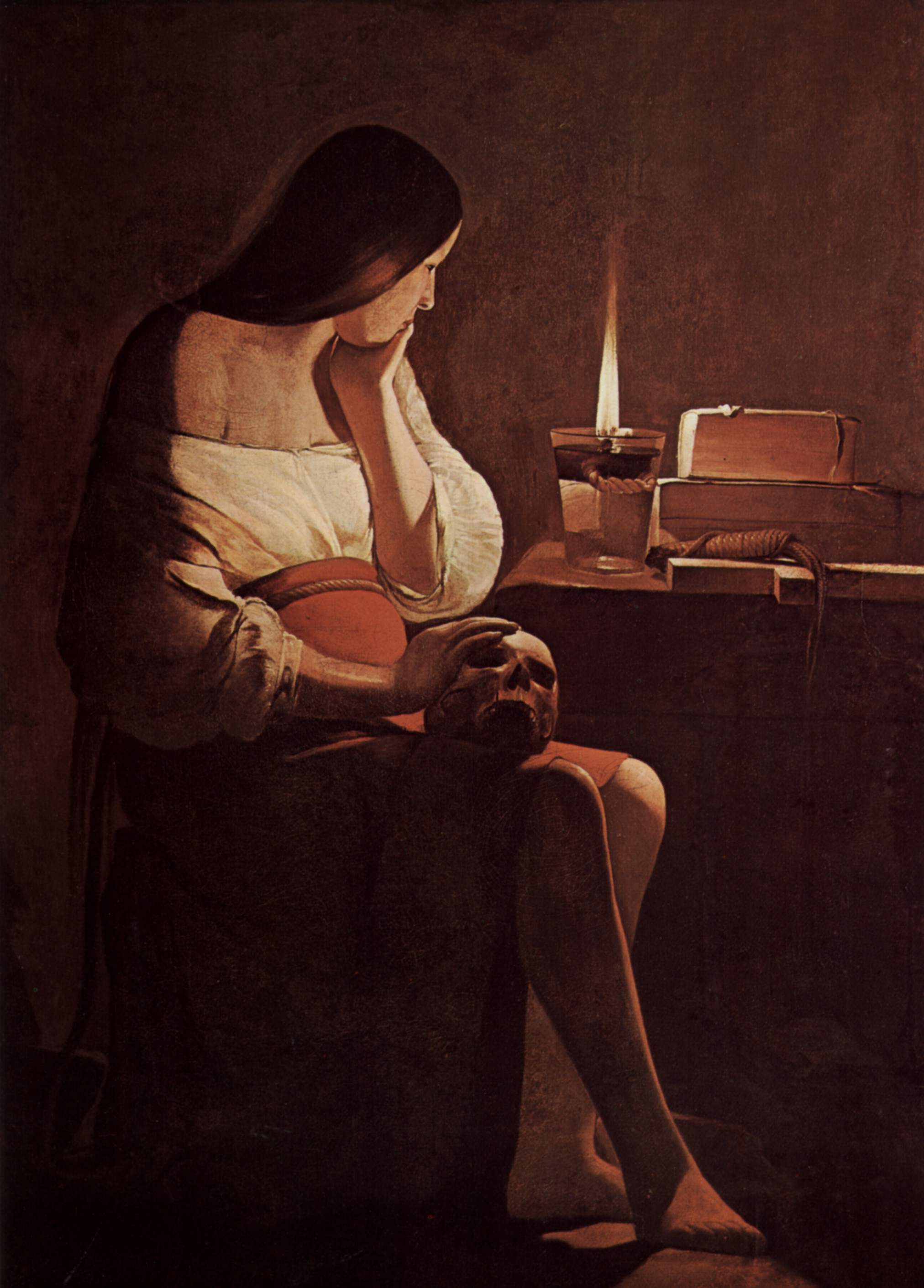
One painting that I’ve been thinking about a lot is Frederick Sandy’s Medea ( 1868, shown below). I became very familiar with this work of art last summer, as it was one of the highlights of the Victorian Radicals exhibition that came to the Seattle Art Museum. It really is such a nice painting! There are a lot of fascinating details in this painting (including the copulating toads in the foreground – eek!), but lately I’ve been drawn to the background of the right hand side, as well as the balustrade-like railing behind Medea.
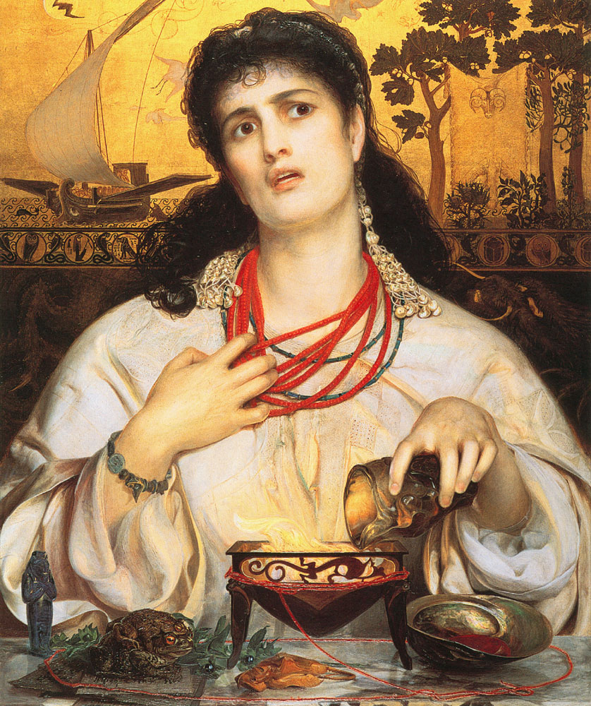
Frederick Sandys, “Medea,” 1868. Oil on composite wood with gold leaf, 24.5 x 18.25 in. (Birmingham Museum of Art)
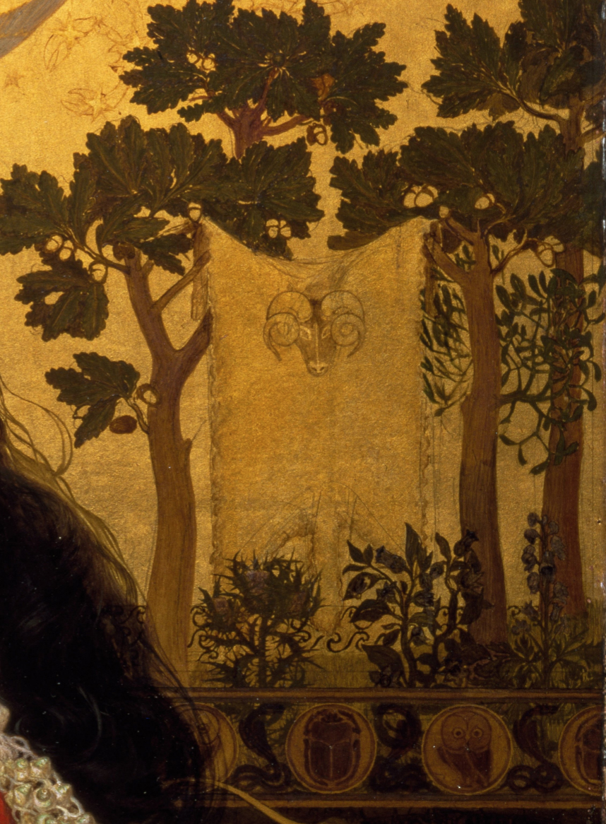
Frederick Sandys, detail of Medea, 1868. Oil on composite wood with gold leaf, 24.5 x 18.25 in. (Birmingham Museum of Art)
Behind Medea is a depiction of the Golden Fleece. This is the sacred fleece that inspires the Greek hero Jason to embark on a quest, since he is told that he can reclaim his right to a throne if he obtains the fleece. Medea is the daughter of King Aietes, the owner of the fleece, and she uses her magic to help Jason complete his tasks and get the fleece in his possession. Later, Jason spurns Medea for another woman named Glauce. In this painting by Frederick Sandys, Medea is depicted as a dangerous femme fatale, as she is in the process of concocting a poisonous garment that will consume her rival Glauce by fire.
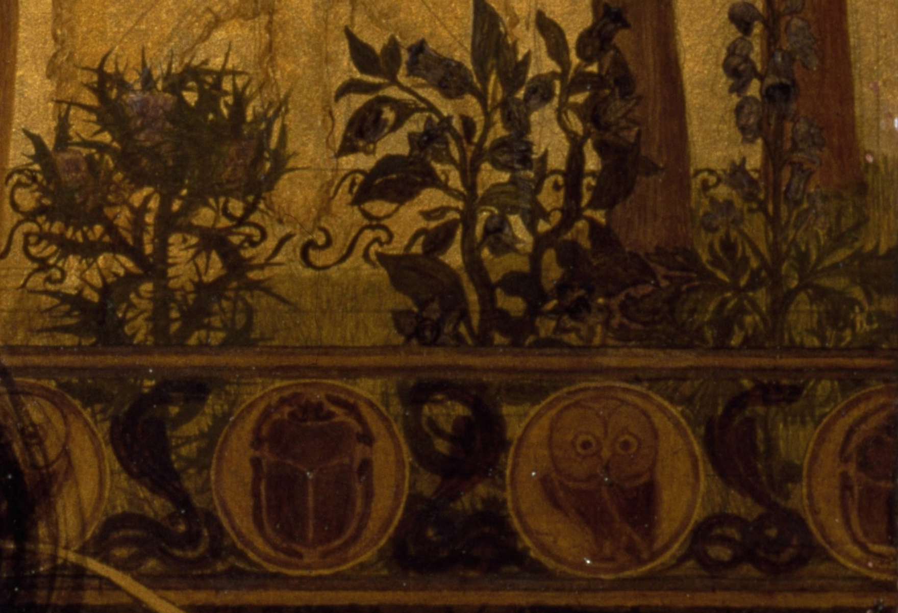
As is typical in Frederick Sandys’ work, this painting includes several plants that are depicted with botanical precision. This imagery has heretofore escaped notice, but I think that that specific plants were used in order to references several literary sources. For example, Sandys clearly intended the Golden Fleece hang from an oak tree, and a few acorns are nestled among the oak leaves to emphasize this point.I think the oak tree might give evidence that Sandys was inspired by a specific version of the story of Jason and the Argonauts, the Orphic Argonautica from the 4th century CE. This version explains that the Golden Fleece was hung on an oak tree in the grove of Ares.
The Orphic Argonautica continues and describes many “noxious plants” that appear in the garden, surrounding the Golden Fleece. A long list of plants are named, including aconite (also known as aconitum, “wolf’s bane” or “monkshood”) and belladonna. These are two plants that Medea was said to have used to create poison, and Sandys paints them with detail so that they can be recognized. In fact, the foreground of the painting also includes belladonna leaves and berries, so there is a clear connection between this plant and the poisonous concoction Medea is creating.
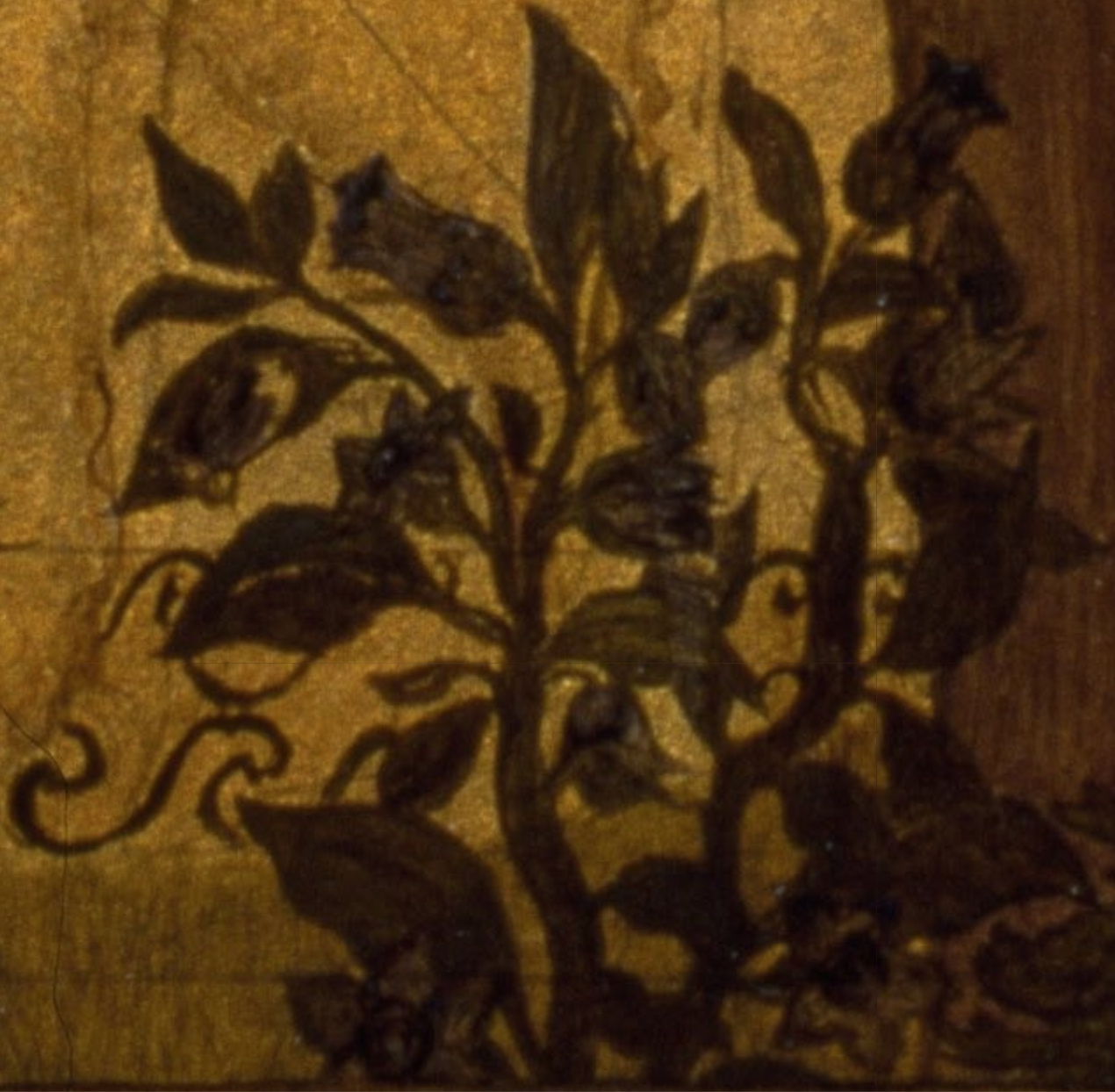
Belladonna from Frederick Sandy’s “Medea”
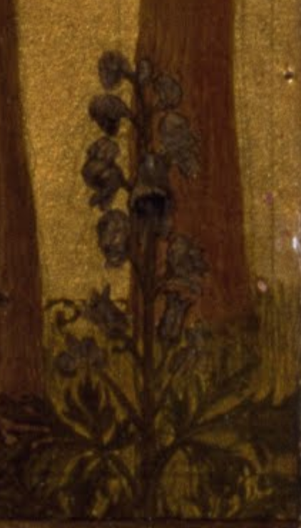
Aconite (“Monk’s Hood”) from Frederick Sandy’s “Medea”
A British audience may have connected the inclusion of wolf’s bane (shown above) to a John Keats poem Ode on Melancholy (1819), mentions wolf’s bane as being a “poisonous wine.” This mention in the poem might be a possible reference to Medea. I’m also struck by how owls and beetles appear in Sandys’ railing and the first stanza of Keats’s poem, which may further solidify that Sandys was looking to this poem for inspiration.
I have had some difficulty identifying the plant farthest on the left (shown below), but I have two ideas. I think it looks like some kind of thistle. The Orphic Argonautica discusses how, in order to open the wall of the sacred grove, Medea helped to place magical herbs as part of a sacrifice laid on “black thorns.” Sandys might have used the thorny thistle as a way to reference these black thorns in the story.
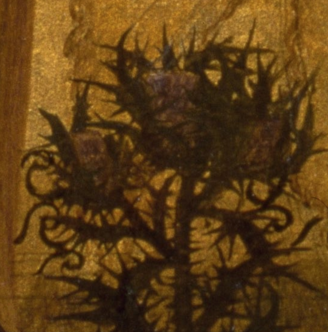
Artichoke thistle? from Frederick Sandy’s “Medea”
My other idea is that the plant might be a cardoon (artichoke thistle). This isn’t a common plant to associate with Medea, and it doesn’t appear in the Orphic Argonautica. However, a publication of the Horticultural Society in London in 1827 discusses how Medea must have created a concoction to restore youth and vitality with a cardoon, and I wonder if Sandys was familiar with this publication. In this mythological story, Jason is celebrating his return with the Golden Fleece, but notices that his aged father Aeson has become infirm and cannot celebrate. Medea withdrew blood from the veins of Aeson, inflused the blood with certain herbs (possibly a cardoon, according to these Victorian horiculturalists), and then returned the infused blood back into Aeson’s body, which revitalized and reinvigorated him.
Detail of plants and railing in Sandys’ “Medea”
Each of these plants is aligned with writhing cobras that appear as a repeating decoration of the railing behind Medea. It almost is as if the cobras serve as exposed roots for the plants! In this context, the writhing cobras – depicted in the style of the Egyptian uraeus – seem to serve as symbols of exotic and mystical witchcraft. The specific alignment of the repeating cobras just underneath the stalks of the plants creates a visual effect that suggest that these mystical and powerful plants are rooted in Medea’s withcraft.
Any other ideas what this plant on the left might be, if it isn’t a thistle? I haven’t found too much discussion of this specific painting from 19th-century sources, but if anyone knows of some, please share!


