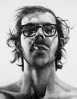
Many art history students are introduced to Chuck Close’s art with this painting:
Big Self Portrait, 1967-1968
Close is really interesting because of his painting theories and technique. Instead of just transferring a photograph into paint on a canvas, Close thinks that painting is a systematic and intellectual exercise. His work is not just about transferring images – he is transferring “photographic information into painted information“).1 I think it’s especially interesting that this systematic approach can be further seen in Close’s choice of large-scale canvases – they are basically same size (9′ x 7′).2 Although he is best described as a photorealist, this interest in systematic and intellectual art makes Close a little different from his colleagues.Anyhow, a conversation last night reminded me that Close’s later work is stylistically different from his early portraits. In 1988, a collapsed spinal artery left Close nearly paralyzed. Luckily, he has been able to continue painting from his wheelchair with a brush strapped to his partially mobile hand. Although Close was veering towards a more lively style before 1988, his current condition ensures that he cannot paint in the meticulous manner required for his early style. Personally, though, I really like Close’s later work. It’s dynamic and interesting. I also think that it’s fun to zoom in on Close’s later paintings until the portraits are unrecognizable; they become a myriad of colorful, stylized swirls and whorls.
You can see how much Close’s style has changed by looking at this self portrait:
Chuck Close, “Self-Portrait,” 1997. Oil on canvas, 102 x 84″ (259.1 x 213.4 cm)
I think it’s really awesome that Close has been able to continue his career and artistic vision (he even continues to paint on large-scale canvases!). You can watch a video of him working below (and read more of the CBS story here).
Pretty impressive stuff, huh? Which Chuck Close style do you like more? His early style or later style? Or neither?
1 Fred S. Kleiner and Christin J. Mamiya, Gardner’s Art Through the Ages, 12th ed., vol. 2 (Belmont, CA: Wadsworth, 2005), 1056 (italics added for emphasis).
There was another interesting documentary about his art on the Ovation Network a few months ago (I love that channel). Close is a very interesting artist. I actually prefer his early work, just because it looks really, really strange to me for some reason.
I love both his early work – absolutely amazing – and his later work as well. I saw his show "Chuck Close Prints: Process & Collaboration" last year in Portland and was just awestruck. I went back twice and even bought the catalog!
As a printer myself, I love his later work – one woodcut print of his niece had 113 different colors! They not only displayed the finished print, but all the woodblocks he had carved and printed from. Truly amazing. His scribble etchings, mezzotints and pulp paper works were incredible too…Look at that book/catalog to see it all.
Wow, joolee, that's cool about Close's woodcuts! I didn't know that. Now I'm really interested in looking at that book you mentioned. How neat. I just looked up a little bit more information about his prints here.
And heidenkind, I'll have to find out if I can see a copy of that documentary. That sounds interesting. (And I can kind of see what you're saying about Close's early work being strange. There definitely is an interesting feeling created by his large-scale heads!)
This reminds me of a line by e.e. cummings in his Introduction to New Poems:
Miracles are to come. With you I leave a remembrance of miracles: they are somebody who can love and who shall be continually reborn,a human being;somebody who said to those near him,when his fingers would not hold a brush "tie it to my hand"–
His Self Portrait 1997 seems to be well calculated, at the same time we can glimpse of his sense of fun. It's like a mosaic made of colorful candy. I wrote such thing in my website. http://homepage3.nifty.com/sekinoka-222/index.html I am living in Japan. I pasted your blog's link on my page. Is it OK ?
This blog focuses on making Western art history accessible and interesting to all types of audiences: art historians, students, and anyone else who is curious about art. Alberti’s Window is maintained by Monica Bowen, an art historian and professor.
 Big Self Portrait, 1967-1968
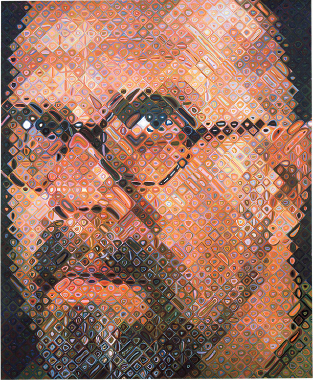
There was another interesting documentary about his art on the Ovation Network a few months ago (I love that channel). Close is a very interesting artist. I actually prefer his early work, just because it looks really, really strange to me for some reason.
I love both his early work – absolutely amazing – and his later work as well. I saw his show "Chuck Close Prints: Process & Collaboration" last year in Portland and was just awestruck. I went back twice and even bought the catalog!
As a printer myself, I love his later work – one woodcut print of his niece had 113 different colors! They not only displayed the finished print, but all the woodblocks he had carved and printed from. Truly amazing. His scribble etchings, mezzotints and pulp paper works were incredible too…Look at that book/catalog to see it all.
Wow, joolee, that's cool about Close's woodcuts! I didn't know that. Now I'm really interested in looking at that book you mentioned. How neat. I just looked up a little bit more information about his prints here.
And heidenkind, I'll have to find out if I can see a copy of that documentary. That sounds interesting. (And I can kind of see what you're saying about Close's early work being strange. There definitely is an interesting feeling created by his large-scale heads!)
This reminds me of a line by e.e. cummings in his Introduction to New Poems:
Miracles are to come. With you I leave a remembrance of miracles: they are somebody who can love and who shall be
continually reborn,a human being;somebody who said to those near him,when his fingers would not hold a brush "tie it to my
hand"–
His Self Portrait 1997 seems to be well calculated, at the same time we can glimpse of his sense of fun. It's like a mosaic made of colorful candy.
I wrote such thing in my website.
http://homepage3.nifty.com/sekinoka-222/index.html
I am living in Japan. I pasted your blog's link on my page. Is it OK ?
Thanks for your comments, Amy and karuma-222.8. I especially like that poem, Amy. How absolutely appropriate!
And karuma-222.8, I am flattered that you linked my blog to your website! Thanks for letting me know.
Thank you so much for your authorization. I wish you a Merry Chirstmas from Japan.