Sunday, July 3rd, 2016
Grace Kelly’s Pressed Flowers
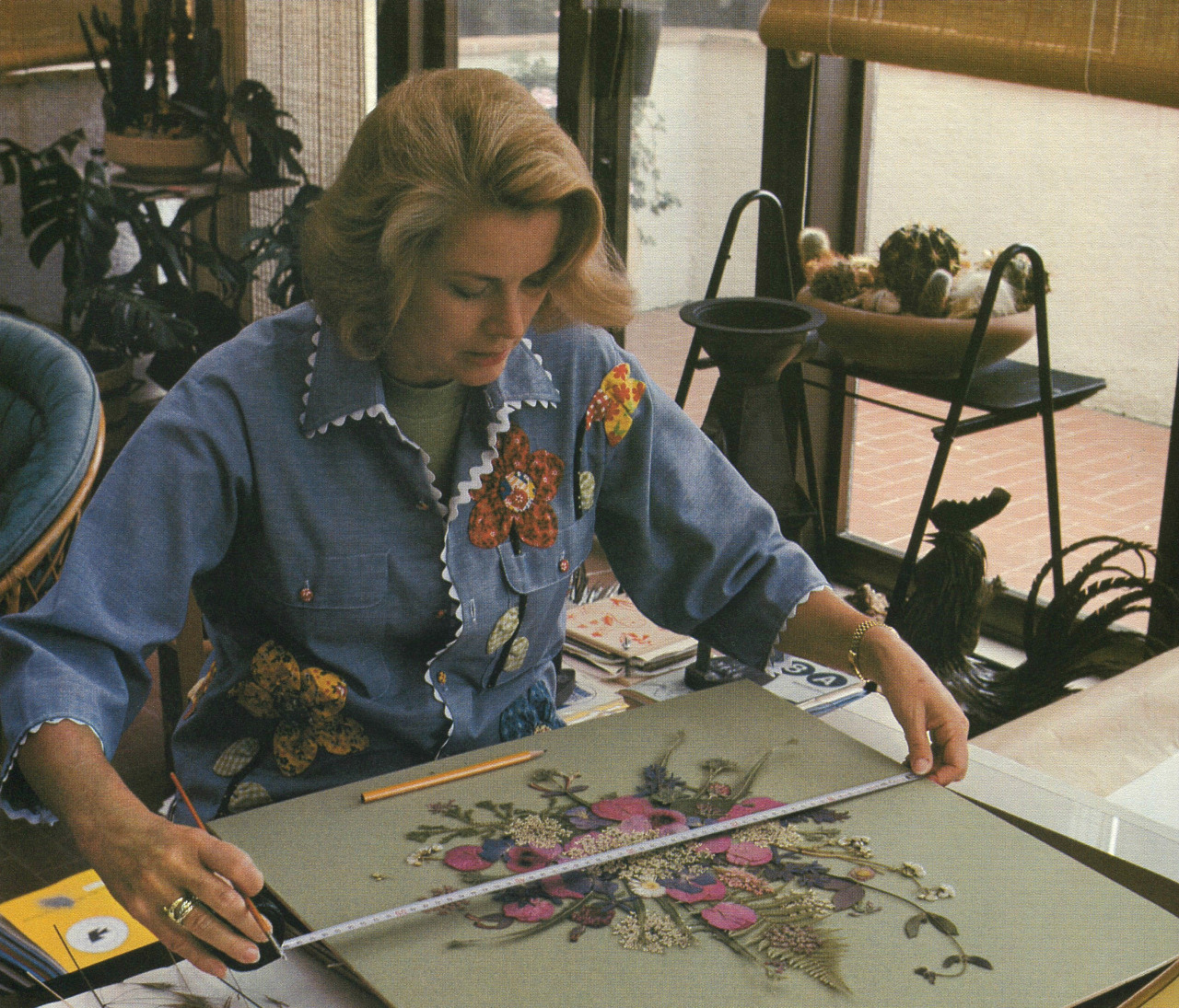
Grace Kelly measuring one of her flower collages, from “My Book of Flowers” (published 1980)
I’ve been reading My Book of Flowers by Princess Grace of Monaco (Grace Kelly) this past week. I’ve been fascinated to learn about this creative outlet for Grace Kelly, which I imagine gave her much satisfaction since many of her early expressions of creativity (as an actress) were put aside after she married Prince Rainier of Monaco in 1956. This book was published in 1980, just two years before Grace Kelly was in a fatal car accident in September 1982.
I especially love My Book of Flowers because it explains Grace Kelly’s thought process and techniques for creating her pressed flower collages. For her, the physical process of touching the flowers and carefully working with her hands provided satisfaction: “…I prefer to use the tip of my fingernail or a small stem to move the petals into place. It is not only that the eyes find pleasure in finishing the pressed flower picture, but just sliding the flowers into place brings that same kind of tranquility as doing needlework, crocheting, or knitting.”1
Grace Kelly also explained that spacing of flowers is really important, especially when creating geometric collages that need to maintain a sense of “pristine formality.”2
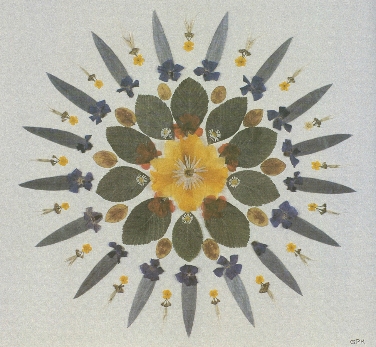
Grace Kelly, pressed flowers in a geometric pattern with protea leaves, periwinkle, viola, daisies, and a yellow daffodil, n.d.
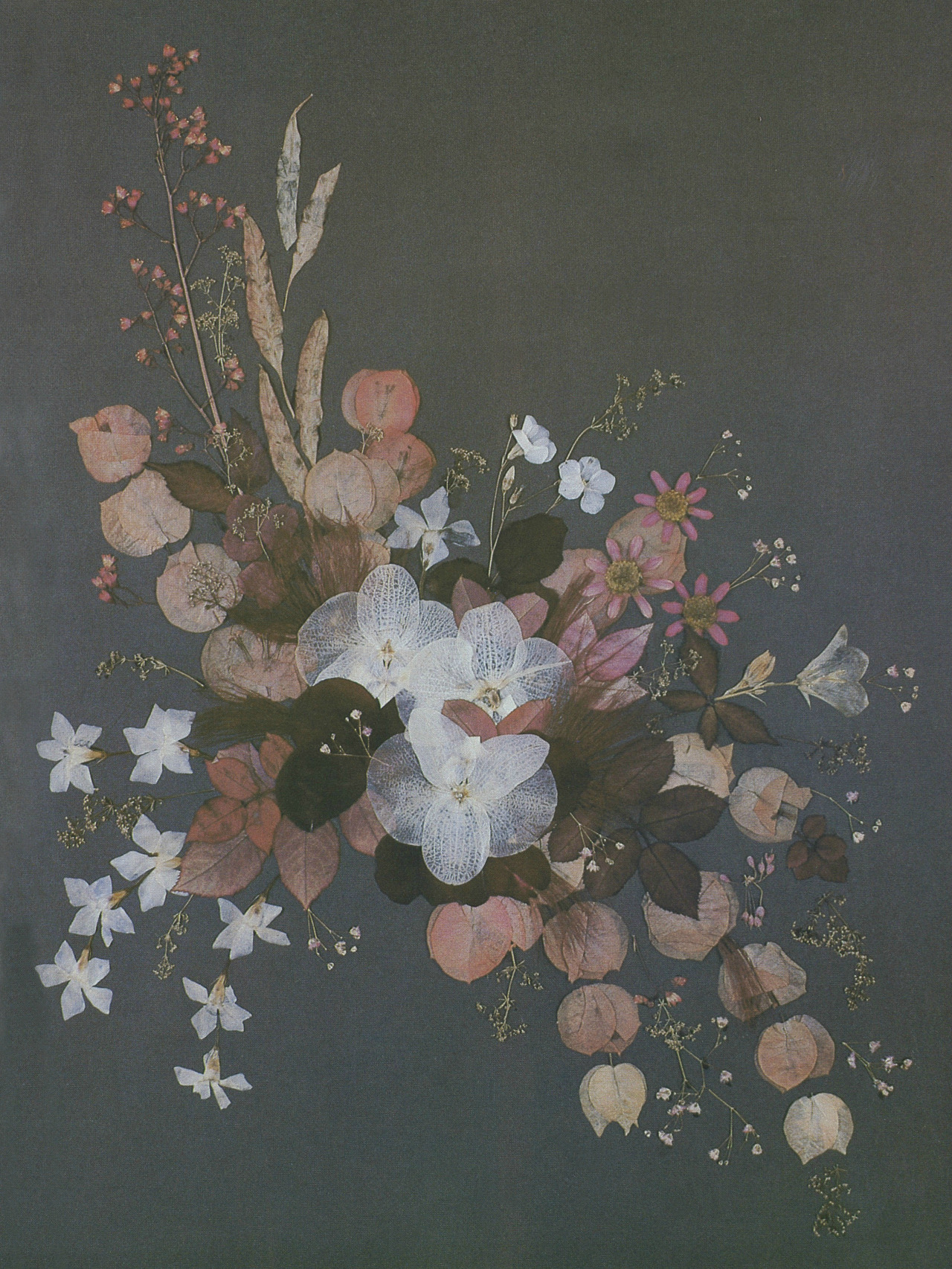
Grace Kelly, flower collage with white phalaenopsis orchids from Ceylon, bougainvillaea and periwinkle, n.d.
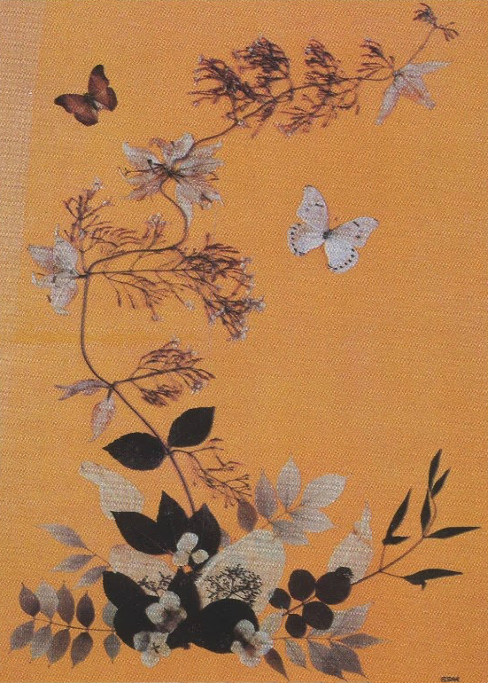
Grace Kelly, pressed collage from a branch of jasmine, prunus leaves, and pale davidii leaves known as “the handkerchief tree,” n.d.
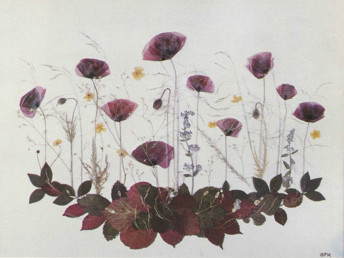
Grace Kelly, pressed collage “to capture the mood of a summer’s day” with poppies, buttercups, and wild grasses, n.d.
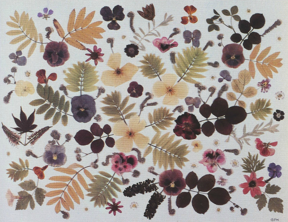
Grace Kelly, pressed collage like a Provençal print or a Liberty fabric, n.d.
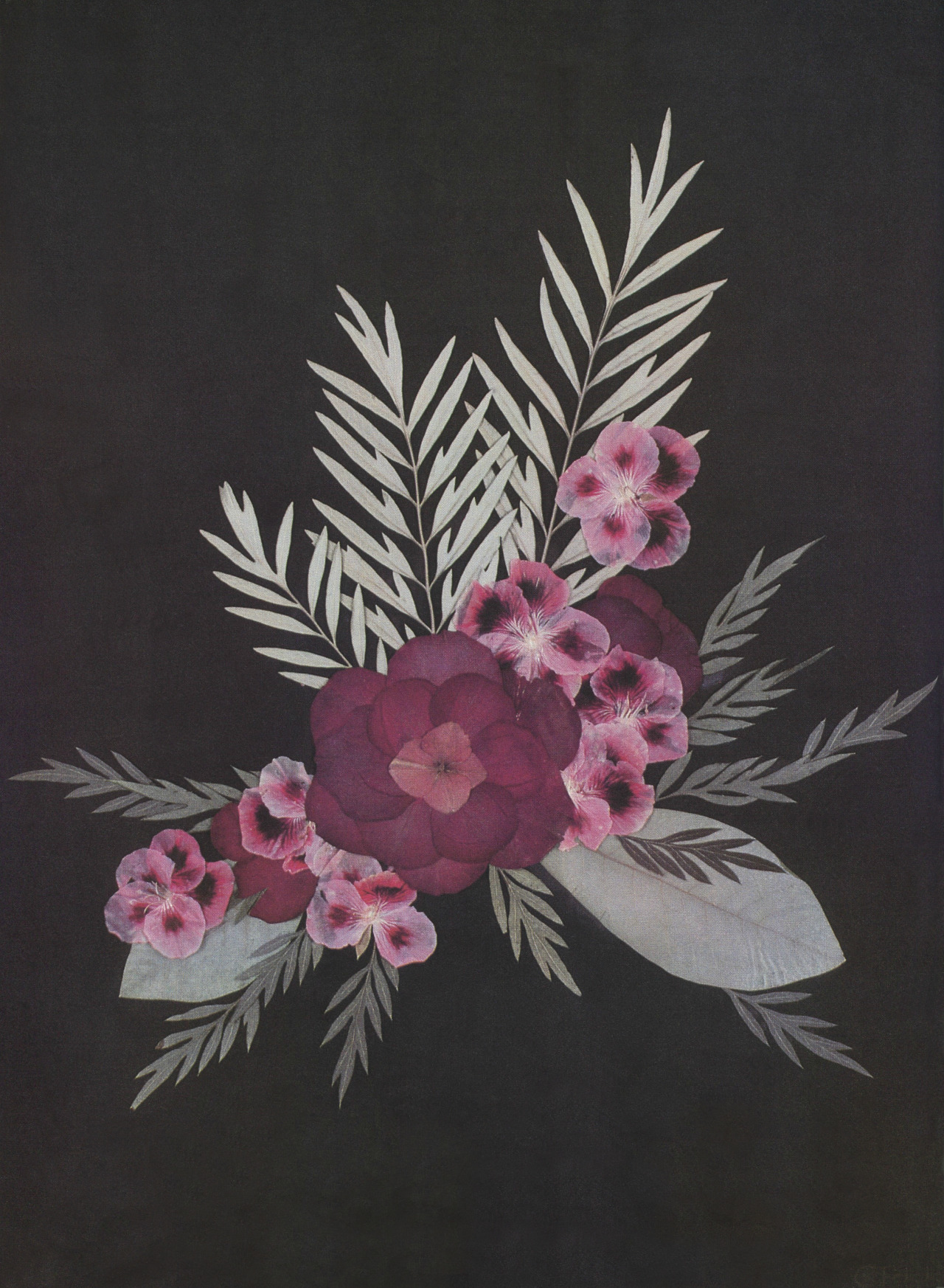
Grace Kelly, pressed collage with a reconstructed red rose and hydrangea flower from California, with pink pelargoniums from Spain, n.d.
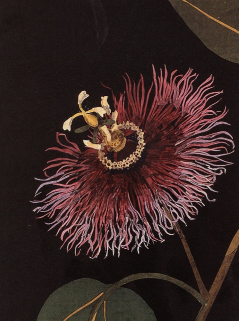
I particularly like this last collage by Kelly because the dark background reminds me of the paper flower collages that Mary Delany created in the 18th century (such as this one of the passionflower). Delany’s collages (which she called “paper-mosaicks”) were made from hundreds of pieces of tissue paper that were carefully cut and layered (and occasionally were touched-up with watercolor). Mary Delany’s collection of work is located at the British Museum. Grace Kelly discusses Mary Delany’s work at length in My Book of Flowers, so I think it is very likely that Kelly had Delany’s work in mind for this particular collage.3 Perhaps Kelly even thought that her “reconstructed red rose” (made from separately-dried flower petals) was similar to Delany’s process in constructing flowers out of cut pieces of paper.
It makes sense to me that Grace Kelly would be interested in creating pressed flower collages, not only as a creative exercise, but from a historical standpoint. Pressed flower collages historically have been associated with restraint and decorum, which are two things that I associate with Grace Kelly (both as an actress and a princess). For one thing, creating flower collages was popular among women during the Victorian era (the age of decorum and restraint!). And, in a ironic way, this restraint and decorum is also associated with the true origin of pressed-flower making, known as the art of Oshibana in Japan. This form of art began in the 16th century, allegedly was created by Samurai warriors as a way to practice patience, restraint, and concentration, as well as harmony with nature.
Although it seems unlikely that Victorian women or Grace Kelly would even be paired with Samurai warriors in the same sentence, I’m really tickled that the art of creating pressed flowers has found resonance and meaning across different time periods and cultures. Perhaps this international art form is another way that pressed flower collages help to embody Grace Kelly’s role as a diplomat and representative of a principality. Several of her collages bring together flowers from different countries too, which in a way is akin to the role she needed to perform as a political figure. This type of international harmony fits well with what Grace said about flowers and her immediate environment too:
“Through working with flowers we began to discover things about ourselves that had been dormant. We found agility not only with our fingers but with our inner eyes in searching for line, scale and harmony. In bringing out these talents within ourselves, we gained a dimension that enabled us not only to search for harmony in an arrangement, but also to discover the importance of carrying it into our lives and our homes.”4
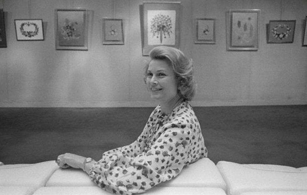
Grace Kelly at an exhibition of her flowers at Galerie Drouant in Paris, 1977
1 Princess Grace of Monaco with Gwen Robyns, My Book of Flowers (Garden City, New York: Doubleday & Company, Inc., 1980), 47.
2 Ibid., 48.
3 See discussion of Mary Delany on Ibid., p. 144-147.
4 Ibid., 10.


