Sunday, August 30th, 2015
The Passionflower in Latin American Art
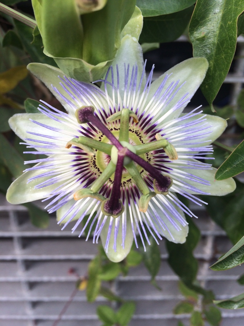
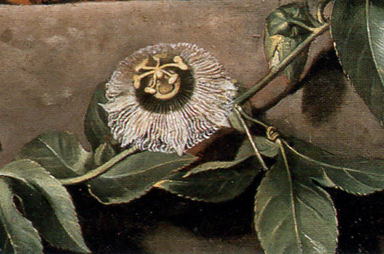
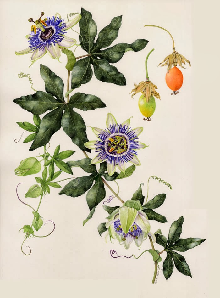
A passionflower
Earlier this week I noticed, by sheer happenstance, that there are passionflowers growing next to the parking garage of my local library! I was thrilled at this discovery: I’ve never seen a passionflower in person before, but every year I teach my students about them. The passionflower was very familiar to many indigenous people located within Spanish and Portuguese territories during the colonial era, and Jesuit missionaries therefore decided to use this flower as a symbolic tool to teach indigenous people about the Passion of Christ:
- The ten petals reference the ten apostles, excluding Judas (who betrayed Christ) and Peter (who denied Christ)
- The pointed tips of the leaves were said to represent the Holy Lance, which pierced Christ’s side
- The spiral tendrils of the flower (not shown in photo above, but can be seen HERE) were compared to the lash of Christ’s scourging
- The radial filiments (shown above in violet) were seen as a representation of the crown of thorns
- Three stigmas (in center of flower) represent three nails. Five anthers (underneath stigmas, in green) represent the five wounds that Christ received. (He received four imprints from the nails and one from the lance.)1
These flowers are very distinctive in appearance, and it makes sense to me that the Jesuits would incorporate this imagery into their artwork as well, so that the symbol could be used for didactic purposes within a more formal setting. So, for the past few years I have been on a quest to compile representations of passionflowers in Jesuit art and architectural decoration, primarily from the seven reductions (missions) located in Brazil and Paraguay. This has been difficult to do, due to the comparatively few extant examples of art from the missions in general, as well as the condition of such surviving objects. An entry on Wikipedia claims that the “flor de maracujá” (passionflower) was one of the most well-known decorative motifs in the missions, but I have yet to find a primary source or clear examples of digital examples online to support this claim (although I would like to think it is correct!). Here are some examples, however, that I think may be representations of passionflowers from Jesuit churches and/or missions:
- Detail above a pilaster at Jesús de Tavarangüé (now in Itapua, Paraguay)
- “Large stone flowers” (“grandees flores de pedra”) are described as having decorated the pilasters found within the living quarters on the reduction for the indigenous people
- Perhaps passionflowers are located on the retable from São Lourenço in Niterói, but I’d like to see higher resolution images of the flowers to make sure.
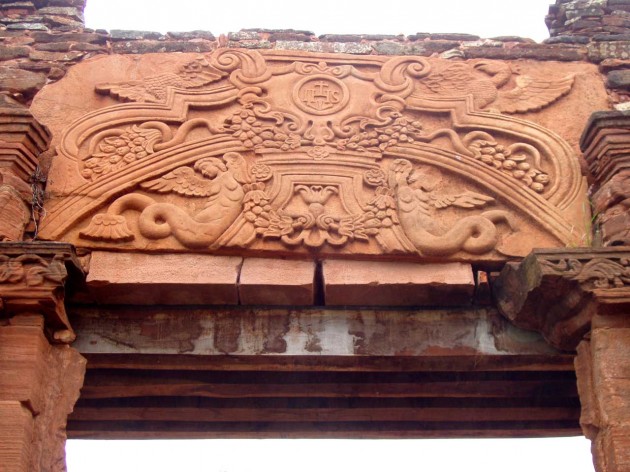
Detail of doorway at San Ignacio Mini, Argentina, 1727
Gauvin Bailey discusses the carving of a passionflower on the Jesuit reduction church of San Iganacio Mini in Argentina. He doesn’t specify where this passionflower is located or its appearance in this particular source, but I wonder if he may be referring to the stylized flowers in the lower corners of the carved doorway panel shown above (the blossoms bell out from the tails of the fantastic winged figures).
Apart from the Jesuits, passionflowers also captured the attention of other artists. Often the passionflower is used in a religious (and perhaps sometimes moralizing) context, but it also appears in secular contexts as well. Here are some other representations of the passionflower in Latin American art:
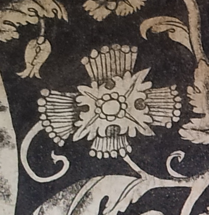
Detail of fresco mural, lower cloister wall from monastery of San Salvador at Malinalco, Mexico, 16th-18th century
Scholar Jeanette Favrot Peterson believes that the flower represented above is a stylized version of the passionflower from a fresco mural wall in the Augustinian monastery of San Salvador at Malinalco, Mexico.2
Detail of doorway at San Ignacio Mini, Argentina, 1727
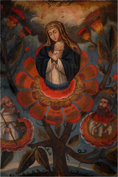
Our Lady of Mercy with Saints of the Order, 18th century. Archivo Museo de la Merced, Santiago
In a fascinating argument, Camila Mardones Bravo argues that this representation of Our Lady of Mercy (Virgen de la Merced) is depicted as emerging from a hybrid flower that contains characteristics of two separate flowers: the rose and the passionflower.
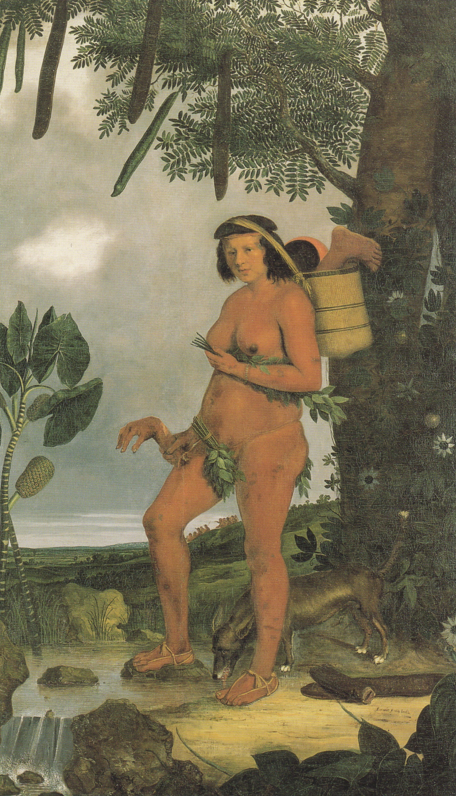
Albert Eckhout, detail from “Still Life with Watermelons, Pineapple and Other Fruit,” 1640
The Dutch painter Albert Eckhout depicted the passionflower a few times in the paintings he created during his time in Brazil, including the one above from Still Life with Watermelons, Pineapple and Other Fruit (detail shown above). In this context, it appears that he is just scientifically presenting the passionflower as an example of the flora of Brazil. Eckhout is also thought by some to be responsible for similarly-scientific representations of Brazilian life, and he may have even been responsible for the depiction of the passionflower in Willem Piso and Georg Marcgraf’s Natural History of Brazil (see below):3
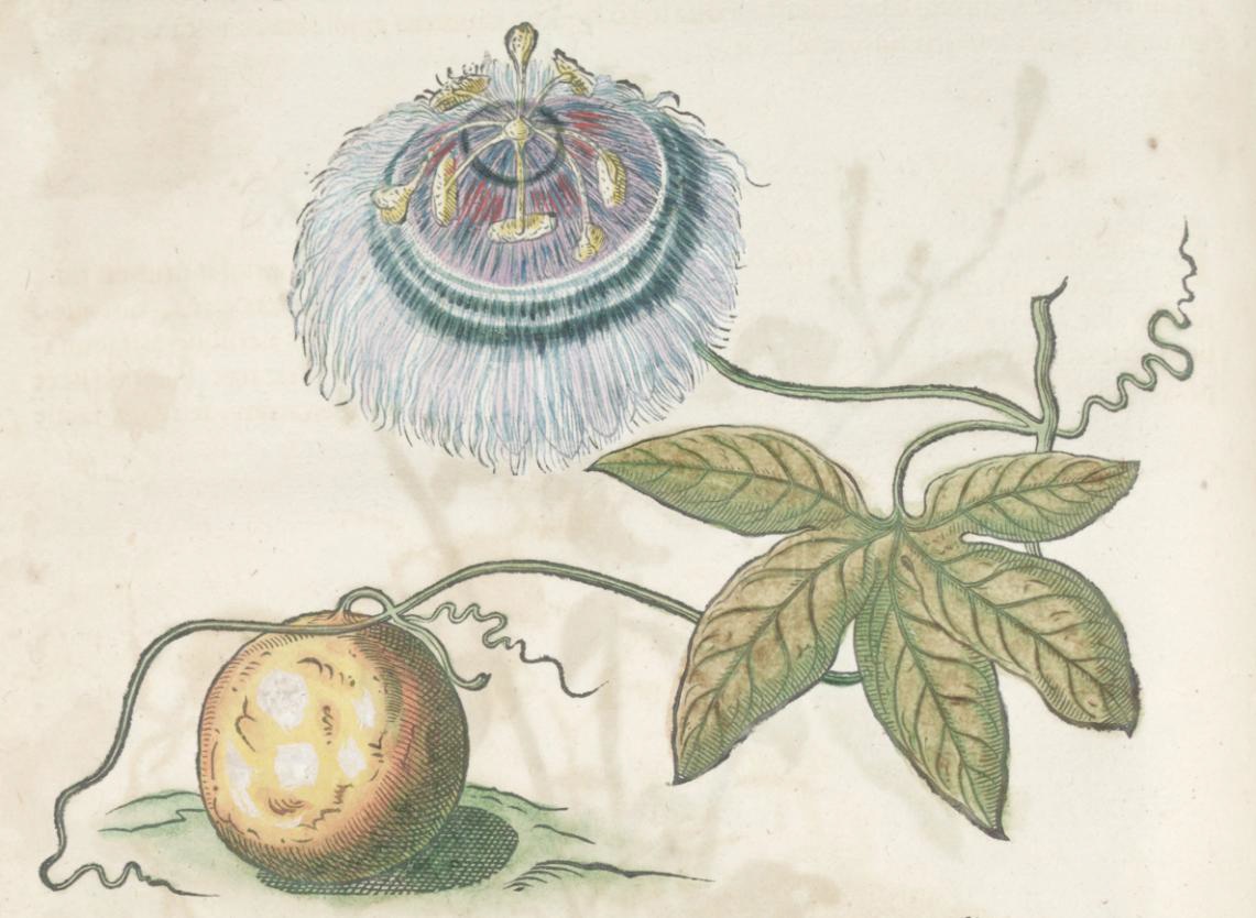
Albert Eckhout (?), ‘Passion fruit’ in “Historia naturalis Brasiliae…,” by Willem Piso and Georg Margraf, 1648
In other visual contexts though, apart from these scientific representations, I think that Eckhout may have been including the passionflower as an allusion to sin and suffering. The passionflower also appears in his ethnographic portraits of a Tapuya and mameluke woman, with the flower prominently appearing in the basket held by the mameluke and on the tree to the left of the Tapuya woman.
I think that the inclusion of the passionflower in these two contexts needs more consideration, and possibly more research. On one hand, Eckhout may be recognizing the importance of the passionflower (and more specifically, the passionfruit) within indigenous cultures for medicinal and sedative properties, as well as food. Eckhout also may be celebrating and highlighting the local flora within these works of art. However, I also wonder if there may be some sort of moralizing message in connection with these flowers, since there are symbolic ways in which these women are cast in a negative light (as uncivilized and/or savage, for example).4 Of course, there are overwhelmingly positive connotations with the passionflower itself (in its connection to Christ), so I wonder if these flowers also could have served as symbol of the civilizing influence of the (Christian) Dutch on these indigenous groups.5
On a side note, I wanted to mention that the passionflower continued to be important in Brazilian culture after the colonial era. In 1938 the poet Alfonso de Guimaraens, a Mineiro, wrote the poem “A Passiflora” which compares a devout person’s soul to a passionflower.
Are you familiar with any representations of the passionflower in Latin American art? If you know of any more, please share! This post is really more of a “post-it” than a post; I feel like there is much more research that can be done on this topic!
1 The symbolic connections between the passionflower and the Passion of Christ are discussed by several authors from the colonial Baroque period, including Juan Eusibio Nieremberg. See Evonne Levy and Kenneth Mills, eds., Lexikon of the Hispanic Baroque: Transatlantic Exchange and Tranformation (Austin, Texas: University of Texas Press, 2014), p. 299. Available online HERE.
2 Jeanette Favrot Peterson, The Paradise Garden Murals of Malinalco: Utopia and Empire of Sixteenth-Century Mexico (Austin: University of Texas Press, 2014), 87-89. Available online HERE.
3 Amy Buono, “Interpretative Ingredients: Formulating Art and Natural History in Early Modern Brazil,” in Journal of Art Historiography 11 (December 2014): 1.
4Rebecca Parker Brienen, Visions of Savage Paradise: Albert Eckhout, Dutch Painter in Colonial Brazil (Amsterdam: Amsterdam University Press, 2006), 120-127, 162-168.
5 About fifteen years after Eckhout painted these works of art, Antonio de León Pinelo wrote a book El paraíso en el Nuevo Mundo (1656) in which he claimed the passionfruit must have been the forbidden fruit in the Garden of Eden. He writes, “For what greater proof that this was the fruit of sin, and that caused the punishment, which found in His flower the most precious signs of forgiveness?”) “¿Pues qué mayor prueba de que esta fruta fue la del pecado, y la que ocasionó el castigo, que hallarse en su Flor las más presisas señales del perdón?” (citation found HERE). I wonder if there were other connotations that carried over to Europe before Pinelo’s writing, and perhaps if any other symbolic associations with this flower (both associated with sin and forgiveness) could be applied to Eckhout’s work.


