Archive

August 2008

New Series

Sigh.

This post just informed me that this series will be broadcast on TV this fall…in the United Kingdom!

Why don’t many art programs get broadcast in the US, let alone Utah? The last art series that I saw was Simon Schama’s ‘Power of Art,’ and I saw it while living in New York last summer.

Bah.

If you haven’t seen the ” Power of Art” show, you should at least read Schama’s book. Or at the very least look at the pictures. This book has some of the best reproductions of paintings that I have ever seen.

— 3 Comments

God as Painter

The other week there were these amazing gray clouds by the point of the mountain. I got J to take a photo as we drove past. It’s a pretty good photo, although it really doesn’t do the clouds justice.

These clouds immediately reminded me of paintings by Morris Louis. Louis was a color field painter from the 1950s and 1960s. His paintings typically were created out of extremely thinned paint that was poured over an unprimed canvas. To give you an idea of the effect of Louis’ technique, here’s his painting, “Point of Tranquility,” (1959-1960).

Now go back and look at the pictures of the gray clouds, particularly in the right hand side of the photo. Doesn’t it look like God poured out extremely diluted paint over his sky-canvas?
— 1 Comment

Kruger, Mulvey, Feminism, and the "Male Gaze"

I think Barbara Kruger is a really fascinating artist. Most of her work deals with the idea of the female in art, particularly as a commentary on how culture affects the reception of the female image in art. Kruger focuses on empowering her female images as “subjects” instead of “objects.” In this image shown to the right, Kruger empowers her subject by resisting the gaze of the viewer of the work.

This resistance of the viewer’s (specifically, a male viewer) gaze is in direct opposition to how females were portrayed in art for centuries. Since ancient times, the passive female image, particularly the nude female, has served as an “object” for the active male viewer in art.1

Kruger’s work and feminist art historical practice became especially interesting to me during graduate school. As an undergrad, I thought that feminist art historians were rather “angsty” and whiny. I think I came to this conclusion mainly because I was only briefly introduced to a few feminist art historical works, primarily Linda Nochlin’s essay, “Why Have there Been No Great Women Artists?” Although I thought Nochlin made some really good points in this essay, I still came away with the overall impression that feminist art historians just liked to stamp their feet, pout, and demand equality. You have to admit, the title of Nochlin’s essay can come across as sounding a bit whiny…

Anyhow, thanks to two die-hard feminist art historians at my university, I was able to change my opinion. One of my favorite articles that I read in graduate school was by Laura Mulvey, entitled “Visual Pleasure and Narrative Cinema.”2 Mulvey discusses how the female image in visual culture, particularly the cinema, encourages the male voyeur. Specifically, the way that the camera functions in film encourages the voyeur, particularly in the way that the camera captures close-ups of women. (Ha – the word “captures” is really appropriate here!). Think of close-ups in an movie – they will focus on the lips, or eyes, or legs, etc. of the female actress. The actress is not viewed as an individual or human being, rather she is reduced (physically cropped on the film screen by the camera lens) and thus fetishized.

This work by Kruger exhibits well how the fetishization and “to-be-looked
-at-ness” of women occurs in the film industry (how ’bout Marylin’s super-glossy-lips! Don’t they just grab your attention!). And the same thing can be said of many other works of art. In regards to painting, I think that the invention of the photograph (which influenced “cropped” subject matter and compositions on the canvas) also helped support this idea of female reduction and fetishization. During my second semester in grad school, I wrote a paper about how some paintings by Gauguin can fall into this study of cropping and fetishization.

Mulvey’s article is really fascinating. It was probably the first article that truly convinced me that feminist art historical/visual culture studies can be a very scholarly and engaging practice. It’s not just about angst or anger – although I’m sure that one can find bitter-men-haters in any feminist paradigm, if you look hard enough…

1Obviously, not every single image of a nude female has held erotic purpose (for example, representations of Eve in Medieval art).
2 See Mulvey, “Visual Pleasure and Narrative Cinema”. Screen 16, no. 3 (1975): 6–18.

— 2 Comments

The Evils of Painting from a Photograph

Although I don’t pretend to be a true art connoisseur or art appraiser, my background in art history and curatorial experience have given me some knowledge about good art technique and production. As a result, I have developed my own opinions about what constitutes a “good” painting. In addition to considering color, composition, application of paint, proportion, etc., I have also formed the opinion that painters should always strive to work with live models instead of painting from photographs. I’m sure some artists would argue that “referencing” a photograph while working is sometimes helpful, and this may be the case. But I think that being a direct copyist of a photograph generally leads to some unfortunate results on the canvas.

One of the main problems with copying directly from a photograph is that the figures in the final painting will appear unnecessarily flat. This flatness is a result of transferring a two-dimensional image (on a photograph) to another two-dimensional surface (the canvas). If the artist is trying to create an illusion of a three-dimensional figure, then it is important to use a three-dimensional model (i.e. a live model) in order to create this effect. In addition, using a photograph as a model not only makes the figures flat, but they can also appear unrealistically placed in their setting. In other words, the images look more like collage cut-outs that are just pasted into a setting.

Unfortunately, many LDS artists have fallen into this trap of painting from a photograph, which results in an overall aesthetic that I find to be substandard.1 And even more unfortunately, LDS art consumers have developed a taste for this type of art. (I realize that some fans of Greg Olsen, Simon Dewey, or Liz Lemon Swindle may argue that this type of art makes them happy, helps them feel the Spirit, allows them to think about Christ, etc., claims which are all valid. Technically, however, I still find this art to be less than favorable. Although I can’t claim that these three aforementioned artists work strictly from photographs, I can see a reliance on photography in much of their work, which is unfortunate.)

Consider this example “Wherefore Didst Thou Doubt” by Benjamin McPherson, an up-and-coming LDS artist who exhibited this piece at the 2006 Spiritual and Religious Show at the Springville Museum of Art. I helped to jury this exhibition. Although all of the judges determined that this painting was definitely good enough to merit place in the show, we all agreed that the artist relied too heavily on photographs instead of live models. As you can see, all of the figures in the painting look like cardboard cut-outs within the scene. There is little integration between the figures, as well as little integration between the figures and setting. For example, the boat looks like it has been cut out of a photo and pasted on the canvas.

However, the flatness of the images is not the only evil which comes about from painting from photographs. In addition, there sometimes can be problems with proportion as well, especially if the artist is painting a group of individuals, all of whom were photographed separately. This problem with proportion can be seen in a detail of McPherson’s painting. 
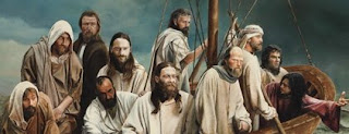
By examining the sizes of the figures, especially their heads, you can see that they are not proportionate with each other. This is because these images were photographed separately and then painted in a single composition like a collage. Had McPherson set up live models for his painting, it would have been easier for him to paint the figures in proportion with each other.

While this show was up at the museum, visitors were especially verbal in their praise for McPherson’s work. “It looks just like a photograph!” “How realistic!” were some of the laudatory remarks that I heard echoing from the area between the Music Gallery and the Dumke Gallery, where the painting was hanging. These comments saddened me, since I felt like calling a painting “photographic” is not really a compliment (which a few exceptions, of course, like the Photorealist movement from the 60’s and 70’s). If LDS artists continue to paint in this manner, then the public will continue to feel like this is “good art.” However, if LDS people were exposed to better art, then they would be able to appreciate a higher quality of painting.

On another note, I feel like McPherson really skimped on his application of paint (you could practically see the canvas!), which also was saddening. If you’re going to use paint, why not really use it?!? Although I have only seen one Greg Olsen original in person (it hung at this same show with McPherson’s work), I noticed that Olsen also didn’t have much paint buildup either (although he did have more than McPherson). Are these artists trying to make their paintings appear photographic by using as little paint as possible? It almost seems like the artists trying to deny the medium which they are using in favor of a photograph. If Jesus walked on the earth today, perhaps these painters would be photographers instead and give up the practice of painting – then they could get the aesthetic they are hoping for without bothering with paint!

Do I have Greg Olsen fans up-in-arms with this post? What do people think? As a side note, I should also mention that there are some LDS artists which I think are very talented, technically speaking. J. Kirk Richards and Walter Rane are two noteworthy LDS artists. If I extended this discussion to include LDS artists which paint religious and non-religious themes, then I would also have to mention one of my favorite Utah artists, Brian Kershisnik.

1 In this post, I am defining an “LDS artist” as a Mormon artist who primarily paints Christian/Mormon subject matter.

— 5 Comments

Thoughts on the Portinari Altarpiece


I’ve been reading a really interesting article on the Portinari Altarpiece lately.1 The Portinari Altarpiece has been determined by earlier art historians (such as Panofsky) to contain iconography related to the Eucharist and Passion. For example, the stalks of wheat in the foreground of the central panel (shown above) are a reference to the Eucharistic bread. In the article I have been reading, Miller discusses how the actual scene of the Nativity can also be interpreted as a metaphor for salvation. She writes,

“Not only did the Nativity represent the Incarnation of the Savior but, in popular legend, the delivery itself was miraculous: it preserved Mary’s virginity and was also exempt from the usual fears, pains, and dangers of ordinary human parturition. This exemption helped to confirm the Virgin’s position as reversing Eve’s role in Original Sin, and in this way the miraculous birth could have stood as a potent metaphor for salvation.”2

The article discusses references to birth, such as the inclusion of Saint Margaret, the patron saint of childbirth. Margaret is placed on the right panel of the triptych. I never noticed this before, but there is a dragon placed at the saint’s feet for her identification! Has anybody else missed seeing that before?

A large part of Miller’s argument ties into the hospital setting for this altarpiece; she finds that elements included within this altarpiece would have had particular significance to the hospital patrons. In this sense, her article is similar to analyses of the Isenheim Altarpiece by Hayum and Mellinkoff.3 Miller mentions how the flowers in the foreground of the central panel of the Portinari Altarpiece were used for medicinal purposes in the Renaissance.4 The healing properties of these flowers would have been recognized by hospital patrons, who could then relate these flowers to the healing properties of Christ’s sacrifice, repentance, etc. Miller then ties her argument together by saying that miraculous childbirth is a metaphor for salvation and therefore also of healing, therefore making the subject matter of this altarpiece of interest to hospital patrons and not just iconographic details included within the work (i.e. the flowers, shafts of wheat, etc.).

I think this is an interesting and fairly convincing argument. I realize that this is a short synopsis of the article, but based on what I have written, what do other people think?

1 Julia I. Miller, “Miraculous Childbirth and the Portinari Altarpiece,” The Art Bulletin 77, no. 2, (June, 1995): 249-61. For those readers who have access to JSTOR, this article is available for reading and download.

2 Ibid., 249.

3 Ibid., 257. See also A. Hayum, “The Meaning and Function of the Isenheim Altarpiece: The Hospital Context Revisited,” Art Bulletin, LIX, 1977, 512-13; and R. Mellinkoff, The Devil at Isenheim: Reflections of Popular Belief in Grunewald’s Altarpiece, (Berkeley: University of California Press, 1988), 89.

4 Ibid.

— 2 Comments

Email Subscription


Archives

About

This blog focuses on making Western art history accessible and interesting to all types of audiences: art historians, students, and anyone else who is curious about art. Alberti’s Window is maintained by Monica Bowen, an art historian and professor.