Petra, the Siq, and the Hellenistic “Baroque” Style
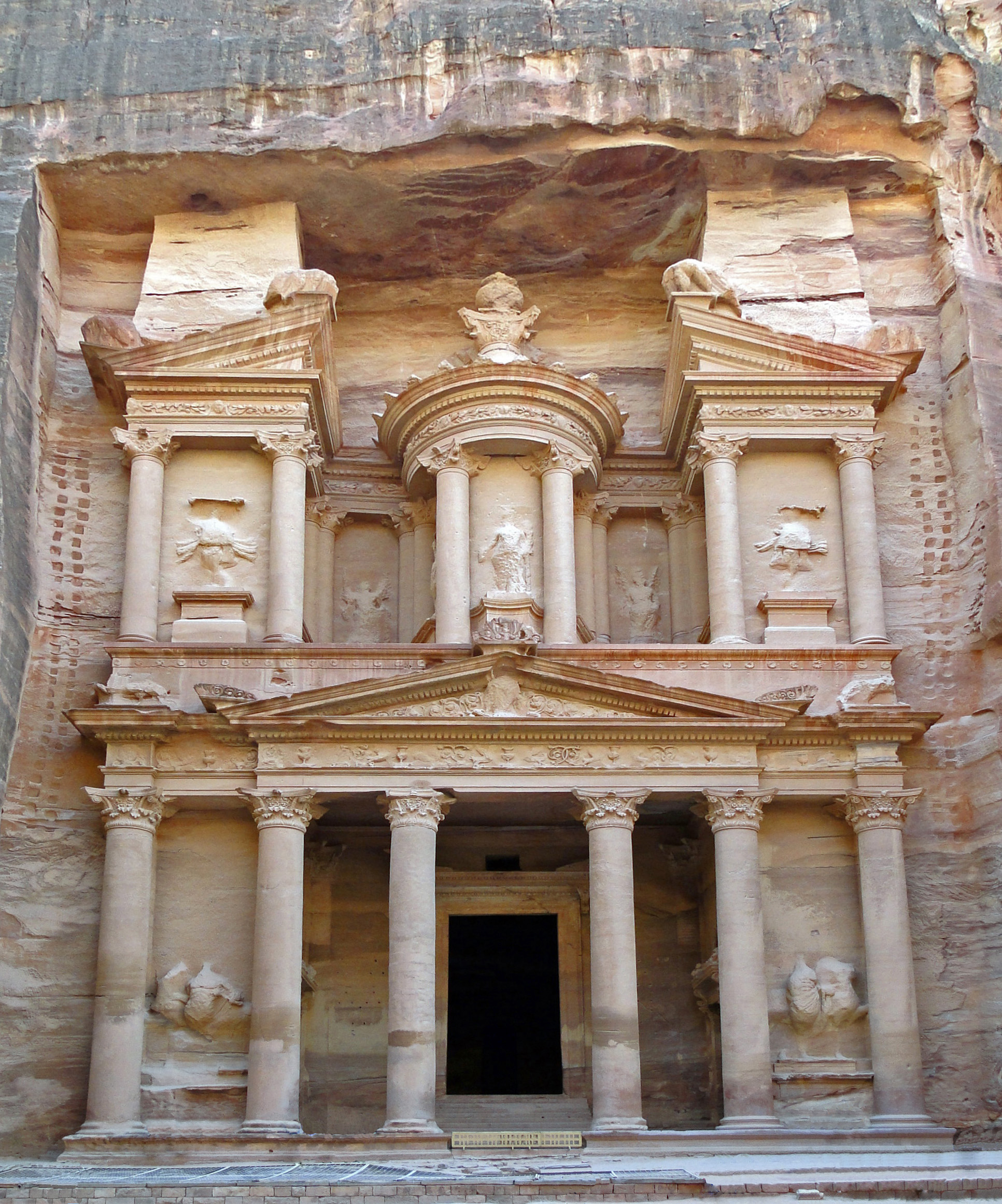
Facade Al-Khazneh (The Treasury), Petra, Jordan, c. 2nd century BC- 2nd century CE. Image courtesy of Bernard Gagnon on Wikipedia.

My little sister recently returned from a study abroad in the Middle East during which she was able to visit, among other things, the ancient ruins at Petra in Jordan. I’m so glad that she got to visit this site; I hope to be able to go here myself one day. Although it is difficult to date the rock-cut tombs found at Petra, they are thought to have been made sometime between the 2nd century BC and the 2nd century CE, when the local group the Nabateans were at their wealthiest. Although some textbooks and scholars find that some of these rock-cut tombs (particularly the famous Al-Khazneh (“The Treasury,” shown above) and Al-Deir (“Monastery”)) are examples of Roman architecture, others feel that most of the buildings in Petra were built before the Roman annexation in 106 CE.

One of the things that I find most fascinating about the famous rock-cut tombs of Petra is the architectural style. Al-Khazneh and Al-Deir exhibit stylistic characteristics that harken back to Alexandrian architecture and the Hellenistic style. In other words, the architecture is very dramatic in its presentation, which has led some scholars to refer to the Hellenistic style as the “ancient Baroque.”1

This drama is especially apparent to me at Al-Khazneh due to the dynamic broken pediment, as well as the emphasis on movement. I see a lot of movement in the upper area of the facade, which contains a rhythm due to the pattern of projecting and recessing architectural segments. This movement is mimicked in the lower part of the façade, in which the frieze projects and recesses as it winds atop Corinthian columns. Additionally, the deep porch on the lower level creates an interesting contrast of light (hitting the Corinthian columns) and dark (shadow in the porch recess), which reminds me of the tenebrism found in Baroque art of the 17th century.

I was anxious to see my sister’s pictures of this building after her trip, and was surprised to discover another element that adds to the drama of this building: the surrounding landscape. Al-Khazneh and other rock-cut tombs are located next at the end of a natural winding rocky cleft called the Siq. When one approaches the structure by walking out of the Siq, there is not only a dramatic baroque element of light and dark contrast, but the theatricality of a natural curtain being unveiled from the façade itself. I think this is baroque presentation at its finest:
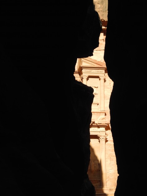
Partial view of façade Al-Khazneh (The Treasury) from the Siq (Canyon), Petra, Jordan, c. 2nd century BC - 2nd century CE.

Partial view of façade Al-Khazneh (The Treasury) from the Siq (Canyon), Petra, Jordan, c. 2nd century BC – 2nd century CE.

Given the theatricality of this style and its geographic location, it is no wonder that Steven Spielberg used Al-Khazneh as the location for the Holy Grail in Indiana Jones and the Last Crusade! I can also see why this dramatic building is associated with legends that pirate loot and pharaonic treasure were once held here (which accounts for the “Treasury” nickname for this building). To complete the dramatic effect, visible bullet holes can be seen on the exterior (shot by Bedouins at a stone urn (the “tholos”), in hopes of releasing the legendary stored treasure. Perhaps the bullet holes add a bit of visual “movement” and texture to the façade today as well!

1 Alina Payne, “Beyond Kunstwollen: Alois Riegl and the Baroque” in The Origins of Baroque Art in Rome by Andrew Hopkins and Arnold Witte, eds. (Los Angeles: Getty Research Institute, 2010), 8
— 2 Comments

Carel Fabritius’s “The Goldfinch” and Fiction

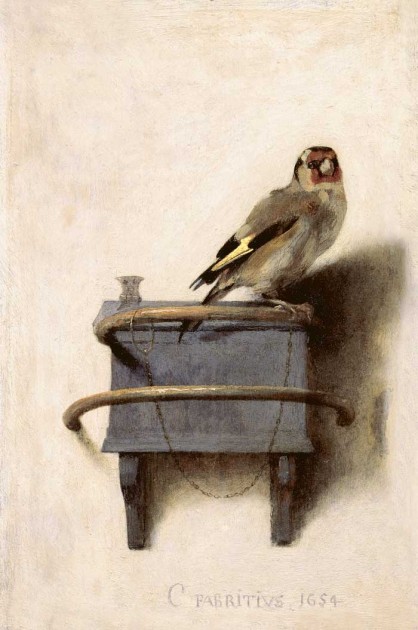
Carel Fabritius, "The Goldfinch," 1654. Oil on panel, Maurithaus Collection

Several months ago, a student recommended that I read the novel The Goldfinch by Donna Tartt, since the book revolves around a stolen painting. I finally had a chance to read the book over the past week. I enjoyed a lot of things about this engaging book, though I also felt like most of the story was overwhelmingly depressing – I wish I had been warned about that!

The stolen painting in this work of art actually does exist, although it was never stolen in actuality. Carel Fabritius, a student of Rembrandt, painted The Goldfinch in 1654. (You can learn more about this painting and Fabritius HERE). I am struck by this painting in a few ways, particularly due to the creamy colored background (which was thought to be yellow, due to discolored varnish, before a restoration in 2003). The light background is particularly interesting to me, because Fabritius would have probably was taught more about dark, Caravaggesque backgrounds by Rembrandt. The Goldfinch still seems a bit Caravaggesque to me, in terms of the light and dark contrasts created by the shadows of the bird and box, but it also seems anti-Caravaggesque because of the light background itself. Was Fabritius conscientiously going against the Caravaggesque fad at the time?

It’s difficult to know Fabritius’s intentions with this painting or his now-lost works of art. Today, only about a dozen paintings are known to be by Fabritius. The Goldfinch was painted the same year that Fabritius died in an tragic accident: a gunpowder magazine near the artist’s studio in Delft exploded, which killed the artist and probably destroyed much of his work. This explosion greatly affected the people of Delft, since a large part of the city was destroyed and hundreds are estimated to have died. Another artist, Egbert van der Poel, painted several depictions of this historic explosion, including The Burning City which is part of the Seattle Art Museum’s permanent collection. Donna Tartt explains about Fabritius’s untimely death in her novel, and draws a parallel with another modern-day tragedy in the book that happens to the protagonist. All of Tartt’s quotes and historical information about paintings and artists in the novel seemed accurate to me, although I noted that one character erroneously asserted that Fabritius was Vermeer’s teacher.1

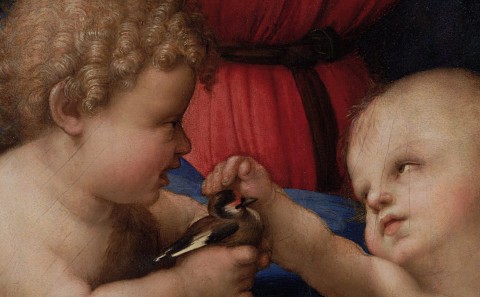
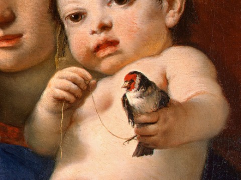
The protagonist, Theodore Decker, moves from scenario to scenario in which he is forced to endure extreme tragedies, sorrows, and the deal with the negative consequences of bad actions (either due to his own actions or those around him). I found it interesting that the goldfinch was a pervading icon throughout this book that revolves around suffering, since in Christianity the goldfinch is a symbol of Christ’s Passion and suffering. I didn’t feel like this symbolic idea was ever explicitly addressed in the book. The goldfinch eats thistles, which associate it with the Crown of Thorns placed on Christ’s head. It also has bright red markings on its face, which connects it to the blood of Christ. Many artists, both before and after the lifetime of Fabritius, painted the goldfinch in a variety of religious contexts due to these symbolic associations.

Giambattista Tiepolo, detail of "Madonna of the Goldfinch," c. 1770

Raphael, detail of "Madonna of the Goldfinch," c. 1505-1506. Image courtesy Wikipedia

Fabritius lived at a time when Dutch artists, in typical Protestant fashion, were interested in creating secular, albeit moralizing, works of art. The goldfinch was a popular pet in Holland in 17th century, so in many respects this painting is similar to a genre paintings or still life. There even could be a moralizing theme to this work of art: the bird is chained to a wooden box, which could pose a message about domesticity and flight.2 Regardless of the impetus to create secular subject matter in Holland, I do think that Fabritius would have probably been aware of the religious symbolic significance of this bird, too. If Tartt had included this idea in her novel, I think it could have added another layer of significance and meaning to her book.

1 Donna Tartt, The Goldfinch (New York: Little, Brown and Company, 2013), 26. Although it appears that Fabritius influenced Vermeer, a contemporary artist who lived in Delft, there is no historical documentation that Fabritius was Vermeer’s teacher. In fact, it is thought unlikely that Fabritius taught Vermeer.

2 Frick Museum, “The Goldfinch.” Available online here: http://www.frick.org/exhibitions/mauritshuis/605. Alternately, it has been proposed that the bird is not chained to the box, but to a water-like container that is in the box. Goldfinches were known for performing the trick of collecting their own water. The bird could have been chained to a thimble-like container with which it could access water in the wooden box. In Dutch, the goldfinch is known as “het putterje” (“The Water Drawer”)  for this reason; Fabritius’s painting is titled “Het Putterje” in the Dutch language.

— 6 Comments

Images of Mothers with Children

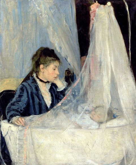
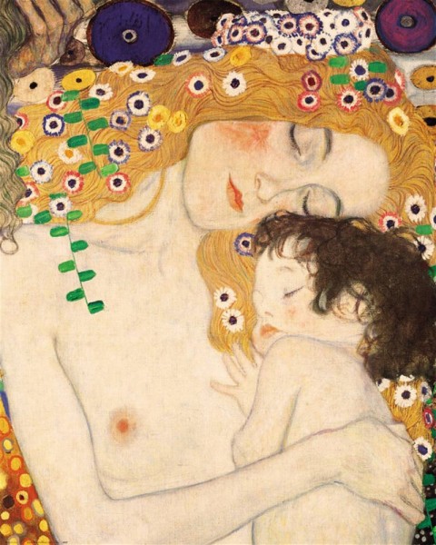
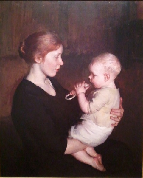
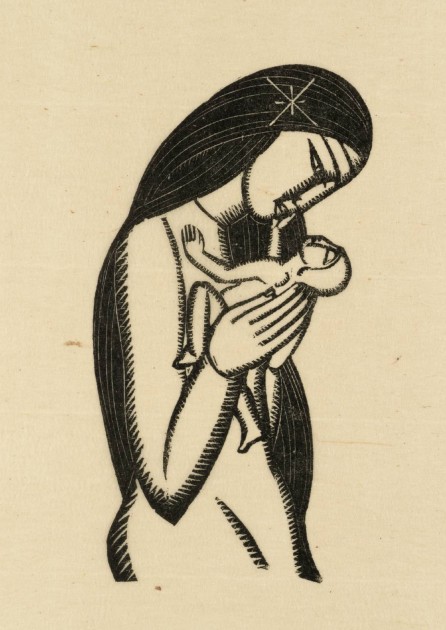
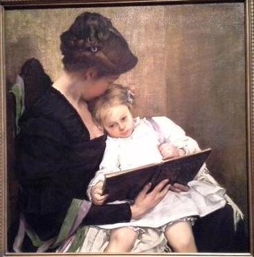
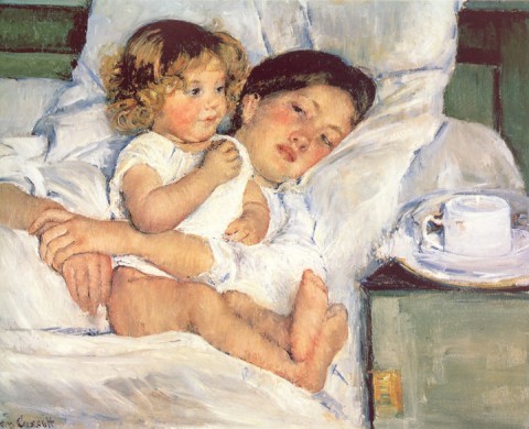
Over a year ago, I began collecting images of mothers who were with either a little baby or a young child. I have enough that I want to start a compilation here, so that I can keep track of them all. I know there are hundreds of works of art depicting mothers and children (particularly ones of the Madonna and Child), but these ones are my absolute favorites:

Berthe Morisot, "Le Berceau," 1872

Gustave Klimt, detail from "The Three Ages of Woman," 1908

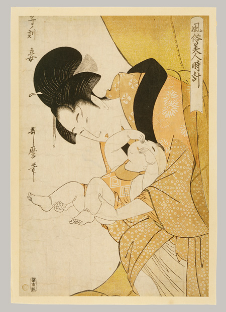
Kitagawa Utamaro, Midnight-The Hours of the Rat-Mother and Sleepy Child, Edo period, ca. 1790 (Metropolitan Museum of Art)

This woodblock print by Utamaro is from a series called Fuzoku Bijin Tokei (Women’s Daily Customs). To illustrate the “daily custom” of midnight, Utamaro depicts a mother sleepily emerging from her mosquito net to attend to her baby (who in turn rubs sleep from its own eyes). Having lost many hours of sleep myself when my son was a newborn, I can relate! A little more information about this print is available HERE.

Marie Danforth Page, "Her Littlest One," 1914 (National Museum of Women in the Arts)

Her Littlest One was made during a period in which Marie Danforth Page created a lot of noncommissioned paintings of mothers with children. Mary Cassatt’s art had a lot of influence on Page at this time, as did Flemish art from the 17th century.1

Eric Gill, "Madonna and Child," 1925. Wood engraving on paper (Tate)

William Sergeant Kendall, At the End of the Day, 1900 (Seattle Art Museum)

Mary Cassatt, "Breakfast in Bed," 1897 (Huntington Library)

What are your favorite images of mothers with children? Why do you particularly like them?

1 Museum label for Marie Danforth Page, Her Littlest One, Washington, D.C., National Museum of Women in the Arts, June 11, 2013.

— 12 Comments

Ancient Egyptians and Greeks: Left Foot Forward!

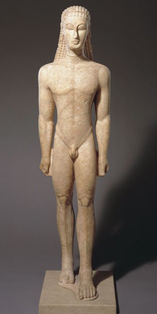
Metropolitan Kouros, c. 590-580 BC. Metropolitan Museum of Art

Last fall, when I taught about the Archaic Period in ancient Greece, a student pointed out that many of the kouroi figures were standing with their left foot forward. We discussed how Egyptian figures often are striding forward with their left foot as well, and perhaps the Greeks simply adopted this composition due to compositional balance. But my student pressed, “But why the left foot? Was the left foot itself important for some type of reason?”

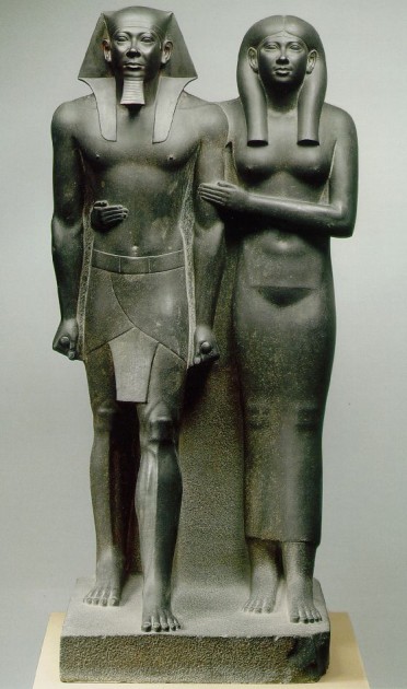
Menkaure and Queen (perhaps his wife Khamerernebty II), 2490-2472 BCE. Graywacke with traces of red and black paint, height 54.5″ (142.3 cm). Museum of Fine Arts, Boston

I have puzzled over this student’s question for several months, particularly as to whether there is significance with the advancing left foot in Egyptian culture, and whether that same type of significance would have carried into Greek culture. We can see that a large number of Egyptian statues, including male and female figures, adopted the “left foot forward” stance; Menkaure and his Queen (shown above), the colossal statue of Queen Tuya (Vatican Museum), Karomama (Louvre), and wooden tomb statue of Tjeti (British Museum) are just a few of the many examples that exist. Some sources argue that Egyptian females are typically represented with both feet together, but I am increasingly wary of that generalization.1

Did the left foot hold special significance for the Egyptians, since this convention appears throughout ancient Egyptian history? I haven’t come to a conclusive answer by any means, but I have come across a few ideas. One idea was presented to me through Twitter: Ma Magdalena Ziegler (@ZiZiChan) wrote to me that for the Egyptians, the “left side is where the heart resides & it’s the house of will, emotions & consciousness, the center of life itself.” A similar idea was presented in an online forum on Egypt, where writer Al Waze-look King wrote, “The real meaning behind the position of the statue [with the advancing left leg] is esoteric. The left side of your body is where the heart is. The Egyptians believed you stepped with the left foot to trod out evil so the heart could proceed.” Another online forum (which actually is dedicated to Freemasons) claims that the left foot is represent the power of Isis, a fertility goddess who is associated with life and new beginnings. Another possibility shared by a tour guide in Egypt is that the left foot forward could suggest that the figure represented in the work of art had been involved in the military.2

Apart from these online exchanges, I haven’t come across any published scholarship to support these ideas, let alone any direct historical document that connects this idea to Egyptian sculpture itself. (If anyone knows of scholarship that supports these ideas or presents an alternative view, please let me know!) Regardless, though, I do think that the question of the left foot needs to be taken further when it comes to Egyptian influence on archaic Greek sculpture. The connection between Egyptian sculpture and ancient kouroi/korai has long been established by scholars.3 Scholars even argue that some kouroi (specifically the Metropolitan Kouros, shown at the top of this post) was based off of the Egyptian canon of proportions.4

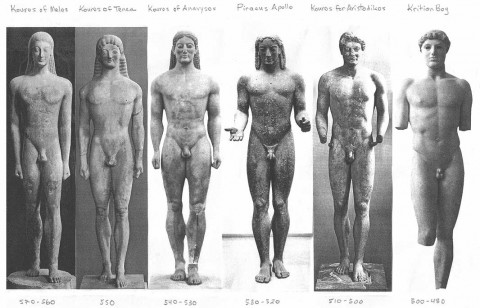
Kouroi examples, culminating with the Kritios Boy from the Early Classical period. Note that the “Piraeus Apollo” is a “transitional sculpture” that is different from the others, since his right foot advancing.

But did the ancient Greeks adopt the “left foot forward” stance for similar reasons as the Egyptians, if Egyptians had symbolic reasoning in the first place? Unsurprisingly, I suppose, I haven’t found a conclusive answer either. If anything, the evidence that I found is contradictory to my Egyptian ideas and a little bit too late historically to coincide with many of the archaic kouroi: Aristotle (writing in the Late Classical period), wrote that the right side of the body was the naturally stronger and more active than the left!5

Archaeologist and art historian Gisela Richter, who published technical analyses on the kouroi and korai, notes the tradition of the advancing left foot in several types of kouroi and korai.6 However, Richter is quite silent as to the reasoning of compositional stance, only suggest that an evolving interest in naturalism and the artist’s desire to suggest “the asymmetry of the two sides of the figure” led to the forward placement of the left leg.7

The Euthydikos Kore, c. 480 BC. Acropolis Museum, Athens. Image via Wikipedia, courtesy of Dorieo

When I started to write this post, I hoped to come up with specific ideas and reasons behind the leg positions of the kouroi and korai. Instead, I hope this post will serve more as a forum and generator of ideas as to the stances of these statues. If you have any ideas as to why left leg was positioned as advancing in either Egyptian or Greek sculpture, please share!

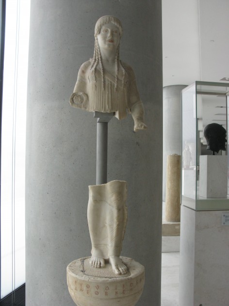
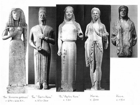
Korai examples, ranging from c. 640 BCE to c. 480 BCE. Several of these korai have their feet placed close together. The exception is the c. 500 BCE kore, who has an advancing left leg

I also may also never find a reason as to why some korai are depicted with their legs together (see above). Is there an “active male” vs. “passive female” being expressed through some of these works of art? I’d love to learn what others think on this topic, too.

1 For example, more “left foot forward” female statues can be seen in Gisela M. A. Richter, Korai: Archaic Greek Maidens (London: Phaidon, 1968), Plate I.

2 Tom Cheshire, A Tourist in the Arab Spring (Bradt Travel Guides , 2013), p, 180.

3 Ibid., p. 4. See also Gisela M. A. Richter, Kouroi: Archaic Greek Youths: A Study of the Development of the Kouros Type in Greek Sculpture (London: Phaidon, 1960), p. 2.

4 For some discussion on the Metropolitan Kouros, see http://academic.reed.edu/humanities/110tech/kouroi2.html. For a more comprehensive analysis of kouroi proportions, see Eleanor Guralnick, “The Proportions of Kouroi” in The American Journal of Archaeology 82, no. 4 (1978): 461-472. Article available online here: http://www.jstor.org/discover/10.2307/504635?uid=2129&uid=2&uid=70&uid=4&sid=21104058982547

5 Geoffrey Earnest Richard Lloyd, Methods and Problems in Greek Science: Selected Papers (Cambridge: University of Cambridge Press, 1991), p. 44. Source available online here: http://books.google.com/books?id=zCg4AAAAIAAJ&lpg=PA43&ots=BnHcQOB55o&dq=greek%20left%20side%20of%20body&pg=PA44#v=onepage&q&f=false

6 See Richter, Korai: Archaic Greek Maidens, p. 4. See also Richter, Kouroi: Archaic Greek Youths, p. 25. It should also be noted that several Greek korai are depicted with their feet together.

7 Richter, Kouroi: Archaic Greek Youths, p. 2-5, 21.

— 24 Comments

East and West: The Edo Period in Japan and the Baroque Period in Europe

Due to my involvement as a volunteer at a local art museum, I’ve been learning and thinking a lot about non-Western art lately. I feel really incompetent when it comes to the Asian and African art – especially in terms of building historical context – so I feel a little out of my comfort zone. I’m excited to learn more about these artistic traditions, though.

In order for me to better contextualize and understand these new historical and artistic periods, I try to mentally cross-list each non-Western period with what is happening contemporaneously in European history. It also has been helpful for me to learn about ways that the Westerners interacted with these different cultures, so I can understand each country and time better within its history at large. So far, I feel like I have been able to best remember things that happen during the Edo Period of Japan (1603-1868), because that period coincides with the Baroque period (as well as Romanticism, Neoclassicism, and Realism). It’s been fun for me to find parallels with Baroque art and the early Edo period.

One parallel that I have found between the early Edo period and the Baroque style is the interest in light. The cultural and artistic approaches to light, however, are quite different. In the Baroque period, light was used as an illusionistic painting in order to create drama through tenebrism. Artists created sculptures and architecture which utilized natural light in order to create dramatic visual contrasts of areas which were brightly lit and cast in shadow.

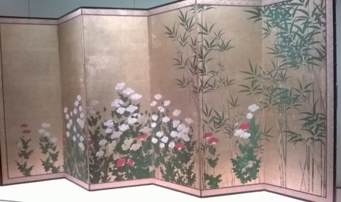
Kano Shigenobou, “Bamboo and Poppies,” early 17th century. Pair or six-panel screens; ink, color and gold on paper. Seattle Art Museum

In the Edo period, the interest in light was quite different and practical. Due to the introduction of Western of firearms in Japan in the 16th century, the Japanese began to build fortress palaces with thick walls.1 The interiors of these fortress palaces was very dark, especially in contrast to the airy, filtered light which permeated through the paper walls of their previous palaces. The Japanese favored indoor screens that were decorated with gold in order to better illuminate the interiors of their new, darkened fortresses. A few examples of such screens are the Shigenobou screen shown above, the Shigenobou screen “Wheat, Poppies, and Bamboo” at the Kimbell Art Museum, as well as the Crow Screen at the Seattle Art Museum. The reflective gold surface provided more light, but I think the gold also is visually dramatic and stunning too, which makes a nice connection with the Baroque style in Europe. In fact, even the flat gold background has some parallel with the dark or ochre monochromatic backgrounds that are found in Caravaggesque paintings.

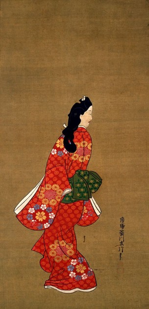
Hishikawa Moronobu, Beauty Looking Back, 17th century. Tokyo National Museum

The popularity of woodblock prints during the Edo period also is easy for me to remember, due to some parallels with what happens in the West at the same time. During the Edo period, wealthy Japanese merchants could afford to have art, particularly prints. The widespread accessibility of art reminds me a bit of the wealthy middle class and rise of the open art market in Holland during the 17th century. In Japan, a wealthy merchant might decide to purchase a print of a famous geisha or actor. Such subject matter is found in Ukiyo-e prints (“pictures of the floating world”), which were popular between the 17th and the 19th centuries. The artist Hishikawa Moronobu is one of the earliest to have made these types of prints in the 17th century (see one such example above). The accessibility of woodblock prints continued to rise in the subsequent century; technological advancements enabled the printing of multiple colors on a single sheet in 1765.

Do you know of other chronological or artistic parallels between Western and non-Western artistic periods? I’m familiar with chinoiserie and japonisme from a Western perspective, for example – this time I’m trying to make parallels to help me specifically remember points about Asian or African art.

1 “SAMART: Golden Screens of the Kano School,” SAMBLOG of the Seattle Art Museum, accessed May 15, 2014, http://samblog.seattleartmuseum.org/2011/11/samart-golden-screens-of-the-kano-school/


— 8 Comments

Email Subscription


Archives

About

This blog focuses on making Western art history accessible and interesting to all types of audiences: art historians, students, and anyone else who is curious about art. Alberti’s Window is maintained by Monica Bowen, an art historian and professor.