Wednesday, December 9th, 2009
 My cousin just sent me this post, and I’m so excited/jealous about the news that I have to post right away. The story sounds like a dream-come-true: an Italian couple decided to remodel their apartment and found a 16th century fresco behind their plastered wall! Although Tarcisio and Teresa de Paolis found the fresco in the 1970s, they only recently decided to announce their find to the public (it appears they were worried that they would lose their home because of this discovery).
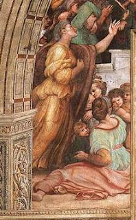
The fresco appears to be by Ugo da Scarpi – it is a miniaturized copy of frescoes from Raphael’s “
Room of Heliodorus” (1512-1514; located in the Vatican – you can take a
virtual tour of the room here). The detail on the right is from Raphael’s fresco
The Mass at Bolsena; you can compare this detail with the da Scarpi copy (located in the photograph with the de Paolis couple).
What an amazing find! I’m green with envy. I have a secret hope that one day I’ll discover a masterpiece that was hidden away in an attic or antique shop.
Do you know of any other amazing art discoveries?
Monday, December 7th, 2009
I’m in a state of shock. Vasari is best known as the biographer for the great (male) artists of the Italian Renaissance – Michelangelo, Donatello, Raphael, Leonardo, etc. But did you know that Vasari mentioned four females in his Lives of the Artists? I had no idea, until I discovered Vasari’s chapter on Properzia de’Rossi the other night. I seriously was dumbfounded – I stared at the word “sculptress” for at least ten seconds.
But don’t get too excited, my feminist art historian friends. Vasari only mentions Rossi in a few paragraphs, and then taps on a few short sentences about three other female artists: Sister Plautilla, Madonna Lucrezia, and Sofonisba Anguissola. You’ve never heard of these artists, you say? Let me show you a sampling of their work:

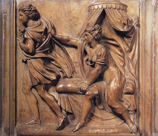
On the right is Properzia de’Rossi’s
Joseph and Potiphar’s Wife (1520s). Vasari mentions that the subject matter of this panel can parallel the unrequited love that Rossi experienced in her own life. I think this comparison is telling about Vasari’s views on women and feminine nature. The editor of my
Lives edition also echoed my thoughts, saying that “while male artists execute works without regard to their personal feelings throughout the
Lives, Vasari seems unable to imagine a woman creating a work of art without sentimental or romantic inspiration.”
1
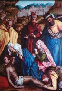
 On the left is Lamentation with Saints (16th century) by Sister Plautilla (Plautilla Nelli). Vasari mentions that Plautilla was an extremely prolific painter, but surprisingly (or perhaps not-so-surprisingly), only three works are definitively attributed to her today. In an effort to bring public awareness to this artist, the Florence Committee of National Museum Women in the Arts paid to have Lamentation restored in 2006 (see news article here).
I think it’s especially interesting that Vasari doesn’t make any statements about Plautilla’s divine role as an artist or God-given talent (which he makes about the male artists in his book). Instead, he stresses that Plautilla and the other ]female artists learned and acquired artistic skill. Futhermore, Vasari wrote this about Plautilla: “But best among her works are those she imitated from others, which demonstrates that she would have created marvellous works if, like men, she had been able to study and work on design and draw natural objects from life.”2 Plautilla was alive when Vasari wrote her biography, and I wonder if she cringed to know that Vasari thought her best works were those that she copied from the divinely inspired, male artists.
 Sofonisba Anguissola is the only female artist with whom I was familiar before reading Vasari. I read about Anguissola when I was doing research on Caravaggio’s Boy Bitten by a Lizard. Several scholars think that Caravaggio’s two versions of this subject were influenced by Anguissola’s Boy Bitten by a Crayfish (also called Boy Bitten by a Crab, c. 1554, on right). Mary Garrard has discussed Anguissola’s drawing in depth. She mentioned how Anguissola painted a picture of a laughing girls, which Michelangelo saw and commented that “the image of a crying boy would have been better.”3 Garrard finds that Michelangelo’s statement implied that boys are better artistic subjects than girls, and tragedy is better than comedy.4 Upon hearing this, Anguissola sent Michelangelo the drawing of Boy Bitten by a Crayfish. However, instead of showing the crying male in a tragic, noble position (and follow Michelangelo’s inferred suggestion), Anguissola shows the boy in an ignoble state with an amused female standing nearby. Wasn’t Anguissola a little sassy? I wonder what Michelangelo thought of the drawing.
Madonna Lucrezia is the other female artist mentioned by Vasari. Unfortunately, there isn’t any (known) surviving art by her. In fact, we know little about Lucrezia beyond that she was active around 1560 and her teacher was Alessandro Allori. It’s sad to think that her work and life is lost to history, most likely because she was a female. I’m glad that Vasari made the effort to mention her and these other females in his Lives, but also disappointed that most females didn’t receive artistic opportunity or art historical attention at the time. It makes me wonder what other female artists have been unappreciated and obscured by historical biases.
Is anyone else shocked that Vasari mentioned female artists in his text?
1 Giorgio Vasari, The Lives of the Artists, translation by Julia Conway Bondanella and Peter Bondanella (London: Oxford University Press, 1991), 565.
2 Ibid., 342.
3 Mary D. Garrard, “Here’s Looking at Me: Sofonisba Anguissola and the Problem of the Woman Artist,” Renaissance Quarterly 47, no. 3 (Autumn, 1994): 611.
4 Ibid., 612.
Monday, November 9th, 2009
Vasari writes that Fra Filippo Lippi made a conscious decision to stop including a lot of hands in his paintings. Apparently, Lippi had been criticized for including too many hands in his compositions, and someone advised him to be aware of that fact.1 Lippi received this sound advice around 1445, and Vasari writes that in later paintings Lippi “covered [the hands] up with draperies or some other invention in order to avoid such criticism.”2
In some ways, you really can see a switch from the “hand” to “hand-free” Lippi. (Okay, in truth, his later paintings aren’t “hand-free,” but often there aren’t as many hands.) Here are some earlier, “handy” paintings:
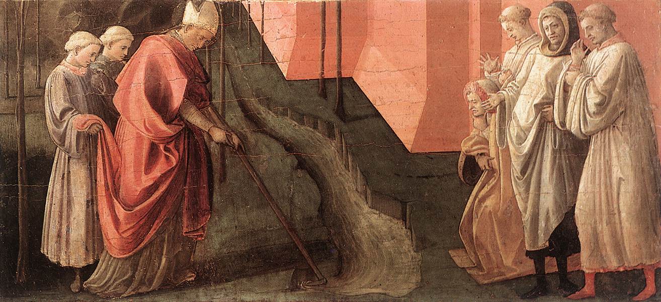
 St. Fredianus Diverts the River Serchio
, c. 1438
There are
way too many hands in the group on the right. And look at the man who is standing on the left side of that group – his hands are awkwardly included in the composition to the point of distraction. It almost looks like that man is going to box the ears of the pious man who is kneeling down.
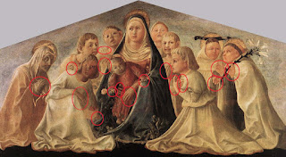
 Madonna of Humility (Trivulzio Madonna), c. 1430
(with red circles added – click here to see a reproduction without circles)
I think this painting is pretty ugly, and the plethora of hands doesn’t help the composition one bit. I circled sixteen different hands. Granted, there are a lot of figures in this painting, but sixteen hands seems a little extreme and unnecessary. Hands pop out in some of the strangest places, too. Check out some of the hands on the left-side of the Virgin.
Lippi’s post-1445 (ahem, post-“handy”) works still include hands, although he often (but not always!) toned down the number of hands and was a little more tactful.

Detail of
Disputation in the Synagogue, 1452-65
Notice how Lippi covered up the figure on the left’s hands with drapery? Smart move. There aren’t any miscellaneous fingers or palms sticking out anywhere, either, which is an improvement.

Detail of
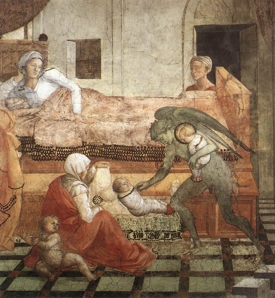
St. Stephen is Born and Replaced with Another Child, 1452-65
Lippi toned down the hands a bit in here – Stephen’s mother covers up one hand with her head, and the seated woman covers up a hand with her knee (although I think her other hand is awkward in its position and placement). And you don’t even see the hands of the figure behind the bed. I think, though, that the woman on the left’s hand is poking out from behind her cloak – it’s a little awkward since its the only part of the woman that we can see, but hey, this is an improvement for Lippi.
Do you know of a “handy” or “hand-free” work by Lippi? What do you think – did Lippi improve by toning down his inclusion of hands? I certainly think so.
1 Giorgio Vasari, The Lives of the Artists, translation by Julia Conway Bondanella and Peter Bondanella (London: Oxford University Press, 1991), 194.
2 Ibid.
Thursday, November 5th, 2009
It’s always interesting to see how an artist depicts an animal that he/she has never seen. Vasari writes that Paolo Uccello wanted to depict a chameleon his Four Seasons, but since the artist had never seen a chameleon, he opted to draw a camel instead.1 I guess you can kind of see Uccello’s logic in picking a camel, since camaleonte and camello are similar words in Italian (the two words are a little similar in English, too). I wish that Uccello’s Four Seasons still existed; I’d love to see what that chameleon/camel looked like.
Durer attempted to depict a rhinoceros, even though he had never seen one. He really didn’t do

too bad of a job (see woodcut print
The Rhinoceros (1515) on the right), although the armor-like plates are a little funny. Durer became interested in the rhino after seeing a sketch and reading descriptions in a letter from Lisbon.
2 The year that Durer made this print, 1515, was a big year for rhinoceroses in Europe. Both the king of Spain and king of Portugal were trying to win the favor of the pope by giving him rhinoceroses. The pope apparently liked the West African rhino (the gift from Spain) best, which allegedly answers why the pope gave more New World territory to Spain.
3 I bet that Durer was trying to maximize on the interest in rhinoceroses during this year, since woodcut prints can be widely distributed, popularized, etc.
There are other animal depictions which I think are amusing. When writing my thesis, I would often chuckle at Aleijadinho’s depiction of a lion. Since the Brazilian artist had never seen a lion before, he sculpted this one with the face of a monkey:

Aleijadinho, detail of lion next to the prophet Daniel, 1800-1805
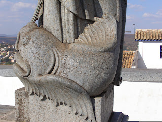
And you have to love Aleijadinho’s great attempt at a whale. I especially love the whale’s two spouts (kind of like nostrils, I guess) and fins:
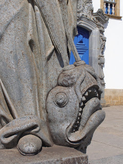
Aleijadinho, detail of whale next to the prophet Jonah, 1800-1805
 Aleijadinho, side-view of Jonah’s whale, 1800-1805
Medieval bestiaries are full of creative depictions of animals. I particularly like
this depiction of a crocodile and
this depiction of an elephant (check out those tusks and horse-like flanks!).
I know there are lots of other interesting/creative/bizarre depictions of creatures that have resulted from the artist never seeing the actual animal. What ones do you know? Do you have a favorite? Let’s see who can give the most bizarre example…
1 Giorgio Vasari, The Lives of the Artists, translation by Julia Conway Bondanella and Peter Bondanella (London: Oxford University Press, 1991), 82.
2 “The Rhinoceros,” in Web Gallery of Art, available from , accessed 5 November 2009.
3 Hemanta Mishra, Bruce Babbitt, Jim Ottaway, Jr.,
The Soul of the Rhino (Guilman, Connecticut: Lyons Press, 2008), 137. Available online here.
Saturday, October 17th, 2009


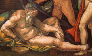
Last night I heard Gary M. Radke give a lecture on the Michelangelo’s Sistine Chapel ceiling (1508-1512). Radke pointed out an interesting similarity between two scenes on the ceiling, the
Creation of Adam (detail on left) and the
Drunkenness of Noah (detail on right). Both of these figures are positioned in the same manner, and Radke finds that to be quite significant.
In order to understand the significance, though, I should explain more about the program of the Sistine Chapel. The panels on the ceiling depict early moments in biblical history, which mainly focus on events around/during the Creation, Fall, and Flood. What is interesting, though, is that one who enters the chapel sees the panels in an anachronistic manner. In other words, the last panel, The Drunkenness of Noah, is the one that is placed over the entrance to the chapel (The Drunkenness of Noah is at the top of this image of the ceiling). As one walks further and further into the chapel, the biblical scenes go backwards in time, showing the Flood, then the Expulsion from the Garden, then the Creation of Adam. Scenes of the Creation appear at the other end of the chapel, culminating in God’s Separation of Light from Darkness (which is located over the altar).
Radke pointed out that it this reversed order is intentional. As one moves closer to the altar and celebration of the mass, one moves closer to God and closer to the moment of purity in the Creation. I think that’s beautiful symbolism; it is as if one moves closer to purity as he/she walks further away from the chapel doorway and the sin that exists in the world. That point is even further emphasized by the choir screen that bisects the length of the Sistine Chapel. The Creation of Adam is placed directly above the choir screen. Therefore, the visitor arrives at that depiction of purity and innocence as he or she walks through the choir screen partition.*
With all this in mind, it’s interesting to see a similarity between Adam and Noah. Noah is shown as a fallen, sinful, elderly man. In contrast, Adam represents the innocence, purity, and youth of the Creation. Yet the two figures are shown in the same position, which emphasizes that Adam and Noah also serve as broader symbols of humanity. I really like that.
*Granted, not everyone would have been able to walk through the choir screen. The lay people would have been expected to stay on the side of the screen which is closest to the doorway. (Too bad for them, huh? They would never be able to approach the pure, sinless moments depicted in the Creation scenes.) Nonetheless, one can still see how the choir screen fits into the program and symbolism of the ceiling.
 My cousin just sent me this post, and I’m so excited/jealous about the news that I have to post right away. The story sounds like a dream-come-true: an Italian couple decided to remodel their apartment and found a 16th century fresco behind their plastered wall! Although Tarcisio and Teresa de Paolis found the fresco in the 1970s, they only recently decided to announce their find to the public (it appears they were worried that they would lose their home because of this discovery).
 The fresco appears to be by Ugo da Scarpi – it is a miniaturized copy of frescoes from Raphael’s “Room of Heliodorus” (1512-1514; located in the Vatican – you can take a virtual tour of the room here). The detail on the right is from Raphael’s fresco The Mass at Bolsena; you can compare this detail with the da Scarpi copy (located in the photograph with the de Paolis couple).
