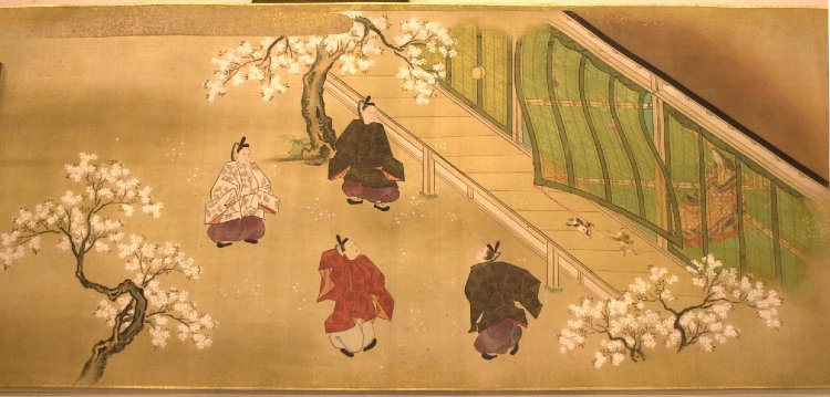
Category

non-Western

Winking in Art

Pieter Bruegel the Elder, detail of "Netherlandish Proverbs," 1559. Image courtesy via Wikipedia.

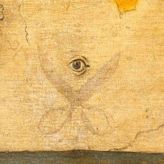
Pieter Bruegel the Elder, detail of “Netherlandish Proverbs,” 1559. Image courtesy Wikipedia.

This afternoon my students and I were discussing some of the proverbs that are referenced in Pieter Bruegel the Elder’s complex painting Netherlandish Proverbs (1559). One student pointed out one particular detail on the wall of the house that I had never noticed before: a pair of open scissors with an eye placed above. I wasn’t familiar with a proverb or a reference to this detail in the painting, so I looked it up afterward.

It turns out that these two symbols are a reference to winking! This image is a play off of the words “Een knip oog,” which means “snip-eye,” or a wink.1 Scholar Alan Dundes, who wrote about the appearance of this symbol in Pieter Bruegel the Younger’s copy of his father’s painting, explained that through this symbol “Bruegel the artist is winking at his audience and he expects the viewer to understand that what he has painted in a huge put-on.”2

Learning about this fun detail made me wonder about the history of winking and whether other winks (either literal or symbolic) appear in art. I haven’t been able to find any scholarly information on the cultural history of winking (if anyone does find something, please let me know!), but I have noticed that obvious references to or depictions of winking appear in examples of art from the Renaissance and onward. (I also realized that it is futile to determine if ancient figures in the composite pose are winking: if the head is in profile view, then only one eye is visible to the viewer, which makes it impossible to ascertain whether a second eye would be open or closed! Ha! I like the thought that Egyptians are actually winking in all of their art, but we just can’t tell.)

I was also interested to see that references to winking appear in both Western and non-Western art. Here are a few examples I came across:

Giuseppe Maria Crespi, “The Courted Singer,” 1700s. Oil on canvas, 58 x 46 cm, Galleria degli Uffizi, Florence. Image courtesy the Web Gallery of Art.

In this painting by Crespi, The Courted Singer (shown above), the winking figure of on the left reminds the viewer that the scene, which depicts a singer being courted, is not inherently gallant or noble. Instead, this singer and her affections are essentially being “bought” with the jewelry and riches offered to her.

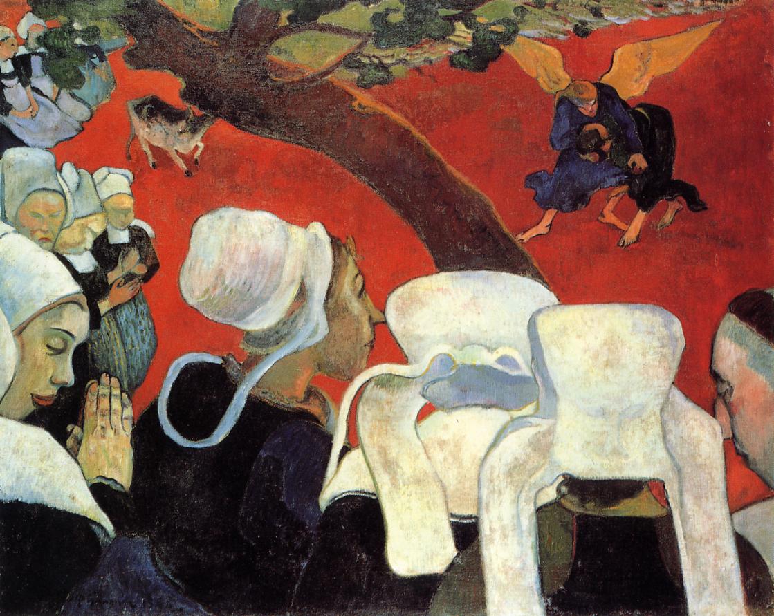
Simon Vouet, “The Fortune Teller,” c. 1618. Oil on canvas, 120 x 170 cm, National Gallery of Canada, Ottawa. Image courtesy the Web Gallery of Art.

Winking was also used between characters within works of art, so that the viewer could understand when a figure was sly or involved in trickery. In this painting by Vouet, a man on the right of the canvas steals the purse from a gypsy woman (who is reading the palm of the woman on the far left). This thief winks to a male accomplice, who looks to me like he might be winking in return.

Master of the Winking Eyes, "Madonna and Child," ca. 1450. National Museum of Women in the Arts, Washington DC.

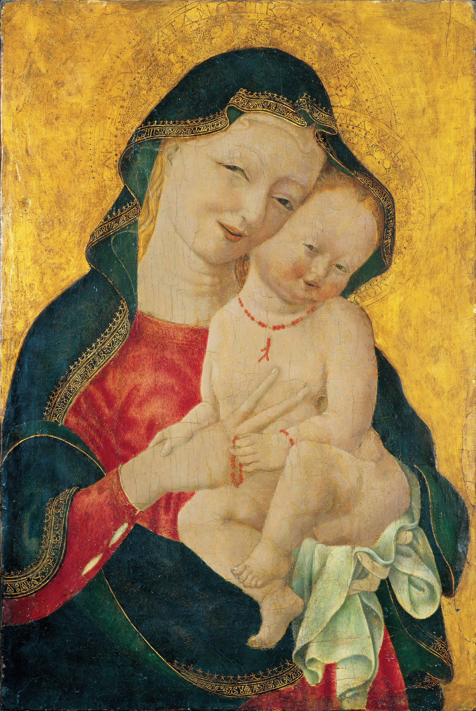
Master of the Winking Eyes, “Madonna and Child,” ca. 1450. National Museum of Women in the Arts, Washington DC.

Although the winking in this picture may be an aesthetic effect rather than an actual part of the subject matter, I still wanted to include this painting by the so-called “Master of the Winking Eyes.” This piece is included in a current exhibition dedicated to representations of the Virgin Mary in art, which includes a section on representations of her as a wife and mother. This painting, among another in the show, prompted one writer to publish this article: “Did the Virgin Mary Tickle the Baby Jesus?”

Huang Yongyu, Owl, 1973. Image courtesy via Wikiart.

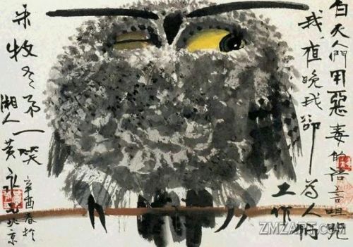
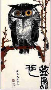
Huang Yongyu, Owl, 1973. Image courtesy Wikiart

Huang Yongu’s Owl is an interesting depiction which caused a lot of controversy. Some interpreted Yongyu’s painting as a self-portrait of the artist who expressing a critique of socialism, and the painting was officially condemned as blasphemous by the Ministry of Culture in March 1974.3 The winking eye in this instance was thought by some to imply, on a basic level, a critique of the socialist system (e.g. officials were turning a blind eye to incorrect behavior). Others did not agree with this interpretation. Even Chairman Mao, who was frustrated with the extent of censorship happening at the time, said with exasperation, “An owl habitually keeps one eye open and one eye closed. The artist does possess the common knowledge, doesn’t he?”Yongu created other versions of the winking owl after this 1973 fiasco, such as this 1977 version and 1978 version.

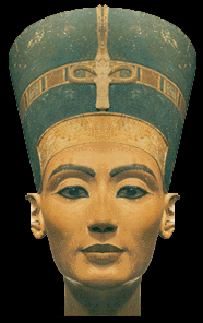
Of course, to end this list, I have to include a .gif of the Nefertiti bust winking. (Since she has an unfinished eye, she does look a little like she could be winking today.) Do you know of other representations of winking in art? I’m sure there are lots of .gifs with winking works of art too, and feel free to also share those in the comments below!

1 Eric Nicholson, “Et in Arcadia the Dirty Brides,” in Transnational Mobilities in Early Modern Theater, by Professor Robert Henke and Dr. Eric Nicolson, eds (Burlington, VT: Ashgate Publishing Company, 2014, p. 99.

2 Alan Dundes, “‘How Far Does the Apple Fall from the Tree?’: Pieter Bruegel the Younger’s Netherlandish Proverbs” in The Netherlandish Proverbs: An International Symposium on the Pieter Brueg(h)els, ed., Wolfgang Mieder (Burlington: University of Vermont Press, 2004): 20. Citation also found online HERE.

3 The painting was subsequently put on display in a Black Paintings Exhibition, in order for its subversive content to be publicly shamed. Eugene W. Wang, “The Winking Owl: Visual Effect and Its Art Historical Thick Description,” in Critical Inquiry 26, no. 3 (Spring 2000): 435. Article available online HERE.

4 Ibid., 436.

— 1 Comment

Frank Capra, Gauguin, and Diagonal Lines

Lately, in coordination with my volunteer responsibilities at a local art museum, I have been reading What Are You Looking At? The Surprising, Shocking, and Sometimes Strange Story of 150 Years of Modern Art by Will Gompertz. Although a good portion of the things in this book are a review for me, I still am learning several new things, which is fun. I also appreciate Gompertz’s humorous and approachable writing style.

This book isn’t without a few minor flaws, however. I am only about a third of the way into the book, but so far I have noticed a few assertions which seem historically unfounded, as well as a quote about Cézanne which was interpreted slightly out of context. But even these slight errors are providing a diversion for me, since they are making me curious in wanting to know more.

One such diversion for me revolved around Gompertz’s assertion that a scene from Frank Capra’s movie It’s a Wonderful Life was influenced by Gauguin’s painting Vision After the Sermon (Jacob Wrestling the Angel). Gompertz points out that the tree in Gauguin’s painting is used to as a compositional device: the tree is set at a diagonal to divide the earthly realm in the lower left portion of the canvas from the heavenly vision in the upper right (shown below).

Gauguin, "The Vision After the Sermon (Jacob Wrestling the Angel)," 1888. Image courtesy WikiArt

Paul Gauguin, “The Vision After the Sermon (Jacob Wrestling the Angel),” 1888. Image courtesy WikiArt

Gompertz then explains that there is a similarity with this composition and a scene from It’s a Wonderful Life. This scene comes just after a pivotal moment in the movie in which George Bailey, who was about to attempt suicide by jumping off a bridge into a river, ended up jumping in the river to rescue the angel Clarence who was drowning.The following scene shows George resting and drying off in a wooden shack with the angel Clarence. Due to the perspective of the camera, some shots of this scene are divided by the diagonal of a clothesline; this line separates the heavenly angel Clarence from the burdened, careworn mortal George Bailey (see below).

Film still from Frank Capra’s “It’s a Wonderful Life” (1946)

I agree with Gompertz that there are compositional and symbolic parallels between Capra’s film and the Gauguin painting. And I appreciate that Gompertz brought this to my attention, especially since It’s a Wonderful Life is one of my favorite movies. My issue, however, is that Gompertz asserts a direct, one-to-one historical relationship between the painting and film. He explicitly states that Capra “referenced this painting” by Gauguin.1 I cannot find any source by Frank Capra or anyone else associated with It’s a Wonderful Life to verify that Capra had Gauguin’s painting in mind when he created his classic film.

Interestingly, though, my research did lead me to find that Capra was interested in Gauguin and his art. Capra’s autobiography, The Name Above the Title (1972), discusses Gauguin at one point. In this section, Capra addresses what some critics could perceive as the “gee whiz!” factor in his films – that is, characters in the films walk around wide eyed, perceiving things as larger than life. Capra defends this “gee whiz” factor by explaining that to some people, “all that meets the eye is larger than life, including life itself.”2 Capra then explains, “Gauguin was a gee whizzer. He painted the South Seas not as he found them, but as he wanted to find them. He created his own South Seas.”3

There is no doubt, then, that Capra thought highly of Gauguin, and it seems like he also liked Gauguin’s paintings, by extension. However, I’m still waiting to find a direct historical connection between It’s a Wonderful Life and Vision After the Sermon, even if a visual connection can be made. If I was writing Gompertz’s book, I would have wanted to point out this visual similarity, but also mention that Capra may have been influenced – either directly or indirectly – by other artistic factors when he considered the set up for this scene with George Bailey and Clarence. I’m particularly reminded of Japanese paintings which use diagonal lines to divide different spaces, such as the division between private and public spheres in a scene from the Tale of Genji (see below).

Kano Ryusetsu Hidenobu, scene from "Tale of Genji," late 17th century - early 18th century

Kano Ryusetsu Hidenobu, scene from “Tale of Genji,” late 17th century – early 18th century

Gauguin’s Vision After the Sermon was definitely influenced by the Japanese aesthetic, but Gauguin wasn’t the only 19th century artist who was interested in diagonal lines (or even trees-as-diagonal-lines, for that matter – see Van Gogh’s Flowering Plum Tree, which is a copy of a Hiroshige print). So, my guess is that several factors are contributing to Frank Capra’s scene. Does anyone have other thoughts or know more about Capra’s artistic influences as a director?

Also, do you know of other places in which diagonal lines are used to create a strong symbolic distinction between two types of spaces (such as earthly and unearthly, or public and private)? This compositional device is intriguing to me.

1 Will Gompertz, What Are You Looking At? The Surprising, Shocking, and Sometimes Strange Story of 150 Years of Modern Art (New York: Plume, 2012), 66. Source available online as a Google Book: http://books.google.com/books?id=gBXxKol-XVYC&lpg=PT56&ots=fD3Hou_k0j&dq=frank%20capra%20george%20bailey%20gauguin&pg=PT56#v=onepage&q&f=false

2 Frank Capra, The Name Above the Title: An Autobiography (London: W. H. Allen, 1972), 138. Source available online as a Google Book: http://books.google.com/books?id=x_E09IWRomMC&lpg=PA138&ots=31sjkINX8o&dq=%22the%20name%20above%20the%20title%22%20gauguin&pg=PA138#v=onepage&q&f=false

3 Ibid.

— 5 Comments

Images of Mothers with Children

Over a year ago, I began collecting images of mothers who were with either a little baby or a young child. I have enough that I want to start a compilation here, so that I can keep track of them all. I know there are hundreds of works of art depicting mothers and children (particularly ones of the Madonna and Child), but these ones are my absolute favorites:

Berthe Morisot, "Le Berceau," 1872

Gustave Klimt, detail from "The Three Ages of Woman," 1908

Kitagawa Utamaro, Midnight-The Hours of the Rat-Mother and Sleepy Child, Edo period, ca. 1790 (Metropolitan Museum of Art)

This woodblock print by Utamaro is from a series called Fuzoku Bijin Tokei (Women’s Daily Customs). To illustrate the “daily custom” of midnight, Utamaro depicts a mother sleepily emerging from her mosquito net to attend to her baby (who in turn rubs sleep from its own eyes). Having lost many hours of sleep myself when my son was a newborn, I can relate! A little more information about this print is available HERE.

Marie Danforth Page, "Her Littlest One," 1914 (National Museum of Women in the Arts)

Her Littlest One was made during a period in which Marie Danforth Page created a lot of noncommissioned paintings of mothers with children. Mary Cassatt’s art had a lot of influence on Page at this time, as did Flemish art from the 17th century.1

Eric Gill, "Madonna and Child," 1925. Wood engraving on paper (Tate)

William Sergeant Kendall, At the End of the Day, 1900 (Seattle Art Museum)

Mary Cassatt, "Breakfast in Bed," 1897 (Huntington Library)

What are your favorite images of mothers with children? Why do you particularly like them?

1 Museum label for Marie Danforth Page, Her Littlest One, Washington, D.C., National Museum of Women in the Arts, June 11, 2013.

— 12 Comments

East and West: The Edo Period in Japan and the Baroque Period in Europe

Due to my involvement as a volunteer at a local art museum, I’ve been learning and thinking a lot about non-Western art lately. I feel really incompetent when it comes to the Asian and African art – especially in terms of building historical context – so I feel a little out of my comfort zone. I’m excited to learn more about these artistic traditions, though.

In order for me to better contextualize and understand these new historical and artistic periods, I try to mentally cross-list each non-Western period with what is happening contemporaneously in European history. It also has been helpful for me to learn about ways that the Westerners interacted with these different cultures, so I can understand each country and time better within its history at large. So far, I feel like I have been able to best remember things that happen during the Edo Period of Japan (1603-1868), because that period coincides with the Baroque period (as well as Romanticism, Neoclassicism, and Realism). It’s been fun for me to find parallels with Baroque art and the early Edo period.

One parallel that I have found between the early Edo period and the Baroque style is the interest in light. The cultural and artistic approaches to light, however, are quite different. In the Baroque period, light was used as an illusionistic painting in order to create drama through tenebrism. Artists created sculptures and architecture which utilized natural light in order to create dramatic visual contrasts of areas which were brightly lit and cast in shadow.

Kano Shigenobou, “Bamboo and Poppies,” early 17th century. Pair or six-panel screens; ink, color and gold on paper. Seattle Art Museum

In the Edo period, the interest in light was quite different and practical. Due to the introduction of Western of firearms in Japan in the 16th century, the Japanese began to build fortress palaces with thick walls.1 The interiors of these fortress palaces was very dark, especially in contrast to the airy, filtered light which permeated through the paper walls of their previous palaces. The Japanese favored indoor screens that were decorated with gold in order to better illuminate the interiors of their new, darkened fortresses. A few examples of such screens are the Shigenobou screen shown above, the Shigenobou screen “Wheat, Poppies, and Bamboo” at the Kimbell Art Museum, as well as the Crow Screen at the Seattle Art Museum. The reflective gold surface provided more light, but I think the gold also is visually dramatic and stunning too, which makes a nice connection with the Baroque style in Europe. In fact, even the flat gold background has some parallel with the dark or ochre monochromatic backgrounds that are found in Caravaggesque paintings.

Hishikawa Moronobu, Beauty Looking Back, 17th century. Tokyo National Museum

The popularity of woodblock prints during the Edo period also is easy for me to remember, due to some parallels with what happens in the West at the same time. During the Edo period, wealthy Japanese merchants could afford to have art, particularly prints. The widespread accessibility of art reminds me a bit of the wealthy middle class and rise of the open art market in Holland during the 17th century. In Japan, a wealthy merchant might decide to purchase a print of a famous geisha or actor. Such subject matter is found in Ukiyo-e prints (“pictures of the floating world”), which were popular between the 17th and the 19th centuries. The artist Hishikawa Moronobu is one of the earliest to have made these types of prints in the 17th century (see one such example above). The accessibility of woodblock prints continued to rise in the subsequent century; technological advancements enabled the printing of multiple colors on a single sheet in 1765.

Do you know of other chronological or artistic parallels between Western and non-Western artistic periods? I’m familiar with chinoiserie and japonisme from a Western perspective, for example – this time I’m trying to make parallels to help me specifically remember points about Asian or African art.

1 “SAMART: Golden Screens of the Kano School,” SAMBLOG of the Seattle Art Museum, accessed May 15, 2014, http://samblog.seattleartmuseum.org/2011/11/samart-golden-screens-of-the-kano-school/


— 8 Comments

Christian and Islamic Art: Flesh vs. Word

Christ, Monastery of Saint Catherine at Mount Sinai, 6th century

I just finished a very busy, busy quarter. One of the classroom discussions that I will remember most involved a comparison between Islamic imagery and Christian imagery. Before discussing Islamic imagery, I introduced my students to Byzantine icons. We discussed how the frontal orientation of figures and direct eye contact were essential in the icon tradition, since such compositional devices encourage interaction with the viewer.1 In the case of the icon of Christ from the Monastery of Saint Catherine (one of the few icons which escaped destruction during the period of iconoclasm in the 8th and 9th centuries), we also discussed how the composition of Christ’s face was significant: “The right side of Christ’s face (our left) is open, receptive and welcoming, whereas his left side – Byzantium’s tradition side of judgment and condemnation – is harsh and threatening, the eyebrow arched, the cheekbone accentuated by shadow, and the mouth drawn down as if in a sneer.”2

To continue this discussion, I emphasized to my students that in many ways figural imagery lends itself to Christianity: Christ assumed a human body (“the Word became flesh”) and Christians are supposed to emulate the actions of Christ. Christians are also encouraged to emulate the lives of virtuous individuals, such as saints and martyrs. Such emulation and mimicry is encouraged when there is figural imagery, perhaps especially when such imagery exists in a narrative scene.

To emphasize this point about mimetic behavior, I had my students read a short article by Gary Vikan on Byzantine icons: “Sacred Image, Sacred Power.” I really like Vikan’s discussion of images and imitative behavior, which he supports with a 4th century quote from St. Basil. Basil explains how there is a parallel between the workshop practice of artists and the appropriate behavior of Christians:

“…just as painters in working from models constantly gaze at their exemplar and thus strive to transfer the expression of the original to their artistry, so too he who is anxious to make himself perfect in all the kinds of virtue must gaze upon the lives of saints as upon statues, so to speak, that move and act, and must make their excellence his own by imitation.”3

Jan Steen, "The Dissolute Household," ca. 1663-64

Although there were periods of iconoclasm in Christian history, I believe that the mimetic behavior of Christians is one of the reasons that figural imagery generally has prevailed in Christian art. And even during some of the comparatively later periods of iconoclasm, such as that experienced by Protestants, the secular imagery at the time was still based on mimetic behavior – particularly the moralizing themes found in Northern Renaissance and Northern Baroque art. Even when Christians weren’t looking toward strictly religious subject matter, they still looked toward paintings to help enforce what behavior they should mimic or avoid. Such moralizing paintings were created by Jan Steen, including The Dissolute Household (ca. 1663-64, see above).

Dome of the Rock, 687-91 CE, Jerusalem. Image courtesy Wikipedia

In contrast with Christianity, Islam doesn’t have exactly the same type of foundation in mimetic behavior: God revealed himself to Mohammad through his word, and therefore the words of the Qu’ran take precedence in religious imagery.4 For Islam, words are the embodiment of God. This point was emphasized in an article that I shared with my students, “The Image of the Word” by Erica Cruikshank Dodd. She explains, “The written or the recited Koran is thus identical in being and in reality with the uncreated and eternal word of God. . . If God did not reveal Himself or His Image to the Prophet, he nevertheless revealed a faithful ‘picture’ of his word.”5 God sent down his image in the form of a book. In turn, Muslims decorate the interior and/or exterior of their religious spaces with phrases from the Qu’ran, as can be seen on the exterior of the Dome of the Rock (a structure that Oleg Grabar describes as a “very talkative building”).

Floriated kufic script at the Sultan Hassan Mosque-Madrassa in Cairo, after 1356 CE

Despite the fundamental differences in Islamic art and Christian art, it is fun to notice some visual similarities. I like to consider how the words of the Qu’ran, as depicted in flat, two-dimensional text, have parallels with the flat stylizations found in many Byzantine icons. In some cases, as seen in the kufic script above, the elongation of the script has an interesting parallel with the elongation of human figures in Byzantine art. Furthermore, both text and image limit the distance between the viewer and representation by rejecting three-dimensional illusionism. As a result, the devout viewer is able to get as close to the embodiment of God as possible, whether that be an image or text.

1 Other visual devices in icons which encourage interaction with the viewer include the gold background (which removes the distraction of earthly or “real” time), half-length figures (to push the figure closer to the viewer), and overly-large eyes.

2 Gary Vikan, “Sacred Image, Sacred Power,” in Late Antique and Medieval Art of the Mediterranean World by Eva R. Hoffman, ed. (Malden, MA: Blackwell Publishing, 2007), 137.

3 Ibid., 140.

4 Although Muslims strive to maintain lifestyle outlined and practiced by the Prophet Muhammad, as explained in the Sunnah, the writings of the Qu’ran are the primary source for the Islamic faith and its religious art.

5 Erica Cruikshank Dodd, “The Image of the Word,” in Late Antique and Medieval Art of the Mediterranean World by Eva R. Hoffman, ed. (Malden, MA: Blackwell Publishing, 2007), 193.

— 16 Comments

Email Subscription


Archives

About

This blog focuses on making Western art history accessible and interesting to all types of audiences: art historians, students, and anyone else who is curious about art. Alberti’s Window is maintained by Monica Bowen, an art historian and professor.