Category

books

Frank Capra, Gauguin, and Diagonal Lines

Lately, in coordination with my volunteer responsibilities at a local art museum, I have been reading What Are You Looking At? The Surprising, Shocking, and Sometimes Strange Story of 150 Years of Modern Art by Will Gompertz. Although a good portion of the things in this book are a review for me, I still am learning several new things, which is fun. I also appreciate Gompertz’s humorous and approachable writing style.

This book isn’t without a few minor flaws, however. I am only about a third of the way into the book, but so far I have noticed a few assertions which seem historically unfounded, as well as a quote about Cézanne which was interpreted slightly out of context. But even these slight errors are providing a diversion for me, since they are making me curious in wanting to know more.

One such diversion for me revolved around Gompertz’s assertion that a scene from Frank Capra’s movie It’s a Wonderful Life was influenced by Gauguin’s painting Vision After the Sermon (Jacob Wrestling the Angel). Gompertz points out that the tree in Gauguin’s painting is used to as a compositional device: the tree is set at a diagonal to divide the earthly realm in the lower left portion of the canvas from the heavenly vision in the upper right (shown below).

Gauguin, "The Vision After the Sermon (Jacob Wrestling the Angel)," 1888. Image courtesy WikiArt

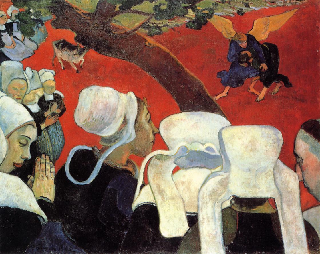
Paul Gauguin, “The Vision After the Sermon (Jacob Wrestling the Angel),” 1888. Image courtesy WikiArt

Gompertz then explains that there is a similarity with this composition and a scene from It’s a Wonderful Life. This scene comes just after a pivotal moment in the movie in which George Bailey, who was about to attempt suicide by jumping off a bridge into a river, ended up jumping in the river to rescue the angel Clarence who was drowning.The following scene shows George resting and drying off in a wooden shack with the angel Clarence. Due to the perspective of the camera, some shots of this scene are divided by the diagonal of a clothesline; this line separates the heavenly angel Clarence from the burdened, careworn mortal George Bailey (see below).

Film still from Frank Capra’s “It’s a Wonderful Life” (1946)

I agree with Gompertz that there are compositional and symbolic parallels between Capra’s film and the Gauguin painting. And I appreciate that Gompertz brought this to my attention, especially since It’s a Wonderful Life is one of my favorite movies. My issue, however, is that Gompertz asserts a direct, one-to-one historical relationship between the painting and film. He explicitly states that Capra “referenced this painting” by Gauguin.1 I cannot find any source by Frank Capra or anyone else associated with It’s a Wonderful Life to verify that Capra had Gauguin’s painting in mind when he created his classic film.

Interestingly, though, my research did lead me to find that Capra was interested in Gauguin and his art. Capra’s autobiography, The Name Above the Title (1972), discusses Gauguin at one point. In this section, Capra addresses what some critics could perceive as the “gee whiz!” factor in his films – that is, characters in the films walk around wide eyed, perceiving things as larger than life. Capra defends this “gee whiz” factor by explaining that to some people, “all that meets the eye is larger than life, including life itself.”2 Capra then explains, “Gauguin was a gee whizzer. He painted the South Seas not as he found them, but as he wanted to find them. He created his own South Seas.”3

There is no doubt, then, that Capra thought highly of Gauguin, and it seems like he also liked Gauguin’s paintings, by extension. However, I’m still waiting to find a direct historical connection between It’s a Wonderful Life and Vision After the Sermon, even if a visual connection can be made. If I was writing Gompertz’s book, I would have wanted to point out this visual similarity, but also mention that Capra may have been influenced – either directly or indirectly – by other artistic factors when he considered the set up for this scene with George Bailey and Clarence. I’m particularly reminded of Japanese paintings which use diagonal lines to divide different spaces, such as the division between private and public spheres in a scene from the Tale of Genji (see below).

Kano Ryusetsu Hidenobu, scene from "Tale of Genji," late 17th century - early 18th century

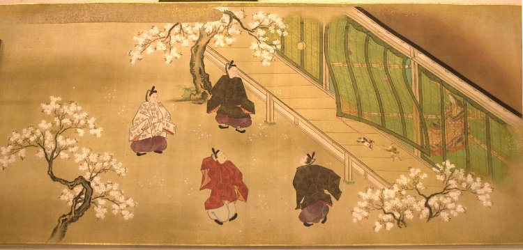
Kano Ryusetsu Hidenobu, scene from “Tale of Genji,” late 17th century – early 18th century

Gauguin’s Vision After the Sermon was definitely influenced by the Japanese aesthetic, but Gauguin wasn’t the only 19th century artist who was interested in diagonal lines (or even trees-as-diagonal-lines, for that matter – see Van Gogh’s Flowering Plum Tree, which is a copy of a Hiroshige print). So, my guess is that several factors are contributing to Frank Capra’s scene. Does anyone have other thoughts or know more about Capra’s artistic influences as a director?

Also, do you know of other places in which diagonal lines are used to create a strong symbolic distinction between two types of spaces (such as earthly and unearthly, or public and private)? This compositional device is intriguing to me.

1 Will Gompertz, What Are You Looking At? The Surprising, Shocking, and Sometimes Strange Story of 150 Years of Modern Art (New York: Plume, 2012), 66. Source available online as a Google Book: http://books.google.com/books?id=gBXxKol-XVYC&lpg=PT56&ots=fD3Hou_k0j&dq=frank%20capra%20george%20bailey%20gauguin&pg=PT56#v=onepage&q&f=false

2 Frank Capra, The Name Above the Title: An Autobiography (London: W. H. Allen, 1972), 138. Source available online as a Google Book: http://books.google.com/books?id=x_E09IWRomMC&lpg=PA138&ots=31sjkINX8o&dq=%22the%20name%20above%20the%20title%22%20gauguin&pg=PA138#v=onepage&q&f=false

3 Ibid.

— 5 Comments

Book Review: “The Horses of St Mark’s: A Story of Triumph in Byzantium, Paris and Venice”

Replica quadriga (four horses) of Saint Mark's, Venice, late 20th century (after originals probably from the 2nd to 4th centuries CE)

Replica quadriga (four horses) of Saint Mark’s, Venice, late 20th century (after originals probably from the 2nd to 4th centuries CE)

I visited St. Mark’s in Venice on a study abroad over ten years ago, but I don’t remember much about my experience. The basilica itself was undergoing some major renovation, and my impression of the interior revolved more around scaffolding than mosaics. I remember seeing the porphyry portraits of the tetrarchs on the exterior, but I don’t remember seeing the replica sculptures of horses (see above) at Saint Mark’s (located above the main portal). I also don’t remember seeing the original horses (shown below in the basilica museum). In fact, the horses of Saint Mark’s never caught my attention in any type of book or article until I received a copy of The Horses of Saint Mark’s: A Story of Triumph in Byzantium, Paris and Venice by Charles Freeman.

I really liked learning about the horses and their “biography” over the centuries as I read this book, but I have to admit that the chapters dealing with the political history of Venice were rather dull to me. It almost felt like Freeman was trying to bulk up material for his book by adding in extra information about Venice, which wasn’t quite pertinent to the story of the horses.

Despite the sections of this book that I found dull, I really enjoyed reading several sections of it. These horses have a very complex history and are unique in several ways. Here are a few other things enjoyed learning in this book:

Quadriga (Four Horses) of Saint Mark's, probably 2nd to 4th centuries CE. Image courtesy Wikipedia

Original quadriga (Four Horses) of Saint Mark’s, probably 2nd to 4th centuries CE. Image courtesy Wikipedia

  • These horses were probably made in the late Roman period. Freeman thinks that they may have been created as a crowning sculpture to a triumphal arch, since quadrigae were often depicted pulling a god or hero (such as an emperor) in a chariot. Freeman thinks that these horses may have appeared on a triumphal arch commemorating Septimius Severus’s victory over Byzantium in 195 CE.1
  • Chariot races and horses (and therefore sculptures of quadrigae, by extension) are associated with triumph and power in Greco-Roman culture. Originally, chariots were seen as synonymous with the power of the gods, but Roman emperors became associated with this symbol of power since the hippodrome/circus was a public venue where the emperor could be physically seen by his people and also display imperial power through ceremonies.2
  • These horses are very unusual, given that they are made almost entirely in copper. The mixture is about 98% copper, 1% tin and 1% lead. Typically, bronze contains about 10% of tin-and-lead mixtures, although sometimes as high as 20%.3 Copper has a higher melting point than bronze, so when it comes to casting, these large-scale horses are the product of great technical feats.
  • Originally, these sculptures were also gilt, and Freeman thinks that these horses were intentionally cast in copper so that the gold layers would adhere properly to the surface. These horses appear to have been gilt with a method which involves mercury, a substance which reacts with tin and lead; the mercury method can’t be used successfully if one is gilding with regular bronze.4 I’m sure these horses would have been very striking back in the day, especially if they were gilt and displayed outdoors!
  • These horses have traveled a lot over the centuries. We know they were located in Constantinople, and probably were located at the hippodrome or the Milion, an imperial building that was located outside the hippodrome but near its starting gates. The horses were likely brought to the hippodrome or Milion from some other monument too, such as the Septimus Severus arch that Freeman proposes.5 From Constantinople, the horses then were brought to Venice in the Fourth Crusade of 1204, after Constantinople was sacked. The horses were removed from the façade of St. Mark’s in December 1797 by orders of Napoleon, and from there were taken to Paris. While in Paris, the horses decorated the gates of the Tuileries Palace and then later on a triumphal arch dedicated to Napoleon (Arc du Carrousel) in the front of the Tuileries.6
  • The intervention of the Venetian sculptor Antonio Canova led to the return of these horses to Venice after Napoleon’s downfall in 1815. The horses were taken down in September of 1815 and arrived in Venice in December of that same year.7 After an exhibition in the early 1980s, in which one of the horses starred as the main attraction, all four original horses were placed inside Saint Mark’s in 1983 in an effort to preserve the sculptures against the adverse effects of pollution.8
  • The horses of Saint Mark’s have been often assessed in terms of their aesthetic quality. When the Parthenon Marbles caused a sensation in the 19th century after their arrival and display in England, British artist Benjamin Haydon drew a sketch to compare the Parthenon horse (from Selene’s chariot) with one of the horses of Saint Mark’s (see below). In this drawing, Haydon aimed to show the superiority of the Parthenon sculpture over that of horse from Saint Mark’s. Haydon found that the eyes of the Saint Mark’s horses were not true to life; he argued that they were too sunken in appearance to be realistic or plausible. He also wrote that the nostrils “of the Venetian horses seem wrongly placed, the upper lip does not project enough and there is an evident grin as [if it] had the snarling muscles of a carnivorous animal. . . it looks swollen and puffed as if it had the dropsy.”9
Landseer. etching after Benjamin Haydon's 1819 drawing "Study Of The Horse’s Head From The East Pediment Of The Parthenon And Of The Head Of One Of The Horses Of St Mark’s Basilica, Venice."

Landseer. etching after Benjamin Haydon’s 1819 drawing “Study Of The Horse’s Head From The East Pediment Of The Parthenon And Of The Head Of One Of The Horses Of St Mark’s Basilica, Venice.”

I think that these horses probably have one of the most complex known biographies within Western art history. Like many objects that are displaced and transported throughout their symbolic lives, these horses often were moved as a result of war and conquest. I’m glad that these horses have been able to remain intact over the centuries, despite their propensity to travel!

1 Charles Freeman, The Horses of St. Mark’s: A Story of Triumph in Byzantium, Paris and Venice (New York: The Overlook Press, 2004), 296.

2 Ibid., 63-65.

3 Ibid., 263.

4 Ibid., 265.

5 For a discussion of other possible locations of the horses, specifically the original location (besides the Septimus Severus arch theory) and the later location after the transformation of Constantinople by Constantine, see Ibid., 29-31, 89-91.

6 Ibid., 201-205.

7 Ibid., 219-220, 223-224.

8 Ibid., 254-255.

9 Ibid., 231-232.

— 1 Comment

Book Review: “From Marble to Flesh: The Biography of Michelangelo’s David”

Michelangelo, "David," 1501-1504. Image via Wikipedia, courtesy of Rico Heil.

Michelangelo, “David,” 1501-1504. Marble, 17′ tall. Image via Wikipedia, courtesy of Rico Heil

This summer I’ve found it more convenient to read eBooks for a variety of reasons, including convenience while I travel. I just finished reading a brand-new book From Marble to Flesh: The Biography of Michelangelo’s David by A. Victor Coonin. I really enjoyed reading this book; it is written in a very engaging and approachable way. The book discusses the history of Michelangelo’s “David,” including the various locations where the sculpture either was intended to be placed or actually placed.

Additionally, the book discusses the famous sculpture’s impact on society and culture over the centuries. I especially liked the chapter which discussed the cultural impact which the David has had on artists, activist groups, and other types of people and communities. It was neat to read about ways in which the David has been recreated and also “cloned” in visual culture, including Banksy’s sculpture from the Banksy vs. the Bristol Museum exhibition in 2009.

I learned a lot of new things about Michelangelo’s “David” when reading this book. There are a lot of interesting tidbits and facts that have sparked my curiosity, and I intend to do a lot of follow-up research on the ideas that Coonin presented. For now, though, I want to highlight several things from this book that I found particularly interesting:

  • Before reading this book I knew that Michelangelo’s “David” originally was intended to adorn a spur above the tribune outside the Florence Cathedral, but I didn’t know that the original plan for the spurs included a whole sculptural program with twelve freestanding, life-sized figures of Old Testament prophets.1 (This is particularly interesting to me, given my own research on Aleijadinho’s twelve sculptures of Old Testament prophets outside Bom Jesus dos Matozinhos in Brazil.)
  • Four sculptures were created for the Florence Cathedral series of prophets before Michelangelo was born: Isaiah (1408) by Antonio and Nanni di Banco; David (1408-09) by Donatello; the gigantic multi-media sculpture Joshua (c. 1410) by Donatello; and a gigantic statue by Antonio di Duccio which probably depicted the prophet Daniel (1464-65). Donatello’s David sculpture may be lost, but some scholars think that it might be Donatello’s David in the Bargello Museum or perhaps another bearded prophet in the Museo dell’Opera del Duomo collection.2  We We know Isaiah was placed a cathedral spur, but when Donatello’s David was completed, Isaiah was taken down and neither sculpture remained on the exterior. It could be that the life-size sculptures were too small to be seen when placed up high.
  • After Isaiah and Donatello’s David were made, an oversize sculpture (called the “giant” or “White Colossus”) of Joshua was made out of brick, clay and gesso (which was whitewashed to give the appearance of marble).3  This sculpture remained in place for several centuries, and we can get an idea of its original placement from a 17th century print by Israel Silvestre (see print detail). Several decades later, Agostino di Duccio created a similar giant (probably a figure of Daniel) out of terracotta in 1464-65 (which is now lost, but does appear on a view of the Cathedral printed in 1584).4
  • I knew that Michelangelo’s “David” was created from a discarded piece of marble (which was thought to be unable to be turned into a sculpture). However, before reading this book I didn’t know that the discarded marble actually was intended to be for the series of twelve Old Testament prophets, too. This marble was quarried in 1464 by Agostino di Duccio, and seems to have been roughly outlined into some anthropomorphic form before it ultimately was abandoned.5
  • In addition to the famous marble sculpture, Michelangelo also created a bronze David, but this sculpture was composed a bit differently. Although this sculpture no longer exists, we can get a semblance of Michelangelo’s working process for the sculpture from a study drawing. We also know more about the final appearance from a drawing of the sculpture by Rubens.
  • The art historian Heinrich Wölfflin really didn’t like Michelangelo’s David at all. He wrote, “What does Michelangelo put forth as his ideal of youthful beauty? A gigantic hobbledehoy, no longer a boy and not yet a man, at the age when the body stretches, which the size of the limbs does not appear to match the enormous hands and feet…Then we have the unpleasant attitude, hard and angular, and the hideous triangle between the legs. Not a single concession has been made to the line of beauty.”6
  • Michelangelo’s David was attacked in 1991 by Pietro Cannata, a mentally-instable visitor who came into the Galleria dell’Accademia. Cannata’s hammer (which had been hidden in his jacket) severed the second toe of the statue’s left foot.7
  • After New York City was attacked on September 11, 2001, the city of Florence offered to send a copy of the David to be placed at Ground Zero. This offer never materialized for some reason, but the gesture suggests how much the David has come to represent hope.8

My only main critique of this book is in the small size and low quality of the resolution for several of the images, which I realize may be an inevitable result of reading an eBook instead of a printed publication. Sometimes it was difficult to see what Coonin was trying to point out in the images because of their small size, and enlarging the images on my iPad made the pictures look very grainy and pixelated. But I did like that there were a lot of images and that they were in color. I assume (and would hope) that the images are more clear in the printed version of the text.

Overall, however, I highly recommend this book. From Marble to Flesh can appeal to all kinds of people, not just art historians. Coonin writes in an easy-to-read manner, but also takes time to define any art history term that is necessary for the reader to understand. I’m excited about all of the things that I learned in this book, and I think anyone interested in Renaissance art or cultural studies will be excited about this book, too.

Thank you to Alexandra Korey and The Florentine Press for providing a review copy of this book.

1 A. Victor Coonin, From Marble to Flesh: The Biography of Michelangelo’s David (Florence: Florentine Press, 2014), 26, ePub for iBooks (vertical orientation).

2 Ibid., 34-37.

3 Ibid., 38.

4 Ibid., 48-49.

5 Ibid., p. 63.

6 Heinrich Wölfflin, The Art of the Italian Renaissance: A Handbook for Students and Travelers (New York and London: 1903), 54-56.

7 Coonin, 16.

8 Ibid., 320.

— 4 Comments

Carel Fabritius’s “The Goldfinch” and Fiction

Carel Fabritius, "The Goldfinch," 1654. Oil on panel, Maurithaus Collection

Several months ago, a student recommended that I read the novel The Goldfinch by Donna Tartt, since the book revolves around a stolen painting. I finally had a chance to read the book over the past week. I enjoyed a lot of things about this engaging book, though I also felt like most of the story was overwhelmingly depressing – I wish I had been warned about that!

The stolen painting in this work of art actually does exist, although it was never stolen in actuality. Carel Fabritius, a student of Rembrandt, painted The Goldfinch in 1654. (You can learn more about this painting and Fabritius HERE). I am struck by this painting in a few ways, particularly due to the creamy colored background (which was thought to be yellow, due to discolored varnish, before a restoration in 2003). The light background is particularly interesting to me, because Fabritius would have probably was taught more about dark, Caravaggesque backgrounds by Rembrandt. The Goldfinch still seems a bit Caravaggesque to me, in terms of the light and dark contrasts created by the shadows of the bird and box, but it also seems anti-Caravaggesque because of the light background itself. Was Fabritius conscientiously going against the Caravaggesque fad at the time?

It’s difficult to know Fabritius’s intentions with this painting or his now-lost works of art. Today, only about a dozen paintings are known to be by Fabritius. The Goldfinch was painted the same year that Fabritius died in an tragic accident: a gunpowder magazine near the artist’s studio in Delft exploded, which killed the artist and probably destroyed much of his work. This explosion greatly affected the people of Delft, since a large part of the city was destroyed and hundreds are estimated to have died. Another artist, Egbert van der Poel, painted several depictions of this historic explosion, including The Burning City which is part of the Seattle Art Museum’s permanent collection. Donna Tartt explains about Fabritius’s untimely death in her novel, and draws a parallel with another modern-day tragedy in the book that happens to the protagonist. All of Tartt’s quotes and historical information about paintings and artists in the novel seemed accurate to me, although I noted that one character erroneously asserted that Fabritius was Vermeer’s teacher.1

The protagonist, Theodore Decker, moves from scenario to scenario in which he is forced to endure extreme tragedies, sorrows, and the deal with the negative consequences of bad actions (either due to his own actions or those around him). I found it interesting that the goldfinch was a pervading icon throughout this book that revolves around suffering, since in Christianity the goldfinch is a symbol of Christ’s Passion and suffering. I didn’t feel like this symbolic idea was ever explicitly addressed in the book. The goldfinch eats thistles, which associate it with the Crown of Thorns placed on Christ’s head. It also has bright red markings on its face, which connects it to the blood of Christ. Many artists, both before and after the lifetime of Fabritius, painted the goldfinch in a variety of religious contexts due to these symbolic associations.

Giambattista Tiepolo, detail of "Madonna of the Goldfinch," c. 1770

Raphael, detail of "Madonna of the Goldfinch," c. 1505-1506. Image courtesy Wikipedia

Fabritius lived at a time when Dutch artists, in typical Protestant fashion, were interested in creating secular, albeit moralizing, works of art. The goldfinch was a popular pet in Holland in 17th century, so in many respects this painting is similar to a genre paintings or still life. There even could be a moralizing theme to this work of art: the bird is chained to a wooden box, which could pose a message about domesticity and flight.2 Regardless of the impetus to create secular subject matter in Holland, I do think that Fabritius would have probably been aware of the religious symbolic significance of this bird, too. If Tartt had included this idea in her novel, I think it could have added another layer of significance and meaning to her book.

1 Donna Tartt, The Goldfinch (New York: Little, Brown and Company, 2013), 26. Although it appears that Fabritius influenced Vermeer, a contemporary artist who lived in Delft, there is no historical documentation that Fabritius was Vermeer’s teacher. In fact, it is thought unlikely that Fabritius taught Vermeer.

2 Frick Museum, “The Goldfinch.” Available online here: http://www.frick.org/exhibitions/mauritshuis/605. Alternately, it has been proposed that the bird is not chained to the box, but to a water-like container that is in the box. Goldfinches were known for performing the trick of collecting their own water. The bird could have been chained to a thimble-like container with which it could access water in the wooden box. In Dutch, the goldfinch is known as “het putterje” (“The Water Drawer”)  for this reason; Fabritius’s painting is titled “Het Putterje” in the Dutch language.

— 6 Comments

The Female Body and Horizontal Images

Sherman, Untitled 94, "Centerfolds" series, 1981

Over the past few weeks I’ve been reading Lives of the Artists by Calvin Tomkins. I’ve been thinking a lot about the chapter dedicated to Cindy Sherman, particularly when she discusses the controversy regarding her “Centerfolds” series from 1981. This series began as a commission from Artforum‘s editor Ingrid Sischy. The format of the commission would have involved two facing pages, which led Sherman to think about “centerfold” photographs from men’s magazines like Playboy. Sherman decided to highlight this reference by using a horizontal format for her photographs, although she added an element of irony by depicting clothed women in supine or semi-supine positions. However, the pictures were never included in the magazine; it was thought that the irony would be lost and “misunderstood” by militant feminists.1 Sherman continued to explore this horizontal format, however, and finished the “Centerfolds” series despite the rejection.

Cindy Sherman, Untitled 96, "Centerfolds" series, 1981

Reading about the “Centerfolds” series and its horizontal format has prompted me to think about about various ways in which the orientation of a work of art can convey meaning. I can understand why the horizontal orientation would be used for a centerfold in a magazine, if only for practical purposes. But I have realized that the horizontal format also is preferred for a lot of depictions of nude females over the centuries. The paintings that immediately come to mind for me are Titian’s Venus of Urbino (1538), Ingres’s The Grand Odalisque (shown below) and Gauguin’s Spirit of the Dead Watching (“Manao Tupapau”, 1892).

Ingres, "The Grand Odalisque," 1814

So, why would a horizontal format be preferred by some artists of the female form? I approached this topic through the lens of feminist analysis (in relation to female objectification and the “male gaze”), and here are some ideas which I came up with:

  • The horizontal orientation the medium implies rest and repose. The image is “at rest” – as emphasized by the horizontal lines on the top and bottom of the canvas or medium itself. This suggestion of repose can perhaps suggest a contrast between the active viewer and the image itself.
  • Repose and rest is emphasized in the horizontal orientation of the subject matter. In this way, the object can be interpreted as passive as well, which draws a contrast with the active viewer.
  • It may be easier to objectify a body through a horizontal orientation, since the body might be more visually approachable to the viewer in a horizontal format. A horizontal body can fill the field of vision on part of the viewer, for example. Along these lines, viewers may find it more approachable to see a large-scale depiction of a body that is horizontally oriented: one may feel unable to objectify a vertically-oriented image in which the sitter towers over the viewer.
  • A thought: Could it be that the female form is more predisposed to horizontal orientations because females are traditionally associated with the land and earth? I’m reminded of the horizon lines of landscapes and wonder if there might be some parallel. In contrast, I often think vertical lines often are associated more with masculinity (e.g. phallic imagery, skyscrapers, etc.).

Cindy Sherman noted herself that the horizontal format conveyed certain meanings to viewers of her “Centerfolds” series. She said, “…the horizontal format was a problem. Filling that space meant using some kind of prone figure, and that made it seem to some people that I was glorifying victims, or something.”2 As a change, Sherman decided to adopt a vertical format for her next series, called “Pink Robes.”

Sherman, Untitled 98, "Pink Robes" series, 1982

Although these vertically-oriented images do not automatically suggest a centerfold spread in a magazine, Sherman explained the following about the “Pink Robes” series: “I was thinking of the idea of the centerfold model. The pictures were meant to look like a model just after she’d been photographed for a centerfold. They aren’t cropped, and I thought that I wouldn’t bother with make-up and wigs and just change the lighting and experiment while using the same means in each.”3

In contrast to the objectification that seems to be implied through the horizontal orientation of the “Centerfolds” series, I think that “Pink Robes” puts more stress on the subjecthood and identity of the model, particularly due to the vertical format. The subjects imply activity and alertness because they are propped “upright” through the vertical position of the frame. Even though the subjects in these scenes imply some vulnerability through their loosely-draped pink chenille bathrobes, the vertical format still suggests strength and presence.

What types of meanings do you think can be conveyed through horizontally- or vertically-oriented images of the female form? Can you think of other examples of representations of the female form which seem to relate to the orientation of the composition and medium?

1 Calvin Tomkins, Lives of the Artists (New York: Henry Holt and Company, 2008), 33.

2 Ibid., 34.

3 Paul Taylor, ‘Cindy Sherman’, Flash Art, no.124 (Oct.-Nov. 1985): 78-9. Source quoted online here: https://www.tate.org.uk/art/artworks/sherman-untitled-98-p77729/text-summary

— 8 Comments

Email Subscription


Archives

About

This blog focuses on making Western art history accessible and interesting to all types of audiences: art historians, students, and anyone else who is curious about art. Alberti’s Window is maintained by Monica Bowen, an art historian and professor.