Saturday, April 22nd, 2017
Jackson Pollock’s “Sea Change”
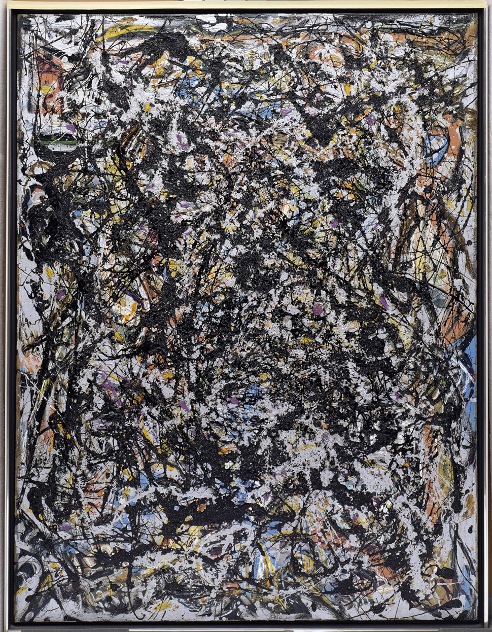
Jackson Pollock, “Sea Change,” 1947. Artist and commercial oil paint, with gravel, on canvas, 57 7/8 x 44 1/8 in. (147 x 112.1 cm), Gift of Signora Peggy Guggenheim to the Seattle Art Museum
Lately I’ve had some opportunities to study and think about Jackson Pollock’s painting Sea Change (1947, above) at the Seattle Art Museum. This painting is fascinating to me for several reasons, including its interesting history regarding how it was gifted to the Seattle Art Museum by Peggy Guggenheim. I also like the painting from a visual perspective: I like to try and trace which layers of paint were placed first, although it is difficult to tell (which isn’t surprising in some ways, since Pollock would work for uninterrupted sessions of 20-30 minutes or more, but later would revisit paintings that he didn’t feel like were finished).1
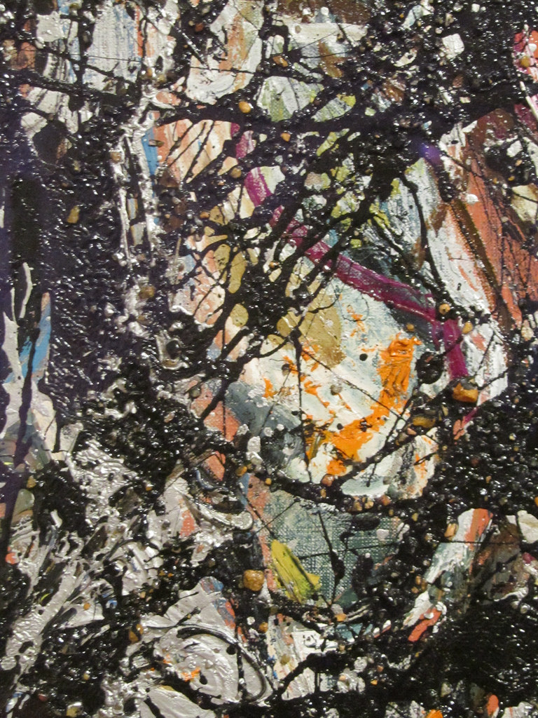
Detail of Jackson Pollock’s “Sea Change,” 1947. Artist and commercial oil paint, with gravel, on canvas, 57 7/8 x 44 1/8 in. (147 x 112.1 cm), Gift of Signora Peggy Guggenheim to the Seattle Art Museum
Some of the layers in Sea Change painting are also especially unusual, because Sea Change was completed (as a drip painting) on top of an earlier Pollock painting. Pollock’s earlier style involved more gestural strokes of paint that were directly applied with the paintbrush touching the canvas (as seen, for example, in his Mural from 1943). The Seattle Art Museum recently conserved Sea Change, and a video points out some of the areas which reveal Pollock’s original painting underneath the dripped paint. In the detail image above, you can see some bits of blue and reddish-orange paint (now serving as an underlayer to the dripped paint) that were smoothly applied with a brush.
The multiple layers of the painting are compelling to me visually, because they play with perceptions of illusionism and space. On one hand, the multiple layers appear complex, but the thickness and viscous nature of the paint simultaneously also reminds me that the layers rest (almost hover) on the flat surface of the canvas. As a result, the painting “suggests a visual space that appears infinitely deep yet shallow at the same time.”2
The thing that I also like about Sea Change is that is isn’t comprised merely of paint, but also of gravel that Jackson Pollock found at a gravel pit near his home in Long Beach (see detail image above). Pollock often would add other materials to his paintings, “such as sand, small pieces of hardware, pebbles and string, to emphasize the ‘thingness’ of the work and to point out that the work was no mystical icon removed from the world; rather, the painting was of the world.” In other words, the gravel helps to assert that this painting, despite its lack of representational subject matter, is grounded in reality.
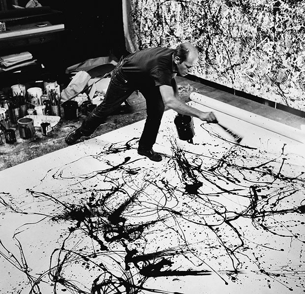
Hans Namuth, photograph of Jackson Pollock working in his studio, 1950
Pollock’s gestural movements also help to ground the painting in reality too, because the viewer can get a sense of Pollock’s physical exertion and real experience in creating the work of art. When creating his drip paintings, Pollock would place his canvases on the floor while he worked. This placement was intentional for Pollock, not only so that gravity could aid the paint to drip downward, but also so Pollock could sense his own physical relationship with the painting. He said, “My painting is direct. I usually paint on the floor. . . Having the canvas on the floor, I feel nearer, a part of the painting . . . similar to the Indian {Navaho] sand painters of the West.”3
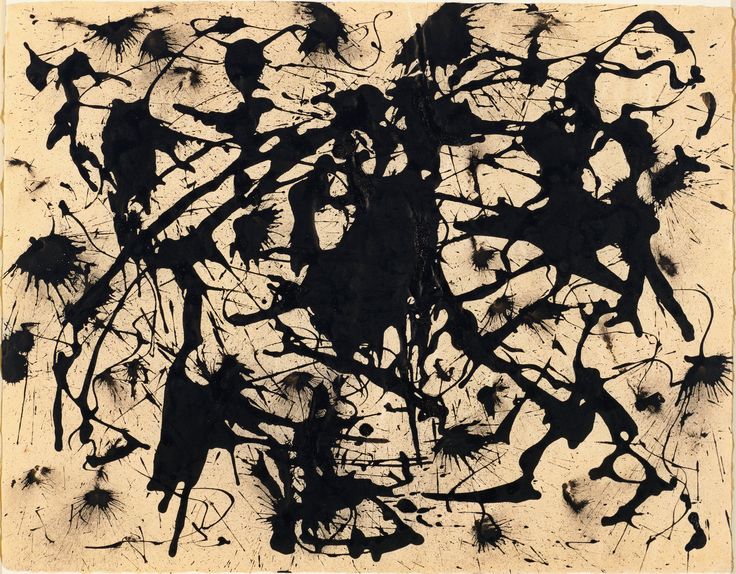
Jackson Pollock, Untitled, c. 1950 Museum of Modern Art
Lee Krasner, an Abstract Expressionist painter who was married to Pollock, explained that Pollock painted with different tools, “using sticks and hardened or work-out brushes (which were in effect like sticks) and basting syringes . . . His control was amazing. Using a stick was difficult enough, but the basting syringe was like a giant fountain pen. With it he had to control the flow of paint as well as his gesture.” Sea Change is a very early example of a drip painting by Pollock, so it seems most likely that he was using a sticks or hardened brushes. In contrast, the basting syringes were used later by Pollock, as seen in his Untitled painting c. 1950 at the Museum of Modern Art (shown above).
What are your favorite paintings by Jackson Pollock? Do you prefer his earlier style with the smooth gestural strokes, the classic drip paintings like Sea Change, or the later “fountain pen” drip paintings that were made with the basting syringe? I like how different types of energy are conveyed through Pollock’s diverse experimentations with painting. It is unsurprising to me that he once said, “My concern is with the rhythms of nature.” After all, various forms of energy and rhythm are manifest in the world; some of them are subtle and lyrical, and others are quite explosive.
1 Michael Corris, “From Abstract Expressionism to Conceptual Art: A Survey of New York Art c. 1940-1970” in Art and Visual Culture 1850-2010: Modernity to Globalization by Steve Edwards and Paul Woods, eds. (London: Tate Publishing, 2011), 233.
2 Ibid.
3 Ibid.


