Archive

September 2009

"Dark Water": Florence Flood of 1966

Tonight I finished reading Dark Water (by Robert Clark) as part of Heidenkind’s Art History Challenge. This book focuses on the 1966 flood in Florence which ruined and threatened many works of art. I liked a lot of things in this book, particularly in the middle section where Clark discusses damaged art/books and restoration techniques. I have to admit, though, that Clark’s writing style and half-baked themes about Icarus/water/Ruskin were annoying.

Anyhow, I was most fascinated about how much damage was caused by this flood (which was around 20′ deep in some areas). Clark writes that some 14,000 moveable artworks were damaged or destroyed.1 The Biblioteca Nazionale also suffered extensive damage; 1.3 items needed restorative work and 8 million catalog cards were inundated.2 It was also interesting to read about the innovative things that art/museum directors did to save pieces of history and culture – I particularly enjoyed reading about how the science museum’s director escaped the flood by walking along the roof towards the neighboring Uffizi gallery, while cradling Galileo’s telescope in her arm.

Here are some pictures taken right after the flood (by LIFE photographer David Lees):

Interior of the Basilica of Santa Croce, 6 November 1966
(Look at all that mud!)Moving Paintings in the Piazza Signoria, 6 November 1966Flood Damaged Books, 1966

Damaged Documents Hanging on Racks, 1966

Pretty crazy, huh? Does anyone have any recollections from when this flood occurred?

A large portion of the book discusses the destruction and restoration of Cimabue’s Crucufix from Santa Croce (c. 1288). Water damaged a good portion of the painting, and it took about ten years for the huge piece to be restored (partially because the wooden cross had absorbed so much water). There was a lot of controversy as to whether the cross should be restored at all, since there was so much damage. Ultimately, it was decided that overlapping trateggio (hatching applied with a fine brush) would be placed in the damaged areas, so that the viewer could see the damage but also get a sense of the original composition. I know that some restorers still disagree with how the Crucifix was restored, but it seems to me like the restoration team did a their best, given their limitations.

Here’s a picture of the original crucifix (photographed before 1966):


And here are two post-restoration photographs (the first one is from 1977):

cimabue crucifix restored flood

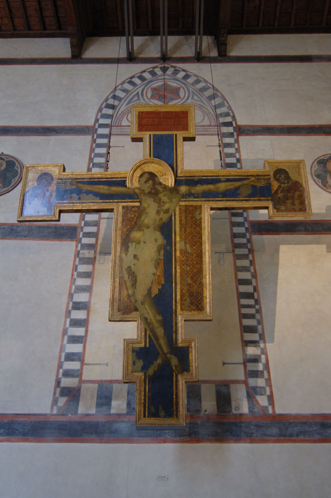
What do you think of the restoration? Do you wish that the area was painted over to give a semblance of Cimabue’s original work, or do you like that the restoration recognizes the damaged areas?

All in all, Dark Water was a pretty interesting book to read. I found the beginning and end of the book to be a little boring, but the bulk of the book was quite fascinating.

1 Robert Clark,
Dark Water: Flood and Redemption in the City of Masterpieces (New York: Doubleday, 2008), 162.

2 Ibid., 225.

— 9 Comments

Can You Spot Jackson Pollock’s Name?

Jackson Pollock, Mural, 1943 (University of Iowa Museum of Art)

My aunt just forwarded me this intriguing article from the most recent edition of Smithsonian.com. The writer of the article argues that Jackson Pollock hid the letters of his name among the swirls of his painting Mural (shown above). If you can’t see these letters right-off-the-bat (I certainly couldn’t), click here to see the Smithsonian interactive site.

What do you think about this? Do you buy it? Can you see the letters? I’m kind of on-the-fence about it. I think it’s possible that Pollock might have included his name – I can see the “P” and “O” of his last name very distinctly. At the same time, though, I think that if a person stares at this painting long enough, they can see tons of other letters. I’ve been looking at this painting for a while, and (with the help of my imagination?) I can see a capital “A” in the lower right corner and a cursive, capital “T” in the upper right corner. So, I don’t know if I’m completely sold on the idea. Nonetheless, it’s fun to think about.

Do you spot anything else? If anyone can help me find a portrait of Clement Greenberg hidden in this painting, I’ll give you five bucks. And then we can co-write a new article for Smithsonian.

— 5 Comments

Enablers for "The Exotic" Experience

During the 17th-19th centuries, colonization and global expansion were growing trends in European culture. Although many Europeans enjoyed the benefits of colonization through imported goods (you do realize that British tea originally came from China, right?), most people would never travel to the exotic, faraway colonies that were claimed by their native countries. Instead, it is apparent that many people turned to fine art and the decorative arts as a way to visualize and experience the exotic. Really, the European view of what constituted “the exotic” was rather distorted from what the actual colonies were like. Travel accounts were a popular way for Europeans to learn about faraway lands, but the writers of these accounts often mythicized their subject matter, in order to make the story more interesting and marketable.
So, it can be argued that “the exotic” is really a European construct. Artists appealed to the interest in this construct by painting “exotic” subject matter. It’s interesting to look at colonial art from this period, and see how it enables Europeans to experience the exotic (or, in truth, what Europeans perceived as exotic).

The Dutch colonists began to arrive in Brazil in the 1620s. Two Dutch artists, Frans Post and Albert Eckhout, were commissioned to artistically record the landscape, people, flora, and fauna of the new Brazilian colony. For the most part, Frans Post concentrated on painting Brazilian landscapes. Post focused on painting specific kinds of flora and fauna in his Brazilian paintings, which likely means that Post “intended his images to be true to the particular landscapes that he depicted.”1


After leaving Brazil, Post continued to paint Brazilian landscapes. However, these later landscapes are not accurate or true-to-life depictions like Post’s earlier works. Instead, these paintings are more imaginary and fantastic, which likely was due to the European demand for mysterious and exciting subject matter in exotic art. You can see Post’s exotic elaborations in the detail of the painting, View of Olinda, Brazil(1662, shown above). Next to the tropical plants, Post includes a sloth, monkey, armadillo, anteater, and a lizard. There is no way that all these animals would realistically appear together, outside of their natural habitats. I think, though, that Post is using this artistic liberty as an enabling mechanism, so that the viewer can experience a saturated “exotic” experience. Interestingly, Post also used much brighter colors in his later landscapes of Brazil, which can tie into this stress on exoticism, since the bright colors could emphasize a striking contrast between the exotic world and Europe.

I mentioned that travel journals were an important aspect of creating “the exotic” construct. Since the time of Alexander the Great, Europeans found the Orient, particularly China, to be an idealized, paradisiacal environment. Associations with China as a type of Paradise, Garden of Eden, or Promised Land are implied in various travel journals which circulated Europe at this time. Ultimately, China was considered to be a “Celestial Empire” by the Europeans, who perhaps would have been able to understand the various descriptions of the Orient better through this Christian perspective.2

I really like how some European religious furniture was decorated with chinoiserie (a Western European style that contained Eastern artistic elements). I think that chinoiserie can be viewed as an enabler for a Western worshiper to have an exotic (and more religious) experience. This Roman prie-dieu (18th century, shown above) is a kneeling bench that was intended for prayer. It is decorated with gilded chinoiserie designs on a dark green background. Even the top of the prie-dieuboard is decorated in chinoiserie. Therefore, when a prayerful worshiper approached this piece, kneeling down onto the design, it would be as if he was placing himself within the chinoiserie landscape. In other words, due to the paradisaical connotations with the East, the worshiper could kneel and place himself in the exotic, celestial realm of God for the duration of his prayer. This association and transcendent experience could heighten the religious experience for the European worshiper, who could feel a more intimate connection with God while temporarily abiding in His heavenly environs.Can you think of a better way for art to enable one to experience the exotic, than to invite the viewer to kneel and physically enter the exotic realm? I think this prie-dieu is awesome.

Interest in “the exotic” continued into the 19th century. Some painters, such as Delacroix, were interested in exotic subject matter of the East. Their paintings and interests created the movement Orientalism, a French facet of Romanticism.
There is so much to say about this subject (for example, Linda Nochlin’s feminist interpretation of Orientalist art is fascinating!), but I just want to mention one thing in regards to technique.3 I think it’s interesting that Delacroix uses a painterly approach in his exotic painting, Women of Algiers (1834, shown left). It has been noted that, because of this tactile technique, Delacroix’s figures are “redolent of the exotic, perfumed, and drugged harem atmosphere.”4 I think that this is an interesting approach to enable the viewer to experience the exotic; Delacroix renders the paint to be tactile and visually-available, which perhaps makes the exotic experience seem within-reach of the viewer.
What do you think of “the exotic” construct and its manifestation in art? I wonder if such an exaggerated and incorrect view of a country (or culture) could exist today, since photographs and films are readily accessible to help one experience or learn about a faraway country. What do you think?
1 Edward J. Sullivan, ed., Brazil: Body and Soul (New York: Guggenheim Museum Publications, 2003), 69.
2 Hugh Honor, Chinoiserie: The Vision of Cathay, (London: John Murray Publishers, Ltd., 1961), 4-6.

3 See Linda Nochlin, “The Imaginary Orient,” in Politics of Vision: Essays on Nineteenth-Century Art and Society (New York: Harper & Row, 1989), 33-59.

4 Laurie Schneider Adams, A Western History of Art (New York: Harry N. Abrams, Inc., 1994), 356.

— 5 Comments

Browere’s Life Mask of Jefferson

Have you heard the story of how Thomas Jefferson was nearly killed by the artist John H. I. Browere? The elderly, retired statesman and ex-president was approached in 1825 by Browere, who asked to be allowed to take a life mask of Jefferson. Apparently, Browere was not very skillful; the plaster hardened too quickly, which impaired Jefferson’s breathing and ability to cry out for help. Luckily, Jefferson’s hand was resting on a nearby chair, and he was able to bang it on the floor to bring attention to his distress.

To make matters worse, Browere did not apply enough oil on Jefferson’s face, so the plaster stuck to the frail man’s face. Browere had to use a mallet and chisel to break the plaster off of Jefferson’s skin, and the ex-president reportedly groaned and even sobbed during the whole ordeal.1 When discussing the removal process, Jefferson wrote in a letter that “there became a real danger that [my] ears would separate from [my] head sooner than from the plaster.”2

Poor man. It’s no wonder that Jefferson wrote in the same letter, “I now bid adieu for ever to busts and even portraits.”3

The above photograph of this infamous life mask was taken in 1939 by LIFE photographer Bernard Hoffman. Jefferson’s expression doesn’t look to happy – and can you blame him? The man couldn’t breathe!

Understandably, Browere didn’t have the greatest reputation. He was called an “itinerant sculptor” by Dumas Malone and a “vile plaisterer” by Jefferson’s granddaughter.4 Artists in the American Academy (i.e. Trumbull) and National Academy were opposed to Bowere, too.5 It seems, though, that the ambitious writer Charles Henry Hart was able to overlook all of Bowere’s faults. In 1899 Hart published a thorough examination of Bowere’s life casts in a book, and he even went as far as to call Bowere an “ingenious” man.6 (No doubt such a statement reflected well on Hart, who credited himself with rediscovering the artist.) Hmph.

Granted, I do think it is really fun to see life casts of so many prominent members from American history. In that aspect, I’m appreciative of what Bowere did. (If you are interested, you should look at some of the life casts in Hart’s book, found online here). As an artist, though, Bowere definitely was lacking in skill. After all, he almost killed one of the Founding Fathers through his incompetence.

Let’s end this post with a more pleasant portrait of Jefferson, shall we? At least Jefferson appears to breathe freely in this bust:

Houdon, Thomas Jefferson, 1789 (Museum of Fine Arts, Boston)

1 Annette Gordon-Reed, The Hemingses of Monticello (New York: W. W. Norton & Company, 2008), 626.

2 Thomas Jefferson to James Madison, 18 October 1825, in Smith, Republic of Letters, 3:1942-43. See also Gordon-Reed, 627.

3 Ibid.

4 Gordon-Reed, 626.

5 Charles Henry Hart, “Life Masks – Those Browere Made of Great Americans. Charles Heny Hart’s Comments on Them.” New York Times, 8 April 1899. Copy of article can be accessed here.

6 Charles Henry Hart, Browere’s Life Masks of Great Americans (Doubleday & McClure Company, 1899), x. Citation can be accessed online here.

— 9 Comments

Vermeer’s Milkmaid

I have been thinking a lot about Vermeer’s The Milkmaid (c. 1660) lately, mostly because of the publicity given to the current special exhibition at the Met. The last time The Milkmaid was on display in the United States was the 1939 World’s Fair. Curator Walter Liedtke has given this painting a very unusual and provocative interpretation, which I first learned about on a recent post by Lee Rosenbaum (CultureGrrl). You can read Liedtke’s discussion here, and also listen to a short radio interview with Rosenbaum here.

Liedtke thinks that the milkmaid can be interpreted in a more suggestive light, partially because of the inclusion of a foot warmer (a popular symbol for arousal in Dutch 17th century art) and the image of Cupid (on the tiles next to the foot warmer, shown above).

When I first heard of this interpretation, I guffawed and immediately thought of this newspaper cartoon that appeared in 1907:

This cartoon appeared in the Dutch publication, Het Vaderland. It was drawn at a time when Vermeer was gaining a lot of international attention. Prices had become so high for “Vermeers” that only American millionaires could afford to buy them. For example, Henry Clay Frick bought three Vermeers for his personal collection and home (which is now a museum in New York). The Dutch began to be concerned that The Milkmaid, which had been in the collection of an Amsterdam family for almost a century, would also be bought by the Americans. This idea of Americans snatching up all of Vermeer’s paintings is embodied in this part of the cartoon, where Uncle Sam is courting “Holland’s best-looking milkmaid.”1

Anyhow, I keep thinking about this cartoon and Liedtke’s interpretation. With an American art historian interpreting the maid in a more sexual light, it now seems as if Uncle Sam is making a sexual proposition in the cartoon. (Yikes!) I wonder what Dutch scholars are going to think of this new theory. Maybe they’ll think that Liedtke Uncle Sam is a scuzz bag.

Or maybe not. In all honesty, though, I have found Liedtke’s theory to be interesting and semi-compelling (despite my initial reaction). I have never noticed the milkmaid’s foot warmer before, but I have seen foot warmers in a lot of other Dutch paintings. At just about the same time that Vermeer painted The Milkmaid, Jan Steen included foot warmers in many of his moralizing paintings, like The Lovesick Maiden (c. 1663-65) and The Doctor’s Visit (c. 1660). Here, the morality of the young girls are called into question by the presence of foot warmers (which suggest arousal because a girl is warmed underneath her skirt). Although Vermeer may have included the foot warmer to create a realistic scene (Henry Rand argues that the foot warmer indicates that the milkmaid’s “kitchen is not properly heated”), I think it is probable that there is symbolic significance.2 After all, Vermeer included symbols in his other paintings, so The Milkmaid is probably not an exception.

What do other people think about Liedtke’s interpretation? Is the milkmaid naughty or nice? Do you think people will get upset with Americans for desecrating this popular symbol of the Dutch Golden Age? Maybe we’ll have to wait another seventy years (or longer!) before the Dutch will let us borrow one of their masterpieces again.

1 Emma Barker, Nick Webb, and Kim Woods, eds., The Changing Status of the Artist, (London: Yale University Press, 1999), 214. Ultimately, the Dutch government voted for funds to acquire The Milkmaid, so that the painting would stay in Holland. To see the other half of the cartoon, in which the milkmaid decides to choose a Dutchman as her suitor, click here.

2 Jonathan Janson, “What is the Milkmaid Cooking?” available from http://www.essentialvermeer.com/catalogue/milkmaid.html; Internet, accessed 15 September 2009.

— 7 Comments

Email Subscription


Archives

About

This blog focuses on making Western art history accessible and interesting to all types of audiences: art historians, students, and anyone else who is curious about art. Alberti’s Window is maintained by Monica Bowen, an art historian and professor.