Let’s Reconsider (and Republish on) the “Well of Moses”
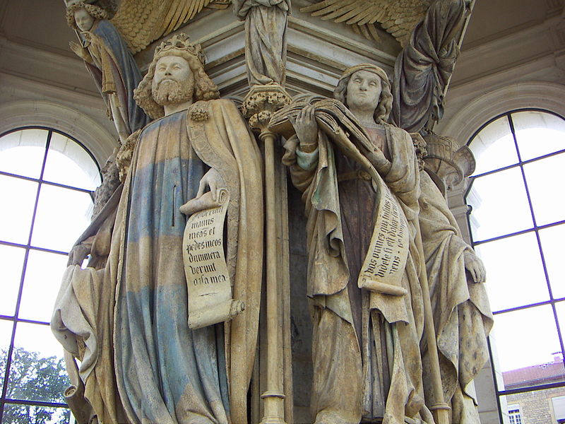
Claus Sluter, detail of David and Jeremiah from the "Well of Moses," 1395-1406. Chartreuse de Champol, Dijon. Image courtesty simonsara via Wikipedia.

I didn’t plan on spending my winter break rooting out an error in Stokstad’s Art History textbook. I promise! I just happened upon this error when looking for more information about the lost Calvary composition, which was originally part of Claus Sluter’s “Well of Moses” (1395-1406). In truth, the “Well of Moses” originally served as a base for a large sculptural composition, which included a crucifix. Today’s “Well of Moses” is just a shadow of the original work produced by Sluter. On a side note, you may find it interesting that the “Well of Moses” is a relatively recent nickname for this work of art, having first been used in the late 18th century. Instead, early sources refer to this monument as “The Cross” or “The Great Cross.”From what I can gather, the original crucifix composition largely was destroyed in 1791, during the French Revolution. One can get a general sense of how the “Well of Moses” appeared by looking at a 16th century copy that is located at the Hôpital Général in Dijon, although there are no figures included with the Calvary scene (see below).
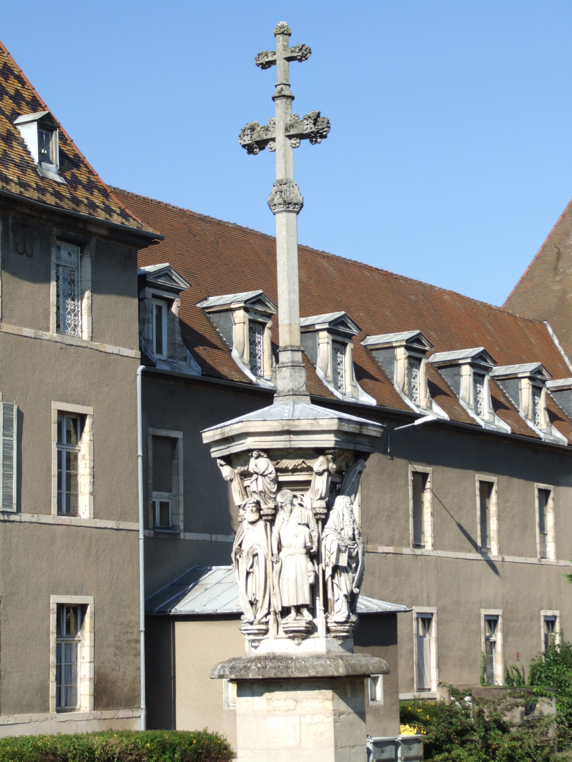
Copy of the "Well of Moses" group, 1508, Hôpital Général, Dijon. The cross is a nineteenth century reconstruction. Image available on Wikipedia via Christophe.Finot

Anyhow, Marilyn Stokstad’s recent art history book points out that that the Calvary group on top of the “Well of Moses” included three figures at the base of the crucifix: the Virgin Mary, John the Evangelist, and Mary Magdalene.2 In the mid 19th century, a model of the Well of Moses was created by Joseph Moreau which showcased these three figures at the base of the crucifix. (It should be noted that sculptural fragments of Christ and Mary Magdalene both exist, but there never have been any fragments found of John the Evangelist or the Virgin Mary.)

I am disappointed that Stokstad’s Art History does not take recent research on the “Well of Moses” into account. A study published in 2005 reveals a very different (and unexpected) result of the crucifix composition. As part of a three-part series of articles on the “Well of Moses,” Susie Nash (of the Courtauld Institute) points out that the Calvary composition only depicted one figure at the base of the cross: Mary Magdalene.3 During the relatively recent restoration of the “Well of Moses” (a fifteen year project that ended in 2004), Nash was able to analyze the top of the “Well of Moses,” including the original mount for the crucifix. Nash also analyzed the remaining fragments from the Calvary composition, too, including the arms of Mary Magdalene. Nash concluded that the composition of the remaining base and extant fragments reveal that only one figure was located at the base of the cross. She also concluded, based on the fragments of the Mary Magdelene figure’s arms, that the Magdalene was originally embracing the foot of the cross. She supports her argument which archival evidence too, including an 18th century drawing of the Hôspital Général “Well of Moses” copy (see below).
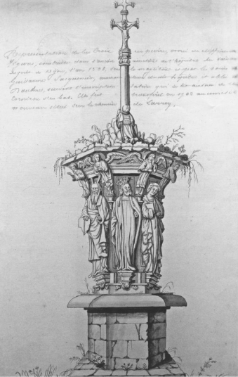
Maurice Bauthélier, "La Belle Croix," c. 1760. Drawing of the 16th century copy of the "Well of Moses," located at the Hôspital Général in Dijon

Although there are some problems with this 18th century drawing (the figure depicted has short locks instead of the flowing, long hair of the Magdalene), it seems pretty obvious that the crucifix composition did not originally include figures of the Virgin Mary and John the Evangelist. (Nash concludes her 2005 article by promising to discuss later how the crucifix itself also appeared differently than usually supposed. This topic ended up being the premise for the article, “Claus Sluter’s ‘Well of Moses’ for the Chartreuse de Champol Reconsidered: Part II,” published by Nash in July, 2006.)

In some ways, perhaps I shouldn’t be too hard on Stokstad for mentioning three figures at the crucifix base instead of just one. Nash herself points out, “The belief that Sluter’s Calvary had three figures is so entrenched in the scholarly literature of the last 160 years that their existence has never been questioned.”4  But, as I have said before, I do feel like such a major art history textbook should be better at keeping up with current scholarship. Is Stokstad’s Art History so confidently “entrenched” that it doesn’t feel the need to include groundbreaking ideas? Omissions like Nash’s scholarship on Sluter reinforce to me that Stokstad’s book is not “the most…inclusive art history text on the market.” Although I think there are some great things about that textbook, I don’t think that Art History should be the art historian’s bible.

P.S. Don’t forget that my giveaway on the Irene Duclos book ends tomorrow!

1 Susie Nash, “Claus Sluter’s ‘Well of Moses’ for the Chartreuse de Champol Reconsidered: Part 1,” The Burlington Magazine 147, no. 1233 (December, 2005): 798. Article available online on Nash’s faculty webpage. I have translated the contemporary sources from French, which read “la croix” or “la grant [sic] croix.”

Marilyn Stokstad and Michael Cothren, Art History, vol. 4 (Prentice Hall, 2011), p. 564.

3 Nash, 799, Susie Nash also has two other publications on the Well of Moses, which were published in The Burlington Magazine in July 2006, pp. 456-67 (Part II) and November 2008, pp. 724-741 (Part III). These two articles are also available on Nash’s faculty webpage.

4 Ibid., 799.
— 3 Comments

Female Artists and Nativity Scenes

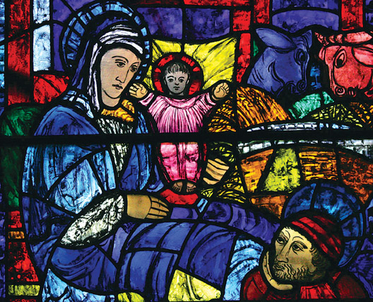
Evie Hone, detail of "Nativity," 1946. Stained glass window located at Saint Stanislaus College, Tullabeg

Keeping in line with the theme for this week on female artists (in connection with my ongoing GIVEAWAY!), I wanted to write a Christmas post on female artists who painted Nativity scenes. This was a much more frustrating project than I anticipated; it was difficult to come up with examples to share. I suppose I shouldn’t be surprised that there aren’t too many (extant) examples out there, but I am a little disappointed. In some ways, it seems a little ironic that the most famous artistic scenes about birth were created by men!

One of the examples that I enjoyed discovering was the Nativity window located at Saint Stanislaus College in Tullabeg, Ireland (see detail above). This window was created by the artist Evie Hone in the mid-20th century. Originally trained as a painter, Hone turned toward stained glass later in her career. S. B. Kennedy writes that this change to stained glass “gave [Hone] free rein to her growing power as a colorist.”1

There are a few contemporary nativity scenes which I think are interesting. Janet McKenzie was commissioned to create The Nativity Project. I think her painting Mary and the Midwives (2003) is quite interesting, not only in terms of style but also subject matter and composition. I also think Flor Larios’ Nativity Star (n.d.) is fun, as well as the Nativity scenes by Valerie Atkisson.

As for more historical art (pre-20th century), I have learned that most of the nativity paintings either longer exist (or are not available online). For example, a Nativity by Lucrina Fetti (17th century) was destroyed during the Napoleonic era.2  Similarly, I can’t find any location for the nativity scene that was made by Victorian artist Eleanor Vere Boyle (etched in brown ink on vellum).Another “untraced” painting was created by the discalced Carmelite nun, Maria Eufrasia della Croce painted a nativity scene for the church San Giuseppe a Capo al Case. The painting received quite a bit of praise. In the 17th century, Filippo de Rossi said that this painting was created by “a most excellent nun and painter of the place.”4 Even Bruzzio was able to drum up some praise for this painting, saying that “even if it is by a woman it is not a displeasing work.”

It is disappointing that these works don’t exist anymore. However, don’t let this thought keep you from enjoying the Christmas holiday, friends! Do you know of any other nativity scenes (or “Adoration of the Shepherds” scenes) created by female artists? Please share! One of the only other examples (which is kinda-sorta similar to Christmas nativity scenes) is Artemisia Gentileschi’s Birth of Saint John the Baptist (c. 1635).

Happy holidays!

1 S. B. Kennedy, “Evie Hone,” in Dictionary of Women Artists, vol. 1 (Chicago: Fitzroy Dearborn Publishers, 1997), p. 402. Available online here.

2 Myriam Zerbi Fanna, “Lucrina Fetti” in Dictionary of Women Artists, vol. 1 (Chicago: Fitzroy Dearborn Publishers, 1997), p. 520-21. Available online here.

3 Ellen Creathorne Clayton, English Female Artists, vol. 2, p. 358.

4 Marylin Dunn, “Convents,” in Dictionary of Women Artists, vol. 1 (Chicago: Fitzroy Dearborn Publishers, 1997), p. 26. Available online here. See Franca Trinchieri Camiz, “Croce,” in Dictionary of Women Artists, vol. 1 (Chicago: Fitzroy Dearborn Publishers, 1997), p. 421. Available online here.

5 Camiz, 421.

— 2 Comments

Book Review and Giveaway: “Irene Parenti Duclos: A Work Restored, an Artist Revealed”

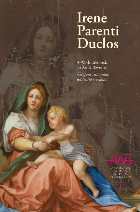
Cover image of "Irene Parenti Duclos: A Work Restored, an Artist Revealed"

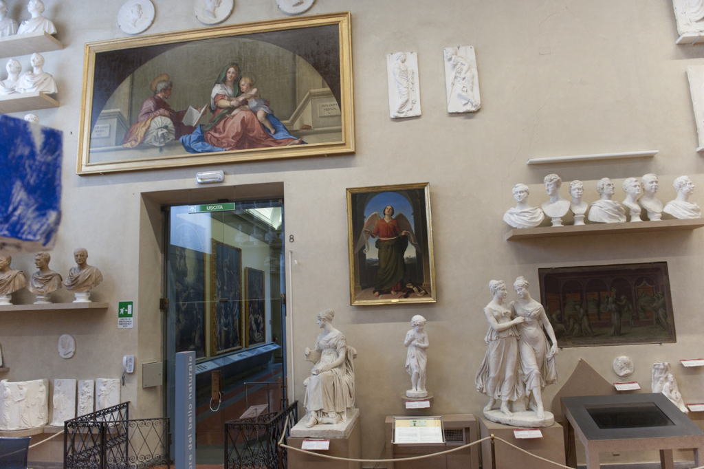
Over the past few weeks I have had the pleasure to read a new book on a female painter, Irene Parenti Duclos. This book, Irene Parenti Duclos: A Work Restored, an Artist Revealed, was published by the Florentine Press in October 2011. I wasn’t familiar with Duclos before reading this book; she was well-respected female painter in 18th century from Florence. This book was written (in part) to discuss the restoration of Duclos’ copy of Andrea del Sarto’s Madonna del Sacco (18th century, detail of Duclos’ copy appears on book cover above). Coincidentally, the restoration of the Duclos canvas occurred at the same time that Andrea del Sarto’s original fresco (1525) underwent restoration (compare del Sarto’s pre-restoration fresco to the restored version). Scholars were able to collaborate and learn more about Duclos (and the del Sarto fresco) during this restorative period. You can read a little more about the Duclos copy and restoration here.

Duclos' "Madonna del Sacco" (18th century) in the Accademia post-restoration

This book is great for a lot of different reasons. For one thing, I like that this book was written and promoted with the help of the Advancing Women Artists Foundation. (What a great cause!) I also like the book has appeal to a lot of different types of people: art historians, feminists, connoisseurs, and restorers. The book pages are divided to accommodate text in two languages (English and Italian), and therefore appeals to an international audience.

Book chapters are divided into different topics of interest. Some of the chapters are more technical than others (especially the last two chapters, which discuss the restoration of the canvas and the digital microscopy used in the process). Although these last two chapters were the most difficult for me to read (my art-historical brain isn’t used to scientific language!), I still thought the discussion was interesting.

As a feminist art historian, I was particularly interested the discussions on female artists. I liked reading a little bit more about Angelica Kauffman, Elizabeth Vigeé Le Brun, and other Italian female artists with whom I was not familiar before. Although Duclos was a painter in the 18th century, the discussion of female artists even expands to include the Renaissance artist, Suor Plautilla Nelli. I was happy to see that Nelli was discussed in detail; I learned just a little about her when I read Vasari’s Lives of the Artists, but I’ve had difficulty learning more biographical information about her. I also appreciated that this book served as a call to action. Nelli’s large-scale painting from the 16th century, Last Supper (which is the only known version of this subject matter produced by a female artist) is in dire need of restoration. Hopefully this publication will bring more exposure to the works of female artists that need preservation and attention.

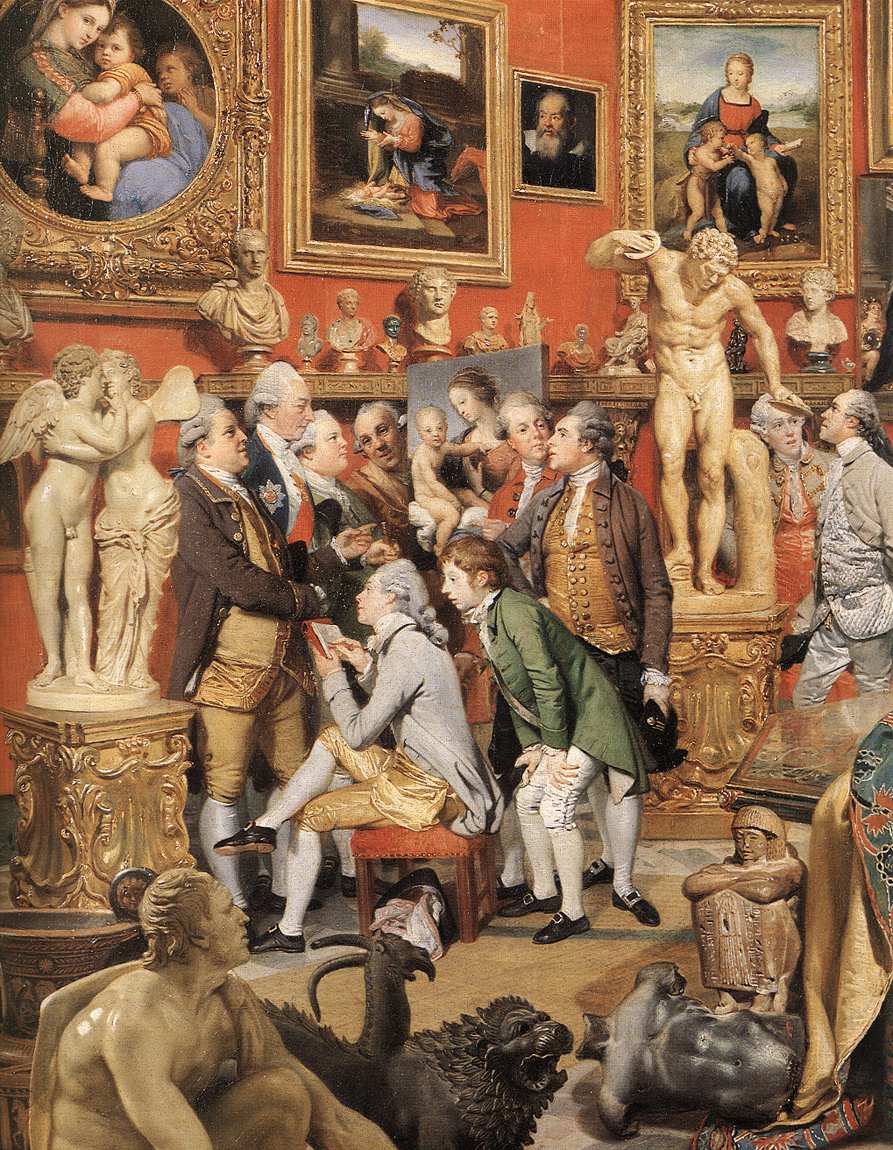
Johann Zoffany, detail of "The Tribuna of the Uffizi," 1772-78

I also enjoyed reading the chapter on the fondness for copying art during the 18th century. Today I think that artistic copies often are viewed with some disdain, implying that the copy is of lesser quality than the original work of art. In the 18th century, however, copies were seen in a much more favorable light. The collecting of copies was seen as a mark of respectability and prestige. One of the paintings which typifies the 18th century rage for Italian works (and the copying of such paintings) is Zoffany’s The Tribuna of the Uffizi (1772-78). Not only did Zoffany copy many great works of art to produce his final canvas, but he also includes an artist in the process of copying a work of art (see above)!

Along the lines of copying and prestige, though, I found it interesting that the book emphasized that 18th century female artists received acclaim as copyists and portrait artists.1 While I do think that this is true, I think it is also important to emphasize that women were still not considered capable of the highest level of achievement (i.e. history painting) as their male artistic counterparts. It seems to me that women only were acclaimed for the types of art which men found them capable of producing. A woman might be able to impressively copy or paint what she saw in front of her (as is the case with portraiture), but it seems apparent that women were also thought (by men) to lack the imagination and intellect necessary to create large-scale history paintings.

But enough of my little rant. This book is very interesting and an informative read. I highly recommend it. And now for the big news: a GIVEAWAY! I am able to offer a copy of this book free, thanks to the generosity of the Florentine Press. Local and international readers may enter this giveaway. I will be randomly selecting one winner (using this site) on December 31, 2011. So you have ten days to enter this giveaway! You can enter your name up to four times. Here are the ways you can enter: 

1) Leave a comment on this post!

2) Tweet about the giveaway (be sure to include my Twitter name: @albertis_window in your tweet, so I can find it). After tweeting, leave a comment on this post to let me know too, please.

3) Write about this giveaway on your own blog, and then include the URL in a comment on this post.

4) Become a fan of The Florentine on Facebook and enter your email address here (so we can cross-check it with your other entries) in the giveaway for a book by Linda Falcone – this way you have a chance to win yet another book! Please also leave a comment on this post, to let me know that you became a fan on Facebook.

While you wait to find out if you won a free copy of the book, check out this nice video of the book presentation.

1 Linda Falcone, ed. “Irene Parenti Duclos: A Work Restored, an Artist Revealed,” (Florence: Florentine Press, 2011), 18, 27.

Thanks to the Florentine Press for supplying the review copy of this book. Those who are interested in purchasing a copy of “Irene Parenti Duclos: An Work Restored an Artist Revealed” can find information here.

— 15 Comments

Caravaggio Exhibition at the Kimbell Art Museum

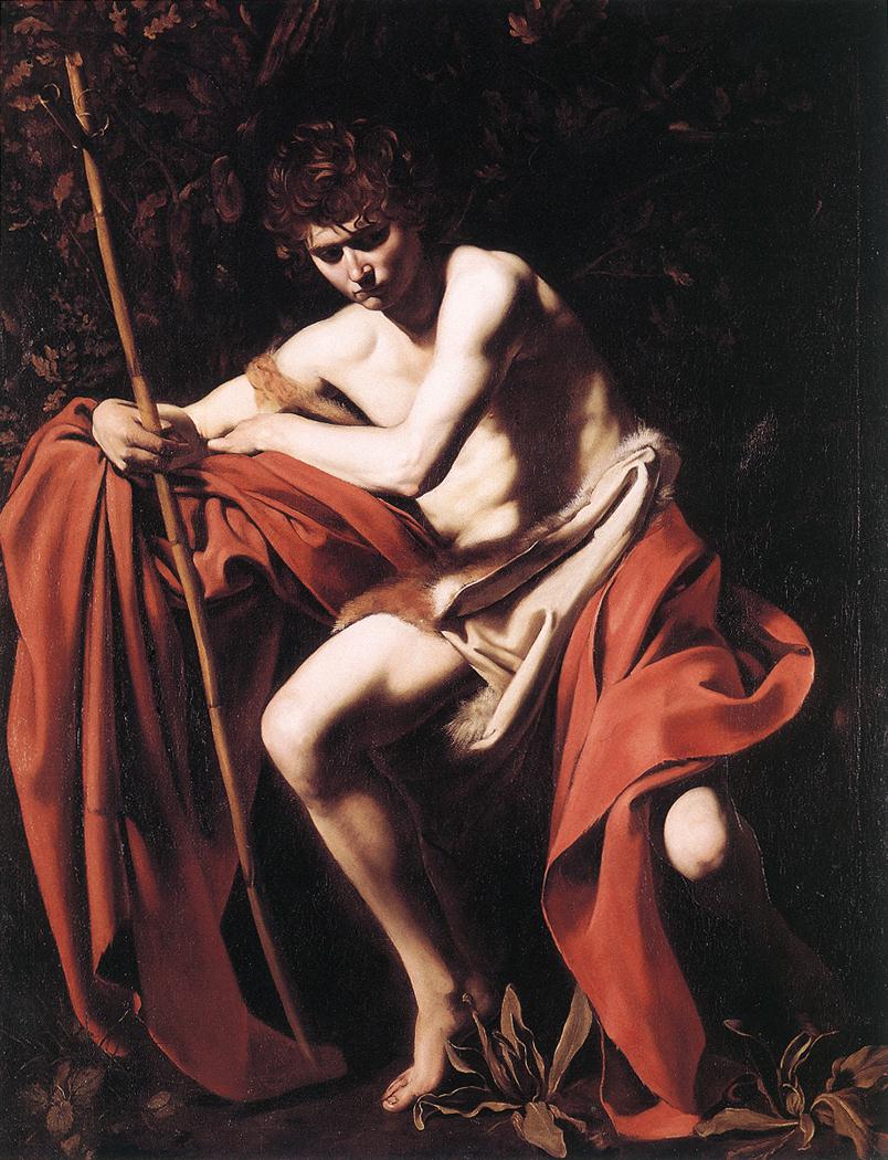
Caravaggio, "Saint John the Baptist in the Wilderness," 1604-05

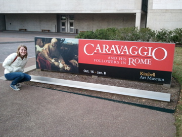
Well, my friends, I did it. Last week my husband and I went down to Texas on an art pilgrimage. We first stopped in Houston to visit the Rothko Chapel (Rothko is my husband’s favorite artist), and then traveled up to Fort Worth so that I could visit the Caravaggio and His Followers in Rome exhibition at the Kimbell Art Museum. We hit a lot of great art museums and installations during the trip, but I loved the Caravaggio exhibit the most of all. It was a pretty phenomenal experience to see so many Caravaggesque paintings (and actual works by Caravaggio) in a single space. Monochromatic backgrounds, tenebristic lighting, and dirty fingernails reigned supreme. It was awesome.

The exhibition display is pretty interesting. The exhibit is sectioned-off into areas that are dedicated to different types of subject matter (as is presented in the exhibition catalog). With the exception of a few paintings, most of the works by Caravaggio are not given too much visual prominence among the other works in the exhibition. Instead, everything is combined together so that one can get a sense of the breadth and influence of Caravaggio’s style. I appreciated this comprehensive approach; I think that it was very easy for the exhibition to prove Caravaggio’s influence as a painter.

However, I don’t think that it was easy for all museum visitors to tell which works were by Caravaggio without help from text labels and audio guides. I overheard one women telling someone that Caravaggio had painted a self-portrait in the background of one painting – and she was looking at a work by Simon Vouet! I would imagine that many typical visitors did not know the difference between Michelangelo Merisi da Caravaggio and his Caravaggesque follower, Cecco del Caravaggio. When I visited the museum on a busy weekend afternoon, the strongest visual indicator for Caravaggio’s paintings were the audio tour crowds that naturally formed. If a visitor didn’t know enough about Baroque art to pick out a work by Caravaggio, they simply needed to spot a crowd of people standing with their heads cocked, listening to an audio device.

There were several details that I noticed during the exhibition about Caravaggio’s work. I was very struck with how Caravaggio’s tenebrism are even more striking when viewed in-person, especially in the painting Saint John the Baptist in the Wilderness (see above). The bright flesh of the saint seems to hum and glow with life, as does the brilliant vermillion drapery. Such vivacity is only offset with the exception of a few areas that are cloaked in dark swaths of shadow. The whole painting is indescribably impressive.

Caravaggio, detail of "The Cardsharps," c. 1596

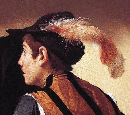
One of the things that I loved about this exhibition was that I noticed several details in Caravaggio paintings that I had never noticed before. I remember noticing the slightest trace of a mustache on one of the figures in The Cardsharps (c. 1596, see detail above). I was impressed with the light, wispy quality of the feather stuck in the same figure’s hat. I also stopped for a long time to admire the texture of the shimmery, blue satin on Mary Magdalene’s dress in Martha and Mary Magdalene (c. 1598), something that is completely lost in some reproductions. Even the curl of Mary’s hair casts a dramatic and striking shadow, which doesn’t translate well in a reproduction.

Several of the Caravaggesque paintings were striking as well (although not as striking as the works by Caravaggio, in my opinion). Ribera’s work impressed me the most. I particularly liked the leathery, tanned skin of Ribera’s Saint Jerome (c. 1623; Cat. 35). I remember looking at the fingers of that saint for some time.

That being said, I didn’t think that all of the Caravaggesque paintings were very good. Some of them, in fact, looked simply ridiculous (to the point of being eyesores) when hung in the same room with Caravaggio’s Saint John the Baptist in the Wilderness. I wasn’t surprised to see that the museum placed The Holy Family in Saint Joseph’s Workshop (attributed to Carlo Saraceni or Guy François, c. 1615; cat. 41) and The Martyrdom of Saint Cecilia (Guy François, c. 1608-13; cat 12) behind two temporary walls. They looked like pretty poor paintings in comparison with Caravaggio’s work. When I complained about those paintings to my husband, he said, “When I saw those paintings, I got the impression Caravaggio influenced all kinds of painters, even ones that weren’t very good.” I’m not sure if the exhibition intended to convey that message, but that point was definitely made! I personally think the should have been taken out, though. These were some of the last two paintings that I saw during my visit, and it left a bad taste in my mouth (or a bad impression on my eyes, I should say). I had to turn and look at Saint John the Baptist in the Wilderness for a few more minutes afterward, just to cleanse by visual palette.

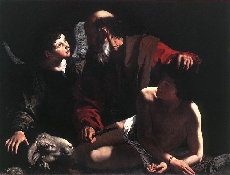
Caravaggio, "Sacrifice of Isaac," 1598-99, Barbara Piasecka Johnson Collection Foundation

All in all, I really enjoyed the show (despite seeing the paintings by Saraceni and François – ugh!). I would have liked to have seen a few more paintings that have been attributed to Caravaggio (some of which have had their authenticity and provenance called into question), but those paintings were only on view when the exhibition was in Canada earlier this year. Hopefully I’ll get to see Saint Augustine (c. 1600), Saint Francis (c. 1598, cat. 30) and Sacrifice of Isaac (c. 1598-99, shown above; cat. 53) another time, so that I can form my own opinion about those pieces.

Me outside the Caravaggio show, December 2011

— 9 Comments

Cathedral of Brasília as Postmodern

This past week I finished teaching a course on Brazilian Baroque art. On the last day of class, my students and I looked at examples of modern and contemporary Brazilian art. Taking many cues from Leopoldo Castedo’s book The Baroque Prevalence in Brazilian Art (1964), we discussed how Baroque stylistic characteristics can be observed in the Brazilian art that was produced in the 20th century.

Castedo’s book was written to highlight some of the continuities between Baroque stylistic characteristics and the modern architecture created in the new city of Brasília (the work of Lúcio Costa and Oscar Niemeyer). Castedo discusses this Baroque style as part of Brazil’s national identity. He asserts that the modernist architecture in Brasília is also inherently “Brazilian,” since he finds continuity between this 20th century style and that of the Baroque. Castedo’s Baroque (and therefore “Brazilian”) characteristics include a discussion of ideas such as audacity, intimacy, drama, and a tendency toward representing “the curve” in art.1

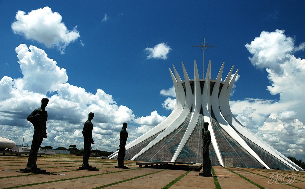
Oscar Niemeyer, Brasília Cathedral, 1962. Image courtesy Xdonat via Wikipedia.

One of the structures that my students and I discussed extensively was the Brasília Cathedral by Oscar Niemeyer (see above). This structure, along with many of the other major structures in Brasília, were built by Niemeyer. (There are some great video clips discussing the history of Brasília and some of the problems that arose by creating this modernist city from scratch. I highly recommend watching “Brasilia, Brazil: BBC World Wonders” and the Brasilia segment from “The Shock of the New” with Robert Hughes.)

It’s easy to see how this cathedral fits within the aims of the modernist architectural style that was popular in the mid-20th century. The lines of the architectural buttresses are clean and precise. The white color is visually-striking, yet also self-effacing. I think that the same can be said for the large windows which are placed in-between the buttresses: these windows are supposed to contribute to the self-effacing, neutral, and even “invisible” aspects of the structure.2

One of the things that I think is so interesting about this cathedral, though, is that the modernist aesthetic intended by Niemeyer has been completely altered. Perhaps this shouldn’t be surprising today, since we live in a postmodern world (which acknowledges context, surroundings, and place) instead of a modernist world (in which structures and works of art are self-contained). And the shift from a modern to a postmodern structure wasn’t too hard to do: the windows simply needed a little bit of color.

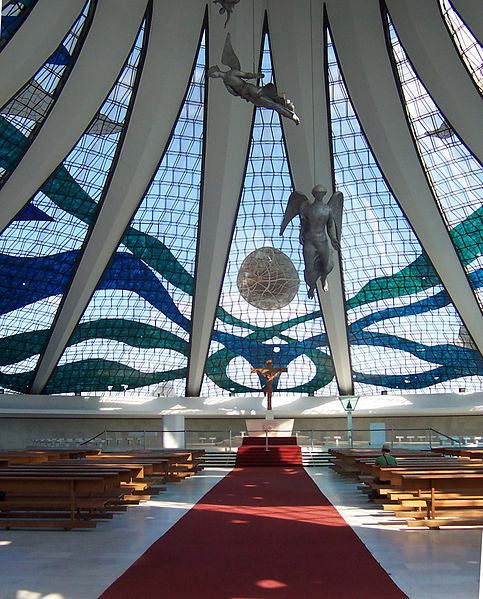
Oscar Niemeyer, Brasília Cathedral, 1962. Windows were painted in 1990 by Marianne Peretti.

So, that’s what happened. The windows of the cathedral were stained in 1990, which I think completely altered the “feel” and aesthetic of this structure. This building can no longer function as a neutral, modernist structure. The windows draw too much attention to the architecture (and even the architectural framework) of the structure to maintain the aesthetic that Niemeyer originally planned. Instead, I think that the colored windows have turned the interior of the building into a postmodern space. The lines and colors highlight the architecture and setting, so that the visitor is continually aware of his/her setting and context.

Do I think that the colored windows are a bad thing? No, not necessarily. I think the colors and designs are pretty. And, in many ways, I think that the stained glass windows are much more appropriate in today’s postmodern world. But I do think it’s interesting how the modernist aesthetic (and the original intention of the architect) was changed with just a little bit of color.

1 See Leopoldo Castedo, The Baroque Prevalence in Brazilian Art, (New York: Charles Frank Publications, 1964). For one discussion on the “love of the curve,” see p. 118.

2 This idea of “invisible” architecture as part of the modernist movement has been explored by scholars, including Panayotis Tournikiotis, who discussed how modernist “architecture is a synthesis of visual and invisible elements.” I think this idea is also easily explained with the “white cube” modernist gallery space, which is intended to be neutral and highlight the works on display (instead of drawing attention to the architecture and surroundings).

— 10 Comments

Email Subscription


Archives

About

This blog focuses on making Western art history accessible and interesting to all types of audiences: art historians, students, and anyone else who is curious about art. Alberti’s Window is maintained by Monica Bowen, an art historian and professor.