A Timeline of Early Modern Censorship

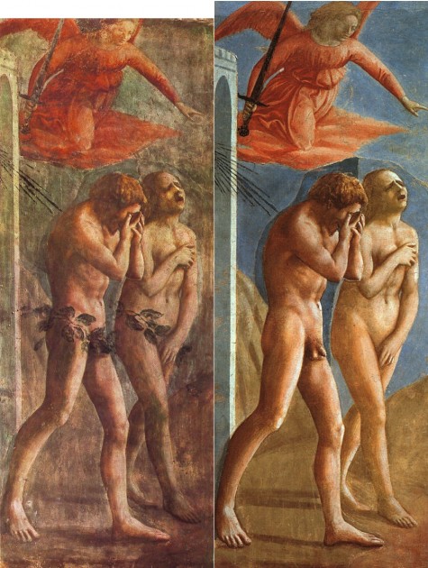
Masaccio, The Expulsion of Adam and Eve, 1424-25. Image on right shows the fresco after its restoration in the 1980s, which removed the fig leaves that were added in the 17th century. Image courtesy Wikipedia

A few weeks ago I was contacted by an art magazine, specifically requesting information on nudity and censorship in the history of art (since I had previously written on this topic). It took me a few hours to compile the necessary information for this group. Unfortunately, I never received any response after sending a detailed email to my contact, so I assume that the information I sent will not be used in the final article or timeline about censorship. Instead, I have decided to publish my research here.

Although the following timeline is not complete by any means, I think that these are some of the most significant and interesting events which surround the issues of censorship and nudity for the Early Modern period in Western art.

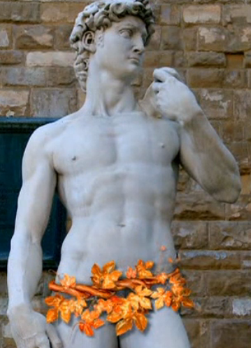
Reconstruction of copper “skirt” which allegedly was placed on Michelangelo’s “David”

  • c. 1504: Objections arose regarding the nudity of Michelangelo’s “David” (to the point that people threw stones at the statue). It is reported that a skirt of copper leaves was created to cover the statue at one point, although we don’t have a mention of this skirt by Vasari (see some commentary on this problematic story HERE). Art historian Paul Barolsky explains that Michelangelo’s “rival Pietro Arentino specifically called [the sculpture’s genitals] ‘the indecency of the colossus.’ In a more positive way, [biographer] Vasari points towards the statue’s erotic zone when he praise the figure’s ‘very divine flanks.’ The ‘fianchi,’ flanks or hips, enframe that region of the body which is the center of what Arentino refers to as the sculpture’s ‘impudicità” or lewdness.”
  • Around 1541: Cardinal Carafa and Monsignor Sernini (Ambassador of Mantua) work to have Michelangelo’s “Last Judgment” censored, due to the nudity. This undertaking is known as the beginning of the “Fig Leaf Campaign.”
  • 1547: In Spain, the first edition of the Index of Prohibited Books (written in 1547, published in 1551) does not mention nudity specifically, but condemns “all pictures and figures disrespectful to religion” (my emphasis).
  • 1555-1559: Pope Paul IV undertakes censorship of nude works of art, which includes the castration of ancient statues.¹
  • 1563 (December 3-4): 25th session of the Council of Trent (as part of the Catholic Counter-Reformation) specifies that art should avoid lasciviousness, “in such wise that figures shall not be painted or adorned with a beauty exciting to lust.”
  • 1565: Daniele da Volterra (later known as “Il Braghettone” or “The Breeches Painter”) was hired to paint bits of drapery over the nude figures of Michelangelo’s The Last Judgment. These “breeches” by Volterra were the first; other bits of drapery were added to this fresco in the following centuries.
  • 1592 – Clement VII undertakes a personal inspection of Rome to ensure that revealing sculptures, including semi-nude depictions of Christ on the cross, are covered with drapery.
  • 1644 – 1655: Pope Innocent X had phalluses chiseled off of Roman sculptures in the Vatican. Metal fig leaves were placed on the figures instead.
  • About 1680: Fig leaves were added to the bodies of Masaccio’s Adam and Eve figures in the Brancacci Chapel (see image above). These were removed in the 1980s, when the frescoes were cleaned and restored.
  • 1758-1759: Pope Clement XIII covers more sculptures at the Vatican with fig leaves

Spanish stamp from 1930, based off of Goya’s painting “La Maja Desnuda,” c. 1797-1800. Image courtesty Wikipedia

  • About 1797-1800: Goya paints “La Maja Desnuda” (sometimes called “The Naked Maja”) which is among one of the first works of Western art to depict a woman with visible pubic hair. In 1815, Goya was summoned before the Spanish Inquisition to discuss this painting. “La Maja Desnuda” was turned into a stamp in the 1930s by the Spanish government, but the US Postal service would not deliver incoming letters that were marked with this stamp. One source reports that the US Postal service ruling was reversed as late as 1996!
  • About 1803: Goya paints “La Maja Vestida” (“The Clothed Maja”), which is a painting of the same woman who posed for “La Maja Desnuda.” It could be that this painting was created in order to be more acceptable than the previous version.
  • 1846-1878: Pope Pius IX places fig leaves on more statues at the Vatican.
  • 1878-1903: Leo XIII places fig leaves on more statues at the Vatican.
  • 19th century: Modifications were made to Bronzino’s “Allegory of Venus and Cupid” (discussed in detail HERE).
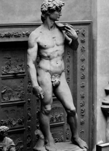
Large fig leaf covering the plaster cast of Michelangelo’s “David” in the Victoria and Albert Museum

  • About 1857: Large fig leaf is created for the plaster cast of Michelangelo’s “David” which is located at the Victoria and Albert Museum in London.
  • 1865 – Victor Lagye creates copies of Adam and Eve for the Ghent altarpiece by Jan van Eyck, with the figures clothed. These copies were placed in the altarpiece.
  • Between 1981-1994: Some (but not all) of the “breeches” of Michelangelo’s “Last Judgment” fresco are removed during restoration and cleaning of the chapel. Others are not removed because the painting could have been damaged in the process.

Censorship in regards to nudity really begins to end in the late 19th century. The early twentieth century sees a lot of nude sculptures that are also more provocative and sexual in nature.

Can you think of any other significant dates in regards to nudity and censorship? I stuck with the Early Modern period in my timeline, but we could also go back to ancient period (I’m reminded of when Early Christians destroyed nude sculptures of the Parthenon in the 5th century CE.)

If you are interested in learning more about censorship and nudity, I would recommend watching this documentary: “Fig Leaf: The Biggest Cover Up in History.”

1 Art historian Leo Steinberg explained that we don’t know a lot about the specific censorship actions taken by Pope Paul IV. He writes, “But we are not well informed about the chronology of these practices. Montaigne (Essays, III, 5) cites ‘many beautiful and antique statues’  which were being ‘castrated’ in Rome during his youth by order of ‘that good man,’ meaning Pope Paul IV (1555-1559).”  See Leo Steinberg, The Sexuality of Christ in Renaissance Art and in Modern Oblivion (Chicago: University of Chicago Press, 2014) p. 186. This book is a reprint of Steinberg’s original 1983 publication. Citation online HERE.
— 3 Comments

Museum “Shrines” and Performative Rituals

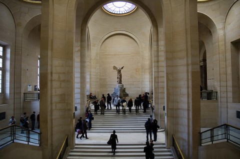
"Nike of Samothrace" on the stairs of the Louvre Museum

The quarter is progressing along, and now I am covering a new book with my students: New Museum Theory and Practice: An Introduction. It’s been really fun to delve into some of the museum theory that I studied several years ago as a graduate student and graduate fellow at a small art museum.

The introduction of this text explores several of the metaphors that are commonly used to describe museums. One of the most interesting metaphors for me is the “museum as shrine.” Museums have a quasi-religious environment, and I like how Janet Marstine explains this idea:

“The museum as shrine is a ritual site influenced by church, palace, and ancient temple architecture. Processional pathways, which may include monumental staircases, dramatic lighting, picturesque views, and ornamental niches, create a performative experience. Art historian Carol Duncan explains, ‘I see the totality of the museum as a stage setting that prompts visitors to enact a performance of some kind, whether or not actual visitors would describe it as such.’ Preziosi adds, ‘all museums stage their collected and preserved relics . . . Museums . . . use theatrical effects to enhance belief in the historicity of the objects they collect.”1

This description immediately made me think of the architecture in several museums which encourage performative, theatrical, and even ritualistic actions from the visitor. The first space that came to mind was the Grand Staircase at the Louvre, above which the “Nike of Samothrace” presides (see photo above). Here are some other spaces which I considered:

Seattle Art Museum stairs

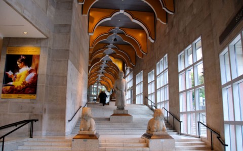
The Seattle Art Museum has a “processional way” staircase in the older part of their museum. Although these stairs are no longer used on a regular basis, there are escalators in the main museum area which carry the visitor to higher physical (and suggestively “spiritual”) levels. Even with an escalator (which doesn’t require much physical movement on part of the viewer), I think that this motion still contains an element of performance on the part of the viewer. Also, shrine-like picturesque views are found at the Seattle Art Museum Sculpture Garden; the structure of this building is created largely out of glass walls.

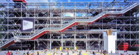
Centre Pompidou exterior with escalator "tubes"

The Centre Pompidou probably has the most famous set of museum escalators. The way that the “tubes” slowly climb with alternating sections of flat and angled lines remind me of the terraces of ziggurats from the ancient Near East.

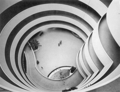
Interior of the Guggenheim Museum, New York

The ramp in the interior of the Guggenheim is probably one of the best examples of ritualistic art, I think because the viewer is continually aware of his or her ascent in relation to the rest of the museum space. The winding ramp reminds me of spires for religious buildings, even contemporary structures like the Independence Temple for the Community of Christ in Missouri.

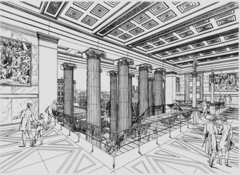
Schinkel, View of the staircase (and view overlooking the Pleasure Garden) in the Altes Museum, Berlin (19th century). Image courtesy of Wikipedia

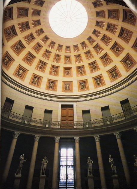
Rotunda of the Altes Museum, Berlin

I think that the Rotunda of the Altes Museum evokes this shrine-like setting (and performative nature) not only by evoking classical imagery (this is a small version of the Pantheon), but also creating a stage-like setting for the sculptures, separating them either with niches or columns. The sculptures on the bottom level are also elevated onto stage-like plinths.

Last week, my students and I discussed whether today’s museums should try to bring more self-awareness to their designs and displays, in order to perhaps expose or at least recognize the “shrine-ness” of the institution. We wondered what visitors might think if a museum was blatantly decorated like a shrine (with candles around works of art, offerings scattered in front of displays, etc.). Would viewers feel uncomfortable if they knew they were taking part in a ritual at a museum? What do you think?

What are some of the other shrine-like aspects of museums? Can you think of any museums which encourage some type of “performative” or ritualistic-like activity on part of the viewer? In a general sense, I think that the quiet whispers that are expected in many museums can fit with this idea.

1 Janet Marstine, “Introduction” in New Museum Theory and Practice: An Introdution by Janet Marstine, ed. (Blackwell Publishing, 2006. See also C. Duncan, Civilizing Rituals: Inside Public Art Museums (London and New York: Routledge, 1995), pp. 1-2. See also D. Preziosi and C. Farago, Grasping the World: The Idea of the Museum (Aldershot and Burlington, VT: Ashgate, 2004), p. 13-21.

— 7 Comments

Modern Art as CIA Weapon

My friend just shared with me an old Independent article, “Modern Art was CIA ‘Weapon'” (22 October 1995). It has been revealed that the American CIA used unwitting artists like Pollock and De Kooning to make political statements during the cultural Cold War with Russia. The decision to include culture and art in the US Cold War arsenal was taken as soon as the CIA was founded in 1947. As Abstract Expressionism (and modern art in general) gained momentum in the 1950s and 1960s, the CIA used this art to foster images of American creativity and and intellectual freedom.

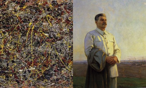
This type of abstract art is a stark contrast to the Soviet Realism that was officially adopted as the only art form of the Soviet Union in 1934. Compare, for example, details from two paintings that were made about the same time:

Left: Detail of Pollock's "No. 5, 1948". Right: detail of Fyodor Savvich Shurpin's "Morning of Our Motherland," 1946-48

I think it is so interesting that the CIA used modern art as a political weapon, because art critics like Clement Greenberg endorsed modern art (specifically Abstract Expressionism) because it wasn’t associated with politics. Political art was “kitsch” in Greenberg’s opinion (as he emphasized in his 1939 essay, “Avant-Garde and Kitsch”). So, in some ways, the CIA was giving Abstract Expressionism political associations that were fundamentally opposed to the tenants of the movement! I’m sure Greenberg would have been appalled to know that his beloved modern art was being used for such lowly (!) propagandistic purposes.

— 3 Comments

UPDATE: The “So-Called” Ishtar Gate?

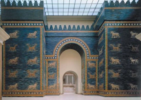
Reconstruction of part of the so-called Ishtar Gate at the Pergamon Museum in Berlin. The original double-gate was built c. 575 BCE. Glazed brick, height of original gate 40' (12.2 m) with towers rising 100' (30.5 m)

A perceptive student asked the other day how we know that the “Ishtar Gate” was really dedicated to the goddess Ishtar. I replied in class, “I believe that the dedication is mentioned on the inscription of the gate.” However, when I pulled up the inscription to show the class, I found that Ishtar was not mentioned at all:

“Nebuchadnezzar, King of Babylon, the faithful prince appointed by the will of Marduk, the highest of princely princes, beloved of Nabu, of prudent counsel, who has learned to embrace wisdom, who fathomed their divine being and reveres their majesty, the untiring governor, who always takes to heart the care of the cult of Esagila and Ezida and is constantly concerned with the well-being of Babylon and Borsippa, the wise, the humble, the caretaker of Esagila and Ezida, the firstborn son of Nabopolassar, the King of Babylon.

Both gate entrances of Imgur-Ellil and Nemetti-Ellil —following the filling of the street from Babylon—had become increasingly lower. Therefore, I pulled down these gates and laid their foundations at the water-table with asphalt and bricks and had them made of bricks with blue stone on which wonderful bulls and dragons were depicted. I covered their roofs by laying majestic cedars length-wise over them. I hung doors of cedar adorned with bronze at all the gate openings. I placed wild bulls and ferocious dragons in the gateways and thus adorned them with luxurious splendor so that people might gaze on them in wonder.

I let the temple of Esiskursiskur (the highest festival house of Markduk, the Lord of the Gods—a place of joy and celebration for the major and minor gods) be built firm like a mountain in the precinct of Babylon of asphalt and fired bricks.”1

This student’s question has sent me on a wild goose chase. After writing a previous version of this post, explaining my frustration in trying to find a contemporary inscription or dedicatory text, David Byron from Baroque Potion sent me a source with some contemporary texts (see first comment below). This publication by A. R. George mentions an inscription on the gate that was excavated in situ. Either this is a second inscription on the gate that is different from the aforementioned one in this post, or it is another part of the aforementioned inscription which doesn’t appear in many English translations:

“I Nebuchadnezzar, king of Babylon,…, son of Nabopolassar, king of Babylon, skillfully rebuilt the Istar Gate with pure lapis-glazed bricks for my lord Marduk. I stationed at its sills fierce bulls of copper and frenzied dragons.

Other contemporary inscriptions and documents are highlighted by George, which refer to the “Ishtar Gate” and its construction.2

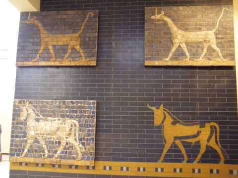
Fragments of the so-called Ishtar Gate with reconstructions, from the Archaeological Museum in Istanbul

Without this inscription or other contemporary inscriptions calling this structure the “Ishtar Gate,” I can see why one would wonder how this gate was associated with Ishtar. After, all the symbol of the lion, which is associated with Ishtar, lines the so-called “Processional Way” which leads up to the gate, but is not found on the gate itself. Instead, the gate is covered with symbols of the god Marduk (the patron god of Babylon) and the god Adad (the storm god). The bull with blue horns and blue tails was associated with Adad. The dragon-like creature (with the head and body of a snake, the forelegs of a lion, and the hind legs of a bird of prey) were sacred to Marduk.

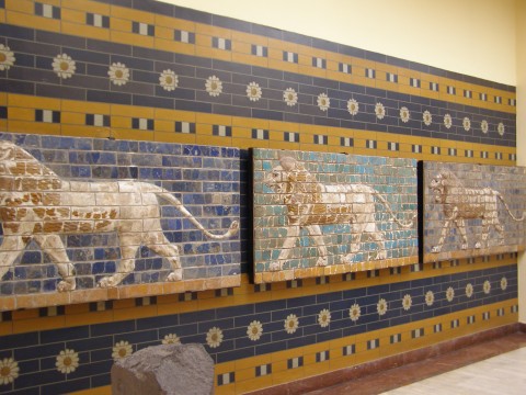
Fragments of lions from the so-called "Processional Way" leading up to the "Ishtar Gate." Fragments and reconstruction found at the Archaeological Museum in Istanbul

The lion motif in the so-called “Processional Way” helps to indicate that Ishtar was supposed to be honored and celebrated, however. After all, during this Neo-Babylonian period (which, after twelve centuries brought splendor back to Babylon during this period in the ancient Near East), it would make sense that Ishtar, the fertility goddess of rejuvenation, would be honored. During this time, Babylon itself was revived and rejuvenated. Additionally, A. R. George notes that “the ceremonial name of the Istar Gate reflects the character of Ishtar as a goddess of battle.”2 With the Medes’ relatively recent defeat of the Assyrians and capture of Nineveh in 612 BC (which established the Neo-Babylonian empire), it makes sense that Ishtar would also be recognized in this role.

Does anyone know more information about the history of this gate? Given this second inscription that David Byron shared with me, I’m curious as to whether anyone has confirmed through analysis that the gate is actually glazed with lapis lazuli. I have read elsewhere that lapis lazuli would have been too expensive of a medium to be used on such a monumental structure. Should we take Nebuchadnezzar II’s inscription at face value? Perhaps this king wanted to give a greater impression of his wealth and prestige by claiming that the bricks were glazed with lapis lazuli?

1 This inscription can be found multiple places online, but I found this translation HERE. It is interesting to note that Nebuchadnezzar II’s inscription states that the gate was made with “stone.” This isn’t quite true: it is made out of glazed brick. However, Nebuchadnezzar II does claim in the second inscription in this post that these bricks were glazed with lapis lazuli. I haven’t come across any analysis to confirm that the bricks are actually glazed with lapis lazuli.

2 A. R. George, Babylonian Topographical Texts, Orientalia Lovaniensia Analecta series, Louvain, Peeters Press, 1992, 339-441. Citation available online HERE.Based on this inscription, it seems like it would be more appropriate to say that the Ishtar Gate was dedicated to Marduk, not necessarily Ishtar.

3 Ibid., 341.

— 5 Comments

Manet Portraying Life: Exhibition on Screen

Edouard Manet, "The Monet Family in Their Garden at Argenteuil," 1874

This is my new favorite work of art by Manet: The Monet Family in their Garden at Argenteuil (1874). On one hand, it reminds me a bit of my own little family and home: my currently-bearded husband, my little boy, my flower garden, my yard. Plus, when learning more about this painting on the Metropolitan Museum of Art website, I grew to like Manet even more than I already do. In 1924, Monet wrote about his experience of sitting in his garden for this very portrait:

“Manet, enthralled by the color and the light, undertook an outdoor painting of figures under trees. During the sitting, Renoir arrived. . . . He asked me for palette, brush and canvas, and there he was, painting away alongside Manet. The latter was watching him out of the corner of his eye. . . . Then he made a face, passed discreetly near me, and whispered in my ear about Renoir: ‘He has no talent, that boy! Since you are his friend, tell him to give up painting!'”

I don’t really care for Renoir’s art, and it turns out that Manet felt the same way. I have a feeling that Manet and I would have gotten along!

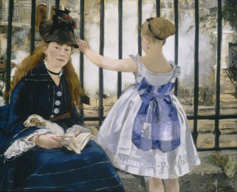
Yesterday I was introduced to Manet’s portrait of the Monet family through a film screening of the exhibition, Manet Portraying Life. This show is currently on display at the Royal Academy of Arts in London. This film screening was informative and entertaining. I especially liked the analysis of the paintings given by various individuals who were invited onto the set, including curators, artists and even an actress, Fiona Shaw. The host Tim Marlow and Shaw had a really interesting conversation; they discussed how Manet’s The Railway (shown below) seems to include an interesting pattern – almost a barrier – created by the iron bars. These bars seem to separate these delicate females (and the viewer) from the industrial world of the railway. Even the smoke coming from the railway area seems to add an element of mystery (or perhaps inaccessibility) to modern life.

Manet, "The Railway," 1873

There were several little snippets of information that I learned during this film screening. Here were a few other short points that stood out to me:

  • Matisse used to show people Le Déjeuner sur L’Herbe (1863) in order to prove that black could be used without making it seem like a “hole” in the canvas. (This negative attitude toward black, especially during Matisse’s career, must have its origins in the late 19th century after the rise of Impressionism.)
  • One of the interviewees mentioned that Salon paintings in the 19th century were hung in rooms according to the name of the artist. From what I understand, artists with last names that began with the same letter would have been grouped together. This practical method of hanging is very interesting to me, especially since earlier museums chose to hang their paintings in either a chronological and/or a thematic fashion. (See more information about the Salon hanging method in the comments below.)
  • Manet felt that Velasquez was the greater painter of all time.
  • Carte-de-visite photographs may have influenced Manet’s work; these comparatively cheap photographs were left as little tokens or remembrances when an individual visited friends or family in the 19th century. Manet may have looked to some carte-de-visites when working on specific portraits.  This information made me wonder if the monochromatic tan background or sepia-like tones of photographs might have directly or indirectly influenced the backgrounds Manet used for several of his portraits (for example, as seen in his Portrait of Berthe Morisot from 1872).

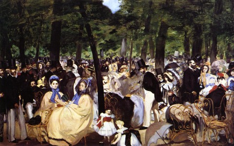
Manet, "Music in the Tuileries Gardens," 1862

I also enjoyed that the film included some of the background information about Manet’s life and/or the history behind the paintings themselves. I appreciated a discussion of Baudelaire’s “Painter of Modern Life” idea in conjunction with Music in the Tuileries Gardens. The film host emphasized that Manet is shown as a flâneur in this painting: he is depicted in the left corner, an observer of modern life who is separated from the crowd. Another commentator in the film also jokingly noted that Manet has decided to depict different prominent critics and writers in the painting: those who might have written and commented on Manet’s art found themselves within the crowd!

I also learned that this painting alternates between spending six years in the National Gallery in London, and then six years in The Hugh Lane gallery in Dublin. This arrangement is due to a bequest that was contested: when Hugh Lane suddenly died in 1915, his official will stipulated that the painting would go to the National Gallery, but an unofficial addendum to the will (found in his desk) said that the paintings should be in Dublin. The six-year arrangement is a balance between following the legal will and honoring the wishes of the deceased donor.

I was hoping that the film camera would move through the different galleries so one could get a feel for the hanging and the layout of the exhibition space, but that didn’t really happen too much. Instead, the film mostly examined isolated works of art. Only some of the paintings in the show were discussed or even shown, which has led me to look for additional information and interviews about the show elsewhere online. That being said, I still really enjoyed the film; I hope to attend the future screenings this year (on exhibitions about Munch and Vermeer).

Did anyone else go to this film screening or see this exhibition (either at the Royal Academy of Arts or at the Toledo Museum of Art)? What were your thoughts?

— 16 Comments

Email Subscription


Archives

About

This blog focuses on making Western art history accessible and interesting to all types of audiences: art historians, students, and anyone else who is curious about art. Alberti’s Window is maintained by Monica Bowen, an art historian and professor.