Category

20th century

Oz and Duchamp

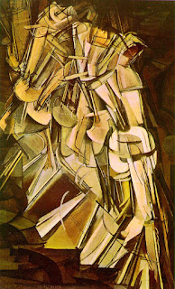
One of my favorite early twentieth century paintings is Marcel Duchamp’s Nude Descending a Staircase, No. 2 (1912, shown right). I used to joke that this painting must look even more interesting through 3-D glasses. In all honesty, though, I think that this painting is a fascinating depiction of animation, movement, and form.

When looking at Nude Descending a Staircase, it’s easy to tell that Duchamp was particularly interested in the way form moves over time (he was inspired by Eadweard Muybridge’s photographic sequences), as well as the Cubist aesthetic. This painting also has been linked to Futurism, although Duchamp argued at the time that he had not seen any Futurist paintings first-hand.1

Duchamp became well-known in the United States after this painting was exhibited in the Armory Show in early 1913. Nude Descending a Staircase got a scandalous reception, and one critic described this work as “an explosion in a shingle factory.”2 Nonetheless, Duchamp’s status as a celebrity was solidified.

Subsequently, Nude Descending a Staircase was copied and parodied throughout the United States, including the memorable cartoon Rude Descending a Staircase (Rush Hour at the Subway). Duchamp’s painting even inspired the children’s author L. Frank Baum. His character Woozy in The Patchwork Girl of Oz (1913) was inspired by Cubism and Nude Descending a Staircase. Woozy is a character made out of rectangles and squares (he is hugging a tree in the illustration on the left). Although Baum described Woozy as blue, the illustrator of the book (John R. Neill) colored Woozy brown like Duchamp’s nude.3 I was excited to learn this connection between Woozy and Duchamp. I grew up reading all of the Oz books, and it’s fun to find that fine art influenced Woozy’s character. I never would have made that connection when I was a kid!

1Francis M. Naumann. “Duchamp, Marcel.” In Grove Art Online. Oxford Art Online, http://www.oxfordartonline.com.erl.lib.byu.edu/subscriber/article/grove/art/T023894 (accessed June 3, 2009).

2 Charles C. Eldredge, “The Arrival of European Modernism,” Art in America 61 (July-August 1973): 35.

3 Katharine M. Rogers, “L. Frank Baum: Creator of Oz,” (New York: St. Martin’s Press, 2002), 194.

— 4 Comments

Vietnam War Memorial

I have to admit, I’ve never thought that the Vietnam War Memorial (1981-1983; National Mall, Washington DC) was especially interesting or intriguing. I think it is a serene, respectful tribute to those who died in the Vietnam War, but I can’t spend hours and hours thinking about the aesthetic or design of the structure. Don’t get me wrong – I like the feel and look of minimalist sculpture and architecture, but I just can’t pontificate much about the, uh, minimal qualities of the work. (And art historians love to pontificate!) For this reason, I’ve always kind of skimmed over the Vietnam War Memorial in my art history textbooks and lectures.

However, one of the reasons I started this blog was so I could learn more information about various art pieces and (hopefully) gain more appreciation for them. So, in light of Memorial Day, I decided to read more about the Vietnam War Memorial. And I’ve learned some fascinating information about controversy that surrounded the completion of this memorial.

In 1981, Maya Lin was 21 years old when her design was chosen (out of 1,421 final entries) for the Vietnam War Memorial. The V-shaped black granite is partially lowered into the ground. I didn’t realize this before, but this monument is lowered in the manner of ancient burial grounds.1 The jury selected Lin’s design because they felt like the simplicity of the design would be least controversial. However, many people were upset with the design choice, arguing that the contrast of the black granite against the nearby white memorials could be interpreted as a criticism of the Vietnam War (and a criticism of the efforts expended by those who fought in the war).2 Furthermore, critics were upset with the black color of the granite; one veteran argued that black is “the universal color of shame, sorry and degradation in all races, all societies worldwide.”3

As a compromise, the Commission of Fine Arts decided in 1983 to commission Frederick Hart to create a realistic bronze sculpture of three armed soldiers (shown right). This sculpture which was eventually placed about 100 feet from the memorial wall. About a decade later, a group of nurses got permission to erect a sculpture honoring women’s service in Vietnam. Glenna Goodacre was commissioned to built this sculpture, and it was placed in 1993 about 300 feet south of the memorial (see an image here).

I’m a little surprised that Maya Lin’s memorial caused so much debate and controversy, although it makes sense. I think that people usually have strong opinions whenever a memorial is built, because so much emotion is connected to the purpose of constructing a memorial. Personally, I think that the black granite is effective and appropriate – the reflective surface ensures that anyone who reads the names on the memorial will become active “participants in the experience of remembering the dead,” because the reader can see himself/herself mirrored against the names.

Here’s to remembering our dead, and those who sacrificed so that we can enjoy freedom. The Vietnam War Memorial lists 57, 939 casualties (including those M.I.A.). It’s mindboggling and humbling to think of how many people have died in other wars, especially since our armed forces are overseas at present.

What do you think of Maya Lin’s monument? Do you find the design controversial?

1“Lin, Maya.” In Grove Art Online. Oxford Art Online, http://www.oxfordartonline.com.erl.lib.byu.edu/subscriber/article/grove/art/T051132, accessed May 25, 2009).

2 Fred S. Kleiner and Christin J. Mamiya, Gardner’s Art Through the Ages, 12th ed., vol. 2 (Belmont, CA: Wadsworth, 2005), 1044.

3 Elizabeth Hess, “A Tale of Two Memorials,” Art in America 71, no. 4 (April 1983): 122.

4 “Lin, Maya” in Grove Art Online.

— 7 Comments

The Unfinished "La Sagrada Família"

Of all of Gaudi’s works, I am most familiar with the Casa Mila. (1907; Barcelona, Spain) However, I think that the cathedral La Sagrada Família (also in Barcelona) is the most fascinating of Gaudi’s masterpieces. This cathedral has been under construction since 1882, and will probably be finished in about twenty years from now (which will be around the 100 year anniversary of Gaudi’s death).

Gaudi lived during the turn of the century (fin de siècle) from 1852-1926. His architecture has been classified as Art Nouveau, but really, there isn’t a category or movement which completely fits for the work of this original, innovative thinker. The thing that I like most about Gaudi’s mature style is his fascination with natural forms; his architecture often mimics or recalls things found in nature. Gaudi believed that his buildings were “symbolically a living thing.”1 Although I have never personally been inside a building by Gaudi, I think that his architecture really looks animated and vivacious in photographs. In La Sagrada Família , I love how the inclusion of gables (the triangular shape framing the portals and doorway) follows the Neo-Gothic tradition, but Gaudi has morphed the triangles to appear more naturalistic, as if canopies of stalactites are forming in place of static architecture. (You can see more detail of the gables by enlarging the photograph above.)

This inclusion of stalactites and naturalistic features helps to ease the transition between modernism and traditional Neo-Gothic elements, with the (literal) pinnacle of individualism finding itself in the four towers. 1 I think these towers are so interesting and striking. They are simple paraboloids in shape, with the sides perforated for acoustic reasons (the towers were intended to hold tubular bells). The plan of this church calls for eighteen towers – what a spectacle! You can see a model for the completed church here.

I also think it’s interesting that Gaudi was able to design this cathedral in such a way that it does not employ flying buttresses. However, I think he kind of mimics and alludes to flying buttresses in his decoration of the Passion portal (shown to the left), with the slightly curved supports that lean into the building. Once again, I feel like he is alluding to traditional architecture, but changing it to be original and modern.

The interior of this building will finally open for services sometime next year. It would be fun to go inside then, but I really am excited to go inside when this cathedral is finally completed. Plus, I’m curious to see how much of the final product compares to Gaudi’s original plans.

1 Fred S. Kleiner and Christin J. Mamiya, Gardner’s Art Through the Ages, 12th ed., vol. 2 (Belmont, CA: Wadsworth, 2005), 896.

2 For more information, see Jordi Oliveras. “Gaudí, Antoni.” In Grove Art Online. Oxford Art Online, http://www.oxfordartonline.com.erl.lib.byu.edu/subscriber/article/grove/art/T030991 accessed May 13, 2009).

— 6 Comments

Brancusi’s Newborn

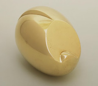
I strongly recommend that you read read my friend Shelley’s post on Brancusi’s Newborn. Shelley’s blog has a picture of an earlier version done in marble (1915); the picture I have is of a bronze version from 1920 (MoMA collection). I prefer the pristine, white marble version, but I like the angle of the sculpture in this image.

Shelley beautifully describes this sculpture as a depiction of a crying newborn. (She is also expecting twins at present, so perhaps her maternal hormones are helping her to write about newborns in such a lovely fashion.) Along these same lines, another writer described this sculpture as an egg that begins to stir and open:

“This Newborn [figure] may be explained thus to anyone who resists it: Here is the egg or the embryo beginning to break up and stir. It stops being a perfect egg shape and stirs into life. It flattens out at one side and seems to open up like a baby crying to be fed.”1

I know that Brancusi did not like his work to be called “abstract,” but instead felt like his sculptures embodied the “essence” of things.2 Because of this, I have a hard time describing Brancusi’s sculptures – I feel like I’m always going to use an incorrect term or upset someone. To play it safe, I’ll just say that I feel like this sculpture embodies the essence of new life. Isn’t it a beautiful sculpture?

1 Louis Slobodkin, Sculpture, Principles and Practice, Dover Publications, Inc, 1949. Citation found on an art blog post; I recommend that people read this post as well.

2 Brancusi reportedly said, “There are imbeciles who call my work as abstract; that which they call abstract is the most realist, because what is real is not the exterior form but the idea, the essence of things.” See Ernest C. Marshall, “Artistic Convention and the Issue of Truth in Art,” Journal of Aesthetic Education 23, no. 3 (Autumn, 1989): 74.

— 5 Comments

Redon’s Flowers and Cezanne

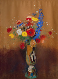
Although Odilon Redon is best known for his fanciful, pre-Surrealist works like The Cyclops, I am particularly drawn to his still-lifes of flowers in vases. I’m actually quite surprised by this, because I am rarely attracted to still-life paintings. Last fall, when I went to visit the “Monet to Picasso” exhibition at the UMFA, this was my favorite painting in the show:

Vase of Flowers, c. 1905 (Cleveland Museum of Art)

One reason I like this painting so much is because of the background. The layers of different colors create these subtle changes in the background that are really beautiful, giving the painting a kind of ethereal quality.

In a letter to Emile Bernard, Cezanne mentioned that he “liked Redon’s talent enormously.”1 This statement has given some reason for art historians to compare and contrast Cezanne and Redon. In an essay, Rachel Frank argues that “the differences are…striking” between between Redon and Cezanne.2. Although I can agree with Frank to a degree, I see some similarities between Redon and Cezanne, primarily that both artists often apply paint in large patches of color. I especially like the “patches” on the vase (i.e. the blues, browns, whites, and blacks) of the following still-life:

Wild Flowers, gouache, c. 1912 (Musée d’ Orsay)

Not long before Wild Flowers was painted, however, Redon remarked to a journalist that Cezanne’s influence in the art world was fading.3 Although I don’t doubt that Redon was sincere in his disillusionment with Cezanne, I still can’t help but find some similarity between the two artists’ styles. For me, I think that artists use the “patches” of color create different aesthetics. Cezanne’s patches of color are more geometric (notice the rigidity of the squares and rectangles of pigment in the lower right corner of this painting). This geometricity emphasizes the formalistic qualities of the objects portrayed. In contrast, I think that Redon’s “patches” draw more attention to the contrasts, harmonies, and subtilities of color; for me, this fanciful effect creates a more emotional response to Redon’s paintings. I think that the different effects created by the paintings ties into the reason why Redon was disappointed with Cezanne – Redon was more interested in emotion and Symbolism, whereas Cezanne was more interested in formalism. To me, it is no wonder that Redon mentioned in this same interview that he was disappointed with the “theoretical, analytical nature of Cubism” (a formalistic style with which Cezanne is often associated as a precursor).4

Nonetheless, I think that these artists mutually influenced each other during their careers. It seems difficult for artists to not be influenced (whether it be deliberate or unintentional) by their contemporaries. What do you think? Do you see similarities or differences between Redon and Cezanne’s styles?

If you like paintings of Redon’s flowers in vases, you can see more of them here.

1 Elizabeth Basye Gilmore Holt, From the Classicists to the Impressionists: Art and Architecture in the 19th Century, 2nd edition (New Haven, Connecticut: Yale University Press, 1986), 526. Excerpt can be read online here.

2 Rachel Frank, “Cezanne and Redon,” The Hudson Review 4, no. 2 (Summer, 1951): 269

3 Dario Gamboni, Potential Images: Ambiguity and Indeterminacy in Modern Art, (London: Reaktion Books, 2002), 132. Citation can be read online here.

4 Ibid.

— 2 Comments

Email Subscription


Archives

About

This blog focuses on making Western art history accessible and interesting to all types of audiences: art historians, students, and anyone else who is curious about art. Alberti’s Window is maintained by Monica Bowen, an art historian and professor.