The complexity and diversity of art in the 19th century parallels the complex changes which occurred during the rise of modernism, particularly the changes which came about because of industrialization and urbanization. It is no wonder that there is some confusion regarding all of the art movements in 19th century France – particularly Impressionism and Post-Impressionism. Both of these artistic movements have rather nebulous and shifting definitions. I thought that I would jot down some of the goals and aims of Impressionism today, and later do the same for Post-Impressionism in another blog entry.
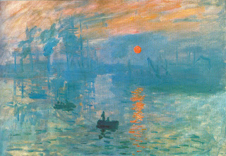
Essentially, Impressionism is a painting movement which focuses on capturing a single moment in time. In some ways, it was influenced by the Realism and the invention of the camera; realist painters strove to capture a moment in time, but Impressionists took that aim a step further by depicting a split second in time. This split second effect is heightened on the canvas by the use of loose brushstrokes; they require speed and spontaneity in execution. An example of loose brushstrokes can be seen in the water of Monet’s painting Impression: Sunrise (1872, shown above to the right). Impressionists were also interested in the effects of light and color, particularly how the eye could blend different colors together to create optically accurate depictions. This interest in light and color also accounts for the interest in outdoor subject matter. Furthermore, the invention of oil paint in tubes also allowed the Impressionists to go outdoors and paint – they were no longer required to work expressly inside their studios. Since artists at this time were painting outside, we have a fairly good idea of what early urbanization and industrialization in Paris looked like at the time.
In my opinion, there are only two painters which can truly be labeled as impressionists: Monet and Renoir. Really, the only reason for this is because Monet and Renoir were the ones who spearheaded the artistic movement. And (in the opinion of one of my past teachers) Monet is the only one who can be considered a “good” impressionist. I kind of have to agree – Renoir is too interested in painting people and figures (see The Luncheon of the Boating Party (c. 1880) as an example), and this detracts from fulfilling the Impressionistic aims of capturing light and color. Personally, I also don’t think that Renoir was that fabulous of a painter. I think some of his figures are awkward and the colors with which he experiments aren’t that becoming or beautiful.
 There are several French painters which also have been labeled Impressionists, largely because they were exhibiting during the same period (c. 1860-1880) and kinda-sorta followed some of the Impressionistic trends (e.g. loose brushstrokes, influence of photography with cropped figures and edges, outdoor scenes, bright colors, interest in light, etc.). These painters were also anti-academic and didn’t follow the traditional rules of painting at the time. Some of these painters are:
- Degas (I love how the painting Ballet Rehearsal (1874, shown above) captures a split second of a ballet class, and I particularly like how it mimics a quickly-snapped photograph with the cropped figures on the right).
- Pisarro
- Manet
- Caillebotte
- Morisot
I guess what I’m trying to say is, if you have ever been confused about Impressionism and Impressionistic artists before, don’t feel too bad. In some ways, the movement is a nebulous umbrella for paintings and artists that are kinda-sorta similar. In fact, participation in the Impressionism shows was constantly a source of contention and debate among artists at the time.1 If you ever wonder if an artist is an Impressionist, find out if the artist is a) French, b) exhibited between the 1860s and 1880s), c) uses loose brushstrokes, or d) is interested in light or outdoor subject matter. If the artist falls into at least two of those categories, then there is a good chance that you can call the artist an Impressionist.
I like Impressionism alright. There are some beautiful colors and interesting optical effects that can be found in this period. And I really love the idea of capturing a split second on a canvas. The thing that really bothers me about Impressionism is that it has become very trendy, almost kitsch. It bothers me that so many Impressionist works now decorate handbags, umbrellas, mugs, scarves, and pencils. And it seems like every college girl has a copy of one of Monet’s water lily paintings in her bathroom. This is just my opinion, of course, but I doubt that Monet would be pleased to find out that he’s a trendy bathroom decorator.
What Impressionist paintings do you like? Do you like Impressionism? Do you think Impressionism is kinda kitschy?
1 Fred S. Kleiner and Christin J. Mamiya, Gardner’s Art Through the Ages, vol. 12 (Belmont, CA: Wadsworth, 2005), 869.

 Greuze, The Laundress, 1761
 Camille Pissarro, Washer Woman, 1880
 Martin Driscoll, The Washer Woman. I was not familiar with this contemporary artist before my quest to find laundress paintings, but I think this work is very nice. You can look at more of Driscoll’s paintings on his website. (Thanks to the Anne P, I also learned that this painting is inspired by William Orpen’s “The Wash House” (1905) located at the National Gallery of Ireland.)
 Degas, Laundresses Carrying Linen in Town, c. 1876-78
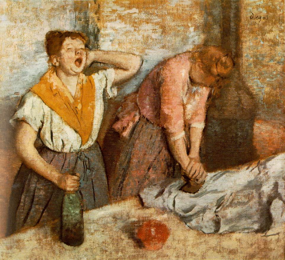 Degas, Women Ironing (Les Rapasseuses), also called “The Laundresses,” 1884


