Wednesday, February 11th, 2015
Manet’s Early Salon Submissions
I’m on a roll this week with my posts on 19th century art, aren’t I? I have been discussing Manet’s Le Déjuner sur l’herbe (Luncheon on the Grass) with my students over the past few days, particularly in how this painting caused a scandal when it was displayed at the Salon des Refusés in 1863. In that discussion, I had a student ask what was the first painting that Manet ever submitted to the Salon for consideration. I didn’t know that answer off the top of my head, so I looked up that information after class.
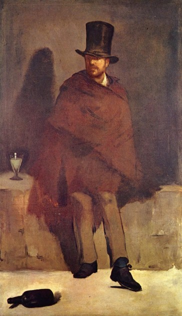
After a little research, I learned that The Absinthe Drinker (c. 1859, shown below) was submitted to the 1859 Salon, when Manet was twenty-seven years old. It was rejected almost unanimously by the committee, with only Eugene Delacroix voting in its favor. I can see why this painting was rejected. The painting looks rather unfinished, and the legs of the figure are quite awkward. The feet turn outward in an awkward way, so that it looks like the shoes are worn on the wrong feet! That being said, I can’t deny that I’m also drawn to the contrast of the black shoes and bottle with the light-yellow floor.
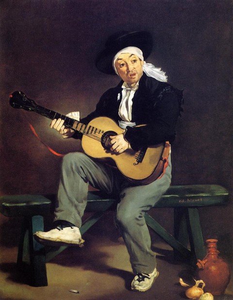
Two years later, in 1861, Manet had two paintings accepted into the Salon for the first time. At this point, Manet was twenty-nine years old. One of these debut paintings was The Spanish Singer (1860, shown below). This also was the first work that brought Manet critical success and recognition; he actually won an honorable mention at the Salon for this painting.
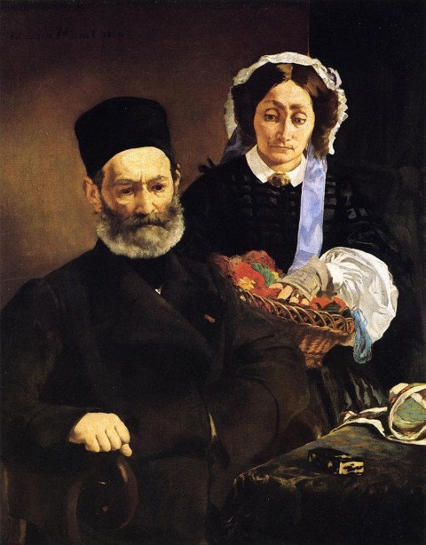
The other painting which was accepted into the Salon of 1861 was a portrait of Manet’s parents, Portrait of M. and Mme Auguste Manet (1860, shown below). This painting did not receive critical attention or favor, which makes sense to me. Madame Manet’s facial features are a bit awkward and asymmetrical (more so, than say, Manet’s Olympia), and the shading of her face seems a bit inconsistent.
It was fun for me to look into these paintings and see some works of art that preceded Manet’s more famous paintings like Luncheon on the Grass and Olympia. I think these earlier paintings are great examples of how Manet was influenced by Velasquez. I particularly thought of Velasquez’s The Water Carrier of Seville (1618-1622) when I looked at these early works, particularly in terms of the color palette, dramatic use of light, and the Caravaggesque background.
It was surprising for me to realize that Manet was in his late twenties when he started submitting paintings to the Salon. He achieved a lot of attention for his art (for better or for worse) fairly early in his life, especially considering that he was just thirty-one when Luncheon on the Grass was hung in the Salon des Refusés in 1863! (This same year, Manet married his old piano teacher, Suzanne Leenhoff, a woman who was two years his senior. It could be that Manet fathered a son with Suzanne a little over a decade before the wedding.) I suppose it was good that Manet captured the attention of the Parisian artistic scene at a relatively young age, since he died of syphillis at the age of fifty-one.
What early works by Manet to you like (or not like)?


It’s probably just familiarity that leads me to say this, but I’ve always been fond of The Reader at the St. Louis Art Museum.
Definitely A Bar At The Folies Bergère. Not only was it clever in the painterly sense. It also evoked the Belle Epoque better than most of the other paintings Manet created.
I like Le Chemin de Fer – lovely colors, and I see it as a sort of and urban vanitas piece with the woman and the child, the book, rabbit, and the movement and steam of the train in the background. The passage of life.
Hi David! Thanks for your comment. Your link to “The Reader” didn’t work, but I found another link here: http://frenchart.umsl.edu/home/english/nineteenth-century/edouard-manet-the-reader-1861/
What a lovely painting! I’m not familiar with this one. The clothing and the book pages have some very nice black and white contrasts, which is one of my favorite things about Manet’s style. I also love the over-sized old book – I wish I had something like that in my library!
I love that The Spanish Singer looks like he’s wearing sneakers.
As for Manet’s maybe-son, I remember reading somewhere that Leon stated years after Manet’s death that he told him privately he was not Leon’s father. Of course, Manet could have lied, but I’m loathe to think he would have lied about something like that.
Hi Val! As always, thanks for your comments. I love this painting too (although I’m more familiar with the English title, “The Railway”). Here is an image, for those who are following these comments:
http://upload.wikimedia.org/wikipedia/commons/7/74/Edouard_Manet_-_Le_Chemin_de_fer_-_Google_Art_Project.jpg
I especially love how the composition is divided by the iron bars, since it makes the female figures seem even closer to the viewer. This composition actually reminds me quite a bit of paintings by Caillebotte, too, in which the composition is divided (barricaded?) by ironwork. Caillebotte’s “Le Pont de l’Europe” and “Sur Le Pont de l’Europe” come immediately to mind:
http://uploads0.wikiart.org/images/gustave-caillebotte/le-pont-de-l-europe.jpg
http://upload.wikimedia.org/wikipedia/commons/e/e2/%27On_the_Pont_de_l%E2%80%99Europe%27%2C_oil_on_canvas_painting_by_Gustave_Caillebotte%2C_1876-77%2C_Kimbell_Art_Museum.jpg
Hello Hels! Thanks for your comment! Yes, I love “A Bar at the Folies Bergère” too! My students love when I point out how the body of the barmaid mirrors the shape of the bottles on the counter. For those readers who are following along, here is an image of the painting:
http://upload.wikimedia.org/wikipedia/commons/0/0d/Edouard_Manet,_A_Bar_at_the_Folies-Berg%C3%A8re.jpg
You raise a good point about how this painting evokes the Belle Epoque – I had never thought of that. I suppose Manet didn’t have too many opportunities to capture the Belle Epoque after he completed this painting in 1882, since he died in 1883.
Thanks for sharing that, Heidendkind! I hope Manet wouldn’t like about something like that, either. Along these lines, I just read an article arguing that Edouard Manet’s father, Auguste Manet (the one featured in the portrait of my post), may have been Leon’s father instead. If anyone is curious, you can read the article here:
http://www.independent.co.uk/news/media/exposed-the-family-secret-behind-manets-most-controversial-picture-6163956.html
The Manet painting that influenced that formed my appreciation for painting in my adolescence years was “The Dead Toreador”, 1864. I was struck by the shear audacity of the composition and pose of the figure. At the time I could not articulate the reasons why I was so moved, but 45 years later it still has a grip on my sensibilities. Yes, the figure looks like it is floating in space; there’s not enough shadow to anchor it to the ground, but the boldness of black and white shapes on the tonal background speaks volumes to Manet’s masterful graphic composition. Perhaps this is why he chose to cut the painting in two as this was obviously the portion of merit.
Due to the juxtaposition of the black and white shapes of the figure in such an unusual and bold position, I believe this was a contributing factor that helped set the stage for the abstraction that was to come. It is this attribute that sets it apart from all its contemporaries.
Hello, Monica,
First of all, thank you for yet another informative post — I’m glad you are teaching, and hope your students realize how fortunate they are!
I’m a fan of Manet’s “Street Singer” at Boston’s MFA. Here’s a link to that image:
http://www.mfa.org/collections/object/street-singer-33971
The work exudes mystery and ambiguity, doesn’t it? I am amazed at how much more realistic and convincing her face is than that of the Spanish Singer or his parents, done just two years earlier. Perhaps that’s just because the model in “Street Singer” was a favorite, though…
I’m currently working on a paper about the ‘Execution of the Emperor Maximilian’. I’ve been struck by the void of obvious emotion, in comparison to Goyas ‘Third of May’. It is difficult to know whom to sympathise with, and where we as spectators lie within the painting. In terms of reception aesthetics, could it be that the cues that Manet lays down for us, is not what we see, but what we don’t. The turned backs and expressionless faces, lead me to think that we are being asked to step up as the ‘ideal’ viewer and participate in understanding its political message. Is this a statement about the French empire at the time, or is it Manets own persecution by his critics, and a general comment on censorship. Its interesting that ‘our’ cast shadow lies at the right officers feet. Do we impose on his moment of absorption? And then of course, what of the internal spectators peering over the wall, they are set up directly opposite us. Do we align ourselves with them, mere spectators, helpless to evoke any change?
agh! – Too many thoughts!
Hi Sabrina! I have been thinking about this painting too, since I saw Manet’s first version of this subject at the Museum of Fine Arts in Boston last week:
http://www.mfa.org/collections/object/execution-of-the-emperor-maximilian-32372
I think you have brought up an interesting point about the “cast” shadow in the foreground and the spectator behind the wall. It’s interesting that those elements aren’t in in the earlier version that I saw. It seems like Manet intentionally wanted to raise issues regarding spectatorship and/or participation of the viewer with these elements.
Sounds like you’re working on an interesting paper!
Hi Susan! Thanks for your response! I was just at Boston’s MFA last week, so your comment is very timely. I didn’t realize that the model was Victorine Meurent though – her face looks a bit different in this painting than in “Olympia” and “Luncheon on the Grass.” And I agree with you – there is mystery and ambiguity in this image. The partially-obscured lips I think add to the mystery surrounding the figure, I think.
Hi Michelle! Thank you for your comment! I love this painting too. The perspective and foreshortening has always been really gripping to me, from a visual standpoint. Sometimes I think about this painting comparison with Mantegna’s “Dead Christ”:
http://upload.wikimedia.org/wikipedia/commons/3/3e/Mantegna_Andrea_Dead_Christ.jpg
It’s interesting to me to consider how the position of the dead figure (with the head placed in the foreground or background) has different effects on the viewer. For me, I think that Manet’s choice of placing the head in the foreground causes me, as a viewer, to empathize with the toreador and consider him as an individual.