Archive

September 2012

The Farnese Bull and Messy Art History

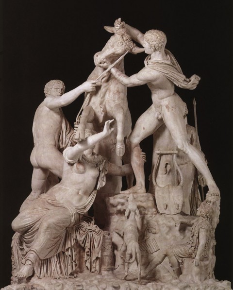
Apollonios of Tralleis and Tauriscus, The Farnese Bull, 2nd century BC or 3rd century CE

Although I’m not a specialist in Hellenistic or Roman sculpture, I like to feel like I am pretty savvy regarding the major works of art from these periods. Up until earlier this year, however, I was not familiar with the “Farnese Bull” (shown above). This sculpture, which was excavated in 1545, was soon placed in the Palazzo Farnese as part of the collection of Pope Paul III (formerly Cardinal Alessandro Farnese).

At almost 12 feet (3.7 m) in height, this sculpture has a dominating presence. In fact, the complex composition and large scale made me wonder why I hadn’t seen this work of art in more art history textbooks. Although I have since learned of a few sources which discuss this book (including a great entry in Haskell and Penny’s Taste of the Antique), I still think that this work is underrepresented in art history textbooks geared for college students. And, after doing some research, I think I have figured out why this book isn’t discussed in more: the subject matter, history, and historical reception of this piece are really complex and messy. Taking my cues from Haskell and Penny’s entry, I thought I would outline a few things to prove my point:

  • Subject matter: It is hard to concretely say what is being represented in this piece. The Farnese inventory (of 1568) describes this piece as “the mountain with the Bull, and four statues around it.” Vasari tried to take things further and described this piece as a Labor of Hercules. Others believe that this sculpture represents the story of Dirce, the wife of Licus. Dirce hated her niece Antiope and tried to have her killed. However, Antiope’s sons intervened and tied Dirce to a wild bull as punishment.
  • Ancient history: It is hard to date this piece. Scholars still debate whether this piece, which was excavated at the Baths of Caracalla, is a Roman copy or an original Hellenistic copy. Some scholars argue that this sculpture was specifically made for Caracalla’s baths (as a Roman copy). Scholars also disagree as to whether this was the work of art that was described by Pliny the Elder: the statue doesn’t quite match the descriptions of a statue which was brought to Rome during the time of Augustus.
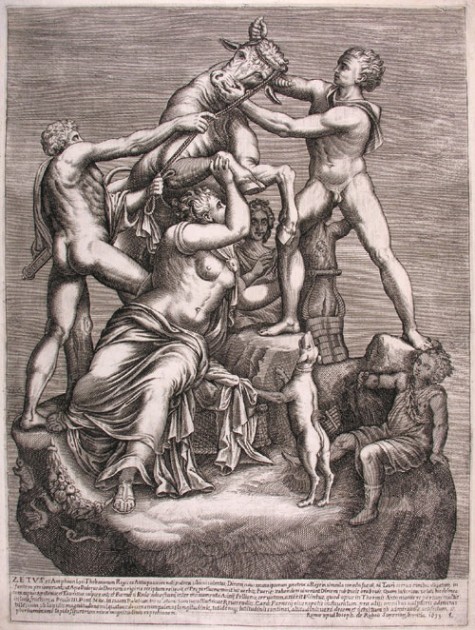
Anonymous Artist "CL", The Farnesian Bull, 1633. Etching.

  • Renaissance and Baroque history: It is clear that the Farnese Bull underwent some restorations after excavation, and they may have been completed by Michelangelo and his students (similar to the restorations of the “Farnese Hercules”). The “Farnese Bull” became very well-known in the Renaissance and afterward, popularized in part by prints (see etching above). Federico Zuccaro said that this was “the most remarkable and marvelous work of the chisel of the ancients” In fact, the ostentatious Louis XIV tried to acquire the piece in 1665!
  • Criticisms of the work: Despite the original praise for this piece, the “Farnese Bull” began to receive criticism in the 17th and 18th centuries for its lack of quality. Bernini noted that the sculpture was only well-known because it was carved from a single piece of stone and created on a large scale. Other criticisms were more pinpointed. The Richardsons noted, for example, that the rope was of “poor quality.” Edward Wright felt like Dirce’s face was “quite without Passion.” Although Winckelmann was also dismissive of the work, although he did note that the extensive restorations have affected the many opinions regarding the piece.1

So, despite the high praise that this work of art experienced in the Renaissance period, it doesn’t seem to have gotten a lot of attention today from art history textbooks. Is it too difficult for textbooks to introduce “messy” situations to undergraduate students? Perhaps it is tricky at times, but I also think that students are bright enough and capable enough to grasp the complexity of art history. In fact, I think it’s good for them to realize how art history is a compilation of various opinions that have built up over time. (It seems like the omission of this sculpture in art history books is an indication of what is and is not valued today in art history.) I also think that it is a good idea to introduce issues of “quality” to students, so they can think about how the concept of quality is a construct.

Has anyone seen the “Farnese Bull” or one of its copies? What was your opinion of the piece? Also, has anyone seen the “Farnese Bull” treated at length in a traditional (and relatively recent) art history textbook for college students?2 I’d be interested to see how this sculpture is treated in such a text, if it exists. Haskell and Penny’s catalog is great as a scholarly resource, but I’m not sure if it is very practical as a textbook for a college course.

1 Francis Haskell and Nicholas Penny, Taste and the Antique: The Lure of Classical Sculpture, 1500-1900 (New Haven: Yale University Press, 1982), 165-167. Citation available online HERE.

2 I did find one online academic source which discusses the Farnese Bull at length, but quotes an art history textbook by Gisela M. A. Richter which was written in 1930!
— 10 Comments

The Transient Experience with Art

Last week I met a woman who told me about her trip to Rome. Before learning that I am an art historian, this woman explained to me that she loved her trip to Italy because she didn’t go to any museums. (You can imagine my surprise – I spend most of my time in museums when I travel!) Instead, this women and her husband spent the whole trip relaxing and eating delicious Italian food.

While listening to this woman, I couldn’t help but think in my head, “Why would you want to have your whole vacation revolve around something as transient as food? Once you eat the food, it’s gone.” But as I thought about our conversation afterward, I realized that experiences with art are just as transient. (And really, aren’t vacations based on the premise of transience as well?) A person’s physical interaction with a work of art, especially in a museum space, is limited by time. And as much as we “consume” either art, or food, or any experience, we are only left with the memory of that interaction afterward. Perhaps that’s why reproductions of art are so popular in museum gift shops: people want to try and recreate (or remember) their fleeting interaction with a certain work of art.

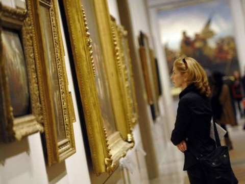
A visitor looking at gilt-framed paintings at the Metropolitan Museum of Art

As I’ve been thinking about this idea of transience and art, I’ve realized how much art (especially historical and academic art) tries to disguise or resist this transient nature by emphasizing mass and physical bulk. Historical paintings are traditionally placed in heavy gilt frames. For centuries, paintings were prized if they were painted on a grand, monumental scale. Sculptures are often weighty too, traditionally made in heavy mediums like marble or bronze. It’s almost as if art wants to assert its physical presence as much as possible, so that the viewer won’t realize that his/her interaction with the object will later become a memory. Perhaps historical pieces also want to assert their physicality in order to make their subject matter seem less-distant to the contemporary viewer, too.

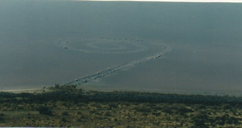
Robert Smithson, Spiral Jetty, first built April 1970 (as seen in March 2003)

Although all physical interactions with art are transient and finite on some level, I do think that art from the 20th and 21st century is less deceiving when it comes to transience. Many modern and contemporary artists embrace the idea of transience, and even highlight that feature within their piece. I’m particularly reminded of Robert Smithson’s Spiral Jetty in the Great Salt Lake, which is supposed to interact and change with the environment over time. It’s easy to see the transient nature of the Spiral Jetty when comparing my photograph (shown above, which was taken in 2003) with a 1970 film still of the piece.

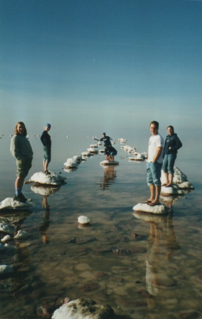
My college friends at the Spiral Jetty in March 2003

I remember in 2002 there was a lot of hype about the Spiral Jetty, because it was visible for the first time in several years. The spiral was above water level for almost a year, so in March 2003 some friends and I decided to make a trip and see the piece for ourselves. I remember being struck with how the earthwork appeared really “ghostly” – just a shadow of the 1,500 foot-long spiral I had seen in my art history textbooks. Despite the sheer size of the piece, the salt-encrusted rocks traced a rather whimsical outline in the water. The work of art seemed transient, just like I remember this experience at the Great Salt Lake as transient (especially when I look at this photo and think of the time that has passed since I went on this trip with my friends).

It’s interesting to contrast the once-bulky Spiral Jetty with the large, gilt-framed paintings and historical statues in an art museum. For me, the Spiral Jetty brought about more awareness of myself (as a viewer) and of the physical time that I was spending with the piece. Perhaps I also had more awareness of transience (and the passing of time) because I was able to physically touch and interact with the Spiral Jetty, too. And I think that even the setting (nature vs. a timeless museum space) can affect the viewer’s awareness of their transient experience with a work of art.

Although a work of art (and the experience with a work of art) can make a different impression on each viewer, it is a little bit depressing for me to realize that physical experiences with visual art are not made to last forever. There comes a point when any viewer of art needs to walk away, close their eyes, or simply just blink. But luckily, even though physical moments with works of art are finite in terms of time, we can have multiple experiences with the same work of art. Perhaps the multiplicity of transient experiences leads to something somewhat lasting and permanent in the human mind?

— 19 Comments

Titian’s “Monkey Laocoön”

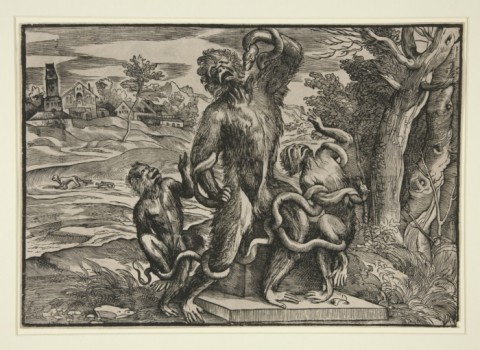
Boldrini (after Titian), "Monkey Laocoön" (Three Monkeys Imitating the Laocoon), c. 1545

I am endlessly intrigued by how Renaissance and Baroque artists were influenced by the Laocoön (1st century BC), a Hellenistic sculpture which was excavated in January 1506. In fact, I think that Renaissance and Baroque art would be quite different if this sculpture was never unearthed. Scholarship on Baroque art (and the acceptance of Baroque art as a subject of study) would be different, too.

But perhaps not all Renaissance and Baroque artists were infatuated with the Laocoön, as might be suggested in Titian’s satire of the statue, Monkey Laocoön (c. 1545). Thanks to Niccolo Boldrini, who did an engraving based off of Titian’s pen drawing, one can perhaps deduce Titian’s sentiment. As early as the 17th century, scholars proposed think that Titian created this drawing to mock contemporary idolaters of this ancient statue.1

However, there are a lot of other debates as to why Titian might have created this drawing. As early as 1831, it was proposed that Titian’s drawing was supposed to be a satire on Bandinelli’s clumsy copy of the sculpture.2 Alternatively, Oskar Fischel proposed in 1917 that Titian created this drawing to free himself from the overwhelming influence that the statue had upon his work.3

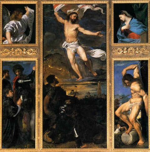
Titian, Averoldi Altarpiece, Brescia, 1520-1522

I think that Fischel’s theory also is interesting, since it is known that Titian owned a cast of the Laocoön.4 Seymour Howard even notes that the “poses and pathos” of the Laocoön appear in Titian’s Averoldi altarpiece in Brescia (shown above), which was made about twenty years before Titian’s caricature drawing. Titian even expressed admiration for classical sculptures in a letter (which pre-dates the woodcut), writing that while in Rome he was “learning from these most wonderful ancient stones.”5

Perhaps all of these arguments can co-exist. Titian might have been criticizing the contemporary infatuation with this sculpture, but also laughing at himself and his own reliance on antiquity. (I bet Titian had a sense of humor!) Or, who knows, perhaps this caricature is simply the product of boredom and doodling?

I also wanted to mention one more argument about this caricature, which is completely different from anything else that has been put forward. Janson argued that Titian’s drawing serves as a commentary on contemporary debates (between theorists Vesalius and Galen) about similarities between ape and human anatomy. Janson feels like Titian was critical of Galen, and interprets the caricature as stating, “This is what the heroic bodies of classical antiquity would have to look like in order to conform to the anatomical specifications of Galen!”6

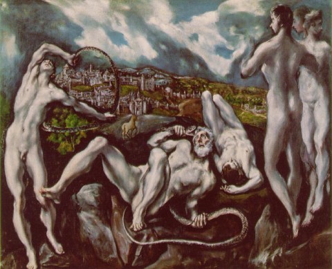
El Greco, "Laocoön," early 1610s

Is there any theory that is convincing to you? I like aspects of each one, for different reasons. Do you know of any other satires associated with the Laocoön? One more thought: Now that I’m familiar with Titian’s Monkey Laocoön, I think that I will forever look at El Greco’s Laocoön painting (early 1610s, shown above) in a different light. Doesn’t it look like the Trojan priest has sprouted a tail? Oh dear!

1 Philip Sohm, “Fighting with Style” in Italian Baroque Artby Susan M. Dixon, ed. (Malden, MA: Blackwell Publishing, 2008), 39, 45. To see more information on the mention of this theory in the seventeenth-century, see footnote #8 in H. W. Janson, “Titian’s Laocoön Caricature and the Vesalian-Galenist Controversy” in The Art Bulletin 28, no. 1 (1946): 49.

2 Janson, 49. This argument makes me wonder if Titian might have agreed or disagreed with Michelangelo’s interpretation that the Laocoön originally was depicted with a bent arm. Bandinelli proposed that the central figure was depicted with an extended right arm. However, Titian’s drawing depicts a bent arm, which seems more reminiscent of Michelangelo’s interpretation (and is consistent with the modern restoration, after the arm was discovered in the early 20th century. To read more about the Michelangelo and Bandinelli debate, see here: https://albertis-window.com/2011/04/the-laocoon-bandinelli-vs-michelangelo/

3 Ibid. Janson also critiques Fischel’s theory, finding that Titian would not have created such a personal response in a drawing that was intended for mass distribution in the form of a woodcut. See Janson, p. 50. As far as I can tell, though, we don’t know for certain if this drawing originally was intended to be made into a woodcut.

4 Seymour Howard, “On Iconology, Intention, Imagos, and Myths of Meaning,” in Arbitus et Historiae 17, no. 34 (1996): 94.

5 Janson, p. 50.

6 Ibid., 51.


— 4 Comments

Gothic Cathedral as Body and Mountain

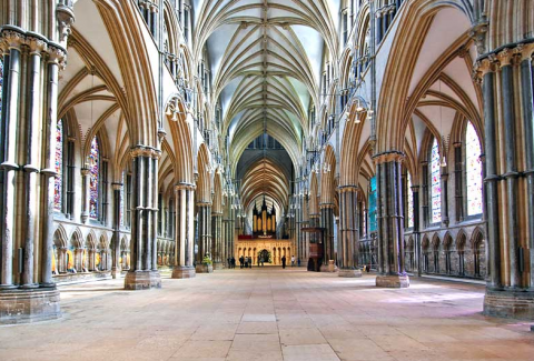
Lincoln Cathedral interior, construction mostly 12th-14th centuries

This past week I read a really interesting article by Peter Fingesten: “Topographical and Anatomical Aspects of the Gothic Cathedral.”1 Fingesten feels like the form and design of Gothic cathedrals have allegorical and symbolic meaning. He compares the interior of cathedrals to the anatomy of the human body (in essence, as symbols of Christ and/or the Virgin Mary). He also compares the exterior of cathedrals to mountains, finding a link between Gothic cathedrals, the Heavenly Jerusalem, and the “sacred mountain imagery” that existed in ancient cultures. This imagery, according to Fingesten, is largely inspired by the John the Revelator’s visions of the Heavenly Jerusalem (Chapter 21 of the Book of Revelation). I thought I’d briefly mention a few of the main points here.

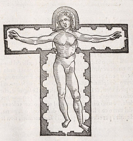
Pietro Cataneo, “Vitruvian Man” (1554)

Before reading this article, I already was familiar with how the floor plan of a basilica can mimic the form of the cross, or even the body of Christ. The allegorist William Durandus (also sometimes written Guillaume Durandi or William Durand) said as much in the 13th century. Fingesten asserts this point, and even references Vitruvius and the Renaissance artist Pietro Cataneo’s “Vitruvian Figure”(1554, see above), which is depicted within the basilica floor plan. But Fingesten takes things further: he discusses how the ribbed vaults of cathedrals mimic the spinal cord and ribs of a human figure. He believes that the Lincoln Cathedral interior (shown at the beginning of this post) is the best expression of this anatomical imagery. Fingesten also believes that the stained glass windows represent the translucent skin of the human body.

Using biblical references, Fingesten argues that the cathedral interior was originally intended to symbolize the body of Christ (who is recorded in the New Testament to have compared his own body to a temple). With the increase of devotion to the Virgin Mary in the twelfth century and afterward, the cathedral also came to symbolize her body. Mary’s body (and womb) traditionally have been compared to a “temple of God,” so I think that this later reinterpretation of the cathedral (really, a merger of male and female allegories) makes sense. I was especially intrigued by Fingesten’s descriptions about how “the pointed ribbed vault system suggests the rib-cage of a gigantic mother bending over her son” and how “cathedrals increased in size until they bulged like a woman high with child.”2

Salisbury Cathedral, England. Church building 1220-1258; west façade finished 1265; spire c. 1320-1330; cloister and chapter house 1263-1284

Fingesten also analyzes the exterior of cathedrals, finding that they symbolize the Heavenly Jerusalem, which is set upon Mount Zion. Fingesten thinks that this sacred mountain imagery is evoked in several ways. He finds that mountain peaks are referenced in the crossing tower and facade towers, while the spires allude to the summit.3 Nature is evoked in the exterior decoration through details and niches,  recalling the weather-beaten appearance of a mountain.4 Even the flying buttresses are used to extend this symbolism, Fingesten argues, and describes how they “hang precariously like snow bridges and drifts from the cliffs of the nave elevation.”5

It’s a really interesting and unique argument, I think. Fingesten delves into some textual references (beyond the Book of Revelation) to back up his argument. I’m not going to delve into those here, but you are welcome to read the argument on your own. My main concern is that Fingesten doesn’t convincingly have his own argument align well with what Durandus wrote in the 13th century. (For example, Durandus compared stained glass windows to the scriptures, not to translucent skin.) That being said, though, I think Fingesten’s interpretation of the cathedral is very impressionable. I know that I’ll think about rib-cages and mountains the next time I visit a Gothic cathedral.

1 Peter Fingesten, “Topographical and Anatomical Aspects of the Gothic Cathedral,” Journal of Aesthetics and Criticism 20, no. 1 (1963): 3-23.

2 Ibid., 18.

3 Ibid., 8.

4 Ibid., 10.

5 Ibid., 9.

— 11 Comments

Email Subscription


Archives

About

This blog focuses on making Western art history accessible and interesting to all types of audiences: art historians, students, and anyone else who is curious about art. Alberti’s Window is maintained by Monica Bowen, an art historian and professor.