Stags and Elk in “Adam and Eve” scenes

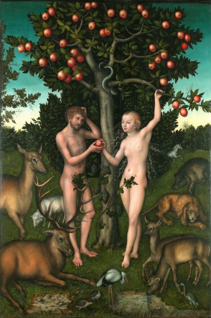
Lucas Cranach the Elder (1472-1553), Adam and Eve, 1526, The Samuel Courtauld Trust, The Courtauld Gallery, London

Lucas Cranach the Elder (1472-1553), Adam and Eve, 1526. The Samuel Courtauld Trust, The Courtauld Gallery, London

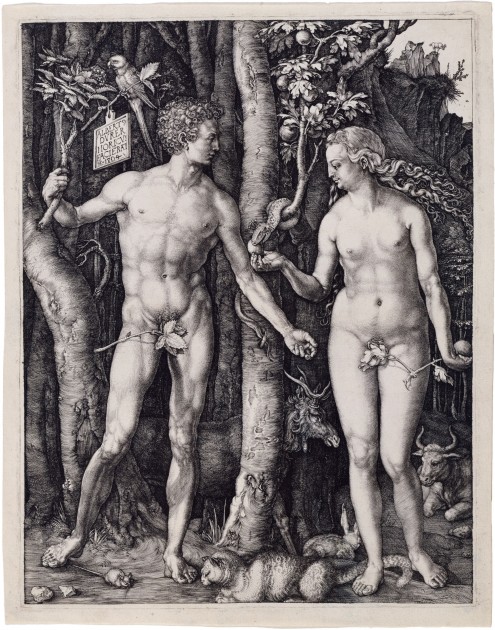
I have been combing through dozens of paintings of Adam and Eve this morning by Lucas Cranach the Elder. I knew he painted several versions, but I had no idea that he painted so many! I’ve been struck at seeing the different animals that Cranach chose to depict within the Garden of Eden, especially since these images by Cranach are influenced by Dürer’s Adam and Eve engraving of 1504. However, Cranach’s animals don’t have the same symbolic meaning relating to the four humors that Dürer intended. Instead, the Courtauld Gallery points out that their version (shown above) includes a multiplicity of animals that are “less solemn and portentous” than Dürer’s few animals. Cranach’s animals seem to suggest the exotic and lively environment within the Garden of Eden, which the Courtauld Gallery describes as a “seductive vision of Paradise.”

Albrecht Dürer, Adam and Eve," 1504. Engraving

Albrecht Dürer, Adam and Eve,” 1504. Engraving

Dürer’s Garden of Eden seems less seductive: there are clearly identifiable animals, but they aren’t visually-celebrated and displayed in the same way as the Cranach painting (notice Dürer’s rabbit is turned away from the viewer). Instead, these animals serve a symbolic purpose. According to Erwin Panofsky, four of the animals each represent one of the four humors and their associated temperaments, which is something that I have written about previously.

One particular animal in Dürer’s print is striking to me: the elk was seen as a symbol of melancholy, one of the four humors. I wonder if Dürer ended up thinking about this animal in a different way later on in his career: a few years after this print was created, a philosopher in Germany named Agrippa of Nettesheim connected the melancholic temperament specifically to creative, imaginative people involved in the arts.1 Dürer himself references to the melancholic temperament and the creative genius in later works of art: the Melencolia I engraving from 1514 is thought by some to be an allegorical portrait of the artist himself. Could Dürer have felt any sort of connection with the elk as an animal, after knowing of this connection between the melancholic temperament and artists? He did also complete a drawing of an elk, but the date of the drawing is disputed and unclear.

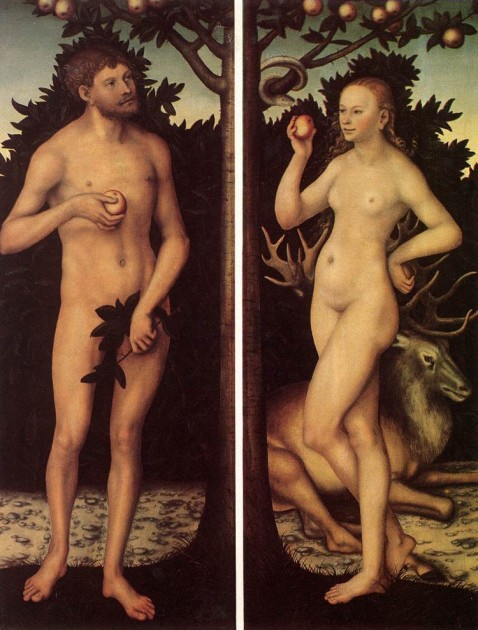
Cranach, Adam and Eve, first half of 16th century, Musées Royaux des Beaux-Arts, Brussels

Cranach, Adam and Eve, first half of 16th century, Musées Royaux des Beaux-Arts, Brussels

Since Cranach and Dürer were contemporaries, I began to wonder if Cranach depicted any elk that could possibly reference the melancholic temperament. However, I learned that Cranach rejected the idea of the Renaissance genius and the hubris of humanism, so it makes sense that he wouldn’t be interested in including symbols of the four humors. Furthermore, I noticed that Cranach’s paintings clearly depict stags instead of elk. There is a clear difference between these animals! Stags are much bigger than elk (see this photo). Cranach also makes an effort to depict the shaggy neck/chest mane that is characteristic of stags (see painting above), to make sure that the stag is clearly identified.

But why stags? This also has symbolic meaning, but in a different way than the elk. Since the medieval period, stags were viewed as a symbol for Christ and Christians. Just as a stag can escape the hunter or a predator, Christ was able to escape the devil and the permanence of death. Similarly, a Christian could also escape the snares of the devil through emulating Christ and living a virtuous life.Cranach emphasizes this idea by showing a stag pulling back from a predatory lion in his 1533 painting of Adam and Eve in the Gemäldegalerie in Berlin.

It’s revealing to me that Cranach often depicts the stag appears behind Eve (shown above) or peeking behind Adam (as seen in this 1528 example in the Detroit Institute of Arts collection), too. This seems intentional because Adam and Eve are not following the “escapist” behavior of the stag, but instead are falling into the trap of sin by partaking of the Forbidden Fruit. Therefore, the stags in these paintings serves as a reminder for the need of Christ, since sin enters into the world due to Adam and Eve’s actions.

So, both the elk and the stag can relate to the idea of imbalance due to the introduction of sin: either the imbalance of the four humors or the need for mankind to find redemption through Christ. I think that Dürer was able to include a more obscure reference to the four humors, since his engraving was intended to produce a smaller amount of prints that would have been circulated in humanist circles that understood the reference. In contrast, Cranach included a traditional medieval symbol with his stag, which explains why he felt comfortable reproducing the stag in numerous paintings, since he knew his broader audience would be more familiar with such symbolism.

1 Paul Wood, “Genius and Melancholy: The Art of Dürer,” in The Changing Status of the Artist by Emma Barker, Nick Webb, and Kim Woods, eds. (Open University Press, 1999), p. 156-157. Available online: https://books.google.com/books?id=A_1Ady0GAuUC&lpg=PP1&pg=PA156#v=onepage&q&f=false

2Lindsey Nicole Blair, “Cats and Dogs: The Development of the Household Pet through Symbolic Interpretations and Social Practices in the Middle Ages and Renaissance,” in Iowa Research Online (Summer 2016): 15-16. Available online: http://ir.uiowa.edu/cgi/viewcontent.cgi?article=1004&context=honors_theses

Comments Off on Stags and Elk in “Adam and Eve” scenes
Frank Sinatra’s Paintings

I read recently that the Renaissance sculptor Benvenuto Cellini reminded Tony Bennett so much of Frank Sinatra that Tony once gave Frank a copy of The Autobiography of Benvenuto Cellini as a birthday gift. I scoffed and chuckled a little bit when learning this, since Cellini had a flair for extreme drama. However, Tony said that he admired how “Benvenuto would draw his sword and battle every hypocrite and phony who stood in the way of truth,” and it is this aspect of Cellini that reminded him of Sinatra.And although Tony Bennett wrote that he was thinking of Frank Sinatra’s character when he made this gift, this anecdote made me wonder if Frank had more direct connections to the world of visual art. And he does!

The title of this post actually has dual meaning, since Frank Sinatra had a collection of paintings and also was a painter himself! I haven’t been able to find information on his personal art collection (or identify the painters/paintings shown in the Getty photograph linked above), so unfortunately I can’t explore his connection to art as a collector. If anyone knows information about Sinatra’s collection or his collecting habits, please share!

Frank Sinatra in his studio, n.d.

Frank Sinatra in his studio with granddaughter Amanda (left, n.d.), display of Frank Sinatra’s art at the Grammy Museum in Los Angeles (right)

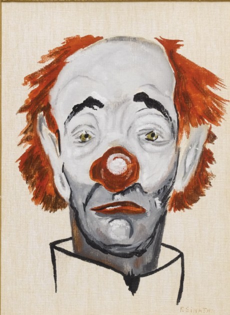
What I have been able to learn, however, is more about Frank Sinatra’s personal interest in oil painting; this was a hobby that he maintained for more than forty years! Some of Frank Sinatra’s paintings and memorabilia are available for sale on a website that is maintained by a collector, and other paintings are on public display at the Grammy Museum in Los Angeles (shown in the image above). I also came across a Telegraph article from 2009 which explains how one of Frank’s paintings is believed to have been painted in 1957, during the artist’s difficult divorce from the actress Ava Gardner. The painting is a self-portrait of the artist as a melancholic clown (see below), and it was a subject that he painted again and again and again (and these links are just a few examples!).

Clown painting by Frank Sinatra, c. 1957. Oil on canvas

Clown painting by Frank Sinatra, c. 1957. Oil on canvas

No doubt when Stephen Sondheim’s 1973 song “Send In the Clowns” was covered by Frank that same year, this song must have had very special meaning for Frank due to his relationship with Ava and also his clown paintings from the previous decade and a half. In fact, Frank once prefaced his performance of this song with an explanation that this is a breakup song between two adults, and I can’t help but think that Frank pulled from his own experiences with breakups to convey the sentiment of the song. I have a feeling that he thought about his self-portraits as a clown while he sang.

Frank didn’t just create representational art, however. In fact, most of his paintings were heavily, heavily influenced by painters of the mid-20th century, especially the Abstract Expressionists. I recently came across the book A Man and His Art: Frank Sinatra with a forward written by his daughter Tina Sinatra. The book mostly includes color plates of Frank’s paintings, and it’s fun to play a guessing game and figure out what artist and/or painting might have served as inspiration for Frank’s art. For example, easy to see how this painting below is reminiscent of Ellsworth Kelly’s art, for example. The different gradients of opacity and transparency of the pigment remind me a little bit of Mark Rothko.

Frank Sinatra, "Summer Wind," c. 1980s.

Frank Sinatra, “Summer Wind,” c. 1980s.

And this bold painting of a geometric shape, which I quite like, reminds me of Frank Stella:

Frank SInatra, Untitled, 1989. 57" x 47", the Desert Hospital, Palm Springs, California

Frank SInatra, Untitled, 1989. 57″ x 47″, the Desert Hospital, Palm Springs, California

When flipping through A Man and His Art, I also notice paintings that reminded me of Josef Albers, Robert Motherwell, and Franz Klein. I also read a short online article that Robert Mangold’s art also served as an inspiration for Sinatra. And while, like Sinatra, I admire all of these 20th-century artists, I don’t think that Sinatra’s art rivaled these other painters. I think some of his paintings are quite terrible, actually, not because it is derivative of another source but that the colors seem muddied and the brushwork is sloppy.

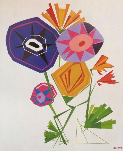
Some of Frank’s art seems more unique to me (although it could just be that I am not familiar with the original source!). Even though I don’t think that Frank was a fabulous painter, but I do really like this one, especially because of the dynamic shapes and lines used to create the stems and leaves of the flowers:

Frank Sinatra, Untitled, 1989. 38" x 42", collection of Frank Sinatra

Frank Sinatra, Untitled, 1989. 38″ x 42″, collection of Frank Sinatra

So looking at these paintings by Frank Sinatra, many of which are clearly derivative of other painters’ styles, makes me reflect back on Tony Bennett’s quote about how he thinks of Frank Sinatra as someone who “would…battle every hypocrite and phony who stood in the way of truth.” I don’t think that Frank saw himself as a “phony” when he heavily took inspiration from other artists, both in painting and also in singing. Tina Sinatra makes an interesting point that her dad “was the first to admit that he mimics what he’s seen, but, just as with music, it becomes Frank Sinatra’s because he stylizes it.”

I like this idea, because I like to think about how Frank Sinatra learned about the potential of crooning and singing softly into a microphone from his slightly-older predecessor Bing Crosby. And Frank took those basic aspects of family-man Crosby’s singing approach and then turned crooning into something sultry. Similarly, since Frank picked up Abstract Expressionism later on in life (especially in the 1980s, after the height of Abstract Expressionism ), he looked to visual art “predecessors” to explore the potential of visual expression. Although I still prefer the Abstract Expressionists over the paintings made by Frank Sinatra (I’m glad you didn’t quit your day job, Frank!), I can see how his work (like by combining the aesthetic of Ellsworth Kelly and Mark Rothko in a single painting) creates something new.

What do you think of Frank Sinatra’s art? Does his art remind you of his music?

1 Tony Bennett, “Sinatra” in Sinatra at 100 in LIFE special edition by Robert Sullivan and editors of LIFE, vol. 15, no. 18, November 27, 2015, p. 9. 

2 Tina Sinatra, A Man and His Art: Frank Sinatra (New York: Random House, Inc., 1991), ix.

Comments Off on Frank Sinatra’s Paintings

Plaster Cover-Up and the “Last Judgment” at Autun Cathedral

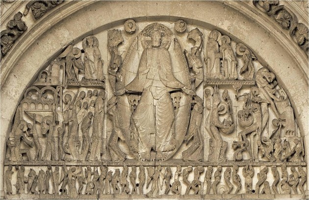
Tympanum depicting the "Last Judgment" from the Saint-Lazare Cathedral, Autun, France. c. 1120-1130 or c. 1130-1145. Base of tympanum is approximately 21' in length

Tympanum depicting the “Last Judgment” from the Saint-Lazare Cathedral, Autun, France. c. 1120-1130 or c. 1130-1145. Base of tympanum is approximately 21′ in length

Earlier this week, I was discussing the “Last Judgment” tympanum at the Cathedral of Autun with my students. I pointed out some details of the bottom-most register (such as this one), and explained that the dead are rising out of their sarcophagi, waiting to be judged by Christ at his Second Coming. These references to resurrection and life after death is especially appropriate on this church, since the Romanesque church was built to house the bones of Saint Lazarus, the man whom Christ rose from the dead.

Then one of my students asked where Saint Lazarus’ bones were located in the church. Since I haven’t visited this church in person, I said that I would look into that question and let him know. In the process, I discovered some very interesting history: the bones of Saint-Lazarue don’t exist anymore because they intentionally were destroyed. For centuries, beginning around 1170-1180, the bones of Saint Lazarus were located in a tomb in the choir area (closer to the east side of the church, in front of the the apse). However, the tomb and bones they were destroyed during the French Revolution (1789-1799) by hostile revolutionaries.

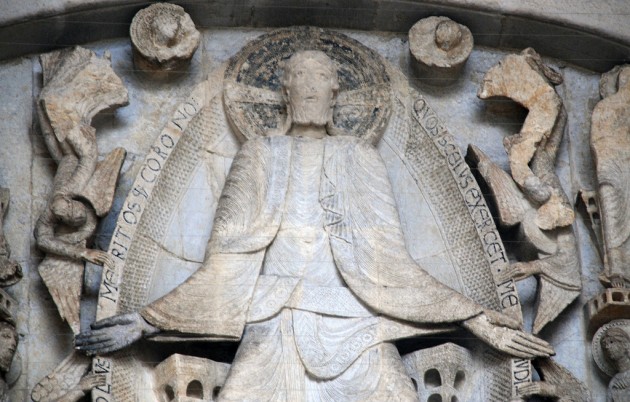
Such destruction of art was not uncommon during the French Revolution, due to the anti-religious and anti-monarchical sentiment that existed at the time. Some French revolutionaries wanted to disassociate themselves and the rising French nation from the traditional past, and the government even endorsed some of this destruction. In fact, other sculptures at the Autun Cathedral were also destroyed by revolutionaries, but luckily the Last Judgment tympanum was preserved through an ironic twist of fate. Around 1766, before the revolution, the tympanum was covered with plaster as part of a remodeling effort to remove traces of the medieval period within the church. In order to achieve a smooth surface of the new plaster covering, Christ’s head was cut off. The head was discovered in the 20th century, authenticated, and restored to its original position in 1948 (although a visible break in the neck is perceptible; see detail below).1

Detail of Christ from the "Last Judgment" tympanum at Autun Cathedral, c. 1120-1130 or c. 1130-1140. Image courtesy Steven Zucker via Flickr (https://creativecommons.org/licenses/by-nc-sa/2.0/; image is unaltered)

Detail of Christ from the “Last Judgment” tympanum at Autun Cathedral, c. 1120-1130 or c. 1130-1140. Image courtesy Steven Zucker via Flickr (https://creativecommons.org/licenses/by-nc-sa/2.0/; image is unaltered)

So, ironically, the Last Judgment tympanum was preserved because the clergymen didn’t like the medieval style! Because it was covered up with plaster about two decades before the French Revolution, the tympanum was not destroyed and was only rediscovered when the plaster was removed in 1837. What luck this work of art exists today!

1 Paul L. Cioffi, “Saint-Lazare Tympanum and Tumeau, West portal,” Georgetown University Library, https://repository.library.georgetown.edu/handle/10822/554259, accessed  2 December 2017. See also Linda Seidel, “Legends in Limestone: Lazarus, Giselbertus, and the Cathedral of Autun” (Chicago: University of Chicago Press, 1999), 26.

Comments Off on Plaster Cover-Up and the “Last Judgment” at Autun Cathedral

Flora Forager’s Fresh Flowers: Fantastic and Iconic Images

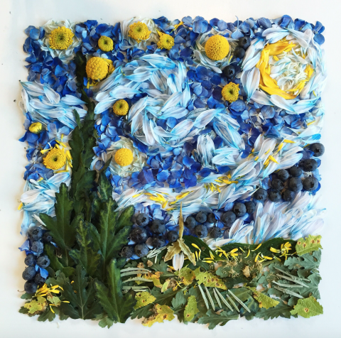
Flora Forager, “Van Gogh’s ‘The Starry Night,'” 2016. Billy buttons, blueberry, chrysanthemum, hydrangea, lavender, sunflower. Used with permission from Bridget Beth Collins (Flora Forager).

Last week I had the opportunity to interview Bridget Beth Collins, a Seattle-based artist who creates gorgeous collages out of flowers, leaves, and other botanical items like pinecones, mushrooms, fruit and seeds. Collins works under the pseudonym of “Flora Forager” since her collages often consist of botanical elements found in her garden or the green areas surrounding her Seattle-based home. Just last month, her book The Art of Flora Forager was released, and it is such a delight to see and read! I really am thrilled about this book. Similarly, it was a real pleasure for me to meet Bridget in person, since I automatically feel a true affinity with people who love flowers, juvenile fantasy fiction, and (as I discovered in the course of our conversation) old murder mystery television series.

Ever since I became familiar with Flora Forager’s work on Instagram earlier this year, I’ve been charmed with her creative subject matter, the novelty of her compositions, and also her unusual choice of medium. Flora Forager’s whimsical collages depict things like animals, insects, woodland fantasy scenes, mandalas, star constellations, portraits of iconic women, and even copies of famous masterpieces. In concept, her collages might remind one of colonial feather paintings or even Grace Kelly’s pressed flower collages. However, in the course of my conversation with Bridget, it became apparent that her work is very different from Grace Kelly’s flowers, even if sometimes their compositions are loosely similar (compare Grace Kelly’s geometric patterns with one of Flora Forager’s mandalas).

Mother and Child

Flora Forager, “Klimt’s ‘Mother and Child,'”, 2015. Aster, chrysanthemum, dahlia, lacecap hydrangea, lilac, pansy, Peruvian lily, pumpkin vine, sunflower. Used with permission from Bridget Beth Collins (Flora Forager).

In contrast to Grace Kelly, Bridget does not like to work with dried or pressed flowers. As we spoke, it was apparent that the three-dimensional quality of the fresh flowers is important to her. She wants to her flowers to have bulk and form as they are layered and arranged, to the point that she is mindful of the shadows that are created: she consistently photographs her work from the same location on her white dining room table, so that all of the shadows fall to the left.1 She also wants to make sure that the shadows are soft and comely, and she commented that the cloudy skies of Seattle create perfect lighting for the effect she wants to capture.2

This interest in softly modeled three-dimensional collages is really revealing to me, because I think it helps to explain why Flora Forager’s representational collages are so delightful and impactful: the three-dimensional forms and fresh flowers create a sense of plausibility and give a lively presence to something that might not actually exist in reality. For example, a three-dimensional rendering makes a fantasy scene (such as this one or this one) seem more palpable, and therefore endearing, to an escapist viewer. Such fantastic escapes and whimsical storybook tales are just within reach! And not only are they rendered possible because the collages are three-dimensional, but they are created with found objects that are easily identifiable and readily found to the viewer. In a sense, her art suggests that fantasy is embedded within the everyday world around us.

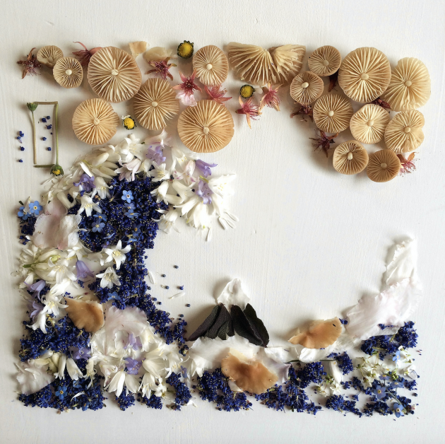
Screen shot Hokusai

Flora Forager, “Hokusai’s ‘Under the Wave Off Kanagawa,” 2015. Bluebell, California lilac, cherry blossom, narcissus, pixie’s parasol mushroom, purple sage, rhododendron, tansy. Used with permission from Bridget Beth Collins (Flora Forager).

In a related way, I think that the three-dimensional fresh flowers also affect the way that the viewer reacts to Flora Forager’s copies of famous masterpieces or portraits of iconic women (like Audrey Hepburn or Marilyn Monroe). On one hand, the three-dimensional forms and botanical media give an iconic image or iconic person a new sense of presence and life: we can look at familiar objects or faces in a new way. But I think that the fresh flowers also help to reinforce the iconic, timeless status of these familiar objects too. When flowers and leaves are captured as fresh and pristine in a photograph, these natural elements become immortalized in the same way that iconic images have been cemented in their well-known celebrity status. As a result, we have timeless flowers that won’t fade, similar to iconic images that don’t dissipate from cultural memory.

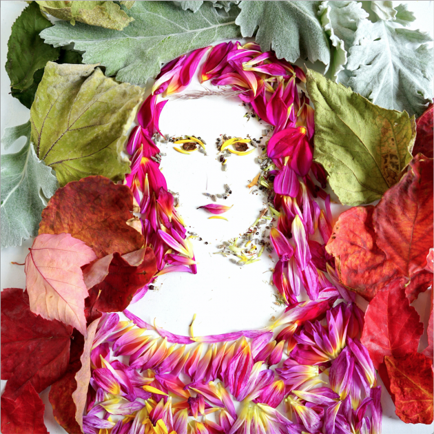
Screen Shot 2017-10-10 at 9.59.41 PM

Flora Forager, “Da Vinci’s ‘Mona Lisa,” 2016. Chrysanthemum, dahlia, lamb’s ear, lavender, pinecone, red maple leaf. Used with permission from Bridget Beth Collins (Flora Forager).

I’m reminded of a quote contrasting long-lasting, iconic works of art to flowers:

“Works of art often last forever, or nearly so. But exhibitions themselves, especially gallery exhibitions, are like flowers; they bloom and then they die, then exist only as memories, or pressed in magazines and books.” – Jerry Saltz, New York Magazine

What Flora Forager does so well is belie the inevitable death of nature: her camera captures flowers and leaves while they are fresh and vibrant, and uses that vibrancy to her advantage to reinforce that an iconic work of art can “last forever” or that a famous celebrity is, indeed, immortal.

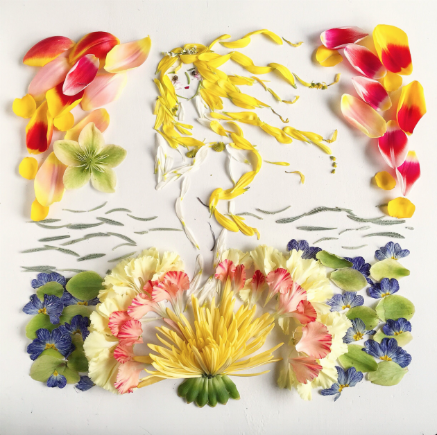
Flora Forager, Botticelli

Flora Forager, “Botticelli’s ‘The Birth of Venus,'” 2016. Carnation, chrysanthemum, daisy, goldenrod, Lenten rose, marsh rosemary, sunflower, tulip, woolly lavender. Used with permission from Bridget Beth Collins (Flora Forager).

For anyone who is interested, please follow Flora Forager on Instagram and see her print shop. In addition to The Art of Flora Forager book, Bridget Beth Collins has also created Flora Forager: A Seasonal Journal Collected from Nature. She anticipates the publication of another journal titled Metamorphosis in 2018.

1 Bridget Beth Collins, interview with author. Seattle, October 5, 2017.

2 Ibid.

— 1 Comment

The Dresden Frauenkirche and “New” Baroque Thoughts

A few weeks ago I had an amazing opportunity to travel to Germany and spend time with two dear friends. My trip began in Munich and eventually ended up in Berlin. I spent an inordinate amount of time at museums, naturally, and I thought a lot about my current aesthetic preferences while I gallivanted about the cultural centers of various German cities and towns. Many of the things I saw that I was drawn to, aesthetically, were typically not the things that I study or teach about in my classes. Perhaps my mind really wanted to feel like it was on summer vacation!

Frauenkirche, Dresden. Original structure completed 1743; restored and rebuilt structure completed 2005.

Frauenkirche, Dresden. Original structure completed 1743; restored and rebuilt structure completed 2005.

One thing that really surprised me was my aesthetic reaction to the Frauenkirche in Dresden. This building is unique because it is a virtual replica of the original building that was destroyed in the WWII bombing of Dresden in 1945. The original building was built 1726-1743. After the bombing of Dresden, the church lay in ruins for several decades (see this photo from about 1965). However, through massive fundraising efforts in the 1980s and 1990s, the church was able to be rebuilt and completed in 2005.

I loved walking around the exterior of this church, because it was a really good reminder to me of how the church is old and new. Several thousands of stones were salvaged from the old building and incorporated into the new structure. The older stones have a darker patina due to weathering and fire damage. I like how the pock-marked appearance of the cathedral gives off a sense of the structure’s complex history and interrupted sense of time, even if the precise placement of the individual stones is not completely accurate to that of the original structure.1

I’ve realized more and more that I like art that gives off some kind of a visual sense of age or time, and I’m trying to determine how much history would I prefer to be visually evident. Some 19th-century art critics considered the successive coats of varnish on a painting to be a mark of beauty and excellence, because they gave an indication of the painting’s age.2 For example, the 18th-century critic Sir George Beaumont wrote, “A good picture, like a good fiddle, should be brown.”3 I don’t know if I would completely go that far, because even while in Dresden I commented to my friend about how it was unfortunate that old structures like the Hofkirche were covered with soot and grime. But think there needs to be some good balance between a sense of the old and the new, and the polka-dotted Frauenkirche exterior helped me to feel connected to the past.

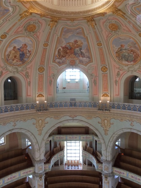
Interior of dome in Frauenkirche, Dresden. Structure completed 2005.

Interior of dome in Frauenkirche, Dresden. Structure completed 2005.

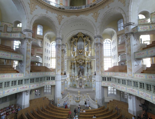
The interior of the Frauenkirche, however, was too new and fresh for me. I know that parts of the original altar were reincorporated into the new structure, but even these salvaged pieces of history were painted over, and it was hard to get a sense of age anywhere.4 The interior was so light and the colors of the paintings were so bright! It made me realize that, had I lived in the 17th or the 18th century, I might not have liked the Baroque style as much, because then it would have been new for its time. Everything in the church appeared to be so clean and recent – and I began to realize that part of the drama that is so inherently “Baroque” in my mind is connected to the mysterious, theatrical aura that these works exude today because they are old.

Interior of the Frauenkirche, Dresden. Interior is a 21st-century replica (completed 2005) of the original 18th-century structure (completed 1743).

Interior of the Frauenkirche, Dresden. Interior is a 21st-century replica (completed 2005) of the original 18th-century structure (completed 1743). Image courtesy Wikipedia

Visiting the Frauenkirche and thinking about my aesthetic preferences for The Old reminded of a quote by Bernard Berenson, which my friend Dr. F shared with me a few months ago. Berenson points out that the inherent biases and preferences which writers bring to their discussions of works of art, and Berenson uses Goethe’s as an example:

“Some months before passing through Assisi he [Goethe] made no reference to San Francesco and all its marvelous Trecento paintings. Such a genius and yet so limited in his visual tastes, he expresses and interprets only the admirations that were current in his epoch, and accepted in the cultured world he belonged to before coming to Italy. If in following his steps I notice his indifference to what is our chief delight now, I do not by any means want to belittle the importance of his pages. I want only to point out the distance created by different cultural traditions between us and eminent men of other ages.”5

This quote makes me wonder if my “chief delight” in Baroque art is its age – something which Baroque artists didn’t inherently imbue in their works of art. I don’t think that this is inherently a bad thing, but I think it should make me reconsider why I am drawn to certain works of art. And it’s revealing to think about this in terms of my escapist personality and character: I want to connect with the past and bygone eras, simply because they are not the present. Old, vintage and antique things need to be unattainable in some way, because that is partially what makes them enjoyable to me!

1 Mark Jarzombek, “Disguised Visibilities: Dresden/’Dresden,'” in Memory and Architecture by Elena Basti ed., 56. Source available online: http://web.mit.edu/mmj4/www/downloads/disguised_vis.pdf

2 David A. Scott,  Art, Authenticity, Restoration, Forgery (Los Angeles: UCLA, Cotsen Institute of Archaeology Press), 2016), p. 21.

3 Ibid.

4 André Harrmann, “Architectural Reconstructions: The Current Develpoment in Germany” (Master’s thesis, The University of Georgia, 2006), 56. Source available online: https://getd.libs.uga.edu/pdfs/harrmann_andre_200608_mhp.pdf

5 Bernard Berenson, The Passionate Sightseer, (London: Thames and Hudson, 1960), 124. Source available online: https://archive.org/stream/in.ernet.dli.2015.507665/2015.507665.The-Passionate_djvu.txt 

— 3 Comments

Email Subscription


Archives

About

This blog focuses on making Western art history accessible and interesting to all types of audiences: art historians, students, and anyone else who is curious about art. Alberti’s Window is maintained by Monica Bowen, an art historian and professor.