Category

William Morris

William Morris and Children’s Classics

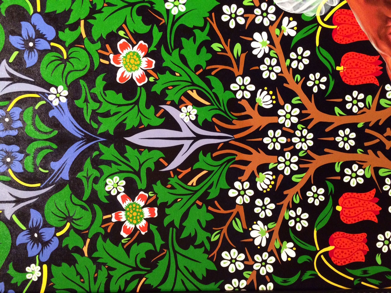
Yesterday I finished listening to an audiobook of The  Secret Garden by Frances Hodgson Burnett. I have loved that story since I was a girl and it was fun for me to revisit the book. While I was looking up some favorite quotes from the text, I came across a Puffin classic collector’s series which incorporates William Morris designs into the covers of the books. All of the covers are designed by Liz Catchpole, who collaborated with the V&A Museum in order to choose Morris designs from the museum’s collection. This is the cover for  The Secret Garden in the series:

Cover of "The Secret Garden," by Frances Hodges Burnett, illustrated by Liz Catchpole

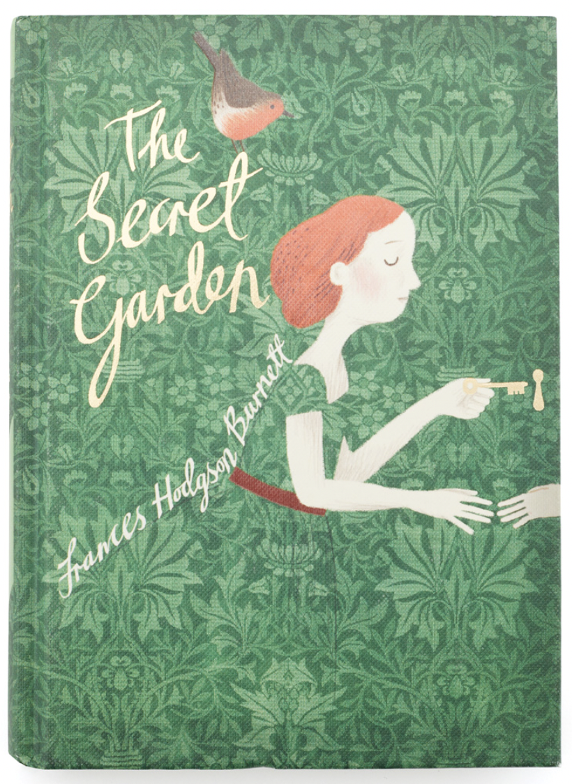
Cover of “The Secret Garden,” by Frances Hodgson Burnett, illustrated by Liz Catchpole

The William Morris design chosen for this cover is “Flower Garden” from 1879, which is a very appropriate title for a book about a garden! However, it should be noted the flowers in the Morris design differ from the ones mentioned in the book. The Secret Garden book mentions lots of flowers, including snowdrops, roses, daffydowndillys (daffodills), crocuses, irises, delphiniums, primroses, poppies, and cherry blossoms. By contrast, the “Flower Garden” design includes stylized flowers that look like snakeshead (fritillary) and borage. There doesn’t appear to be any ivy, so the quote on the back of the book cover about the “swinging curtain of ivy” is less relevant to the Morrisian design.

William Morris, "Flower Garden," 1879. Furnishing fabric of Jacquard-woven silk and wool, made at Queen Square Workshop and at Merton Abbey Workshop, England. © Victoria and Albert Museum, London. Used with permission.

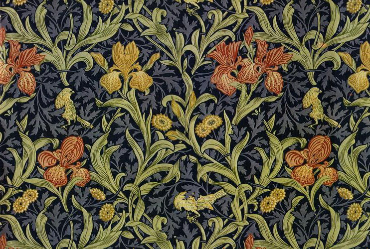
William Morris, “Flower Garden,” 1879. Furnishing fabric of Jacquard-woven silk and wool, made at Queen Square Workshop and at Merton Abbey Workshop, England. © Victoria and Albert Museum, London. Used with permission.

All this being said, though, I still love the use of the Morris design for this book cover. I think that having the “Flower Garden” pattern used as part of Mary’s dress is clever in two ways: 1) it complements how this design by Morris was used to make 19th-century textiles at Merton Abbey and 2) the thriving foliage foreshadows the positive growth and internal change that Mary Lennox experiences as she lives as Misselthwaite and cares for the Secret Garden.

The V&A Store explains on their website how each of the books in the collector series are held within the National Library. These are the other books in the series, along with the Morris designs chosen:

  • The Wind in the Willows  cover is Morris’s “Willow Bough” design (1887). I think this choice is so appropriate, especially because the leaves overlap and curl as if they are being moved by the wind.
  • The Anne of Green Gables cover is Morris’s “Bird” design (1878). This design reminds me a little of a quote that Anne says while she travels with Matthew to Green Gables from the train station: “If you were out in a great big woods with other trees all around you and little mosses and June bells growing over your roots and a brook not far away and birds singing in you branches, you could grow, couldn’t you?”1
  • The Alice’s Adventures in Wonderland  cover is appropriately decorated with Morris’s “Brother Rabbit” design (1880-1881) to reference the White Rabbit.
  • The Little Women cover is Morris’s “Larkspur” design (1875). I don’t see a clear connection between the design and Jo on the cover. But larkspur is mentioned in the book at the beginning of Chapter 10, in a description of the different flowers that the four sisters grow in their respective quarters of the garden plot.
  • The Peter Pan cover is Morris’s “Marigold” design (1875). I don’t see a direct connection to the book, although the dense foliage could perhaps evoke the forest of Neverland.
  • The Jungle Book cover is the “Indian” design (produced 1868-70) used by Morris & Co. The V&A website explains that this design was not made by Morris, but was copied from an 18th-century wallpaper or may have been designed by architect George Gilbert Scott, whose company Watts & Co. produced some wallpapers. I can see why this cover was chosen, as the dense and spiky plants evoke a sense of a warm climate and jungle.
  • The Treasure Island cover design is “Strawberry Thief” (1883). While the birds in the design only loosely relate to the parrot on Long John’s Silver’s shoulder, I think that the theme of thievery can serve as a loosely appropriate parallel between the design and the pirate rogues in the book.

And in case you are curious, the William Morris designs are only on the covers of the books, and not part of any illustration within the texts themselves. (One reviewer has wondered if it would be possible for Liz Catchpole could illustrate the pictures within the text too.) I know Liz Catchpole has done a few other designs for books that include William Morris patterns, including The Twelve Days of Christmas, William Morris ABC and William Morris 123. If you know of other children’s books which incorporate William Morris designs, please share!

1 L. M. Montgomery, Anne  of Green Gables, first published 1908. Quote is from Chapter 2 and found online here.

— 4 Comments

“The Arnolfini Portrait” and “La Belle Iseult”

Over the weekend, I listened to author and curator Suzanne Fagence Cooper present a Zoom lecture titled “At Home with Jane and William Morris,” drawing information from a book scheduled to come out next year. I was especially interested in the passing comment that Cooper made about William Morris’s painting La Belle Iseult (1858, shown below). This is the only completed oil painting by William Morris that exists; today his work in the arts is more closely associated with designs of tapestries and wallpaper prints. However, early in his career (when he fell under the beguiling spell of Dante Gabriel Rossetti), Morris tried his hand at painting. The model for this painting is Jane Burden, who would marry William Morris the following year in 1859.

William Morris, "La Belle Iseult," 1858.  Photo © Tate. Available through Creative Commons License CC-BY-NC-ND 3.0 (Unported)

William Morris, “La Belle Iseult,” 1858. Oil paint on canvas, 71.8 x 50.2 cm. Photo © Tate. Available through Creative Commons License CC-BY-NC-ND 3.0 (Unported)

Suzanne Fagence Cooper mentioned how this painting is has some similarities with Jan Van Eyck’s painting The Arnolfini Portrait (1432), with the positioning of Iseult’s body matching the turned pose and voluminous drapery folds of the Arnolfini wife, in addition to the inclusion of oranges on the right side. In comparing the two paintings side by side, the folded up bed curtains on the right side also have similarity in composition. Both paintings also include carpets, dogs, mirrors, and slippers.

Jan Van Eyck, "The Arnolfini Portrait, 1432. Oil on oak, 82.2 x 60 cm. Photo © Tate. Available through Creative Commons License CC-BY-NC-ND 3.0 (Unported)

Jan Van Eyck, “The Arnolfini Portrait, 1432. Oil on oak, 82.2 x 60 cm. Photo © Tate. Available through Creative Commons License CC-BY-NC-ND 3.0 (Unported)

The Arnolfini Portrait was purchased by the National Gallery (London) in 1842The influence of the Arnolfini Portrait on the Pre-Raphaelite Brotherhood (and William Morris, but extension) was highlighted in a 2018 exhibition Reflections : Van Eyck & the Pre-Raphaelites.   In fact, La Belle Iseult was included as part of the show and was promoted online an attraction.

I haven’t been able to find a photograph of this painting that includes an image of the original frame by Morris, but this article mentions that the phrase “As I can” is included, as a nod to the phrase that Van Eyck would use in when signing many of his paintings. (If anyone has or knows where there is a photograph of this frame online, please share!) It seems to me that La Belle Iseult also includes a humble acknowledgement of William Morris’s shortcomings as a painter, not only in contrast to his peers Edward Burne-Jones and Dante Gabriel Rossetti (as others have noted), but specifically Jan Van Eyck: the back of the painting includes the inscription “I cannot paint you; but I love you.” It seems to me that this inscription also is intended to complement and echo the “as I can” sentiment on phrase on the frame.

While William Morris may have sensed his limitations as a figural painter, Suzanne Fagence Cooper pointed out how La Belle Iseult indicates Morris’s strengths in pattern design. The carpets, tapestry, drapery pattern all are meticulously painted and are the greatest strengths of this painting. In fact, I think that these patterns are part of the greatest tribute to Jan Van Eyck, since he paid attention to minute details and was very interested in reproducing the likeness of fabrics and textures.

— 5 Comments

Wiley and Morris at the St Louis Art Museum

Screen Shot 2018-12-19 at 11.28.59 AM

The radio silence on my blog has been deafening for me, but luckily I’ve been able to do some writing over the past few months. The William Morris Society in the United States contacted me a few months ago, after reading my 2016 post on Kehinde Wiley and William Morris. I expanded this initial post into a new one for their “News from Anywhere” webpage with updated information about a current Kehinde Wiley show at the Saint Louis Art Museum. And check out the gorgeous catalog cover for the exhibition!

Comments Off on Wiley and Morris at the St Louis Art Museum

Kehinde Wiley and William Morris

My different art experiences are colliding this week in an unusual way. This past weekend I went and saw the exhibition Kehinde Wiley: A New Republic at the Seattle Art Museum. And then, just today I taught my students about some of the designs that appear in William Morris’s wallpaper. When I got home this afternoon, I began to think about how some of William Morris’s work is referenced in a few of Kehinde Wiley’s paintings that I saw on display.

Kehinde Wiley, "St. John the Baptist in the Wilderness," 2013

Kehinde Wiley, “St. John the Baptist in the Wilderness” from “The World Stage: Jamaica series 2013

For example, the background design in Saint John the Baptist in the Wilderness is clearly referencing a William Morris print of birds and irises. As someone who loves William Morris’s designs, I would have liked to have seen this references explored a little more clearly. A review of this same exhibition from last year (when it was at the Brooklyn Museum of Art) also suggested that mentioning the origins of the backgrounds in Wiley’s paintings would strengthen the show.

Kehinde Wiley, "Mrs. Siddons from the series 'An Economy of Grace,'" 2012. Oil on canvas

Kehinde Wiley, Mrs. Siddons from the series ‘An Economy of Grace,'” 2012. Oil on canvas

The reference to William Morris was most clearly pointed out to me in the portrait of Mrs. Siddons; the pattern is clearly inspired by the Blackthorn block-printed wallpaper that Morris designed in 1882.

IMG_1882

Kehinde Wiley, “Mrs. Siddons from the series ‘An Economy of Grace,'” 2012. Oil on canvas

It seems like there are several reasons for why Kehinde Wiley chooses to reference William Morris’s designs in some of his paintings. On one hand, Wiley’s compositions and designs are trying to draw awareness to the realm of history and art history, not only with the decorative motifs but the way the figure is represented (the female figure’s position which looks away from the viewer reminds me of depictions of the penitent Magdalene by George de la Tour).

In past centuries, fine art was typically associated with white Europeans and refinement. Wiley wants to challenge the idea that fine art and statements of cultural refinement are limited to a specific race; he does this by referencing European artistic traditions in his portraits of black people. To help emphasize his point, Wiley draws inspiration from Morris’s wallpaper designs, since they are associated with taste and the high-quality production surrounding the Arts & Crafts movement. In the exhibition catalog for this show, Annie Paul explains that Wiley creates “decorative backgrounds [which are] inspired by the English designer William Morris, who wove images from botany and zoology into intricate patterns signifying taste and discrimination.”It seems like Wiley occasionally uses Morris’s designs to reference English history and colonialism, too. For example, the inclusion of a Morris print in St. John the Baptist in the Wilderness (shown above) references the past colonial presence of the English in Jamaica.

So, Kehinde Wiley’s portraits of black figures, which contain visual references to European history and European art, call for attention and help to create a new vision of contemporary black identity and presence. Holland Cotter, in reviewing a 2005 exhibition of Wiley’s work, asserted as much by saying that Wiley “is a history painter. . . . By this I mean that he creates history as much as tells it.”2

And what would William Morris think about his imagery being utilized in this way? I think that he would be quite pleased: Morris was a socialist who wanted to bring about a change in the art world and society. William Morris felt like the arts, particularly the decorative arts, “were ‘sick’ as a consequence of the split between intellectual and mechanical work that occurred during the Renaissance.”3 Perhaps in a similar vein, Kehinde Wiley seeks to bind together racial divides and “heal” stereotypical assumptions about what constitutes art and portraiture.

So when Wiley’s paintings are considered in terms of social unity, Morris’s designs are very appropriate. Art historian Caroline Arscott has analyzed Morris’s designs in relation to the social climate of his day, finding that the designs “imagine an overcoming of social contradictions in an allegory performed ‘through the twists and turns of plants.’ In this way his aesthetic stands as a powerful equivalent for the recovered wholeness of men and women, of their relations to their fellows and to nature.”4 In many ways, Wiley is also suggesting similar themes of “wholeness” by binding different cultures together within his paintings. It isn’t surprising, then, that Wiley is inspired by designs of plants which repeatedly interconnect, wind, and bind themselves to each other.

1 Holland Cotter, “Art in Review: Kehinde Wiley,” New York Times, December 9, 2005.

2 Eugenie Tsai, ed., Kehinde Wiley: A New Republic (New York: Brooklyn Museum, 2015), 146. 

3 Steve Edwards, “Victorian Britain: From Images of Modernity to the Modernity of Images,” in Art and Visual Culture 1850-2010 by Steve Edwards and Paul Wood, eds. (London: Tate Publishing 2012), p. 81.

4 Ibid., 81.

— 2 Comments

Email Subscription


Archives

About

This blog focuses on making Western art history accessible and interesting to all types of audiences: art historians, students, and anyone else who is curious about art. Alberti’s Window is maintained by Monica Bowen, an art historian and professor.