Category

Northern Baroque

Dutch Dollhouses and Miniatures

Jacob Ortman, "Doll's House of Petronella Oortman," c. 1710. Oil on parchment on canvas. 87cm × 69cm. Rijksmuseum

Jacob Appel, “Doll’s House of Petronella Oortman,” c. 1710. Oil on parchment on canvas. 87 cm × 69 cm. Rijksmuseum

When I watched The Minaturist TV series a few years ago, it didn’t even occur to me to wonder whether the 17th-century doll house was grounded in historical fact. I think that the darker aesthetic and bizarre aspects of the show made me think less about any historical foundation. However, I learned this evening that it there was a small group of adult Dutch women in the 17th and 18th centuries which have miniature houses – these dollhouses and miniatures were usually given in connection with weddings. They weren’t meant to be for children to play with, but were meant for adult collectors to enjoy. You can see some details of one such house that was on display at the MFA in this video.

Curatorial research fellow Courtney Harris explained in another MFA video, “The Dutch Golden Age in Miniature” how these miniature environments were ways for women to enact control over an environment on a small scale. Women were also able to interact with craftsmen to purchase miniature objects and held autonomy over what was placed on display. Women could also control the viewing of the miniature houses by keeping them covered with curtains until an appropriate time to reveal the miniature spaces to guests. One dollhouse, owned by Petronella de la Court, was an exact replica of her own house!

Doll's house owned by Petronella de la Court, c. 1670-1690. Centraal Museum, Utrecht. Image courtesy Wikipedia

Doll’s house owned by Petronella de la Court, c. 1670-1690. Centraal Museum, Utrecht. Image courtesy Wikipedia

The Rijksmuseum has an interesting painting in their collection which depicts the dollhouse owned by another collector, Petronella Oortman, a woman who “spent vast sums of money on creating and decorating her house” (see image at top of post). The museum also has the actual dollhouse in its collection as well. I am drawn to this painting, though, because it is a miniaturization of the miniature house. The actual house is 255 cm high and 190 cm wide (approx. 8.3′ x 6.2′), whereas the painting is 87 cm and 69 cm wide (approx. 2.9′ x 2.25′). I wonder why this miniature house caught the attention of a male painter, unless this painting was a commission? By painting the miniature objects on an even smaller scale than the actual house, is Jacob Appel attempting to outdo the technical achievements of the craftsmen who made the small objects for the house? Or is Appel’s creation of this painted house intended to rival the Petronella Oortman’s miniature creation?

— 1 Comment

Vermeer’s Cupid Revealed!

Vermeer, "Girl at the Window," (with recent restoration revealing image of Cupid), c. 1658

Vermeer, “Girl Reading a Letter at an Open Window,” (with recent restoration revealing image of Cupid), c. 1658. Gemäldegalerie Alte Meister, Dresden

Like many other art historians, I have been fascinated by the recent article in The Art Newspaper which announced that a hidden figure of Cupid has, though restoration work, become visible in Vermeer’s painting Girl Reading a Letter at an OpenWindow.  This image of Cupid has been known for about forty years due to x-ray scans, but it was thought to have been overpainted by Vermeer himself. However, new studies have revealed that the Cupid was painted out of the scene several decades after Vermeer had died.

This figure of Cupid is actually familiar to those familiar with Vermeer’s art: it also appears in another painting by Vermeer, A Lady Standing at a Virginal (1670, shown below). In fact, Vermeer placed Cupid in almost the same compositional place as Girl Reading a Letter at an Open Window.  Vermeer would often use similar props or compositional devices in his paintings, so the discovery of this new Cupid is consistent with what we have know about Vermeer’s work. There is even a “Cupid” item that is listed in Vermeer’s inventory, so he may have owned this painting himself.

Vermeer, "Lady Standing at a Virginal," 1670. National Gallery of Art, London

Vermeer, “Lady Standing at a Virginal,” 1670. National Gallery of Art, London

I have a strong hunch that the Cupid figure was taken out of Girl Reading a Letter at an Open Window in order to make it more salable. As an artist, Vermeer fell into obscurity after his death. Art dealers in the 18th and 19th centuries reattributed to his paintings to better known artists from the 17th century, likely due to lack of information, but it also undoubtedly in an effort to make more money.1 For example, Girl Reading a Letter at an Open Window was thought to be a painting by Rembrandt when it was acquired by the Elector of Saxony in 1742.It seems likely to me that the Cupid was painted out sometime before the Elector of Saxony purchased the painting, since Rembrandt often has muted, dark backgrounds that don’t include framed paintings of Cupids. It makes sense to me that a dealer might encourage the Cupid to be painted out, in order for the attribution to seem more plausible.

Perhaps this Cupid figure – despite being covered up with paint – has helped imbue this painting with a bit of luck over the centuries: Girl Reading a Letter at an Open Window  was hidden for safekeeping during World War II and escaped destruction during the massive bombing of Dresden in 1945. Later that year the painting was seized by the Red Army and taken to Russia as booty. After the war, the Soviet Minister of Culture wanted to East Germany to keep this painting in Russia as a token of gratitude for Russian assistance, but the proposal was dropped and the painting returned to Dresden in 1955. I remember specifically going to the Gemäldegalerie Alte Meister in Dresden in August 2017 to see this painting, but I was disappointed to learn that it had been taken off of view for conservation purposes – my guess is that they already were working to clean this painting and reveal this Cupid figure back then.

Which Girl Reading a Letter at an Open Window  do you prefer? The newly-restored version (shown at the top of the pose) or the overpainted version (shown below)? I have to admit, it will take a while for me to get used to the fact that this girl is no longer reading her letter “by herself” in visual isolation – there is another commanding figure in the room! Hopefully I’ll get more adjusted to the appearance over the next year; it is expected to take that long for all of the overpaint paint to be removed from the Cupid figure.

Vermeer, "Girl Reading a Letter at a Window," c. 1658

Vermeer, “Girl Reading a Letter at a Window,” c. 1658. Gemäldegalerie Alte Meister, Dresden

1 The painting was also described as being “in the manner of Rembrandt” in 1747 and then in 1801 was described as the work of Rembrandt’s pupil Govaert Flinck. Between 1826-1860, the painting was attributed to the domestic painter Pieter de Hooch, with the correct attribution to Vermeer not appearing until 1862. For more information, see Arthur K. Wheelock, ed., Johannes Vermeer (Washington, D. C.: National Gallery of Art and Yale University Press, 1995), 56-57. Available online here: https://www.nga.gov/content/dam/ngaweb/research/publications/pdfs/johannes-vermeer.pdf

2 For more information on art dealers and their effect on Vermeer’s posthumous reputation, see Emma Barker’s “The Making of a Canonical Artist: Vermeer” in The Changing Status of the Artist (Open University Press, 1999), 201-4. Limited preview available here: https://books.google.com/books?id=A_1Ady0GAuUC&lpg=PP1&dq=changing%20status%20of%20the%20artist&pg=PA204#v=onepage&q&f=false

— 3 Comments

Parrots in Art

Albrecht Dürer, detail of parrot from "Adam and Eve," 1504. Engraving

Albrecht Dürer, detail of parrot from “Adam and Eve,” 1504. Engraving

Last week, while driving to work, I was thinking about Dürer’s engraving Adam and Eve, which includes a parrot in the upper left quadrant of the print. In this particular context, the parrot functions as a symbol for the Virgin Mary. The symbolic association might seem like a stretch today, but the belief was that the parrot was similar to Mary. Both the parrot and the Virgin were associated with typically-improbable situations: if a parrot can be taught to speak, then a virgin can become pregnant and give birth! Additionally, there are connections between parrots and Mary’s purity and virginity, which are explained in more detail elsewhere. Here are a couple of my favorite representations of the Virgin with parrots:

Martin Schongauer, "Madonna and Child with the Parrot," 1470-75. Engraving, 159 x 101 mm

Martin Schongauer, “Madonna and Child with the Parrot,” 1470-75.
Engraving, 159 x 101 mm

Jan Van Eyck, detail of parrot from "Madonna with the Canon van der Paele," 1436. Oil on wood, 122 x 157 cm

Jan Van Eyck, detail of parrot from “Madonna with the Canon van der Paele,” 1436. Oil on wood, 122 x 157 cm

I think that the association with the Virgin and parrots is one reason why there are so many paintings of women and parrots in comparatively recent centuries. Parrots typically don’t appear with men in art (perhaps because pirates didn’t commission their own portraits? Ha ha!). However, I do know of one example of a man depicted with parrots:

Max Slevogt, "Man with Parrots," 1901. Oil on canvas, 82 x 66 cm.

Max Slevogt, “Man with Parrots,” 1901. Oil on canvas, 82 x 66 cm.

Typically, though, in art parrots are usually depicted with women, or appear in a still-life painting, or in some type of naturalist or scientific drawing. Why is this? The scientific examples are easily explained, since parrots are non-European and therefore served as an example worthy of study. In addition, parrots could be studied by artists in relation to their anatomy and color. Such was the case with Van Gogh, who studied the anatomy of a stuffed parrot when he created The Green Parrot:

Vincent Van Gogh, "The-Green Parrot," 1886.

Vincent Van Gogh, “The-Green Parrot,” 1886.

Here is one example of a parrot in a still-life painting, although there are several others by this same artist Georg Flegel (see Still Life with Pygmy Parrot and Dessert Still Life):

Georg Flegel (1566-1638), Still-life with Parrot, n.d.

Georg Flegel (1566-1638), Still-life with Parrot, n.d.

I think that the inclusion of parrots with still-life paintings is interesting, because it connect parrots to the material world, wealth, and trade. As an exotic creature from non-European lands, parrots were highly prized during the colonial period. And it wasn’t just the live birds that were valued: in the colonial era the plucked feathers of parrots were valued too. In Mexico, the indigenous practice of feather painting was combined with European pictorial conventions (see below). This type of feather painting was highly prized by the Europeans, which adds to how parrots were connected with material value.

Jaun Bautista Cuiris, "Portrait of Christ Made of Humming Bird and Parrot Feathers," 1550-80.

Jaun Bautista Cuiris, “Portrait of Christ Made of Humming Bird and Parrot Feathers,” 1550-80.

Beyond these examples, there are lots of representations of women with parrots. In this context, I think there is more symbolic and visual meaning at play than a mere historical connection to traditional representations of the Virgin. For example, as late as the 17th century, a connection between women and caged birds was made in moralizing paintings suggesting seduction (such as Couple with Parrot (1668) by Pieter de Hooch.) Also, the brightly-colored and and textural plumage of parrots are very decorative, and this is a key thing to remember in relation to representations of women. As a result, parrots complement decorative elements within a work of art, and give an added sense to materiality to such paintings which are dedicated to showing pretty objects. The inclusion of the parrot hints that the other objects in the painting (whether a female figure or fancy tableware in a still life, for example), are especially meant-to-be-looked-at by the viewer.

The depiction of a parrot with a woman hints that the woman is also decorative, like the parrot, and perhaps is even exotic. I think that there might even be a correlation with the softness of the bird’s plumage and the implied softness of the female skin, especially with nude/semi-nude paintings like Delacroix’s Woman with a Parrot and Tiepolo’s Woman with a Parrot. Even the more muted of paintings that completely cover the female body still hint at an element of decoration and texture, especially with the silky intimate dressing gown that is worn by Manet’s model in this painting:1

Édouard Manet, "Young Lady in 1866," 1866.

Édouard Manet, “Young Lady in 1866,” 1866

It seems to me that the usage of parrots in art took a vast turn from their symbolic connection to Mary (stressing the miraculous nature of the virgin birth!) to the tangible, decorative, and perhaps even frivolous associations with parrots in later art. What do you think? Do you know of any other genres or scenarios in which parrots appear in art?

1 Recent scholars have interpreted Manet’s painting as an allegory for the five senses. In this context, the parrot (as a confidant) may represent hearing. For more information see: http://www.metmuseum.org/toah/works-of-art/89.21.3/


— 5 Comments

Carel Fabritius’s “The Goldfinch” and Fiction

Carel Fabritius, "The Goldfinch," 1654. Oil on panel, Maurithaus Collection

Several months ago, a student recommended that I read the novel The Goldfinch by Donna Tartt, since the book revolves around a stolen painting. I finally had a chance to read the book over the past week. I enjoyed a lot of things about this engaging book, though I also felt like most of the story was overwhelmingly depressing – I wish I had been warned about that!

The stolen painting in this work of art actually does exist, although it was never stolen in actuality. Carel Fabritius, a student of Rembrandt, painted The Goldfinch in 1654. (You can learn more about this painting and Fabritius HERE). I am struck by this painting in a few ways, particularly due to the creamy colored background (which was thought to be yellow, due to discolored varnish, before a restoration in 2003). The light background is particularly interesting to me, because Fabritius would have probably was taught more about dark, Caravaggesque backgrounds by Rembrandt. The Goldfinch still seems a bit Caravaggesque to me, in terms of the light and dark contrasts created by the shadows of the bird and box, but it also seems anti-Caravaggesque because of the light background itself. Was Fabritius conscientiously going against the Caravaggesque fad at the time?

It’s difficult to know Fabritius’s intentions with this painting or his now-lost works of art. Today, only about a dozen paintings are known to be by Fabritius. The Goldfinch was painted the same year that Fabritius died in an tragic accident: a gunpowder magazine near the artist’s studio in Delft exploded, which killed the artist and probably destroyed much of his work. This explosion greatly affected the people of Delft, since a large part of the city was destroyed and hundreds are estimated to have died. Another artist, Egbert van der Poel, painted several depictions of this historic explosion, including The Burning City which is part of the Seattle Art Museum’s permanent collection. Donna Tartt explains about Fabritius’s untimely death in her novel, and draws a parallel with another modern-day tragedy in the book that happens to the protagonist. All of Tartt’s quotes and historical information about paintings and artists in the novel seemed accurate to me, although I noted that one character erroneously asserted that Fabritius was Vermeer’s teacher.1

The protagonist, Theodore Decker, moves from scenario to scenario in which he is forced to endure extreme tragedies, sorrows, and the deal with the negative consequences of bad actions (either due to his own actions or those around him). I found it interesting that the goldfinch was a pervading icon throughout this book that revolves around suffering, since in Christianity the goldfinch is a symbol of Christ’s Passion and suffering. I didn’t feel like this symbolic idea was ever explicitly addressed in the book. The goldfinch eats thistles, which associate it with the Crown of Thorns placed on Christ’s head. It also has bright red markings on its face, which connects it to the blood of Christ. Many artists, both before and after the lifetime of Fabritius, painted the goldfinch in a variety of religious contexts due to these symbolic associations.

Giambattista Tiepolo, detail of "Madonna of the Goldfinch," c. 1770

Raphael, detail of "Madonna of the Goldfinch," c. 1505-1506. Image courtesy Wikipedia

Fabritius lived at a time when Dutch artists, in typical Protestant fashion, were interested in creating secular, albeit moralizing, works of art. The goldfinch was a popular pet in Holland in 17th century, so in many respects this painting is similar to a genre paintings or still life. There even could be a moralizing theme to this work of art: the bird is chained to a wooden box, which could pose a message about domesticity and flight.2 Regardless of the impetus to create secular subject matter in Holland, I do think that Fabritius would have probably been aware of the religious symbolic significance of this bird, too. If Tartt had included this idea in her novel, I think it could have added another layer of significance and meaning to her book.

1 Donna Tartt, The Goldfinch (New York: Little, Brown and Company, 2013), 26. Although it appears that Fabritius influenced Vermeer, a contemporary artist who lived in Delft, there is no historical documentation that Fabritius was Vermeer’s teacher. In fact, it is thought unlikely that Fabritius taught Vermeer.

2 Frick Museum, “The Goldfinch.” Available online here: http://www.frick.org/exhibitions/mauritshuis/605. Alternately, it has been proposed that the bird is not chained to the box, but to a water-like container that is in the box. Goldfinches were known for performing the trick of collecting their own water. The bird could have been chained to a thimble-like container with which it could access water in the wooden box. In Dutch, the goldfinch is known as “het putterje” (“The Water Drawer”)  for this reason; Fabritius’s painting is titled “Het Putterje” in the Dutch language.

— 6 Comments

Art in My Home

“…have nothing in your houses that you do not know to be useful, or believe to be beautiful.” – William Morris

Today is somewhat of an exciting day at my house. We moved into our place a few years ago, and over the past several months we have been accruing reproductions of our favorite pieces of art to display around the house. Today, the final framed print arrived! Although I’m sure that we will buy some more pieces over time (and hopefully actual works of art one day, not just reproductions), I think we are set in our arrangement for the time being.

I wanted to jot down some things about the pieces that we decided to purchase for our home over the past few years, so I can remember a little bit about each work. (I also remember enjoying when my friend Hasan wrote a similar post last fall, which ended up being one of the last posts on his site.) Keep in mind that my husband and I have a collective aesthetic that is very narrow. I love older historical pieces, while my husband prefers modern and contemporary art. We usually are able to find a middle ground in art from the nineteenth century as a compromise.

Roy Lichtenstein, Rouen Cathedral promo set, January-July 1969

We have a small set of prints that were made to promote Lichtenstein’s “Rouen Cathedral” series. Of course, Lichtenstein’s printed series was made in homage to Monet’s famous paintings. The painted series by Lichtenstein is made out of ben-day dots, and the paintings are blown up to a large scale so that the dots are extremely visible.

I’m not sure if the complete series by Lichtenstein was finished. When we bought this set, we also received a flyer (printed in April 1969) which mentioned that the actual projected series had fourteen paintings by Lichtenstein, although it remained unfinished at the time the flyer was written. (If anyone knows more information on this series, please share!) At present, I am aware of two sets from this series: Rouen Cathedral, Set V (1969) and Rouen Cathedral (Seen at Five Different Times of Day), Set III (1968-69).

Odilon Redon, “A Vase of Blue Flowers,” c. 1905-1908. Pastel on paper, private collection.

My husband gave this Redon print to me for Christmas a few years ago, as the first work of art to hang in our new place. Unlike the bizarre and fantastic imagery which Redon created during much of his career, Redon created a lot of pastels of flowers during the last fifteen years of his life. I like a lot of his floral still lifes, but this one works especially well within our living space.

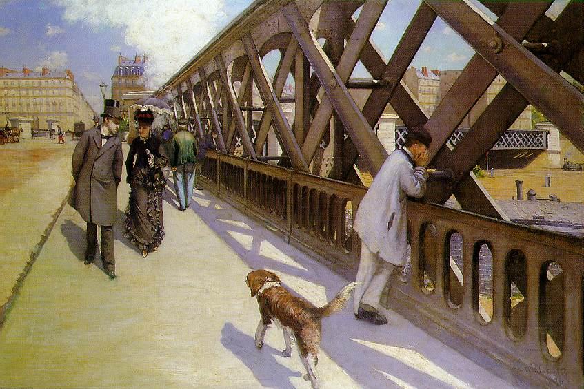
Gustave Caillebotte, “On the Pont de l’Europe,” 1876. Oil on canvas. Kimbell Art Museum.

We got a print of On the Pont de l’Europe (1876-1877) by Caillebotte after seeing the original during a trip to the Kimbell Art Museum in December 2011. I really like the bluish-grey color palette and asymmetrical composition of this piece. In fact, I think I like this painting better than Caillebotte’s other treatment of the same bridge (see Le Pont de l’Europe from 1876). One of the things that I think is interesting about my print is that the scene overlooks the Saint-Lazare train station, a place which served as subject matter for many of Monet’s paintings. More information about this painting can be found HERE.

Manet, “The Monet Family at Argenteuil,” 1874

I got a print of “The Monet Family at Argenteuil” around the time that I wrote a post which included this painting. In that post, I mentioned that Manet and Renoir worked side by side in 1874 to paint the Monet family members. I think Manet’s painting is so much better; Renoir’s Madame Monet and Her Son (also called Camille Monet and Her Son Jean in the Garden at Argenteuil) is simply atrocious in comparison to Manet’s strong composition and use of color.

Arthur Melville, “The Blue Night – Venice,” 1897. Watercolor and gouache on board, Tate Museum.

After visiting London last summer, we got a copy of Melville’s The Blue Night – Venice (1897). I saw this painting while visiting the Tate with my cousin; my husband was visiting Cambridge that morning and missed going to the Tate with us. I took this photograph to show my husband, and we both liked the painting so much that we wanted to buy a print as a momento.

This painting captures some key places in Venice: the Campanile, the Doge’s Palace, and Saint Mark’s Cathedral. One of the reasons that I am drawn to this painting is due to the striking color and hazy definition of forms. I think that the striking properties of this painting are due to the fact that Melville championed a new watercolor technique. The TATE website explains: “He saturated the paper with Chinese white paint and used sponges to create a velvet-like texture. Before applying the paint, he tried out ideas on pieces of glass held over the painting. Colour, such as the blue used here, drew attention not just to the subject of the work, but to the medium itself.”

Gustave Klimt, “Attersee,” 1901. Oil on canvas, approx. 2.5′ x 2.5′ (80.2 cm x 80.2 cm). Leopold Museum, Vienna

We have a very small print of Klimt’s “Attersee” (1901), which my husband got after a trip to Vienna last fall. This painting is of a Lake Attersee, which Klimt visited repeatedly as a summer retreat. Klimt would travel to Attersee to spend summers with his lifelong companion, Emilie Flöge, and her family. He also painted other works of art during this same retreat in 1901, including Tannenwald I and Tannenwald II. More information about this painting is found HERE.

Alfred Roller, Poster For the 14th Exhibition of Vienna Secession, c.1902

We also got this poster print after my husband returned from his trip to Austria. Some view this poster as an anticipation of Cubism and Art Deco.1 I am still trying to find more information about this poster and its imagery, but I did find out that this poster was included in an exhibition at Harvard, which highlighted a “subversive triumvirate” of the feminine, the decorative, and the abstract.

Van Gogh, “Les Alpilles Mountain Landscape Near Saint-Rémy,” 1889. Oil on canvas, Rijksmuseum Kröller-Müller, Otterlo, Netherlands

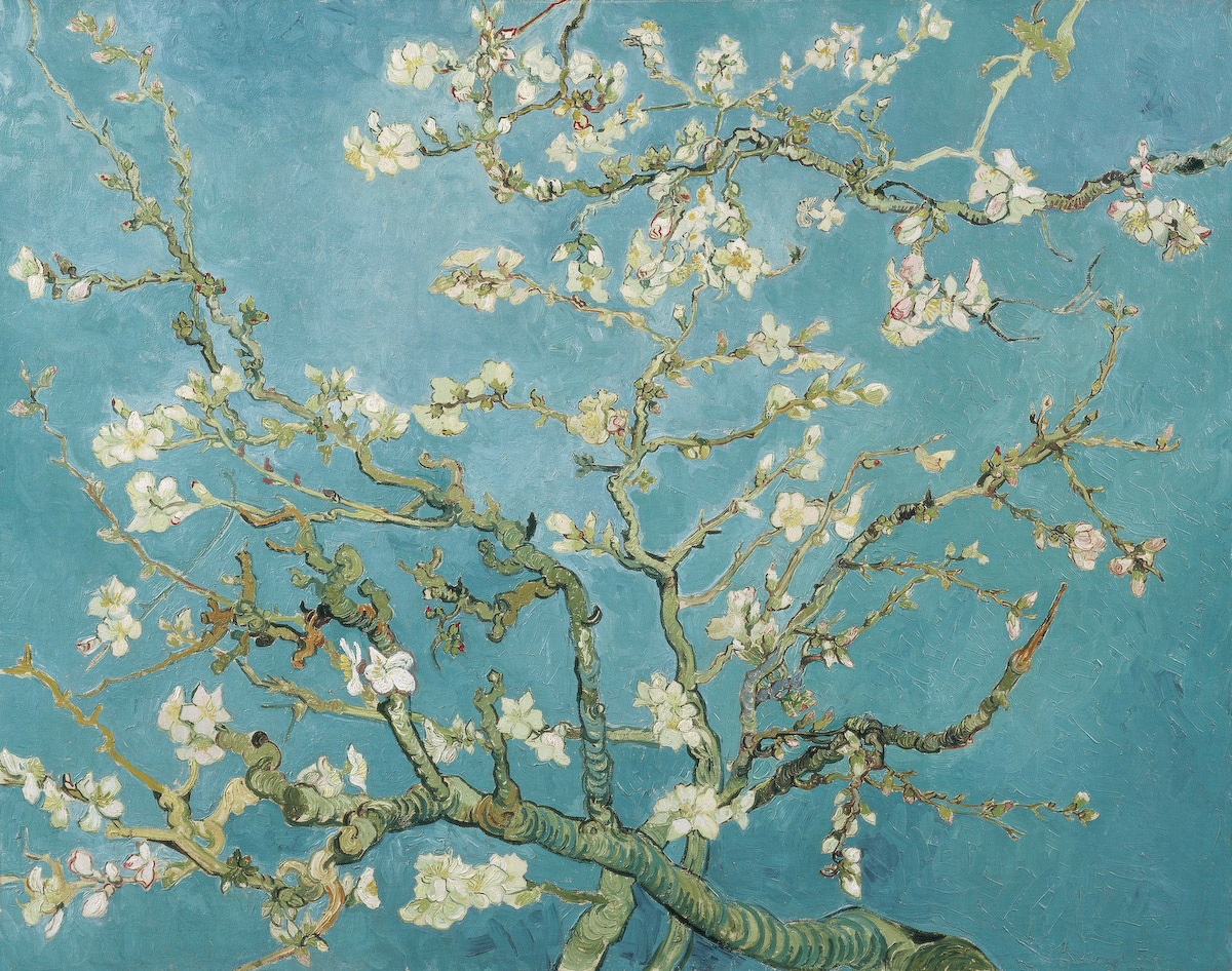
I have wanted to have a some type of Van Gogh print in my home for some time. I really love his Almond Blossom (1890) painting, but I don’t have the right wall colors in my home to complement the blue background. My husband and I liked this print not only for its colors, but also because we weren’t familiar with this painting before stumbling upon it online. This particular painting was done during the period when Van Gogh lived in Saint-Rémy (from May 1889 until May 1890); Van Gogh voluntarily admitted himself into the Saint-Paul asylum located in this area.

Willem van Aelst, “Floral Still Life with a Pocketwatch” (“Still Life with Poppies and Roses”), 1663. Oil on canvas, Rijksmuseum, Amsterdam

The print that we received today is a copy of this painting by Willem van Aelst. I’m afraid that my print does not look nearly as luminous as the actual painting itself, but I’m still happy. I’ve liked the idea of having a Dutch still life in my home for some time, but my husband and I could not find a print that we both liked. However, my husband saw this painting in the Rijksmuseum during a recent trip to Amsterdam, and I readily agreed that it would look nice in our home. I love all of the little details in this painting, from the butterflies and bugs to the small key that is connected to the ribbon.

Willem van Aelst is perhaps somewhat a lesser known still life painter today, although he achieved a lot of fame and prestige during his lifetime. Today, I think that his pupil, Rachel Ruysch, is perhaps a little better known. According to a biography on van Aelst, he was one of the first painters to create asymmetrical still life compositions during his day. (It’s no wonder that my husband, with his modern eye, would be drawn to this composition!)

Bowen family, “Fake Albers,” 2012

And, just for fun, I’ll end this post with some fake “Homage to the Square” prints that my family created a few years ago. My husband really loves the work of Josef Albers, but we couldn’t find prints in his square series which fit with the colors we wanted to highlight in our home. So, we designed our own! My son and I each picked out one of the color schemes, and my husband chose the final two. He designed the prints based off of actual Albers prints.

 1 Philip B. Meggs and Alston W. Purvis, Meggs’ History of Graphic Design, 5th edition (John Wiley & Sons, Inc., 2011). Text available online HERE.

— 7 Comments

Email Subscription


Archives

About

This blog focuses on making Western art history accessible and interesting to all types of audiences: art historians, students, and anyone else who is curious about art. Alberti’s Window is maintained by Monica Bowen, an art historian and professor.