Category

museums and exhibitions

Politics, the Capitoline Museum, and the She-Wolf
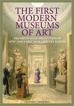
This quarter I am working with just a few of the senior art history majors on a special “Directed Study” course. We are exploring museum history and curatorial theory, using two new books: The First Modern Museums of Art: The Birth of an Institution in 18th- and 19th-Century Europe (2012) and New Museum Theory and Practice: An Introduction (2011). I really like that The First Modern Museums of Art is written in a very approachable, yet scholarly, way. Each chapter serves a case study for a different museum that was established; the book proceeds in a chronological fashion, based on founding dates for the institutions.

This week, my students and I read about the Capitoline Museum (established 1733). Carole Paul writes about how the objects within the museum serve as strong signifiers of political and cultural heritage. The museum, which contains a lot of Roman art, emphasizes Roman authority and jurisdiction. The artistic “progression” and superiority of Roman culture (and those Westerners who are heirs to the Roman tradition) are implied in many ways, including the display of art. For example, the visitor encounters Egyptian figures before the Greco-Roman antiquities, which suggests both artistic and political succession.

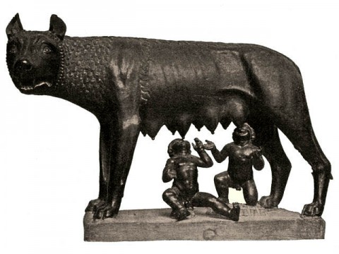
Capitoline She Wolf, 5th century BC or medieval

The political associations and signifiers of power also extend into the collection. I think it’s particularly interesting that the bronze sculpture of the she-wolf forms part of the collection, given the history of the piece. Before Sixtus IV donated this sculpture to the Compidoglio (Capitoline Hill), the she-wolf was displayed in the Lateran Palace, the pope’s official residence.1 This she-wolf was seen as a symbol of the city, since the founders of Rome, Romulus and Remus, were suckled by a she-wolf. As part of the papal collection, this statue then served as a symbol of papal jurisdiction and the papal succession of authority after pagan rule.

Given these associations with Roman history, I can see why the Capitoline Museum seemed a bit hesitant to acknowledge the recent analyses which determined that the “She-Wolf” statue was cast during the medieval period! This was big change in the traditional attribution, which placed this statue in the fifth century BC (as an example of Etruscan art). When I covered this story in 2010, over two years after the new study results were made available, I was surprised that the Capitoline Museum did not have the updated medieval date on its website! Now that I understand the political and authoritative statements behind the formation of this museum, though, I can see why the museum seems to have been hesitant to acknowledge this new information. The museum would want to endorse this as a work of art as an authentic piece from the Etruscan/pre-Roman period, in order to emphasize the institutional message of Roman authority. If the “She-Wolf” is a medieval work of art, there isn’t as direct of a connection to Roman history.

However, today I went back and checked the Capitoline Museum website again. Now the site has been updated to acknowledge the alternate date and also mentions the Carbon 14 analysis (albeit that the information is slightly hidden under a “Reveal text” button).

What have been your experiences at the Capitoline Museum? Did you feel like the message of Roman authority and power came through during your visit?

1 Carole Paul notes that this wolf (lupa) was in fact returned to its rightful home through Sixtus IV’s donation. Paul writes that the wolf “had originally stood on the Campidoglio and in 65 BC had been struck by a bolt of lightning that apparently broke her feet and destroyed the suckling twins, who were replaced only in the fifteenth century.” See Carole Paul, “Capitoline Museum, Rome: Civic Identity and Personal Cultivation” in The First Modern Museums of Art: The Birth of An Institution in 18th- and 19th-Century Rome, Carole Paul, ed., (Los Angeles: Getty, 2012), 22. Given that the she-wolf is now thought to have been produced in the medieval period, I personally think that Paul might be referring to a different depiction of a wolf (perhaps lost) or that this story might have been a myth. Paul cites a 1980 publication by Richard Krautheimer in relation to this story about the lightening bolt. Therefore, she does not seem take into account the more recent Carbon 14 analysis and medieval date.
— 10 Comments

King Tut: Nesting Shrines, a Sarcophagus, and Coffins


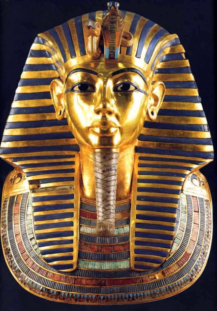
King Tut Funerary Mask, c. 1327 BC

Last weekend I had the opportunity to visit an amazing exhibit on King Tutankhamun (see some images from the show here). I’ve always been interested in King Tut (I’ve blogged about him before), and I’ve been anticipating the opening of this exhibition for a long time. Upon entering the exhibit space, I was really pleased to see that the show wasn’t limited to objects found in King Tut’s tomb, but included sculptures and artifacts from the Old Kingdom and New Kingdom. In fact, one of the colossal statues of Ankhenaten also was there, which was neat to see.

One of the things that I found particularly interesting was a short video clip by National Geographic. The clip recreated how all the different nesting shrines, sarcophagus, and coffins covered King Tut’s body.

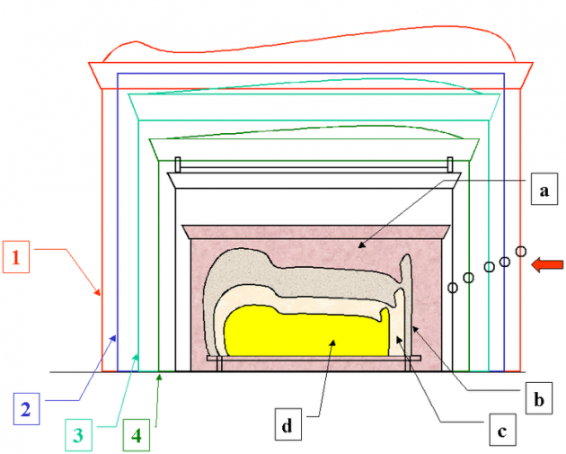
I already knew that several coffins covered King Tut’s body, but I wasn’t aware of how many shrines were used to cover the sarcophagus. All together, the shrines, sarcophagus and coffins totaled the number nine: the Egyptian number which symbolized infinity. I’ve recreated a list of the different shrines, sarcophagus and coffins below, going in order from the outermost shrine. (On a side note: You would be surprised to know how many conflicting stories exist online about King Tut’s shrines, sarcophagus and coffins! It has taken me forever to sort out the correct information.)

Cross-section diagram of shrines, sarcophagus, and nesting coffins for King Tutankhamun’s mummy. Courtesy Hotepibre via Wikipedia.

  • Outermost Golden Shrine: This shrine, which housed all of the remaining shrines, sarcophagus, coffins and mummy, almost filled the entire room of King Tut’s tomb. It is about nine feet high and sixteen feet long. The shrine is decorated with the double-tiered knot of Isis and the djed (the backbone of Osiris, representing stability). There also are hieroglyphs of Osiris on the case. This shrine is on display in the Cairo Museum. A virtual tour of this shrine (and the second and third shrines) is found HERE.
  • The Pall Frame: This is a nine-piece gabled framework. It is made out of wood and gold. On top of the framework was a fabric that was decorated with large marguerites (daisy-like flowers) of gilded bronze. One commenter described the fabric as “like a night sky spangled with stars.” Unfortunately, the fabric was ruined when it was left out in the open, during a period when Carter’s American team was prevented from working in the tomb and laboratory.
  • The Second Shrine (also see drawing here): This second shrine is made out of gold and is decorated with funerary texts from the book of the dead. This particular shrine has a sloping roof and is thought to be in the shape of the Per-Wer, the ancient shrine of Upper Egypt that once housed a cult image of the tutelary goddess Nekhbet. This shrine was constructed by sixteen separate pieces, which allowed the shrine to be assembled on-site in the burial chamber (a process likely confirmed by the assembling directions written in black ink on several individual pieces). Domestic, magical, and ornate objects were placed in the available space between this shrine, the third shrine, and the fourth shrine.
  • The Third Shrine: This shrine is very similar to the second shrine, only with smaller dimensions. This shrine is also made out of gold and has a sloping roof. Likewise, the third shrine also is decorated with funerary texts from the Book of the Dead.
  • The Fourth (Innermost) shrine (also see drawing): The sides of the shrine depict a procession of various gods, including Anubis and Horus. The sky goddess Nut was depicted on the top of the ceiling, embracing the sarcophagus with her wings. The interior walls depict Spell 17 from the Book of the Dead.
  • Sarcophagus (also see drawing): This sarcophagus was made out of quartzite (for the body of the sarcophagus) and was supported by a block of alabaster. The lid was made out of red granite. The lid doesn’t quite match the sarcophagus (and furthermore, was cracked and then repaired with gypsum!), which might suggest that the intended lid was not created in time for the hurried burial. The whole sarcophagus itself weighed over a ton.
  • Outermost Coffin: Like the other two coffins, this coffin was wrapped in linen. This anthropoid coffin depicted an image of the king. The coffin was made out of gilded wood and cut stones. Four silver handles were created to lower the coffin into the sarcophagus. When containing the other nested coffins, this outermost coffin weighed 1.36 metric tons (3,000 pounds).
  • Second (Middle) Coffin (see photo of a museum display that compares of smaller second coffin with outermost gold coffin): This anthropoid coffin is made out of gilded wood. Small pieces of colored glass were affixed to practically the whole body of the coffin. It was protected by a red linen shroud when it was discovered by Howard Carter. Additionally, the red linen shroud was covered with floral garlands. The flowers, although far dead and dry, suggest that the king was buried during the spring time when the flowers would have been available. No handles exist on this middle coffin, which made the excavation difficult.
  • Innermost Coffin (see detail image HERE): This anthropoid coffin was made of pure gold, inlaid with glass and semi-precious stones. When it was discovered, this coffin originally was covered in a sticky black residue, made from a perfume. The coffin is just over six feet tall and weighs nearly 243 pounds. Gold handles are located on this innermost coffin.
  • The mummy of King Tut, with the head protected by a funerary mask of gold, lapis lazuli, glass, and semi-precious stones. The mask weighs 24 pounds (11 kg). Gold sandals were placed on the mummy’s feet, along with various other decorative objects on the body. The king’s fingers were lined with hollow gold finger tips.

Inner Coffin of Tutankhamun’s Sarcophagus, c. 1332-1322 BCE

On a side note, apart from these nested shrines, sarcophagus, and coffins, there also was another separate shrine located in King Tut’s tomb: the canopic shrine. You can watch a video about King Tut’s canopic shrine HERE. Inside the shrine there was a canopic chest and small canopic “coffinettes” which contained some of King Tut’s vital organs. (THIS ONE contained King Tut’s liver.)

Although ancient thieves entered King Tut’s tomb relatively soon after the pharaoh’s burial, afterward the tomb remained undisturbed for several centuries. And since thieves never touched King Tut’s actual sarcophagus (the seal on the second and third shrines were intact upon discovery), we have been able to better understand the burial process and some of the funerary objects for Egyptian pharaohs. However, it blows my mind to think about what luxurious coffins and objects were placed inside the tombs of more prestigious kings. As a relatively insignificant pharaoh who died at a young age, King Tut apparently received a more modest burial than other Egyptian rulers. One can only imagine what riches were taken by the ancient thieves that disturbed some of the other tombs!

— 4 Comments

Thoughts on the Rothko Chapel

A few days ago I was invited to speak to some students about my experience last month, when I visited the Rothko Chapel. Before visiting the Caravaggio show in Fort Worth, my family and I flew to Houston expressly to visit the Rothko Chapel.

My husband and I feel like Rothko would have approved of our pilgrimage to Houston. Before he had even received the commission to make the chapel paintings, Rothko had considered the idea of wayside chapels or one-man museums spread across the country. He liked the idea of having a person travel to a specific place (and even better, a place that was difficult to access) to see a work of art.1 That way, it seemed likely that the viewer would be more invested in seeing the specific art that was on display – as opposed to say, if the viewer happened to see some art within a gigantic museum or on the wall of a restaurant (cough – The Four Seasons in the Seagram Building – cough).

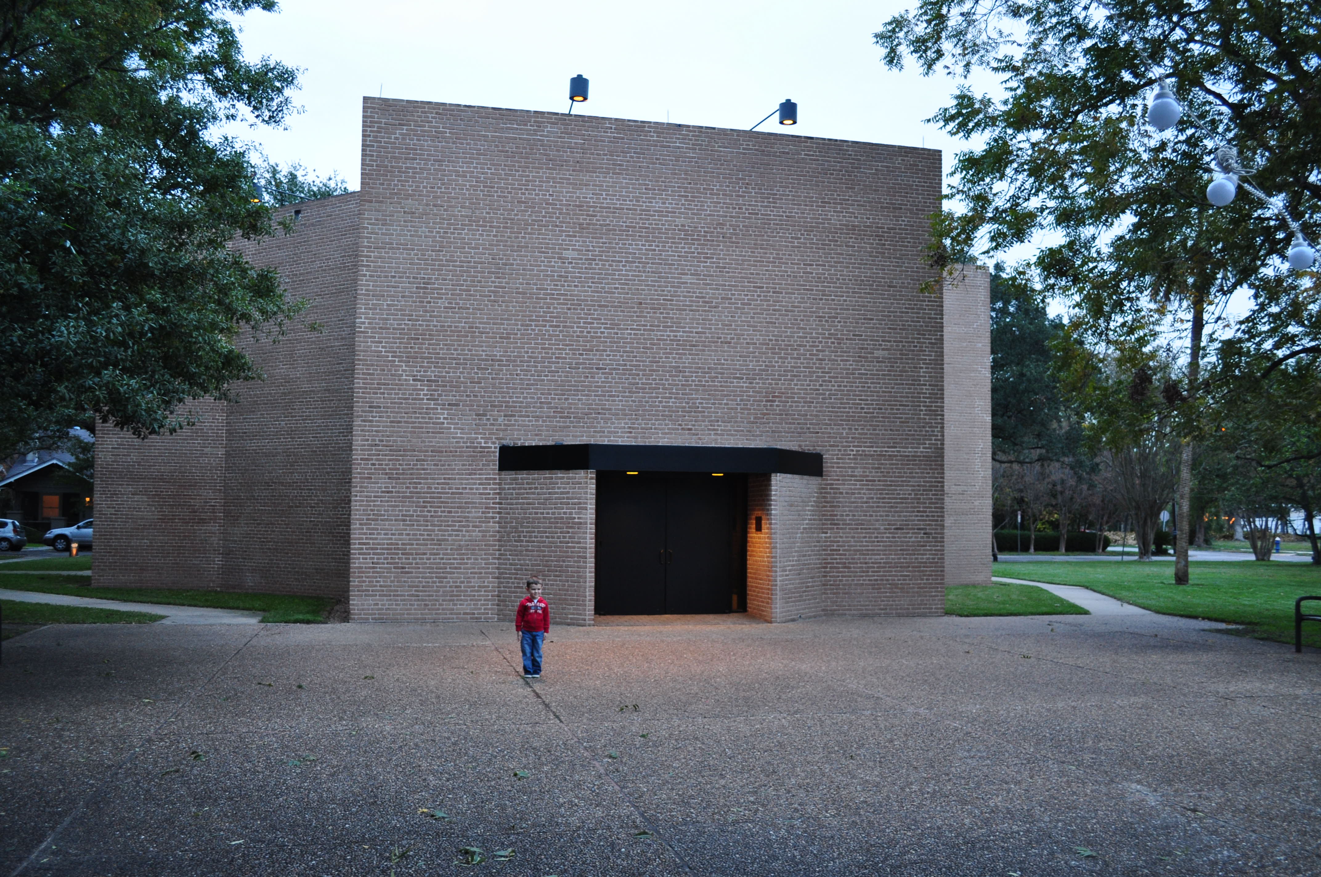
My little boy outside the Rothko Chapel (dedicated February 1971)

One of the main things that struck me about the exterior of the Rothko Chapel was the heavy masonry of the structure. I was immediately reminded of Byzantine churches and mausoleums in Ravenna like San Vitale and Galla Placidia. Only after visiting this chapel did I learn that Rothko wanted to have the structure of the chapel be a merge between architecture of the East and West. In fact, Rothko was particularly impressed with the Byzantine church S. Maria Assunta (near Venice). San Vital and S. Maria Assunta both have octagonal floor plans, too, similar to the Rothko Chapel.

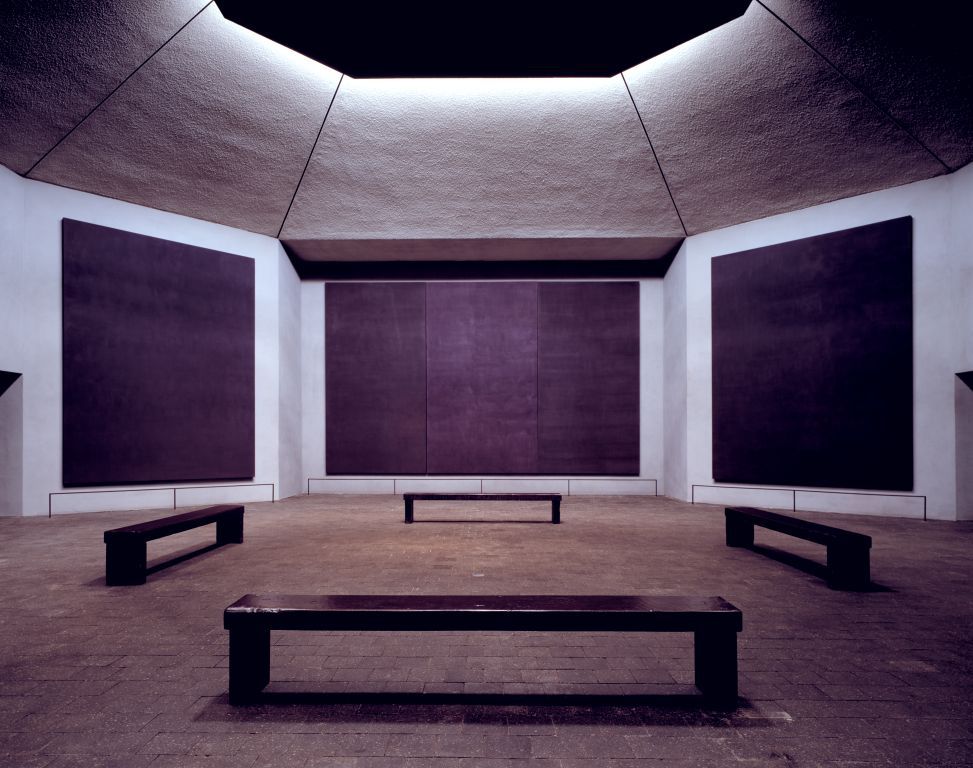
Interior of Rothko Chapel. Paintings created between 1964-1967

Upon entering the Rothko Chapel, I was confronted with an environment that was a little bit unique and unexpected. I was planning to be in a place that looked serene (like the image above) or perhaps even see someone meditating in front of Rothko’s purple and black canvases. That evening, though, the chapel was preparing to host a Christmas concert. There were a lot of instruments and chairs covering the chapel floor – and there was a piano tuner. For the whole time that my family and I were in the chapel (about fifteen minutes), the tuner played the same high-pitched note over and over and over. It was very distracting and frustrating, although there was something horribly ironic in hearing the repeated note and looking at fourteen large-scale canvases that have little variation (at least upon first glance).

I felt like the environment was both peaceful and oppressive – something that definitely was influenced by my friend the piano tuner, but I think that the paintings also contributed to this environment. Likewise, I also felt like the chapel both embraced and rejected history/context. The austere white walls and clean lines of the chapel fit well within the modern aesthetic, but other aspects of the chapel were very reminiscent of historical traditions. Even some of the panels were hung in a triptych form, which gave the suggestion of history and context. (In fact, this commission originally was intended for a chapel on a Catholic university campus.)

It was a rather interesting and yet somewhat conflicting experience in the chapel for me. But I suppose that is what Rothko would have liked me to experience. He was interested in the conflict created by the human condition, wasn’t he?

Have you ever been to the Rothko Chapel? What was your experience?

1 James E. B. Breslin, Mark Rothko (Chicago: University of Chicago Press, 1993), 464.

— 4 Comments

Caravaggio Exhibition at the Kimbell Art Museum

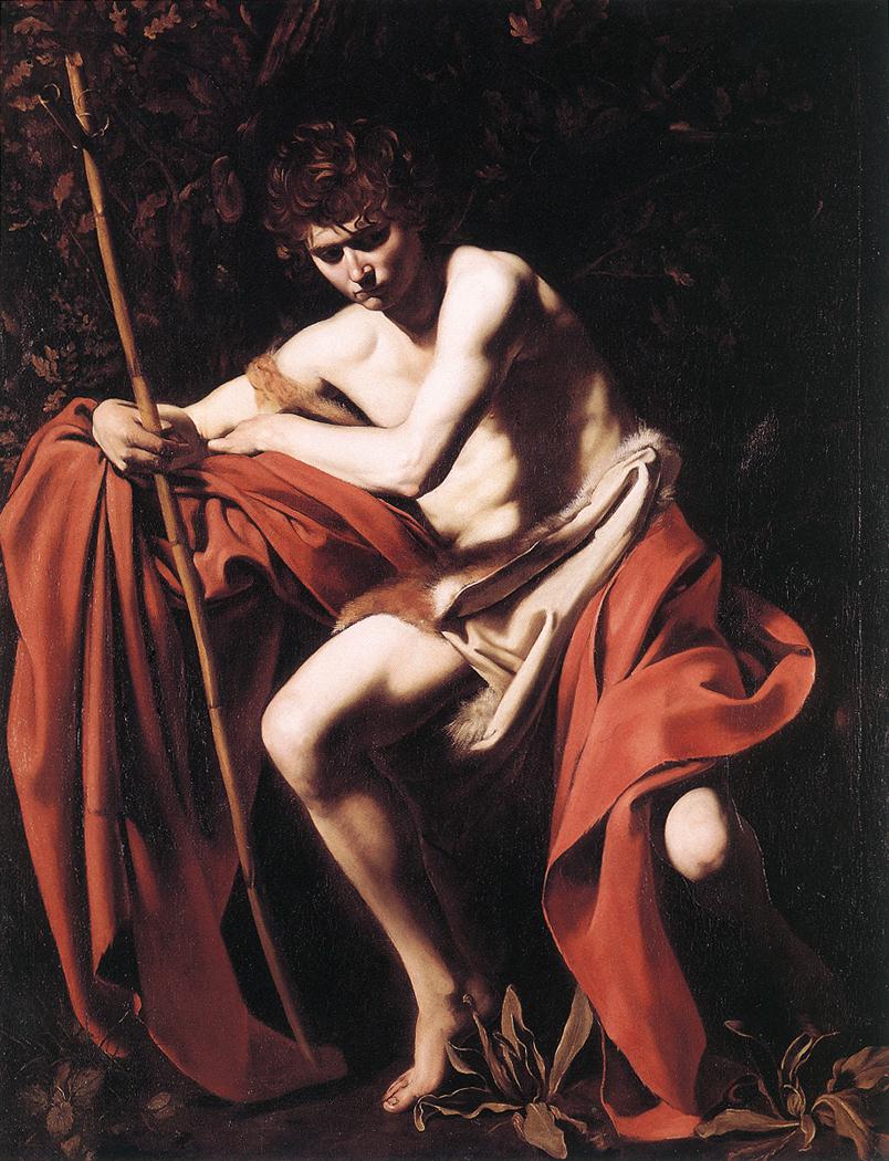
Caravaggio, "Saint John the Baptist in the Wilderness," 1604-05

Well, my friends, I did it. Last week my husband and I went down to Texas on an art pilgrimage. We first stopped in Houston to visit the Rothko Chapel (Rothko is my husband’s favorite artist), and then traveled up to Fort Worth so that I could visit the Caravaggio and His Followers in Rome exhibition at the Kimbell Art Museum. We hit a lot of great art museums and installations during the trip, but I loved the Caravaggio exhibit the most of all. It was a pretty phenomenal experience to see so many Caravaggesque paintings (and actual works by Caravaggio) in a single space. Monochromatic backgrounds, tenebristic lighting, and dirty fingernails reigned supreme. It was awesome.

The exhibition display is pretty interesting. The exhibit is sectioned-off into areas that are dedicated to different types of subject matter (as is presented in the exhibition catalog). With the exception of a few paintings, most of the works by Caravaggio are not given too much visual prominence among the other works in the exhibition. Instead, everything is combined together so that one can get a sense of the breadth and influence of Caravaggio’s style. I appreciated this comprehensive approach; I think that it was very easy for the exhibition to prove Caravaggio’s influence as a painter.

However, I don’t think that it was easy for all museum visitors to tell which works were by Caravaggio without help from text labels and audio guides. I overheard one women telling someone that Caravaggio had painted a self-portrait in the background of one painting – and she was looking at a work by Simon Vouet! I would imagine that many typical visitors did not know the difference between Michelangelo Merisi da Caravaggio and his Caravaggesque follower, Cecco del Caravaggio. When I visited the museum on a busy weekend afternoon, the strongest visual indicator for Caravaggio’s paintings were the audio tour crowds that naturally formed. If a visitor didn’t know enough about Baroque art to pick out a work by Caravaggio, they simply needed to spot a crowd of people standing with their heads cocked, listening to an audio device.

There were several details that I noticed during the exhibition about Caravaggio’s work. I was very struck with how Caravaggio’s tenebrism are even more striking when viewed in-person, especially in the painting Saint John the Baptist in the Wilderness (see above). The bright flesh of the saint seems to hum and glow with life, as does the brilliant vermillion drapery. Such vivacity is only offset with the exception of a few areas that are cloaked in dark swaths of shadow. The whole painting is indescribably impressive.

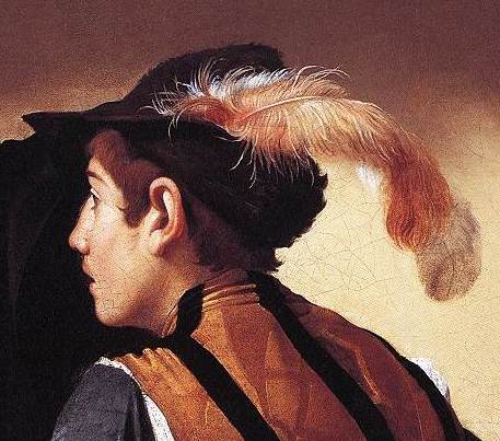
Caravaggio, detail of "The Cardsharps," c. 1596

One of the things that I loved about this exhibition was that I noticed several details in Caravaggio paintings that I had never noticed before. I remember noticing the slightest trace of a mustache on one of the figures in The Cardsharps (c. 1596, see detail above). I was impressed with the light, wispy quality of the feather stuck in the same figure’s hat. I also stopped for a long time to admire the texture of the shimmery, blue satin on Mary Magdalene’s dress in Martha and Mary Magdalene (c. 1598), something that is completely lost in some reproductions. Even the curl of Mary’s hair casts a dramatic and striking shadow, which doesn’t translate well in a reproduction.

Several of the Caravaggesque paintings were striking as well (although not as striking as the works by Caravaggio, in my opinion). Ribera’s work impressed me the most. I particularly liked the leathery, tanned skin of Ribera’s Saint Jerome (c. 1623; Cat. 35). I remember looking at the fingers of that saint for some time.

That being said, I didn’t think that all of the Caravaggesque paintings were very good. Some of them, in fact, looked simply ridiculous (to the point of being eyesores) when hung in the same room with Caravaggio’s Saint John the Baptist in the Wilderness. I wasn’t surprised to see that the museum placed The Holy Family in Saint Joseph’s Workshop (attributed to Carlo Saraceni or Guy François, c. 1615; cat. 41) and The Martyrdom of Saint Cecilia (Guy François, c. 1608-13; cat 12) behind two temporary walls. They looked like pretty poor paintings in comparison with Caravaggio’s work. When I complained about those paintings to my husband, he said, “When I saw those paintings, I got the impression Caravaggio influenced all kinds of painters, even ones that weren’t very good.” I’m not sure if the exhibition intended to convey that message, but that point was definitely made! I personally think the should have been taken out, though. These were some of the last two paintings that I saw during my visit, and it left a bad taste in my mouth (or a bad impression on my eyes, I should say). I had to turn and look at Saint John the Baptist in the Wilderness for a few more minutes afterward, just to cleanse by visual palette.

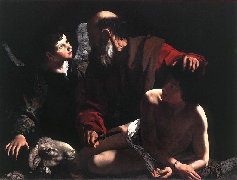
Caravaggio, "Sacrifice of Isaac," 1598-99, Barbara Piasecka Johnson Collection Foundation

All in all, I really enjoyed the show (despite seeing the paintings by Saraceni and François – ugh!). I would have liked to have seen a few more paintings that have been attributed to Caravaggio (some of which have had their authenticity and provenance called into question), but those paintings were only on view when the exhibition was in Canada earlier this year. Hopefully I’ll get to see Saint Augustine (c. 1600), Saint Francis (c. 1598, cat. 30) and Sacrifice of Isaac (c. 1598-99, shown above; cat. 53) another time, so that I can form my own opinion about those pieces.

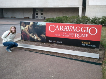
Me outside the Caravaggio show, December 2011

— 9 Comments

Hillwood Estate: Self-Portrait of an Heiress

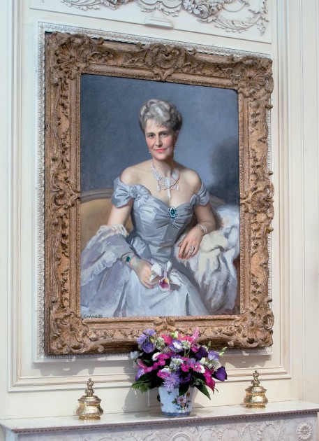
Edward Chandor, "Portrait of Marjorie Merriweather Post," 1952

How I’ve missed blogging over this past month! These past several weeks have been some of the most hectic that I have experienced in a long time. I don’t even have a Halloween-themed post for today (you can look at my Rubens and Goya posts from previous Halloweens). Instead, I want to share some thoughts on something completely different: a female collector who was interested in frothy, powderpuff, sumptuous decorative arts that are often called “feminine.” (And hey, I know that a few of you may find this art to be just as frightening and off-putting as a ghoulish work by Goya!)

Marjorie Merriweather Post was an art collector in the mid-20th century. In 1955, Post purchased the estate Hillwood in Washington, DC to house her large art collection. Hillwood is one of the “collection museums” that I listed in an earlier post. The museum has a short introduction film on their website which is as fabulous as the tag line for the museum: Where Fabulous Lives.

Early in life, at the young age of twenty-seven, Marjorie Merriweather Post became the heiress of the Postum Cereal Company (later known as General Foods Corporation) in 1914. Many biographers have commented on how Post was thrust into a “man’s world” of industry and business at a very early age.1 Several years after inheriting the family company, Post began to acquire furniture and decorative art with the help of art dealer Joseph Duveen. Interestingly, Post developed a keen interest in art during the same period in which she pushed for her business to merge with Birdeye Frozen Foods. Post’s art collection and museum can be interpreted as a self-portrait of Post, visually emphasizing her approachability, gender and femininity in order to draw a contrast with her perceived “masculine” pursuits in business.

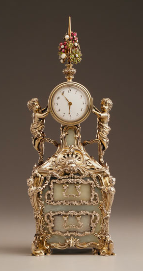
Clock, 1896, silver gilt, bowenite, watercolor on ivory. Height 11.25", width 4"

The works that Marjorie Merriweather Post collected seem eclectic and even disparate at first glance: she was interested in French decorative arts from the 18th and 19th centuries, porcelain, jewelry, objects from imperial Russia, Farbergé, costumes, and even Native American art. However, when analyzing Post’s collection, one can see the majority the collection requires the viewer to interact with the objects in a similar way. Many of the items in Post’s collection are created on a small-scale, which require the viewer to examine the finely detailed objects at an extremely close distance. It has been commented that Post was considered to be intimidating and off-putting to many people, because she gave the impression of “being very grand.”2 In one sense, Post’s art collection reflects and even extends this idea of grandeur, since the objects are very fine, luxurious, and extremely expensive. However, Post’s collection of small, dainty objects also presupposes an environment of familiarity, approachability, and even intimacy. In turn, one can assume that Post wanted to have these characteristics extended to her own persona. Post wanted her objects to be seen up close, and perhaps used these smaller objects to creatively assert that she, as an individual, was also approachable.

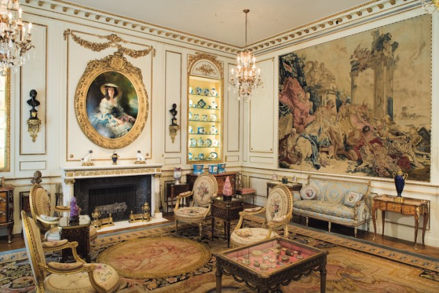
French Drawing Room at Hillwood Estate

The interior decoration and collective effect of the display contribute to the sense of femininity at Hillwood Estate. Such femininity is particularly manifest in the French Drawing Room, which is designed to “evoke the splendor of the French aristocratic life from the 18th century.” Such objects, particularly those from the Rococo period of 18th century France, historically have been considered “feminine” in nature. Art historian Melissa Hyde has stated, “During the second half of the eighteenth century, the rococo qualities exemplified by the work of [the artist] Boucher – grace, plenitude, emphasis on the seductions of color…came to be identified exclusively with the feminine.” Post includes a tapestry by Boucher in her drawing room, which compliments the flowery objects and lyrical decorative lines that suggest plenitude and grace. Such femininity can be seen in the rugs, chairs, and even the gilded molding of garlands on the wall. It is this particular room at Hillwood Estate that is decorated with many of the objects that Marjorie collected in the 1920s, the period in which she rallied to have her business merge with Birdseye Frozen Foods.

This post isn’t long enough to give a sense of the rich, luxurious quality or the expansiveness of Post’s collection- it’s quite amazing. There are many other ways that the collection and estate relate to gender, femininity, and domesticity too (I didn’t even get to the estate gardens!). Has anyone visited Hillwood Estate? What was your impression of the place?

1 For one example, see interview with Ellen Charles, granddaughter of Marjorie Merriweather Post (Hillwood introduction film at 3:39). Available at: http://www.hillwoodmuseum.org/welcome.html

2 See interview with Dina Merril, daughter of Marjorie Merriweather Post (Hillwood introduction film at 2:42). Available at: http://www.hillwoodmuseum.org/welcome.html

— 7 Comments

Email Subscription


Archives

About

This blog focuses on making Western art history accessible and interesting to all types of audiences: art historians, students, and anyone else who is curious about art. Alberti’s Window is maintained by Monica Bowen, an art historian and professor.