Category

female artists

Judy Chicago’s "Venus"

I guess it’s pretty obvious that I’ve been researching prehistoric female figurines lately, huh?  I promise this will be my last post on the subject, at least for a while!  I just wanted to show everyone this cool Judy Chicago piece, Ceramic Goddess #3 (Study for Goddess Figurine on Fertile Goddess runner; 1977, shown above).  Pretty fun, huh?  It’s funky, playful shape makes me think that this could have been the prehistoric statuette from Lewis Carroll’s fictive “Wonderland.”  Yep, that’s it: this is the Venus of Wonderland.

The shape also reminds me a little bit of Henry Moore‘s anthropomorphic style.  (And speaking of Henry Moore, I’ve been thinking about how the replica of the prehistoric figurine “Venus de Lespugue” also reminds me Moore’s work.)

Anyhow, it’s neat to look at Chicago’s work and see how a 20th century feminist identified with the prehistoric figurines.  Although today some question the prehistoric “goddess” theory, it’s interesting to think about how feminist activists latched onto this subject matter in the 1970s and 1980s.  (You may be familiar with Judy Chicago’s well-known feminist work, The Dinner Party (1974-79)).  You can read more about this female figurine and Judy Chicago here.

Comments Off on Judy Chicago’s "Venus"

Prendergast’s "Lost"

In honor of the upcoming season finale for LOST, I thought it would be appropriate to highlight a work of art that shares the same title as the TV series.  Kathy Prendergast’s Lost (1999) is a digital print that depicts a map of the United States.  The map points out all of the actual towns in the United States that contain the word “lost.”  Every other city and place in the country has been excluded from this map, as you can see from a detail below:

Curator Mel Watkin pointed out that this interesting omission of every mappable location (and consequent focus on “lost” places) implies some interesting questions: “Are we lost?  Are they lost?  Or is [Prendergast]?”1

So, could we relate Prendergast’s map to the TV show?  My only thought is that this map visually asserts why LOST has been such a popular show in the US – apparently we’re obsessed with the idea of being lost, since so many places are named accordingly.  If you can think of other relationships between Prendergast and the TV show, feel free to post them in the comments section.  I’ll crown the person with the wittiest answer (and accurate prediction for the finale) as the winner.

1 Mel Watkin, Terra Incognita: Contemporary Artists’ Maps and Other Visual Organizing Systems (Saint Louis: Contemporary Art Museum, 2001), n. p. An exhibition brochure.

— 1 Comment

Lorna Simpson’s Two "Eyes"

Last week I had a student remark that the two circles in Lorna Simpson’s Untitled (2 Necklines) (1989, shown left) look like a pair of eyes. I’ve been thinking a lot about this comment lately, particularly because I think it ties into Laura Mulvey’s theories regarding the male gaze and fragmentation. Basically, the two circles eyes make the viewer especially conscious that he (the gendered pronoun is intentional) is fragmenting, cropping, and fetishizing the woman with his gaze.

It’s interesting to note that these eyes detract attention from the fact that Simpson (and Simpson’s camera) have actually done the fragmentation of the image. And there are other interesting parallels which can be drawn between human eyes and cameras: eyes have a limited amount of scope within their visual field and crop things naturally, just as a camera has to crop images because of the limitations of the camera lens.

I like that Simpson includes the word “eye” in one of the text boxes between the circles. I realize that this group of words also can also be associated with discrimination, slavery, and lynching – not just the objectification of women. But it’s interesting to read the word “eye” and between two circular eyes.

And if you stare at this work of art too long (as I have been doing this morning), the column of words become the outline for a nose, the dark skin looks like pupils, and the white clothing looks like the whites of eyes. Could we say, then, that this piece is an actual visualization of the male viewer? Ha ha! Okay, probably not, but it is kind of interesting to see a little “face” emerge in Simpson’s work.

— 1 Comment

Maya Lin and "Eleven Minute Line"

Last week, I heard Maya Lin speak at the university where I work. Her lecture was uncannily appropriate, since I had planned for my students to learn about Lin last week (before realizing that she was coming to speak). Minutes after the lecture began, I had two distinct impressions: 1) Lin is extremely tired of speaking about the Vietnam War Memorial and 2) Lin has a lot of flexibility in her career, since she established fame and recognition so early in life. Really, because Lin already has public attention and a fan base, she can create whatever she wants; she isn’t like many other contemporary artists, who seem to feel the need to be shocking or controversial in order to get attention.

One of my favorite parts of the lecture was when Lin discussed her ideas behind her earth art Eleven Minute Line (2004). This squiggly line is 1600 feet long and 12 feet high. And here’s the awesome part: it’s located in a cow pasture in Sweden. The first time I saw Lin’s piece, it immediately reminded me of the Serpent Mound (c. 1070 AD) in Adams County, Ohio (shown below). The Serpent Mound is the largest effigy structure in the United States, and it is thought to have been built by the the Fort Ancient people. (It was originally thought that the structure was built in prehistoric times, but carbon dating of the mound revealed a much later date.)

My suspicions regarding the connection between Eleven Minute Line and the Serpent Mound were confirmed during Lin’s lecture. The artist is from Ohio, and she has always been struck with the story of the Serpent Mound. When Europeans came to America and discovered the Serpent Mound, they concluded that an earlier group of Europeans must have made the structure and then traveled back to the Old World. Basically, these European explorers could not conceive that Native Americans could have built something so complex and monumental. Lin decided add a subtle element of irony with Eleven Minute Line by turning the tables a bit: she brought a design that was inspired from the New World back to the Old World (i.e. Sweden).

It was a real privilege to hear such a well-known artist speak. I was glad that she discussed her more recent art, too. Are you familiar with Maya Lin’s work (aside from the Vietnam War Memorial)? I think her interests in environmental/landscape issues are really interesting.

— 5 Comments

Morisot and Manet

It has taken me forever to work through Sue Roe’s The Private Lives of the Impressionists, and I’m still not quite finished. I’ve had various obligations and nonrenewable library books that have consumed my time over the past three months. Hence, Private Lives has had to sit on my nightstand for quite awhile. I’m really interested in the subject matter, though, and hope to finish the book soon.

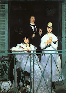
Anyhow, I have read far enough in the book to learn more about the relationship between Manet and Berthe Morisot, a female Impressionist painter. Morisot posed in several of Manet’s portraits, and it is often thought that the two were romantically interested in each other (although Manet was already married and Morisot eventually became engaged to Manet’s brother). Manet’s painting on the left, The Balcony (1868-69) was the first painting for which Morisot posed (she is seated in the foreground). Since I am interested in this Manet/Morisot relationship, I was excited to see that today heidenkind mentioned an interesting article on this topic (see her fun post which “interviews” Manet).

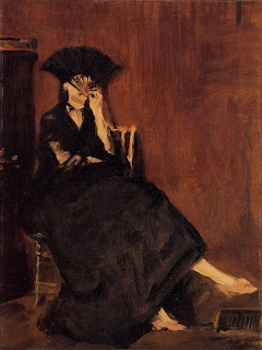
The article, “Unmasking Manet’s Morisot” by Marni R. Kessler visually analyzes portraits of Morisot by Manet. Kessler points out that the “crucial significance of Manet’s depictions of Morisot lies in…continual shifting identity: [Morisot] looks different from canvas to canvas.”1 It is especially interesting to see how Morisot’s portraits morph over time, especially as Morisot’s relationship progressed with Manet’s brother. Morisot’s features continually become harsher in the paintings, and she is depicted with increasingly violent brushstrokes. Take a look at these following paintings, which are posted chronologically:

Manet, Le Repos (Portrait of Berthe Morisot), 1870

Manet, Berthe Morisot with a Bouquet of Flowers, 1872
Manet, Berthe Morisot with a Fan, 1872
Manet, Berthe Morisot with a Veil, 1872
Manet paints this veil so that it simultanously reflects lace, a skull, and even a beard.2 Not a very flattering portrait, is it?
Manet, Berthe Morisot in a Mourning Hat, 1874
This painting was created shortly after Morisot’s father died. Also, by this time, Morisot was engaged to Manet’s brother. Not surprisingly, Manet abruptly stopped painting Morisot after her marriage.

Pretty interesting, huh? It seems that the depictions of Morisot don’t reflect changes in her actual appearance too, since she also painted self-portraits at the time. Instead, one can visualize Manet’s frustration and sense of loss as Morisot becomes engaged to Manet’s brother. I would really recommend that you read Kessler’s detailed analysis of these paintings – they are quite fascinating.

This article explores a lot of other interesting ideas, such as Kessler’s argument that a sense of artistic rivalry is manifest in these same portraits: interestingly, Manet never chose to depict Morisot in the act of painting. Instead of a reference to her accomplishments as a painter, all of these portraits emphasize Morisot’s gender and femininity in one way or another.3

Anyhow, this is an interesting article, and I wholeheartedly recommend it.

1 Marni R. Kessler, “Unmasking Manet’s Morisot,” The Art Bulletin 81, no 3 (September 1999): 475.
2 Ibid., 482.
3 Ibid., 477-478.

— 7 Comments

Email Subscription


Archives

About

This blog focuses on making Western art history accessible and interesting to all types of audiences: art historians, students, and anyone else who is curious about art. Alberti’s Window is maintained by Monica Bowen, an art historian and professor.