Category

artistic mediums

Expensive Pigments, Dyes and Artistic Mediums

Lately I’ve been thinking about some of the artistic mediums and/or colors which were expensive or highly prized at different points in history. Obviously, there are some artistic mediums which were valued in the past that still have value today, like gold or silver. There are a few other mediums have stuck out to me beyond these common examples, and I thought I would jot down a few things about these mediums and colors.

Cult Image of the God Ptah, lapis lazuli, ca. 945-600 BC (Dynasty 22 – early Dynasty 26). Height 2.25″ (5.6 cm), Metropolitan Museum of Art

LAPIS LAZULI: Lapis lazuli is a hard stone which contains the mineral lazurite. This rare blue stone which originally came from Afghanistan and was highly prized in the ancient period. In fact, in early cultures lapis lazuli was considered more expensive than gold. Due to its expensive nature, lapis lazuli was usually used in royal sculptural workshops, either for depictions of royalty or depictions of the gods.1 Such is the case with the cult image of the God Ptah, the Lord of the Sky. The lapis lazuli is creatively used in this instance to underscore Ptah’s role, since the medium suggests a deep blue cosmos studded with stars.

Portrait of the Four Tetrarchs, c. 305 CE. Porphyry, height approx. 4’3″.

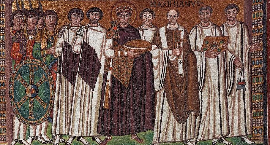
PORPHYRY (AND THE COLOR PURPLE): The color purple was highly prized in ancient cultures, particularly Roman, Byzantine, and medieval cultures. This color was largely prized because of the dye Tyrian purple, which is also known as “royal purple” or “imperial purple.” Tyrian purple dye was rare and valued, since it was made from the secretion of mollusks.2 During ancient times only the elite could afford to be clothed in purple. As a result, the color purple is associated with the iconography for royalty and deities.3 Such imagery can be found in representations of Christ (like mosaics found at Sant’Apollinare Nuovo) and emperors (like the Justinian mosaic in San Vitale). Even the Virgin Mary is sometimes associated with purple.

As a result of this expensive dye and its associations with the elite, other purple-colored substances, like the hard stone porphyry (see image above), were also valued. The red-purple variant of porphyry which was valued among royals came from a specific remote site in Egypt: Gebel Dokhan. Even today, this is the only location in the world in which imperial porphyry is found.

Vermeer. “Woman Pouring Milk” (The Kitchen Maid), c. 1660. Oil on canvas, which includes ultramarine blue pigment

ULTRAMARINE BLUE: Ultramarine blue is a pigment which existed in ancient times, but was also used in the Early Modern period. This pigment was highly valued, largely because true ultramarine blue is created with ground lapis lazuli stone. The ground stone is purified with multiple washings and then bonded with oil using a hand mulling process. Since the early nineteenth century, however, ultramarine blue is only created through a synthetic process.

Renaissance and Baroque artists, including Vermeer (see image above) used true ultramarine blue. The vibrant blue of the kitchen maid’s wrap is a great example of the brilliant color found in this type of pigment. True ultramarine was expensive, and sometimes Renaissance artists would resort to using azurite blue instead.

Okay, now it’s your turn. What are some other artistic mediums or pigments which which were valued in history? (Off the top of my head, I can think of other fabrics which have been valued, like silk and velvet.) If you know of specific works of art which are created with certain valued mediums or pigments, please share!

*Several of my thoughts for this post were sparked by the website, “Pigments through the Ages.” This website has a lot of information about the history of different pigments, how to make these pigments, and the technical details for these pigments.

1 Blue was a very important color in Ancient Egypt. In addition to the lapis lazuli stone, the Egyptian blue pigment was also used for painting depictions of royalty and gods.

2 Victoria Finlay explains that 250,000 “murex branders” and “murex trunculus” shellfish were needed to extract the dye needed for one garment (which would be about half an ounce. Additionally, Finlay explains that the clothes dyed in purple had a distinctive odor of fish and the sea, which Pliny disliked and called “offensive.” See Victoria Finlay, The Brilliant History of Color in Art (Los Angeles, The J. Paul Getty Museum, 2014), p. 28. 

3 A mythology surrounding the discovery of purple dye developed in ancient cultures. The Roman writer Cassidorus explained that Tyrian Hercules discovered the purple color when his dog devoured a murex snail while they were at a beach. Later artists were also interested in this mythology; the Baroque artist Rubens painted “Hercules and the Discovery of the Secret of Purple” (La découverte de la pourpre”) around 1636.

— 10 Comments

Watercolor as Underdog

Albrecht Dürer, "Young Hare," 1502, watercolor and gouache on paper

One of the classes I’m teaching this quarter includes a lot of avant-garde art from the 19th and 20th centuries. Last week, a student observed that we haven’t been discussing watercolor paintings as a class. I thought this was a good observation, and responded that avant-garde painters often (but definitely not always) stick with oil and canvas as a medium. This reliance or insistence on oil makes sense for a lot of reasons. On one hand, avant-garde artists seemed to want to “reference” the tradition of oil painting while simultaneously establishing their “difference” from that tradition (to borrow two phrases from Griselda Pollock).

This comment about watercolor, though, has got me thinking. On a whole, I would say that watercolors are not highlighted or discussed very much in general art history textbooks (or in the artistic world at large). In some ways, I think this is a little surprising. Water-based paint has existed since prehistoric and ancient times. Several significant European painters also were interested in watercolor, like Albrecht Dürer (see above).

However, it seems to me that watercolor often has played second fiddle to other mediums, including oil paint. (Maybe it’s part of our human psyche to be reliant on all types of oil – hence the contemporary issues with oil drilling today! Ha!) In fact, in 1804 a group of disgruntled watercolorists banded together in Britain. These artists were upset that watercolor did not receive very high status by the Royal Academy (which had created a hierarchy of artistic mediums). One British watercolorist, William Marshall Craig, even felt compelled to debate the superiority of watercolor over oil painting.1

So, is watercolor really less pervasive of a medium than other types of paint (from a historical standpoint), or does our current view of history simply privilege other mediums? Do we not value watercolor as a medium very much? I haven’t come up with all of the answers (feel free to leave your own opinion), but here are some of the things that I’ve thought about:

  • Going back to the Baroque period, watercolor was used by artists for preliminary compositions, cartoons, or copies. (One such example is a kitchen scene by Jacob Jordaens, which happens to fit quite nicely with my recent post on meat and art). Perhaps watercolor has escaped a lot of attention because it is seen in connection with “unfinished” or “lesser” works of art.
  • Today art museums do not highlight watercolor as much, due to the fragile, light-sensitive nature of the medium. I remember a curator once telling me that watercolor paintings can only be displayed for a short period of time (six weeks?) before they needed to be taken down or rotated with another painting. Perhaps if watercolor paintings were inherently a little heartier, then they would receive more exposure (ha ha!) to the public eye?

John James Audubon, "American Stork," 1827-28, watercolor

  • Watercolor is also associated with things that are not strictly labeled as “fine art” (or, along these lines, “art for art’s sake”). For example, watercolor paintings often appear in naturalist field guides. The connection with watercolor and nature has been longstanding, perhaps reaching its zenith in the work of John James Audubon in the 19th century (see above).2
  • Avant-garde artists might have wanted to “reference” the longstanding tradition of oil painting (and perhaps better challenge the Academy by using a medium which was valued at the time?).

I’d love to hear other people’s thoughts on the topic. Do we need to write some revisionist history to include more watercolor painting? What watercolor paintings do you enjoy and/or feel like they deserve more attention? Are there watercolor paintings that you find to be historically significant?

1 William Marshall Craig put forth four arguments in defense of the superiority of watercolor paint. First, he finds that watercolor gets a brighter range of tones than oil paint (partially because the white of the paper produces a brightness that is unattainable in oil). Second, he argues that transparent watercolors allow for clarity and detail that cannot be achieved with oil. (I personally don’t completely agree with that point.) Third, watercolors do not change in appearance when they dry, which is different from oil. Fourth, he finds that watercolor is better for working outdoors, which is necessary with the increasing interest in naturalism. I think this last point is really interesting, especially since he made these arguments several decades before Impressionism. If painters had focused on watercolors a bit more, I wonder if Impressionism (or a similar movement to Impressionism) could have happened several decades earlier. Craig’s arguments are outlined in the book, Great British Watercolors from the Paul Mellon Collection (New Haven: Yale University Press, 2007), p. 2. Citation available online HERE.

2 Audubon is best known for his “The Birds of America” publication (1827-1838). The complete watercolor work of Audubon can be seen HERE.


— 12 Comments

Email Subscription


Archives

About

This blog focuses on making Western art history accessible and interesting to all types of audiences: art historians, students, and anyone else who is curious about art. Alberti’s Window is maintained by Monica Bowen, an art historian and professor.