Category

architecture

Bernini and Borromini’s "Arms"

I just finished reading The Genius in the Design: Bernini, Borromini, and the Rivalry That Transformed Rome by Jake Morrissey.  It was a pretty good book, although I fluctuated between being bored and fascinated.  Morrissey covered a lot of information that I already knew (his discussion of St. Peter’s building history bored me to no end), but he also presented many things that were new to me.  It’s always interesting for me to read popular history books like this one. I vacillate between feeling like a scholar (by already knowing the information that’s presented in the book) and feeling like an idiot who doesn’t know anything.  I guess such vacillation is good, in a way.  There is always more to learn on a subject, and it’s good to be reminded of that.

This book revolved around the artistic rivalry that existed between Borromini and Bernini during the 17th century.  Although the artists worked together for many years (did you know that Borromini helped Bernini make the baldacchino inside St. Peter’s?), they eventually had a falling out.  The two artists ended up competing for some of the same commissions.  Things turned especially ugly when Borromini publicly and vehemently critiqued the instability of Bernini’s bell towers at St. Peter’s.  It’s interesting to realize, though, that although they two artists were rivals, they also undoubtedly influenced the work of each other.  Morrissey points out one such influence by suggesting that Bernini’s Scala Regia (1663-1666) was influenced by Borromini’s colonnade at the Palazzo Spada (1652-53).

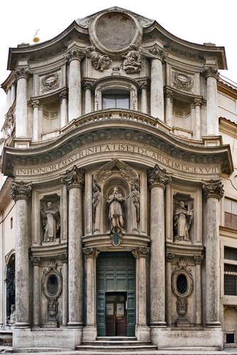
As I was reading Morrissey’s book, I thought about another possible way that Borromini may have influenced Bernini.  Morrissey quotes Borromini’s description of his church Oratorio dei Filippini (Oratory of Saint Philip Neri, 1637-1650, shown left in a 1658-1662 engraving by Domenico Barrière).  Borromini designed this church with specific intent to reference the human figure.  He wrote in his treatise Opus Architectonicum, “In giving form to the facade…I created the figure of the human body with open arms as if it embraces everyone who enters; and this open-armed figure is divided in five parts, that is, the chest in the center, and the arm, each in two sections [arm and forearm] as they open out.”1

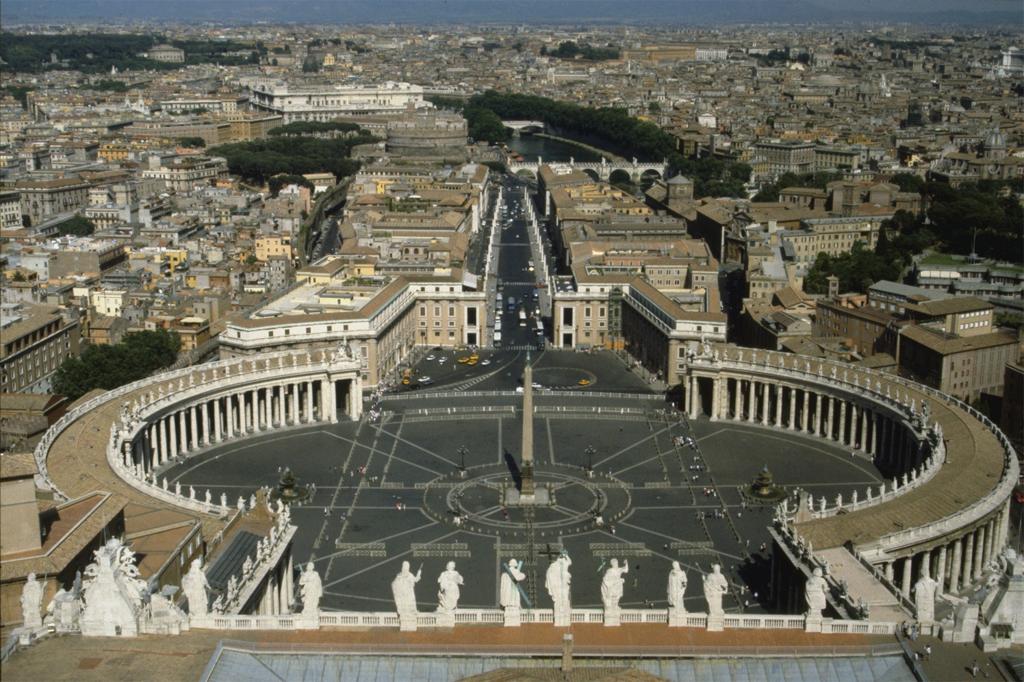
This quote immediately reminded me of the many interpretations of Bernini’s piazza of Saint Peter’s (1656-1667, shown right), which has also been analyzed as anthropomorphic in form.  In fact, Howard Hibbard notes that Bernini himself compared the colonnade of the piazza to those of outstretched arms (just like Borromini’s comparison with the Oratorio dei Filippini and open arms!).  Hibbard writes, “The image of the piazza was likened by Bernini to the outstretched arms of the Church welcoming the faithful, so that even this seemingly pure architectural creation has an anthropomorphic, and even quite sculptural connotation and function.”2

Is it just coincidence that these two rivals both used the imagery of oustretched, open arms for their architectural designs?  I doubt it, especially considering the rivalry between these two men.  I think that Bernini’s architectural “arms” were influenced by Borromini’s “arms” at the Oratorio dei Filippini.  Borromini’s church was completed just six years before Bernini began work on his project. And, furthermore, the manuscript of Opus Architectonicum (in which Borromini outlines his explanation of the “arms” idea) is dated to 1656, the same year that Bernini began work on the piazza of St. Peter’s.  What if Bernini got a look at Borromini’s treatise or heard of some of the ideas contained therein?  I think it’s possible that Borromini’s “arms” theory may have actually influenced the piazza design at St. Peter’s.3


1 Jake Morrissey, The Genius in the Design: Bernini, Borromini and the Rivalry That Transformed Rome (New York: Harper Collins, 2005), 132.  Morrissey quotes Borromini’s treatise Opus Architectonicum (Joseph Connors, ed. Milan: Il Polifilo, Trattati di architettura, 1998). 

2 Howard Hibbard, Bernini (New York: Penguin Books, 1965), 155.

3 I realize that other architectural theories exist which compare architectural forms to the human figure.  Even the ancient Roman writer Vitruvius compared the proportions of the Classical orders to the human form.  Admittedly, Borromini is not the first architect to come up with this comparison between the human form and architecture.  However, I wonder if Borromini could have been the first to incorporate the welcoming outstretched arms in architecture, particularly in its propagandistic role for the Counter-Reformation.  If that’s the case, then Borromini has once again been relegated to the sidelines, since most people associate this propagandistic idea of Catholic arms/hugs/embraces with Bernini’s piazza.

— 4 Comments

Yamasaki and Trade Center Towers


This is a very appropriate post for today. It discusses the architect for the World Trade Center Towers, Minoru Yamasaki. You should check it out – it’s quite interesting. I didn’t realize that another architectural project by Yamasaki was destroyed in 1972 (just two years after the World Trade Center towers were completed). Poor Yamasaki. I hope that none of his other work is destroyed in such a tragic fashion.

— 4 Comments

Gauguin + Eiffel Tower


The following anecdote won’t be as funny if I have to explain it. Hopefully you know/can surmise enough about architectural symbolism and Gauguin’s personality/lifestyle to see the humor.

This is more-or-less an excerpt from tonight’s dinner conversation:

M: So, I read this case study about the Eiffel Tower and modernity today, and I was surprised to find that Gauguin commented about the 1889 exhibition. He said that he was impressed with…

J: [Interrupts] …the Eiffel tower’s virility?

M: [Chokes on spaghetti while laughing] Ha ha ha!
[Recovers and clears throat] No.

J: [Chuckling and looking pleased about his clever remark] Then what did he say?

M: Gauguin admired the technical modernity of the Galerie des Machines; he called the exhibition a “triumph of iron.”1 I am always surprised at how Gauguin really embraced modern life. On one hand, he wanted to be “primitive” and earthy by living in Tahiti and being a “savage,” but really, at same time he loved modern life. It seems like he really embraced primitivism because it was the modern, avant-garde thing to do. He didn’t want to be primitive because he wanted to get away from modern life – he wanted to embrace modernity by being primitive.2

—Don’t you wish you ate dinner at our house? Then you could choke on spaghetti too. Don’t get your hopes up too much though, because footnotes aren’t included in our actual dinner conversations.

1 Gauguin admired the technical modernity of the tower, but he did think that the tower was designed with outdated decorative forms. This is the the full quote: “This exhibition represents the triumph of iron; not only regarding machines but also architecture. Though architecture is in its infancy, in that, as an art it lacks a sense of decoration proper to its own materials. Why, alongside this iron, so rugged and strong, is there trivial terracotta decoration? Why, next to these geometric lines or a wholly new character, this ancient stock of old ornament?” See Paul Wood, ed., The Challenge of the Avant-Garde (New Haven: Yale University Press, 1999), 159.

2 During graduate school, I wrote a paper about how Gauguin was in a state of denial regarding his savage, primitive lifestyle in Tahiti. Even though Gauguin renounced modern civilization and claimed to be a “barbarian” in his writings, in actuality he couldn’t part with modern life. For example, he was almost entirely reliant on tinned foods from the trading store in the area; he couldn’t even bring himself to eat the native food! In addition, Gauguin frequently used oil paint when creating his art – a medium which not only is European, but also is closely tied to the art market, commodofication, and avant-gardism. In my opinion, Gauguin was “primitive” because it was the hip (ahem, “modern”) thing to do. Gauguin’s 1889 reaction to the Eiffel Tower solidifies my opinion that the artist was not leaning away from modern life before going to Tahiti (he arrived there in 1891), but leaning towards it.

— 11 Comments

Intro to Architecture: Greek Capitals


Someone requested that I write a few introductory posts on architecture, and I am more than happy to comply! I thought that it would be fun to start with the architectural orders that were popular in ancient Greece. (I thought about waiting to write this post until I reached this same chronological point in my intro/survey posts, but I’m too excited to wait. So, sorry for the anachronism. Just pretend that the architectural posts are separate from the other survey posts.)

The three Greek architectural orders are called Doric, Ionic, and Corinthian. These orders are easily defined by a key characteristics, namely the capitals (decorative heads) at the tops of the columns. There are several other architectural features which define these three orders (and there also are variants within these orders, as you can see in the drawing on the right), but I don’t want to overwhelm anyone. For now, we’ll just focus on the capitals of these basic columns.

As you can see from the pictures above, the Doric capital essentially is split into two simple sections. In contrast, the Ionic capital is decorated with large volute scrolls and the ornate Corinthian capital is decorated with acanthus leaves and scrolls. If you want to see some other examples of these capitals (and some other awesome capitals in general), click here and here.

Throughout history, the Greek architectural style has been adopted and revived by many other cultures. The Romans quickly adopted the Greek architectural style (really, they borrowed tons of their artistic ideas from the Greeks), and the term “Classical style” can refer to either Greek or Roman art. However, Romans put a twist to Greek design by sometimes using a superimposed order on buildings which had more than one story – each of the successive stories are decorated with a different order (this is a deviation from the Greeks, who consistently would use one order throughout a whole building). For example, you can see a superimposed order on the outside of the Colosseum (Rome, 70-80 AD). The Doric order is on the bottom level, the Ionic is on the middle level, and the Corinthian is on the top:

You can also see another drawing of the Colosseum orders here
(Note: the fourth level of the Colosseum also is decorated with Corinthian capitals – but these capitals are atop pilasters instead of columns).

The Greek/Classical style has been revived many other times throughout history. Due to the excavation/discovery of Pompeii in 1748, Europeans became enamored with the Classical style once again – which led to the popular Neoclassical movement. Neoclassical architecture can be seen all over America and Europe. In America, the classical style is often used for civic buildings (which makes sense, because the Founding Fathers took part in this Neoclassical revival – they were influenced by the ideal of the Roman Republic). Here are a couple of Neoclassical examples:

William Wilkins (architect), Downing College, Cambridge (1807-21)

Note the large Ionic columns that decorate the porch

Thomas Jefferson, Monticello, Charlottesville, Virginia (1770-1806)
Jefferson used Doric columns for the porch of his home

Jacques-Germain Soufflot, the Panthéon (Ste.-Geneviève),
Paris, 1755-1792
See the large Corinthian columns?

So, where have you most recently seen some columns with Doric, Ionic, or Corinthian capitals? I most recently saw Corinthian columns on this iron pergola:

Pergola, Historic Pioneer Square, Seattle (first built 1909)

— 7 Comments

N. S. do Rosário dos Pretos and Peterskirche

When I went to do research in Brazil a few years ago, this was my favorite church that I visited. Nossa Senhora do Rosário dos Pretos (shown right, dates from the latter 18th century) was built in colonial Brazil as a place for the African slaves to worship. One of the reasons I like this church so much is that it is based on an oval floorplan. It seems to me that somehow this church was indirectly influenced by the oval floorplan that was popularized by Borromini in Italy (click here to see the floorplan of Borromini’s church San Carlo alle Quattro Fontane. This is one of my absolute favorite buildings. I love the undulating facade, the oval floorplan, and the oval dome. It’s so awesome and unique.)

John Bury has also written a little about how this Brazilian church is “Borrominesque,” but he can’t seem to pinpoint any concrete influence.1 So far, I haven’t been able to find a concrete influence for N. S. do Rosário dos Pretos either. One interesting thing I have found, though, is that this church might have been indirectly influenced by the Peterskirke in Vienna.2 Some Portuguese rulers and leaders (i.e. Pedro II, João V, and the Marquis do Pombal) were married to Austrian ladies. Perhaps the Austrian design trickled through Portugal and then down to Brazil.

The Peterskirche in Vienna (shown left, 1733) is a beautiful church that is also based on an oval floorplan. It seems to me that this church is also Borrominesque in design, although I read here that the design was actually based off of St. Peter’s Basilica in Rome. I’m a little skeptical of that information (not only because it’s from Wikipedia, but because it just doesn’t make sense – the floorplan of St. Peter’s Basilica isn’t even oval (and none of the earlier floorplans were oval either)).3 Borromini’s style was copied and emulated internationally, and it seems more likely that he affected the floorplan and design of Peterskirche. (Don’t you think that the lil’ curves in the facade could have been influenced by Borromini?)

Anyhow, I hope that I can do more research and find out the connections between Borromini, the Peterskirche, and N.S. do Rosário dos Pretos. If anyone has leads, suggestion, or information, I’d be happy to hear them.

1 John Bury, “The ‘Borrominesque’ Churches in Colonial Brazil,” (The Art Bulletin 31, no. 1):43- 44.

2 Murillo Marx, “Brazilian Architecture in the XVIII and Early XIX Centuries,” in History of South American Colonial Art and Architecture by Murillo Marx and Damián Bayón, eds., (New York: Rizzoli, 1989), 361. Marx also cites Pal Kelemen, Baroque and Rococo in Latin America (New York: Macmillan, 1951).

3 I do recognize, though, that the Wikipedia article could be referring to some aspect design other than the floorplan. In general, though, I have not observed any other striking similarities between the designs of Peterskirche and St. Peter’s Basilica. If anyone knows specific architectural connections between the two buildings, I would be interested to know them.

— 4 Comments

Email Subscription


Archives

About

This blog focuses on making Western art history accessible and interesting to all types of audiences: art historians, students, and anyone else who is curious about art. Alberti’s Window is maintained by Monica Bowen, an art historian and professor.