Category

20th century

Images of Mothers with Children

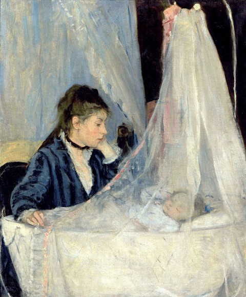
Over a year ago, I began collecting images of mothers who were with either a little baby or a young child. I have enough that I want to start a compilation here, so that I can keep track of them all. I know there are hundreds of works of art depicting mothers and children (particularly ones of the Madonna and Child), but these ones are my absolute favorites:

Berthe Morisot, "Le Berceau," 1872

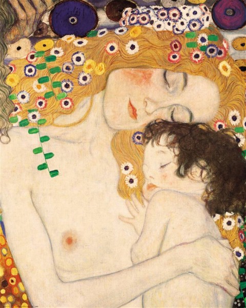
Gustave Klimt, detail from "The Three Ages of Woman," 1908

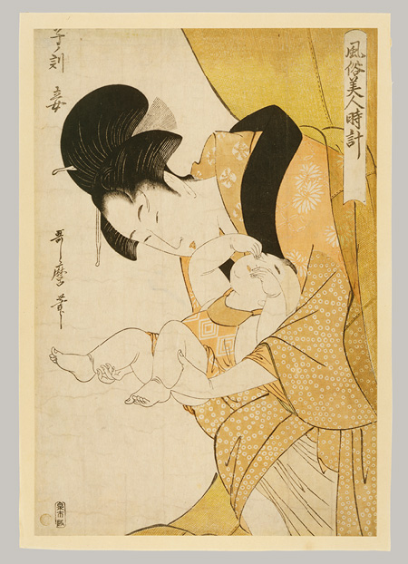
Kitagawa Utamaro, Midnight-The Hours of the Rat-Mother and Sleepy Child, Edo period, ca. 1790 (Metropolitan Museum of Art)

This woodblock print by Utamaro is from a series called Fuzoku Bijin Tokei (Women’s Daily Customs). To illustrate the “daily custom” of midnight, Utamaro depicts a mother sleepily emerging from her mosquito net to attend to her baby (who in turn rubs sleep from its own eyes). Having lost many hours of sleep myself when my son was a newborn, I can relate! A little more information about this print is available HERE.

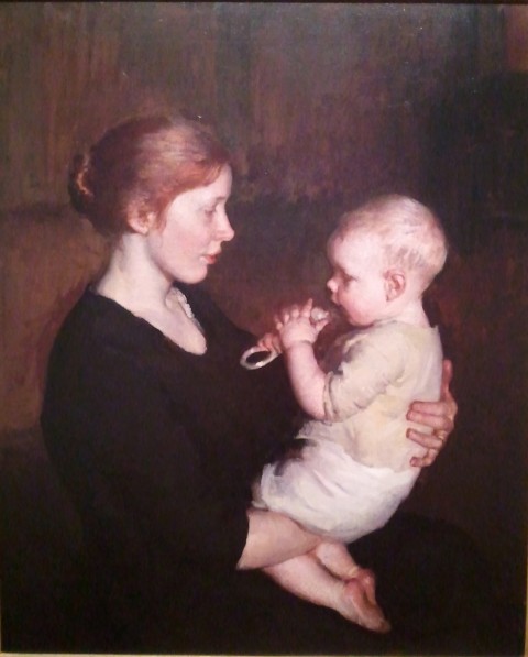
Marie Danforth Page, "Her Littlest One," 1914 (National Museum of Women in the Arts)

Her Littlest One was made during a period in which Marie Danforth Page created a lot of noncommissioned paintings of mothers with children. Mary Cassatt’s art had a lot of influence on Page at this time, as did Flemish art from the 17th century.1

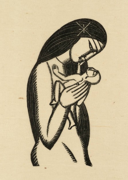
Eric Gill, "Madonna and Child," 1925. Wood engraving on paper (Tate)

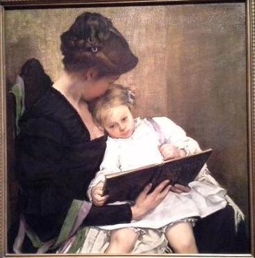
William Sergeant Kendall, At the End of the Day, 1900 (Seattle Art Museum)

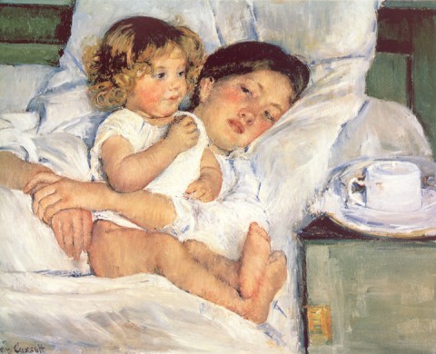
Mary Cassatt, "Breakfast in Bed," 1897 (Huntington Library)

What are your favorite images of mothers with children? Why do you particularly like them?

1 Museum label for Marie Danforth Page, Her Littlest One, Washington, D.C., National Museum of Women in the Arts, June 11, 2013.

— 12 Comments

The Female Body and Horizontal Images

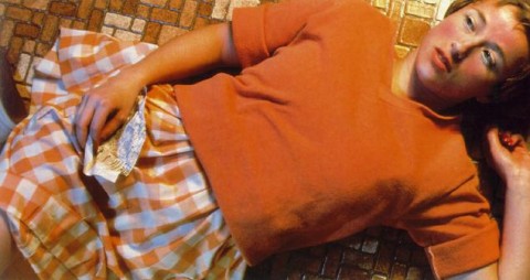
Sherman, Untitled 94, "Centerfolds" series, 1981

Over the past few weeks I’ve been reading Lives of the Artists by Calvin Tomkins. I’ve been thinking a lot about the chapter dedicated to Cindy Sherman, particularly when she discusses the controversy regarding her “Centerfolds” series from 1981. This series began as a commission from Artforum‘s editor Ingrid Sischy. The format of the commission would have involved two facing pages, which led Sherman to think about “centerfold” photographs from men’s magazines like Playboy. Sherman decided to highlight this reference by using a horizontal format for her photographs, although she added an element of irony by depicting clothed women in supine or semi-supine positions. However, the pictures were never included in the magazine; it was thought that the irony would be lost and “misunderstood” by militant feminists.1 Sherman continued to explore this horizontal format, however, and finished the “Centerfolds” series despite the rejection.

Cindy Sherman, Untitled 96, "Centerfolds" series, 1981

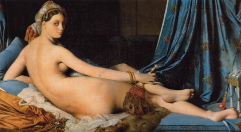
Reading about the “Centerfolds” series and its horizontal format has prompted me to think about about various ways in which the orientation of a work of art can convey meaning. I can understand why the horizontal orientation would be used for a centerfold in a magazine, if only for practical purposes. But I have realized that the horizontal format also is preferred for a lot of depictions of nude females over the centuries. The paintings that immediately come to mind for me are Titian’s Venus of Urbino (1538), Ingres’s The Grand Odalisque (shown below) and Gauguin’s Spirit of the Dead Watching (“Manao Tupapau”, 1892).

Ingres, "The Grand Odalisque," 1814

So, why would a horizontal format be preferred by some artists of the female form? I approached this topic through the lens of feminist analysis (in relation to female objectification and the “male gaze”), and here are some ideas which I came up with:

  • The horizontal orientation the medium implies rest and repose. The image is “at rest” – as emphasized by the horizontal lines on the top and bottom of the canvas or medium itself. This suggestion of repose can perhaps suggest a contrast between the active viewer and the image itself.
  • Repose and rest is emphasized in the horizontal orientation of the subject matter. In this way, the object can be interpreted as passive as well, which draws a contrast with the active viewer.
  • It may be easier to objectify a body through a horizontal orientation, since the body might be more visually approachable to the viewer in a horizontal format. A horizontal body can fill the field of vision on part of the viewer, for example. Along these lines, viewers may find it more approachable to see a large-scale depiction of a body that is horizontally oriented: one may feel unable to objectify a vertically-oriented image in which the sitter towers over the viewer.
  • A thought: Could it be that the female form is more predisposed to horizontal orientations because females are traditionally associated with the land and earth? I’m reminded of the horizon lines of landscapes and wonder if there might be some parallel. In contrast, I often think vertical lines often are associated more with masculinity (e.g. phallic imagery, skyscrapers, etc.).

Cindy Sherman noted herself that the horizontal format conveyed certain meanings to viewers of her “Centerfolds” series. She said, “…the horizontal format was a problem. Filling that space meant using some kind of prone figure, and that made it seem to some people that I was glorifying victims, or something.”2 As a change, Sherman decided to adopt a vertical format for her next series, called “Pink Robes.”

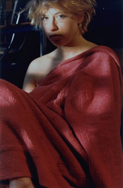
Sherman, Untitled 98, "Pink Robes" series, 1982

Although these vertically-oriented images do not automatically suggest a centerfold spread in a magazine, Sherman explained the following about the “Pink Robes” series: “I was thinking of the idea of the centerfold model. The pictures were meant to look like a model just after she’d been photographed for a centerfold. They aren’t cropped, and I thought that I wouldn’t bother with make-up and wigs and just change the lighting and experiment while using the same means in each.”3

In contrast to the objectification that seems to be implied through the horizontal orientation of the “Centerfolds” series, I think that “Pink Robes” puts more stress on the subjecthood and identity of the model, particularly due to the vertical format. The subjects imply activity and alertness because they are propped “upright” through the vertical position of the frame. Even though the subjects in these scenes imply some vulnerability through their loosely-draped pink chenille bathrobes, the vertical format still suggests strength and presence.

What types of meanings do you think can be conveyed through horizontally- or vertically-oriented images of the female form? Can you think of other examples of representations of the female form which seem to relate to the orientation of the composition and medium?

1 Calvin Tomkins, Lives of the Artists (New York: Henry Holt and Company, 2008), 33.

2 Ibid., 34.

3 Paul Taylor, ‘Cindy Sherman’, Flash Art, no.124 (Oct.-Nov. 1985): 78-9. Source quoted online here: https://www.tate.org.uk/art/artworks/sherman-untitled-98-p77729/text-summary

— 8 Comments

Dali’s “Metamorphosis”: Paranoiac-Critical Activity and the Artist-Genius

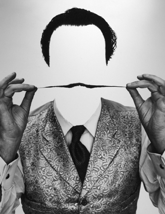
Philippe Halsman, "Invisible Dali," 1954

I love this photograph of Salvador Dali, because I think that it typifies a lot of ideas regarding Dali’s own persona and his art work. On one hand, the photograph is somewhat similar to a double image (a typical visual trope that appears in Dali’s art), since the white negative space implies a face without depicting one. The other reason I love this photograph, though, is that casts Dali in a certain type of light. As an “invisible” figure in this photograph, Dali is a person, but obviously not a “regular” or “normal” person. He is special.

Ever the eccentric, Dali wanted to be seen as someone who was different from regular society. In many ways, I think that his career and personality are an explosive reaction to the “artist-genius” construct which had slowly developed in Western society since the Renaissance. (In fact, speaking of the Renaissance, I think that Dali also viewed himself as a “Renaissance Man,” as evidenced by how he characterizes himself during his appearance on the game show “What’s My Line?” in 1957.) Dali wanted to claim special creative powers and psychological abilities as an artist-genius, which I think ties into Dali’s “paranoiac-critical method” (his term) that he used when creating art.

On a basic level, I think that the paranoiac-critical method can be defined as a way in which Dali cultivated and explored how a paranoid person can “misread, mangle, and misconstrue ordinary appearances.”1 So, as a result of self-induced paranoiac-critical activity, the artist can see things simultaneously, both as rational and irrational objects. In other words, Dali claims that he, as a unique individual, has the special ability to see things as a rational being (an objective artist) and also as a paranoid person. Dali maintained that he was not mad, but could participate in paranoic delirium as both an actor and a spectator.2 Dali’s theory, then, is based off of a willful misreading of Freud, since Dali claimed that he could intentionally embrace both the conscious and unconscious minds.3

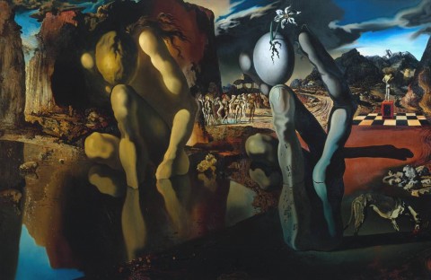
Just like Dali wanted to be seen as fluctuating between the sane and insane, Dali often painted “double-image” works of art (as a result of paranoiac-critical activity) which can simultaneously be “read” in at least two ways. One of the best examples of such double imagery is Metamorphosis of Narcissus (see below). There are lots of things in this painting that can play with the viewer’s eye and mind, but I think that the most common example is that the figure (Narcissus) looking into the water on the left is mirrored on the right by the image of a large hand holding a cracked egg. More double-image details in this painting are discussed in a short video clip by Smarthistory.

Salvador Dali, "Metamorphosis of Narcissus," 1937. 51.1 cm x 78.1 cm (approx 1.67' x 2.5'). Tate Museum, London

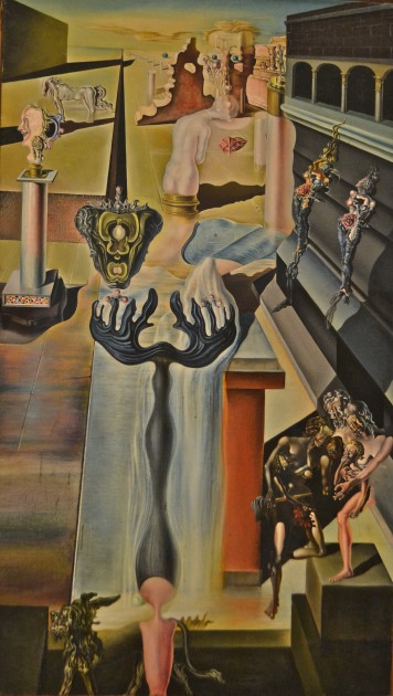
The Tate Modern site claims that Metamorphosis of Narcissus (painted 1937) was Dali’s first painting made entirely in accordance with the paranoiac-critical method.4 However, this isn’t the first painting by Dali to incorporate double images. Several years before this painting was made, Dali’s wrote an essay (“L’Âne Pourri” in June 1930) which already mentioned the double image is part of the paranoiac thought process. At the time this essay was written, Dali had begun painting The Invisible Man (see below).5

Salvador Dali, "The Invisible Man," 1929-1933. 140 cm x 81 cm (approx. 4.5' x 2.65'). Reina Sofia Museum, Madrid

Dali began to work on The Invisible Man, therefore, about the same time that he began to establish his ideas about the paranoia-criticism. Dali’s ideas about paranoia-criticism changed and morphed (as did his art) over time, which make his theory difficult to discuss in a nutshell.6 (If you do know of other ways to concisely discuss this method, please share!) But I agree with Haim Finkelstein in that Dali wanted to promote his method in order to gain favor and theoretical legitimacy with the Surrealist group in the 1920s.5 In that sense, Dali didn’t want himself to be seen as an “invisible man” among the more scientifically-engaged Surrealists at the time.

Dali’s relationship with the Surrealist group did not last forever. In a famous trial in 1934, Dali was expelled from the group. In some ways, I think that his paranoiac-critical method was a little too personalized for the other Surrealists. This ego-centric methodology and mentality of an artist-genius must have been confirmed to the other members of the group when Dali said, “I am Surrealism!” in response to his expulsion.

From what I can tell, Dali seems to be the only Surrealist artist who claims to experience a state of paranoiac delirium without any other external aid. His method differs from the artistic methods (such as automatism) employed by other Surrealists, which could involve drug-induced hallucinations or “sleeping-fits” in order to help aid the artist in approximate irrational and unconscious thought.7 Dali, in contrast, famously said, “I have never taken drugs, since I am a drug. I don’t talk about my hallucinations, I evoke them. Take me, I am the drug: take me, I am hallucinogenic!”

Of all the artists who have described or claimed to be an artist-genius, I’m pretty sure that Dali is the only one who has claimed to a drug! You can’t get much more unique than that.

1 Marilyn Stokstad and Michael W. Cothren, Art History, 5th edition (Upper Saddle River, New Jersey, Pearson, 2014), 1058.

2 Haim Finkelstein, “Dali’s Paranoia-Criticism or the Exercise of Freedom” in Twentieth Century Literature 21, no. 1, Essays on Surrealism, (Feb. 1975): 64.

3 Dr. Steven Zucker, Smarthistory video, “Metamorphosis of Narcissus”: http://smarthistory.khanacademy.org/dali-metamorphosis-of-narcissus.html

4 It is interesting to consider how Dali was proud of Metamorphosis of Narcissus as an example of his method and work. When Dali met Sigmund Freud in 1938, he took this painting with him to show Dr. Freud an example of his method and work.

5 Finkelstein, 62.

6 For a more complete discussion of Dali’s paranoiac-critical method, see Finkelstein article.

7 One such example of how other Surrealists methods differed from Dali is in Max Ernst’s essay “Au-delá de la peinture” (first published 1936). Ernst skeptically differentiates between Dali’s method and Ernst’s own practical process of frottage. Ernst also says that how Dali’s paranoia-criticism is “a pretty term which will probably have some success because of its paradoxical content” but cautions that “inasmuch as the notion of paranoia is employed there in a sense which does not correspond to its medical meaning.” See Finkelstein, 59.

— 2 Comments

Art in My Home

“…have nothing in your houses that you do not know to be useful, or believe to be beautiful.” – William Morris

Today is somewhat of an exciting day at my house. We moved into our place a few years ago, and over the past several months we have been accruing reproductions of our favorite pieces of art to display around the house. Today, the final framed print arrived! Although I’m sure that we will buy some more pieces over time (and hopefully actual works of art one day, not just reproductions), I think we are set in our arrangement for the time being.

I wanted to jot down some things about the pieces that we decided to purchase for our home over the past few years, so I can remember a little bit about each work. (I also remember enjoying when my friend Hasan wrote a similar post last fall, which ended up being one of the last posts on his site.) Keep in mind that my husband and I have a collective aesthetic that is very narrow. I love older historical pieces, while my husband prefers modern and contemporary art. We usually are able to find a middle ground in art from the nineteenth century as a compromise.
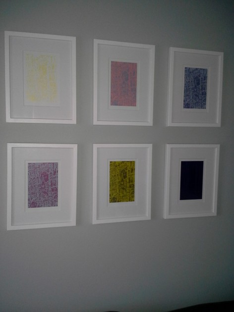
Roy Lichtenstein, Rouen Cathedral promo set, January-July 1969

We have a small set of prints that were made to promote Lichtenstein’s “Rouen Cathedral” series. Of course, Lichtenstein’s printed series was made in homage to Monet’s famous paintings. The painted series by Lichtenstein is made out of ben-day dots, and the paintings are blown up to a large scale so that the dots are extremely visible.

I’m not sure if the complete series by Lichtenstein was finished. When we bought this set, we also received a flyer (printed in April 1969) which mentioned that the actual projected series had fourteen paintings by Lichtenstein, although it remained unfinished at the time the flyer was written. (If anyone knows more information on this series, please share!) At present, I am aware of two sets from this series: Rouen Cathedral, Set V (1969) and Rouen Cathedral (Seen at Five Different Times of Day), Set III (1968-69).
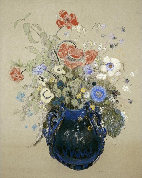
Odilon Redon, “A Vase of Blue Flowers,” c. 1905-1908. Pastel on paper, private collection.

My husband gave this Redon print to me for Christmas a few years ago, as the first work of art to hang in our new place. Unlike the bizarre and fantastic imagery which Redon created during much of his career, Redon created a lot of pastels of flowers during the last fifteen years of his life. I like a lot of his floral still lifes, but this one works especially well within our living space.

Gustave Caillebotte, “On the Pont de l’Europe,” 1876. Oil on canvas. Kimbell Art Museum.

We got a print of On the Pont de l’Europe (1876-1877) by Caillebotte after seeing the original during a trip to the Kimbell Art Museum in December 2011. I really like the bluish-grey color palette and asymmetrical composition of this piece. In fact, I think I like this painting better than Caillebotte’s other treatment of the same bridge (see Le Pont de l’Europe from 1876). One of the things that I think is interesting about my print is that the scene overlooks the Saint-Lazare train station, a place which served as subject matter for many of Monet’s paintings. More information about this painting can be found HERE.
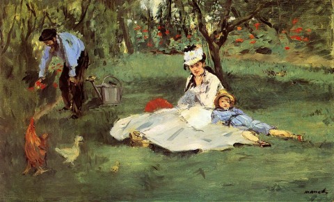
Manet, “The Monet Family at Argenteuil,” 1874

I got a print of “The Monet Family at Argenteuil” around the time that I wrote a post which included this painting. In that post, I mentioned that Manet and Renoir worked side by side in 1874 to paint the Monet family members. I think Manet’s painting is so much better; Renoir’s Madame Monet and Her Son (also called Camille Monet and Her Son Jean in the Garden at Argenteuil) is simply atrocious in comparison to Manet’s strong composition and use of color.
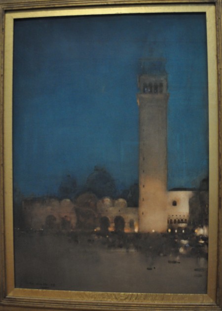
Arthur Melville, “The Blue Night – Venice,” 1897. Watercolor and gouache on board, Tate Museum.

After visiting London last summer, we got a copy of Melville’s The Blue Night – Venice (1897). I saw this painting while visiting the Tate with my cousin; my husband was visiting Cambridge that morning and missed going to the Tate with us. I took this photograph to show my husband, and we both liked the painting so much that we wanted to buy a print as a momento.

This painting captures some key places in Venice: the Campanile, the Doge’s Palace, and Saint Mark’s Cathedral. One of the reasons that I am drawn to this painting is due to the striking color and hazy definition of forms. I think that the striking properties of this painting are due to the fact that Melville championed a new watercolor technique. The TATE website explains: “He saturated the paper with Chinese white paint and used sponges to create a velvet-like texture. Before applying the paint, he tried out ideas on pieces of glass held over the painting. Colour, such as the blue used here, drew attention not just to the subject of the work, but to the medium itself.”
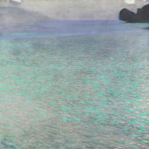
Gustave Klimt, “Attersee,” 1901. Oil on canvas, approx. 2.5′ x 2.5′ (80.2 cm x 80.2 cm). Leopold Museum, Vienna

We have a very small print of Klimt’s “Attersee” (1901), which my husband got after a trip to Vienna last fall. This painting is of a Lake Attersee, which Klimt visited repeatedly as a summer retreat. Klimt would travel to Attersee to spend summers with his lifelong companion, Emilie Flöge, and her family. He also painted other works of art during this same retreat in 1901, including Tannenwald I and Tannenwald II. More information about this painting is found HERE.
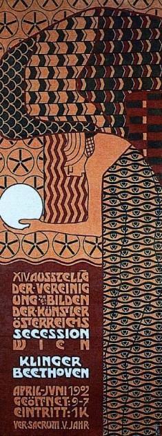
Alfred Roller, Poster For the 14th Exhibition of Vienna Secession, c.1902

We also got this poster print after my husband returned from his trip to Austria. Some view this poster as an anticipation of Cubism and Art Deco.1 I am still trying to find more information about this poster and its imagery, but I did find out that this poster was included in an exhibition at Harvard, which highlighted a “subversive triumvirate” of the feminine, the decorative, and the abstract.
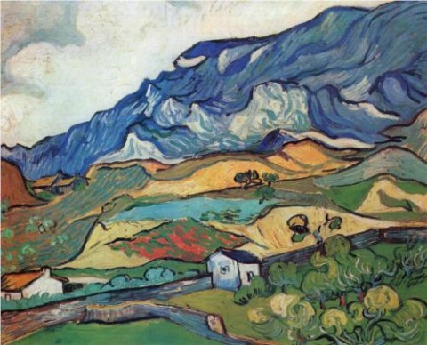
Van Gogh, “Les Alpilles Mountain Landscape Near Saint-Rémy,” 1889. Oil on canvas, Rijksmuseum Kröller-Müller, Otterlo, Netherlands

I have wanted to have a some type of Van Gogh print in my home for some time. I really love his Almond Blossom (1890) painting, but I don’t have the right wall colors in my home to complement the blue background. My husband and I liked this print not only for its colors, but also because we weren’t familiar with this painting before stumbling upon it online. This particular painting was done during the period when Van Gogh lived in Saint-Rémy (from May 1889 until May 1890); Van Gogh voluntarily admitted himself into the Saint-Paul asylum located in this area.

Willem van Aelst, “Floral Still Life with a Pocketwatch” (“Still Life with Poppies and Roses”), 1663. Oil on canvas, Rijksmuseum, Amsterdam

The print that we received today is a copy of this painting by Willem van Aelst. I’m afraid that my print does not look nearly as luminous as the actual painting itself, but I’m still happy. I’ve liked the idea of having a Dutch still life in my home for some time, but my husband and I could not find a print that we both liked. However, my husband saw this painting in the Rijksmuseum during a recent trip to Amsterdam, and I readily agreed that it would look nice in our home. I love all of the little details in this painting, from the butterflies and bugs to the small key that is connected to the ribbon.

Willem van Aelst is perhaps somewhat a lesser known still life painter today, although he achieved a lot of fame and prestige during his lifetime. Today, I think that his pupil, Rachel Ruysch, is perhaps a little better known. According to a biography on van Aelst, he was one of the first painters to create asymmetrical still life compositions during his day. (It’s no wonder that my husband, with his modern eye, would be drawn to this composition!)
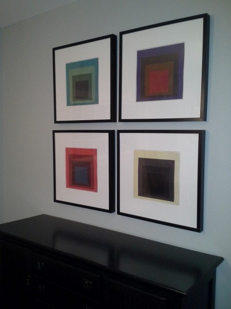
Bowen family, “Fake Albers,” 2012

And, just for fun, I’ll end this post with some fake “Homage to the Square” prints that my family created a few years ago. My husband really loves the work of Josef Albers, but we couldn’t find prints in his square series which fit with the colors we wanted to highlight in our home. So, we designed our own! My son and I each picked out one of the color schemes, and my husband chose the final two. He designed the prints based off of actual Albers prints.
 1 Philip B. Meggs and Alston W. Purvis, Meggs’ History of Graphic Design, 5th edition (John Wiley & Sons, Inc., 2011). Text available online HERE.

— 7 Comments

Trip to London: New Discoveries

My family and I just got back from a vacation to England. About three-and-a-half of those days were spent in London, and we were able to cram eight museum visits into those few days! We visited Sir John Soane’s Museum, the Tate Modern, the Victoria & Albert Museum, the Wallace Collection, the Design Museum, the National Gallery, the Tate Britain, and the British Museum. I especially loved the elegance of the Wallace Collection, the quirkiness of the Soane Museum, and the grandeur of the British Collection.

I got to see a lot of beloved works of art on this trip, including relief carvings of Ashurbanipal’s lion hunt, the Parthenon Marbles, the hunting scene from the Tomb of Nebamun, and Holbein’s The Ambassadors. I also was really glad that I saw the “Vermeer and Music” show at the National Gallery (even though it meant that I had to sacrifice seeing The Arnolfini Portrait in another section of the museum, due to time constraints!). I also became familiar with new artists and/or works of art during this trip, and I thought I would share them here.

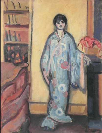
Emilie Charmy, Woman in a Japanese Dressing Gown, 1907. Oil on canvas, 81 x 68 cm. Image from StudyBlue

This isn’t a work of art that I saw in London, but I was introduced to the work of Emilie Charmy on the plane ride to England. Several of her paintings (including Woman in a Japanese Dressing Gown, shown above) are included in Gender and Art, a book that I read while on my trip. In 1921, the critic Roland Dorgelés wrote that that Charmy “sees like a woman and paints like a man.”1 An online gallery of Charmy’s work can be found HERE.

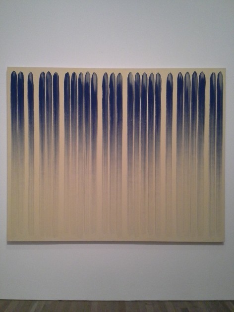
Lee Ufan, "From Line," 1978. Oil paint and glue on canvas. Tate Modern.

Ufan’s From Line is one of the works of art that I saw in the Tate Modern. I love this painting for several reasons, partly because the aesthetic perfectly matches the things that my husband loves about Abstract Expressionism. Ufan wrote this about his method: “Load the brush and draw a line. At the beginning it will appear dark and thick, then it will get gradually thinner and finally disappear . . . A line must have a beginning and an end. Space appears within the passage of time, and when the process of creating space comes to an end, time also vanishes.”2

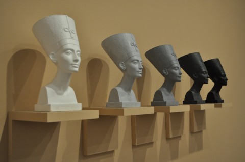
Fred Wilson, "Grey Area (Black Version)," 1993. Five painted plaster busts, five painted plaster wooden shelves.

I am mostly familiar with Fred Wilson’s interesting exhibition work in Mining the Museum, so I found his piece Grey Area (Black Version) to be a welcome surprise. Plus, I love the Egyptian bust of Nefertiti. Wilson’s piece draws attention to “the claims for Nefertiti, and ancient Egypt generally, as positive examplars of blackness within African American culture, but also on the debates around Nefertiti’s actual racial identity and obscured histories of African peoples, alluded to in the title ‘Grey Area.'”3

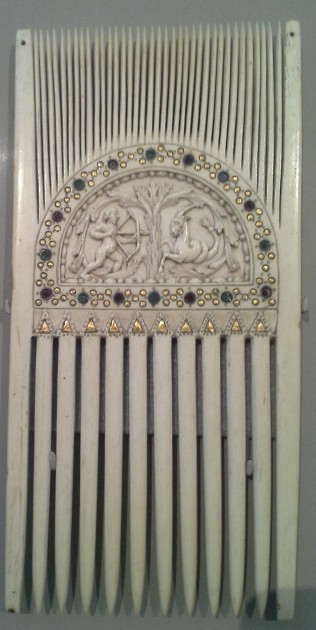
Carolingian Ceremonial Comb with Astrological Symbols, c. 875. Victoria and Albert Museum

I was excited to see this liturgical comb in the V&A, largely because my friend Shelley had piqued my interest in liturgical combs with her post earlier this summer. The museum text panel for this Carolingian comb explained, “Combs like this were used to part the hair of the priest before celebrating Mass, and in other ceremonies. This combing symbolically ordered the mind, as well as reducing the risk of falling hair contaminating the wine.”4 The museum website also explains (in a blurb about a 12th century comb) that liturgical combs symbolized “a concentration of thoughts toward the liturgy.”

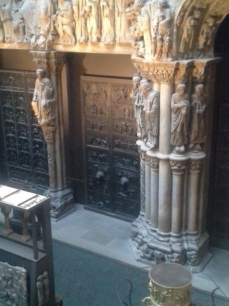
Cast of the Hildesheim doors (center) in the Cast Courts at the Victoria & Albert Museum.

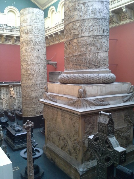
Plaster casts of Trajan's Column, from the Cast Courts at the Victoria & Albert Museum

I was really looking forward to seeing the casts in the Cast Courts at the Victoria & Albert Museum. To my great disappointment, I found that the Cast Courts were closed, and only one of the courts could be seen by looking from a second-story balcony. I was most looking forward to seeing minute details in the casts of the Hildesheim Doors, but I had to try and be content with seeing those doors from a distance. I did feel like I had a new perspective though, on the sheer size of Trajan’s column after seeing the cast placed in an indoor space. Both my husband and I exclaimed in surprise when we stumbled upon the balcony which afforded a view of the column (so large that it is displayed in two pieces!). More information on the plaster casts of Trajan’s Column can be found HERE.

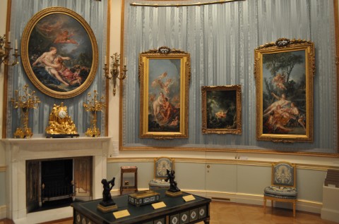
Fragonard's "The Swing" (second from right) and Boucher's "Cupid á Captive" (right) in the Wallace Collection

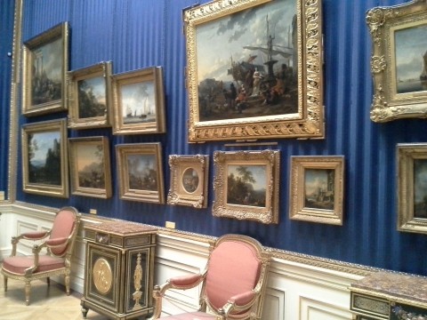
One of the Dutch Rooms in the Wallace Collection

I wanted to include two images of the Wallace Collection interior, since I felt like the setting for this museum was a work of art in-and-of-itself. If I had to choose, I think that this museum was my very favorite one that we visited on this trip. I wanted to visit this museum and the Soane Museum ever since I began to compile my Collection Museum list, and the Wallace Collection did not disappoint! It was also really fun to see Fragonard’s The Swing, since the first art history paper I ever wrote in college was on that painting. It was a lot smaller than I expected! I also thought it was neat that The Swing and Cupid á Captive hang side by side, since those are two popular works of art that often feature in art history survey courses.

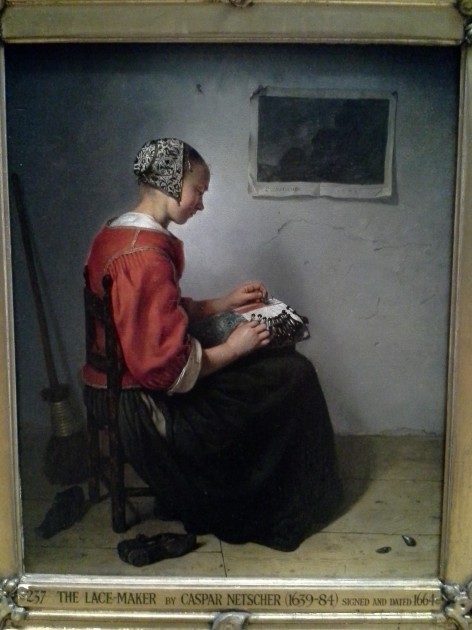
Caspar Netscher, The Lace-Maker, 1664

One of the paintings that was a very nice discovery in the Wallace Collection was Netscher’s The Lace Maker. I feel like this has a really strong composition, but also exhibits some interesting interest in texture (for example, with the intricate cap, the plastered wall, and the paper on the wall). This morning I have been thinking about how the turned body and red clothes of the figure remind me a little bit of the centrally-placed woman in Courbet’s The Wheat Sifters (1854) from the Musée des Beaux-Arts de Nantes collection. In some ways, it’s interesting to compare these paintings and see how Courbet was heir of the Dutch genre painting tradition.

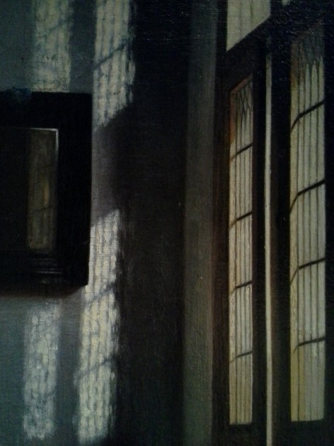
Detail from Peter de Hooch, "Woman Peeling Apples," c. 1663.

Another great painting in the Wallace Collection that is hung near The Lace Maker is Peter de Hooch’s Woman Peeling Apples (c. 1663). I use this painting when I lecture on 17th century Dutch art, but I never had seen this painting before in person. The light streaming through the windows is quite lovely, and I like a lot of things about the color and details of this whole painting.

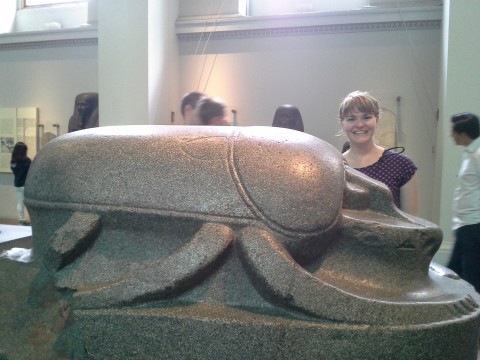
Colossal scarab, perhaps 305-30 BC (possibly earlier)

A colossal scarab! Who knew that such a thing existed?!? This scarab was brought by Lord Elgin (of “Parthenon Marbles” fame) to Britain in the 19th century. I like this scarab for a couple of reasons, including that the scarab was found in Istanbul, although it probably decorated an Egyptian temple. I wonder why the scarab ended up in Istanbul. Scarabs are also interesting to me because of their symbolic associations with rebirth and the sun. Egyptians thought that the scarab was seemingly miraculously hatch out of the dung. In addition, the scarab pushes dung into small balls, much like the god Khepri pushes the sun through the sky.

I took lots of other photos of museums and works of art on this trip, but I think that these are the main “new” (for me, at least) works of art and spaces which will stick out to me the most. Even though we got to visit eight museums, there are still many more things that I wish I could have seen. I already feel the pull go to back, especially since it seems like Millais’s Ophelia is not currently on view at the Tate Britain! I couldn’t find it anywhere. Could that painting have been taken down (or sent off for travel) with the recent rehanging of the Tate’s permanent collection?

What are your favorite works of art and museums in London? Why?

1 Gill Perry, “The Parisian Avant-Garde and ‘Feminine’ Art in the Early Twentieth Century” in Gender and Art by Gill Perry, ed., (New Haven: Yale University Press, 1999), 220.

2 Museum label for Lee Ufan, From Line, London, Tate Modern, August 11, 2013.

3 Museum label for Fred Wilson, Grey Area (Black Version), London, Tate Modern, August 11, 2013.

4 Museum label for Ceremonial Comb with Astrological Symbols, London, Victoria & Albert Museum, August 11, 2013.

— 8 Comments

Email Subscription


Archives

About

This blog focuses on making Western art history accessible and interesting to all types of audiences: art historians, students, and anyone else who is curious about art. Alberti’s Window is maintained by Monica Bowen, an art historian and professor.