Thursday, October 3rd, 2024
“Lost Masterpieces”: Tracey Emin’s Tent
I first came across the book Lost Masterpieces by Michael Collins at the library earlier this year, and I liked it so much that I bought a copy as a birthday present to myself. It is a small little green book and it is divided into four sections, focusing on art that has been either lost, stolen, damaged or destroyed. Some of my favorite topics, all in a portable volume! The entries aren’t long – only a page or two – but it is just enough of information to get me to think about a work of art or two for a few minutes during my busy day. And I’ve been surprised at the new things I’ve learned about works of art that already were familiar to me.
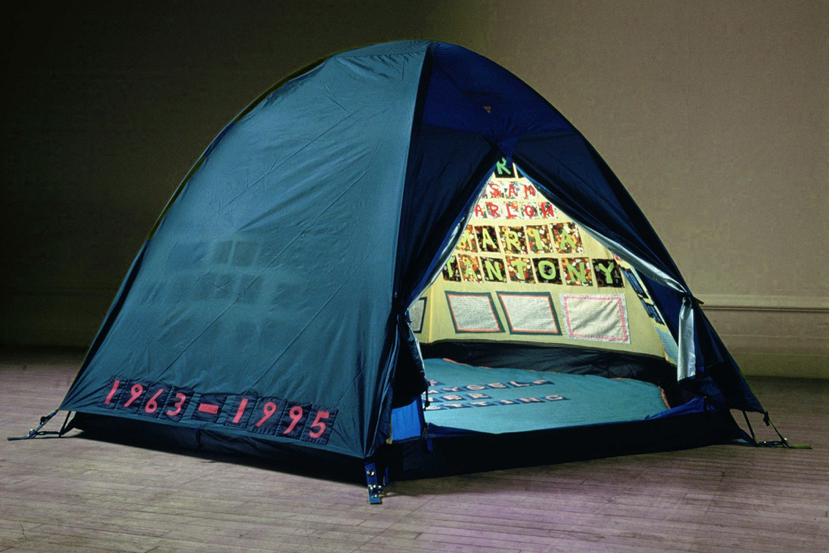
Tracey Emin, “Everyone I Have Ever Slept With 1963-1995,” 1995.
One thing that I was surprised to learn is that Tracey Emin’s famous tent installation, Everyone I Have Ever Slept With 1963-1995, was destroyed in a 2004 fire at a London warehouse that was leased by Momart, a company which specializes in fine art storage.1 At the time, the installation was being stored by its owner, the gallery dealer and collector Charles Saatchi. Many other artists lost their own works of art in the fire, including Damien Hirst and Chris Ofili. The value of the art that was destroyed in the fire is estimated to range from £30-50 million pounds. Many artists, auction houses, galleries and collectors sued Momart for negligence, and Momart counter-argued that those using their facilities should have had their own insurance.
The loss of Tracey Emin’s tent is an interesting one, since the tent was a time capsule of a specific period of time in Emin’s life. The tent is appliquéd with the names of 102 people that Emin had slept with over the course of two decades. And it should be noted that the title “slept with” is not always a euphemism for sex, but can literally just mean sleep: Emin includes the names of people like her grandma, explaining “I used to lay in her bed and hold her hand. We used to listen to the radio together and nod off to sleep. You don’t do that with someone you don’t love and don’t care about.”2
The impactful installation, which was intended to cause people who entered the tent think about their own lives, partners, and who they had “slept with,” as well as broader topics found in her work that include abuse, rape, sexual violence and poverty.3 The collector and dealer Charles Saatchi bought Everyone I Have Ever Slept With 1963-1995 for £40,000, although he had to buy it from a secondary private dealer because Emin refused to sell it to Saatchi due to his advertising work for Margaret Thatcher. Perhaps Emin, who had originally sold the installation for only £12,000, felt like the fire was a form of karma? After the fire, Emin said that she wouldn’t recreate the installation, explaining that “I couldn’t remake that time in my life any more than I could remake the piece.”4 She further argued that the fire was not a total loss: “No one died and ideas continue.”5 The tent may have gone to rest in a metaphorical sense, but Emin’s ideas will not be going to sleep anytime soon.
1) Michael Collins, Lost Masterpieces (DK Publishing: New York, 2002), 179.
2) Barry Didcock, “The E spot,” The Sunday Herald, 30 April 2006.
3) Simon Hattenstone, “The radical, ravishing rebirth of Tracey Emin: ‘I didn’t want to die as some mediocre YBA,’” The Guardian, 29 May 2024
4) Collins, 180.
5) Ibid., 181.


