Archive

November 2010

Guernica as Nativity

This past weekend, I engaged in a mini-research project to help a friend. This friend is putting together a slideshow of Nativity images for a Christmas party; he is specifically interested in showing images which depict the biblical scene with clothing/architecture/instruments that are contemporary to the time of the artist. This project wasn’t too hard to complete, especially since Northern Renaissance artists loved to depict Nativity scenes in Northern interiors with Northern clothing. Perhaps I’ll post some of my Nativity findings in the next few weeks – it was a very fun project.

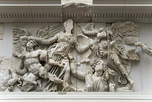
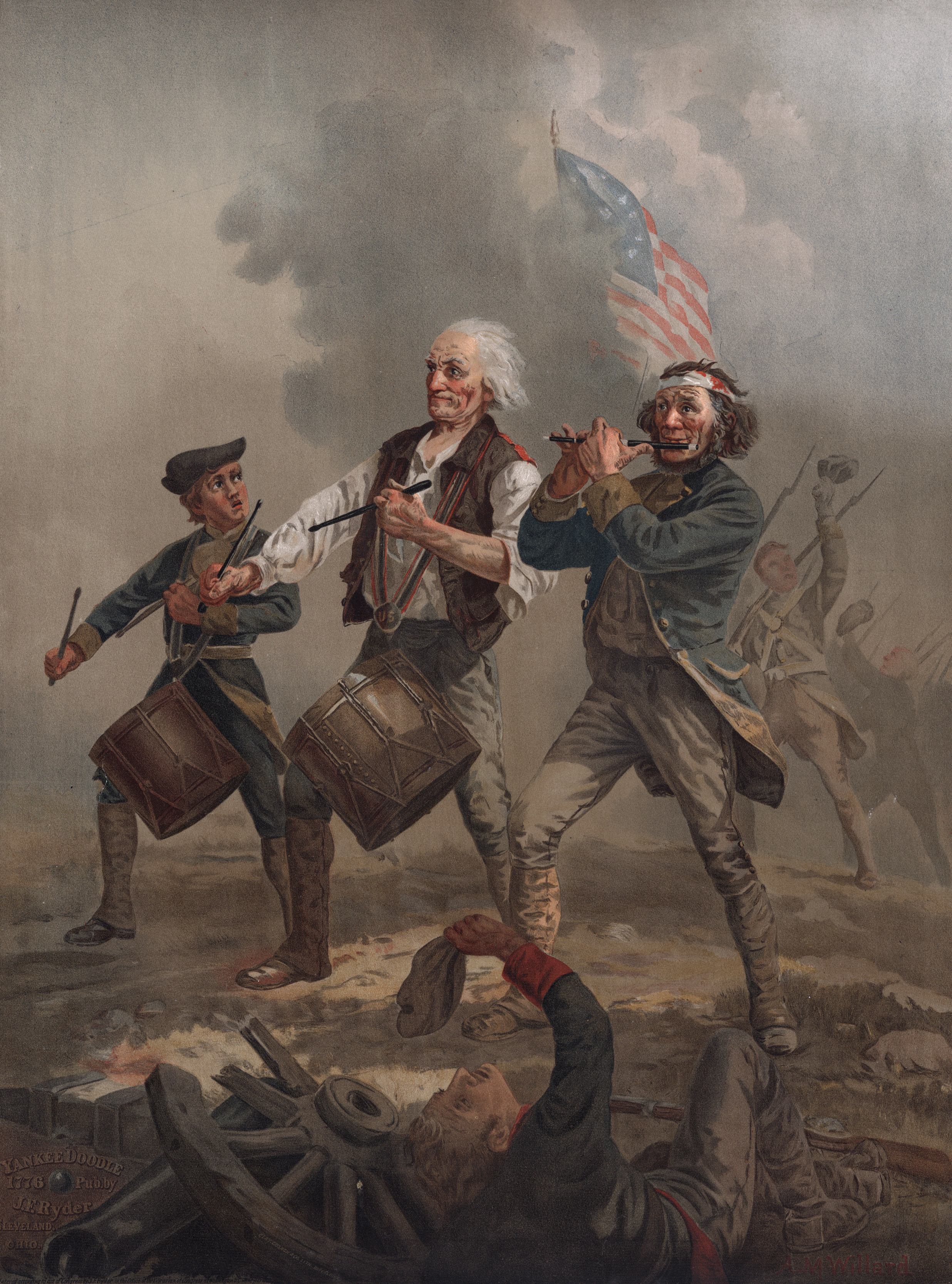
Anyhow, while compiling images I became curious to see if Picasso had ever created a Nativity scene. Since Picasso was such a prolific artist (with 271 new works recently added to his oeuvre), I thought he would have depicted a Nativity scene at least once. Surprisingly, I didn’t find any works titled “Nativity” in my limited research time, but I did come across an interesting argument that was recently published in Nómadas: Revista Crítica de Cincias Socialies y Jurídicas. Pablo Huergo Macón argues that Picasso’s iconic painting Guernica (1937, shown above) is a modern representation of the Nativity. Basically, Macón finds that Guernica “is a manger blown up by bombs.”1 Here are some of the traditional images which Macón points out:

  • Virgin Mary cradling a (Christ) child (far left)
  • Joseph (shown as a warrior brandishing a sword)
  • Angel who appears to shepherds (holding a candle in Picasso’s scene)
  • Shepherds (represented by the women on the right side, one in a shawl and one with raised arms)
  • Stable animals (Macón argues that the bull represents the ox and horse represents the mule)
  • Star of Bethlehem (light bulb in center, illuminating the scene)

I think the inclusion of the llight bulb puts an interesting contemporary twist on the whole Nativity scene (but I decided that my friend probably wouldn’t want to use this image for his Christmas party slideshow! It doesn’t exactly scream “Christmas cheer,” does it?).

Anyhow, I think Macón’s theory is interesting and deserves some attention. Even if this theory isn’t perfect, I think it could explain at least one reason why Guernica is so jarring to us: Western viewers can recognize distorted, perverse, and extremely unsettling elements of a traditional Christian theme.

1 Pablo Huergo Macón, “The Other Side of Guernica,” Nómadas: Revista Crítica de Cincias Socialies y Jurídicas 23 (2009:3): 1. Found online here.

— 9 Comments

Thanksgiving Gratitude List: Formal Elements

It is the Thanksgiving holiday this week in the US, which means that Americans tend to focus on things for which they are thankful. I thought it would be fun to compile a list of the formal elements in art for which I am grateful. In other words, these are all of the physical (formal) aspects of art which I find aesthetically pleasing. To me, these things make art beautiful:

I am grateful for compositions with strong diagonals.
Athena Battling Alkyoneos, Detail of the Gigantomachy Freize from the Altar of Zeus, c. 175 BC
I am grateful for strong light and dark contrasts.
Caravaggio, Madonna of the Snake, 1606

I am grateful for impasto.
Van Gogh, detail of Wheat Field with Cypresses, 1889 (Metropolitan Museum)

I am grateful for volume, particularly when it creates
an illusion of the human figure.

(Look at how Pluto’s fingers press into Proserpina’s body!)
Bernini, detail of Pluto and Proserpina, 1621-22 (Borghese Gallery)

I am grateful for flat planes of solid color.
Gauguin, Self Portrait with Halo, 1889

I am grateful for thick, dark outlines of figures.
Brian Kershisnik, Artist Devoured by a Terrible Beast, n.d.

I am grateful for monochromatic backgrounds.
Whistler, Arrangement in Grey and Black: Portrait of the Artist’s Mother, 1871

I am grateful for the luminescent colors afforded by oil paint.
Robert Campin, detail of the Merode Altarpiece, 1425-28

You can really tell what artistic periods (and centuries) I prefer, huh? What formal elements are YOU grateful for?
— 12 Comments

"Priceless" by Robert K. Wittman

I recently finished reading Robert K. Wittman’s book Priceless: How I Went Undercover to Rescue the World’s Stolen Treasures. I had waited several weeks (months?) to get my hands on a library copy of this book, and became even more anxious after reading this great review of the book on Truth, Beauty, Freedom and Books.

The wait paid off, though. Not only is this book entertaining and informative, but it also gives a really interesting perspective on art. As an undercover FBI agent, Wittman has to be informed about the historical significance of the art in his cases, but it is also clear that he views art as objects and historical artifacts. There definitely is nothing wrong with this perspective, and it is a logical perspective for Wittman (since he’s interested in recovering a physical object that has been stolen).

Anyhow, it was interesting to think about Wittman’s apparent “art as object” perspective, since art historians sometimes forget that a work of art is, in its essence, an object: art is paint on a canvas, a block of marble, or metal. I think art historians often “mysticize” or elevate works of art to the point that the objects are exempt from their actual physical properties. Gombrich, for example, tried to humanize art by comparing it to the complexity of “real human beings” (see here). In some ways, I don’t have issue with this perspective either, but it’s interesting to think about how art historians sometimes divorce themselves from the physicality of the art they discuss. But I digress. The point is: it was interesting to see Wittman approach art from a different (more practical?) perspective than I usually encounter among art historians and critics.

Although I would have enjoyed reading more about the historical background for some of the art pieces, Wittman provided a decent amount of information. (Also on a side note, Wittman also works to recover historical artifacts, such as an original copy of the Bill of Rights. These cases are also interesting, but I assumed beforehand that I would only be reading about stolen fine art.)

I especially was interested in reading about the theft of Norman Rockwell’s Spirit of ’76 (1976, shown right).1 This painting was stolen from a gallery in 1978 and was never recovered. The FBI closed the case a few years after the theft, but the case resurfaced in the mid-to-late 1990s, when it became known that the painting had was in the possession of an art dealer in Rio de Janeiro. Wittman was deeply involved in this case by the time of 9/11. Unsurprisingly, the interest in Rockwell and Americana surged after 9/11, due to the rise of patriotism in the American people. Therefore, a whole new dimension and meaning was added to this case, given the 9/11 happenings and interest in Rockwell. And, even more interestingly, Rockwell’s Spirit of ’76 includes an image of the “Twin Towers” (shown in the bottom right corner of the painting). In fact, the inclusion of the “Twin Towers” helped give impetus to finishing this case and recover the artwork from Brazil: officials realized it would be a great public relations move.2

I’d recommend this book to anyone who likes art crime. I think Americans will find the cases especially interesting and meaningful, since Wittman recovered many objects that are significant to American history. However, there are several European pieces that Wittman also recovers/mentions. Really, though, I think that this book would appeal to most people who are interested in art and art crime.

1 I can’t help but add that Rockwell’s composition was inspired by Archibald Willard’s classic Spirit of ’76 (“Yankee Doodle,” the linked version dates c. 1875)

2 Robert K. Wittman, Priceless: How I Went Undercover to Rescue the World’s Stolen Treasures (New York: Crown Publishers, 2010), 174.

— 3 Comments

The Capitoline Wolf is Medieval?!?

I don’t know how I missed this news (it’s over two years old), but I thought that I would post it for others who may not have heard. In recent years scholars have questioned whether the “Capitoline Wolf” (an iconic statue of a she-wolf that is related to the mythological founding of Rome, see left) is Etruscan. Winckelmann first attributed this statue to the Etruscan period; he based his reasoning on the way that the wolf’s fur is depicted. In turn, it generally became accepted that the statue was created in the 5th century BC.

However, a couple of scholars have questioned this attribution since the 19th century. The most recent critique was published by art historian Anna Maria Carruba in 2006. Carruba noted that in the 1997 restoration of the statue, it was observed that the she-wolf was cast as a single unit – a technique that was common during the medieval period.

Carruba’s work eventually led to radio-carbon dating tests on the sculpture. About twenty dating tests were conducted at the University of Salermo, which resulted in the announcement that the she-wolf was created in the 13th century AD! In other words, she was created up to 1,700 years later than we originally thought. Wow. Sorry Winckelmann: it looks like you’ve struck out again. Ouch.

This is a crazy paradigm shift for me. I’ve always connected the Capitoline Wolf with the Etruscans (and the Romans by extension, since she is connected with the story of how Rome was founded). I’ve always known that the Romulus and Remus figures underneath were made during the Renaissance (they were fashioned in the late 15th century AD, probably by Antonio Pollaiolo), but it’s crazy to think that the Capitoline Wolf is medieval.

I should note, though, that the attribution of this statue is still far from resolved. Not only can one get a sense of the ongoing debate here and here, but right now the Capitoline Museum still has the Etruscan date on their official website. As for me, though, I’m currently inclined to go with the radio-carbon tests and the several scholars which have questioned the attribution. (And maybe I feel this way because I often question Winckelmann’s judgment, even outside of this Etruscan attribution.)

Is this news for anyone else? Maybe I’m just behind the times. What do other people think about this new date?

— 13 Comments

The Minoans as Hippies (and an Etruscan Thought)

When I was an undergrad, one of my professors liked to compare the Minoans to the hippies of the 1960s. My teacher isn’t the only one who has made this comparison. In fact, recently Minoan lilies were cleverly dubbed “the ancient equivalent of flower power.”1

My teacher pointed out that the Minoans were very interested in nature (as evident in their art, which often depicts animals and plants) and used opium. And I think one could even (jokingly) say that the bright colors in some of the frescoes (like the hills in the Spring Fresco from Akrotiri, Thera, before 1630 BCE, shown above left) are “psychedelic.”2

I don’t mind the hippie comparison, especially if it can help students to differentiate between the Minoan and Mycenaean civilizations. I do think it’s important, though, for students to know that the comparison isn’t perfect. For example, the fact that the Minoans had fortifications (despite what Sir Arthur Evans argued) and were possibly involved in human sacrifices suggest that these people weren’t all about love and peace.

Speaking of Minoans and the Spring Fresco, I was struck today about how there are some similarities between this painting and a tomb painting from the Etruscan period (“Boys Climbing Ricks and Diving,” from Tomb of Hunting and Fishing in Tarquinia, late 6th century BC, shown right). Both paintings depict brightly colored hills (with the mounds divided into multiple colors). In both cases, the hills are adorned with spindly vegetation (the Spring Fresco depicts stylized lilies, but I don’t think there is enough detail to identify the Etruscan plant). Additionally, the two paintings have birds darting about in the air. I know that over 1,000 years separate these frescoes (not to mention that they are from different geographic areas – the Minoans were on islands in the Aegean Sea and the Etruscans were on mainland Italy), but I think the similarities are interesting.

1 Mary Beard, “Knossos: Fakes, Facts, and Mystery,” in The New York Review of Books (August 13, 2009). Available online here.

2 However, I only make the psychedelic comparison with students as a joke. It has been noted that the bright colors of the rocks are actually quite naturalistic. “The colors may seem fanciful to us, but sailors today who know the area well attest to their accuracy, suggesting that these artists recorded the actual color of Thera’s wet rocks in the sunshine, a zestful celebration of the natural world.” See Stokstad, Art History, 4th ed. (Upper Saddle River, New Jersey: Prentice Hall, 2011), 92.

— 9 Comments

Email Subscription


Archives

About

This blog focuses on making Western art history accessible and interesting to all types of audiences: art historians, students, and anyone else who is curious about art. Alberti’s Window is maintained by Monica Bowen, an art historian and professor.