Archive

June 2009

St. Paul: His Remains and a Catacomb Painting

I just read this post which informed me that a new catacomb painting of St. Paul has been found in Rome. This is the oldest extant fresco of St. Paul, which dates to the 4th century AD. Plus, this discovery is also exciting because of all of the images of St. Paul from the Early Christian period, this one is in the best condition.

This fresco was discovered in the Catacomb of St. Thekla. The catacomb is near the place where Paul was reportedly buried (the Basilica of St Paul’s Outside-the-Walls in Rome). This fresco was instantly recognized as St. Paul since the thin face and dark beard were typical iconographic features for the saint in the 4th century.

You can read more about the fresco’s discovery in yesterday’s Telegraph article. Along these same lines, today’s Telegraph article discusses test results which confirm that the remains located in St. Paul’s Outside-the-Walls belong to St. Paul. (Well, probably. The remains have been confirmed to date from the first or second century.) It appears that the finding of this fresco prompted officials to test the remains inside the sarcophagus.

Pretty cool stuff. I think it’s especially interesting that this fresco was restored using a laser. Technology is helping archaeologists and restorers do some amazing stuff. If lasers were never invented, do you think this fresco would have been lost forever?

— 2 Comments

N. S. do Rosário dos Pretos and Peterskirche

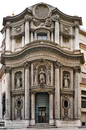
When I went to do research in Brazil a few years ago, this was my favorite church that I visited. Nossa Senhora do Rosário dos Pretos (shown right, dates from the latter 18th century) was built in colonial Brazil as a place for the African slaves to worship. One of the reasons I like this church so much is that it is based on an oval floorplan. It seems to me that somehow this church was indirectly influenced by the oval floorplan that was popularized by Borromini in Italy (click here to see the floorplan of Borromini’s church San Carlo alle Quattro Fontane. This is one of my absolute favorite buildings. I love the undulating facade, the oval floorplan, and the oval dome. It’s so awesome and unique.)

John Bury has also written a little about how this Brazilian church is “Borrominesque,” but he can’t seem to pinpoint any concrete influence.1 So far, I haven’t been able to find a concrete influence for N. S. do Rosário dos Pretos either. One interesting thing I have found, though, is that this church might have been indirectly influenced by the Peterskirke in Vienna.2 Some Portuguese rulers and leaders (i.e. Pedro II, João V, and the Marquis do Pombal) were married to Austrian ladies. Perhaps the Austrian design trickled through Portugal and then down to Brazil.

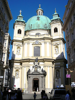
The Peterskirche in Vienna (shown left, 1733) is a beautiful church that is also based on an oval floorplan. It seems to me that this church is also Borrominesque in design, although I read here that the design was actually based off of St. Peter’s Basilica in Rome. I’m a little skeptical of that information (not only because it’s from Wikipedia, but because it just doesn’t make sense – the floorplan of St. Peter’s Basilica isn’t even oval (and none of the earlier floorplans were oval either)).3 Borromini’s style was copied and emulated internationally, and it seems more likely that he affected the floorplan and design of Peterskirche. (Don’t you think that the lil’ curves in the facade could have been influenced by Borromini?)

Anyhow, I hope that I can do more research and find out the connections between Borromini, the Peterskirche, and N.S. do Rosário dos Pretos. If anyone has leads, suggestion, or information, I’d be happy to hear them.

1 John Bury, “The ‘Borrominesque’ Churches in Colonial Brazil,” (The Art Bulletin 31, no. 1):43- 44.

2 Murillo Marx, “Brazilian Architecture in the XVIII and Early XIX Centuries,” in History of South American Colonial Art and Architecture by Murillo Marx and Damián Bayón, eds., (New York: Rizzoli, 1989), 361. Marx also cites Pal Kelemen, Baroque and Rococo in Latin America (New York: Macmillan, 1951).

3 I do recognize, though, that the Wikipedia article could be referring to some aspect design other than the floorplan. In general, though, I have not observed any other striking similarities between the designs of Peterskirche and St. Peter’s Basilica. If anyone knows specific architectural connections between the two buildings, I would be interested to know them.

— 4 Comments

Guessing Game with Art and Film Stills

It’s Friday and I think we should play another fun guessing game. I got the idea for this post after coming across a blog which points out an “art history shout-out” in a TV show. There are a lot of references to art in pop culture (I’m specifically thinking of television and movies, but it extends beyond that). Can you name the famous works of art that are referenced in these film stills? (The answers are in the comments section of this post.)

LOST, “Fire + Water,” Season 2

Home Alone (1990)

Alfred Hitchcock’s, “Psycho” (1960).
This one is a little tricky. Don’t pay attention to the scene, but the architecture of the house.

Tideland (2005)

And I couldn’t find a film still for my last one, so I’ll just give you the answer. A scene from Forrest Gump (1994) is directly inspired by Norman Rockwell. Here’s the painting:

Girl with Black Eye (1953)

To see the film scene inspired by the painting, scroll to 0:33 on this clip:


Can you think of any other movies or films inspired by art? (Note: I purposefully did not mention the Thomas Kinkade painting which inspired a movie last year.) Also, if you’re interested, I found a webpage called Art History in the Movies, which lists films about art and some films inspired by art.

And can you think of any paintings that should be turned into movie scenes? Tyler Green suggested five. I think that Renoir’s Le Moulin de la Galette (1876) would make a good scene in a film. And if it was a murder mystery, then perhaps one of Gentileschi’s versions of Judith Slaying Holofernes (the one linked is from the Uffizi Gallery and dated 1614-20)?

— 3 Comments

William Blake’s "The Pilgrim’s Progress" Series

I am in the middle of reading John Bunyan’s The Pilgrim’s Progress. I know the plot of this book quite well, having read the children’s version Dangerous Journey and watched its accompanying film a bigillion times. But, being a historian and purist, I wanted to read the original book (first published in 1687).

Although I know the story well, I didn’t know that William Blake created illustrations of this famous allegory. It doesn’t surprise me that Blake would be interested in The Pilgrim’s Progress; as a nonconformist artist that was interested in mythical and prophetic subject matter, this story is right up his alley.

Blake began this The Pilgrim’s Progress series in 1824, but it was never finished (I assume because Blake died in 1827). The completed illustrations weren’t put into a book until 1941 by the Limited Editions Club, over 100 years after Blake died.

I haven’t been able to find a lot of information or discussion about this series in art history databases. I also haven’t been able to find a lot of images of the series. Perhaps this series has been ignored because it is incomplete?

I’m curious to see what the other illustrations look like. I might have to buy this 1942 edition (Heritage Press) off of eBay, which includes twelve of the watercolor illustrations by Blake. But I’m a little skeptical as to why this book is only for sale for $29. Doesn’t that seem a little low for an old book with watercolors by William Blake?

— 3 Comments

The Answer is: Giulio Romano

I had another art history dream the other night. I dreamed that I went to go visit my the AP art history teacher from my old high school. She was a really fantastic teacher and really influenced my decision to study art history. In my dream, I wanted to prove to Mrs. W that I had learned a lot from my art history training and schooling, so I went to go visit her class. However, I arrived on a day that an exam was scheduled. Mrs. W had set up the test so that we would travel to her house and then give a stylistic analysis of the house’s architectural features. When we arrived, I realized that Mrs. W expected me to take the exam too. The facade of her dilapidated house was a mumbo-jumbo amalgamation of a bigillion different architectural features.

I started the exam feeling pretty confident, because I saw a whole bunch of connections and references to famous pieces of architecture. And then I noticed some architectural feature which related to the Palazzo del Té (Mantua, Italy; 1525-1535, shown here). I wrote that down, but then panicked and realized that I couldn’t remember the architect’s name.

What is it?
What is it?

Aaaah! I died of embarrassment, knowing that Mrs. W would find out that I couldn’t remember something that she expected her AP students to know. Luckily, I woke up before we finished taking the exam. Phew!

When I woke up, I still couldn’t remember the name and had to look it up. But I’m sure that I won’t forget it now. The answer is Giulio Romano.

The Palazzo del Té dates from the Mannerist period in art. In this period, it was the style for figures in painting and sculpture to be elongated, twisted in physically impossible poses, depicted with unnatural colors, etc. The key idea surrounding Mannerism is that art is artifice – and for that reason, it’s okay to make things look like they are not “natural.” This nonsensical (and sometimes strange) style spread into architecture too, as shown in the design of the Palazzo del Té.

My favorite things about the Palazzo del Té are the ridiculously large keystones. They look really unsettled and seem like they are going to slip out from their position. Furthermore, many keystones are placed over rectangular niches (which is ridiculous, since keystones are used to help hold an arch in place, not a rectangle). I also like the impressively large Tuscan columns, that end up supporting an itty-bitty architrave. (And the architrave itself is broken into different sections, as if the triglyphs above are going to push chunks of architrave off of the structure.) He hee! It’s a little silly. And I like it.

So, thanks for making this fun piece of architecture, Giulio Romano. I promise not to forget your name again.

— 1 Comment

Email Subscription


Archives

About

This blog focuses on making Western art history accessible and interesting to all types of audiences: art historians, students, and anyone else who is curious about art. Alberti’s Window is maintained by Monica Bowen, an art historian and professor.