Student Research on Bernini and Caravaggio

One of my favorite courses that I taught this past academic year was an upper-level class on the art of the Catholic Counter-Reformation. My students were required to write research papers with original arguments on topics of their choice. I was pleased to see that two of my students, Peg Anderson and Chloe Froom, were undaunted by the mounds of already-existing research for two popular Baroque artists, Bernini and Caravaggio. They have given me permission to share a little of their research and arguments here. I’m pleased that I got to play a small role in helping these students approach these topics, but the original arguments and ideas were entirely their own.
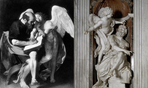
Left: Caravaggio's "Saint Matthew and the Angel," 1602 (destroyed 1945). Right: Bernini, "Habbakuk and the Angel," 1655-61 (Chigi Chapel, Santa Maria del Popolo, Rome)

My student Chloe Froom argued that Bernini was deliberately influenced by Caravaggio when Bernini created Habakkuk and the Angel for the Chigi Chapel in Santa Maria del Popolo. The composition and subject matter of Habbakuk and the Angel is very similar to Caravaggio’s painting, Saint Matthew and the Angel (also known as the first version of The Inspiration of Saint Matthew). As can be seen through a direct comparison (see above), Bernini seems to deliberately mimic the extended leg of Caravaggio’s figure of Saint Matthew; this leg projects forward into the space of the viewer. Additionally, both works of art include an angel who lightly and lyrically extends an arm to engage in the the slightest bit of physical contact with the seated figure. Froom writes, “In both works, the angels are covered in delicate drapery [that is] revealing of their forms. There is a deep slit beginning at the top of the hip that continues to reveal the entire leg. Their abdomens are also exposed, Caravaggio’s caused by the sheerness of the fabric and Bernini’s by the parting of drapery.”1

At the time of Bernini’s commission for the Chigi Chapel, paintings by Caravaggio already were in place in another chapel within Santa Maria del Popolo, the Cerasi Chapel (namely, The Conversion of Saint Paul on the Road to Damascus and The Crucifixion of Saint Peter, which both date 1600-1601). Perhaps Bernini sought to create aesthetic continuity within these two Santa Maria del Popolo chapels by honoring Caravaggio’s style. It is almost certain that Bernini would have been familiar with Caravaggio’s painting Saint Matthew and the Angel. After this painting was rejected in 1602 for the Contarelli Chapel in San Luigi dei Francesi, it immediately entered the collection of the wealthy collector Vicenzo Giustiniani. Froom explains, “In 1590 the Giustiniani family bought the palazzo opposite S. Luigi dei Francesi and created the Palazzo Giustiniani. The family also had a villa outside the Porta del Popolo, where Bernini created his sculpture Habakkuk and the Angel. The Palazzo Giustiniani, along with their other villas, were filled with the family’s vast art collection and became a popular destination for many artists until the late 18th century. It is therefore, a definite possibility Bernini went into the Guistiniani Palazzo and villas…because he worked in close proximity to them.”2

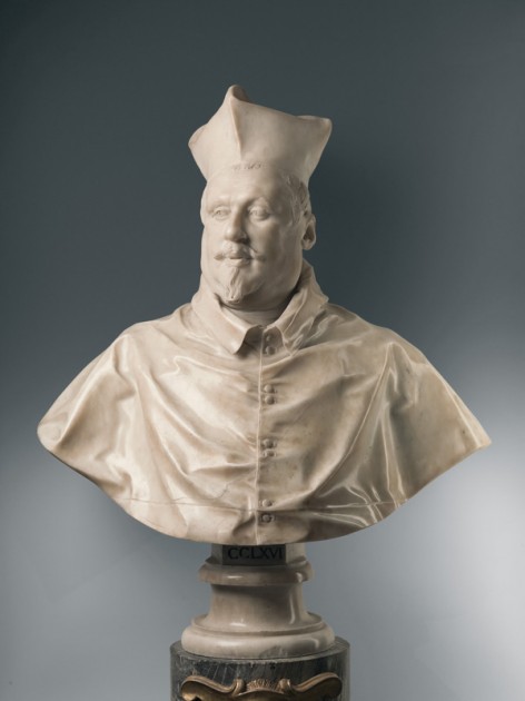
Bernini, Portrait of Cardinal Scipione Borghese, 1632

Peg Anderson argued in her research that Bernini’s personal relationship with some of his patrons affected the way in which the figures were represented. For example, Anderson finds that the portrait of Cardinal Scipione Borghese depicts the figure in a very positive light, despite Borghese’s overweight frame. Such positive features include the relaxed, slightly-cocked head, and the soft, yet penetrating gaze of the sitter. Anderson also explored how Borghese was Bernini’s first major patron of the arts; this supportive and close relationship accounts for why Bernini cast his sitter in a positive light. In fact, Anderson even argues that the slightly-undone button in the cardinal’s clothing, is really a playful gesture (perhaps a sign of endearment, I think one could argue) on Bernini’s part.

Anderson writes, “He creates an accurate depiction of the sitter, however he portrays Scipione with the persona he would have wanted [contemporary] Romans to believe he possessed. In the Bust of Cardinal Scipione Borghese, Scipione the model appears to be spirited, approachable, and perhaps celebrated. Yet some accounts of Scipione differ from this depiction. The man was described by author Franco Mormando as  ‘ruthless as any sociopath in his mad pursuit of money, power, and pleasure.'”3

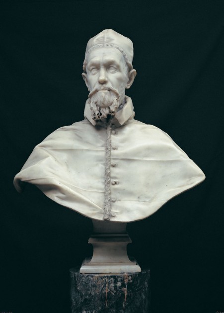
Bernini, Bust of Innocent X, completed 1647

For contrast, Anderson explored how Bernini had a negative relationship with Innocent X, which stemmed from Bernini’s ill-fated towers for Saint Peters. The towers were completed in 1644, although they were unstable and a crack had begun to appear before the towers were even completed. Two years later, in 1646, the Pope Innocent X ordered the towers to be torn down. A year later, Bernini completed his bust portrait of the pope, which is less flattering than the one he created of Scipione Borghese.

Anderson argues the following abut the Pope Innocent X portrait: “The sparkle that held the viewer’s gaze in Bust of Cardinal Scipione Borghese does not exist, there is not even a glimmer of hope in [this] old man. The eyes are empty, arguably hollow and absent. The furrowed brow only further contributes to the unpleasant facial expression. Bernini is not generous when he reflects the wrinkles he saw on Innocent X’s forehead, and deep creases in between the nose and mouth…the bust is portrayed standoffish, uninterested, inaccessible, and unable to please.”4

I’m proud of Chloe and Peg and the work that they did on this assignment. Their arguments are much more extensive than I have included here, but this post captures their gist of their research. Really, I had several fantastic research papers submitted from students who took my Counter-Reformation course. I wanted to highlight these two papers, though, because I worked quite a bit with these students during their research process and because I love Bernini’s art!

On a side note, people may be interested to see this online compilation of some of Bernini’s portraits. Additionally, if you would like to help ensure that Bernini’s bust of Francesco d’Este is able to go on public view again, you can donate to this fundraiser (there are only a few days left!).

1 Chloe Froom, “Bernini’s ‘Habbakuk and the Angel’ and Caravaggio’s ‘The Inspiration of Saint Matthew,” unpublished, 2013.

2 Ibid.

3 Peg Anderson, “Bernini’s Portraits: Creating a Likeness,” unpublished, 2013. See also Franco Mormando, Bernini: His Life and His Rome (Chicago: University of Chicago Press, 2011), 46.

4 Anderson, 2013. Anderson finishes her paper by discussing Bernini’s caricature of another pope, Pope Innocent XI. Pope Innocent XI had issues with the figures of “Truth” (and “Charity”) that Bernini created for the tomb of Alexander in St. Peter’s; the pope found the figure’s exposed breasts to be indecent. The sculptures were accordingly modified, but left Bernini upset. As a result, Bernini may have created this caricature of the shriveled, skeletal and weak pope as a personal means to express his frustration.
— 2 Comments

The Slashing of Velasquez’s “The Rokeby Venus”

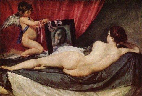
Velasquez, "The Toilet of Venus" (also called "The Rokeby Venus), 1648. The National Gallery of Art, London. Image courtesy Wikipedia.

Last week I met a feminist scholar who mentioned that she likes to show her students Velasquez’s “The Toilet of Venus” (commonly known as “The Rokeby Venus”) when she takes students to London on a study abroad program. This scholar teaches her students about the suffragette Mary Richardson, who slashed this canvas multiple times in 1914 in order to protest the recent arrest of suffragette leader Mrs. Emmeline Pankhurst.

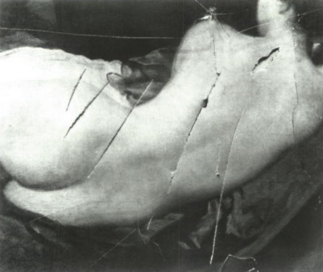
Detail of damage to "The Rokeby Venus." The attack by Mary Richardson occurred in the National Gallery 1914. Image courtesy Wikipedia.

I recently watched a BBC documentary (from “The Private Life of a Masterpiece” series) that covered more details about this attack (beginning about 32:17 in the linked video). At the time, Mary Richardson did not mention that she was bothered by the painting itself. However, Richardson mentioned in 1952 that she was bothered by the subject matter of this painting (as a female nude which attracted the attention of male viewers); this sentiment appropriately encouraged the soon-to-be feminist movement to uphold this attack a symbols of feminist attitudes toward the female nude.1

I think that the image of the slash marks are particularly interesting, because they remind the viewer that the Venus is actually an illusion which is painted on a two-dimensional surface. It’s also interesting to see how the media responded to this attack, since they cast Mary Richardson as a murderer (referring to her as “Slasher Mary,” which is a charged term given that Jack the Ripper killings took place a few decades before). Since Venus was proven to be an illusion instead of an actual body, Richardson had essentially “killed” the Venus.2

It is also interesting that Richardson concentrated her attack on the body of the Venus figure itself, as if to prevent the back and buttocks from serving as palpable, believable fetishes for the male viewer. In its original (now restored) state, this painting is well-construed for fetishization: the back and buttocks are highlighted as objects, especially since the “subjecthood” or “personhood” of the female is lessened through the obscured face (which is not only turned from the viewer, but is represented in the mirror in a very blurry, undefined manner). Richardson’s marks, however, challenge and defy this fetishization.

Do you know of any other physical attacks on works of art by feminists? Do you have any other thoughts on what new meanings were created by Richardson’s slash marks?

1  In 1952, in an interview, Mary Richardson said, “I didn’t like the way men visitors gaped at the painting all day long.” This quote is mentioned in “The Rokeby Venus” episode from “The Private Life of a Masterpiece” BBC series, but also found at “Political Vandalism: Art and Gender” found here: http://www.angryharry.com/rePoliticalVandalism.htm

2 Laura Nead discusses how the media used words that seemed to suggest that wounds were inflicted on an actual body, instead of a pictorial representation of a female. See Lynda Nead, “The Female Nude: Art, Obscenity, and Sexuality”. (New York: Routledge, 1992), 2.

— 4 Comments

Archives and Absorption for the Historian-Spy

Tonight I have been reading an article by Lois Marie Fink about museum archives as scholarly resources. I was particularly struck by her word choice for one particular sentence, in which she explained that she used an archive “to spy on a discussion” found in certain archival records.1

I’ve never considered historians as individuals who spy before, but this word does seem appropriate. Many things in archives are letters or documents that were passed between individuals, without any thought for how the documents would be read by a third party in future generations. In a way, historians are able to “see” into the past without being “seen” by those who have originally wrote the documents, which places the historian in a position of power that is similar to that of a guard in the Panopticon, a 19th century prison. In essence, through this act of seeing without being observed, the historian-spy is empowered through the archive.

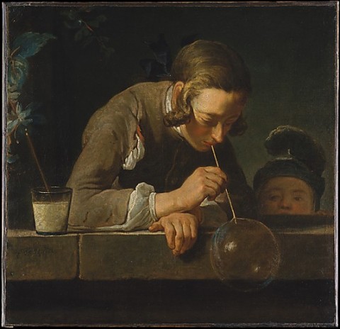
Chardin, Soap Bubbles, ca. 1733-74. Oil on canvas, 24 x 24 7/8 in. (61 x 63.2 cm), Metropolitan Museum of Art

It has occurred to me this evening that archival texts and correspondences contain “absorption” (to use Michael Fried’s term). These texts are written without expressly acknowledging the historian-spy who reads the documents in the archive. Instead, historical writer(s) seem to be singularly involved in the process of recording or exchanging information pertinent to his/her time. This can relate to the 18th century paintings that Fried explored in his seminal book, Absorption and Theatricality: Painting and Beholder in the Age of Diderot. Such paintings, like Chardin’s Soap Bubbles (shown above) are created to give the impression that the viewer does not exist. The subjects do not gaze outward to directly acknowledge the viewer, but are intently involved and absorbed in their own actions (in this case, forming and/or watching a bubble).

For circumstances in which archival records are created expressly for archives, the element of absorption has even more parallels with this kind of 18th century painting. Even though such paintings want to stress the fiction that the viewer does not exist, these paintings also presuppose a viewer through their very existence as painted objects. Likewise, such texts are created with the intention of being seen and utilized as records in the future, but they do not directly address or acknowledge the intended audience.

When I was sharing these ideas with my husband this evening, he mentioned that he thinks paintings are more approachable works when they contain an element of absorption. He personally prefers to not be confronted by subject matter when he approaches a work of art. Instead, he likes paintings which are construed so that one seems to “happen” upon a scene that is taking place. I imagine that a lot of historian-spies feel the same way in the archives. As long as the presence of the historian-spy is not directly acknowledged in the texts themselves, then the historian-spy can truly feel like the information he/she encounters is a singular “discovery” that no one else has seen!

1 Lois Marie Fink, “Museum Archives as Resources for Scholarly Research and Institutional Identity,” in New Museum Theory and Practice: An Introduction by Janet Marstine, ed. (Malden, MA: Blackwell Publishing, 2006), p. 295, emphasis added.

— 1 Comment

“She’s Got the Look!”: Portraits of Prospective Royal Brides

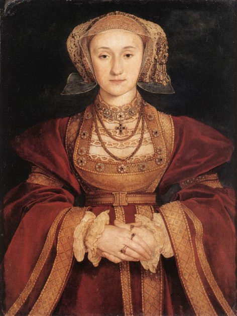
Hans Holbein, Portrait of Anne of Cleves c. 1539. Parchment mounted on canvas, 65 x 48 cm Musée du Louvre, Paris

I’ve chucked a few times today about the post “Anne of Cleves Gables,” which is especially if amusing if you are familiar with both the Anne of Green Gables series and the story behind the portrait by Holbein (above). I guess if Henry VIII hypothetically could have known the popular song “She’s Got the Look!” by the group Roxette, he might have sung the lyrics when looking at Holbein’s portrait of Anne, but probably would not have thought of that music when he actually met Anne in person.

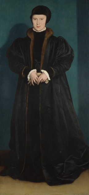
Holbein was sent to Düren in 1539 to create a portrait of the widow Anne of Cleves for Henry VIII; the king wanted to see whether he would like to take Anne as a bride. There is no doubt that Holbein must have felt a lot of pressure. Henry VIII was in his late forties and already had been married three times before this point. Henry VIII was very displeased upon seeing Anne in person (finding her to be a “fat Flanders mare”), which seems to suggest to me that Holbein created Anne to be more flattering than her actual appearance. There are no records of Henry VIII’s actual reaction to Holbein’s portrait, however. Interestingly, we know that Henry VIII was quite smitten with a portrait that Holbein previously created of Christina of Denmark, who also was considered by Henry VIII as a prospective bride (see below).

Hans Holbein the Younger, "Christina of Denmark, Duchess of Milan," 1538, oil on oak, 179.1 x 82.6 cm. National Gallery of Art, London

It is recorded that Henry VIII had musicians play all day long when he saw this portrait of Christina, so he could feast all day on music (the food of love). However, Christina wasn’t selected as a bride. All in all, these portraits may have been helpful for Henry, but not the ultimate decision-making tool for marriage. Historian David Starkey claims that influential courtiers convinced Henry VIII to marry Anne instead of Christina.

Several other Renaissance and Baroque artists were commissioned to paint portraits of prospective brides or husbands for rulers. This idea of painting the likeness of a prospective spouse really seems to be a new phenomenon for the Renaissance, which makes sense due to the rise of both portraiture and naturalism in Renaissance art. I thought it would be fun to create a list with information about prospective bride and/or betrothal portraits, so I started a list here:

  • Charles VI of France (c. 1380-1422) is recorded to have sent his painter to three different royal courts to create portraits of prospective brides.
  • Jan Van Eyck, Portrait of Isabella of Portugal, 1428 (now lost, although a copy is thought to exist). This was painted as a betrothal portrait after the marriage agreement had already taken place (to function as a visual assertion of Isabella’s identity for when she arrived in Burgandy).
  • Catherine de’Medici expressed disapproval in the portrait of Elizabeth I that was created for her son Charles IX. Luckily, Catherine blamed the portrait on the portraitist, not on Elizabeth herself. Consequently, on 3 July 1571, Catherine wrote to Monsieur de la Mothe-Fénelon, ambassador in London, requested a new portrait be created: “I pray you do me the pleasure that I may soon have a painting of the queen of England of small volume, in great [de la grandeur], and that it be well portrayed and done in the same fashion as the one sent be by the earl of Leicester, and ask, as I already have one in full face, it would be better to have her turning to the right.”
  • Nicholas Hilliard (also spelled “Nicholas Belliart”) was sent by Catherine de’Medici to Sweden and Denmark in 1574 to paint portraits of prospective wives for Catherine’s son, Henry III.

Rubens, Henry IV Receiving the Portrait of Marie de'Medici, 1621-1625. Oil on canvas, approx. 13' x 9'8" (3.94 x 2.95m), Louvre

  • Marie de’Medici was so proud of her “prospective bride portrait” that was sent to Henry IV that later, after she and Henry were married, she commissioned Rubens to depict Henry falling in love upon seeing her portrait for the first time!

Anything else we could add to this list? I couldn’t pinpoint images for several of the portraits mentioned above, so please comment and leave a link if you know of their existence online. Also, please feel free to share further examples and thoughts on this topic in the comments below.

And I go: la la la la la / She’s got the look!

— 2 Comments

Rublev’s “Holy Trinity”

Some of my friends from high school have chosen very interesting professions and fields of study. A few of these friends studied in divinity school, which can make for interesting conversations via social media. Whenever I have something meaningful to contribute in relation to art, I like to join in the conversation. I thought I’d share some of my thoughts that I contributed to a thread about the Trinity this evening. One of my friends, who is an Orthodox Greek, mentioned that the Hospitality of Abraham is one of the feast days in which the theology of the Trinity is celebrated. He mentioned how the Hospitality of Abraham is popular in icons, and I then popped in with some additional thoughts, which I’ve slightly modified below:

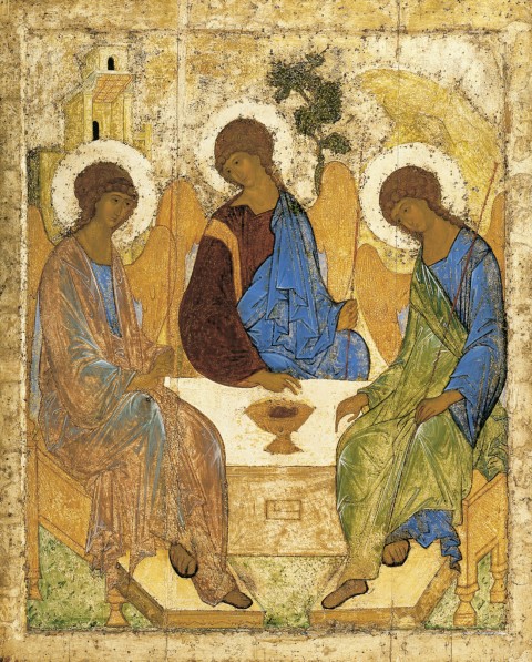
Andrei Rublev, Angels and Mamre (also called "Holy Trinity" or "Three Angels Visiting Abraham"), c. 1410-25. Tempera on wood, 142 cm × 114 cm (56 in × 45 in)

“I think that one of the most famous scenes showing the Hospitality of Abraham/Holy Trinity is the one by Andrei Rublev.

The mountain behind the figure on the right is a symbol for the Holy Spirit (since, for example, mountains are holy locations at which the Spirit can be manifest). The tree (next to the central figure) is a symbol for Christ and the cross. This figure also points to an object that resembles a cup filled with wine. I have read different interpretations regarding the architecture in the background on the right. On one hand, it can serve as a symbol for the house of God, or it can reference the Father as a Creator. Also, obviously, this structure can represent the tent in which Sarah “laughed within herself” upon hearing the prophesy that she would bear a child in old age (Genesis 18:12).

On a side note, I think that the practically identical faces of the angels help to emphasize the unity of the Trinity.”

There are a couple of other symbols and thoughts that I could have added to this comment, but I didn’t want to hijack the thread. I’ll include them here:

  • Circular composition of the angels seated at the table emphasizes the eternal and unified nature of the Trinity.
  • Each figure wears a blue garment, perhaps symbolizing the heavens.
  • I’ve read a couple of interpretations that the seemingly translucent nature of the Father’s garment (the figure on the far left) can emphasize the immaterial nature of God (i.e. the idea of God as Spirit). Although it appears that the quality of the paint may be deteriorating in this example above (which could prompt such a reaction about translucency), we can see that other Orthodox artists who copied Rublev (see an example HERE) also suggest this same idea of a translucent garment.
  • The two fingers for the central figure can represent how Christ is both earthly and divine.
  • Each figure holds a staff. I think that these staffs serve as symbols of authority and power. Another blogger thinks that the staffs suggest that God walks with men throughout their earthly pilgrimages.
  • On a different note, the scale of this piece is larger than you might suppose! It is 142 cm tall (over four and a half feet!).

Does anyone have other thoughts on the symbolism for this icon? On a side note, I think that the sweeping curves and sweet faces of these figures are very appealing. I really like Rublev’s style.

— 1 Comment

Email Subscription


Archives

About

This blog focuses on making Western art history accessible and interesting to all types of audiences: art historians, students, and anyone else who is curious about art. Alberti’s Window is maintained by Monica Bowen, an art historian and professor.