Friday, April 11th, 2014
The Female Body and Horizontal Images
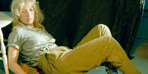
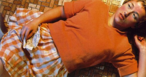
Over the past few weeks I’ve been reading Lives of the Artists by Calvin Tomkins. I’ve been thinking a lot about the chapter dedicated to Cindy Sherman, particularly when she discusses the controversy regarding her “Centerfolds” series from 1981. This series began as a commission from Artforum‘s editor Ingrid Sischy. The format of the commission would have involved two facing pages, which led Sherman to think about “centerfold” photographs from men’s magazines like Playboy. Sherman decided to highlight this reference by using a horizontal format for her photographs, although she added an element of irony by depicting clothed women in supine or semi-supine positions. However, the pictures were never included in the magazine; it was thought that the irony would be lost and “misunderstood” by militant feminists.1 Sherman continued to explore this horizontal format, however, and finished the “Centerfolds” series despite the rejection.
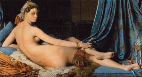
Reading about the “Centerfolds” series and its horizontal format has prompted me to think about about various ways in which the orientation of a work of art can convey meaning. I can understand why the horizontal orientation would be used for a centerfold in a magazine, if only for practical purposes. But I have realized that the horizontal format also is preferred for a lot of depictions of nude females over the centuries. The paintings that immediately come to mind for me are Titian’s Venus of Urbino (1538), Ingres’s The Grand Odalisque (shown below) and Gauguin’s Spirit of the Dead Watching (“Manao Tupapau”, 1892).
So, why would a horizontal format be preferred by some artists of the female form? I approached this topic through the lens of feminist analysis (in relation to female objectification and the “male gaze”), and here are some ideas which I came up with:
- The horizontal orientation the medium implies rest and repose. The image is “at rest” – as emphasized by the horizontal lines on the top and bottom of the canvas or medium itself. This suggestion of repose can perhaps suggest a contrast between the active viewer and the image itself.
- Repose and rest is emphasized in the horizontal orientation of the subject matter. In this way, the object can be interpreted as passive as well, which draws a contrast with the active viewer.
- It may be easier to objectify a body through a horizontal orientation, since the body might be more visually approachable to the viewer in a horizontal format. A horizontal body can fill the field of vision on part of the viewer, for example. Along these lines, viewers may find it more approachable to see a large-scale depiction of a body that is horizontally oriented: one may feel unable to objectify a vertically-oriented image in which the sitter towers over the viewer.
- A thought: Could it be that the female form is more predisposed to horizontal orientations because females are traditionally associated with the land and earth? I’m reminded of the horizon lines of landscapes and wonder if there might be some parallel. In contrast, I often think vertical lines often are associated more with masculinity (e.g. phallic imagery, skyscrapers, etc.).
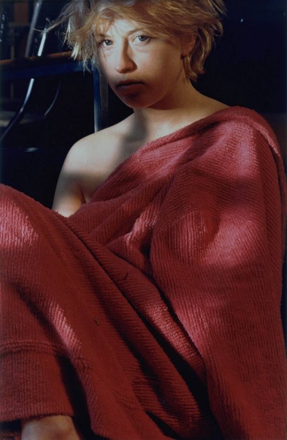
Cindy Sherman noted herself that the horizontal format conveyed certain meanings to viewers of her “Centerfolds” series. She said, “…the horizontal format was a problem. Filling that space meant using some kind of prone figure, and that made it seem to some people that I was glorifying victims, or something.”2 As a change, Sherman decided to adopt a vertical format for her next series, called “Pink Robes.”
Although these vertically-oriented images do not automatically suggest a centerfold spread in a magazine, Sherman explained the following about the “Pink Robes” series: “I was thinking of the idea of the centerfold model. The pictures were meant to look like a model just after she’d been photographed for a centerfold. They aren’t cropped, and I thought that I wouldn’t bother with make-up and wigs and just change the lighting and experiment while using the same means in each.”3
In contrast to the objectification that seems to be implied through the horizontal orientation of the “Centerfolds” series, I think that “Pink Robes” puts more stress on the subjecthood and identity of the model, particularly due to the vertical format. The subjects imply activity and alertness because they are propped “upright” through the vertical position of the frame. Even though the subjects in these scenes imply some vulnerability through their loosely-draped pink chenille bathrobes, the vertical format still suggests strength and presence.
What types of meanings do you think can be conveyed through horizontally- or vertically-oriented images of the female form? Can you think of other examples of representations of the female form which seem to relate to the orientation of the composition and medium?
1 Calvin Tomkins, Lives of the Artists (New York: Henry Holt and Company, 2008), 33.
2 Ibid., 34.
3 Paul Taylor, ‘Cindy Sherman’, Flash Art, no.124 (Oct.-Nov. 1985): 78-9. Source quoted online here: https://www.tate.org.uk/art/artworks/sherman-untitled-98-p77729/text-summary
