Category

pop culture

Cleopatra and the Carpet Myth

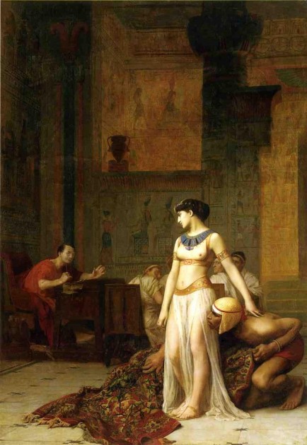
Jean-Leon Gérôme, "Cleopatra and Caesar," 1866

Jean-Leon Gérôme, “Cleopatra and Caesar,” 1866

Today in class I showed my students the beginning of a short video clip by Sotheby’s about Gérôme’s Cleopatra and Caesar (shown above). The clip highlights how Cleopatra is depicted as having hidden in a rug (either a Persian or Turkish rug), which isn’t an accurate representation of what is described in Plutarch’s text. However, given the taste for exoticism in Orientalist art at the time, I can see why Gérôme’s opted to depict a carpet rug instead, despite the cultural inaccuracy and anachronism.

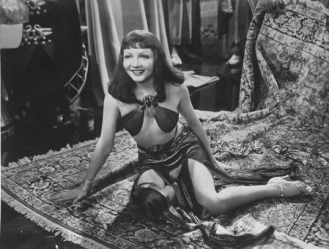
The video clip mentions how Gérôme’s painting has influence on Cecil B. DeMille, who directed Cleopatra (1937, starring Claudette Colbert). I can see how the inaccurate inclusion of a carpet could perhaps connect to this point, since a carpet rug was used to smuggle Cleopatra into Caesar’s presence in DeMille’s film (see image below). Similarly, a later version of Cleopatra which was directed by Joseph L. Mankiewicz (1963, starring Elizabeth Taylor) has a great scene which shows the queen dramatically and unceremoniously unrolled from a rug before Caesar (who is played by Rex Harrison). I can see why these filmmakers opted to depict a lavish carpet – it is more visually striking and dramatic than a sack used to hold bedclothes (as described by Plutarch).

Claudette Colbert in film "Cleopatra" (1937)

Claudette Colbert in film “Cleopatra” (1937)

To be fair, though, I want to highlight something about this “carpet myth.” While I think that Gérôme’s painting may have inspired 20th century filmmakers to portray Cleopatra with a carpet, other sources should be acknowledged too. I don’t think that this painting, which was completed in 1866, should be highlighted as the ultimate source for the myth. In fact, a 1770 translation of Plutarch by Langhorne introduced the word “carpet” instead of “sack of bedclothes.”1 A few decades after Gérôme’s painting was completed, George Bernard Shaw highlighted the carpet in his 1898 novel, Cleopatra and Caesar, by writing, “It is a Persian carpet – a beauty!”2

Do you know of other examples in art or popular culture that display Cleopatra with a carpet?

1 Christopher Pelling, Plutarch Caesar: Translated with an Introduction and Commentary (Oxford: Oxford University Press, 2011), p. 385.

2 Ibid.


Comments Off on Cleopatra and the Carpet Myth

Petra, the Siq, and the Hellenistic “Baroque” Style

Facade Al-Khazneh (The Treasury), Petra, Jordan, c. 2nd century BC- 2nd century CE. Image courtesy of Bernard Gagnon on Wikipedia.

My little sister recently returned from a study abroad in the Middle East during which she was able to visit, among other things, the ancient ruins at Petra in Jordan. I’m so glad that she got to visit this site; I hope to be able to go here myself one day. Although it is difficult to date the rock-cut tombs found at Petra, they are thought to have been made sometime between the 2nd century BC and the 2nd century CE, when the local group the Nabateans were at their wealthiest. Although some textbooks and scholars find that some of these rock-cut tombs (particularly the famous Al-Khazneh (“The Treasury,” shown above) and Al-Deir (“Monastery”)) are examples of Roman architecture, others feel that most of the buildings in Petra were built before the Roman annexation in 106 CE.

One of the things that I find most fascinating about the famous rock-cut tombs of Petra is the architectural style. Al-Khazneh and Al-Deir exhibit stylistic characteristics that harken back to Alexandrian architecture and the Hellenistic style. In other words, the architecture is very dramatic in its presentation, which has led some scholars to refer to the Hellenistic style as the “ancient Baroque.”1

This drama is especially apparent to me at Al-Khazneh due to the dynamic broken pediment, as well as the emphasis on movement. I see a lot of movement in the upper area of the facade, which contains a rhythm due to the pattern of projecting and recessing architectural segments. This movement is mimicked in the lower part of the façade, in which the frieze projects and recesses as it winds atop Corinthian columns. Additionally, the deep porch on the lower level creates an interesting contrast of light (hitting the Corinthian columns) and dark (shadow in the porch recess), which reminds me of the tenebrism found in Baroque art of the 17th century.

I was anxious to see my sister’s pictures of this building after her trip, and was surprised to discover another element that adds to the drama of this building: the surrounding landscape. Al-Khazneh and other rock-cut tombs are located next at the end of a natural winding rocky cleft called the Siq. When one approaches the structure by walking out of the Siq, there is not only a dramatic baroque element of light and dark contrast, but the theatricality of a natural curtain being unveiled from the façade itself. I think this is baroque presentation at its finest:

Partial view of façade Al-Khazneh (The Treasury) from the Siq (Canyon), Petra, Jordan, c. 2nd century BC - 2nd century CE.

Partial view of façade Al-Khazneh (The Treasury) from the Siq (Canyon), Petra, Jordan, c. 2nd century BC – 2nd century CE.

Given the theatricality of this style and its geographic location, it is no wonder that Steven Spielberg used Al-Khazneh as the location for the Holy Grail in Indiana Jones and the Last Crusade! I can also see why this dramatic building is associated with legends that pirate loot and pharaonic treasure were once held here (which accounts for the “Treasury” nickname for this building). To complete the dramatic effect, visible bullet holes can be seen on the exterior (shot by Bedouins at a stone urn (the “tholos”), in hopes of releasing the legendary stored treasure. Perhaps the bullet holes add a bit of visual “movement” and texture to the façade today as well!

1 Alina Payne, “Beyond Kunstwollen: Alois Riegl and the Baroque” in The Origins of Baroque Art in Rome by Andrew Hopkins and Arnold Witte, eds. (Los Angeles: Getty Research Institute, 2010), 8

— 2 Comments

A Meaty Post

I belong to a really fantastic book group. This month we have been reading The Sexual Politics of Meat: A Feminist-Vegetarian Critical Theory by Carol J. Adams. This book is really fascinating to me. It explores how meat consumption is related to patriarchal values; meat has longstanding associations with power, strength, virility, and wealth. Adams makes some interesting parallels with how the “masculine” consumption of meat is related to the sexual consumption and objectification of women, too. (You can get a sense of the parallels made between meat and women-as-meat in Adam’s slideshow.) There is a lot more to this book too, and I would highly recommend it to anyone interested in theory, literature, or the history of vegetarianism.

While reading this book, I continually thought of how meat is represented in art and visual culture. Although I have yet to read Adam’s other book, The Pornography of Meat, I feel like I’ve already come up with a substantial list. In many ways, the following representations of meat can also be related to patriarchy and power. I find it telling that the majority of the depictions of meat (that I have come across, at least) were created by men. And I also think it’s interesting that male artists like Rembrandt and Snyder (see below) decided to include women with the carcasses of dead animals. Are these artists merely referencing the fact that women have been delegated the responsibility to prepare meat (for male consumption)? I think we can we make deeper associations between what objects are construed for “the male gaze” in these images, especially from our modern-day perspective.
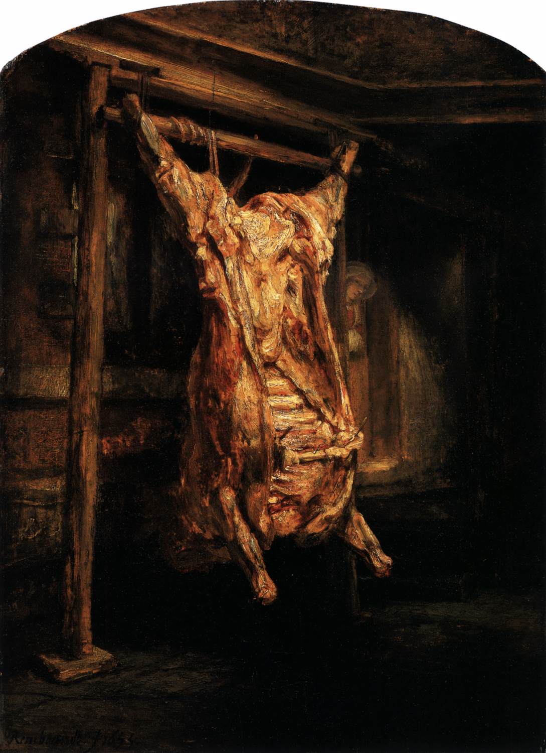
Rembrandt, "The Slaughtered Ox," 1655
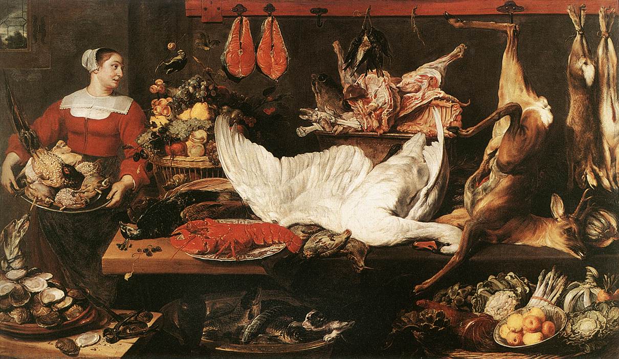
Frans Snyder, "The Pantry," c. 1620

Along these lines of sexuality and male consumption, it is especially interesting to consider how Snyder depicted the maidservant with birds on a platter. The Dutch word “vogelen” (which means “to bird”) not only refers to fowl, but also to the sexual act. This painting, therefore, seems to reference worldly temptations or physical love.

Artists in the 20th century also were interested in exploring “meaty” subject matter. One work of art that immediately comes to mind is Francis Bacon’s Head Surrounded by Sides of Beef (1954, see below). As an air raid warden in London during WWII, Bacon saw many of the horrors of war (a grisly enterprise which, I think, can be interpreted in many respects as a “masculine” endeavor). With two slabs of meat flanking the sides of a ghostly figure, Bacon explores parallels between meat and death.
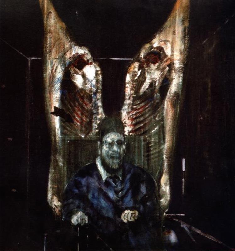
Francis Bacon, "Head Surrounded by Sides of Beef," 1954

Other 20th century artists have made some interesting parallels between meat and male consumption, including the Surrealist artist Meret Oppenheim. Her work, The Governess (see below) depicts a pair of stilletto heels (objects which can signify female sexuality and arousal). The heels are tied together and decorated with paper crowns – the type of decoration sometimes found on a leg of lamb or chicken.
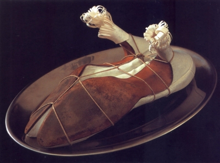
Meret Oppenheim, "My Governess," 1936

One of the most influential works of art involving meat is Carolee Schneemann’s performance Meat Joy (1964). This performance, which is very aggressive and controversial, involved men and women who danced, rolled on the floor, and played with a mixture of raw flesh (e.g. partially-plucked bloody chickens, raw fish, and raw sausages). The sexual connections between meat and “pleasures of the flesh” are quite clear in the performance.

I also think that it is unsurprising that audience members would squirm during Meat Joy. After all, Schneeman is including bloody and partially-plucked chickens, something that relates to what Carol Adams calls the absent-referent. When people consume animals today, the flesh is usually cooked and modified (and sometimes given a different name than the actual animal, like “veal” or “beef”) to help obscure the reality that a once-living creature has comprised the meal. So, in essence, animals are absentreferents on the dinner table. They are there, but they are also not there. Schneeman’s aggressive reference to flesh and blood in her “happenings” performance restores the absent-referent, which undoubtedly contributed to why viewers squirmed.

Many artists have been influenced by Carolee Schneeman. In fact, in 2008 exhibition titled Meat After Meat Joy brought together the works of various artists who have explored different meanings between meat and flesh. (You can read one blogger’s take on the exhibition here.) One of the videos on display in this exhibition was Zhang Huan’s performance, My New York (2002, see below).
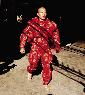
Zhang Huan, "My New York," 2002. Video still from performance.

Many of Huan’s performance works involve endurance and masochism. In this particular performance, Huan walked through New York wearing a heavy suit with actual pieces of raw beef. Looking like a “beefed-up” body-builder (which alludes to masculinity and virility!), Huan would occasionally release doves during the performance.  It was interesting to interpret this performance in a political light, given the recent 9/11 attacks.  The small figure of the artist (within the powerful, beefy costume) was a reflection on how America (and New York itself) were vulnerable – as a nation and as a city.

And finally – I can’t finish this post without a pop culture reference. Lady Gaga has clad herself in “meaty clothes” a few times, once in a meat bikini on the cover of Vogue Hommes Japan. Soon after, Lady Gaga also appeared in a “meat dress” at the 2010 Video Music Awards, complete with a steak on her head (see below).

Lady Gaga's "meat dress" at the VMA music awards, 2010

Although Lady Gaga said in an interview that her dress was a statement about fighting for rights (and asserted “I am not a piece of meat”), I can’t help but see how her dress just reinforces the associations with the masculine consumption of women (which other feminists, including Carol J. Adams, have observed). In this outfit, I think Lady Gaga is suggesting that she is available for consumption on two levels: to satiate sexual and physical hunger. And because of the associations with animals and meat, Lady Gaga seems to reinforce her sexuality by suggesting that she, too, is animalistic.

Any thoughts? Have I spoiled your appetite? (Sorry!) I’m curious to see what other depictions of meat are out there. Do you know of any more? I’m also reminded of Pieter Aertsen’s two works The Butcher’s Stall (1551) and Cook in Front of a Stove (1559). Another example is Van Gogh’s Still Life with Apples, Meat, and a Roll (1886).
— 15 Comments

Strawberries as an "Earthly Delight"

I’ve been thinking about Hieronymous Bosch and The Garden of Earthly Delights (c. 1510-1515) quite a bit this week. In fact, this afternoon I sat down to write a post about how Bosch’s “tree-man” (located in the center of the panel which depicts Hell) is believed by some to be a self-portrait of the artist.1 But, I’m not going to write on that. At least not right now.

Instead, I’ve become pleasantly distracted by Walter S. Gibson’s article, “The Strawberries of Hieronymous Bosch.” These strawberries appear all over the central panel of The Garden of Earthly Delights altarpiece (see details on right and below). Gibson notes that Bosch’s strawberries garnered attention from viewers very early on. In fact, in 1593 an inventory for some of Philip II’s pictures mentions that the altarpiece had earned the nickname the Madroño (or “the Strawberry”).2 Twelve years later a librarian at El Escorial, Philip’s monastery-palace, explained that the panel is “of the vanity and glory and the passing taste of strawberries or the strawberry plant and its pleasant odor that is hardly remembered once it has passed.”3 This librarian, named Fray José de Sigüenza, felt that the strawberry was the most important feature of Bosch’s garden, and was the fruit was a symbol of the ephemeral, transient nature of earthly pleasures.

Many symbolic interpretations for the strawberries have been put forward, and most of them have negative connotations.4 For example,  strawberries have multiple seeds, which could hint at promiscuity.5 The other fruit included in the central panel (such as the big raspberries) could also be associated with promiscuity for this same reason.

Gibson suggests that the strawberry imagery might connected to a text by Virgil (which probably would have been familiar to Bosch and Hendrik III because Virgil’s passage is referenced in Roman de la Rose, a popular poem in the Burgundian court). In this text, Virgil warns children to not gather strawberries, because “the cold, evil serpent” is hiding the grass nearby. It seems to me that Bosch’s strawberries could serve as an indirect reference to a serpent (and, by extension, the Fall and sin). Such associations fit well with the imagery for The Garden of Earthly Delights, don’t you think? That being said, I also think that there isn’t just one specific symbolic meaning for these strawberries. Since this altarpiece undoubtedly served as a focus for intellectual discussion, it is appropriate that Bosch used imagery that was replete with symbolic associations.

Do you know of any other interpretations for the strawberries in this altarpiece? Do you know of any works of art which also include strawberries for symbolic reasons? On a fun side note, I found an amusing comparison between Katy Perry and Bosch’s fruit here. No doubt that Perry would view Bosch’s strawberries as a symbol of sexuality!

1 David G. Wilkins, Bernard Schultz, Katheryn M. Linduff, Art Past Art Present, 6th edition, (Upper Saddle River, New Jersey: Prentice Hall, 2009), 327.

2 Walter S. Gibson, “The Strawberries of Hieronymous Bosch,” in Cleveland Studies in the History of Art 8 (2003): 25.

3 Ibid.

4 There are some positive interpretations of the strawberry which exist. In fact, Gibson points out that the strawberry was seen a medieval symbol of the Virgin. Such exalted associations with the fruit have led a handful of individuals to interpret Bosch’s central panel as a scene of transcendent bliss and spiritual love. For a brief synopsis of these interpretations, see Gibson, 26-27. 

5 Wilkins, 326.

— 11 Comments

Barbie in Fine Art


A student sent me some fun links with images of Barbie that reference famous works of art. I recently saw something along these lines with drawings of Barbie, but I like that the actual dolls are used as models for most of these images. Check them out:

Barbie as Mona Lisa, Venus de Milo, Nefertiti, etc.
Barbie as a Warhol print

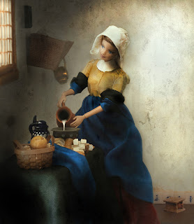
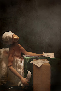
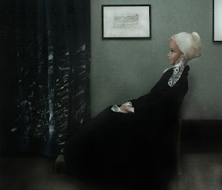
Photographer Mariel Clayton has a whole series of Barbie photographs that reference famous works of art (see the “Hystoria” section on her website). She has kindly given me permission to reproduce a few images here. They are all quite fun, but I think that her recreation of Vermeer’s Girl with a Pearl Earring is my favorite.

Mariel Clayton, after Vermeer’s The Milkmaid from c. 1660

Mariel Clayton, after David’s Death of Marat from 1793

Mariel Clayton, after Vermeer’s Girl with a Pearl Earring from c. 1665

Mariel Clayton, after Whistler’s Arrangement in Gray and Black: The Artist’s Mother (also called “Whistler’s Mother”) from 1871

Do any other professors find themselves talking about Barbie in art history courses? Whenever I teach about ancient art, students always bring up Barbie in comparison with the Venus of Willendorf. I enjoy comparing how the standards and ideals for representing the female figure (and perhaps beauty) have changed since prehistoric times, but I think it’s interesting that students best understand (or relate to?) this concept in conjunction with Barbie.

— 14 Comments

Email Subscription


Archives

About

This blog focuses on making Western art history accessible and interesting to all types of audiences: art historians, students, and anyone else who is curious about art. Alberti’s Window is maintained by Monica Bowen, an art historian and professor.