Category

Middle Ages

Ottonian “Baroque” Elements

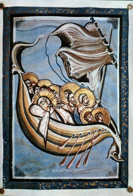
"Christ and Apostles on the Sea of Galilee" from the Hitda Codex, c. 1025-50 CE. Ms. 1640, folio 117

Over the past week I have been transcribing my handwritten art history notes from my undergraduate years into digital format. I’ve been working on the notes from my class on medieval art, and I’ve been struck that my past professor casually referred to some Ottonian works of art as “baroque” in style. Although the Ottonian period is often referred to as a “renaissance” in terms of a rebirth of artistic production (with classical influence feeding into the Ottonian style from both the Carolingians and Rome itself), I can see what my professor is saying about a few instances in which baroque elements can be found in Ottonian art.

For example, the bow and stern of the ship in “Christ and the Apostles on the Seat of Galilee” from the Hitda Codex (shown above) seem to strain against the border of the manuscript itself, as if pushing forward into the actual space of the viewer.1 The sweeping curves of the ship remind me of the undulating, Borrominesque curves found in 17th century architecture. And the dramatically-windblown sail reminds me of the grandiose “cloth of honor” that is found in many Baroque paintings, such as the Caravaggio’s Death of the Virgin from 1606.

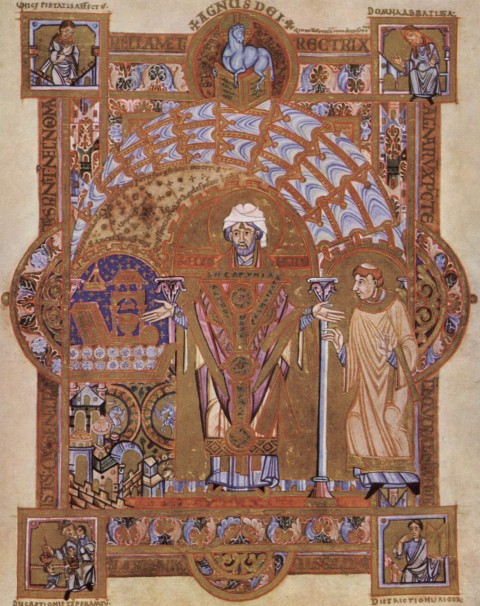
"St. Erhard Celebrating the Mass," from the Uta Codex, c. 1020. Image courtesy Wikipedia

My professor also felt like the Ottonian School of Regensburg was the “baroque phase” of Ottonian illumination, largely because the works of art are so visually complex. The Uta Codex is from Regensburg and includes several masterpiece manuscripts, such as “St. Erhard Celebrating the Mass.”2 Visual complexity is typified in the dynamic, decorative canopy which sweeps over the head of St. Erhard. The manuscript is also filled with excessive decoration and detail. Semi-circles seem to bulge out of the sides of the rectangular border of the frame, which adds a dynamic element that arguably could be called baroque.
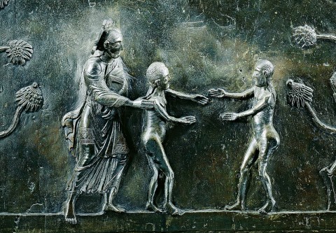
Detail of Creator introducing Adam and Eve, from the Hildesheim Doors, 1015. Photo via petrus.agricola via Flickr

While thinking about such baroque elements in Ottonian art, I also was reminded of an article by Harvey Stahl, “Eve’s Reach: A Note on the Dramatic Elements in the Hildesheim Doors” (.PDF available online). Stahl discusses how there are dramatic elements and moments of tension in the doors, which help to encourage the viewer to follow the narrative. I think that this element of drama has some parallels with the aesthetic and subject matter of the Baroque period. One such dramatic element found in the panel in which Adam and Eve are introduced. Here, Adam and Eve reach for each other, but are depicted as almost touching. Stahl explores this idea of drama and tension, finding that the doors were influenced by the plays written by Hrotsvitha of Gandersheim about a half-century before Bishop Bernward commissioned these doors.3

Although I do not claim that these Ottonian elements had a direct impact on Baroque artists, I do like to think that this might be another slight example of the cyclical nature of art. Perhaps, in some ways, the classical style of the Carolingians led into a few Ottonian dramatic elements and visual distortions that could be seen as departures from the “classical calm,” similar to how the Renaissance style of the 15th and 16th centuries led into the Baroque style of the 17th century.

1 For more images from the Hitda Codex, scroll to the bottom of this website: http://www.oberlin.edu/images/Art310/Art310f.html

2 For more information on this manuscript, see http://employees.oneonta.edu/farberas/arth/arth212/liturgical_objects/liturgical_objects2.html and http://muse.jhu.edu/login?auth=0&type=summary&url=/journals/catholic_historical_review/v088/88.4mayr-harting.html. I especially like that Abbess Uta, the original owner of the manuscript, is depicted in the upper-right corner.

3 Harvey Stahl, “A Note on the Dramatic Elements in the HIldesheim Doors” from Reading Medieval Images by Elizabeth Sears and Thelma K. Thomas, eds. (Ann Arbor, Michigan: University of Michigan Press, 2002), p. 163, 168, 169.
— 6 Comments

Trip to London: New Discoveries

My family and I just got back from a vacation to England. About three-and-a-half of those days were spent in London, and we were able to cram eight museum visits into those few days! We visited Sir John Soane’s Museum, the Tate Modern, the Victoria & Albert Museum, the Wallace Collection, the Design Museum, the National Gallery, the Tate Britain, and the British Museum. I especially loved the elegance of the Wallace Collection, the quirkiness of the Soane Museum, and the grandeur of the British Collection.

I got to see a lot of beloved works of art on this trip, including relief carvings of Ashurbanipal’s lion hunt, the Parthenon Marbles, the hunting scene from the Tomb of Nebamun, and Holbein’s The Ambassadors. I also was really glad that I saw the “Vermeer and Music” show at the National Gallery (even though it meant that I had to sacrifice seeing The Arnolfini Portrait in another section of the museum, due to time constraints!). I also became familiar with new artists and/or works of art during this trip, and I thought I would share them here.

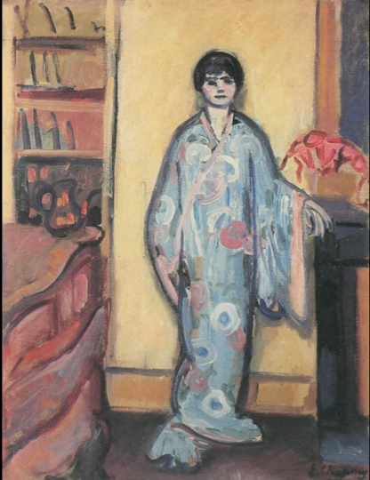
Emilie Charmy, Woman in a Japanese Dressing Gown, 1907. Oil on canvas, 81 x 68 cm. Image from StudyBlue

This isn’t a work of art that I saw in London, but I was introduced to the work of Emilie Charmy on the plane ride to England. Several of her paintings (including Woman in a Japanese Dressing Gown, shown above) are included in Gender and Art, a book that I read while on my trip. In 1921, the critic Roland Dorgelés wrote that that Charmy “sees like a woman and paints like a man.”1 An online gallery of Charmy’s work can be found HERE.

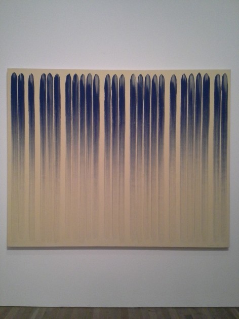
Lee Ufan, "From Line," 1978. Oil paint and glue on canvas. Tate Modern.

Ufan’s From Line is one of the works of art that I saw in the Tate Modern. I love this painting for several reasons, partly because the aesthetic perfectly matches the things that my husband loves about Abstract Expressionism. Ufan wrote this about his method: “Load the brush and draw a line. At the beginning it will appear dark and thick, then it will get gradually thinner and finally disappear . . . A line must have a beginning and an end. Space appears within the passage of time, and when the process of creating space comes to an end, time also vanishes.”2

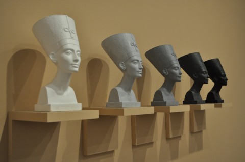
Fred Wilson, "Grey Area (Black Version)," 1993. Five painted plaster busts, five painted plaster wooden shelves.

I am mostly familiar with Fred Wilson’s interesting exhibition work in Mining the Museum, so I found his piece Grey Area (Black Version) to be a welcome surprise. Plus, I love the Egyptian bust of Nefertiti. Wilson’s piece draws attention to “the claims for Nefertiti, and ancient Egypt generally, as positive examplars of blackness within African American culture, but also on the debates around Nefertiti’s actual racial identity and obscured histories of African peoples, alluded to in the title ‘Grey Area.'”3

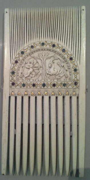
Carolingian Ceremonial Comb with Astrological Symbols, c. 875. Victoria and Albert Museum

I was excited to see this liturgical comb in the V&A, largely because my friend Shelley had piqued my interest in liturgical combs with her post earlier this summer. The museum text panel for this Carolingian comb explained, “Combs like this were used to part the hair of the priest before celebrating Mass, and in other ceremonies. This combing symbolically ordered the mind, as well as reducing the risk of falling hair contaminating the wine.”4 The museum website also explains (in a blurb about a 12th century comb) that liturgical combs symbolized “a concentration of thoughts toward the liturgy.”

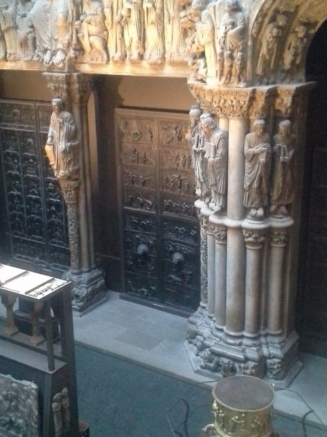
Cast of the Hildesheim doors (center) in the Cast Courts at the Victoria & Albert Museum.

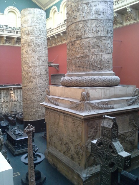
Plaster casts of Trajan's Column, from the Cast Courts at the Victoria & Albert Museum

I was really looking forward to seeing the casts in the Cast Courts at the Victoria & Albert Museum. To my great disappointment, I found that the Cast Courts were closed, and only one of the courts could be seen by looking from a second-story balcony. I was most looking forward to seeing minute details in the casts of the Hildesheim Doors, but I had to try and be content with seeing those doors from a distance. I did feel like I had a new perspective though, on the sheer size of Trajan’s column after seeing the cast placed in an indoor space. Both my husband and I exclaimed in surprise when we stumbled upon the balcony which afforded a view of the column (so large that it is displayed in two pieces!). More information on the plaster casts of Trajan’s Column can be found HERE.

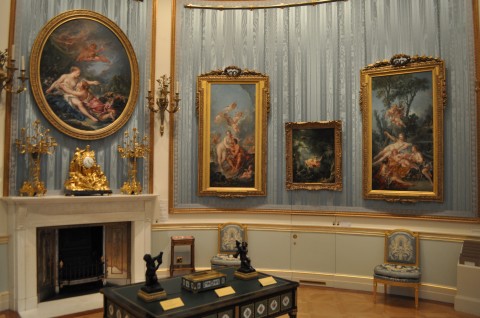
Fragonard's "The Swing" (second from right) and Boucher's "Cupid á Captive" (right) in the Wallace Collection

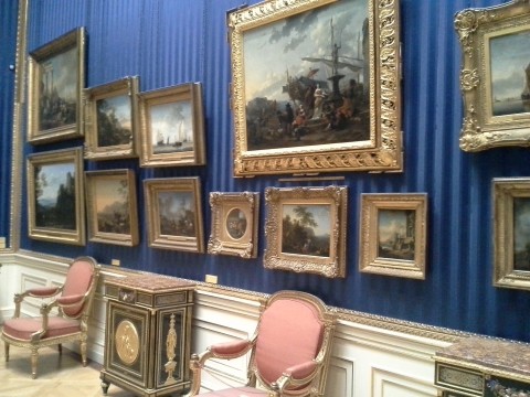
One of the Dutch Rooms in the Wallace Collection

I wanted to include two images of the Wallace Collection interior, since I felt like the setting for this museum was a work of art in-and-of-itself. If I had to choose, I think that this museum was my very favorite one that we visited on this trip. I wanted to visit this museum and the Soane Museum ever since I began to compile my Collection Museum list, and the Wallace Collection did not disappoint! It was also really fun to see Fragonard’s The Swing, since the first art history paper I ever wrote in college was on that painting. It was a lot smaller than I expected! I also thought it was neat that The Swing and Cupid á Captive hang side by side, since those are two popular works of art that often feature in art history survey courses.

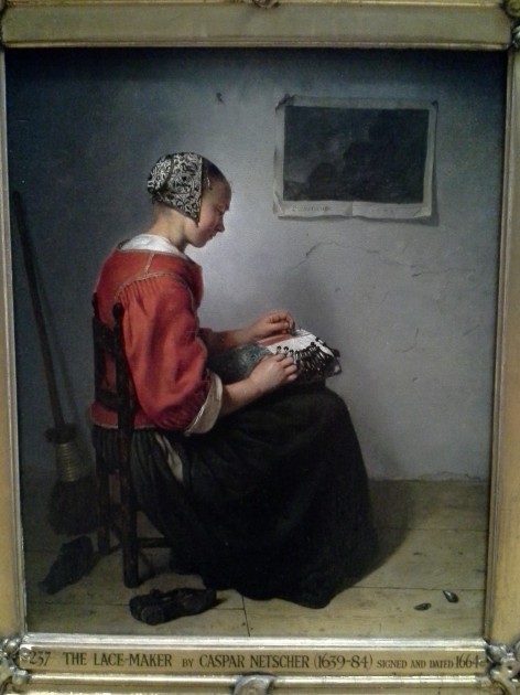
Caspar Netscher, The Lace-Maker, 1664

One of the paintings that was a very nice discovery in the Wallace Collection was Netscher’s The Lace Maker. I feel like this has a really strong composition, but also exhibits some interesting interest in texture (for example, with the intricate cap, the plastered wall, and the paper on the wall). This morning I have been thinking about how the turned body and red clothes of the figure remind me a little bit of the centrally-placed woman in Courbet’s The Wheat Sifters (1854) from the Musée des Beaux-Arts de Nantes collection. In some ways, it’s interesting to compare these paintings and see how Courbet was heir of the Dutch genre painting tradition.

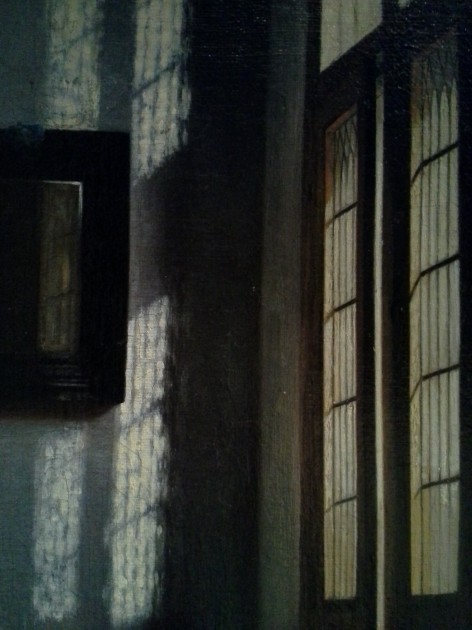
Detail from Peter de Hooch, "Woman Peeling Apples," c. 1663.

Another great painting in the Wallace Collection that is hung near The Lace Maker is Peter de Hooch’s Woman Peeling Apples (c. 1663). I use this painting when I lecture on 17th century Dutch art, but I never had seen this painting before in person. The light streaming through the windows is quite lovely, and I like a lot of things about the color and details of this whole painting.

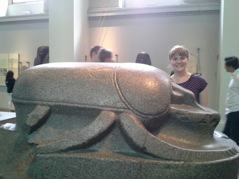
Colossal scarab, perhaps 305-30 BC (possibly earlier)

A colossal scarab! Who knew that such a thing existed?!? This scarab was brought by Lord Elgin (of “Parthenon Marbles” fame) to Britain in the 19th century. I like this scarab for a couple of reasons, including that the scarab was found in Istanbul, although it probably decorated an Egyptian temple. I wonder why the scarab ended up in Istanbul. Scarabs are also interesting to me because of their symbolic associations with rebirth and the sun. Egyptians thought that the scarab was seemingly miraculously hatch out of the dung. In addition, the scarab pushes dung into small balls, much like the god Khepri pushes the sun through the sky.

I took lots of other photos of museums and works of art on this trip, but I think that these are the main “new” (for me, at least) works of art and spaces which will stick out to me the most. Even though we got to visit eight museums, there are still many more things that I wish I could have seen. I already feel the pull go to back, especially since it seems like Millais’s Ophelia is not currently on view at the Tate Britain! I couldn’t find it anywhere. Could that painting have been taken down (or sent off for travel) with the recent rehanging of the Tate’s permanent collection?

What are your favorite works of art and museums in London? Why?

1 Gill Perry, “The Parisian Avant-Garde and ‘Feminine’ Art in the Early Twentieth Century” in Gender and Art by Gill Perry, ed., (New Haven: Yale University Press, 1999), 220.

2 Museum label for Lee Ufan, From Line, London, Tate Modern, August 11, 2013.

3 Museum label for Fred Wilson, Grey Area (Black Version), London, Tate Modern, August 11, 2013.

4 Museum label for Ceremonial Comb with Astrological Symbols, London, Victoria & Albert Museum, August 11, 2013.

— 8 Comments

Politics, the Capitoline Museum, and the She-Wolf

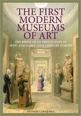
This quarter I am working with just a few of the senior art history majors on a special “Directed Study” course. We are exploring museum history and curatorial theory, using two new books: The First Modern Museums of Art: The Birth of an Institution in 18th- and 19th-Century Europe (2012) and New Museum Theory and Practice: An Introduction (2011). I really like that The First Modern Museums of Art is written in a very approachable, yet scholarly, way. Each chapter serves a case study for a different museum that was established; the book proceeds in a chronological fashion, based on founding dates for the institutions.

This week, my students and I read about the Capitoline Museum (established 1733). Carole Paul writes about how the objects within the museum serve as strong signifiers of political and cultural heritage. The museum, which contains a lot of Roman art, emphasizes Roman authority and jurisdiction. The artistic “progression” and superiority of Roman culture (and those Westerners who are heirs to the Roman tradition) are implied in many ways, including the display of art. For example, the visitor encounters Egyptian figures before the Greco-Roman antiquities, which suggests both artistic and political succession.

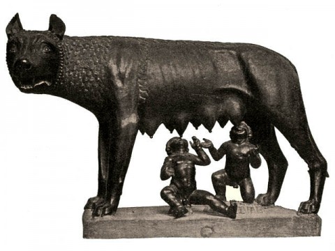
Capitoline She Wolf, 5th century BC or medieval

The political associations and signifiers of power also extend into the collection. I think it’s particularly interesting that the bronze sculpture of the she-wolf forms part of the collection, given the history of the piece. Before Sixtus IV donated this sculpture to the Compidoglio (Capitoline Hill), the she-wolf was displayed in the Lateran Palace, the pope’s official residence.1 This she-wolf was seen as a symbol of the city, since the founders of Rome, Romulus and Remus, were suckled by a she-wolf. As part of the papal collection, this statue then served as a symbol of papal jurisdiction and the papal succession of authority after pagan rule.

Given these associations with Roman history, I can see why the Capitoline Museum seemed a bit hesitant to acknowledge the recent analyses which determined that the “She-Wolf” statue was cast during the medieval period! This was big change in the traditional attribution, which placed this statue in the fifth century BC (as an example of Etruscan art). When I covered this story in 2010, over two years after the new study results were made available, I was surprised that the Capitoline Museum did not have the updated medieval date on its website! Now that I understand the political and authoritative statements behind the formation of this museum, though, I can see why the museum seems to have been hesitant to acknowledge this new information. The museum would want to endorse this as a work of art as an authentic piece from the Etruscan/pre-Roman period, in order to emphasize the institutional message of Roman authority. If the “She-Wolf” is a medieval work of art, there isn’t as direct of a connection to Roman history.

However, today I went back and checked the Capitoline Museum website again. Now the site has been updated to acknowledge the alternate date and also mentions the Carbon 14 analysis (albeit that the information is slightly hidden under a “Reveal text” button).

What have been your experiences at the Capitoline Museum? Did you feel like the message of Roman authority and power came through during your visit?

1 Carole Paul notes that this wolf (lupa) was in fact returned to its rightful home through Sixtus IV’s donation. Paul writes that the wolf “had originally stood on the Campidoglio and in 65 BC had been struck by a bolt of lightning that apparently broke her feet and destroyed the suckling twins, who were replaced only in the fifteenth century.” See Carole Paul, “Capitoline Museum, Rome: Civic Identity and Personal Cultivation” in The First Modern Museums of Art: The Birth of An Institution in 18th- and 19th-Century Rome, Carole Paul, ed., (Los Angeles: Getty, 2012), 22. Given that the she-wolf is now thought to have been produced in the medieval period, I personally think that Paul might be referring to a different depiction of a wolf (perhaps lost) or that this story might have been a myth. Paul cites a 1980 publication by Richard Krautheimer in relation to this story about the lightening bolt. Therefore, she does not seem take into account the more recent Carbon 14 analysis and medieval date.

— 10 Comments

Gothic Cathedral as Body and Mountain

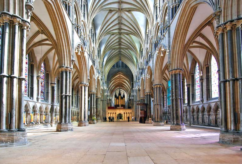
Lincoln Cathedral interior, construction mostly 12th-14th centuries

This past week I read a really interesting article by Peter Fingesten: “Topographical and Anatomical Aspects of the Gothic Cathedral.”1 Fingesten feels like the form and design of Gothic cathedrals have allegorical and symbolic meaning. He compares the interior of cathedrals to the anatomy of the human body (in essence, as symbols of Christ and/or the Virgin Mary). He also compares the exterior of cathedrals to mountains, finding a link between Gothic cathedrals, the Heavenly Jerusalem, and the “sacred mountain imagery” that existed in ancient cultures. This imagery, according to Fingesten, is largely inspired by the John the Revelator’s visions of the Heavenly Jerusalem (Chapter 21 of the Book of Revelation). I thought I’d briefly mention a few of the main points here.

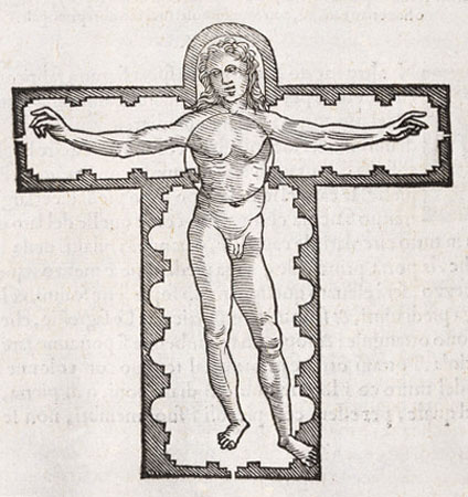
Pietro Cataneo, “Vitruvian Man” (1554)

Before reading this article, I already was familiar with how the floor plan of a basilica can mimic the form of the cross, or even the body of Christ. The allegorist William Durandus (also sometimes written Guillaume Durandi or William Durand) said as much in the 13th century. Fingesten asserts this point, and even references Vitruvius and the Renaissance artist Pietro Cataneo’s “Vitruvian Figure”(1554, see above), which is depicted within the basilica floor plan. But Fingesten takes things further: he discusses how the ribbed vaults of cathedrals mimic the spinal cord and ribs of a human figure. He believes that the Lincoln Cathedral interior (shown at the beginning of this post) is the best expression of this anatomical imagery. Fingesten also believes that the stained glass windows represent the translucent skin of the human body.

Using biblical references, Fingesten argues that the cathedral interior was originally intended to symbolize the body of Christ (who is recorded in the New Testament to have compared his own body to a temple). With the increase of devotion to the Virgin Mary in the twelfth century and afterward, the cathedral also came to symbolize her body. Mary’s body (and womb) traditionally have been compared to a “temple of God,” so I think that this later reinterpretation of the cathedral (really, a merger of male and female allegories) makes sense. I was especially intrigued by Fingesten’s descriptions about how “the pointed ribbed vault system suggests the rib-cage of a gigantic mother bending over her son” and how “cathedrals increased in size until they bulged like a woman high with child.”2

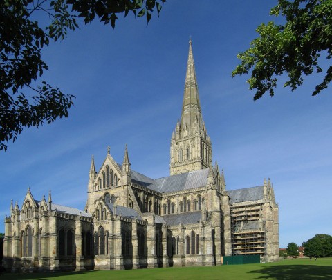
Salisbury Cathedral, England. Church building 1220-1258; west façade finished 1265; spire c. 1320-1330; cloister and chapter house 1263-1284

Fingesten also analyzes the exterior of cathedrals, finding that they symbolize the Heavenly Jerusalem, which is set upon Mount Zion. Fingesten thinks that this sacred mountain imagery is evoked in several ways. He finds that mountain peaks are referenced in the crossing tower and facade towers, while the spires allude to the summit.3 Nature is evoked in the exterior decoration through details and niches,  recalling the weather-beaten appearance of a mountain.4 Even the flying buttresses are used to extend this symbolism, Fingesten argues, and describes how they “hang precariously like snow bridges and drifts from the cliffs of the nave elevation.”5

It’s a really interesting and unique argument, I think. Fingesten delves into some textual references (beyond the Book of Revelation) to back up his argument. I’m not going to delve into those here, but you are welcome to read the argument on your own. My main concern is that Fingesten doesn’t convincingly have his own argument align well with what Durandus wrote in the 13th century. (For example, Durandus compared stained glass windows to the scriptures, not to translucent skin.) That being said, though, I think Fingesten’s interpretation of the cathedral is very impressionable. I know that I’ll think about rib-cages and mountains the next time I visit a Gothic cathedral.

1 Peter Fingesten, “Topographical and Anatomical Aspects of the Gothic Cathedral,” Journal of Aesthetics and Criticism 20, no. 1 (1963): 3-23.

2 Ibid., 18.

3 Ibid., 8.

4 Ibid., 10.

5 Ibid., 9.

— 11 Comments

Justinian Mosaic Altered Not Once, but Twice!


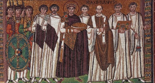
Detail of Justinian and His Attendants, wall of the apse of the San Vitale Church (Ravenna), c. 545-546. Church consecrated 547. Some alterations date c. 1100.

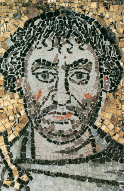
The mosaic “Justinian and His Attendants” at San Vitale (c. 544-545 CE) is one of the most famous works of art from the Byzantine period. It also happens to be one of my favorite piece from this era. It is commonly known that there were some alterations made to this mosaic just a few years after it was created, probably between 546 and 548. We know that the head of the archbishop (who is standing to the left of Justinian or the right side from the viewer’s perspective) was altered and the inscription Maximianus was included at this time. This change probably is because Bishop Victor was originally depicted in the mosaic. After Victor died in 545, Maximian came into power and wanted to have himself depicted instead. It is thought that Maximian needed to include his portrait as an assertion of power, since his authority was insecure at the time. In fact, around the time of this alteration the archbishop had recently been banned from entering the city of Ravenna, due to a dispute with its citizens.1

Detail of Justinian mosaic, probably depicting John the Nephew of Vitalian

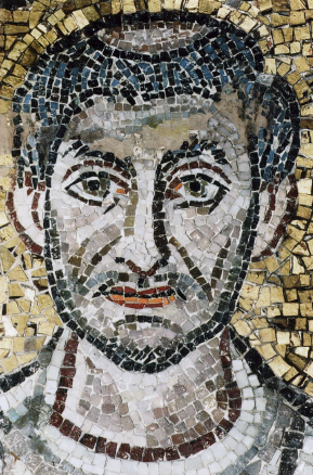
Another one of the early modifications was the inclusion of a courtier who stands in between Justinian and the bishop (see above). If you look closely at the overall composition, you’ll see that this individual does not have any feet (which can be explained with the understanding that this figure is a late addition). It is thought that this figure represents John the Nephew of Vitalian, who was second in command to the commander-in-chief of Italy (the latter is thought to be depicted on the right side of Justinian, wearing a beard). Maximian may have seen potential in John the Nephew’s power, and therefore decided to include him in the composition.2 Although it does seem like it would be humiliating to be included in the background of the composition, John the Nephew did get a prime location between the emperor and archbishop.

However, in addition to these early alterations there are some other alterations to this mosaic which seem to have taken place several hundred years later, probably around 1100 CE. Isn’t that interesting? In the 1990s, scholars Irina Andreescu-Treadgold and Warren Treadgold published results on some technical analyses of the Justinian mosaic. The publications revealed changes in the scale and materials of the tesserae that were used.3 Based on these studies, I wanted to present some of the medieval restorations that took place.

Detail of deacon with tonsure, Justinian mosaic

One of the interesting additions in the c. 1100 restoration is the tonsure (shaved top of scalp) which was added to one of the deacons on the right side of the mosaic. Although the origins of the tonsure are unclear, I am not familiar with any examples of the tonsure that exist before the 7th and 8th centuries. (If anyone does know of examples, I’d be interested to learn about them!) It’s important to realize that the tonsure might not have existed in the sixth century, when this mosaic was originally made!

Detail of Justinian's crown and fibula (brooch)

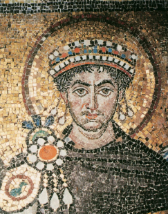
Other medieval alterations include the emperor’s crown, which apparently was simplified and diminished in scale (although it is interesting to note that Empress Theodora’s crown, depicted in another mosaic in the San Vitale apse, is an original). A fibula (or brooch) was also added to Justinian’s attire in this later alteration (see above). I think that this inclusion of the fibula is rather interesting – perhaps the mosaicists wanted to visually compensate for the fact that they gave Justinian a smaller crown? Finally, the smaller pieces of tesserae at the beginning and end of the Maximianus inscription indicates that there was an alteration in this place, too.

Isn’t it interesting that we can deduce through formal and technical analysis that this mosaic was altered several hundred years after its creation? The nuanced history of this mosaic makes me love it all the more. What do you like best about this work of art?

1 Irina Andreescu-Treadgold and Warren Treadgold, “Procopius and the Imperial Panels of S. Vitale,” The Art Bulletin 79, no. 4 (1997): 721. Maximian had been barred from Ravenna because he had supported Justininan’s Edict of the Three Chapters. The inclusion of himself with the emperor in this mosaic serves to visually reinforce Maximian’s support of the emperor.

2 Ibid.

3 Ibid. See also Treadgold, “The mosaic workshop at San Vitale” in A. M. Ianucci ed., Mosaici a San Vitale e altri restaur. Il restauro in situ di mosaici parietali, Ravenna, 1992, pp. 31-41. The restoration is also briefly discussed in Sarah E. Bassett, “Style and Meaning in the Imperial Panels at San Vitale,” Arbitus et Historiae 29, no. 57 (2008): 56.

— 8 Comments

Email Subscription


Archives

About

This blog focuses on making Western art history accessible and interesting to all types of audiences: art historians, students, and anyone else who is curious about art. Alberti’s Window is maintained by Monica Bowen, an art historian and professor.