Category

contemporary art

Prendergast’s "Lost"

In honor of the upcoming season finale for LOST, I thought it would be appropriate to highlight a work of art that shares the same title as the TV series.  Kathy Prendergast’s Lost (1999) is a digital print that depicts a map of the United States.  The map points out all of the actual towns in the United States that contain the word “lost.”  Every other city and place in the country has been excluded from this map, as you can see from a detail below:

Curator Mel Watkin pointed out that this interesting omission of every mappable location (and consequent focus on “lost” places) implies some interesting questions: “Are we lost?  Are they lost?  Or is [Prendergast]?”1

So, could we relate Prendergast’s map to the TV show?  My only thought is that this map visually asserts why LOST has been such a popular show in the US – apparently we’re obsessed with the idea of being lost, since so many places are named accordingly.  If you can think of other relationships between Prendergast and the TV show, feel free to post them in the comments section.  I’ll crown the person with the wittiest answer (and accurate prediction for the finale) as the winner.

1 Mel Watkin, Terra Incognita: Contemporary Artists’ Maps and Other Visual Organizing Systems (Saint Louis: Contemporary Art Museum, 2001), n. p. An exhibition brochure.

— 1 Comment

The $12 Million Stuffed Shark

When I worked in the museum industry several years ago, one of my bosses was heavily involved in the art auction business (in addition to his responsibilities at our museum). This boss worked as an on-call consultant for a major auction house, and would often tell me stories about the dog-eat-dog attitude within the art market. I remember one story that involved an auctioneer who fell into a coughing fit at the climax of one lot sale, but it quickly became apparent that he was stalling for time: there was an agent on the phone who was working to secure a higher bid for the painting.

Anyhow, I think that listening to these stories piqued my interest in the art market, which is why I wanted to read Don Thompson’s book, The $12 Million Stuffed Shark: The Curious Economics of Contemporary Art. The book discusses the everything you wanted to know about the art market: auction houses, prices for art, art as an investment, galleries and dealers, etc.

I thought the first few chapters of this book was really fascinating. Thompson related some interesting anecdotes about contemporary artists and art sales, including an interesting story about Damien Hirst’s The Physical Impossibility of Death in the Mind of Someone Living (1991). Thompson relates how the original shark in Hirst’s tank was not preserved properly, and by the time the work of art went for sale, the shark was not in good condition: one of the fins had fallen off and the skin had become green and wrinkly. Worse still, the formaldehyde had become rather murky. Nonetheless, the deteriorated shark and tank sold for $12 million! (Hirst later agreed to replace the original shark with a new one.)1

I have to admit, though, the middle of the book was rather uninteresting. Thompson focused a lot of auction prices and technicalities. I think this information would be very useful to anyone who is interested in buying or selling art, but it wasn’t very compelling from a historical standpoint. Perhaps I shouldn’t have set my expectations too high – I knew that Thompson was an economist (and not an art historian) when I started to read the book.

The ending of the book completely redeemed itself, though. Thompson devoted a whole chapter to how art crime (especially forgeries) affect the art market. One interesting story was from May 2000, when Christie’s and Sotheby’s realized that their most recent auction catalogs were offering the exact same painting for sale, Gauguin’s Vase de Fleurs (Lilas), 1885.

Obviously, one of the paintings had to be a fake. The auction houses showed the works to a specialist, and it was later determined that Christie’s was selling the copy. The FBI ended up getting involved and a complex art scandal was unearthed that involved Ely Sakhai, the owner of the original Gauguin painting.

Anyhow, I don’t know if I’ll read this book again, but I think it is a good resource for the art world. I’d recommend this book to anyone who is seriously interested in buying or selling contemporary art.

This is my last book for heidenkind’s Art History Challenge.

1 Don Thompson, The $12 Million Stuffed Shark: The Curious Economics of Contemporary Art (London: Palgrave Macmillan, 2008), 2, 63.

— 4 Comments

Maya Lin and "Eleven Minute Line"

Last week, I heard Maya Lin speak at the university where I work. Her lecture was uncannily appropriate, since I had planned for my students to learn about Lin last week (before realizing that she was coming to speak). Minutes after the lecture began, I had two distinct impressions: 1) Lin is extremely tired of speaking about the Vietnam War Memorial and 2) Lin has a lot of flexibility in her career, since she established fame and recognition so early in life. Really, because Lin already has public attention and a fan base, she can create whatever she wants; she isn’t like many other contemporary artists, who seem to feel the need to be shocking or controversial in order to get attention.

One of my favorite parts of the lecture was when Lin discussed her ideas behind her earth art Eleven Minute Line (2004). This squiggly line is 1600 feet long and 12 feet high. And here’s the awesome part: it’s located in a cow pasture in Sweden. The first time I saw Lin’s piece, it immediately reminded me of the Serpent Mound (c. 1070 AD) in Adams County, Ohio (shown below). The Serpent Mound is the largest effigy structure in the United States, and it is thought to have been built by the the Fort Ancient people. (It was originally thought that the structure was built in prehistoric times, but carbon dating of the mound revealed a much later date.)

My suspicions regarding the connection between Eleven Minute Line and the Serpent Mound were confirmed during Lin’s lecture. The artist is from Ohio, and she has always been struck with the story of the Serpent Mound. When Europeans came to America and discovered the Serpent Mound, they concluded that an earlier group of Europeans must have made the structure and then traveled back to the Old World. Basically, these European explorers could not conceive that Native Americans could have built something so complex and monumental. Lin decided add a subtle element of irony with Eleven Minute Line by turning the tables a bit: she brought a design that was inspired from the New World back to the Old World (i.e. Sweden).

It was a real privilege to hear such a well-known artist speak. I was glad that she discussed her more recent art, too. Are you familiar with Maya Lin’s work (aside from the Vietnam War Memorial)? I think her interests in environmental/landscape issues are really interesting.

— 5 Comments

Work of Art: The Next Great Artist

Have you heard about the new reality show, “Work of Art: The Next Great Artist”?  Yes, my friends, the world of reality TV has decided to pay attention to the visual arts.  This is a reality show which aims to unearth the talent of a new artist.  I just found out about this show on Edward Winkleman’s recent blog post, and I don’t quite know what to think.  On one hand, I think it might give exposure and generate more interest in non-traditional forms of art.  By and large, and I would say that the general public defines art as traditional mediums like painting and sculpture.  Perhaps something like this show would help people to appreciate relatively newer types of art, such as performance art, video art, etc.  It looks like the artists dabble in lots of different mediums (as indicated on their bios), but I wonder what types of art they will be allowed/required to create on the show.

I also wonder how this show will dispel or encourage the myth of the “artist as genius.”  Will these people seem like everyday Joe Schmoes, or will the producers want to play up the angle that these artists are unique, creative individuals that are different from ordinary people?  Will viewers accept it if “the next great artist” is just the girl next door?  It will be interesting to see.

Do you think this show could have an effect on the art world?

If you’re interested, you can see a sneak preview here:


— 4 Comments

Kehinde Wiley and His Inspiration

I love when contemporary artists use historical art for inspiration. Kehinde Wiley is one such artist, who often creates portraits of African-American men in poses that mimic specific portraits from the 17th-19th centuries. Since Wiley’s portraits show African-American in the latest hip hop street fashion, the portraits provide interesting commentary on fashion, identity, and propaganda. It’s also interesting to see how issues of identity (and the creation of identity via portraiture) have existed for centuries, especially when examining the historical paintings which inspired Wiley. Here are two of my favorite Wiley paintings (and the paintings that inspired them):
Kehinde Wiley, Prince Tommaso Francesco of Savoy-Carignano, 2006
See the portrait which inspired Wiley below:
Anthony Van Dyck, Prince Tommaso Francesco of Savoy-Carignano, 1634
Kehinde Wiley, Equestrian Portrait of Philip II, 2009
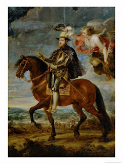
This portrait by Wiley is a little different, in that he doesn’t depict Michael Jackson wearing hip hop street clothes. Jackson actually commissioned this portrait in 2008, but never saw the completed work. J thinks that the inclusion of the cherubs (instead of the angel in the Ruben’s painting which inspired Wiley, as shown below) is fitting, given that Jackson was accused of sexually abusing children. I really doubt that Wiley intended to make that reference, but it’s an interesting thought. The painting was finished after Jackson’s death in 2009 and sold that same year to German collector for $175,000. My favorite thing about this portrait is that it depicts Jackson at the height of his career. I think the armor and pose totally scream “I’m bad, I’m bad, you know it!” Man, you can’t help but love MJ’s early stuff. He was the Prince of Pop, and a royal equestrian portrait is fitting. Anyhow, you can read more about this portrait here and here.
Rubens, Philip II on Horseback, c. 1628-29
I have to admit, I think Rubens has created a lot more powerful horses than the one in this painting. Wiley’s horse has a lot more presence than the one shown here. Maybe the puny horse accounts for why this portrait is not very well-known. Anyhow, if you’re interested, the Prado Museum has some discussion about the restoration of this portrait here.
You can see more of Wiley’s work on his website and read a little bit more about him on this page of the National Portrait Gallery’s site. What do you think of Wiley’s portraits? Do you think they raise interesting questions about identity and personal image?
(e, do you remember when you saw L L Cool J’s portrait by Wiley (2005) in the NPG? I found out this evening that both L L Cool J and Wiley wanted the portrait to recall John Singer Sargent’s portrait of Rockefeller (1917). Pretty cool, huh? Who would have guessed that L L Cool J was familiar with Sargent? Even though I think the green and red pattern in the Wiley portrait is a a little too visually aggressive, I love that the painting recalls a Sargent portrait.)
— 7 Comments

Email Subscription


Archives

About

This blog focuses on making Western art history accessible and interesting to all types of audiences: art historians, students, and anyone else who is curious about art. Alberti’s Window is maintained by Monica Bowen, an art historian and professor.