Category

contemporary art

Pregnancy in Western Art

Earlier this week, I was researching something on Barbara Kruger when I happened upon some posters that she made in 1991 for bus shelters, as part of a project created through the Public Arts Fund. These posters, which had the word “HELP!” superimposed over the picture of a man, used smaller blurbs of text to draw attention to issues that people might face when they become pregnant. To me, Kruger is pointing out that any difficulties surrounding pregnancy should not be merely perceived as a “woman’s problem,” but a situation which affects both genders. These posters are discussed elsewhere in relation to social responsibility and abortion, which I think also is appropriate.

Barbara Kruger, poster from "HELP!" series, 1991


In this instance, I think Kruger’s depiction of a male, while addressing the topic of pregnancy, is entirely appropriate. However, these posters also made me pause and think about how there are comparatively few representations of pregnant women in the Western canon as a whole, especially, say, in contrast with the popularity of the idealized female nude. The topics of pregnancy and childbirth are found in the narratives and historical circumstances surrounding works of art (I’m particularly thinking of Christian scenes of the Visitation and Nativity), but many of those works of art do not highlight the pregnant or postpartum female body. I suppose on one hand, this makes sense, because the pregnant form was not part of the idealized form found in classical art (which is a primary foundation for the Western canon). I thought I would compile a few images of pregnant women in this post — either well-known objects or obscure ones made by a well-known Western artist — as a starting point to think about this topic:
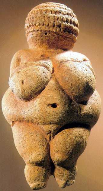
The so-called "Venus of Willendorf" (also 'Woman of Willendorf), ca. 28,000-25,000 BCE. Oolitic limestone, 4.25" inches (10.8 cm)

I thought the Venus of Willendorf would be a good place to start this compilation, particularly due to relatively recent findings by McCoid and McDermott that this statuette and other Paleolithic “Venus” figurines are representations of pregnant women. It is thought that these statues may have been made by prehistoric women who were looking down at their own bodies, which could explain for some of the extreme exaggerations of the body and the lack of feet.1

Rogier van der Weyden, Visitation, c. 1445. Oil on oak panel, 57 x 36 cm.

I like this Northern Renaissance example of the Visitation (see above), because Elizabeth and Mary are not only decidedly pregnant, but they are laying their hands on each other’s bellies (which visually draws attention to their pregnant forms).

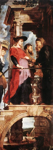
Rubens, detail of Visitation from Descent of the Cross, 1612-1614

Perhaps the Northern tradition of painting (with its keen interest in Aristotelian, empirical observation) caused artists like van der Weyden and Rubens to depict the pregnant form more clearly. In Rubens’s “Visitation” scene, Mary is decidedly pregnant. (It is hard to tell whether Elizabeth is pregnant, due to her placement and dark clothing, however.) I also wonder if Rubens, who had a preference for depicting the curvaceous female form, might have visually been drawn to the curves of the pregnant belly in this instance.

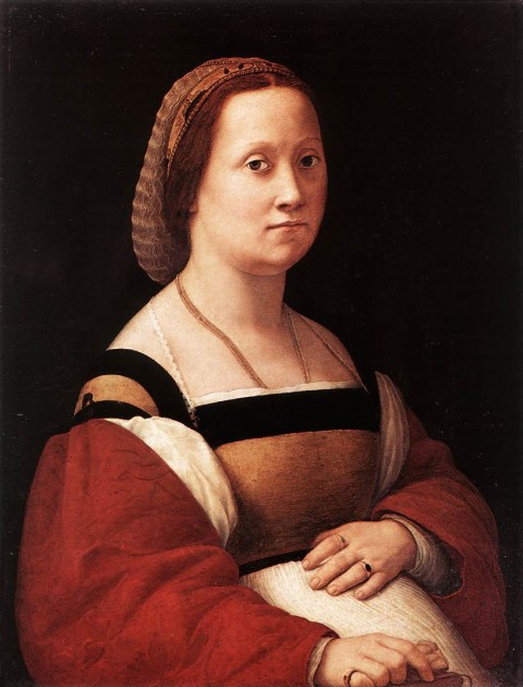
Raphael, "Portrait of a Woman" ("La Donna Gravida"), 1505-06. Oil on panel, 66 x 52 cm

I haven’t come across many images of Southern (especially Italian) artists who painted the pregnant female form, but I do like “La Donna Gravida” by Raphael. I especially like how the sitter also draws attention to her pregnant belly with her hand.

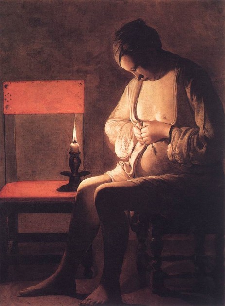
Georges de la Tour, "Woman Catching Fleas," 1630s. Oil on canvas

This painting by Georges de la Tour depicts a woman who is crushing a flea between her fingers. The seemingly everyday subject matter probably has deeper symbolic meaning, however. It has been suggested that this is a depiction of the Virgin (perhaps isolated after Joseph discovers she is pregnant), with the candle representing Christ as the Light of the World.

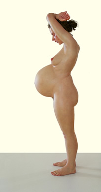
If we jump to the contemporary art scene, there are some images of pregnant women that exist. It makes sense that more pregnant forms would pop up in the postmodern era, since artists are questioning and drawing awareness to traditional Western standards. I think that Ron Mueck’s hyperrealistic Pregnant Woman is probably the best image that highlights and respects the pregnant form. Mueck studied a pregnant model, starting in the sixth month of her pregnancy until about the time that she gave birth. Mueck also studied anatomical books and drawings diligently while creating this sculpture, in order to achieve accuracy.

Ron Mueck, Pregnant Woman, 2002

I really like art historian Mary Kisler’s discussion of this piece, who mentions how this sculpture, in a public environment, has parallels with how a pregnant woman’s body becomes public in actuality. To prove her point, Kisler discusses how people (even strangers!) will sometimes touch the belly of a pregnant woman, when the non-pregnant female has stricter, more private boundaries.

I have to admit, apart from Mueck’s work, I’m not entirely smitten with several of the other contemporary representations of pregnant women. For example, consider this monumental statue by Marc Quinn:
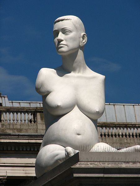
Marc Quinn, "Alison Lapper Pregnant," 2005, 12 feet (3.6 m) high. Photo courtesy of Garry Knight via Flickr under Creative Commons license.*

This sculpture by Marc Quinn was placed in Trafalgar Square in 2005. It depicts the artist Alison Lapper, who was born without arms, when she was eight months pregnant. On one hand, I like that Quinn is trying to deconstruct Western notions of beauty by depicting a figure who is different from Western ideals. So, in that sense, I think that this sculpture is empowering to women, pregnant women, and any figure type which traditionally has been excluded from canonical standards. On the other hand, though, I feel like Quinn is using the pregnant form to get his point across – almost as if the pregnancy itself is a mere device for “shock value.” In this sense, I have a hard time viewing this sculpture as a pure celebration of the pregnant female form.

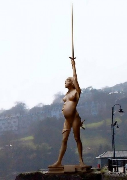
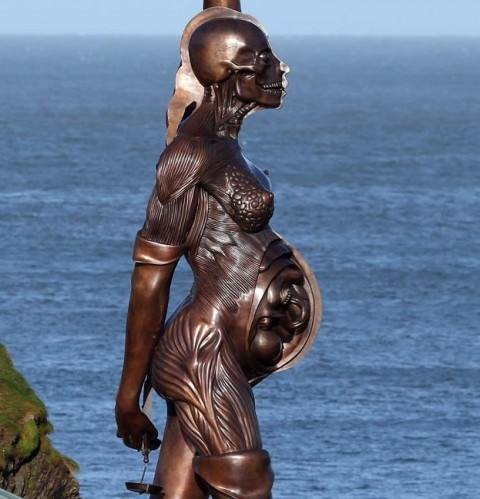
I also feel the same way about Damien Hirst’s sculpture, Verity, which is a variant of earlier works of art by Hirst (like The Virgin Mother). One half of the statue shows the exterior of the pregnant woman, while the other half shows the internal organs and matter inside the woman, including the fetus.

Damien Hirst, "Verity," 2003-2012. Approximately 65-feet tall (20 m)

Damien Hirst, "Verity," 2003-2012, detail

Verity is a monumental statue which is placed on the pier of Ilfracombe, Devon. Hirst, who lives in Ilfracombe, has loaned the sculpture to the town for twenty years (beginning in 2012). Hirst views his sculpture as an allegory for truth and justice, and I think that meaning is made clear with the revealed anatomy on one side. However, like with the Quinn sculpture, I feel like this sculpture is using the pregnant form to generate “shock value,” rather than for concrete symbolism or celebration of the pregnant form itself. It seems like the reference to truth and justice are best expressed in the sword and scales; I can’t see Hirst’s immediate connection between pregnancy and truth or justice. (If anyone can make that direct connection, please share!)

Do you have a favorite representation of the pregnant form in art? Any further thoughts as to why the pregnant form is comparatively scarce in Western art as a whole, apart from what I have put forward about idealized figures?

1 McCoid and McDermott, “Toward Decolonizing Gender: Female
Vision in the Upper Paleolithic,” in American Anthropologist 98 (no. 2): 319-
326.

*See Creative Commons license for photograph by Garry Knight

— 9 Comments

Trip to London: New Discoveries

My family and I just got back from a vacation to England. About three-and-a-half of those days were spent in London, and we were able to cram eight museum visits into those few days! We visited Sir John Soane’s Museum, the Tate Modern, the Victoria & Albert Museum, the Wallace Collection, the Design Museum, the National Gallery, the Tate Britain, and the British Museum. I especially loved the elegance of the Wallace Collection, the quirkiness of the Soane Museum, and the grandeur of the British Collection.

I got to see a lot of beloved works of art on this trip, including relief carvings of Ashurbanipal’s lion hunt, the Parthenon Marbles, the hunting scene from the Tomb of Nebamun, and Holbein’s The Ambassadors. I also was really glad that I saw the “Vermeer and Music” show at the National Gallery (even though it meant that I had to sacrifice seeing The Arnolfini Portrait in another section of the museum, due to time constraints!). I also became familiar with new artists and/or works of art during this trip, and I thought I would share them here.

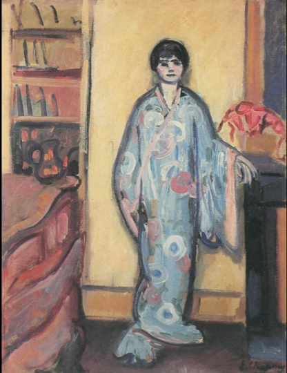
Emilie Charmy, Woman in a Japanese Dressing Gown, 1907. Oil on canvas, 81 x 68 cm. Image from StudyBlue

This isn’t a work of art that I saw in London, but I was introduced to the work of Emilie Charmy on the plane ride to England. Several of her paintings (including Woman in a Japanese Dressing Gown, shown above) are included in Gender and Art, a book that I read while on my trip. In 1921, the critic Roland Dorgelés wrote that that Charmy “sees like a woman and paints like a man.”1 An online gallery of Charmy’s work can be found HERE.

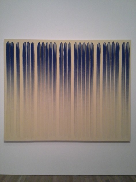
Lee Ufan, "From Line," 1978. Oil paint and glue on canvas. Tate Modern.

Ufan’s From Line is one of the works of art that I saw in the Tate Modern. I love this painting for several reasons, partly because the aesthetic perfectly matches the things that my husband loves about Abstract Expressionism. Ufan wrote this about his method: “Load the brush and draw a line. At the beginning it will appear dark and thick, then it will get gradually thinner and finally disappear . . . A line must have a beginning and an end. Space appears within the passage of time, and when the process of creating space comes to an end, time also vanishes.”2

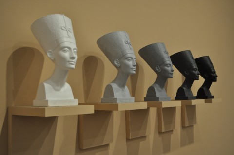
Fred Wilson, "Grey Area (Black Version)," 1993. Five painted plaster busts, five painted plaster wooden shelves.

I am mostly familiar with Fred Wilson’s interesting exhibition work in Mining the Museum, so I found his piece Grey Area (Black Version) to be a welcome surprise. Plus, I love the Egyptian bust of Nefertiti. Wilson’s piece draws attention to “the claims for Nefertiti, and ancient Egypt generally, as positive examplars of blackness within African American culture, but also on the debates around Nefertiti’s actual racial identity and obscured histories of African peoples, alluded to in the title ‘Grey Area.'”3

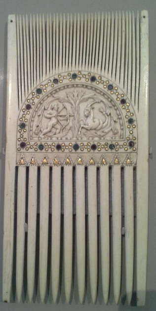
Carolingian Ceremonial Comb with Astrological Symbols, c. 875. Victoria and Albert Museum

I was excited to see this liturgical comb in the V&A, largely because my friend Shelley had piqued my interest in liturgical combs with her post earlier this summer. The museum text panel for this Carolingian comb explained, “Combs like this were used to part the hair of the priest before celebrating Mass, and in other ceremonies. This combing symbolically ordered the mind, as well as reducing the risk of falling hair contaminating the wine.”4 The museum website also explains (in a blurb about a 12th century comb) that liturgical combs symbolized “a concentration of thoughts toward the liturgy.”

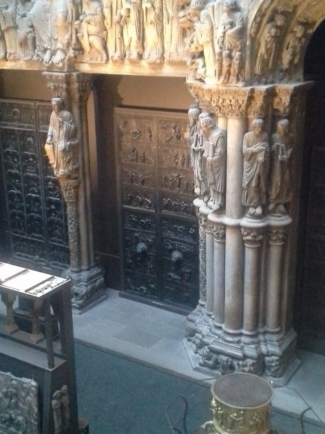
Cast of the Hildesheim doors (center) in the Cast Courts at the Victoria & Albert Museum.

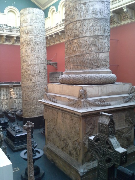
Plaster casts of Trajan's Column, from the Cast Courts at the Victoria & Albert Museum

I was really looking forward to seeing the casts in the Cast Courts at the Victoria & Albert Museum. To my great disappointment, I found that the Cast Courts were closed, and only one of the courts could be seen by looking from a second-story balcony. I was most looking forward to seeing minute details in the casts of the Hildesheim Doors, but I had to try and be content with seeing those doors from a distance. I did feel like I had a new perspective though, on the sheer size of Trajan’s column after seeing the cast placed in an indoor space. Both my husband and I exclaimed in surprise when we stumbled upon the balcony which afforded a view of the column (so large that it is displayed in two pieces!). More information on the plaster casts of Trajan’s Column can be found HERE.

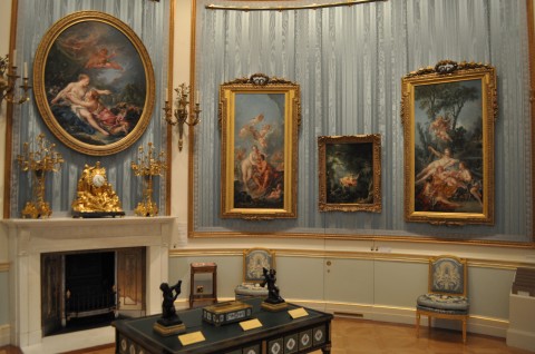
Fragonard's "The Swing" (second from right) and Boucher's "Cupid á Captive" (right) in the Wallace Collection

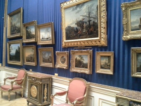
One of the Dutch Rooms in the Wallace Collection

I wanted to include two images of the Wallace Collection interior, since I felt like the setting for this museum was a work of art in-and-of-itself. If I had to choose, I think that this museum was my very favorite one that we visited on this trip. I wanted to visit this museum and the Soane Museum ever since I began to compile my Collection Museum list, and the Wallace Collection did not disappoint! It was also really fun to see Fragonard’s The Swing, since the first art history paper I ever wrote in college was on that painting. It was a lot smaller than I expected! I also thought it was neat that The Swing and Cupid á Captive hang side by side, since those are two popular works of art that often feature in art history survey courses.

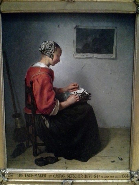
Caspar Netscher, The Lace-Maker, 1664

One of the paintings that was a very nice discovery in the Wallace Collection was Netscher’s The Lace Maker. I feel like this has a really strong composition, but also exhibits some interesting interest in texture (for example, with the intricate cap, the plastered wall, and the paper on the wall). This morning I have been thinking about how the turned body and red clothes of the figure remind me a little bit of the centrally-placed woman in Courbet’s The Wheat Sifters (1854) from the Musée des Beaux-Arts de Nantes collection. In some ways, it’s interesting to compare these paintings and see how Courbet was heir of the Dutch genre painting tradition.

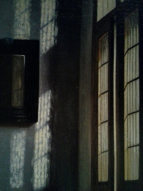
Detail from Peter de Hooch, "Woman Peeling Apples," c. 1663.

Another great painting in the Wallace Collection that is hung near The Lace Maker is Peter de Hooch’s Woman Peeling Apples (c. 1663). I use this painting when I lecture on 17th century Dutch art, but I never had seen this painting before in person. The light streaming through the windows is quite lovely, and I like a lot of things about the color and details of this whole painting.

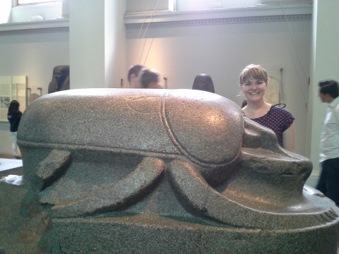
Colossal scarab, perhaps 305-30 BC (possibly earlier)

A colossal scarab! Who knew that such a thing existed?!? This scarab was brought by Lord Elgin (of “Parthenon Marbles” fame) to Britain in the 19th century. I like this scarab for a couple of reasons, including that the scarab was found in Istanbul, although it probably decorated an Egyptian temple. I wonder why the scarab ended up in Istanbul. Scarabs are also interesting to me because of their symbolic associations with rebirth and the sun. Egyptians thought that the scarab was seemingly miraculously hatch out of the dung. In addition, the scarab pushes dung into small balls, much like the god Khepri pushes the sun through the sky.

I took lots of other photos of museums and works of art on this trip, but I think that these are the main “new” (for me, at least) works of art and spaces which will stick out to me the most. Even though we got to visit eight museums, there are still many more things that I wish I could have seen. I already feel the pull go to back, especially since it seems like Millais’s Ophelia is not currently on view at the Tate Britain! I couldn’t find it anywhere. Could that painting have been taken down (or sent off for travel) with the recent rehanging of the Tate’s permanent collection?

What are your favorite works of art and museums in London? Why?

1 Gill Perry, “The Parisian Avant-Garde and ‘Feminine’ Art in the Early Twentieth Century” in Gender and Art by Gill Perry, ed., (New Haven: Yale University Press, 1999), 220.

2 Museum label for Lee Ufan, From Line, London, Tate Modern, August 11, 2013.

3 Museum label for Fred Wilson, Grey Area (Black Version), London, Tate Modern, August 11, 2013.

4 Museum label for Ceremonial Comb with Astrological Symbols, London, Victoria & Albert Museum, August 11, 2013.

— 8 Comments

Vik Muniz and Perspective

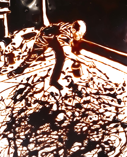
Muniz, "Action Photo after Hans Namuth" (1997). Photograph of image created with chocloate syrup

Vik Muniz is a contemporary Brazilian artist who is based in New York. He is particularly interested in referencing images from pop culture or fine art, but with the use of unconventional mediums like peanut butter, syrup, wire, and sugar. A few years ago, I saw his works Double Mona Lisa (Peanut Butter and Jelly) (After Warhol) and Medusa Marinara (among many others) at an exhibition in Seattle.

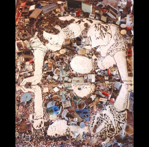
Last night, I watched the documentary Waste Land which discusses how Muniz created “Pictures of Garbage” (2008), a series of large-scale portraits that were comprised of rubbish and junk that was found at Jardim Gramacho, a large landfill near Rio de Janeiro. The ThinkShop blog has already highlighted the Marat: Sebastião portrait that was created as part of this project, so I won’t say much on that topic here. Instead, I wanted to point out how different visual perspectives (particularly aerial views) form an interesting aspect of the documentary and Muniz’s work itself.

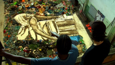
Tião (portrait sitter) and Muniz's assistant Fabio Ghivelder look at "Marat: Sebastião" in studio

There were several points in the documentary where the film would pull out to show aerial views of the recycling pickers at Jardim Gramacho. I remember at one point someone commenting that the workers looked like small ants from such a distance. It was interesting to see that Muniz’s own approach to creating his photographs was also with an aerial view approach. After taking photographs of his subjects, the image was projected on the bottom of a studio floor. Recycling pickers were recruited to help fill the portrait shadows and lines with different types of materials that were taken from the landfill, under Muniz’s supervision. The documentary has a few great shots of Muniz giving orders to the assistants below, using a laser pointer to indicate what areas needed attention.

Viewer looking at a detail of Muniz's "Narcissus (after Caravaggio)"

Interestingly, though, I noticed that the documentary had several scenes which scanned up-close details of either the recycling pickers or the final works of art created by Muniz. Both an aerial (distanced) view and an up-close view were presented in the film, which mirrors the perspectives that Muniz wants to encourage for those who view his works of art. Muniz said as much in the documentary itself, and also in a different interview: he wants viewers to step away from his photographs to see the overall subject matter clearly, but then step close to the the photographs in order to notice the medium and details. It is this back-and-forth movement of the viewer (which almost seems ritualistic to me, particularly in a museum setting) that Muniz wants to encourage.

I’m quite a fan of works of art that encourage such dynamic interactions between the works of art and the viewer. I like to think that, as a Brazilian, Muniz is influenced by colonial Brazilian art (i.e. the Brazilian Baroque) which requires such participation on behalf of the viewer.

Muniz, "Narcissus (after Caravaggio)," 2005

For those who are interested, Muniz created another series two years earlier that was also based in Rio de Janeiro. “Pictures of Junk” (2006) was created with the help of art students in an underprivileged area in Rio de Janeiro. These works of art were also made with junk, but the compositions were based off of famous Western works of art, such as Narcissus (after Caravaggio) (shown above), Saturn Devouring One of His Sons (after Francisco de Goya y Lucientes), and The Birth of Venus (After Botticelli) (Triptych).

— 3 Comments

Technology and Triumphal Arch Parallels: Dürer and Debombourg

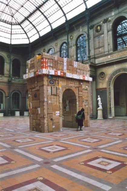
Baptiste Debombourg, Triumphal Arch, 2001. Cardboard boxes, glue, strings, scotch tape. Height 5.3 m (approx 17.38 feet)

This morning one of my students shared with me a Tumblr page with images of Debombourg’s Triumphal Arch, which is largely comprised of cardboard boxes. My student commented that this disposable monument reminded him of the temporary triumphal arches that we discussed in our class on colonial Brazilian art.1 I am curious as to whether Debombourg recycled used boxes for his construction. If he did, I think this would be an interesting contrast between our environmentally-conscious society and the colonial conquerors who initially perceived Latin America to be a land of abundant, limitless resources.

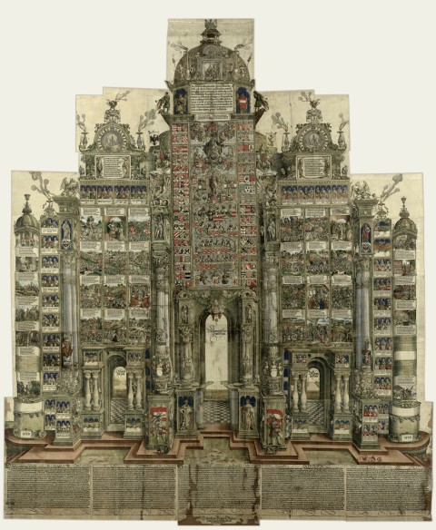
Anyhow, by coincidence, later this morning I came across another triumphal arch in the new art history textbook that I am reading (edited by Kim W. Woods). The text discusses the monumental arch that Dürer created for Emperor Maximilian (see below). This huge arch was printed on paper using 192 woodblocks, and was intended to be a wall decoration, kind of like a substitute for a tapestry or wall painting.

Albrecht Dürer, "Arch of Emperor Maximilian," 1515-17, colored woodcut. 357 x 295 cm (approx. 11.7' x 9.67')

Although these two arches are very different for a lot of reasons, I can’t help but think about how these arches have some interesting similarities. The both are created on a monumental scale. They both are “constructed” works of art, either with physical boxes or with the woodblocks which comprised Dürer’s final print. Even the small print on some Debombourg’s boxes has an interesting parallel with Dürer’s print: the latter has complicated Latin inscriptions which would have been hard to read, not to mention the complex compositions which would have been equally difficult to view.2

Curiously, both works of art have an interesting element of “reproducibility.” Dürer’s arch was originally printed in 700 sets, and later was reissued in more than 300 sets by one Archduke Ferdinand, one of Maximilian’s grandson.3 Ferdinand’s son Charles, in turn, also reissued sets of the arch. Dürer was able to reproduce his work through the relatively-new technological invention of the printing press. Likewise, Debombourg’s arch has been similarly “reproduced” over and over through blogs, tweets, and Tumblr “likes” (for starters, just look at the list on the Tumblr site that I included above).

It is interesting to think about how the Internet has assumed a “reproducibility function” for art, a function which for a long time was partially the responsibility of the printing press. Artists no longer become famous through distributing physical copies (i.e. prints) of their art. Instead, artists and viewers can place images on the Internet, and let those images (or the links to those images) reproduce themselves. Lately, when I have visited a museum gallery, I have been struck by how many people (including myself) are taking images of art with their cellphone cameras. It is phenomenal to consider how many works of art are “reproduced” via digital images each day.

Considering the widespread fame which Dürer achieved in his lifetime with physical copies of his prints, one can only imagine what mind-boggling fame he might have achieved if he lived in the Internet age. And I would bet that Dürer would have relished every moment of it.

1 Although we don’t have examples of temporary triumphal arches from Brazil, there are some descriptions that exist in documents. We can learn a little about how temporary triumphal arches appeared in Latin America by looking at a Spanish American painting of a viceroy “entrada.” Look on the far right side of Melchor Pérez Holguín’s, “The Entrance of the Viceroy Morcillo into Potosí,” 1716.

2 Kim W. Woods, ed., “Art and Visual Culture, 1100-1600: Medieval and Renaissance,” (London: Tate Publishing), 181-82.

3 Ibid., 181.

— 1 Comment

A Meaty Post

I belong to a really fantastic book group. This month we have been reading The Sexual Politics of Meat: A Feminist-Vegetarian Critical Theory by Carol J. Adams. This book is really fascinating to me. It explores how meat consumption is related to patriarchal values; meat has longstanding associations with power, strength, virility, and wealth. Adams makes some interesting parallels with how the “masculine” consumption of meat is related to the sexual consumption and objectification of women, too. (You can get a sense of the parallels made between meat and women-as-meat in Adam’s slideshow.) There is a lot more to this book too, and I would highly recommend it to anyone interested in theory, literature, or the history of vegetarianism.

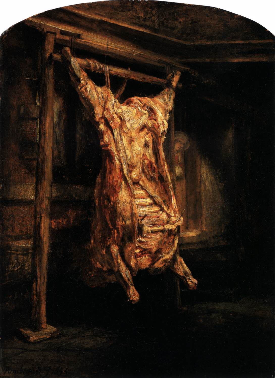
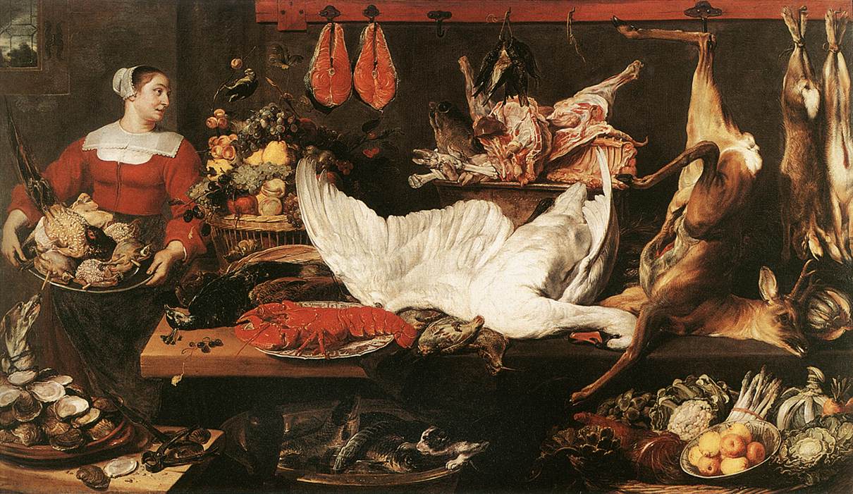
While reading this book, I continually thought of how meat is represented in art and visual culture. Although I have yet to read Adam’s other book, The Pornography of Meat, I feel like I’ve already come up with a substantial list. In many ways, the following representations of meat can also be related to patriarchy and power. I find it telling that the majority of the depictions of meat (that I have come across, at least) were created by men. And I also think it’s interesting that male artists like Rembrandt and Snyder (see below) decided to include women with the carcasses of dead animals. Are these artists merely referencing the fact that women have been delegated the responsibility to prepare meat (for male consumption)? I think we can we make deeper associations between what objects are construed for “the male gaze” in these images, especially from our modern-day perspective.

Rembrandt, "The Slaughtered Ox," 1655

Frans Snyder, "The Pantry," c. 1620

Along these lines of sexuality and male consumption, it is especially interesting to consider how Snyder depicted the maidservant with birds on a platter. The Dutch word “vogelen” (which means “to bird”) not only refers to fowl, but also to the sexual act. This painting, therefore, seems to reference worldly temptations or physical love.

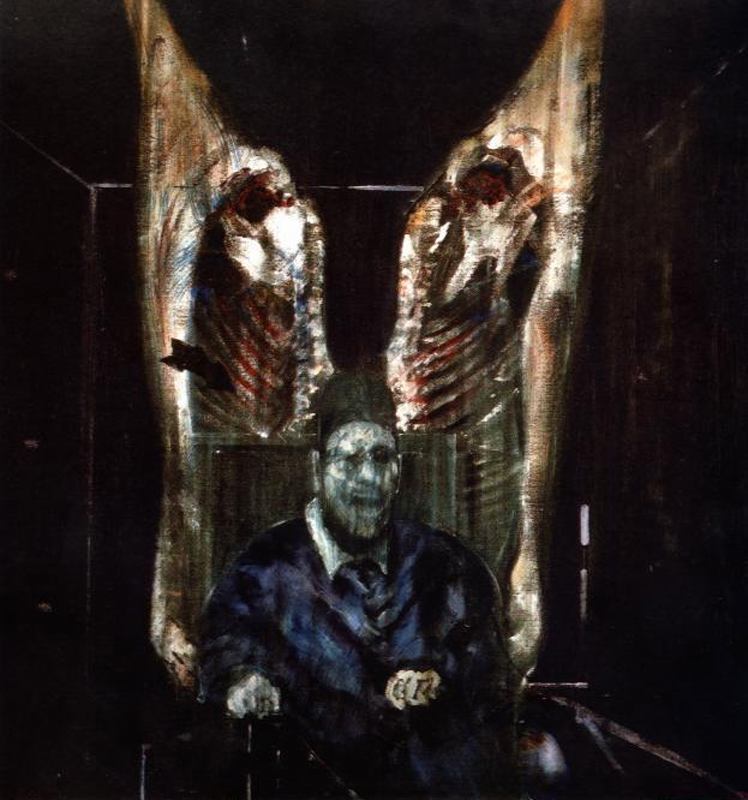
Artists in the 20th century also were interested in exploring “meaty” subject matter. One work of art that immediately comes to mind is Francis Bacon’s Head Surrounded by Sides of Beef (1954, see below). As an air raid warden in London during WWII, Bacon saw many of the horrors of war (a grisly enterprise which, I think, can be interpreted in many respects as a “masculine” endeavor). With two slabs of meat flanking the sides of a ghostly figure, Bacon explores parallels between meat and death.

Francis Bacon, "Head Surrounded by Sides of Beef," 1954

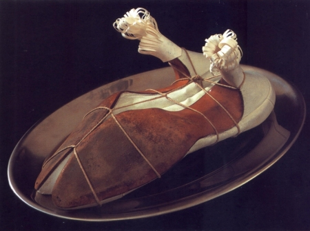
Other 20th century artists have made some interesting parallels between meat and male consumption, including the Surrealist artist Meret Oppenheim. Her work, The Governess (see below) depicts a pair of stilletto heels (objects which can signify female sexuality and arousal). The heels are tied together and decorated with paper crowns – the type of decoration sometimes found on a leg of lamb or chicken.

Meret Oppenheim, "My Governess," 1936

One of the most influential works of art involving meat is Carolee Schneemann’s performance Meat Joy (1964). This performance, which is very aggressive and controversial, involved men and women who danced, rolled on the floor, and played with a mixture of raw flesh (e.g. partially-plucked bloody chickens, raw fish, and raw sausages). The sexual connections between meat and “pleasures of the flesh” are quite clear in the performance.

I also think that it is unsurprising that audience members would squirm during Meat Joy. After all, Schneeman is including bloody and partially-plucked chickens, something that relates to what Carol Adams calls the absent-referent. When people consume animals today, the flesh is usually cooked and modified (and sometimes given a different name than the actual animal, like “veal” or “beef”) to help obscure the reality that a once-living creature has comprised the meal. So, in essence, animals are absentreferents on the dinner table. They are there, but they are also not there. Schneeman’s aggressive reference to flesh and blood in her “happenings” performance restores the absent-referent, which undoubtedly contributed to why viewers squirmed.

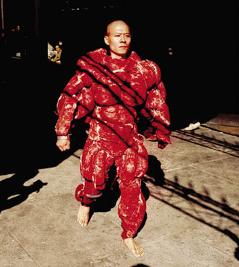
Many artists have been influenced by Carolee Schneeman. In fact, in 2008 exhibition titled Meat After Meat Joy brought together the works of various artists who have explored different meanings between meat and flesh. (You can read one blogger’s take on the exhibition here.) One of the videos on display in this exhibition was Zhang Huan’s performance, My New York (2002, see below).

Zhang Huan, "My New York," 2002. Video still from performance.

Many of Huan’s performance works involve endurance and masochism. In this particular performance, Huan walked through New York wearing a heavy suit with actual pieces of raw beef. Looking like a “beefed-up” body-builder (which alludes to masculinity and virility!), Huan would occasionally release doves during the performance.  It was interesting to interpret this performance in a political light, given the recent 9/11 attacks.  The small figure of the artist (within the powerful, beefy costume) was a reflection on how America (and New York itself) were vulnerable – as a nation and as a city.

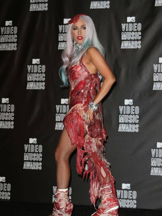
And finally – I can’t finish this post without a pop culture reference. Lady Gaga has clad herself in “meaty clothes” a few times, once in a meat bikini on the cover of Vogue Hommes Japan. Soon after, Lady Gaga also appeared in a “meat dress” at the 2010 Video Music Awards, complete with a steak on her head (see below).

Lady Gaga's "meat dress" at the VMA music awards, 2010

Although Lady Gaga said in an interview that her dress was a statement about fighting for rights (and asserted “I am not a piece of meat”), I can’t help but see how her dress just reinforces the associations with the masculine consumption of women (which other feminists, including Carol J. Adams, have observed). In this outfit, I think Lady Gaga is suggesting that she is available for consumption on two levels: to satiate sexual and physical hunger. And because of the associations with animals and meat, Lady Gaga seems to reinforce her sexuality by suggesting that she, too, is animalistic.

Any thoughts? Have I spoiled your appetite? (Sorry!) I’m curious to see what other depictions of meat are out there. Do you know of any more? I’m also reminded of Pieter Aertsen’s two works The Butcher’s Stall (1551) and Cook in Front of a Stove (1559). Another example is Van Gogh’s Still Life with Apples, Meat, and a Roll (1886).

— 15 Comments

Email Subscription


Archives

About

This blog focuses on making Western art history accessible and interesting to all types of audiences: art historians, students, and anyone else who is curious about art. Alberti’s Window is maintained by Monica Bowen, an art historian and professor.