Category

contemporary art

Josiah McElheny’s “From an Historical Anecdote About Fashion”

I haven’t been blogging on here this summer, but that is not to say that I haven’t been busy or thinking about art. The pandemic has forced me to spend the summer prepping online material for the three classes that I will be teaching this Fall quarter. I’ve been thinking about art every day, as I record lecture videos while seated at my desk. I’ve often chuckled at my bizarre sense of fashion during this videos, which is a professional look from the waist up, but a casual look from the waist down with flip flops or exercise pants hidden from the camera’s view.

Josiah McElheny, “From An Historical Anecdote About Fashion,” 2000. Blown glass objects and display case, overall: 67 7/8 × 120 × 27 5/16in. (172.4 × 304.8 × 69.4 cm). Whitney Museum of Art

Perhaps in some ways that’s why I have been drawn to Josiah McElheny’s “From an Historical Anecdote About Fashion” during this pandemic. I miss having a reason to get dressed up in fancy clothes, and I miss having the free time to watch films from the Golden Age of Hollywood. McElheny explains in an ART:21 documentary (at 40:38 in this video) that he was looking to draw parallels with “the connection between a glass factory and the designs of Christian Dior.”

The “historical anecdote” that served as inspiration for McElheny was regarding the 1952 Venice Biennale. That year, the glass design company owned by Paolo Venini entered a display of vases that were based off of the haute couture fashions which Ginette Gagnous Venini, the owner’s wife, wore when she visited the factory.2 Ginette was very involved in the business and was said to have been seen by those in the furnace room whenever she ascended or descended the stairs to and from the office.

Josiah McElheny, detail from “From An Historical Anecdote About Fashion,” 2000. Blown glass objects and display case, overall: 67 7/8 × 120 × 27 5/16in. (172.4 × 304.8 × 69.4 cm). Whitney Museum of Art

Josiah McElheny, detail from “From An Historical Anecdote About Fashion,” 2000. Blown glass objects and display case, overall: 67 7/8 × 120 × 27 5/16in. (172.4 × 304.8 × 69.4 cm). Whitney Museum of Art

McElheny’s clothes give off a definite sense of 1950s fashion, especially with the wasp waists and several voluminous skirts. The excessive use of fabric in Dior “New Look” line drew a contrast with the restricted use of fabrics during the World War era.1 And so maybe now, in a time when I feel more restricted in my behavior, these voluminous dresses seem like an excessive and unattainable luxury.

Another thing that I love about McElheny’s pieces is that they suggest the female form that would be wearing the clothing. The glass objects give off a sense of presence and absence, since the figures’ forms are visible through the clothing but also conspicuously lack any anatomical features outside of the dresses themselves. Likewise, the translucent glass seems present and also absent. Perhaps that’s why I’m drawn to these works of art as I’m working to create an online class: I’m constructing a virtual “presence” for myself while also keenly aware of how I am absent from the physical classroom. Or perhaps I’m also drawn to the fragility of the glass medium, since the pandemic has caused me to think more about the fragility of human life and health. All depressing thoughts aside, I wish that quarantine and online teaching could be as carefree and elegant as these references to haute couture!

1 Robin Updike, “Fashion and Glass Merge With Imagination In Show At Henry,” Seattle Times (March 17, 1999). Available online: https://archive.seattletimes.com/archive/?date=19990317&slug=2949785 

2 The idea of designing a bottle to look like a dress wasn’t completely new to the Vanini factory. In 1947 a design was produced for Venini which decorated bottles with lace, to suggest the body of a woman or a mannequin in 19th-century dress. See Marino Barovier and Carla Sonego, eds., Paolo Venini and His Furnace, Skira Editore (2016), pp. 83-84. Available online: http://www.showonshow.com/skira/2017/venini/pressdocs/PVenini_layout_UK.pdf
Comments Off on Josiah McElheny’s “From an Historical Anecdote About Fashion”

A Recent Addition to “The World Stage: Brazil”

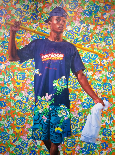
Kehinde Wiley, "Indio Cuauhtemoc: The World Stage, Brazil," 2017. Oil on canvas.

Kehinde Wiley, “Indio Cuauhtemoc: The World Stage, Brazil,” 2017. Oil on canvas. Photo taken by the author

Last month I visited the Portland Art Museum and saw a painting by Kehinde Wiley that I hadn’t seen before. This painting is currently on display as a loan from the collection of Arlene and Harold Schnitzer, major philanthropists in the area (Harold passed away in 2011). I already was familiar with Wiley’s series called The World Stage that feature people from countries around the world, but I wasn’t familiar with this one that comes from the Brazil installment of The World Stage. And as I’ve studied this work, I realized that this painting was made fairly recently, in 2017, almost ten years after the initial series was begun and exhibited. The painting isn’t listed as part of Wiley’s Brazil series, and I wonder why Wiley decided to create this painting so much later. Did he have all of the source material and photos of the model from before, but simply ran out of time to start this painting until almost a decade later?

Wiley began this project through a residency in Rio de Janeiro in March 2008 and exhibited the installation in 2009. At the time, a short book was published with two essays and images of the exhibition painting, and similar books were produced for other installments of The World Stage. The exhibition aimed to draw attention to issues of Afro-Brazilian identity and the complex and problematic social issues created due to the history of slavery and colonialism in Brazil. As a result, Wiley’s Afro-Brazilian figures are positioned in compositions that are reminiscent of famous paintings and monuments in Brazilian culture. Here are a few examples:

  • Wiley’s painting “Omen Negro (Black Man)” refers to a watercolor by the German artist Zacharias Wagener (who was in Brazil when the Dutch were there). Ironically, Wagener’s watercolor is actually a copy of another painting titled “African Man” by Albert Eckhout, so there are multiply layers of copying and appropriation that are taking place. Furthermore, the title of this work seems have layers of appropriation and inadvertent spelling corruption: Wiley’s phrase “Omen Negro” is a corruption of Wagener’s title “Omem Negro,” which itself is a corruption of the accurate Portuguese phrase “homem negro” (“black man”).
  • Wiley’s painting “Marechal Floriano Peixoto” copies the composition of a monument in Cindelândia’s public square in Rio de Janiero. The monument honors the second president of the Republic, Floriano Peixoto, but these two particular figures represent the indigenous people of Brazil. The inclusion of these active, strong figures and their composition alludes to the colonial presence in Brazil and the subjugation of the native presence by the Portuguese. Other allegorical figures in the monument recognize the African, Portuguese, and Catholic aspects of Brazilian history.
  • Wiley’s “Alegoria a Lei do Ventre Livre” is inspired by a gesso sculpture by A. D. Bressae of the same title. Kimberly Cleveland explains that this allegorical figure is an reference to the 1871 law which declared that the children who were born to slave parents would be free. She writes, “The irony of this law is suggested in the less-than-enthusiastic expression of Wiley’s model,” but absent from the original, nineteenth-century sculpture” of a smiling boy.1
  • Wiley has multiple paintings (see one, two and three) dedicated to Alberto Santos Dumont, an innovator in aviation. The compositions for these paintings come from a monument honoring Dumont, located outside of the Dumont airport in Rio.

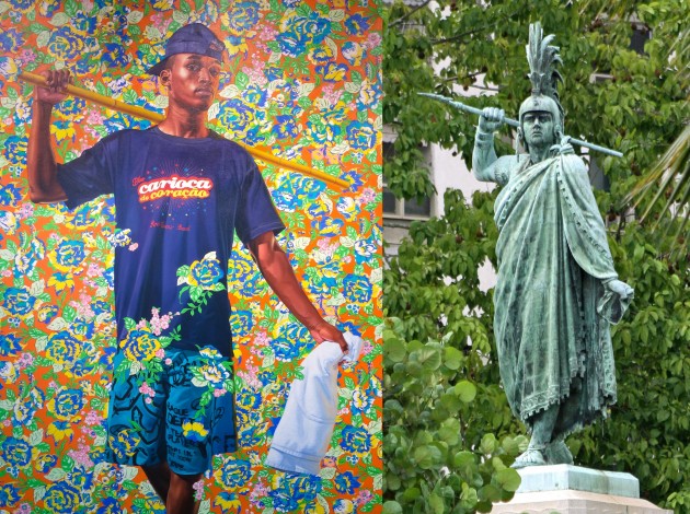
The influence of Brazilian monuments on the composition brings me back to the new Kehinde Wiley addition to this series: this 2017 painting is inspired by a monument of Cuauhtemoc that is located in the Parque do Flamengo in Rio de Janeiro.

Left: Kehinde Wiley, "Indio Cuauhtemoc: The World Stage, Brazil," 2017. Right: Monument to the Indio Cuauhtemoc in Rio de Janeiro. Image courtesy Wikipedia

Left: Kehinde Wiley, “Indio Cuauhtemoc: The World Stage, Brazil,” 2017 (photo taken by the author). Right: Monument to the Indio Cuauhtemoc in Rio de Janeiro. Image courtesy Wikipedia

The monument itself is a bizarre connection to Brazil, because is quite oblique. The statue is in Brazil because it was a gift from Mexico in 1922, to recognize the 100th anniversary of the Brazilians’ independence from Portugal in 1822. The statue depicts Cuauhtemoc, the last Aztec emperor, who ruled between 1520-1521 and then was executed by the Spanish. Perhaps there is a loose parallel between the end of an indigenous empire and the end of a colonial period, but it is a little bit of a stretch. Nonetheless, the sculpture is seen as a symbol of friendship between Mexico and Brazil.

By assuming the same composition as the Cuauhtemoc sculpture in Brazil, which is itself a copy of an original 1887 sculpture by Miguel Noreña in Mexico City, Wiley’s painting continues to add layers of appropriation and meaning. One theme is of connections and friendships between countries, since Wiley, as an American painter, took temporary residence in Brazil and painted Brazilian subjects. By depicting an Afro-Brazilian model, Wiley also touches on colonial history and those who were conquered and subjugated by Europeans, Africans and Aztecs alike.

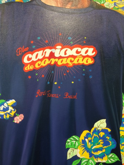
Kehinde Wiley, detail of "Indio Cuauhtemoc: The World Stage, Brazil," 2017. Oil on canvas

Kehinde Wiley, detail of “Indio Cuauhtemoc: The World Stage, Brazil,” 2017. Oil on canvas. Photo taken by the author

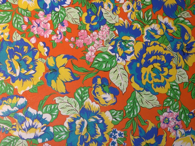
Kehinde Wiley, detail of "Indio Cuauhtemoc-The World Stage, Brazil," 2017. Oil on canvas

Kehinde Wiley, detail of “Indio Cuauhtemoc: The World Stage, Brazil,” 2017. Oil on canvas. Photo taken by the author

The casual clothing of Wiley’s subject allude to commodifications by referencing popular (American) fashion and culture. In addition, the bright colors and thriving flowers also connect to Western commodification, suggesting how “the exotic” is a Western construct that has been fetishized and desired. The inspiration for at least one backgrounds in the series came from textiles found at the Sahara market in Rio, and perhaps this design may have been found in a similar place.2 I noticed that Wiley used this same floral background in a study for a painting called “Sidney da Rodra, Jr.” (2008), but it doesn’t appear in the final version, and a detailed image of this same floral background appears as an unlabeled plate at the beginning of the World Series: Brazil book.So Wiley was thinking about this background during this project and studying it, even though this painting wasn’t made (or perhaps finished?) until 2017.

The layered appearance of human figures and decorative patterns in Wiley’s paintings are an appropriate visual reminder of the layers of meaning and appropriation. Typically, Wiley’s paintings have a few elements from the background which extend out of their pattern to partially cover the clothing of the subject. This can be seen best on the t-shirt and the shorts of the “Indio Cuauhtemoc” figure by Wiley, which are partially covered with flowers. Such layers remind us that, despite the real life issues that Wiley addresses, he has presented them to us in a fictive environment to remind us that all the world is a stage and his “streetcast” models are actors.

1 Kimberly Cleveland, “Kehinde Wiley’s Brazil: The Past Against the Future” in Kehinde Wiley: The World Stage: Brazil by Kehinde Wiley (Roberts & Tilton, 2009), 26.

2 Kehinde Wiley, Kehinde Wiley: The World Stage: Brazil (Roberts & Tilton, 2009), 12.

3 Ibid., 4, 45.

— 1 Comment

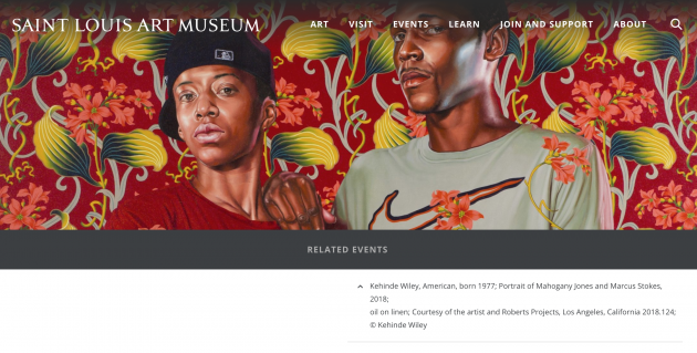
Wiley and Morris at the St Louis Art Museum

Screen Shot 2018-12-19 at 11.28.59 AM

The radio silence on my blog has been deafening for me, but luckily I’ve been able to do some writing over the past few months. The William Morris Society in the United States contacted me a few months ago, after reading my 2016 post on Kehinde Wiley and William Morris. I expanded this initial post into a new one for their “News from Anywhere” webpage with updated information about a current Kehinde Wiley show at the Saint Louis Art Museum. And check out the gorgeous catalog cover for the exhibition!

Comments Off on Wiley and Morris at the St Louis Art Museum

Flora Forager’s Fresh Flowers: Fantastic and Iconic Images

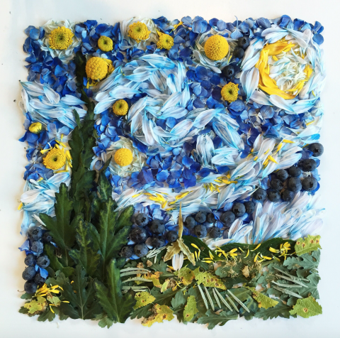
Flora Forager, “Van Gogh’s ‘The Starry Night,'” 2016. Billy buttons, blueberry, chrysanthemum, hydrangea, lavender, sunflower. Used with permission from Bridget Beth Collins (Flora Forager).

Last week I had the opportunity to interview Bridget Beth Collins, a Seattle-based artist who creates gorgeous collages out of flowers, leaves, and other botanical items like pinecones, mushrooms, fruit and seeds. Collins works under the pseudonym of “Flora Forager” since her collages often consist of botanical elements found in her garden or the green areas surrounding her Seattle-based home. Just last month, her book The Art of Flora Forager was released, and it is such a delight to see and read! I really am thrilled about this book. Similarly, it was a real pleasure for me to meet Bridget in person, since I automatically feel a true affinity with people who love flowers, juvenile fantasy fiction, and (as I discovered in the course of our conversation) old murder mystery television series.

Ever since I became familiar with Flora Forager’s work on Instagram earlier this year, I’ve been charmed with her creative subject matter, the novelty of her compositions, and also her unusual choice of medium. Flora Forager’s whimsical collages depict things like animals, insects, woodland fantasy scenes, mandalas, star constellations, portraits of iconic women, and even copies of famous masterpieces. In concept, her collages might remind one of colonial feather paintings or even Grace Kelly’s pressed flower collages. However, in the course of my conversation with Bridget, it became apparent that her work is very different from Grace Kelly’s flowers, even if sometimes their compositions are loosely similar (compare Grace Kelly’s geometric patterns with one of Flora Forager’s mandalas).

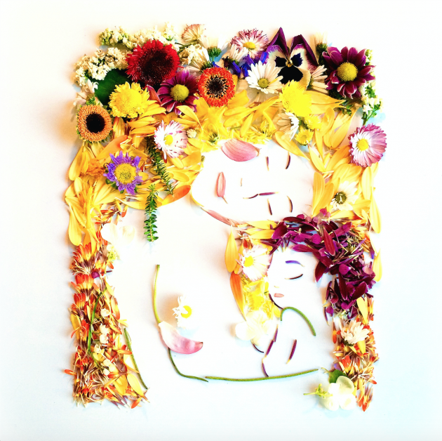
Mother and Child

Flora Forager, “Klimt’s ‘Mother and Child,'”, 2015. Aster, chrysanthemum, dahlia, lacecap hydrangea, lilac, pansy, Peruvian lily, pumpkin vine, sunflower. Used with permission from Bridget Beth Collins (Flora Forager).

In contrast to Grace Kelly, Bridget does not like to work with dried or pressed flowers. As we spoke, it was apparent that the three-dimensional quality of the fresh flowers is important to her. She wants to her flowers to have bulk and form as they are layered and arranged, to the point that she is mindful of the shadows that are created: she consistently photographs her work from the same location on her white dining room table, so that all of the shadows fall to the left.1 She also wants to make sure that the shadows are soft and comely, and she commented that the cloudy skies of Seattle create perfect lighting for the effect she wants to capture.2

This interest in softly modeled three-dimensional collages is really revealing to me, because I think it helps to explain why Flora Forager’s representational collages are so delightful and impactful: the three-dimensional forms and fresh flowers create a sense of plausibility and give a lively presence to something that might not actually exist in reality. For example, a three-dimensional rendering makes a fantasy scene (such as this one or this one) seem more palpable, and therefore endearing, to an escapist viewer. Such fantastic escapes and whimsical storybook tales are just within reach! And not only are they rendered possible because the collages are three-dimensional, but they are created with found objects that are easily identifiable and readily found to the viewer. In a sense, her art suggests that fantasy is embedded within the everyday world around us.

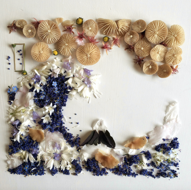
Screen shot Hokusai

Flora Forager, “Hokusai’s ‘Under the Wave Off Kanagawa,” 2015. Bluebell, California lilac, cherry blossom, narcissus, pixie’s parasol mushroom, purple sage, rhododendron, tansy. Used with permission from Bridget Beth Collins (Flora Forager).

In a related way, I think that the three-dimensional fresh flowers also affect the way that the viewer reacts to Flora Forager’s copies of famous masterpieces or portraits of iconic women (like Audrey Hepburn or Marilyn Monroe). On one hand, the three-dimensional forms and botanical media give an iconic image or iconic person a new sense of presence and life: we can look at familiar objects or faces in a new way. But I think that the fresh flowers also help to reinforce the iconic, timeless status of these familiar objects too. When flowers and leaves are captured as fresh and pristine in a photograph, these natural elements become immortalized in the same way that iconic images have been cemented in their well-known celebrity status. As a result, we have timeless flowers that won’t fade, similar to iconic images that don’t dissipate from cultural memory.

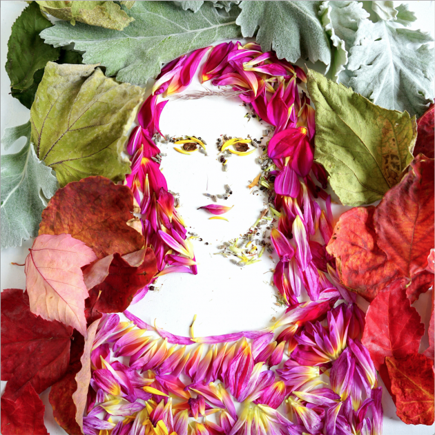
Screen Shot 2017-10-10 at 9.59.41 PM

Flora Forager, “Da Vinci’s ‘Mona Lisa,” 2016. Chrysanthemum, dahlia, lamb’s ear, lavender, pinecone, red maple leaf. Used with permission from Bridget Beth Collins (Flora Forager).

I’m reminded of a quote contrasting long-lasting, iconic works of art to flowers:

“Works of art often last forever, or nearly so. But exhibitions themselves, especially gallery exhibitions, are like flowers; they bloom and then they die, then exist only as memories, or pressed in magazines and books.” – Jerry Saltz, New York Magazine

What Flora Forager does so well is belie the inevitable death of nature: her camera captures flowers and leaves while they are fresh and vibrant, and uses that vibrancy to her advantage to reinforce that an iconic work of art can “last forever” or that a famous celebrity is, indeed, immortal.

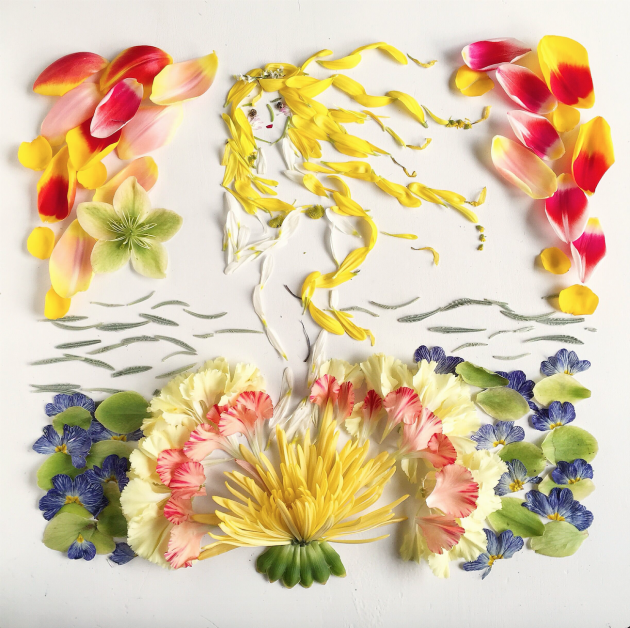
Flora Forager, Botticelli

Flora Forager, “Botticelli’s ‘The Birth of Venus,'” 2016. Carnation, chrysanthemum, daisy, goldenrod, Lenten rose, marsh rosemary, sunflower, tulip, woolly lavender. Used with permission from Bridget Beth Collins (Flora Forager).

For anyone who is interested, please follow Flora Forager on Instagram and see her print shop. In addition to The Art of Flora Forager book, Bridget Beth Collins has also created Flora Forager: A Seasonal Journal Collected from Nature. She anticipates the publication of another journal titled Metamorphosis in 2018.

1 Bridget Beth Collins, interview with author. Seattle, October 5, 2017.

2 Ibid.

— 1 Comment

Fragonard’s “The Swing” and “Portrait of a Lady”

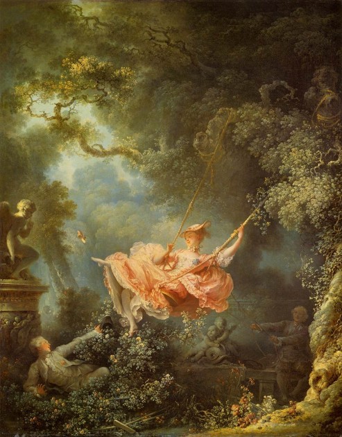
Fragonard, "The Swing," 1766. Oil on canvas. Wallace Collection

Fragonard, “The Swing,” 1767. Oil on canvas. Wallace Collection

Tonight I am feeling very sheepish. About three or four months ago, a student mentioned to me that Fragonard’s The Swing served as a point of inspiration for “Portrait of a Lady.” I found a copy of Henry James’ novel The Portrait of a Lady a few days later. Now, after reading 660+ pages and finishing the book, I was left rather confused as to what my student meant, so I went online to read some commentary. Only then did I realize that my student was referring to William Carlos Williams’ poem “Portrait of a Lady” and not the Henry James novel! I don’t regret reading lengthy book at all, but I feel less confused and won’t try to dwell on which suitors are courting Isabel Archer (or perhaps Pansy?) in this Fragonard painting anymore!

Instead, the William Carlos Williams poem has very direct references to Rococo art and painters. This is the poem, which was first published in The Dial in 1920:

Your thighs are apple trees

whose blossoms touch the sky.

Which sky? The sky where Watteau hung a lady’s slipper.

Your knees are a southern breeze — or

a gust of snow. Agh! what

sort of a man was Fragonard?

— As if that answered

anything. –Ah, yes. Below

the knees, since the tune drops that way, it is one of those white summer days,

the tall grass of your ankles

flickers upon the shore —

Which shore?

Agh, petals maybe. How

should I know?

Which shore? Which shore?

–the petals from some hidden

apple tree — Which shore?

I said petals from an apple tree.

I’ve been reading commentary, scholarly interpretations, and watching a short lecture segment (though disregard some of the art historical commentary in the video, since it is a bit inaccurate) on this poem, and thinking about how this poem encapsulates the difficulties of poetic words and conventions in terms of expression. The poem seems to show the problems which poets can face, especially since there are two voices which interrupt the flow of the expressive content. There are even other exclamations which disrupt the flow, too: the first “agh!” may have been exclaimed when the speaker realized that he meant to say “Fragonard” instead of “Watteau” when first referencing to the artist of The Swing.1

Given the historical context of his poem and how the disjointed style of the poem is interpreted as a precursor to postmodernism, interesting to me that these two Rococo artists were mentioned. Watteau is the earlier of the two artists, and he really served as a pioneer for the Rococo style. On one hand, Watteau’s art can be interpreted as expressing conflicting emotions and voices (the subject matter of his artistic output is associated with pleasure and sadness, perhaps typified in his comedia dell’art painting Italian Players from 1720), which parallels the disjointed and interrupted conversation of the speakers in the poem.2 Watteau also was a bit of a radical artist for his time, since his “fete galante” paintings of the aristocracy did not fit the conventional requirements for academic history paintings, and this unconventional approach to art mirrors the unconventional form of disjointed expression in Williams’ poem.3

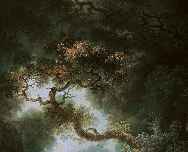
Fragonard, detail of "The Swing," 1767. Oil on canvas. Wallace Collection

Fragonard, detail of “The Swing,” 1767. Oil on canvas. Wallace Collection

Obviously, Williams was considering the themes like love and eroticism when he made a reference to Fragonard’s The Swing, since a woman is accompanied by two suitors and she kicks off her shoe (and reveals what is underneath her dress) at the suitor who is hidden in the bushes. Fragonard is a later Rococo artist who followed in Watteau’s wake, and I think his socially-accepted painting style and traditional career don’t have the same parallels to the radical style of poetry that Williams used. However, from a compositional standpoint, I like how compositional lines meander through the painting (such as the branch which zig-zags in the upper left corner, see above); these visual lines complement the nonlinear, back-and-forth voices presented in the poem.

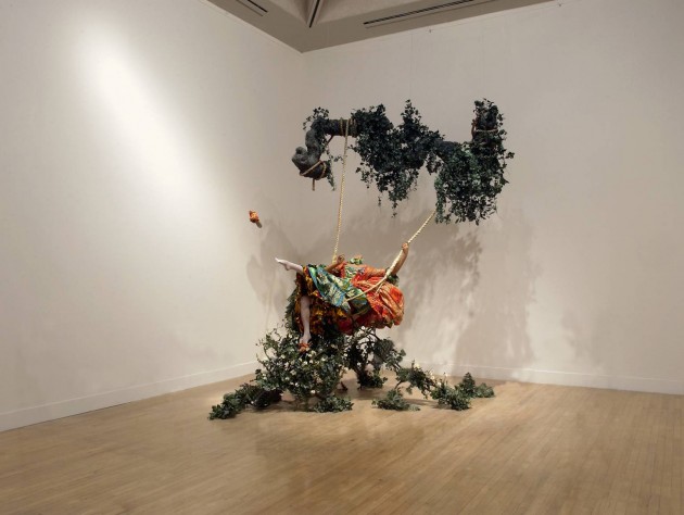
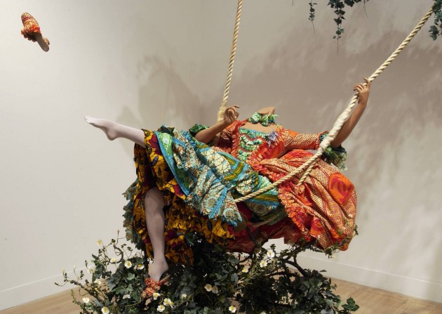
Yinka Shonibare, The Swing (after Fragonard)', 2001. Tate Modern

Yinka Shonibare, “The Swing (after Fragonard),” 2001. Tate Modern

Really, I think the best work of art today that encompasses Williams’ poem is Yinka Shinobare’s installation “The Swing (after Fragonard)” from the Tate Modern. Since the Fragonard painting has become iconic, Shinobare’s composition is familiar to the viewer but also strange: the tree lacks a trunk and the principal subject lacks a head. This familiar-and-strange reaction is similar to what is conveyed through Williams’ poem, since the poem attempts to reference the traditional language of poetry (like using a metaphor about an apple tree), but the metaphors are intentionally used in an ineffective way. Since Shinobare intentionally omits aspects of Fragonard’s composition, this disjointed appearance mirrors the disjointed flow of Williams’ poem.

Shinobare detail

Yinka Shonibare, detail of “The Swing (after Fragonard),” 2001. Tate Modern

The skin of Shinobare’s model is also dark and she wears a print that references African textiles which have a complex global history regarding colonial production and international consumption. These references to the complexities of globalization and visually acknowledging multiple voices seems to be a fitting parallel with how Williams’ poem is seen in relation to postmodernism – a movement which accepts the multiplicities of meanings and perspectives.

Do you see any other parallels between Williams’ poem and either the Fragonard painting or Shinobare’s installation?

1 See Thomas Dilworth, “On ‘Portrait of a Lady,'” The Explicator 56.2 (Winter 1998). Available online: http://www.english.illinois.edu/maps/poets/s_z/williams/lady.htm

2 For more information on how Watteau’s art is associated with conflicting emotions and interpretations, see Linda Walsh, “Subjects, Society, Style: Changing Evaluations of Watteau and His Art” in The Changing Status of the Artist by Emma Barker, Nick Webb, and Kim Woods (Open University Press, 1999), 220-248.

3 Ibid., 235-238.

— 7 Comments

Email Subscription


Archives

About

This blog focuses on making Western art history accessible and interesting to all types of audiences: art historians, students, and anyone else who is curious about art. Alberti’s Window is maintained by Monica Bowen, an art historian and professor.