Category

20th century

Lygia Clark: (Non)Interaction within the Museum

I was first introduced to the artist Lygia Clark by chance.  I was doing research in Brazil several summers ago, but arrived in Rio de Janeiro to find out that the Ministry of Culture was on strike.  All cultural institutions in the city were closed – including the National Library, where I had intended to do most of my research.  Argh!  Long story short: I discovered that the Museum of Modern Art in Rio de Janeiro was open (they must receive private funding and not be associated with the Ministry of Culture), I subsequently discovered Lygia Clark in the Tropicália exhibition, and luckily I was able to complete my research a few days later.

I think that Clark is a really interesting artist.  Much of her early work revolved around participation of the viewer.  In order to truly experience her art, Clark wanted people to touch, manipulate, and sometimes wear (!) her sculptures.  In one piece, Diálogo: Óculos (“Dialogue: Glasses”, 1968, shown left), two people were supposed to wear a set of goggles.  The goggles constrained the individuals to maintain eye contact, and thus forced a type of dialogue to ensue between the two people.  It is the experience created by the goggles that is the work of art, and not the actual object itself.

Unfortunately, museum display and security don’t allow Clark’s work to be interactive (or even to function, really).  With art museums as a “no touch” zone, most of Clark’s interactive work is stuck on pedestals and behind glass cases.  (Although, to be fair, in 2008-09 the SFMOA had an exhibition called “The Art of Participation” which allowed visitors to interact with works of art, including Lygia Clark’s Diálogo: Óculos.)

But the mentality behind the “The Art of Participation” show isn’t found everywhere.  Consider the particular irony of this clip from the Walker Art Museum, in which the curator explains and demonstrates how the sculpture is supposed to be experienced, but then shows the Bicho (“Bug,” 1960) sculpture placed behind a glass case:

Obviously, I understand why works of art need to be placed behind protective glass.  I understand the element of preservation too, since constant handling of any sculpture will cause wear and tear on the piece.  And, to be fair, the SFMOA blog has some great reasoning about institutional limitations in regards to participation, which was posted in conjunction with “The Art of Participation” show. (This blog post also includes a link to this video of people turning Lygia Clark’s Rede de elástico (“Elastic Net”) into a jump rope within the gallery, which is kinda fun but obviously dangerous in the gallery space.)

Still, institutional limitations aside, I wish that there were more shows like “The Act of Participation” in the museum world. Then Lydia Clark’s art would actually be able to function, instead just being a neat thing to talk about.

— 5 Comments

Judy Chicago’s "Venus"

I guess it’s pretty obvious that I’ve been researching prehistoric female figurines lately, huh?  I promise this will be my last post on the subject, at least for a while!  I just wanted to show everyone this cool Judy Chicago piece, Ceramic Goddess #3 (Study for Goddess Figurine on Fertile Goddess runner; 1977, shown above).  Pretty fun, huh?  It’s funky, playful shape makes me think that this could have been the prehistoric statuette from Lewis Carroll’s fictive “Wonderland.”  Yep, that’s it: this is the Venus of Wonderland.

The shape also reminds me a little bit of Henry Moore‘s anthropomorphic style.  (And speaking of Henry Moore, I’ve been thinking about how the replica of the prehistoric figurine “Venus de Lespugue” also reminds me Moore’s work.)

Anyhow, it’s neat to look at Chicago’s work and see how a 20th century feminist identified with the prehistoric figurines.  Although today some question the prehistoric “goddess” theory, it’s interesting to think about how feminist activists latched onto this subject matter in the 1970s and 1980s.  (You may be familiar with Judy Chicago’s well-known feminist work, The Dinner Party (1974-79)).  You can read more about this female figurine and Judy Chicago here.

Comments Off on Judy Chicago’s "Venus"

Matisse as de Heem (or "The Old as New")

About a week ago, my brother-in-law asked if I knew of any 20th century still-life paintings which “quoted” or were influenced by a still-life from an earlier century. In essence, N was interested in seeing if any 20th century artists had abstracted a traditional still-life beyond recognition. I didn’t know of any direct copies/abstractions off the top of my head, but I did come across one example today (thanks to J!). Below is a painting by Matisse, which was influenced by the 17th century painting A Table of Dessert (“La Desserte”, 1640, shown on bottom).

Matisse, Still Life After Jan Davidsz. de Heem’s ‘La Desserte’, 1915
Jan Davidsz. de Heem, Table of Desserts (“La Desserte”), 1640
Matisse actually painted his version of this still-life after an academic copy that he made in 1893. I read a little about this painting in this article about a new Matisse exhibition at the MOMA. Looks like a fun show.
Although this isn’t exactly what my brother-in-law was looking for (Matisse didn’t abstract de Heem’s still-life beyond recognition), it still is pretty fun. That being said – does anyone know of examples in which a 20th century painter abstracted an earlier work of art beyond recognition?
— 5 Comments

Milton Glaser + Marcel Duchamp = Bob Dylan

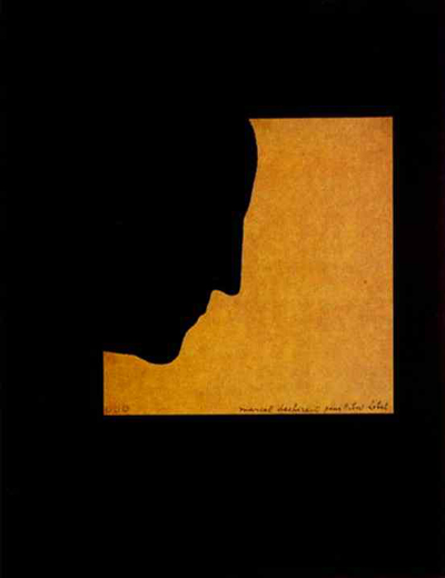
Did you know that Milton Glaser’s iconic poster of Bob Dylan (1966, shown on right) was influenced by one of Marcel Duchamp’s self-portraits (1957, shown on left)? I had no idea, until I read this recent Smithsonian article. (My favorite part of the article is where Glaser discusses how he feels about the poster: he wishes that he could redo Bob Dylan’s hair, finding it “a little clumsy.”) Anyhow, I thought the article was fitting, given that last week Dylan turned 69 years old. You can compare the Duchamp and Dylan profiles below. Now tell me, who do you think has a more noble nose?

— 5 Comments

Prendergast’s "Lost"

In honor of the upcoming season finale for LOST, I thought it would be appropriate to highlight a work of art that shares the same title as the TV series.  Kathy Prendergast’s Lost (1999) is a digital print that depicts a map of the United States.  The map points out all of the actual towns in the United States that contain the word “lost.”  Every other city and place in the country has been excluded from this map, as you can see from a detail below:

Curator Mel Watkin pointed out that this interesting omission of every mappable location (and consequent focus on “lost” places) implies some interesting questions: “Are we lost?  Are they lost?  Or is [Prendergast]?”1

So, could we relate Prendergast’s map to the TV show?  My only thought is that this map visually asserts why LOST has been such a popular show in the US – apparently we’re obsessed with the idea of being lost, since so many places are named accordingly.  If you can think of other relationships between Prendergast and the TV show, feel free to post them in the comments section.  I’ll crown the person with the wittiest answer (and accurate prediction for the finale) as the winner.

1 Mel Watkin, Terra Incognita: Contemporary Artists’ Maps and Other Visual Organizing Systems (Saint Louis: Contemporary Art Museum, 2001), n. p. An exhibition brochure.

— 1 Comment

Email Subscription


Archives

About

This blog focuses on making Western art history accessible and interesting to all types of audiences: art historians, students, and anyone else who is curious about art. Alberti’s Window is maintained by Monica Bowen, an art historian and professor.