Thursday, September 12th, 2013
Ottonian “Baroque” Elements

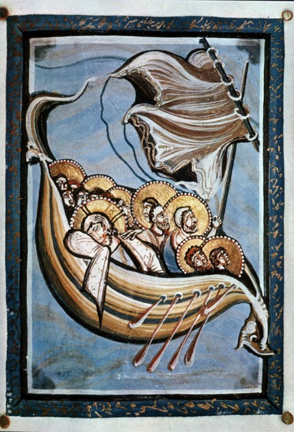
"Christ and Apostles on the Sea of Galilee" from the Hitda Codex, c. 1025-50 CE. Ms. 1640, folio 117
Over the past week I have been transcribing my handwritten art history notes from my undergraduate years into digital format. I’ve been working on the notes from my class on medieval art, and I’ve been struck that my past professor casually referred to some Ottonian works of art as “baroque” in style. Although the Ottonian period is often referred to as a “renaissance” in terms of a rebirth of artistic production (with classical influence feeding into the Ottonian style from both the Carolingians and Rome itself), I can see what my professor is saying about a few instances in which baroque elements can be found in Ottonian art.
For example, the bow and stern of the ship in “Christ and the Apostles on the Seat of Galilee” from the Hitda Codex (shown above) seem to strain against the border of the manuscript itself, as if pushing forward into the actual space of the viewer.1 The sweeping curves of the ship remind me of the undulating, Borrominesque curves found in 17th century architecture. And the dramatically-windblown sail reminds me of the grandiose “cloth of honor” that is found in many Baroque paintings, such as the Caravaggio’s Death of the Virgin from 1606.
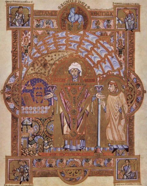
My professor also felt like the Ottonian School of Regensburg was the “baroque phase” of Ottonian illumination, largely because the works of art are so visually complex. The Uta Codex is from Regensburg and includes several masterpiece manuscripts, such as “St. Erhard Celebrating the Mass.”2 Visual complexity is typified in the dynamic, decorative canopy which sweeps over the head of St. Erhard. The manuscript is also filled with excessive decoration and detail. Semi-circles seem to bulge out of the sides of the rectangular border of the frame, which adds a dynamic element that arguably could be called baroque.

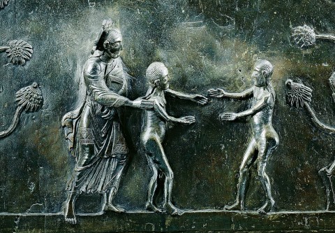
Detail of Creator introducing Adam and Eve, from the Hildesheim Doors, 1015. Photo via petrus.agricola via Flickr
While thinking about such baroque elements in Ottonian art, I also was reminded of an article by Harvey Stahl, “Eve’s Reach: A Note on the Dramatic Elements in the Hildesheim Doors” (.PDF available online). Stahl discusses how there are dramatic elements and moments of tension in the doors, which help to encourage the viewer to follow the narrative. I think that this element of drama has some parallels with the aesthetic and subject matter of the Baroque period. One such dramatic element found in the panel in which Adam and Eve are introduced. Here, Adam and Eve reach for each other, but are depicted as almost touching. Stahl explores this idea of drama and tension, finding that the doors were influenced by the plays written by Hrotsvitha of Gandersheim about a half-century before Bishop Bernward commissioned these doors.3
Although I do not claim that these Ottonian elements had a direct impact on Baroque artists, I do like to think that this might be another slight example of the cyclical nature of art. Perhaps, in some ways, the classical style of the Carolingians led into a few Ottonian dramatic elements and visual distortions that could be seen as departures from the “classical calm,” similar to how the Renaissance style of the 15th and 16th centuries led into the Baroque style of the 17th century.
1 For more images from the Hitda Codex, scroll to the bottom of this website: http://www.oberlin.edu/images/Art310/Art310f.html
2 For more information on this manuscript, see http://employees.oneonta.edu/farberas/arth/arth212/liturgical_objects/liturgical_objects2.html and http://muse.jhu.edu/login?auth=0&type=summary&url=/journals/catholic_historical_review/v088/88.4mayr-harting.html. I especially like that Abbess Uta, the original owner of the manuscript, is depicted in the upper-right corner.
3 Harvey Stahl, “A Note on the Dramatic Elements in the HIldesheim Doors” from Reading Medieval Images by Elizabeth Sears and Thelma K. Thomas, eds. (Ann Arbor, Michigan: University of Michigan Press, 2002), p. 163, 168, 169.

Thanks for the great images. The boat looks like it is suspended in air though the blue background is obviously the sea. It would seem that these primitive artists were doing their best with limited technical resources. I doubt if they were consciously aiming for “baroque” style.
I think the billowing sail is just a traditional way to depict a storm at sea. We have an example in our own church here in Connecticut.
Frank
Hi Frank! Thanks for your comment. I actually do think that this sail from the Hitda Codex is more dynamic in comparison to some other sails in Ottonian works of art. For comparison, you may be interested in seeing the sail depicted in the same scene (Christ Calming the Sea) in the Gospel Book of Otto III:
http://upload.wikimedia.org/wikipedia/commons/a/a5/11th-century_painters_-_Gospel_Book_of_Otto_III_-_WGA15919.jpg
The Hitda Codex sail also seems especially swoopy and dynamic in comparison with the several static, rigid sails which appear on Bernward’s Column (an example of Ottonian sculpture). I think these sails look more like square wafer cookies. Here is one example:
http://www2.rgzm.de/Navis2/Objects/De/DeObj0015Img02F.jpg
I really like the Hitda Codex image quite a bit. The composition and fluid lines exhibit a lot of sophistication on part of the artist(s), I think. One of my other favorite images from this codex is the Baptism of Christ. I really like the texture of John the Baptist’s shaggy coat, as well as the depiction of transparent water. The cartoon-like fish (which remind me of the characters from “The Incredible Mr. Limpet” film) are also fun:
http://www.oberlin.edu/images/Art310/16297.JPG
Perhaps your professor was a fan of Heinrich Wolfflin’s “Kunstgeschichtliche Grundbegriffe”?–Once you’ve defined terms like “baroque” and “classical” according to stylistic criteria, they become unmoored from the periods they were originally associated with, and can be applied across time….
Ben
Hi Ben! Yes, I think that you are right. I actually had thoughts along those lines as well. The “closed vs. open form” and “multiplicity vs. unity” binaries seem apparent in the notes that I have been transcribing. I think that “Christ and the Apostles on the Sea of Galilee” can be interpreted as an example of open form (since the ship extends beyond the border of the page) and “St. Erhard Celebrating the Mass” can be seen as an example of multiplicity in its many details.
I also agree that the “classical” and “baroque” terms have been uprooted from the periods with which they were generally associated. The meaning of “baroque” has changed over the centuries, anyway. For that reason, I don’t have problems with the language that my professor was using. As long as one understands distinctions between the term and the Baroque period of the 17th century, I think that the usage is fine. In fact, my professor’s usage of “baroque” made me think about these works of art in a completely new way, which I appreciate.
I don’t use the term Baroque except for the Baroque period. And if the art object is more modern than the Baroque period but looks as if it had been influenced by it, then the term Neo-baroque seems perfectly acceptable.
But what happens if the object has Baroque-like qualities, but was created too early – in the 11th century, as your codex was? Proto-Baroque perhaps?
I think the ship is terrific, by the way. It is propelling itself through the waves, surging forward, even though the oars seem miraculously unmanned.
Hi Hels. I can see why you choose to use “Baroque” just for the art of the Baroque period. I think that the term needs to be used carefully, in order to avoid confusion. Proto-Baroque could be a very acceptable substitute. Either way, I do think it is important to stress that this interpretation and connection can be made from a modern perspective, since (obviously) the Baroque period and its stylistic characteristics (as a unified, collective whole) did not exist in the 11th century. But I do think that drawing parallels with later periods can help us to think about elements of earlier styles in a new, fresh way.
Isn’t the ship in that manuscript wonderful? I love the curvature of the ship’s body. I also love the dark lines that reinforce the curves, which sometimes give the suggestion of the grain of wood.