Archive

January 2012

The Prude Nude: Censorship and Cover-Ups in Art

For some reason, over the past several days the topic of nudity and censorship keeps popping up in my work (and on Twitter!). I thought I would share some of the interesting things that I am sharing with my students (and have recently discovered).

First off, I suppose I should admit I think that censorship (or cover-ups) of nudity often are a bit amusing. Drapery, fig leaves, conveniently-placed branches – it’s quite an interesting phenomenon in Western art. I often joke with my students about how a bit of drapery conveniently blew across the battle field, right over David’s torso, just before the shepherd boy killed Goliath. (It must be so, right? Bernini recorded the event as such.)

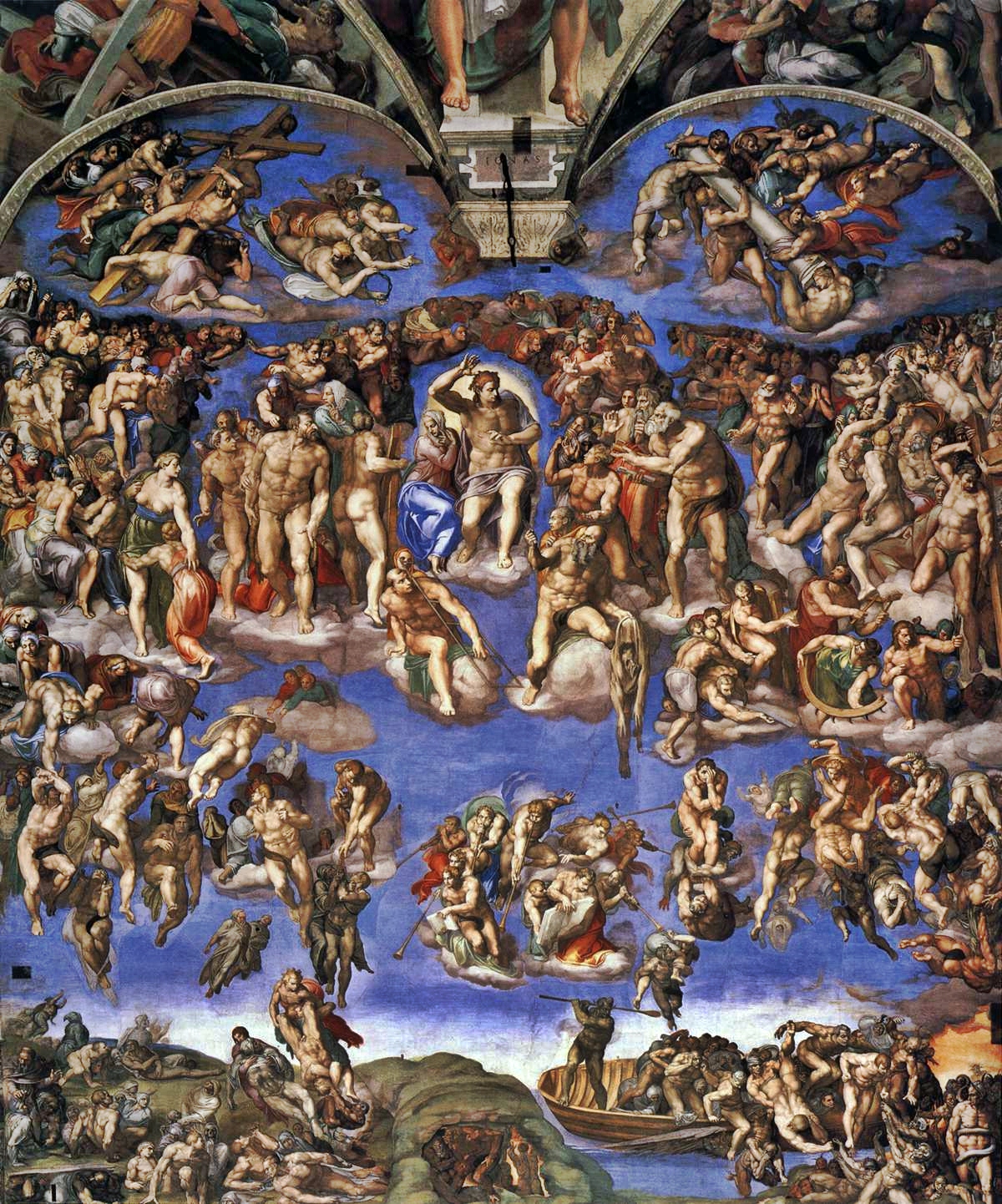
Michelangelo, Last Judgment, 1537-1541

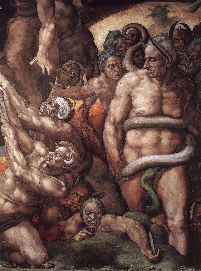
Next week, my students will be learning about Michelangelo’s “Last Judgment” fresco from the Sistine Chapel ceiling (shown above). I imagine that this is probably the most well-known story about censorship from the Renaissance period. Right off the bat, discontent was expressed at the nudity shown in the Last Judgment scene. (Side note: I think this complaint is a little strange, because there are plenty of other “Last Judgment” examples in art in which the damned are naked. Perhaps people really had issue with the fact that both the righteous and damned were fully-exposed?) Vasari records that when the Master of Ceremonies, Biagio da Cesena, saw the almost-finished painting and commented that the nudity made this painting more fit for a bath or a tavern than the pope’s chapel.1 Michelangelo, notwithstanding, decided to paint da Cesena’s portrait on a nude figure (see below). Da Cesana appears in Hell as the figure of Minos. Michelangelo even added some donkey ears, for some extra flair (and humiliation). Luckily (or perhaps unluckily) for da Cesena, Michelangelo covered the man’s genitals with a serpent.

Michelangelo, Last Judgment (1537-1541), detail of Da Cesena as Minos

However, the story of the Last Judgment and censorship doesn’t end there. During the meeting Council of Trent in 1563-1564, the indecency of the Last Judgment fresco was a topic of discussion. It was decided to that the painting should be modified so that the genitalia would be covered. (One can only imagine how Michelangelo must have felt if he heard the news; the artist died in February 1564.) Soon after, in 1565, the artist Daniele da Volterra was hired to paint bits of drapery over the nude figures. Unfortunately for Volterra, the commission had a negative effect on his career. Henceforth the artist was known as “Il Braghettone (“breeches painter” or “underclothes painter.”)

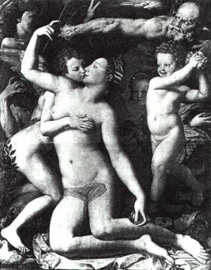
Censorship continued through the centuries. I’m particularly reminded of when Masaccio’s Adam and Eve (“Expulsion from the Garden of Eden”) were covered in the 17th century with little <ss>tutus</ss> vines (which were removed when the fresco was restored in the 1980s). And the austere Victorians also liked to cover up their subjects. I think one of the most interesting examples is Bronzino’s Allegory of Venus and Cupid (c. 1545). In the 19th century, Bronzino’s subjects were “made decent” with the help of a myrtle branch (placed over Cupid-the-Contortionist’s rear) and a clumsily-painted veil over Venus’ torso (see image below). Venus’ left nipple was painted out of Cupid’s grasp, too. Finally, Venus’ tongue was also painted out of the picture, so that her incestuous kiss would Cupid would be a little more, um, chaste. These modifications were removed when the painting was restored to its original state in 1958.

Bronzino, "Allegory of Venus and Cupid" (c. 1545) with 19th century modifications

It seems like there must be a demand or interest in the topic of censorship and art. A few days ago, a tweet alerted me to a relatively new program on BBC4, “Fig Leaf: The Biggest Cover Up in History.” You can watch a short introduction to the documentary on YouTube or watch the whole thing online. The film covers the history of the fig leaf in art, explaining when the fig leaf began to be used in Christianity. The show first explains how classical statues were shown in the complete nude, and one scholar explains how the small phalluses shown in Greek statues were seen as a symbol of restraint and control. (I didn’t know that!)

At one point in the documentary, a specialist explains how the fig leaf both covers the genitals but also draws attention to this area of the body (a similar effect, I think, to the Venus pudica pose). I think that’s a very good point. In many respects, one can argue that these “cover-ups” ended up having a reverse effect than what was intended. Even the outcries against nudity just cause people to focus on the naked figures even more.

Okay, now it’s your turn. What are some censored works of art that stand out in your mind? What are your favorite (or not-so-favorite) depictions of fig leaves?

1 Giorgio Vasari, The Lives of the Artists (translation by Julia Conway Bondanella and Peter Bondanella (London: Oxford University Press, 1991), p. 461-462.

2 You can read a little bit more about the censorship of the “Allegory of Venus and Cupid” at the short article entitled, ‘A ‘most improper picture.'”
— 7 Comments

Martin Luther King, Jr. and Barnett Newman

Barnett Newman, Broken Obelisk (outside Rothko Chapel), 1963-64

Since today is Martin Luther King Jr., Day, and since I just wrote about the Rothko Chapel, I thought it would be fun to write a short post on Barnett Newman’s Broken Obelisk.

One of the casts for this sculpture rests outside the Rothko Chapel, although art collectors John and Dominique de Menil originally intended this sculpture to be placed elsewhere in Houston. In May of 1969 (about one year after Martin Luther King, Jr.’s assassination), John and Dominque de Menil donated money toward the purchase of this sculpture, stipulating that it was to be placed near City Hall in Houston and function as a monument to Martin Luther King, Jr. And as you can imagine (considering the political and cultural climate in the South during the 1960s), the city officials were prompted to refuse a sculpture that would be dedicated to the civil rights activist. So, the de Menils decided to place the sculpture elsewhere.

In the fall of 1969, Barnett Newman was flown to Houston to choose a new location for his sculpture. He chose to place Broken Obelisk in a pool outside the Rothko Chapel (which was under construction at the time and was commissioned by the de Menils). The only minor difficulty? A house was in the chosen location. The de Menils bought the house and tore it down without a moment’s hesitation.1

I think this sculpture is a powerful and fitting tribute to Martin Luther King, Jr. The form conveys a lot of strength and power to me, not only in its solid pyramidal base, but also in the vertical orientation of the obelisk. At the same time, though, the pyramid and obelisk come together in a really delicate balance. To me, this delicacy not only suggests the frailty of human life (MLK’s life, specifically), but the tension that existed in the South during the Civil Rights Movement.

1 James E. B. Breslin, Mark Rothko (Chicago: University of Chicago Press, 1993), 483-84.

Comments Off on Martin Luther King, Jr. and Barnett Newman

Thoughts on the Rothko Chapel

A few days ago I was invited to speak to some students about my experience last month, when I visited the Rothko Chapel. Before visiting the Caravaggio show in Fort Worth, my family and I flew to Houston expressly to visit the Rothko Chapel.

My husband and I feel like Rothko would have approved of our pilgrimage to Houston. Before he had even received the commission to make the chapel paintings, Rothko had considered the idea of wayside chapels or one-man museums spread across the country. He liked the idea of having a person travel to a specific place (and even better, a place that was difficult to access) to see a work of art.1 That way, it seemed likely that the viewer would be more invested in seeing the specific art that was on display – as opposed to say, if the viewer happened to see some art within a gigantic museum or on the wall of a restaurant (cough – The Four Seasons in the Seagram Building – cough).

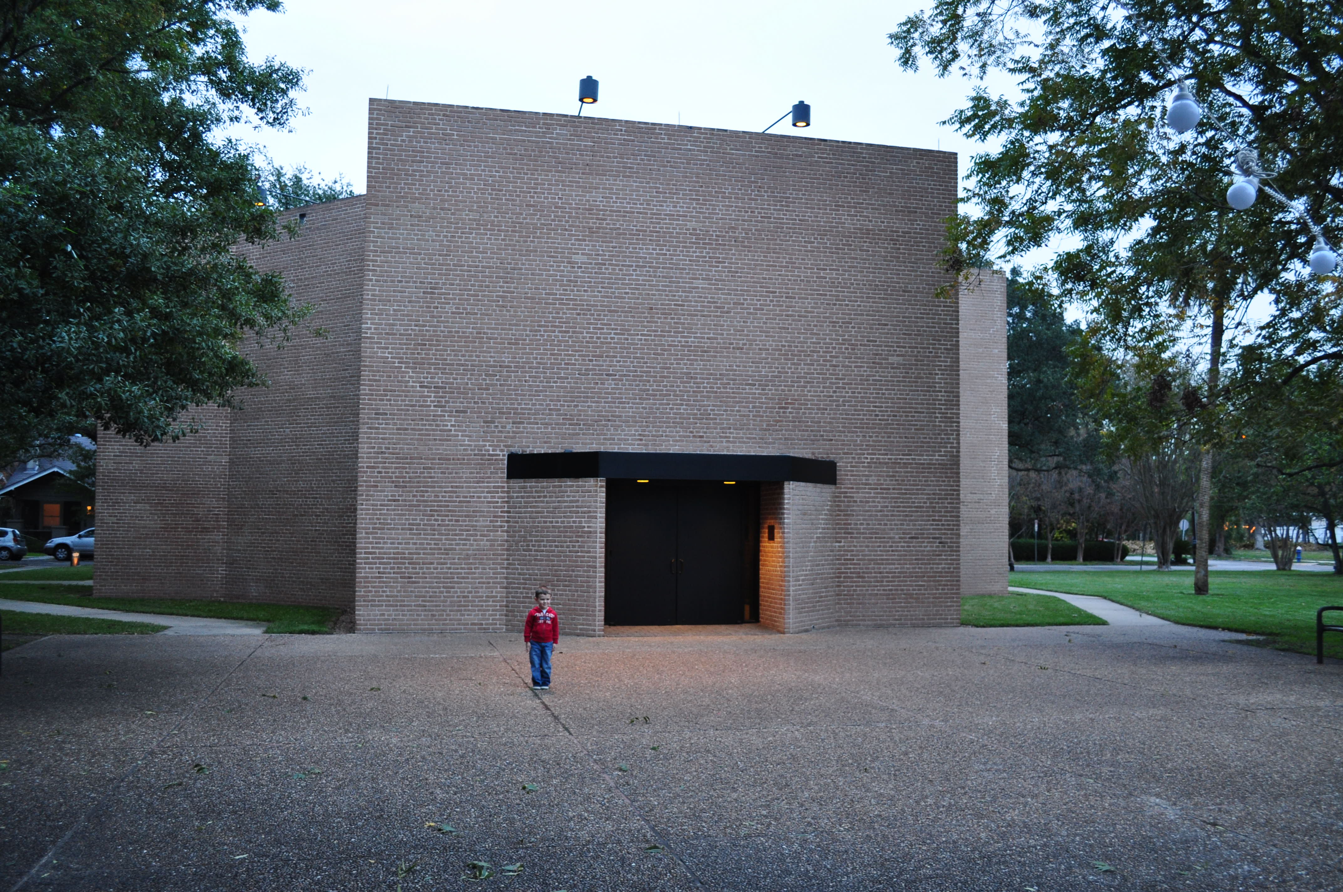
My little boy outside the Rothko Chapel (dedicated February 1971)

One of the main things that struck me about the exterior of the Rothko Chapel was the heavy masonry of the structure. I was immediately reminded of Byzantine churches and mausoleums in Ravenna like San Vitale and Galla Placidia. Only after visiting this chapel did I learn that Rothko wanted to have the structure of the chapel be a merge between architecture of the East and West. In fact, Rothko was particularly impressed with the Byzantine church S. Maria Assunta (near Venice). San Vital and S. Maria Assunta both have octagonal floor plans, too, similar to the Rothko Chapel.

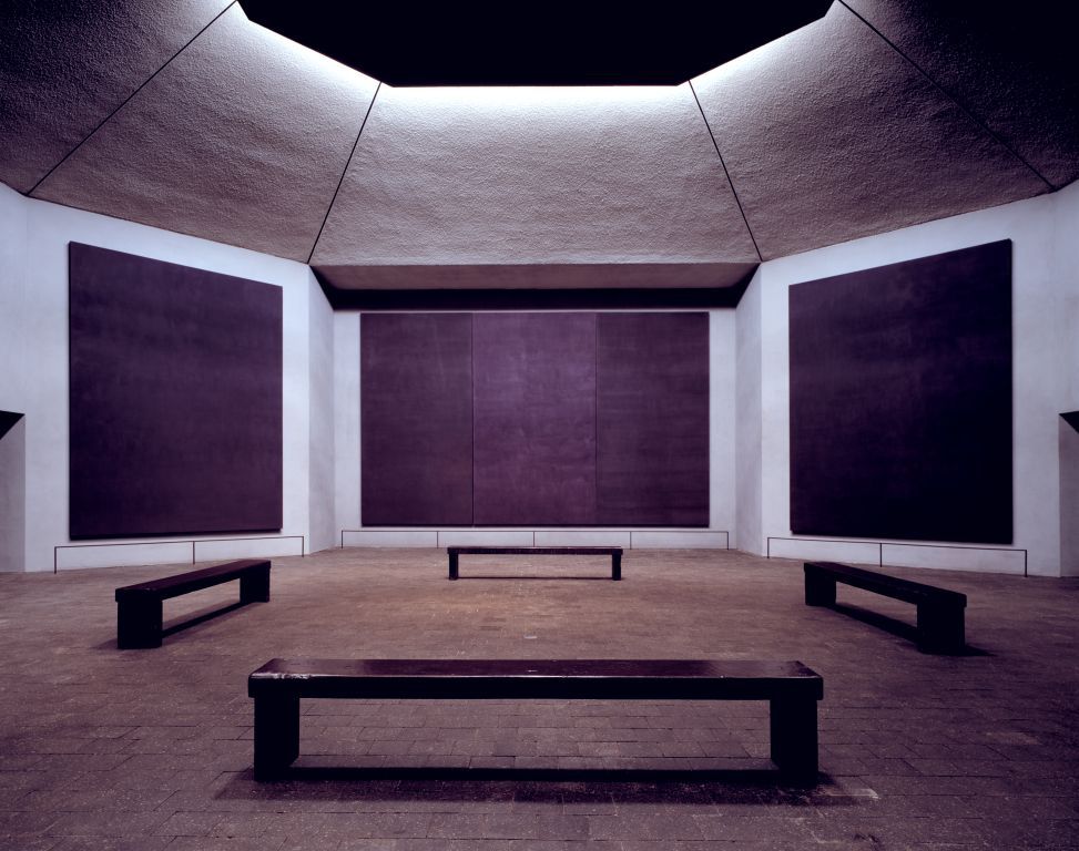
Interior of Rothko Chapel. Paintings created between 1964-1967

Upon entering the Rothko Chapel, I was confronted with an environment that was a little bit unique and unexpected. I was planning to be in a place that looked serene (like the image above) or perhaps even see someone meditating in front of Rothko’s purple and black canvases. That evening, though, the chapel was preparing to host a Christmas concert. There were a lot of instruments and chairs covering the chapel floor – and there was a piano tuner. For the whole time that my family and I were in the chapel (about fifteen minutes), the tuner played the same high-pitched note over and over and over. It was very distracting and frustrating, although there was something horribly ironic in hearing the repeated note and looking at fourteen large-scale canvases that have little variation (at least upon first glance).

I felt like the environment was both peaceful and oppressive – something that definitely was influenced by my friend the piano tuner, but I think that the paintings also contributed to this environment. Likewise, I also felt like the chapel both embraced and rejected history/context. The austere white walls and clean lines of the chapel fit well within the modern aesthetic, but other aspects of the chapel were very reminiscent of historical traditions. Even some of the panels were hung in a triptych form, which gave the suggestion of history and context. (In fact, this commission originally was intended for a chapel on a Catholic university campus.)

It was a rather interesting and yet somewhat conflicting experience in the chapel for me. But I suppose that is what Rothko would have liked me to experience. He was interested in the conflict created by the human condition, wasn’t he?

Have you ever been to the Rothko Chapel? What was your experience?

1 James E. B. Breslin, Mark Rothko (Chicago: University of Chicago Press, 1993), 464.

— 4 Comments

Email Subscription


Archives

About

This blog focuses on making Western art history accessible and interesting to all types of audiences: art historians, students, and anyone else who is curious about art. Alberti’s Window is maintained by Monica Bowen, an art historian and professor.