Saturday, December 3rd, 2011
Cathedral of Brasília as Postmodern
This past week I finished teaching a course on Brazilian Baroque art. On the last day of class, my students and I looked at examples of modern and contemporary Brazilian art. Taking many cues from Leopoldo Castedo’s book The Baroque Prevalence in Brazilian Art (1964), we discussed how Baroque stylistic characteristics can be observed in the Brazilian art that was produced in the 20th century.
Castedo’s book was written to highlight some of the continuities between Baroque stylistic characteristics and the modern architecture created in the new city of Brasília (the work of Lúcio Costa and Oscar Niemeyer). Castedo discusses this Baroque style as part of Brazil’s national identity. He asserts that the modernist architecture in Brasília is also inherently “Brazilian,” since he finds continuity between this 20th century style and that of the Baroque. Castedo’s Baroque (and therefore “Brazilian”) characteristics include a discussion of ideas such as audacity, intimacy, drama, and a tendency toward representing “the curve” in art.1
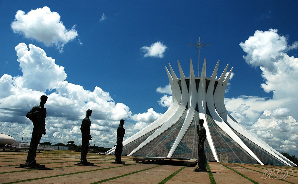
One of the structures that my students and I discussed extensively was the Brasília Cathedral by Oscar Niemeyer (see above). This structure, along with many of the other major structures in Brasília, were built by Niemeyer. (There are some great video clips discussing the history of Brasília and some of the problems that arose by creating this modernist city from scratch. I highly recommend watching “Brasilia, Brazil: BBC World Wonders” and the Brasilia segment from “The Shock of the New” with Robert Hughes.)
It’s easy to see how this cathedral fits within the aims of the modernist architectural style that was popular in the mid-20th century. The lines of the architectural buttresses are clean and precise. The white color is visually-striking, yet also self-effacing. I think that the same can be said for the large windows which are placed in-between the buttresses: these windows are supposed to contribute to the self-effacing, neutral, and even “invisible” aspects of the structure.2
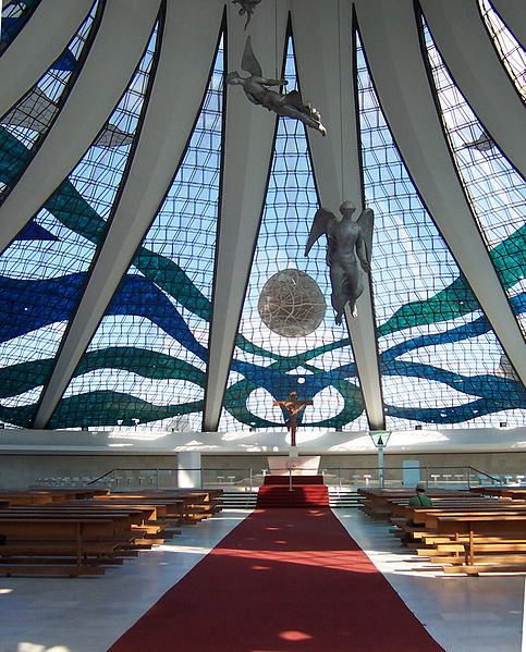
One of the things that I think is so interesting about this cathedral, though, is that the modernist aesthetic intended by Niemeyer has been completely altered. Perhaps this shouldn’t be surprising today, since we live in a postmodern world (which acknowledges context, surroundings, and place) instead of a modernist world (in which structures and works of art are self-contained). And the shift from a modern to a postmodern structure wasn’t too hard to do: the windows simply needed a little bit of color.
So, that’s what happened. The windows of the cathedral were stained in 1990, which I think completely altered the “feel” and aesthetic of this structure. This building can no longer function as a neutral, modernist structure. The windows draw too much attention to the architecture (and even the architectural framework) of the structure to maintain the aesthetic that Niemeyer originally planned. Instead, I think that the colored windows have turned the interior of the building into a postmodern space. The lines and colors highlight the architecture and setting, so that the visitor is continually aware of his/her setting and context.
Do I think that the colored windows are a bad thing? No, not necessarily. I think the colors and designs are pretty. And, in many ways, I think that the stained glass windows are much more appropriate in today’s postmodern world. But I do think it’s interesting how the modernist aesthetic (and the original intention of the architect) was changed with just a little bit of color.
1 See Leopoldo Castedo, The Baroque Prevalence in Brazilian Art, (New York: Charles Frank Publications, 1964). For one discussion on the “love of the curve,” see p. 118.
2 This idea of “invisible” architecture as part of the modernist movement has been explored by scholars, including Panayotis Tournikiotis, who discussed how modernist “architecture is a synthesis of visual and invisible elements.” I think this idea is also easily explained with the “white cube” modernist gallery space, which is intended to be neutral and highlight the works on display (instead of drawing attention to the architecture and surroundings).


Is the sphere or oval above the crucifix hung from the ceiling or is it painted on the window? Also, the floating angels seem more Baroque than anything else.
Frank
I have only just rediscovered your blog in its new format. Unfortunately it doesn’t upload on my blogroll when you write a new post, but I shall check in periodically.
Hi Frank! Yes, the circle is actually painted on the window. You can see a better image of the circle here. And you’re right: the angels do add a more “Baroque” atmosphere to the cathedral. The three angels in the cathedral were made by Alfredo Ceschiatti (with help from Dante Croce) in 1970.
Columnist, thanks for your comment. I’m sorry that my blog doesn’t upload in your blogroll. I’ll try to look into that on my end. Please check in with my blog periodically, nonetheless!
It reminds me of the chapel at the Air Force Academy: http://www.usafa.af.mil/information/visitors/cadetchapel.asp That was designed in 1959, so around the same time period.
Personally, I think the windows look great! They’re a wonderful reinterpretation of traditional stained glass windows.
Oh, I like that comparison with the Air Force Academy! I actually wasn’t familiar with that building. And I agree, heidenkind, these windows are a nice contemporary reinterpretation of traditional stained glass windows. The flowing lines and forms are really pretty.
M:
I did some checking and the windows are stained, not painted glass. Rather than being just pretty, I believe the artist meant to convey some meaning with the brown, green, and blue colored pattern. I would guess the brown represents earth; the green vegetation; and the blue water. If the artist was employing some kind of color symbolism, does that make the windows modern, post-modern, or traditional?
Frank
Hi Frank. I think you’re right. Portuguese writers sometimes use the words “painted glass” to describe stained glass (“vitrais”). I should have thought of that. After reading your comment I’ve looked at sources in English, several of which say that the glass is stained. I’ve edited my post accordingly. (If you happened to find a great discussion of her work at the cathedral in English, I’d be interested to see it.)
I think that the inclusion of stained/colored glass still makes this building quite postmodern. Postmodernism not only embraces physical context (like the setting and space within the cathedral), but also acknowledges historical context (like the tradition of stained glass in Western cathedrals). Even if Peretti did intend symbolism with her color choices, I think that this acknowledgment of symbolism and tradition would still place her work within a postmodern vein.
M;
Here’s a somewhat negative assessment of the later Niemeyer with a little bit on the windows. http://marvelousarchitectures.blogspot.com/2008/01/even-if-his-own-work-isnt-broken.html
Frank
It seems very modern to me, especially since the style of the design on the glass is abstract instead of representative. It looks like an amazing space, no matter how you interpret it – like being in an aquarium! I find it hard to imagine the windows with plain glass. It seems like it would have felt more exposed, especially in a bright sunlight.
The Catholic Cathedral in Liverpool has a similar concept – a teepee-like structure, and alternating glass and concrete. The concrete is ugly, almost brutal, but when you get inside the deep colors of the glass are really beautiful. The contrast of the earthly and heavenly, I suppose. http://www.liverpoolmetrocathedral.org.uk/
Hi Val! A lot of people have pointed out similarities between this cathedral and the one in Liverpool. The Liverpool Cathedral was built in 1978; perhaps it was influenced by Niemeyer’s earlier building (finished 1962).
I like your idea of the earthly and heavenly contrast with the Liverpool Cathedral. It sounds like an interesting structure to visit.