Wednesday, August 24th, 2011
Ancient Art: Formal Analysis Example
Note: The following post is intended to be a resource for my ancient art students. If you know of any good examples of basic formal analysis that are available online, please leave links in the comments section below! I would like to build up a list of resources for my students.
Formal elements are things that are part of the form (or physical properties) of a work of art: medium, line, color, scale, size, composition, etc. Formal analysis involves an exploration of how these formal elements affect you, as a viewer.
Formal analysis involves describing a work of art, but formal analysis goes beyond mere description. Instead, description is used as an agent to support the argument-at-hand. Although your essay will likely introduce a work of art with some general descriptions, the rest of your descriptions should be very pinpointed and with purpose. Make sure that such detailed descriptions are used to back up specific points of your argument. For this formal analysis assignment, your argument will revolve around some type of reaction to the work of art.
Your formal analysis should include some type of thesis statement that revolves around your reaction. To help you think about your own assignment and personal reaction, I have written a short sample of formal analysis below (and have underlined the thesis statement). Please also note that I am not basing my reaction on content (i.e. the subject matter, narrative, or symbolism), nor on historical context. Instead, I am focusing strictly on formal (visual or physical) elements:
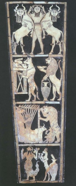
The front panel of the Great Lyre sound box (shown above) is an example of Sumerian art from the Ancient Near East.The panel is divided into four different registers. These registers contain four scenes with figures (mostly animals) involved in various activities. Despite the rather rigid compartmentalization of the four sound box scenes, the overall effect of the front panel of the Great Lyre sound box is one of energy and dynamism. Such energy can be seen in the color of the figures and in curvy compositional lines.
The sound box is comprised of two different colors, a dark black and a light tan. These colors are caused by the medium of the panel. Dark black is the color of bitumen, which is used for the background of the panel and lines. Light tan is the color of the inlaid shell that is used for the bodies of the figures and objects. The stark contrast of light tan against a dark background adds a sense of dynamism to the figures. The figures seem to glow and hum with life. Furthermore, these lightly-colored figures are pushed closer toward the viewer, away from the black background, which gives the figures a sense of presence and energy.
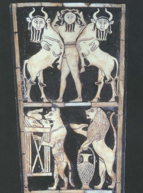
The composition of the figures also lends itself to this idea of energy. The figures fill the whole space of their respective registers and scenes, giving them a strong, energetic presence. In fact, some figures strain and twist so that their bodies can fill and fit within the register space. Such dynamic twisting is especially seen in the two bulls in the upper-most register (see image above). These bulls are symmetrically placed on either side of a central human figure, creating a “Master of the Animals” motif. The bodies of the bulls twist inward toward the human figure, and but their necks and heads twist outward and slightly downward. The theme of curves and energy is underscored in the beards and hair of these three figures: each lock of hair ends with a bouncy curl.
Energy can be seen in the curvaceous lines of other figures as well. In the second register from the top, the backs and tails of the hyena and lion are comprised of swooping lines. In fact, the lines of the lion’s back are reinforced and highlighted by swooping, short lines that suggest the lion’s bushy mane. While the lion’s mane swoops toward the center of the scene, the lion’s lower back curves in the other direction. These opposing compositional lines give the panel an added sense of energy and movement.
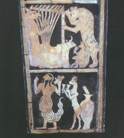
In the second register from the bottom, the back of the bear curves upward and downward in a lyrical, dynamic swoop (see image above). In fact, the whole body of the bear is placed at a more dynamic angle, since the bear is leaning toward the lyre placed on the left side of the scene. Some of the strings of the lyre curve upward toward the right, opposite the angle of the bear’s body, to add more opposing movement and dynamism to the overall composition.
The lowest register of the front panel contains some of the most dynamic curves and lines. The most obvious curve is found in the tail of the scorpion man on the left side of the scene. This tail curls and swoops upward, only to end with a stinger that loops downward. The shape and detail lines of the scorpion tail are also energetic. The tail is comprised of several oval shapes of decreasing sizes. These shapes are combined together to creating a visually dynamic, bouncy outline for the tail. Furthermore, the tail is full of energy because of the multiple lines that appear within each oval shape. These lines look a little like a maze or labyrinth; they visually reinforce the idea of movement through their repetition and interlocking layout.
The front panel of the Great Lyre sound box embodies energy in many ways. This energy can be seen not only because of the colors of the panel, but also through several compositional devices and lines. Such visual interest in energy is fitting for this piece, given that this sound box originally hummed with musical vibrations and the energy created by sound.
For further information about formal analysis, you may want to look at the chapter, “Formal Analysis” by Anne d’Alleva. Preview is available online here.


