Archive

June 2010

"The Kiss" and the 1889 Exposition

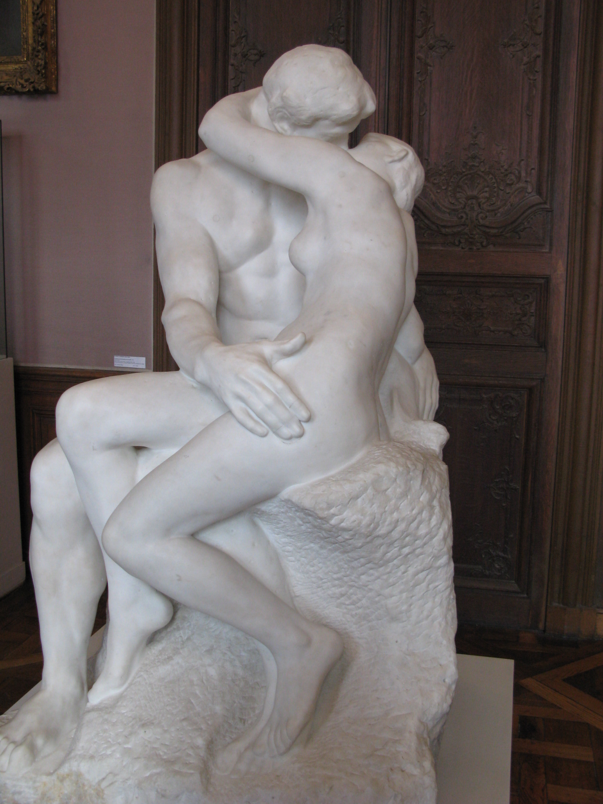
Did you know that a version of Rodin’s The Kiss (1888-89, shown right) was slated to be shown in the 1889 Exposition Universelle in Paris? The marble sculpture wasn’t finished in time (largely due to the serious illness of an assistant), which I think is really unfortunate. The Eiffel Tower was also constructed for the exhibition that year, which obviously ended up being the highlight of the world fair event. I wonder how The Kiss would have been received by the public, in comparison to the popular Eiffel Tower. Would people at the fair have loved it as well? (And what would Gauguin have said about it? Ha ha!)

I like to think about why this sculpture might have been chosen for the 1889 exhibition. What is it about this sculpture that would have been perceived as typically “French?” Obviously not the literal subject matter, since it was inspired by Dante’s Inferno. Perhaps the passion and love embodied in the piece appealed to the French culture? I think it’s likely that this sculpture was selected for both its artistic nod towards Classicism, and also its blatant disregard for proportions and perfection. This sculpture is indeed modern and innovative in that sense, and it definitely would have communicated that idea of French modernity to those who visited the fair.

Why do you think that the French might have wanted this sculpture in the 1889 Exposition Universelle? Why do you like (or dislike – *gasp!*) this sculpture?


The Kiss is one of the featured works of art in “The Private Life of a Masterpiece” BBC series. The episode of The Kiss is quite interesting, since it gives background on the copy of the The Kiss that now belongs to the Tate Modern. I didn’t realize that the Tate sculpture had spent time being 1) hidden under a tarpaulin (due to its scandalous subject matter) and 2) stored in a carriage house and placed under bales of hay or straw! If you’re interested, you can win a copy of this episode by entering my giveaway to receive a free DVD set of “The Private Life of a Masterpiece” BBC series.

— 8 Comments

GIVEAWAY! "The Private Life of a Masterpiece" DVD Set

Huzzah! I have a lot to celebrate this week. Not only has school just ended for the summer (I submitted grades on Monday), but two other momentous things have happened in relation to this blog. This is my 200th post and I recently received over 100 readers through at least one RSS feed. Hooray! Thanks for reading my art historical musings. In order to celebrate (and thank you wonderful readers), I wanted to hold a really fantastic giveaway. And I’m able to offer something very awesome: the complete seasons (a 7 DVD disc set) of “The Private Life of a Masterpiece” BBC series.

Trust me. This is a really awesome giveaway. Normally this series (which includes 22 episodes) is valued at $100.00, and I’m giving away a brand-new set for free. And I’m not the only person who enjoys this series: you can read about some great reviews on Amazon.com. I really like that this series has appeal for both art historians and newcomers to art. I’ve used clips from some of the episodes in my lectures, partially because the artistic images and details are fabulous.

I will be randomly selecting the winner (using this site) on June 30, 2010. So you have two weeks to enter this giveaway! You can enter your name up to four times. Here are the ways you can enter:
1) Leave a comment on this post!
2) Tweet about the giveaway (be sure to include my Twitter name: @albertis_window in your tweet, so I can find it). After tweeting, leave a comment on this post to let me know too, please.
3) Write about this giveaway on your own blog, and then include the URL in a comment on this post.
4) Become a follower of my blog (via Blogger – see sidebar on the left to join). Once you have become a follower (or, if you already are listed follower), leave a comment on this post.
Please make sure that you write a separate comment for each of your entries. I will write a post, announcing the winner’s name on June 30th. The winner will then have three days to contact me via email (albertis.window@gmail.com) in order to claim the prize and give a shipping address. If the winner does not come forth by that time, I will then randomly select a new winner.
In anticipation for the giveaway date, I’ll be writing intermittent posts about some of the works of art that are featured within these seven discs. Some of my favorite works are discussed in these episodes. If you want to see a list of the featured art, you can go here (note: the discs for this giveaway do not include any of the the Christmas or Easter specials).
Since this DVD is created for use in the United States and Canada, this giveaway is only available to readers who are located in these two countries. My apologies to readers who are overseas.
— 35 Comments

What the Palette Has to Say

A friend recently sent me a link to this Telegraph article, which discusses the palettes of several French painters from the 19th century. It’s a really interesting article, and it’s fun to see the how the methodology, artistic style, personality of an artist is revealed in his/her palette. Here are two examples from the article that I thought were especially interesting:

Seurat’s palette for La Grande Jatte (1884) was heavily ordered by Chevruel’s color theory (which was popular among Impressionist painters at the time). Look at how Seurat kept the colors on his palette rigidly organized.
Delacroix’s palette is especially interesting to me. I’ve never thought of Delacroix as being an extremely meticulous person, but look at how he orders and arranges his palette. In a way, this orderly arrangement reminds me of how Delacroix was extremely concerned with the composition of his paintings. I’ve always been struck with how the triangular composition of Liberty Leading the People (1830) is very well-considered, especially when examining the different gestures and lines that form the triangle.
Which artist’s palette do you like best? (Note: There are several other images of palettes in the article, not just these two.) What part of the article did you find most interesting?
— 3 Comments

Hallucinogenic Plant or Exploding Cucumber?

Over the past few weeks or so, there has been some fascinating discussion about Botticelli’s Mars and Venus (c. 1485).  I’ve tweeted about this a bit, but I wanted to write out some of the details about this discussion.

About two weeks ago, a Times article publicized a new argument that the plant located in the lower right-hand corner of Botticelli’s painting (underneath the hand of the satyr) could be datura stramonium, a plant which is known for its hallucinogenic properties.  In essence, this article suggested that Mars is swooning due to effects from this drug plant.

This news was picked up in several places in the art history community of blogs, including the Art History Newsletter (see here) and Three Pipe Problem (see original post here).  I’d encourage you to read the comments for both of these posts, so you can follow the different arguments and ideas that were presented to critique this argument for the hallucinogenic plant.  Hasan Niyazi from Three Pipe Problem researched the history of datura stramonium even further, and came to the conclusion that the plant depicted is actually quite different (see his fascinating findings here).  Instead of datura stramonium, Niyazi finds it more likely (and I agree) that the plant depicted is ecballium elaterium, commonly known as the “exploding cucumber” plant. For one thing, the plant depicted simply looks a lot more like an “exploding cucumber” than datura stramonium.  I also think the phallic shape and properties of this plant are unmistakable, which makes this plant a more appropriate fit for the Mars and Venus theme of love.

Congratulations to Niyazi on some great research!  This is a very convincing argument, especially since Niyazi can assert that the “exploding cucumber” would have been commonly found in Europe during Botticelli’s day (which cannot be confirmed for the datura stramonium).

Although it can be disappointing to realize that the painting may not contain a reference to drugs or hallucinogenics, I think it’s quite fun to know that an “exploding cucumber” could be located on the canvas instead.

— 4 Comments

A Herculean Emperor

This evening I was flipping through some textbooks on ancient art. I am currently developing curriculum for an introductory course on ancient art, and I am hoping to find a textbook which will enable me to teach the course through a case-study approach (similar to the other introductory course which is taught at my university). (That being said, if anyone has some textbook or curriculum recommendations, please let me know!)

Anyhow, while looking through one textbook, I came across an image of Emperor Commodus. The marble bust immediately caught my eye, since Commodus is represented as the god Hercules (c. AD 191-92, Capitoline Museum, shown right). I’ve seen Roman emperors to assume godlike characteristics (Augustus’ youthful statue from Primaporta (original dated ca. 20 BC) can be interpreted as a propagandistic statement – Augustus liked to advertise that he was the son of a god, since his father Caesar had been made a god after his death.) However, I’ve never seen another Roman emperor assume the lion skin and bear club of Hercules in portraiture. Commodus even carries the apples of Hesperides in his hands, which is a reference to one of Hercules’ most difficult labors.

Some sources list that Hercules was the particular patron of Commodus, while others go as far as to say that Commodus was thought to be a reincarnation of the god Hercules.1 It seems like Emperor Commodus was quite the character; he even fought in the arena in order to display his herculean strength and physical prowess.

Cassius Dio’s Roman History records that “a vast number of statues” were erected of Commodus dressed in Herculean garb. You can see an example of Commodus depicted as a young Hercules here. Cassius Dio also mentions that Commodus replaced Nero’s head on the Colossus statue with his own head, and then added a bronze club and lion to the statue so it would look like Hercules.

Commodus was pretty invested in maintaining his Herculean image, perhaps even to his detriment, since he didn’t seem to be a very good ruler. What about you? If you wanted to be depicted as a mythological god, who would you choose? I wouldn’t mind being depicted as Artemis/Diana.

1 For mention of Hercules as Commodus’ patron, see Marina Vaizey, Art: The Critic’s Choice

2 Cassius Dio, Roman History (published in Vol. IX of the Loeb Classical Library edition, 1927), available online here. If you’re interested in reading more about Commodus, I would suggest that you read the whole chapter located at the link.

3 Ibid. (New York: The Ivy Press Limited, 1999), 20.

— 8 Comments

Email Subscription


Archives

About

This blog focuses on making Western art history accessible and interesting to all types of audiences: art historians, students, and anyone else who is curious about art. Alberti’s Window is maintained by Monica Bowen, an art historian and professor.