Friday, October 30th, 2009
 Halloween is here and I can’t help but think of all the creepy, spooky art that exists. I think some of the creepiest art belongs to Goya’s “Black Paintings” series (1820-1823). These fourteen paintings were created during the period that Goya was recuperating from yellow fever. Some have interpreted these works as Goya’s response to constitutional freedom, but I think (along with many other art historians) there must have been a lot more personal, psychological motivations that inspired Goya’s work.1
Goya created the “Black Paintings” on the walls of his home, Quinta del Sordo (you can see a virtual tour here). Later, the paintings were transferred to canvas in the 1870s. The most famous painting in this series is Saturn Devouring His Children (shown above to the right). This painting refers to the classical story of Saturn, the king of the gods, who feared an prophecy which said that one of his children would overthrow him. In order to stop this from happening, Saturn ate each child upon birth (although you will notice that Saturn is eating an adult body in this painting). (You can read more of the mythological story here). With grim sarcasm, Goya painted Saturn Eating His Children on his dining room wall. Doesn’t it whet your appetite?
 Another creepy work from the “Black Paintings” series is Witches Sabbath (The Great He-Goat) (shown left). This painting shows a group of witches who have convened with the devil, who has assumed the form of a goat. Goya was obviously drawn to this subject matter, since he created a more light-hearted version of this subject earlier in 1789 (see here). I think the “Black Paintings” version is infinitely more spooky and ominous. I identify most with the figure of the little girl on the right, who seems resistant and apart from the frightening crowd.
The earlier 1789 version of Witches Sabbath was one of six paintings of witches and devils. Goya created these six paintings for the Duke and Duchess of Osuna. If the “Black Paintings” don’t convince you that Goya was interested in creepy subject matter, maybe two of these Osuna paintings will:
 The Bewitched Man
, c. 1798
(More information
here)
 Witches in the Air, 1797-98
I think this painting is freaky. (More information here)
Still not convinced that Goya liked creepy art? Then check out some of the lithographs from his
Los Caprichos series, which he created around the same time as the paintings for the Duke and Duchess of Osuna. You can see a few
here. Another one in the series,
“There is a lot to Suck” (Capricho 45), depicts a greedy witch with her mouth wide open. The witches are catching babies in a basket, in order to drink their blood. This superstition might be connected to abortion, since women who assisted with abortion were labeled as witches.
2
Are you spooked? Which work by Goya do you think is the creepiest?
Happy Halloween!
1 Priscilla E. Muller, “Goya, Francisco de“, in Grove Art Online. Oxford Art Online, http://www.oxfordartonline.com.erl.lib.byu.edu/subscriber/article/grove/art/T033882, accessed 30 October 2009.
2 Rose-Marie Hagen and Rainer Hagen, Francisco Goya: 1746-1828 (London: Taschen, 2003), 36. Available online here.
Tuesday, October 27th, 2009
 In an ideal world, I would have time to blog about whatever strikes my fancy. (Really, in an ideal world, I would get paid to blog about whatever strikes me fancy.) There are a couple of major events that have happened recently in the art world, but I haven’t had time to write about them (mostly because I get distracted by silly things like Giovanni Arnolfini’s red turban). Here are two news items that I’ve wanted to blog about, but haven’t had the chance:
– The recent attribution of a Leonardo da Vinci painting via fingerprinting (shown above). You can read about the story here and see a BBC video clip here. Heidenkind expressed some of her reservations about this new attribution, and I kind of feel the same way. I’m not sure if I’m ready to jump on the “La Bella Principessa” bandwagon yet.
– Earlier this month Egypt cut off ties with the Louvre due to an ownership dispute regarding antiquities. In order to maintain good relations, the Louvre quickly agreed to return five fresco fragments to Egypt.
I like to keep up-to-date with major/interesting art news on this blog, but I realize that it’s not feasible to write about everything (especially since I tend to get distracted and write about whatever I’m thinking about/researching). So, I’ve decided to start a Twitter account for Alberti’s Window. Please follow me. You also may have noticed that I’ve also uploaded a “tweet feed” on the left side of the blog page. I’ll tweet about interesting art news, short art history thoughts, and one-liner reviews of art exhibitions. It should be fun!
Friday, October 23rd, 2009
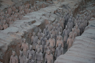
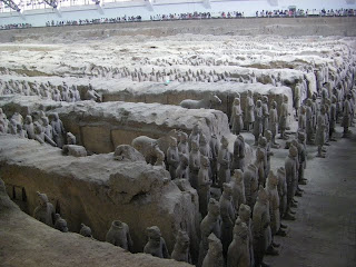
 My friend rachsticle just got back from a trip to China. I am really, REALLY jealous that she got to see the terracotta warriors at Xi’an. These warriors are placed to protect the tomb of the emperor Qin Shi Hugandi, who proclaimed to be the first emperor of China in 221 BC.
So, what’s the big deal about these warriors? Well, first off, it’s estimated that there are about TEN THOUSAND of them. These warriors were discovered in 1974, and over the past thirty-five years only about an eighth of the warriors have been excavated. Some of these underground vaults and pits are very hard to access (there are around 600 pits that cover a 22 square-mile area), but excavations are still in progress.
Huangdi arranged a mass-production project to create all of these warriors. Almost in assembly line fashion, artisans cranked out bodies and then customized them with ears, mustaches, hats, shoes, etc. Many of the figures appear strikingly individualized, but it’s not likely that they were modeled after real people. Instead, it’s more probable that the workers were instructed to represent different regional types of Chinese people.
If you don’t have plans to go to China soon, you could still see some of these statues in Washington DC. Next month, terracotta warriors will be on display in the National Geographic Society Museum, as part of an exhibition series which features the largest collection of these statues to ever leave China. You can read more about these statues and the upcoming exhibition in this Smithsonian article.
Sadly, I don’t have plans to go to China or DC in the near future. If you’re like me, then feel free to content yourself with some of rachsticle’s pictures (thanks, friend!):

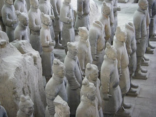
It appears that the artisans had different molds for body types.
Look at how some of the bodies are skinnier than others.
Monday, October 19th, 2009
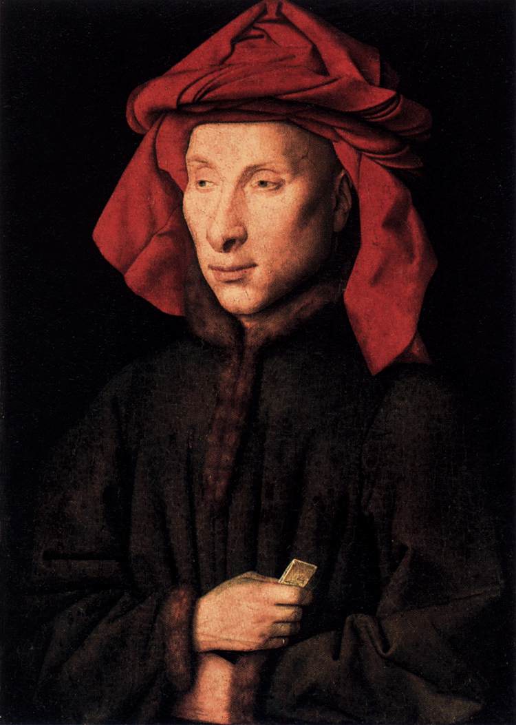
 Most people are familiar with Giovanni Arnolfini because of his infamous family portrait by Jan van Eyck (1434). But did you know that Jan van Eyck made another portrait of Giovanni Arnolfini? This portrait, shown above, dates c. 1435.
I’ve never thought that Giovanni Arnolfini was very attractive, and seeing this portrait has further solidified my opinion. But who knows? Maybe he had a great personality, right?
What really caught my attention, however, is that there is a striking similarity between this portrait and Jan van Eyck’s self-portrait, (commonly called Man in a Red Turban, 1433, see below):
 Notice the red turbans (which, technically, should be called chaperons) in each painting? I realize that this headgear was popular in the mid-fifteenth century (you can see more examples here), so I guess it shouldn’t be surprising that both men are portrayed this way. But there are other similarities between the portraits too, like the dark fur-lined coat and three-quarter profile view. Perhaps it isn’t coincidental that these portraits are only about two years apart. I wonder if Giovanni saw van Eyck’s self-portrait and then said, “Hey Jan, will you make me one of those too?”
Saturday, October 17th, 2009


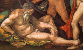
Last night I heard Gary M. Radke give a lecture on the Michelangelo’s Sistine Chapel ceiling (1508-1512). Radke pointed out an interesting similarity between two scenes on the ceiling, the
Creation of Adam (detail on left) and the
Drunkenness of Noah (detail on right). Both of these figures are positioned in the same manner, and Radke finds that to be quite significant.
In order to understand the significance, though, I should explain more about the program of the Sistine Chapel. The panels on the ceiling depict early moments in biblical history, which mainly focus on events around/during the Creation, Fall, and Flood. What is interesting, though, is that one who enters the chapel sees the panels in an anachronistic manner. In other words, the last panel, The Drunkenness of Noah, is the one that is placed over the entrance to the chapel (The Drunkenness of Noah is at the top of this image of the ceiling). As one walks further and further into the chapel, the biblical scenes go backwards in time, showing the Flood, then the Expulsion from the Garden, then the Creation of Adam. Scenes of the Creation appear at the other end of the chapel, culminating in God’s Separation of Light from Darkness (which is located over the altar).
Radke pointed out that it this reversed order is intentional. As one moves closer to the altar and celebration of the mass, one moves closer to God and closer to the moment of purity in the Creation. I think that’s beautiful symbolism; it is as if one moves closer to purity as he/she walks further away from the chapel doorway and the sin that exists in the world. That point is even further emphasized by the choir screen that bisects the length of the Sistine Chapel. The Creation of Adam is placed directly above the choir screen. Therefore, the visitor arrives at that depiction of purity and innocence as he or she walks through the choir screen partition.*
With all this in mind, it’s interesting to see a similarity between Adam and Noah. Noah is shown as a fallen, sinful, elderly man. In contrast, Adam represents the innocence, purity, and youth of the Creation. Yet the two figures are shown in the same position, which emphasizes that Adam and Noah also serve as broader symbols of humanity. I really like that.
*Granted, not everyone would have been able to walk through the choir screen. The lay people would have been expected to stay on the side of the screen which is closest to the doorway. (Too bad for them, huh? They would never be able to approach the pure, sinless moments depicted in the Creation scenes.) Nonetheless, one can still see how the choir screen fits into the program and symbolism of the ceiling.
 Halloween is here and I can’t help but think of all the creepy, spooky art that exists. I think some of the creepiest art belongs to Goya’s “Black Paintings” series (1820-1823). These fourteen paintings were created during the period that Goya was recuperating from yellow fever. Some have interpreted these works as Goya’s response to constitutional freedom, but I think (along with many other art historians) there must have been a lot more personal, psychological motivations that inspired Goya’s work.1
 Another creepy work from the “Black Paintings” series is Witches Sabbath (The Great He-Goat) (shown left). This painting shows a group of witches who have convened with the devil, who has assumed the form of a goat. Goya was obviously drawn to this subject matter, since he created a more light-hearted version of this subject earlier in 1789 (see here). I think the “Black Paintings” version is infinitely more spooky and ominous. I identify most with the figure of the little girl on the right, who seems resistant and apart from the frightening crowd.
 The Bewitched Man, c. 1798
 Witches in the Air, 1797-98
