Category

Northern Renaissance

Jan Van Eyck’s “Eve” from the Ghent Altarpiece

Jan van Eyck, detail of Eve from the Ghent Altarpiece, 1432

How I have missed blogging over the past several weeks! This school quarter is one of the busiest that I have experienced in my career, and I am rarely left with free time to blog or research. I have a lot of ideas for posts swirling in my head, though, so tonight I want to explore at least one topic.

Several weeks ago, near the beginning of the quarter, some of my students of Renaissance art asked some pointed questions about the practice of modeling in Northern Europe. One such question was: “Who posed for the figure of ‘Eve’ when Jan van Eyck painted the Ghent altarpiece?”

I had never considered linking a specific model/individual to that figure, nor had I thought much about the practice of modeling in the Northern Renaissance. I did a little bit of digging and made some inquiries to colleagues, and found some interesting information and theories about this figure.

Jan van Eyck, Eve from the Ghent Altarpiece, 1432

As far as I can tell from my research, we have no knowledge of the individual that posed for the figure of Eve. I asked my colleague SW (who specializes in Northern art) for her opinion, and she finds it unlikely that Van Eyck (or any Northern artist before Rembrandt) used a nude female model. In her opinion, it seems more likely that Van Eyck built up this female figure by looking at a nude male model (which, if this is true, makes this realistic image even more astonishing and impressive!).

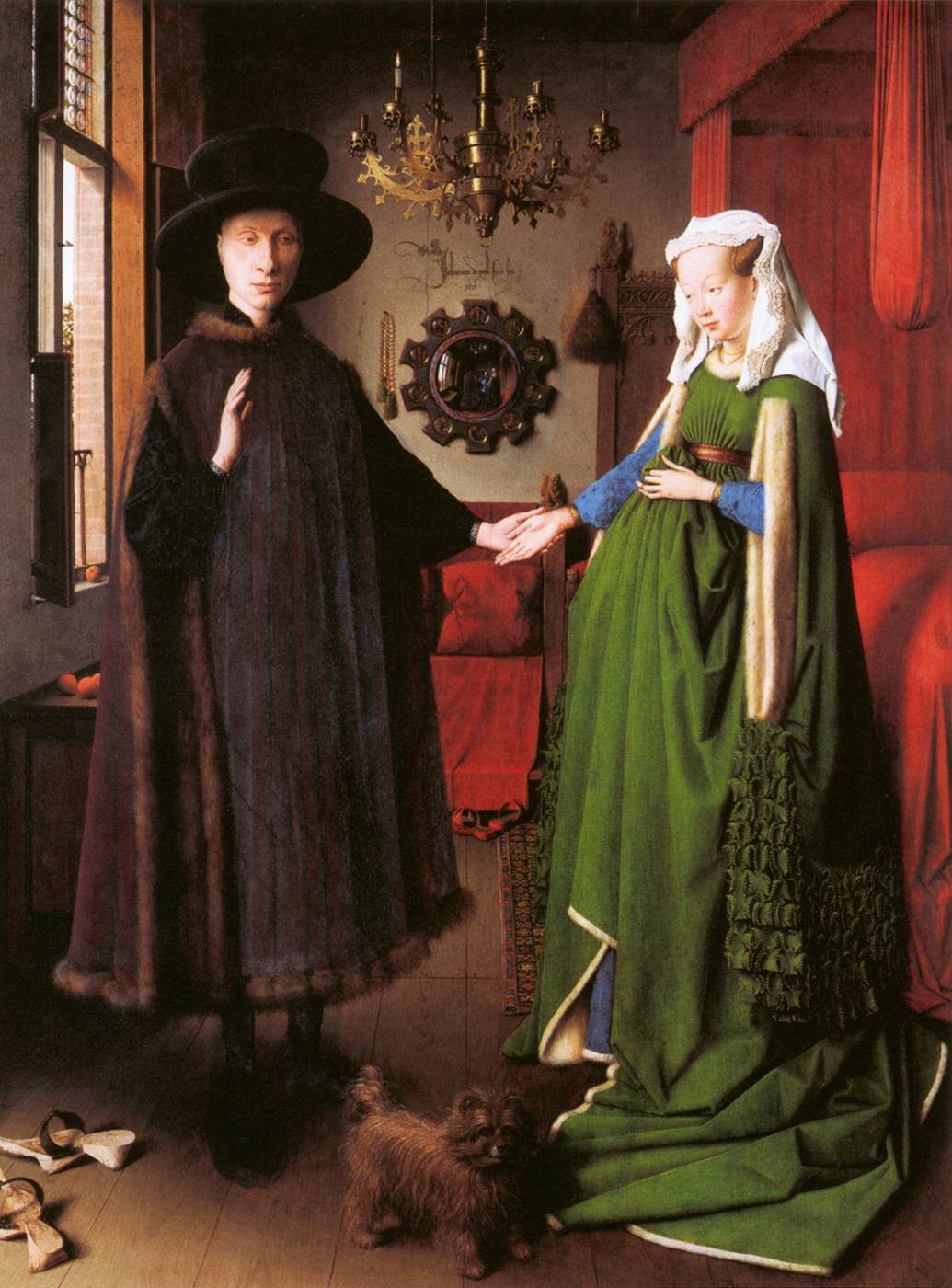
Thanks to an additional side comment from SW, I also have formulated another theory on this topic, too. I wonder if it would have been possible for Jan Van Eyck to have studied a clothed female model, at least in part (perhaps in addition to studying a nude male figure). In her book, Seeing Through Clothes, scholar Anne Hollander has argued that the exaggerated belly of Eve (and other bellies of women that are represented in Northern paintings) can relate to the clothing fashion of the day. While Hollander sees this exaggerated belly as an sign for beauty and refinement (which does make sense to me), I wonder if the exaggeration of the belly also could have been due to practical considerations (i.e. modeling while clothed). There are some similarities, for example, between Eve’s midsection and Giovanni Arnolfini’s wife, the latter being represented in a portrait by van Eyck while wearing fashionable green dress. Could a similarly-clothed woman have posed for the figure of Eve? It doesn’t seem like an impossible idea to me. I haven’t found much information on this topic (or the practice of modeling in Northern Europe) on my own, though. If anyone has ideas or suggestions for future research, please share!

Victor Lagye, Adam and Eve with Bear Skins (Copies of the Ghent Altarpiece), 1865

While checking up on this topic, I also was reminded that two copies of the Adam and Eve panels were created in the 19th century, although the figures of Adam and Eve were covered with bearskins in both copies. The copies which were intended for display at St. Bavo’s Cathedral (the original and intended location for the Ghent altarpiece) were created by Victor Lagye in 1865.1 If you consider Hollander’s argument regarding clothing and representations of the female body, in addition to my idea that a model might have posed for van Eyck while clothed, it seems almost ironic that bearskins were added to Eve’s body a few centuries later. In this case, Eve seems to be intrinsically linked to clothing, even without the additional skins.

1 Noah Charney, Stealing the Mystic Lamb: The True Story of the World’s Most Coveted Altarpiece (New York: Public Affairs, 2010), 115. 

— 7 Comments

Watercolor as Underdog

Albrecht Dürer, "Young Hare," 1502, watercolor and gouache on paper

One of the classes I’m teaching this quarter includes a lot of avant-garde art from the 19th and 20th centuries. Last week, a student observed that we haven’t been discussing watercolor paintings as a class. I thought this was a good observation, and responded that avant-garde painters often (but definitely not always) stick with oil and canvas as a medium. This reliance or insistence on oil makes sense for a lot of reasons. On one hand, avant-garde artists seemed to want to “reference” the tradition of oil painting while simultaneously establishing their “difference” from that tradition (to borrow two phrases from Griselda Pollock).

This comment about watercolor, though, has got me thinking. On a whole, I would say that watercolors are not highlighted or discussed very much in general art history textbooks (or in the artistic world at large). In some ways, I think this is a little surprising. Water-based paint has existed since prehistoric and ancient times. Several significant European painters also were interested in watercolor, like Albrecht Dürer (see above).

However, it seems to me that watercolor often has played second fiddle to other mediums, including oil paint. (Maybe it’s part of our human psyche to be reliant on all types of oil – hence the contemporary issues with oil drilling today! Ha!) In fact, in 1804 a group of disgruntled watercolorists banded together in Britain. These artists were upset that watercolor did not receive very high status by the Royal Academy (which had created a hierarchy of artistic mediums). One British watercolorist, William Marshall Craig, even felt compelled to debate the superiority of watercolor over oil painting.1

So, is watercolor really less pervasive of a medium than other types of paint (from a historical standpoint), or does our current view of history simply privilege other mediums? Do we not value watercolor as a medium very much? I haven’t come up with all of the answers (feel free to leave your own opinion), but here are some of the things that I’ve thought about:

  • Going back to the Baroque period, watercolor was used by artists for preliminary compositions, cartoons, or copies. (One such example is a kitchen scene by Jacob Jordaens, which happens to fit quite nicely with my recent post on meat and art). Perhaps watercolor has escaped a lot of attention because it is seen in connection with “unfinished” or “lesser” works of art.
  • Today art museums do not highlight watercolor as much, due to the fragile, light-sensitive nature of the medium. I remember a curator once telling me that watercolor paintings can only be displayed for a short period of time (six weeks?) before they needed to be taken down or rotated with another painting. Perhaps if watercolor paintings were inherently a little heartier, then they would receive more exposure (ha ha!) to the public eye?

John James Audubon, "American Stork," 1827-28, watercolor

  • Watercolor is also associated with things that are not strictly labeled as “fine art” (or, along these lines, “art for art’s sake”). For example, watercolor paintings often appear in naturalist field guides. The connection with watercolor and nature has been longstanding, perhaps reaching its zenith in the work of John James Audubon in the 19th century (see above).2
  • Avant-garde artists might have wanted to “reference” the longstanding tradition of oil painting (and perhaps better challenge the Academy by using a medium which was valued at the time?).

I’d love to hear other people’s thoughts on the topic. Do we need to write some revisionist history to include more watercolor painting? What watercolor paintings do you enjoy and/or feel like they deserve more attention? Are there watercolor paintings that you find to be historically significant?

1 William Marshall Craig put forth four arguments in defense of the superiority of watercolor paint. First, he finds that watercolor gets a brighter range of tones than oil paint (partially because the white of the paper produces a brightness that is unattainable in oil). Second, he argues that transparent watercolors allow for clarity and detail that cannot be achieved with oil. (I personally don’t completely agree with that point.) Third, watercolors do not change in appearance when they dry, which is different from oil. Fourth, he finds that watercolor is better for working outdoors, which is necessary with the increasing interest in naturalism. I think this last point is really interesting, especially since he made these arguments several decades before Impressionism. If painters had focused on watercolors a bit more, I wonder if Impressionism (or a similar movement to Impressionism) could have happened several decades earlier. Craig’s arguments are outlined in the book, Great British Watercolors from the Paul Mellon Collection (New Haven: Yale University Press, 2007), p. 2. Citation available online HERE.

2 Audubon is best known for his “The Birds of America” publication (1827-1838). The complete watercolor work of Audubon can be seen HERE.


— 12 Comments

A Meaty Post

I belong to a really fantastic book group. This month we have been reading The Sexual Politics of Meat: A Feminist-Vegetarian Critical Theory by Carol J. Adams. This book is really fascinating to me. It explores how meat consumption is related to patriarchal values; meat has longstanding associations with power, strength, virility, and wealth. Adams makes some interesting parallels with how the “masculine” consumption of meat is related to the sexual consumption and objectification of women, too. (You can get a sense of the parallels made between meat and women-as-meat in Adam’s slideshow.) There is a lot more to this book too, and I would highly recommend it to anyone interested in theory, literature, or the history of vegetarianism.

While reading this book, I continually thought of how meat is represented in art and visual culture. Although I have yet to read Adam’s other book, The Pornography of Meat, I feel like I’ve already come up with a substantial list. In many ways, the following representations of meat can also be related to patriarchy and power. I find it telling that the majority of the depictions of meat (that I have come across, at least) were created by men. And I also think it’s interesting that male artists like Rembrandt and Snyder (see below) decided to include women with the carcasses of dead animals. Are these artists merely referencing the fact that women have been delegated the responsibility to prepare meat (for male consumption)? I think we can we make deeper associations between what objects are construed for “the male gaze” in these images, especially from our modern-day perspective.

Rembrandt, "The Slaughtered Ox," 1655

Frans Snyder, "The Pantry," c. 1620

Along these lines of sexuality and male consumption, it is especially interesting to consider how Snyder depicted the maidservant with birds on a platter. The Dutch word “vogelen” (which means “to bird”) not only refers to fowl, but also to the sexual act. This painting, therefore, seems to reference worldly temptations or physical love.

Artists in the 20th century also were interested in exploring “meaty” subject matter. One work of art that immediately comes to mind is Francis Bacon’s Head Surrounded by Sides of Beef (1954, see below). As an air raid warden in London during WWII, Bacon saw many of the horrors of war (a grisly enterprise which, I think, can be interpreted in many respects as a “masculine” endeavor). With two slabs of meat flanking the sides of a ghostly figure, Bacon explores parallels between meat and death.

Francis Bacon, "Head Surrounded by Sides of Beef," 1954

Other 20th century artists have made some interesting parallels between meat and male consumption, including the Surrealist artist Meret Oppenheim. Her work, The Governess (see below) depicts a pair of stilletto heels (objects which can signify female sexuality and arousal). The heels are tied together and decorated with paper crowns – the type of decoration sometimes found on a leg of lamb or chicken.

Meret Oppenheim, "My Governess," 1936

One of the most influential works of art involving meat is Carolee Schneemann’s performance Meat Joy (1964). This performance, which is very aggressive and controversial, involved men and women who danced, rolled on the floor, and played with a mixture of raw flesh (e.g. partially-plucked bloody chickens, raw fish, and raw sausages). The sexual connections between meat and “pleasures of the flesh” are quite clear in the performance.

I also think that it is unsurprising that audience members would squirm during Meat Joy. After all, Schneeman is including bloody and partially-plucked chickens, something that relates to what Carol Adams calls the absent-referent. When people consume animals today, the flesh is usually cooked and modified (and sometimes given a different name than the actual animal, like “veal” or “beef”) to help obscure the reality that a once-living creature has comprised the meal. So, in essence, animals are absentreferents on the dinner table. They are there, but they are also not there. Schneeman’s aggressive reference to flesh and blood in her “happenings” performance restores the absent-referent, which undoubtedly contributed to why viewers squirmed.

Many artists have been influenced by Carolee Schneeman. In fact, in 2008 exhibition titled Meat After Meat Joy brought together the works of various artists who have explored different meanings between meat and flesh. (You can read one blogger’s take on the exhibition here.) One of the videos on display in this exhibition was Zhang Huan’s performance, My New York (2002, see below).

Zhang Huan, "My New York," 2002. Video still from performance.

Many of Huan’s performance works involve endurance and masochism. In this particular performance, Huan walked through New York wearing a heavy suit with actual pieces of raw beef. Looking like a “beefed-up” body-builder (which alludes to masculinity and virility!), Huan would occasionally release doves during the performance.  It was interesting to interpret this performance in a political light, given the recent 9/11 attacks.  The small figure of the artist (within the powerful, beefy costume) was a reflection on how America (and New York itself) were vulnerable – as a nation and as a city.

And finally – I can’t finish this post without a pop culture reference. Lady Gaga has clad herself in “meaty clothes” a few times, once in a meat bikini on the cover of Vogue Hommes Japan. Soon after, Lady Gaga also appeared in a “meat dress” at the 2010 Video Music Awards, complete with a steak on her head (see below).

Lady Gaga's "meat dress" at the VMA music awards, 2010

Although Lady Gaga said in an interview that her dress was a statement about fighting for rights (and asserted “I am not a piece of meat”), I can’t help but see how her dress just reinforces the associations with the masculine consumption of women (which other feminists, including Carol J. Adams, have observed). In this outfit, I think Lady Gaga is suggesting that she is available for consumption on two levels: to satiate sexual and physical hunger. And because of the associations with animals and meat, Lady Gaga seems to reinforce her sexuality by suggesting that she, too, is animalistic.

Any thoughts? Have I spoiled your appetite? (Sorry!) I’m curious to see what other depictions of meat are out there. Do you know of any more? I’m also reminded of Pieter Aertsen’s two works The Butcher’s Stall (1551) and Cook in Front of a Stove (1559). Another example is Van Gogh’s Still Life with Apples, Meat, and a Roll (1886).

— 15 Comments

The Sting of Love

Albrecht Dürer, “Cupid the Honey Thief,” 1514. Pen, ink, and watercolor on paper.

Happy Valentine’s Day! I thought that this year I would highlight slightly different theme: the sting of love. The material for this post formed over several weeks, partially due to some conversations on Twitter with H Niyazi (of Three Pipe Problem) and Agnes Crawford (of Understanding Rome). Our conversation was sparked by some discussion in one of my earlier posts, which examined whether Fragonard depicted a dolphin or a beehive in his painting The Swing (1767).

In some tweets, Agnes Crawford pointed out that cupid has been depicted with a beehive in many instances. As far as I have found, Dürer’s Cupid the Honey Thief (1514, see above) is the earliest known example of this subject matter in a Northern European context. This association between Cupid and the bee goes back to a fable which is found in the Idylls (which historically has been attributed to the Greek poet Theocritus, but such attribution is unsubstantiated). In this little story, Venus compares her son to a bee and laughs, “Are you not just like the bee – so little yet able to inflict such painful wounds?” Here’s a translation of Idyll XIX:

When wanton Love designed to thieve,

And steal the Honey from the Hive,

An impious Bee his Finger stung,

And thus reveng’d the proffered Wrong.

He blew his Fingers, vex’d with Pain,

He stamp’d and star’d, but all in vain;

At last, unable to endure,

To Venus runs, and begs a Cure,

Complaining that so slight a Touch,

And little Thing, should wound so much.

She smil’d, and said, how like to thee,

My Son, is that unlucky bee?

Thy self art small, and yet thy Dart

Wounds deep, ah! very deep the Heart.

You can see an older English translation of the poem here. A similar poem by Anacreon (which is more witty, in my opinion) is found here.

It seems that this story was especially popular in Germany during the Renaissance. Two Latin translations of “Idyll XIX” were published in 1522 and 1528.1 One such translation copy was made by the humanist Johann Hess, who included the manuscript note “Tabella Luce” (“Picture by Lucas”). It is possible that Hess was referring to a painting by Lucas Cranach the Elder. Cranach made his first version of Cupid and the Bee story in 1526-27. Some estimate that Cranach made at least twenty-five versions of this subject matter. Here are a few of my favorite Cranach variations on this theme:

Lucas Cranach the Elder, “Cupid Complaining to Venus,” 1526-27. National Gallery of Art, London.

Lucas Cranach the Elder, “Venus with Cupid Stealing Honey,” 1527. Metropolitan Museum of Art

Lucas Cranach the Elder, “Venus and Cupid with a Honeycomb,” c. 1531. Borghese Gallery.

Want to see another version by Cranach? Here’s Venus and Cupid (1531) from the Musées Royaux des Beaux-Arts, Brussels. (And if you know of another version, please share in the comments!) It seems like this type of painting was so popular during Cranach’s day because of the moralizing message (which fit with Protestant sensibilities): there is no pleasure without pain.

That being said, I hope that your Valentine’s Day (with your own honey!) is more pleasurable than painful. But if this doesn’t end up being the Valentine’s Day of your dreams, never fear. Cupid can commiserate with you about the sting of love.

1 You may have noticed that the Latin translations I mentioned actually post-date Dürer’s 1514 watercolor by almost a decade! Dürer undoubtedly became familiar with this poem through his friend Willibald Pirckheimer, and even provided illustrations of a text (thought to be by Theocritus) for his humanist friend. 

— 8 Comments

Let’s Reconsider (and Republish on) the “Well of Moses”

Claus Sluter, detail of David and Jeremiah from the "Well of Moses," 1395-1406. Chartreuse de Champol, Dijon. Image courtesty simonsara via Wikipedia.

I didn’t plan on spending my winter break rooting out an error in Stokstad’s Art History textbook. I promise! I just happened upon this error when looking for more information about the lost Calvary composition, which was originally part of Claus Sluter’s “Well of Moses” (1395-1406). In truth, the “Well of Moses” originally served as a base for a large sculptural composition, which included a crucifix. Today’s “Well of Moses” is just a shadow of the original work produced by Sluter. On a side note, you may find it interesting that the “Well of Moses” is a relatively recent nickname for this work of art, having first been used in the late 18th century. Instead, early sources refer to this monument as “The Cross” or “The Great Cross.”From what I can gather, the original crucifix composition largely was destroyed in 1791, during the French Revolution. One can get a general sense of how the “Well of Moses” appeared by looking at a 16th century copy that is located at the Hôpital Général in Dijon, although there are no figures included with the Calvary scene (see below).

Copy of the "Well of Moses" group, 1508, Hôpital Général, Dijon. The cross is a nineteenth century reconstruction. Image available on Wikipedia via Christophe.Finot

Anyhow, Marilyn Stokstad’s recent art history book points out that that the Calvary group on top of the “Well of Moses” included three figures at the base of the crucifix: the Virgin Mary, John the Evangelist, and Mary Magdalene.2 In the mid 19th century, a model of the Well of Moses was created by Joseph Moreau which showcased these three figures at the base of the crucifix. (It should be noted that sculptural fragments of Christ and Mary Magdalene both exist, but there never have been any fragments found of John the Evangelist or the Virgin Mary.)

I am disappointed that Stokstad’s Art History does not take recent research on the “Well of Moses” into account. A study published in 2005 reveals a very different (and unexpected) result of the crucifix composition. As part of a three-part series of articles on the “Well of Moses,” Susie Nash (of the Courtauld Institute) points out that the Calvary composition only depicted one figure at the base of the cross: Mary Magdalene.3 During the relatively recent restoration of the “Well of Moses” (a fifteen year project that ended in 2004), Nash was able to analyze the top of the “Well of Moses,” including the original mount for the crucifix. Nash also analyzed the remaining fragments from the Calvary composition, too, including the arms of Mary Magdalene. Nash concluded that the composition of the remaining base and extant fragments reveal that only one figure was located at the base of the cross. She also concluded, based on the fragments of the Mary Magdelene figure’s arms, that the Magdalene was originally embracing the foot of the cross. She supports her argument which archival evidence too, including an 18th century drawing of the Hôspital Général “Well of Moses” copy (see below).

Maurice Bauthélier, "La Belle Croix," c. 1760. Drawing of the 16th century copy of the "Well of Moses," located at the Hôspital Général in Dijon

Although there are some problems with this 18th century drawing (the figure depicted has short locks instead of the flowing, long hair of the Magdalene), it seems pretty obvious that the crucifix composition did not originally include figures of the Virgin Mary and John the Evangelist. (Nash concludes her 2005 article by promising to discuss later how the crucifix itself also appeared differently than usually supposed. This topic ended up being the premise for the article, “Claus Sluter’s ‘Well of Moses’ for the Chartreuse de Champol Reconsidered: Part II,” published by Nash in July, 2006.)

In some ways, perhaps I shouldn’t be too hard on Stokstad for mentioning three figures at the crucifix base instead of just one. Nash herself points out, “The belief that Sluter’s Calvary had three figures is so entrenched in the scholarly literature of the last 160 years that their existence has never been questioned.”4  But, as I have said before, I do feel like such a major art history textbook should be better at keeping up with current scholarship. Is Stokstad’s Art History so confidently “entrenched” that it doesn’t feel the need to include groundbreaking ideas? Omissions like Nash’s scholarship on Sluter reinforce to me that Stokstad’s book is not “the most…inclusive art history text on the market.” Although I think there are some great things about that textbook, I don’t think that Art History should be the art historian’s bible.

P.S. Don’t forget that my giveaway on the Irene Duclos book ends tomorrow!

1 Susie Nash, “Claus Sluter’s ‘Well of Moses’ for the Chartreuse de Champol Reconsidered: Part 1,” The Burlington Magazine 147, no. 1233 (December, 2005): 798. Article available online on Nash’s faculty webpage. I have translated the contemporary sources from French, which read “la croix” or “la grant [sic] croix.”

Marilyn Stokstad and Michael Cothren, Art History, vol. 4 (Prentice Hall, 2011), p. 564.

3 Nash, 799, Susie Nash also has two other publications on the Well of Moses, which were published in The Burlington Magazine in July 2006, pp. 456-67 (Part II) and November 2008, pp. 724-741 (Part III). These two articles are also available on Nash’s faculty webpage.

4 Ibid., 799.

— 3 Comments

Email Subscription


Archives

About

This blog focuses on making Western art history accessible and interesting to all types of audiences: art historians, students, and anyone else who is curious about art. Alberti’s Window is maintained by Monica Bowen, an art historian and professor.