Category

contemporary art

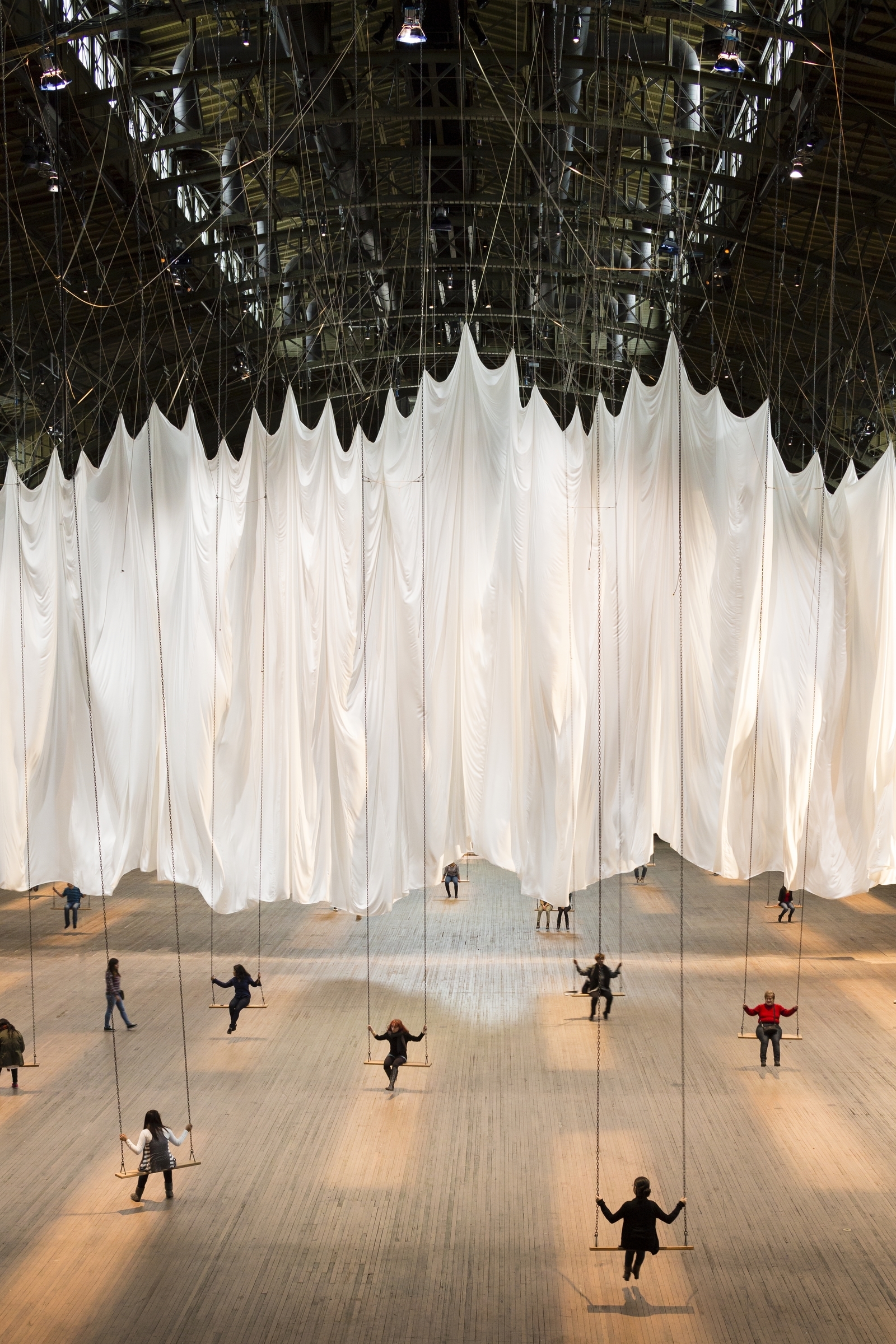
Cai Guo-Qiang’s “Inopportune: Stage One”

Cai Guo-Qiang, "Inopportune: Stage One" (2004). Current display at Seattle Art Museum

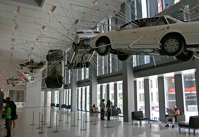
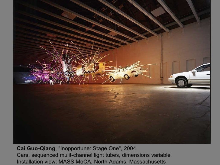
Cai Guo-Qiang, “Inopportune: Stage One” (2004). Current display at Seattle Art Museum

Last Friday, when I heard about the terrorist attacks in Paris, I couldn’t help but think of Cai Guo-Qiang’s Inopportune: Stage One (2004) which is on display in the Seattle Art Museum. Guo-Qiang first created this installation in 2004 for the Mass MoCA (it also was displayed at the Guggenheim in 2008). Nine Ford Taurus cars are laid out in a sequence, but the overall effect is to give the suggestion of one car that is flipping through the air (although time is standing still, so the viewer sees “freeze frame” shots of the car suspended). The first and the ninth car are placed on the ground, suggesting the beginning and end of motion, as well as the beginning and ending of an event: the exploding of a car bomb.

Cai Guo-Qiang, "Inopportune: Stage One" (2004). View of 2004 installation at MASS MoCA

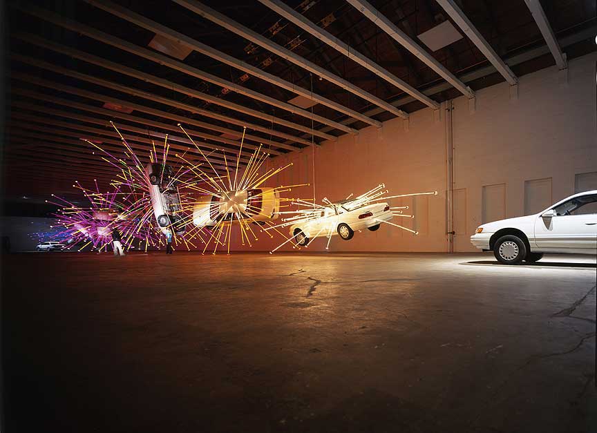
Cai Guo-Qiang, “Inopportune: Stage One” (2004). View of 2004 installation at Building 5 of MASS MoCA

Lights emanate from most of the cars, but the colors change as the cars flip through the air. The first few cars have lights from all different colors, which have been compared to fireworks.1 (As a Chinese artist, perhaps Guo-Qiang is connecting to his heritage by alluding to Chinese fireworks.) However, the last few cars (numbers seven and eight in the sequence) emanate different colors: blue, indigo, and purple. (I actually prefer the Mass MoCA installation setup for this reason, because you can best see how the colors of the lights change.) These colors suggest that the impact and heat of the bomb are dying out, as the explosion ends.

Guo-Qiang is a New Yorker, and he was deeply impacted by the terrorist attacks September 11, 2001. Inopportune: Stage One is a reference to 9-11 and also a reference to the world as it exists today (as the result of the events of 9-11).2 So, when I heard about the attacks in Paris, I couldn’t help but think of how this installation embodies the turmoil and upset that is still taking place because of terrorism. I also feel like this installation also can embody an element of hope and perspective too, since the cars and lights are suspended and presented in a beautiful and lyrical way:

“We live in a world full of terror, of discussion and fear of terror. However, if you present only that, you are not providing a perspective. What if it is also something that is very beautiful and dreamlike? Does that reflect something? I always come back to this point: that art ought not to just restate what we know and how we live, it must provide a perspective, a distance.”3 – Cai Guo-Qiang

Ironically, I received notification just this afternoon that Inopportune: Stage One is going to be taken down from its permanent installation in the Brotman Forum at the Seattle Art Museum, starting soon after the beginning of the new year (January 2016). I’m torn about this decision, especially since I feel like the sentiment behind this installation, both in referencing terror and spreading beauty, is more poignant and needed than ever.

This evening, though, I wondered if maybe the visuals of this installation need to be altered to fit with today’s situation. I heard a segment on the radio saying that in years to come, we may look back and say that “The War on Terrorism 1” began in 2001 with an American initiative, and that “The War on Terrorism 2” began right now, in 2015, with the European response. Sadly, time will tell if this is the case. But this makes me wonder if a new installation of Inopportune would be appropriate, with perhaps Renault or Citroën cars suspended in the air.

1 Seattle Art Museum, “Inopportune: Stage One.” Accessed November 18, 2015. http://www1.seattleartmuseum.org/eMuseum/code/emuseum.asp?style=single&currentrecord=1&page=search&profile=objects&searchdesc=Number%20is%202006.1&searchstring=Number/,/is/,/2006.1/,/0/,/0

2 Ibid.

3 Guggenheim Museum, “Cai Guo-Qiang, I Want to Believe.” Accessed November 18, 2015. http://www.guggenheim.org/new-york/education/school-educator-programs/teacher-resources/arts-curriculum-online?view=item&catid=727&id=93

— 1 Comment

Chuck Close and Jackson Pollock

Jackson Pollock, "Sea Change," 1947. Artist and commercial oil paint, with gravel, on canvas, 57 7/8 x 44 1/8 in. (147 x 112.1 cm). Seattle Art Museum

Jackson Pollock, “Sea Change,” 1947. Artist and commercial oil paint, with gravel, on canvas, 57 7/8 x 44 1/8 in. (147 x 112.1 cm). Seattle Art Museum

Tonight I learned an interesting connection between Chuck Close, Jackson Pollock, and the Seattle Art Museum. In a 2008 interview, Close explained that at an early age, he was influenced by Jackson Pollock’s drip paintings. Close said, “I went to the Seattle Art Museum with my mother for the first time when I was eleven. I saw this Jackson Pollock drip painting with aluminum paint, tar, gravel and all that stuff. I was absolutely outraged, disturbed. It was so far removed from what I thought art was. However, within two or three days, I was dripping paint all over my old paintings. In a way I’ve been chasing that experience ever since.”1

I can’t find an indication of which Jackson Pollock painting Chuck Close saw, but I think that there is a chance that it might have been Sea Change by Jackson Pollock (1947, shown above). This painting was acquired by the Seattle Art Museum in 1958, but previously it was exhibited in 1955 at the SAM in a show called “Contemporary Trends in International Art” (April 7 – May 1, 1955). Since there is some uncertainty as to Chuck Close’s exact age when he saw a Pollock painting in the Seattle Art Museum (see first footnote), I want to propose that Sea Change is a viable possibility for the painting that influenced Close so much, even though Close would have been almost fifteen years old at the time (not eleven).

When Chuck Close was eighteen, Sea Change (1947, shown above) entered the Seattle Art Museum’s permanent collection as a gift from Peggy Guggenheim. A fascinating side note: I found an fascinating transcript of the oral history of Edward B. Thomas, who used to work as a curator for the Seattle Art Museum. Thomas recounts his involvement in the museum’s acquisition of the painting Sea Changby Jackson Pollock. The painting was given to the museum as a gift from the art collector Peggy Guggenheim, under some very unusual circumstances. In essence, Edward Thomas was invited to dinner at Peggy Guggenheim’s palazzo in Venice, along with another dinner guest who appears to have been overbearing and rude. As a result, Peggy took a shine to the curator from Seattle, and at the end of the evening offered to let him select one of the Jackson Pollock paintings from her collection as a gift! Perhaps the Edward Thomas was drawn to selecting this Pollock, since it had just exhibited in Seattle a few years before? It seems likely to me.

Even if Sea Change wasn’t the painting that influenced Close as an adolescent, it is certain that Chuck Close would have seen this Pollock when it entered the museum collection. Close went to college in the Seattle area and even exhibited at a show for Northwest artists at the SAM in 1959.2

I feel like Jackson Pollock’s influence perhaps wasn’t keenly present in the middle of Close’s career, when he focused on creating hyperrealistic portraits like Mark (1978-79). However, I think in more recent decades the painterly quality of his portraits, which include swaths and swirls of color, could perhaps tap into Close’s early interest in Pollock:

Chuck Close, "Emma," 2000. Oil on canvas

Chuck Close, “Emma,” 2000. Oil on canvas

I’ve written elsewhere on this blog about Close’s change in style during his later years, which in some ways can relate to the fact that he is now bound to a wheelchair and suffers from a partially-mobile painting hand. And now, while considering Close’s interest in Jackson Pollock, I like to think that Close is somehow indirectly inspired by his predecessor’s “action painting” more than ever, despite his own recent limitations in physical mobility. Go Chuck!

1 Phong Bui, “Chuck Close with Phong Bui,” The Brooklyn Rail, July 7, 2008. Available online: http://brooklynrail.org/2008/06/art/chuck-close-with-phong-bui. Elsewhere, another online source indicates that Close was fourteen (not eleven) when he saw the Pollock paintings, whereas another biography indicates Close probably saw the Jackson Pollock in 1953 (when he was thirteen).

2 Robert Storr, Chuck Close, Kirk Varnedoe, Deborah Wye, Chuck Close (New York: The Museum of Museum of Modern Art, 1998), p. 203. Available online HERE.

— 1 Comment

Wayne Thiebaud and Jim Gaffigan

Wayne Thiebaud, "Three Donuts," 1994. Oil on canvas, 11 x 24 in. (27.9 x 35.6 cm.)

Wayne Thiebaud, “Three Donuts,” 1994. Oil on canvas, 11 x 24 in. (27.9 x 35.6 cm.)

I’ve been thinking about Wayne Thiebaud’s paintings today, mostly because I have eaten way too many chocolate doughnuts over the past few days. Thiebaud doesn’t have as many paintings of doughnuts as he does of cakes and other sweets, but he does have a few (such as the one shown above, or this one of doughnuts and cupcakes).

The thing that I love most about Thiebaud’s paintings of desserts is his handling of the paint itself. Thiebaud applies the paint thickly; it almost feels like he’s painting with frosting itself (see detail below). The desserts have a true sense of tactility, which I think makes them seem even more desirable as tasty treats! (I guess it’s a good thing that Cookie Monster didn’t see a Thiebaud painting in when he visited art museums in New York earlier this year, or he would have tried to eat it!)

Wayne Theibaud, detail "Folsom Street Fair Cake," Crocker Art Museum, 2013. Image courtesy torbakhopper via Flickr and Creative Commons License

Wayne Theibaud, detail “Folsom Street Fair Cake,” Crocker Art Museum, 2013. Image courtesy torbakhopper via Flickr and Creative Commons License

Thinking about Wayne Thiebaud has also reminded me of Jim Gaffigan’s standup comedy, which often is about his love of delicious-yet-unhealthy food. Gaffigan must not have been aware of Thiebaud’s art before he made his joke about artists and still life paintings. This is what Gaffigan says in his show Obsessed about fruit (a healthy type of food that he dislikes!):

“…we haven’t wanted [to eat] fruit for hundreds of years. That’s why there’s so many paintings in museums of just bowls of fruit. Because you could start painting a bowl of fruit, you could leave for a couple of days, come back, and no one would have touched the bowl of fruit. But if you’re painting a doughnut? You better finish it up in the first sitting! You can’t even take a bathroom break – ‘Hey, what happened to my doughnut?’ Your friends are [like], ‘Oh, some fat guy came in here! Anyway, I’m going to get some milk and take a nap.’ That’s why there’s no doughnut art. It’s sad, really. When’s the last time you saw a painting of a doughnut?” (Audio clip of Obsessed found HERE, starting at 2:34).

To be fair though, it’s good to acknowledge that Wayne Thiebaud paints his doughnuts and cakes “from his imagination and from long-ago memories of bakeries and diners.”1  So, maybe Thiebaud just likes to eat doughnuts and cakes too, and he doesn’t have the patience to study them! Thiebaud does, however, also paint from life: he paints human figures (such as his wife Betty Jean, who is shown on the left in Two Kneeling Figures), and also sketches California landscapes outdoors and then returns to his studio to paint.

Anyhow, do you know of other images of doughnuts, cakes or other treats in art, besides those by Thiebaud? I thought of a few:

1 Cathleen McGuigan, “Wayne Thiebaud Is Not a Pop Artist!” Smithsonian (Feburary 2011). Available online: http://www.smithsonianmag.com/arts-culture/wayne-thiebaud-is-not-a-pop-artist-57060/?no-ist

— 2 Comments

Tapestries and Social Metaphors

About two weeks ago, I had the opportunity to hear the contemporary artist Ann Hamilton give a public lecture. This lecture was absolutely fantastic, and I have been thinking about it ever since. Hamilton’s work is very compelling to me, since her installations and pieces often incorporate textiles or fabrics. These textiles and fabrics, which are comprised of single threads woven or knit together, serve as a beautiful social metaphor for Hamilton (as a combination of the singular “I” and plural “we”). Since listening to this lecture, I’ve been thinking of several ways that tapestries (and even the interconnectedness of the Internet as a “web”) can relate to this social metaphor.

Ann Hamilton, the event of a thread, Park Armory, New York, 2012-2013. Photo by James Ewing.

Ann Hamilton, the event of a thread, Park Armory, New York, 2012-2013. Photo by James Ewing.

The interconnectedness of individuals is especially apparent to me in Ann Hamilton’s installation “the event of a thread” (Park Armory, New York, 5 December 2012 – 6 January 2013). While there are several components to this installation, I’m particularly drawn to the immense white fabric and swings which were set up in part of the space. The fabric inherently serves as a reference to Hamilton’s social metaphor, because it is a textile, but this idea of the interconnectedness of people especially was emphasized through the swings that are attached to the fabric. Each swing was connected to another swing through a system of pulleys. As people swung back and forth, the white tapestry rose and fell to match the rhythm of their movements. As a result, the tapestry served more of a visual image of the connectedness of people rather than of any sort of barrier between them. You can see some videos of this installation HERE and HERE.

I love the idea of a tapestry as something which expresses the connection between people. Since this lecture by Ann Hamilton, I’ve been thinking about ways that other tapestries give visual evidence of social collaboration and interconnectedness. One example which has stuck out to me is the series of tapestries that Raphael designed for the Sistine Chapel. These ten tapestries serve as a unique example of social and geographic connectedness: they were designed as cartoons by Raphael in Italy between 1515-1516, but were woven in Brussels in the workshop of Peter van Aelst between 1516 and 1521. Given that some areas of Europe were disrupted by the beginnings of the Protestant Reformation at this time, I think that these tapestries also serve as a unique metaphor of Catholic solidarity between Belgium (which was part of the Seventeen Provinces of the Low Countries at this time) and the Vatican.

Raphael and PIeter van Alest, "The Miraculous Draught of Fishes," from the Raphael Tapestry series, c. 1519. Tapestry in silk and wool, with silver-gilt threads, height 490 cm, width 441 cm. Musei Vaticani, Vatican

Raphael and Pieter van Alest, “The Miraculous Draught of Fishes,” from the Raphael Tapestry series, c. 1519. Tapestry in silk and wool, with silver-gilt threads, height 490 cm, width 441 cm. Musei Vaticani, Vatican. Image courtesy the Web Gallery of Art

Beyond the woven medium itself, these tapestries also suggest a longing for people to interconnect themselves with the biblical and classical past. I’m particularly intrigued by The Miraculous Draught of Fishes tapestry (shown above), which is decorated with a border that recalls the appearance of relief carvings on classical sarcophagi, but depicts two episodes from the life of Pope Leo X. Additionally, the main scene depicts a biblical event, but includes references contemporary to the Renaissance period. In the back left corner of the tapestry, for example, there is a depiction of Vatican hill with the towers along the wall of Leo XI. Saint Peter’s also is depicted as under construction (a very anachronistic inclusion when one considers how Simon Peter is only just being called as a “fisher of men” in the foreground!).

Raphael and Pieter van Alest, detail of Vatican hill within “The Miraculous Draught of Fishes,” from the Raphael Tapestry series, c. 1519.

So, the creation and appearance of the Raphael tapestries can relate to the interconnectedness of people, either across geographic boundaries or historical divides. From a reverse perspective, we can also see that the displacement of these tapestries serve as evidence of social rifts. During the Sack of Rome in 1527, troops of the Holy Roman Emperor Charles V looted and pillaged the city, and thousands upon thousands of people were murdered. These tapestries tie into this event, since they were stolen and not returned until the 1550s (although only seven tapestries made their way back). The remaining tapestries were stolen again when French troops entered Rome at the end of the 18th century. It is interesting to me how one of these tapestries was reportedly burned in order for people to try and gain access to the precious material of the silver-gilt threads.1 Therefore, the material which once helped to bind this tapestry together was intentionally destroyed when people metaphorically pulled apart from each other.

All of these thoughts about tapestries and social metaphors have caused me to think also about the Internet as a tapestry which binds people together. My friend, the late Hasan Niyazi, was the best “weaver” of people via the Internet that I have met thus far. As an art history blogger with a particular passion for Raphael, Hasan sought to not only share his research and ideas regarding art, but also to connect the online art historical community together. His untimely death has caused an absence which is still keenly felt among art history bloggers. I think that we are still seeking for ways to make sure that we keep Hasan’s tapestry together. This post about social metaphors and Raphael’s tapestries is dedicated to Hasan’s memory, especially in light of Raphael’s birthday earlier this week (April 6th).

1 There are several different accounts that report when some of these missing tapestries could have been burned. Passavant suggests that one specific tapestry was burned in near the end of the 18th century (incorrectly written in the text as 1789 instead of the 1798 French invasion of Rome). See Johann David Passavant, “Raphael of Urbino and His Father Giovanni Santi,” p. 298, available online HERE).

— 1 Comment

Pregnancy in Western Art

Earlier this week, I was researching something on Barbara Kruger when I happened upon some posters that she made in 1991 for bus shelters, as part of a project created through the Public Arts Fund. These posters, which had the word “HELP!” superimposed over the picture of a man, used smaller blurbs of text to draw attention to issues that people might face when they become pregnant. To me, Kruger is pointing out that any difficulties surrounding pregnancy should not be merely perceived as a “woman’s problem,” but a situation which affects both genders. These posters are discussed elsewhere in relation to social responsibility and abortion, which I think also is appropriate.

Barbara Kruger, poster from "HELP!" series, 1991


In this instance, I think Kruger’s depiction of a male, while addressing the topic of pregnancy, is entirely appropriate. However, these posters also made me pause and think about how there are comparatively few representations of pregnant women in the Western canon as a whole, especially, say, in contrast with the popularity of the idealized female nude. The topics of pregnancy and childbirth are found in the narratives and historical circumstances surrounding works of art (I’m particularly thinking of Christian scenes of the Visitation and Nativity), but many of those works of art do not highlight the pregnant or postpartum female body. I suppose on one hand, this makes sense, because the pregnant form was not part of the idealized form found in classical art (which is a primary foundation for the Western canon). I thought I would compile a few images of pregnant women in this post — either well-known objects or obscure ones made by a well-known Western artist — as a starting point to think about this topic:

The so-called "Venus of Willendorf" (also 'Woman of Willendorf), ca. 28,000-25,000 BCE. Oolitic limestone, 4.25" inches (10.8 cm)

I thought the Venus of Willendorf would be a good place to start this compilation, particularly due to relatively recent findings by McCoid and McDermott that this statuette and other Paleolithic “Venus” figurines are representations of pregnant women. It is thought that these statues may have been made by prehistoric women who were looking down at their own bodies, which could explain for some of the extreme exaggerations of the body and the lack of feet.1

Rogier van der Weyden, Visitation, c. 1445. Oil on oak panel, 57 x 36 cm.

I like this Northern Renaissance example of the Visitation (see above), because Elizabeth and Mary are not only decidedly pregnant, but they are laying their hands on each other’s bellies (which visually draws attention to their pregnant forms).

Rubens, detail of Visitation from Descent of the Cross, 1612-1614

Perhaps the Northern tradition of painting (with its keen interest in Aristotelian, empirical observation) caused artists like van der Weyden and Rubens to depict the pregnant form more clearly. In Rubens’s “Visitation” scene, Mary is decidedly pregnant. (It is hard to tell whether Elizabeth is pregnant, due to her placement and dark clothing, however.) I also wonder if Rubens, who had a preference for depicting the curvaceous female form, might have visually been drawn to the curves of the pregnant belly in this instance.

Raphael, "Portrait of a Woman" ("La Donna Gravida"), 1505-06. Oil on panel, 66 x 52 cm

I haven’t come across many images of Southern (especially Italian) artists who painted the pregnant female form, but I do like “La Donna Gravida” by Raphael. I especially like how the sitter also draws attention to her pregnant belly with her hand.

Georges de la Tour, "Woman Catching Fleas," 1630s. Oil on canvas

This painting by Georges de la Tour depicts a woman who is crushing a flea between her fingers. The seemingly everyday subject matter probably has deeper symbolic meaning, however. It has been suggested that this is a depiction of the Virgin (perhaps isolated after Joseph discovers she is pregnant), with the candle representing Christ as the Light of the World.

If we jump to the contemporary art scene, there are some images of pregnant women that exist. It makes sense that more pregnant forms would pop up in the postmodern era, since artists are questioning and drawing awareness to traditional Western standards. I think that Ron Mueck’s hyperrealistic Pregnant Woman is probably the best image that highlights and respects the pregnant form. Mueck studied a pregnant model, starting in the sixth month of her pregnancy until about the time that she gave birth. Mueck also studied anatomical books and drawings diligently while creating this sculpture, in order to achieve accuracy.

Ron Mueck, Pregnant Woman, 2002

I really like art historian Mary Kisler’s discussion of this piece, who mentions how this sculpture, in a public environment, has parallels with how a pregnant woman’s body becomes public in actuality. To prove her point, Kisler discusses how people (even strangers!) will sometimes touch the belly of a pregnant woman, when the non-pregnant female has stricter, more private boundaries.

I have to admit, apart from Mueck’s work, I’m not entirely smitten with several of the other contemporary representations of pregnant women. For example, consider this monumental statue by Marc Quinn:

Marc Quinn, "Alison Lapper Pregnant," 2005, 12 feet (3.6 m) high. Photo courtesy of Garry Knight via Flickr under Creative Commons license.*

This sculpture by Marc Quinn was placed in Trafalgar Square in 2005. It depicts the artist Alison Lapper, who was born without arms, when she was eight months pregnant. On one hand, I like that Quinn is trying to deconstruct Western notions of beauty by depicting a figure who is different from Western ideals. So, in that sense, I think that this sculpture is empowering to women, pregnant women, and any figure type which traditionally has been excluded from canonical standards. On the other hand, though, I feel like Quinn is using the pregnant form to get his point across – almost as if the pregnancy itself is a mere device for “shock value.” In this sense, I have a hard time viewing this sculpture as a pure celebration of the pregnant female form.

I also feel the same way about Damien Hirst’s sculpture, Verity, which is a variant of earlier works of art by Hirst (like The Virgin Mother). One half of the statue shows the exterior of the pregnant woman, while the other half shows the internal organs and matter inside the woman, including the fetus.

Damien Hirst, "Verity," 2003-2012. Approximately 65-feet tall (20 m)

Damien Hirst, "Verity," 2003-2012, detail

Verity is a monumental statue which is placed on the pier of Ilfracombe, Devon. Hirst, who lives in Ilfracombe, has loaned the sculpture to the town for twenty years (beginning in 2012). Hirst views his sculpture as an allegory for truth and justice, and I think that meaning is made clear with the revealed anatomy on one side. However, like with the Quinn sculpture, I feel like this sculpture is using the pregnant form to generate “shock value,” rather than for concrete symbolism or celebration of the pregnant form itself. It seems like the reference to truth and justice are best expressed in the sword and scales; I can’t see Hirst’s immediate connection between pregnancy and truth or justice. (If anyone can make that direct connection, please share!)

Do you have a favorite representation of the pregnant form in art? Any further thoughts as to why the pregnant form is comparatively scarce in Western art as a whole, apart from what I have put forward about idealized figures?

1 McCoid and McDermott, “Toward Decolonizing Gender: Female
Vision in the Upper Paleolithic,” in American Anthropologist 98 (no. 2): 319-
326.

*See Creative Commons license for photograph by Garry Knight

— 9 Comments

Email Subscription


Archives

About

This blog focuses on making Western art history accessible and interesting to all types of audiences: art historians, students, and anyone else who is curious about art. Alberti’s Window is maintained by Monica Bowen, an art historian and professor.